I really tried to focus on two things with this portrait, getting the drawing right and keeping the gouache colors light (gouache dries darker). For once I managed to keep a tilted head tilted in my drawing–for some reason my brain always wants to make everything upright and symmetrical. It doesn’t surprise me since I learned that the image that comes in from our eyes is upside down and it’s our brains that convert it to right-side up. My brain definitely has a mind of its own…oh wait a minute–it is my mind!
Below is the original pencil drawing over which I painted the gouache. I wish I could show you the photo I worked from, but I think those are only meant to be visible to members of Julia Kay’s Portrait Party, which you can apply to join on Flickr and play too, if you want to.
Zorn Palette color chart in gouache, 10×8 inches in A4 Moleskine
In trying to learn more about gouache I made a few color charts. I’m using mostly M. Graham gouache which I like much better than the Winsor & Newton and Schmincke I used before. The Graham gouache is creamy and brilliant, rewets well and doesn’t smell (like the W&N). I found that using fresh-squeezed gouache is more fun to work with than rewetting dried paint, but frugality keeps me trying to reuse dried. The best solution is to set up a palette for each session, squeezing out tiny blobs, adding more as needed.
Above is an exploration of the Zorn palette in gouache, a limited palette using only Yellow Ochre, Cadmium Red, White, and Black. The black paint, when mixed with white, is meant to serve as blue since it is a cool color that can look blue next to warm colors. Next I want to try using it in an actual painting.
M. Graham Gouache paint chart, gouache in A4 Moleskine, 10×4 inches
Above is a chart of my gouache colors straight from the tube and mixed with white and each other. Sadly when I removed the masking tape it pulled off some of the paper from the extra large Moleskine watercolor notebook that is my current journal. I don’t recall previous Moleskine WC notebooks having that problem but I’ve switched to low-tack tape now.
Before ordering any new brushes specifically for gouache I wanted to see how the brushes I already had might work so did the test below. I found a few that I liked and ordered a couple of others. I’ll do another post about my gouache palette and brushes I’ve settled on soon.
JKPP Gouache sketch of Stuart, gouache, 8×10 inches
I sketched Stuart (from the Julia Kay Portrait Party) and painted him in gouache. I’m still struggling with mixing colors to dry light enough. In this sketch I started by painting the light on the side of his face and leaving it alone. That seems to be a good way to proceed since painting light over dark doesn’t work seem to work that well for me. I’m so enjoying painting and drawing people. I got too many layers of paint on his hand and arm so I gave up trying to get it right. I know the hand looks like a slab of mystery meat with no bones in it but oh well. It’s always about getting the drawing right first, which I didn’t do with the hands. I also apparently need to use less pink/red in flesh mixtures to avoid getting this icky pinky-grey color.
I painted Kathleen (from the Julia Kay Portrait Party) side by side with the flower below but decided to post them as separate images. I’m loving gouache but really struggling with the way light colors turn so much darker when it dries. I actually lightened the sketch above in Photoshop so that it wouldn’t look so scary.
Azalea in Gouache, 7×5 x 5.5 inches
I found this flower (I think it’s an azalea) growing along the sidewalk in the neighborhood and picked off a blossom to paint. The flower is too dark because of my lack of experience with gouache, but I had fun painting it. Gouache is so much fun and I’m especially loving M. Graham Gouache. Now to just learn to mix colors about 4 shades lighter than they look! I mastered doing the opposite with watercolor so I’m (almost) sure I can do it with gouache too.
Portrait for Julia Kaye’s Portrait Party, gouache in XL WC Moleskine, 9×6.5″
When I learned that Julia Kay’s Portrait Party (Facebook) (Flickr) was coming to SF in March for a weekend of live portrait party events I signed up. My goal for 2015 is to develop my portrait drawing and painting skills and this seemed a perfect way to get started, along with the excellent 4-hour figure/portrait drawing/painting class I’m taking at my local community college.
Since I’ve been experimenting and teaching myself to paint with gouache (more about that soon, with reviews of paint and brushes for gouache). I thought it would be a perfect medium for my first Portrait Party attempt. One thing that I know about gouache but am not yet accustomed to, is that it dries significantly darker than it looks on the palette (unlike watercolor which dries lighter). That explains the very vibrant tones in the portrait above compared to the original photo (which I don’t have permission to post here)! Below is the original sketch that I painted over in my X-large Watercolor Moleskine.
Sketch of Jan Jaap for Julia Kaye’s Portrait Party, graphite, 9×6.5″
Morton Skullman the Man Skull study, oil on panel, 12×9″
I painted my skull model, whom I call Mortie Skullman, to kick off my painting for 2015 since my plan for this year is to focus on portraits, mostly of people (but also of dogs of course, my favorite subject). The process I followed for this study was based on the approach David Jon Kassan takes on his online skull painting video, “Premier Coup” (only $1.95 to rent for 1 week). It was fun painting along with him, taking inspiration from the thoughts he shared as he worked.
The process starts by drawing and blocking in with PanPastels using Sofft Tools and then moves on to oil paints. You can paint over PanPastels without need for drying time or fixative and they can be completely erased with any eraser, making them ideal for underpainting.
Below is the setup and most of the painting sessions in progress.
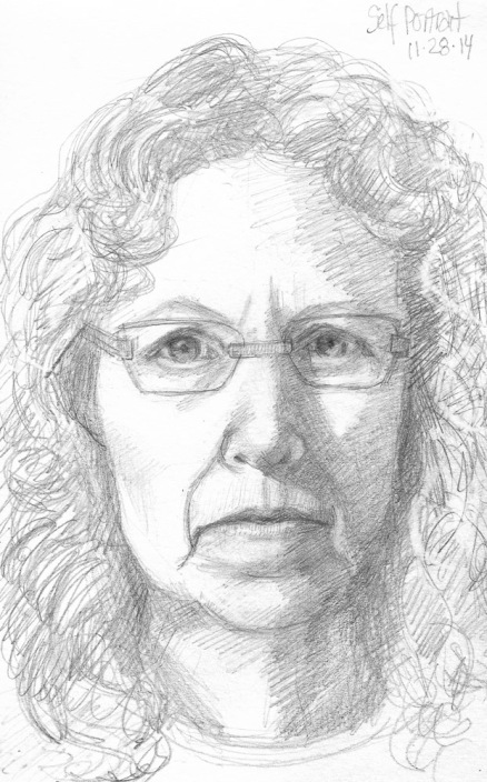
End of Journal Self Portrait with New Glasses, graphite, 8×5″ 11/2014
I’ve been doing more oil painting than sketching lately so it’s taken longer than usual to fill my journal and get to the last page that I always save for a self-portrait (above). It’s interesting how each sketch in the collection below shows a progression upwards in age and (occasionally) in skill and how only bits of them resemble me at all. Also interesting how many of them were done on days I was feeling grumpy and/or tired (probably wisely choosing to sketch myself instead of working on something that “mattered” when I felt that way).
Below is a little gallery of self-portrait end-of-journal sketches since 2009. You can click on any image to see it larger, if you must.
End of Journal Self-Portrait, graphite, 5×7.5 in
End of Journal Self-Portrait, ink & watercolor
End of Journal Self-Portrait, February 2013, Pitt brown Brush Pen and watercolor, 8×5″
End of Journal Self Portrait, graphite and watercolor, 7.5×5″
End of Journal Self-Portrait #1, ink & watercolor, 7×5″
End of Journal Self Portrait, colored pencils, 7×5″
End of sketchbook self portraits, ink & watercolor
End of Journal Self-Portrait #1
End of Journal #2 (Ick!)
Self Portrait B-1, ink & watercolor
Tortured sketch (in mirror), Pretending sweetness (from photo)
Wildcat Canyon trail trash can, ink in pocket Moleskine notebook
Dog on wheels at the dog park, ink in pocket Moleskine
Meeting Stuff, sketches in pocket Moleskine
Sketch during Father Keating movie, ink in pocket Moleskine
Wildcat Canyon Wildflowers, ink, colored pencil, gouache in pocket Moleskine
Here are some random sketches from hikes and walks with my dog, sitting in meetings, a movie shown in a library and at the dog park. These are all in my pocket Moleskine that I carry with me all the time. Hover over images to read captions or click on them to see them larger.
UC Berkeley Center Street Entrance, ink and watercolor, 5×8 in
I had a great time at Sketchcrawl 44 on the University of California, Berkeley campus. I missed the starting meet up at 11:00 because I stopped at the entrance to do the sketch above (and to be honest, because I arrived an hour late due to my seeming inability to get out of the house on time in the morning no matter how hard I try). Most of the students are gone for the summer but there were hundreds of visitors from all over the world and families doing campus tours with their high school students and large groups of teens in summer programs on campus.
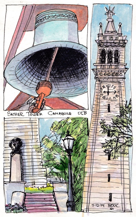
UC Berkeley Sather Tower Campanile, ink and watercolor 8×5 in
At lunchtime I met up with Cathy and some other sketchers, and had lunch sitting on white chairs set up for a wedding in front of the Faculty Club. Then I sketched at our meet up spot, Sather Tower, aka “the Campanile,” a tall clock tower in the center of campus. I rode the elevator up to the top and was going to sketch the panoramic view when I noticed someone looking up at the huge bells just over my head. I would have totally missed that sight (until the bells sounded excruciatingly loudly at 2:00 as I was drawing the one bell above). I skipped drawing the panorama since it took so long to understand and draw the bell. Then I took the slow elevator back down and sketched the tower. I only got the top 3/4 in the sketch on the right so added the base with a statue and stairs on the left.
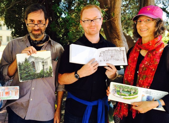
Gary Amaro, Pete Scully and Me
At our 3:00 meet up time I was delighted to spot my friends and fellow Urban Sketchers Pete Scully and Gary Amaro. It was such a treat to see them again and get a chance to look through their amazing sketchbooks. I told Pete I wish I could live in the world he draws. I so love the light and depth and detail in his sketches! Gary’s gouache and ink sketch of a campus building is really gorgeous in person.
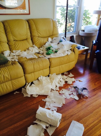
Living Room with 2 Rolls of Shredded Paper Towels (my couch isn’t really that yellow…ick)
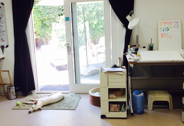
I’ve missed going out sketching all the time like I used to. 2014 so far has been the year of the dog. Unfortunately, having been rescued from the streets of Taiwan, Millie is not fond of urban environments, making urban sketching with her rather difficult. She shivers and shakes on busy streets so much that her teeth chatter. Even though she did get into trouble while I was out (see above) in the hour before the dog sitter came to take her to the park, I’ve really enjoyed the time I spend with her and she’s becoming a great studio dog (see below).
Carole Baker is an amazing painter in remote northern Alaska who I’ve known through our blogs and correspondence for years. When she was in Berkeley for a visit we met in North Berkeley to sketch. Above is a photo of my wonky sketch (held by Carole so that I could photograph it) of Earthly Goods, the store on one corner of Vine and Shattuck.
Carol holding her sketch of the corner of Shattuck and Vine
We sat on the same bench but looked in opposite directions. Here is Carole and her sketch of the produce market on the opposite corner of Shattuck and Vine.
I was so inspired by Carole and her art on the beautiful greeting cards she gave me as a gift. You can see Carole’s art on her blog Carole Baker’s Art Journal.


")


, Pretending sweetness (from photo)")