(Update: This painting won second place for Portrait of the Year on Making a Mark in 2012.)
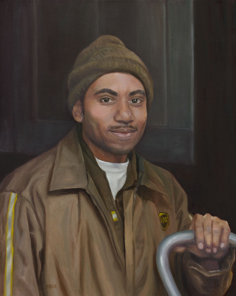
One night last winter two UPS guys arrived in the dark to deliver a dozen boxes of the flooring materials for my studio. I had started a series of paintings of people at work (still in progress) and asked if I could take their photo to use for a painting. They agreed and were great models!
A couple of months ago he called, asking about the painting, inspiring me to finally finish it. There were some magic moments along the way (see process photos below), such as the one where I did a quick first pass on his hand and then stepped back and said “Wow! That works and I’m not touching it again.”
Since I took the photos at night without flash outside lit only by the fluorescent lights from inside the studio, the photo was dark and the colors were, well, mostly brown. But the UPS slogan is right, BROWN really does deliver! Who knew there were so many shades of brown? I must have mixed a hundred different browns.
Below are photos showing the process of drawing and painting this portrait.
After the Party: Cerveza and Lemon, oil on Gessobord, 7×5″
My neighbors from Mexico really know how to celebrate birthdays. They prepare by cooking delicious traditional Mexican food for days (including a huge vat of my favorite, birria de chivo) and decorate their yard, filling the patio with tables, chairs and umbrellas like the best cafes.
Beer and Lemon study for oil painting, Ink & Watercolor, 8×5″
The kids gleefully bounce like human ping-pong balls in a giant inflatable jumper in the front yard while the adults enjoy Cumbias music, dancing and good food in the backyard. I appreciated the chance to practice my Spanish but was relieved to discover that most of their friends are bilingual; when my meager Spanish fails we can still talk.
I thought the little beer bottles were cute so I took mine home to paint.
The oil painting is available here. The study is in my journal.
Happy Boy Farms Tomatoes, Oil on Gessobord panel, 12×12″
Happy Boy Farms Tomatoes, Oil on Gessobord panel, 12×12″
My friend Barbara said this painting made her want to lick the tomatoes right off the panel. That was her positive feedback when I got stuck and asked for advice at an earlier stage of this painting. The constructive criticism was harder to hear but helped me get to the final painting above. The earlier stages of the painting and her advice are below.
Preliminary thumbnails and watercolor sketch
When I set up the still life I hung a light yellow-green cloth as a backdrop and piled the tomatoes into a thrift shop silver basket. I thought I’d use the folds in the cloth to divide up the green background.
Block Landscape, final painting, 12×16, oil on panel
I wanted to learn how to get from a grisaille underpainting to a full color painting after I did the Frankie Flathead monochrome study. So I decided to set up some colored blocks as if they were a landscape, and paint them in layers, starting with a grisaille, trying to find a method that worked for me.
Aboveis the final painting and belowis the step-by-step process that I followed.
Planes of the Head, Grisaille study, oil on canvas panel, 11×14″
When I bought a “Planes of the Head” life-sized plaster cast two years ago I wanted to learn more about portrait painting. I put it on display in the studio and studied it. I knew I should be drawing and painting from the cast, but hoped learning would happen by osmosis since it didn’t really inspire me as a painting subject.
Planes of the Head Plaster Cast
Then I got curious about grisaille techniques after seeing beautiful paintings that began with that approach. I watched the excellent video “How to Paint: The Grisaille Method” by Jon deMartin (in which he paints from a cast of Julius Caeser) and decided to try grisaille using homely Frankie Flathead, my Planes of the Head cast, as my model. See bottom of post for a clip of the deMartin video.
Open Grisaille in which Frankie resembles a demented old perv
I was going to display all my steps along the way, but my photos weren’t good enough. Above is the first stage, the “open” grisaille, which means it’s painted thinly, using only transparent washes of grey (or in this case, burnt umber) and wiping paint off to achieve the lighter values. At the top of the post is the “closed” grisaille, made by mixing and applying a range of values opaquely, using white and the same burnt umber on top of the original “open” grisaille.
One of the most powerful things I discovered in the video is the way light changes across planes.
9-step Value Scale (white to black) on left and strip painted Value 4 Gray on right (screenshot from video)Same Value as image to the left but the Value 4 Gray strip is curved to show the range of values as it turns away from light (screenshot from video)
When bent so planes are at different angles to the light, the gray strip on the right seems to have all the values in the 9-step value strip on the left. Isn’t this a powerful demonstration of the effects of light and shadow?
My first attempt at grisaille was interesting. I made many mistakes and got lots of good practice.
My finished painting isn’t great, but doing the study helped prepare me for the next lesson I gave myself (and that I enjoyed more and will post soon): starting with a grisaille to set the value structure in a still life and then adding the color in the same values.
Below is a clip from the video. I was very curious about how grisaille works so it was worth the $35 to download the three-hour program, also available here to watch online and DVD.
(Disclaimer: I have no connection to or receive no benefit from writing about these products)
Peonies in Mom’s Copper Pitcher, oil on Gessobord, 10×8″
A couple of years ago my mom and I had one of those conversations that goes something like this…
Mom: “You know those flowers that are big and fluffy and round…”
Me: “Uh, no.”
Mom: “You know! One of your neighbors had some that we saw when we walked by once.”
Me: “Do you mean the ones that we always called “popcorn ball flowers” and that I can never remember the real name of?” (referring to Hydrangea).
Mom: “No, ugh, I can’t remember what they’re called but they’re really pretty…”
Me: “Sorry. I have no idea.”
Mom: “Well anyway, I was thinking you should paint some.”
Two months later the phone rings:
Me: “Hello.”
Mom: “PEONIES! That’s what they were! You should paint some.”
While I’d often admired them in paintings, I’d never actually seen them in real life. So when Trader Joes had them in their flower stand I brought some home to paint. This nifty copper pitcher came from my mom’s collection of interesting objects.
Peonies, quick preliminary thumbnail sketch in journal
I made a good start on the pitcher but as I began painting the flowers, life intervened. I broke the “rule” for painting from life: always start with the thing most likely to move, fade or rot (which wouldn’t be the pitcher). So by the time I returned to the studio, the flowers had lost some of their fluffy peony-ness and were looking more like roses. But they hung on long enough for me to finish the painting.
Now I keep watching flower stands hoping to find more peonies to paint. But next time I’ll start with the flowers!
My three wonderful next-door neighbor children bring me flowers every year for my birthday. This year the bouquet lasted so long I got to make two paintings from it. They come to my door, hand me the flowers and then each one shyly gives me a hug and says “Happy birthday.” I love that they’re still doing it at 10, 13 and 16.
When they were little they would come to the studio and make brilliant expressive paintings. Then school got the better of them and they started drawing the archetypical house under a rainbow with 2 windows, a door and smoke coming out of a chimney).
Birthday Bouquet #2, oil on linen panel, 8×8″
When I try to work too fast or am tired, I start generalizing, which rarely turns out well, whether in painting or drawing. It’s too easy to do like my neighbor kids and just make a generic house or bunch of flowers rather than these specific ones. I enjoy the process and the results much more when I go for accuracy in drawing, color and value.
Some people are great at simplifying and whipping out gorgeous, impressionistic art. But for me, it’s the individual personality of my subject that interest me; the specifics that make it that particular rose, place or person.
That was the discovery I made when painting these, so they are two more “almost” paintings (see previous post). Each one is just a stepping stone on the long and joyful path that is painting. (And some paintings really are better suited to use as stepping stones in the garden than hanging on the wall!)
Tea and Lemon on Lavender, oil on linen panel, 8×8″
I make a lot of “almost” paintings: they are almost what I intended; I almost like them, if only… (insert painting problem here). I’ve learned to appreciate the learning process and the parts that work and learn from my mistakes. But I haven’t yet learned to leave “almost” paintings alone and start another one.
Instead I keep working them until I reach the point where the underlying problem (e.g. poor composition, icky colors of background or subject, bad drawing, too overworked, or just not enough skill to pull off what I was going for) becomes insurmountable. Then I make a note of what I discover and what went wrong and give myself an assignment of something to study and practice on the next one.
With Tea and Lemon, I was happy with almost everything except the background which I reworked several times. I’m tempted to mess with it some more so I’m posting it to make myself stop.
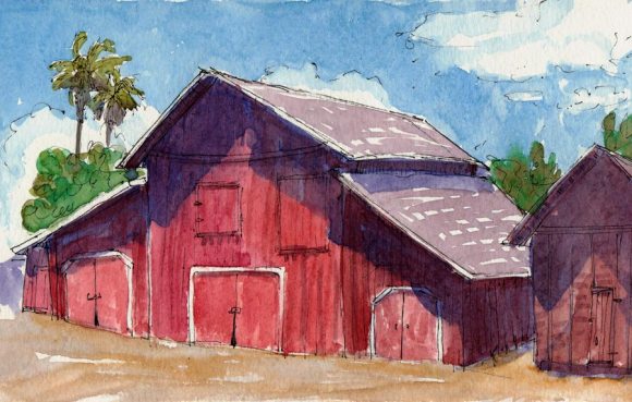
Ruth Bancroft Gardens Old Barn, ink & watercolor, 5×8″
My plein air group was given the great privilege of being able to go beyond the chained off, “Private Property. No Entrance” signs to explore the property where Mrs. Bancroft and other family members still live. There are old barns like the one above and other outbuildings as well as a log cabin, a chalet and a beautiful Japanese style home.
1970s Muscle Cars Resting in the Shade and Dust Behind the Garden
The Ruth Bancroft Gardens in Walnut Creek began as a 400-acre fruit farm in the 1880s developed by Hubert Howe Bancroft, a famous historian and publisher whose book collection is now part of UC Berkeley’s Bancroft Library.
Bancroft Garden Lilly Pond and Dragonflies, ink & watercolor 5×8″
The farm was passed down through the generations, and much of the land was sold off for housing development. In 1971 the last walnut orchard on the property was cut down, and Ruth’s husband, Phillip Bancroft, offered her three acres to begin a new garden using her large collection of succulents.
Giant Agave, ink & watercolor, 5×8″
The garden also has collections of aloes, agaves, yuccas, and echeverias. Aeonium ‘Glenn Davidson’, the first succulent in Ruth’s collection, is still growing in the garden.
With each painting I do I’m getting closer to finding my way, or I should say myway. I am attracted to so many styles and ways of painting, from tightly rendered realism to loose and sketchy and everything in between. Some require more time and patience then I have; others are fun to paint but the results don’t interest me.
I painted this one a couple months ago (I’m so behind on posting!) at the beginning of this honing in period (or is it homing in?). As I catch up on posting the paintings and sketches I’ve done since this one, I’ll be sharing the process and work that has helped me to sort out what and how I enjoy painting and what I don’t; what I do well and what I need to learn to improve.
After chasing so many different approaches, sometimes in circles, it’s exciting to get close to finding my way, which was probably there all along waiting for me to come back to it.