Categories
Drawing Life in general Sketchbook Pages Watercolor

Greatful vs Grateful & Terrific Tools: Toto Toilet

TOTO WC

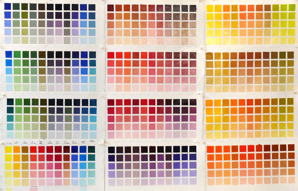
Ink & Kremer watercolors (larger)

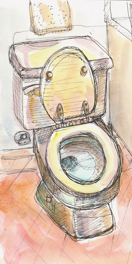
I’m probably going to regret this post tomorrow so I apologize in advance if you find the image unsavory. It’s just that I was so tired tonight all I wanted to do was curl up with a good book and a big bowl of popcorn. To avoid the carb overload and squeeze in a little fun after a long work day, I tried to inspire myself to draw a bit. Looking for a subject, I wandered through the house and saw my shiny, excellent Toto toilet.

I highly value competence, good design, and well-made tools (from cars to combs, to clocks to computers–anything that helps manage my daily life I consider a tool). My Toto toilet is a terrific tool. It never has the problems my other WC does (which requires keeping a plunger nearby it at all times).

Here are some other tools I use and appreciate regularly for their great design and functionality: Soltek easel, iPhone, Toyota RAV 4, electric teakettle, Canon MP610 Scanner/Printer, TiVo, Canon Power Shot SD800IS camera, Photoshop, caller ID, Cheap Joes Golden Fleece brushes for watercolor and Robert Simmons Signet brushes for oil, ancient Eagle Creek backpack, my slippers, my bed…

Just writing this list makes me realize how lucky I am and how much I have to be grateful for, and this is just in the tools department, not the really important stuff of life, like friends, family and health.

That’s the great thing about drawing. I start out grumpy and tired and end up feeling grateful. So maybe I won’t regret this post after all.

One last thing: why is grateful spelled “grate” and not “great?” Grate is what you do with cheese or carrots. Great means good. Full of great makes more sense than full of grate.

OK, I had to look it up on Dictionary.com, another wonderful tool:

  • Grate in grateful comes from the Latin, grātus, which means pleasing.
  • Grate (framework of metal bars) comes from L crāt- (s. of crātis) which means wickerwork, hurdle or crate.
  • Grate (as in grating cheese or grating on your nerves) originally comes from German, kratzen to scratch.
  • GREAT comes from Groat, which was a silver coin of England, equal to four pennies, issued from 1279 to 1662 and which was larger than other coins in former use.

Oh the poor English learners! What a complex melting pot the English language is!

Categories
Painting Sketchbook Pages

Infinite Color & Joy: Charting My Palette

Color Chart of my oil palette

11 colors x 11 colors = Joy! (Larger)

Richard Schmid said it best, when writing about his experience with doing these charts when he was an art student:

“When I finished I knew more about my paint than I had ever thought possible. It was an astonishing experience—imagine being taken into the kitchen of a great chef and shown everything he could do with flavors—that was what it was like for me! There was nothing tedious or boring about doing the charts; each was a revelation of the power that awaited me…”

I’ve been working on these charts for about two weeks and it has been an amazing experience, just as Schmid described. I’ve had moments of sheer delight at the unexpected appearance of a beautiful coppery color or a lovely mulberry. I was flown back in time to memories of dipping easter eggs in dye and seeing the colors emerge, and could almost smell the scent of the redwood forest with the appearance of sharp dark greens and rich deep reds.

The purpose of doing the charts is to see, understand, and remember how they behave. They also provide a wonderful resource to refer to again and again. I mixed 11 colors with each other and then lightened them in 5 steps, so that the first row is pure color and the last row is a tinted white. Adding more colors, more steps…the possibilities are endless! These could also be done with watercolor, using water instead of white paint.
(Please click “Continue Reading” for more…).

Categories
Drawing Painting Sketchbook Pages Watercolor

Hotel Mac, Pt. Richmond Plein Air

Hotel Mac, Pt. Richmond, Ink & Watercolor

Ink & watercolor, 8×6″ (larger)

When we had all our paintings lined up to view after our plein air paint-out today, a very cheery homeless man passed by, examined everyone’s work, and announced that my oil painting (below) was the only one he would buy, repeating this several times. It wasn’t as high praise as one of the others in the group got: this is the third week in a row she’s sold her painting right off her easel!

I started the day with the oil painting below, trying to make use of some of the color mixing theory I’ve been studying. I was hungry to do some more detailed drawing too, so after the critique, I put away my painting gear and got out my sketchbook to do the ink and watercolor above.

Hotel Mac, Pt. Richmond, Oil

Oil on panel, 8×10″ (larger)

Brick buildings are rare in California as they do not tend to survive earthquakes. But Hotel Mac, this three-story, red brick building in Pt. Richmond, a quaint, bayside community, was built in 1911, and must have weathered many quakes over the years.

Pt. Richmond is only a 15 minute drive from my house but I’d never been there before. I was pleasantly surprised by this little town on a hill. The street is lined with charming cafes and just over the hill is a huge, beautiful waterfront park (Miller/Knox Regional Shoreline) with gorgeous views of San Francisco across the water, a lagoon, and a railroad museum. I’m definitely going back there to paint again!

Categories
Drawing Faces Painting People Sketchbook Pages Subway drawings Watercolor

I just love to draw

BART riders

Ink & watercolor in Strathmore Drawing 6×8″ sketchbook (larger)

A tall, overstuffed, nerdy guy sat down beside me on the commute home, opened his laptop and started watching a bloody horror movie. It was one of those movies with a creepy doll in it.

I turned away from him, tired from my first day back at work after being home with a cold,  and feeling disgusted by what I saw on his screen. But once I started drawing, I just felt happy.

I added watercolor this evening at home and that made me feel happy too. I really like this sketchbook paper for drawing with ink and then adding light watercolor washes. Although I usually prefer Cheap Joes inexpensive Golden Fleece watercolor brushes, tonight I grabbed an old friend: the first watercolor brush I ever bought: a Winsor Newton Series 7 Kolinsky Sable brush, with peeling paint, loose ferrule and no point.

I’m glad to be 2/3 over my cold, out of my pajamas, showered and dressed after a couple of days of being housebound with no energy to do any of the above.

Categories
Drawing Life in general Painting Sketchbook Pages Still Life Watercolor

Still Life for a Spring Cold

Still Life for a Spring Cold

Brown Micron Pigma ink and watercolor in homemade sketchbook, 5×7″ (larger)

Need I say more?

I had a quiet, restful weekend, got enough sleep, didn’t stand out in the wind painting, and what do I get for it? A cold! That will teach me to slow down. Maybe if I just keep moving as fast as I usually do, always staying busy, the darn bugs don’t have a chance to take hold. The minute I slowed down they went to work.

Or maybe the cold was already taking hold and that’s why I chose quiet indoor painting this weekend?

With some Vitamin C, tea with lemon, and chicken soup, I’m usually able to kick a cold in 24 hours. That’s what I’m counting on this time.

Categories
Art theory Oil Painting Painting Studio

Back to Basics – Color Vocabulary

Painting Blocks to Paint Blocks

Painting blocks to use in light and color-study still-life as explained in this previous post. (Newly gessoed panels drying in little rack behind the blocks).

After jumping head first (or was it feet first?) into oil painting, and then flailing about, trying to find my way, I realized it was time to go back to basics. Just as with writing or speaking, a basic vocabulary is essential to expressing oneself.

But I was trying speak “oils” using the vocabulary of color I’d learned with watercolor, assuming that Red is Red, whether it’s watercolor or oils. Unfortunately, I’m finding that’s like assuming if you can speak English you can speak French since they use the same alphabet.

Testing Colors to Choose a Palette

Oil painting tests of different brands of color to choose my basic palette
(Click Images To Enlarge)

When I first started painting with watercolor, I made dozens of color charts, testing the various pigments to learn about their natures, alone and mixed with other colors. In watercolor this is really essential since there are so many characteristics that affect the flow of the paint: whether it charges into neighboring paint or resists it; whether it’s opaque or transparent; sedimentary (leaving little spots of sediment), staining or lifts easily, how it mixes with other colors and more.

I hadn’t done this with oil painting. But watching Camille Przedowek demonstrate a couple of weeks ago, I was struck by her huge “vocabulary” of color. She was quickly mixing up and painting with colors I couldn’t even name! I realized my oil painting color vocabulary is about that of a 4-year old from a foreign country.

(CLICK “Continue Reading” to read and see the rest…)

Categories
Drawing Faces Other Art Blogs I Read People Portrait Sketchbook Pages Watercolor

More Portrait Swaps: Andy (& Nel again)


Andy

ANDY by JANA
Ink & watercolor, Aquabee sketchbook, 12×9″
(larger)

Andy of “Drawn to Running” emailed me and invited me to do a portrait swap with him. I think he’s quite adorable and looks like someone with a very kind heart. I exaggerated in my sketch of him but had great fun doing the drawing, which was a relief after my struggles in the studio earlier this week.

Here’s his excellent portrait of me: an amazing likeness!:

Andy\'s portrait of me

JANA by ANDY

I’m still working on painting Nel and I’m determined to succeed to capture her image from one particular photo without making her look unattractive, which she most definitely is not! Here is another attempt (3rd of those I did today, the first two not worth posting!).

NEL #6
Ink & watercolor, Aquabee sketchbook, 12×9″
(larger)

Nel 6

Drawing in Sharpie is great fun. You have to move quickly or it starts to bleed; you can’t erase, just have to redraw the lines. I enjoy this kind of “take a chance and go” drawing and quick painting so much more than careful labored work these days.

Categories
Life in general Sketchbook Pages Watercolor

Help! My House is Haunted! (A true mystery)

Haunted Bird Clock

Ink and watercolor in Aquabee sketchbook (larger)

When my father was dying several years ago, I flew to Maine to help with his care and say goodbye. I arrived in late October, on a warm, fall day, and he was still eating and talking and trying to finish his last book, which I helped him edit those final days. When I left a week later on Halloween, winter had arrived with an icy blast and everything was covered in snow. He died two days later, on All Souls Day.

Before I left, the only thing of his I asked to take was his bird clock, pictured above. It chimed with the call of a different bird each hour from the wall above his writing desk. Even though the birds are now all faded to pale gray, I’ve had it on my wall ever since. Until this week, that is…when it apparently led to the haunting of my house.

I never was able to get the proper birds to chime on their designated hour. The two owl calls were supposed to chime at 6 and 12 but when the hands pointed to the Oriole it played the call of an owl, and when it pointed to an owl you might hear a blue bird or a cardinal. But I digress…back to the haunting.

A week ago, at exactly 4:00 a.m. I was awakened by the sound of the owl calling out from the clock: “Whooo whoo whoo. Whoo whoo whoo. Whoo whoo whoo.” The clock has a light sensor and is not supposed to chime in the dark, and had never done so before. I got out of bed and walked toward the clock in the dining room, but the sound stopped before I could reach it. The next day, groggy from disturbed sleep, I removed the batteries that control the bird calls.

But the next morning at exactly 4:00 a.m. the same thing happened again. I removed the last battery. The clock stopped and I put it on a shelf in another room.

The next morning at exactly 4:00 a.m.: “Whoo whoo whoo…etc.” I lay in bed wracking my brain trying to come up with what else could be making that sound but could think of nothing.

That day I put the clock in my garage, which is down a long driveway from the house. The next morning, 4:00 a.m., the owl was back, singing away from my dining room, without need of clock or batteries.

owl.jpg

(Click “Continue Reading” below for the rest of the story.)

Categories
Other Art Blogs I Read Painting People Portrait Sketchbook Pages Watercolor

More for the portrait party

Nel 2

Watercolor, 11×7.5″ Nel #1 (larger)

Last week I posted my portraits of Nel and Rita for the Portrait Party blog’s birthday celebration. Today I worked on painting Nel from a different photo. Above is my first attempt.

Nel and Rita both did wonderful portraits of me for the Portrait Party. You can see Rita’s here and Nel’s here. They captured my likeness and a sense of my funny side and joyfulness.

Here’s today’s second version:

Nel 3

Watercolor, 11×7.5″ Nel #2 (larger)

You might notice that the drawing is exactly the same in both paintings. That’s because I did the drawing first and scanned it “just in case” I messed up. Then, when I wanted to do another painting, I printed the drawing out on a piece of watercolor paper and started again.
Nel 4

Watercolor, 11×7.5″ Nel #3 (larger)

I’m not happy with any of these, and I seem to have put my frustration on Nel’s face. Since that seems to be the general theme in my painting this week, maybe it’s time to move on to making color charts, always a good thing to do when the muse is on strike.

Categories
Art theory Landscape Life in general Oil Painting Outdoors/Landscape Painting Plein Air

Am I Having Fun Yet? Uh, no.

Borgas Ranch

Oil on panel, 9×12″ (reworked from original plein air) (larger)

Saturday was the first plein air paint-out of the season for the East Bay Plein Air Painters. We went to Old Borges Ranch, a charming historical old ranch with a blacksmith shop, old barns, farm animals, all surrounded by the brilliant green hills of springtime. It was very cloudy and I decided that what I wanted to focus on was trying to observe and paint the effect of the cloudy, cool, diffused light.

After wandering around trying to pick a spot, by the time I was ready to start painting I only had two hours left before our group critique. This is the same painting as above after two hours:

Borgas Ranch - @ 2 hours

Oil on panel, 9×12″ (original plein air) (larger)

I probably should have left it alone and moved on. But I was frustrated with the way I seem to always be painting hills (I’m sick of painting hills!) and they always look flat. So after the critique, I went back and started working on the painting again, determined to figure out how to make the hills not look flat. I stood there painting for 2 more hours and although I made some discoveries about paint application and brush strokes, I hadn’t improved the painting at all (just the opposite).

What I’d planned to do after the paint-out at 1:00, was to take a walk on the beautiful trails and do some sketching of the interesting sights but it was too late when I finally gave up on the painting at 4:00 because I had a long drive home and had to get ready for a dinner party that evening.

Today, even though I tried to ignore it, the painting and my frustration about it continued to bug me. I finally decided to work on it some more until I either got it or killed it. I guess I did a little of both.

The truth is that today oil painting isn’t feeling like fun. I’m missing the watercolor sketchbooking and drawing for fun I did all the time before I took up oils. I’m jealous of all the people I see while I’m plein air painting who are taking a hike in pretty places instead of torturing themselves trying to paint them. I’m missing filling up my sketchbook with fun, wonky drawings and loose watercolors. I’m longing for working from still life set ups or photos where the light doesn’t change and where it’s not always a rush against time.

I also know that I’m persistent if nothing else, and that I’m not giving up the struggle. But it’s time to have more fun with my art. After all, I’m doing this for my own creative pleasure, and as much as I love learning, sometime a woman just needs to play, too.