Thanks to Kaelin on Sktchy app for the twinkle in her eyes that inspired me to sketch her on my ancient Winnie the Pooh book’s last page map of Pooh Corners. Digital ink in Procreate.
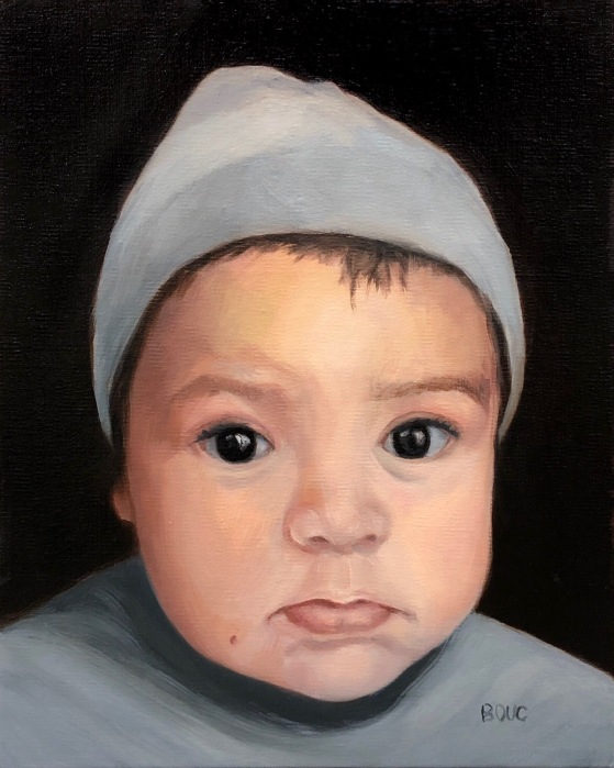
Portrait of Baby Toa, oil on linen panel, 10×8 inches
I really enjoyed making this painting of my friend’s grandson Toa. The biggest challenge was working from a cellphone photo taken in a carseat in the dark where his skin looked dark and bright orange. Fortunately I was able to see some other snapshots with better skin color.
I’ve been taking a new approach to painting; focusing on the joy of creating and letting go of the internal “committee” that demands perfection. I have accepted that my work will never be perfect and that perfect art bores me anyway. A bit of wonkiness, even in a portrait, is ok with me, if I feel I have captured the spark of the subject. I’m painting for myself; if it pleases someone else too that’s a bonus, but not at all a requirement. Giving myself this freedom has completely changed my life.
Below are my initial sketches, a picture of the setup with the photo, and an early stage in the painting.
I’ve developed the goofy habit of storing my leftover cucumber in the bell pepper half when I prepare a salad. It always makes me laugh so I decided to paint it. My sister called it veggie porn. I hope it makes you chuckle too.
I’m trying out a new format for my blog posts, a simple list with images of what I’ve been working on, successes, challenges and what else is going on in the studio and my life. Theoretically it will mean less writing and more frequent posting. So here goes…let me know what you think.
CHALLENGES: I’ve been struggling with composition, discovering half way through a painting that the composition sucks and the painting will never be an enjoyable thing to look at.
Veggie Porn Thumbnail sketches
Photo of the set-up
SUCCESSES: I finally got the willingness to begin all paintings with some thumbnail sketches. I realized that COMPOSITION is simply the structure that directs the eye around the painting, creates a feeling of action or stillness and (if done well) delights the eye. Two of my favorite painters, Susan Jane Walp and Giorgio Morandi use composition in unexpected ways, and both delight the eye (or at least my eyes) whether they are following or breaking the “rules” of composition or making their own.
LETTING GO OF A BAD PAINTING: This one started off really happily but ended up in the trash, after scraping and redoing it over and over until I killed it so dead it couldn’t be revived. I just felt there was too much red, that it was too “hot” somehow. A friend suggested adding black. That was the final nail in the coffin. I’m not sure why I’m even sharing it at all.
FAIL: Bad Begonias, oil on panel, 10×8″
SKETCHES: I try to do a sketch from the SKTCHY App at least weekly. Here is a recent one.
Ms. I. T, from Sktchy photo reference, graphite, 12×9″
WHAT I’M READING: “Irresistible: The Rise of Addictive Technology and the Business of Keeping Us Hooked.” Great book about how our devices and apps are designed to keep us using them. I waste way too much time web-surfing on my phone. This book gave me some tools for changing my habits along with a good talking to! I think it’s a must-read for parents especially.
WHAT I’M LISTENING TO: Ed Sheeran and Alicia Keys on Amazon music, which I like much better than Apple music. (If you’re interested, here’s a link to Amazon Music Unlimited 30-Day Free Trial)
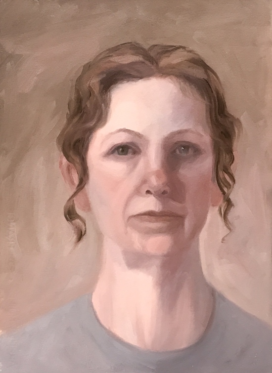
Painting quick self-portraits seemed like a good way to work through my feelings while supporting my elderly mother in hospice, especially with my limited studio time and energy. The most recent, #6 above, is my favorite so far because I focused on finding light, beauty and strength rather than darkness (and because I omitted my frown lines). I used a limited palette of titanium white, yellow ochre, venetian red, cobalt blue and a little Gamblin Asphaltum and a cool white light bulb.
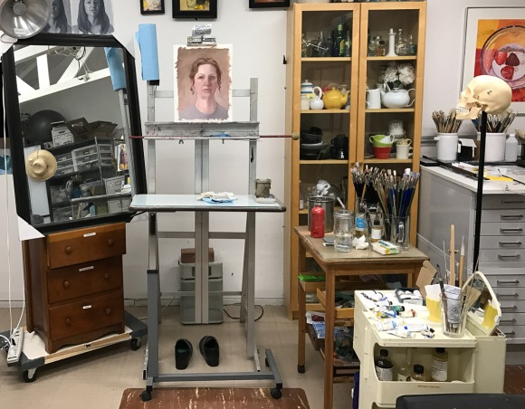
Studio set-up with mirror
Here’s my funky set up with the big mirror propped up on a dresser drawer. In all six of these self-portraits (above and below) I focused on capturing something of what I was feeling in a short session (3- to 4-hour studies) without worrying too much about getting a true likeness.
After I did these two studies on one piece of Arches Oil Paper focusing on values (started with transparent earth color underpainting), I caught a nasty head cold. I feel super lousy and haven’t had the energy to paint but I’ve done a couple sketches, below.
Pomegranate and persimmons on a brick. 2B pencil in 8×10 moleskine.
Drawing helped take my mind off my sneezing and nose running like a river.
FarhooD S via Sktchy app. graphite, 11×8″
I think I made his hand too small. Here’s his photo on Sktchy:
We had the lovely and vivacious model Beebe R. today in figure drawing. She did a fantastic job holding the long pose. I worked for about an hour and a half on this one, trying to stop at the “less is more” stage instead of the “Ugh! Way overworked!” Stage.
I can see many things I’d like to adjust (and experimented doing so after class in ProCreate with a photo of the sketch on my iPad (below).
Another quick post of a recent sketch done from an inspiration photo on Sktchy. I love the app and I love drawing people more than just about anything. Pears and bowls and pretty landscapes are great, but nothing can match the joy of drawing people for me. Below is the reference photo. I’d intended to add color but liked the black and white version too much.
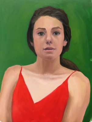
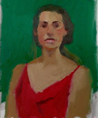
Red Green Complementary Color Portrait #6, Oil on Arches Oil Paper, 14X11 inches
I thought this color and portrait exercise was going to be hard, if not impossible, because of the crazy neon green and red lighting on the model. But because she was lit from the sides her face was modeled with visible planes and shapes it was surprisingly easier than the previous red/green portrait experiments. It was fun to paint and I’m really happy with everything about it. Below is the reference photo and the teacher’s study. I enjoy seeing how he makes each painting look like a different person, using the model as a jumping off place rather than going for a specific likeness.
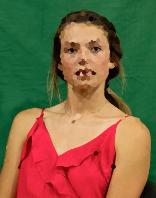
Red Green Complementary Color Reference Photo #2
Red Green Complementary Color, Bill Perkin’s study
Usually I pick the one image that I like the best to put at the top of my posts but after doing this exercise six times, I don’t know which, if any, I like at all. My struggles and mood on the day I was working on these studies really came through in the images. Each portrait seems to be saying what I was feeling, from “WTF!” to “I’m confused” to “Erk!” to “Help! Get me out of here!” To “Maybe it’s time to move on.” More about complementary colors and what I learned from this exercise after all the awful paintings below:
Red Green Complementary Color Portrait #5, Oil on Mylar, 14X11 inches
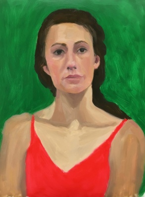
Red Green Complementary Color Portrait #4, Oil on Mylar, 14X11 inches
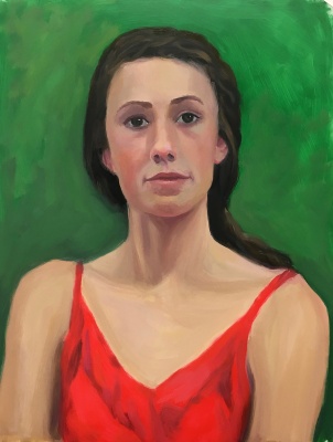
Red Green Complementary Color Portrait #3. Oil on Mylar, 14X11 inches
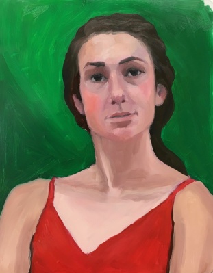
Red Green Complementary Color Portrait #2. Oil on Mylar, 14X11 inches
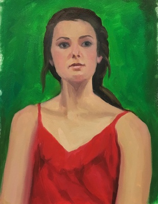
Red Green Complementary Color Portrait #1. Oil on Mylar, 14X11 inches
Bill Perkins 30 minute study
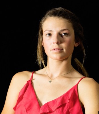
Original photo reference.
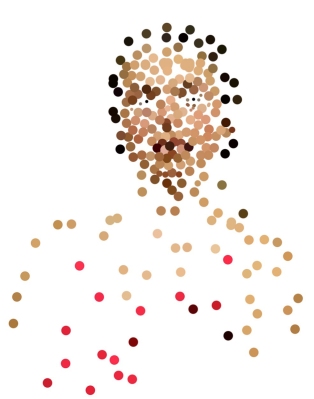
Original photo reference with color spots in Photoshop
Color spots layer in Photoshop on top of original photo reference.
The goal of the Complementary Color part of the New Masters Academy Color Boot Camp is to work with different pairs of complementary colors under different lighting conditions and observe the way the colors interact, both visually in the image, and when mixing together on the palette. Complementary colors are clearly explained this Wikipedia page.
The easiest way to remember which colors are complements are to think of the triad of the three primary colors: red, blue and yellow. Pick a color; the missing part of the triad is its complement. If you pick green (composed of blue and yellow) then red is missing. Red and green are each other’s complements. Pick yellow and what’s missing? Red and blue. When combined they make purple. Therefore purple and yellow are complementary colors. Ditto for orange (red+yellow) and blue.
Things I noticed: Red and green, like all complements, when beside each other make each other look brighter, more vibrant. When mixed together they dull each other down and make a grayed color. I really struggled to get a likeness, and even though that isn’t the point of the color exercises I got determined (obsessive?) until I finally gave up. Flat, frontal lighting makes it hard to find landmarks and planes in the face.
The last images are of the original photo reference, the teacher’s painting and two Photoshopped pictures where I selected color spots on the reference photo using the eyedropper tool and painted a spot of that color on a layer above the photo layer (displayed here with and without the photo). I do that when I have trouble recognizing what colors I’m actually seeing. I never really nailed any of these, in likeness or color. But the next exercise came out really great and I’ll post that soon.
Color Boot Camp SATURATION: Neutral Areas vs. Saturated Areas, 11×14″ oil study
In this last Saturation exercise in the New Masters Academy Color Boot Camp series, the Major Key is low with so much black background. The most contrast of saturation or Minor Key comes in her red dress. I was happy with the way my study proceeded, without too much struggle, and how it turned out. It was easier to paint because there was more contrast in the reference photo.
Below are the reference photo and Mr. Perkins’ 30 minute study.