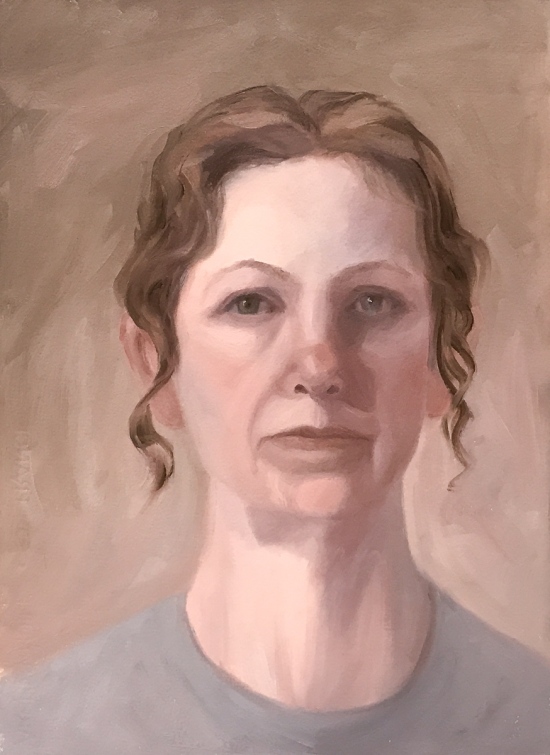
Painting quick self-portraits seemed like a good way to work through my feelings while supporting my elderly mother in hospice, especially with my limited studio time and energy. The most recent, #6 above, is my favorite so far because I focused on finding light, beauty and strength rather than darkness (and because I omitted my frown lines). I used a limited palette of titanium white, yellow ochre, venetian red, cobalt blue and a little Gamblin Asphaltum and a cool white light bulb.
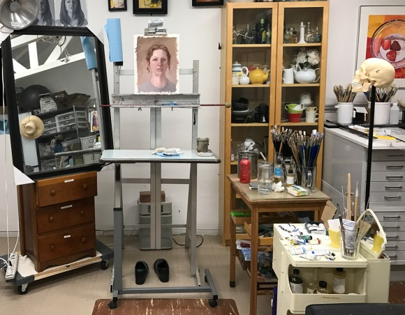
Studio set-up with mirror
Here’s my funky set up with the big mirror propped up on a dresser drawer. In all six of these self-portraits (above and below) I focused on capturing something of what I was feeling in a short session (3- to 4-hour studies) without worrying too much about getting a true likeness.
After I did these two studies on one piece of Arches Oil Paper focusing on values (started with transparent earth color underpainting), I caught a nasty head cold. I feel super lousy and haven’t had the energy to paint but I’ve done a couple sketches, below.
Pomegranate and persimmons on a brick. 2B pencil in 8×10 moleskine.
Drawing helped take my mind off my sneezing and nose running like a river.
FarhooD S via Sktchy app. graphite, 11×8″
I think I made his hand too small. Here’s his photo on Sktchy:
We had the lovely and vivacious model Beebe R. today in figure drawing. She did a fantastic job holding the long pose. I worked for about an hour and a half on this one, trying to stop at the “less is more” stage instead of the “Ugh! Way overworked!” Stage.
I can see many things I’d like to adjust (and experimented doing so after class in ProCreate with a photo of the sketch on my iPad (below).
Another quick post of a recent sketch done from an inspiration photo on Sktchy. I love the app and I love drawing people more than just about anything. Pears and bowls and pretty landscapes are great, but nothing can match the joy of drawing people for me. Below is the reference photo. I’d intended to add color but liked the black and white version too much.
Inspired by a Sktchy photo, created in ProCreate on iPad with Apple Pencil, when it was too early for bed and I was too tired to go to the studio. Sat the iPad on my knee, looked at photo in Sktchy App on iPhone. And here’s the inspiration photo:
Shower cap inspiration photo on Sktchy by Danith R.
Let me know what you think about shorter posts like this. I’m going to try to post more often to the blog, with more pictures and less words. Sometimes less is more (posts) if I can get stuff posted quickly without long explanations. But don’t worry, there will still be lessons I’m learning in the studio posts too.
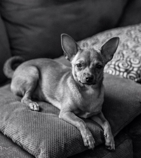
When the Sktchy (see previous post) Weekend Art Extravaganza inspiration was to make a color sketch from a black and white photo I found the photo below and couldn’t resist putting a little color in this little guy’s life. I used to make fun of Chihuahuas, comparing them to rats (which can also actually make good pets if you don’t mind the smell). But after a couple of friends adopted chihuahua mixes, I have come to really appreciate their funny and quirky personalities.
I so enjoy the Sktchy App where people post their photos, artists post their sketches of the photos and everybody is so positive and encouraging. Each weekend Sktchy hosts a Weekend Art Extravaganza or “WAX,” which is a cue or art concept to inspire artists to apply to their sketches. Last weekend it was “Candlelight.” I found the inspiring photo below on Sktchy and used it for this painting.
Photo reference for candlelight
Do join in on Sktchy if you have an iPhone and want practice drawing people (and their pets and home/cities) from all over the world, all ages, all lifestyles. It’s so much fun!
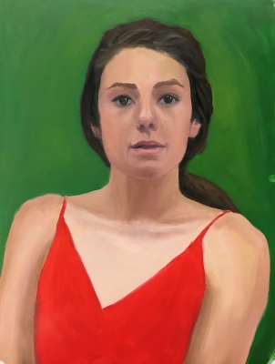
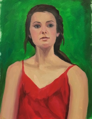
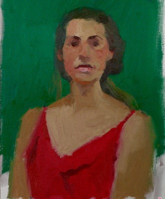
Red Green Complementary Color Portrait #6, Oil on Arches Oil Paper, 14X11 inches
I thought this color and portrait exercise was going to be hard, if not impossible, because of the crazy neon green and red lighting on the model. But because she was lit from the sides her face was modeled with visible planes and shapes it was surprisingly easier than the previous red/green portrait experiments. It was fun to paint and I’m really happy with everything about it. Below is the reference photo and the teacher’s study. I enjoy seeing how he makes each painting look like a different person, using the model as a jumping off place rather than going for a specific likeness.
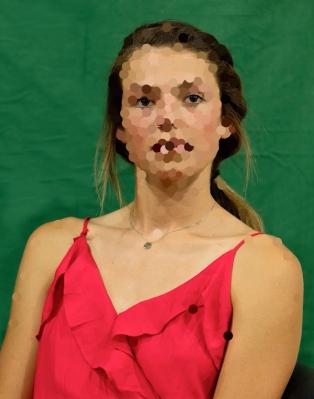
Red Green Complementary Color Reference Photo #2
Red Green Complementary Color, Bill Perkin’s study
Usually I pick the one image that I like the best to put at the top of my posts but after doing this exercise six times, I don’t know which, if any, I like at all. My struggles and mood on the day I was working on these studies really came through in the images. Each portrait seems to be saying what I was feeling, from “WTF!” to “I’m confused” to “Erk!” to “Help! Get me out of here!” To “Maybe it’s time to move on.” More about complementary colors and what I learned from this exercise after all the awful paintings below:
Red Green Complementary Color Portrait #5, Oil on Mylar, 14X11 inches
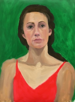
Red Green Complementary Color Portrait #4, Oil on Mylar, 14X11 inches
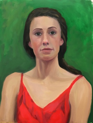
Red Green Complementary Color Portrait #3. Oil on Mylar, 14X11 inches
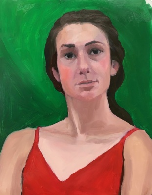
Red Green Complementary Color Portrait #2. Oil on Mylar, 14X11 inches
Red Green Complementary Color Portrait #1. Oil on Mylar, 14X11 inches
Bill Perkins 30 minute study
Original photo reference.
Original photo reference with color spots in Photoshop
Color spots layer in Photoshop on top of original photo reference.
The goal of the Complementary Color part of the New Masters Academy Color Boot Camp is to work with different pairs of complementary colors under different lighting conditions and observe the way the colors interact, both visually in the image, and when mixing together on the palette. Complementary colors are clearly explained this Wikipedia page.
The easiest way to remember which colors are complements are to think of the triad of the three primary colors: red, blue and yellow. Pick a color; the missing part of the triad is its complement. If you pick green (composed of blue and yellow) then red is missing. Red and green are each other’s complements. Pick yellow and what’s missing? Red and blue. When combined they make purple. Therefore purple and yellow are complementary colors. Ditto for orange (red+yellow) and blue.
Things I noticed: Red and green, like all complements, when beside each other make each other look brighter, more vibrant. When mixed together they dull each other down and make a grayed color. I really struggled to get a likeness, and even though that isn’t the point of the color exercises I got determined (obsessive?) until I finally gave up. Flat, frontal lighting makes it hard to find landmarks and planes in the face.
The last images are of the original photo reference, the teacher’s painting and two Photoshopped pictures where I selected color spots on the reference photo using the eyedropper tool and painted a spot of that color on a layer above the photo layer (displayed here with and without the photo). I do that when I have trouble recognizing what colors I’m actually seeing. I never really nailed any of these, in likeness or color. But the next exercise came out really great and I’ll post that soon.
I did this sketch from a photo on the wonderful Sktchy App but it seemed festive enough and somehow appropriate for this point in time in the USA. Have a happy Independence Day as the nation celebrates by blowing stuff up (and scaring dogs and cats everywhere).