Watching the Demo, Ink & watercolor in 8x6" sketchbook
Monday night Randall Sexton did a still life demo at the El Cerrito Art Association meeting. It was my first time attending an ECAA meeting but my second time with Randy, as I’d taken a weekend figure painting workshop with him last summer. He is an excellent painter and a gentle teacher. He was ready to start painting right on time and waited patiently for at least half an hour while the friendly group took care of business matters and announcements.
Randy Sexton demonstrating, Ink & watercolor in 8x6" sketchbook
I’d been struggling with a still life painting that day so the demo came at a perfect time and I left knowing exactly where I’d gone wrong with the painting. Some days, just knowing where I’ve gone wrong is as good as it gets.
(To read my notes from the demo, click the image to enlarge it.)
View from Old Borges Ranch; Plein air, Oil on panel, 9x12"
I’m celebrating a bit of progress I saw today when I painted plein air at Old Borges Ranch in Walnut Creek. I painted at this site a year ago and had a terrible time, titling the post of the awful painting I did that day, “Am I Having Fun Yet? Uh…no!”
Today was a lot more fun. I started the painting with a plan (described below) and stuck with it until I started rushing to wrap it up in time for our group critique at 1:00 when I muddied things up a bit since the light had changed in the scene from when I first started at 10:30.
When I put the painting in the line up with the other 14 paintings, I didn’t even cringe or feel embarrassed. It helped too, that I now understand that my plein air paintings are sketches, not finished works of art.
Here are the steps I took that seemed to work for me:
So I’m still at it with these camellias, this time in oil. I have a plan for Camellias #4 as I still haven’t quite got what I’m after. I want to see if I can get bright light colors in oils without the chalkiness of white paint. I think that will mean using thin transparent washes instead of thick paint, even though the usual method in oil is to make lights thick and darks thin.
I spent hours and hours standing at the easel this weekend, determined to once again try to paint a portrait of a little boy whose photograph I took a couple years ago at the San Francisco Museum of Art. After many hours and sore feet, below is how the painting turned out:
Canvas painted over with white paint
It had a few promising phases but I just couldn’t “execute” any of them to completion. At the end of the day I gave up and saved the lovely linen canvas to reuse by painting it over with white paint.
Tonight I decided to do something in watercolor just to try to have a little fun. When I went looking for a subject to paint everything seemed tired and insipid. I think I’ve seen one too many meaningless little still lifes with a clove of garlic, a lemon slice, or an apple. I started wondering, “What’s the point?” so the pointy juicer seemed a perfect subject.
I wasn’t happy with the first (overworked) version below, so I tried it again and the second version is at the top of the post. I didn’t have an orange to juice so I made pretend orange juice with watercolor paint.
What's the Point? watercolor on hotpress paper, 6x4"
Since I’ve been in a stuck place for a couple weeks I’ve been trying to figure out what kind of artwork would bring back my creative juices. Just making pretty pictures, developing good enough technique to be able to make classical still lifes or impressionist landscapes or traditional portraits isn’t it. So I made a list of what I do enjoy:
going out sketching with ink, watercolor and sketchbook
painting subjects with emotional content (like the two autobiographical series I’m planning)
painting large, getting lost in the painting, having unexpected things appear and running with them
drawing complicated subjects or painting details in watercolor
painting my crazy dreams
creative thinking to come up with concepts and images based on one-word challenges like Illustration Friday offers
painting without a lot of planning, just jumping in and seeing what happen
I was stuck on #2 because I was envisioning working with large canvases (30×40″) but thinking about the cost of the canvases and the paint to cover them, and where I’d hang them or store them if I actually made as many in the series as I intend…. and then as I was writing about this in my journal I realized the solution:
Just start! Go for it! Go wild! Play! Forget about the product and enjoy the process. So I’m going to START with the bigger of the canvases I have on hand and just keep going from there. And I’m going to get out and sketch more.
I love Trader Joe’s Balsamic Vinegar. It’s delicious as a salad dressing all by itself; it’s not too tart or bitter and has a pleasant, mild sweetness. I bought a second bottle to take to my office and when I saw them sitting side by side on the counter I thought they looked cute and wanted to paint them.
Then, just as I was nearly finished with the painting, the panel popped off the easel, and seeming to be in slow motion, bounced off the brush holder and landed on the floor, right side UP! I was so surprised, since nothing I drop ever lands right side up, but it did. I was really relieved and went back to doing some final touch ups.
The next thing I knew it was sailing through the air again, flipped, bounced twice, and finally hit the floor painted side DOWN this time. I was ready to get really sad, but amazingly there wasn’t too much damage. The biggest problem was the cat hair. I’d been meaning to vacuum sometime soon….
I touched up the areas that lost paint, picked out all the cat hair using a clean soft brush, wiped the paint off the floor and declared the painting done. I may work on it some more after it dries. But for now, it’s time to clean up, make dinner and then (ugh) do my taxes.
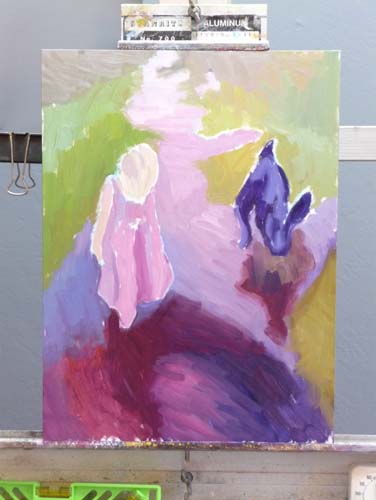
After I posted this painting a few weeks ago I realized I’d left off the foamy bubbles on top of the water. Last weekend I worked on the painting some more, at first planning to just add the bubbles but ended up adding a whole new layer of paint. I gave Hannah another haircut and slimmed down her dress a bit. I felt a little afraid to go back in and start messing with things, but told myself to just have fun and see what happens.
I don’t think I quite got the essence of the foam, it looks more like rose petals floating on the surface, but I decided I liked that idea and left it alone.
I’m wondering if there is a problem with the grasses behind the rust colored reeds on the middle right that sort of point towards her head. Should that patch of yellow-green grasses have less texture, be cooler and more blurry so that they recede more? I think so.
Here’s what it looked like before in the original post:
Hannah's Reflection, Oil on Gessobord, 16x12
I’m trying to get over the idea that paintings need to be completed in one painting session or in one day. Alla prima and plein air painting is great, but so is letting layers dry and adding more more until the painting says it’s done. Sometimes it forgets to say “When” though, and then it’s overdone.
I have the same trouble with steaming vegetables. I lose my concentration and before I know it my broccoli has turned to mush. So is the revision mushy broccoli or an improvement? Do you think I should soften those grasses or move on?
Thinking about painting and broccoli reminds me of this poster I made a long time ago:
"Listen to Your Broccoli and It Will Tell You How to Eat It," Colored Pencil, 24x18"
My artist friend Laura (of Laurelines) offered some wonderful suggestions for improving the original version of this painting.
Original version
Laura said:
“One thing I’ve noticed about your oil paintings is that you don’t have the same strong value differences within objects that you do in your watercolors.”
I agreed with her and gave it another go-around, this time adding some dark glazes in the dark area and more lights in the light area. I was working from a photo (since the original artichokes are long gone), so the colors were a little different than the original.
I am so appreciative of the wonderful community of art bloggers and the sharing we do with each other. Laura and I continued the conversation, and talked a bit about plein air painting and impressionism. Then she said:
Your watercolors are pure 21st century YOU. They are clear, strong, bold, and sometimes, though not always, quirky. Your flower paintings are YOU. In oil, it seems to me, anyway, that you’re trying to be someone else or are being encouraged to try to be someone else. That way lies horrible frustration. YOU can use oils in transparent glazes, with shimmering lights and darks, that will feel like you. YOU can use complements to create shadows. YOU can do all those nifty things in oil that you do in watercolor.
What a gift it is to have someone speak from the heart like that. She so hit the nail on the head about what I was struggling with in oil painting. I told her that in watercolor I found my direction early on, knew what I liked, what I wanted to do and developed the skill to do it. In oil I started out wanting to paint like I do in watercolor and everybody told me that “you don’t do that” in oils. I had to learn about the importance of brush strokes, edges, filling the canvas rather than putting an interesting object on a white page, etc. All the books and blogs stressed alla prima, completing a painting a day, impressionism, etc. Somewhere along the way I lost my direction.
I sometimes picture life as a series of turns made when angels have perched on the signpost and pointed in the next good direction to take (sometimes the guides aren’t angels but rather tricksters saying turn left when the correct direction is right — heaven knows I’ve made many unfortunate turns in my life). I think she might have been one of those angels, pointing me back to my right path.
I’m not sure if this version is better than the first. There are definitely more darks, but it seems to have lost its glow, partly due to working from a photo rather than the brightly lit subject. What do you think? Does it need more work or is it overworked?
After deconstructing one artichoke to paint in watercolor (previous post) I decided they were too old and worn out to bother cooking them, so why not paint them instead. I’m finding how important it is to take breaks when I’m painting. Each time I took one (because someone came to the door, I had to go to sleep or have lunch) I was surprised at seeing the painting with fresh eyes. It gave me a chance to strategize, stop futzing around in one area that wasn’t working and just needed to be scraped off and started over, notice that the values needed strengthening, etc.
At a certain point I recognized that this is as good as I can do for now. I’ll learn a little more and be able to a better on the next piece. That is so much more satisfying than trying to bring the piece to the level of the bar I keep raising or trying to make it as good as the painting of other artists’ work I admire. As a good friend said to me yesterday, “Compare…and despair!” and he was so right. Another friend pointed me to this from Desiderata:
If you compare yourself with others,
you may become vain or bitter,
for always there will be greater and lesser persons than yourself.
Artichokes, easel & palette in the studio
The multi-colored card on my easel is a Gretagmacbeth ColorChecker that I use when I photograph art work. Sometimes I use the white square to set my cameras “white balance. I always include some or all of the card when I take the photograph so I can compare the colors on the card to the colors on my monitor to see if I’ve got it right.
With the card included in the photo, I can correct the colors in the photo using the Levels tool in Photoshop:
Select the “white” eyedropper in the Levels menu and click it on the white square. This sets the white level so that white in the photo is pure white, not greyish. Sometimes this is all that’s needed.
If the black square doesn’t look black enough, I do the same with the black eyedropper in the black square. Setting this range of black to white really helps, especially when there is no black or white in the painting.
To remove a color cast (e.g. when the gray square looks greenish pinkish) I use the grey eyedropper on various spots on any of the gray squares until the color cast is gone and gray is gray.
No, the injury and insult referred to in the title of this post does not refer to this painting of a Tangelo. It explains why I haven’t posted lately.
First I had the stomach flu (or was it food poisoning from the dreaded peanut/salmonella scare?) The next week while waiting at the doctor’s for my flu shot, I felt a little tickle in my throat and wondered if I might be getting a cold. I was. It wasn’t terrible, and went to work all week.
When the weekend arrived I expected to feel better and get to paint. But the cold (or was it the flu?) hit full force. For the next 5 days it hurt to think, let alone do anything creative. On day 10 my doctor prescribed antibiotics and I began to recover.
That Friday night after a 10-hour work day, my cat Fiona begged me to come play tag with her. She loves to run through the house chasing me, and me, her. My house is perfect for this game because it’s quite long. It was originally two flats, mirror images, that I connected with a doorway, so it’s a nice long run.
We look completely ridiculous, but it gets us both a bit of exercise. We’ve tried to teach Busby, my other cat, to play, but he doesn’t get it. He comes out of the closet that he’s been sleeping in to watch us, with a confused look on his face.
So there I was running after Fiona when I felt a “snap” in my calf and then a sharp pain that made it nearly impossible to walk, except with a sort of peg-leg gait. When I called the advice nurse he ruled out all the really bad possibilities (broken things, torn apart things, blood clots, etc.) so apparently it’s just going to take some time to heal. It’s been four days and I’m still limping (and coughing).
Despite the limp I was determined to paint this weekend, and chose a delicious Minneola tangelo sitting on the lid of a glass refrigerator container. I liked its funny little poofy crown. I learned that Minneola is both a city in New York and a combination of a Duncan grapefruit and a Dancy tangerine.
I wish I could push rewind and go back one stage on this painting. Knowing when to stop is one of the hardest things in painting.
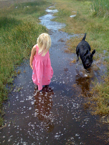
My friend Gina emailed me a photo with a note saying, “I like the light in this photo– for some reason I always think of you when I look at it.” Although I rarely paint from photos, especially those taken by other people, I just had to paint this one. My computer monitor is set up so that I can paint directly from the image on the screen which is a lot better than working from the limited colors in a printed image.
I’m not sure if I’m done yet, but I couldn’t see what else was needed so I stopped. If you have any suggestions for improving the picture, I’d love to hear.
Below are some stages of the painting. I used a bit of artistic license: I gave Hannah a bit of a haircut and deleted Gina’s wonderful dog Bella because:
The dog was competing with Hannah as the focal point and was about the same size.
I couldn’t get Bella to “read” as a dog; no matter how hard I tried to draw her correctly, she just kept turning into a jackrabbit.
Hannah’s Reflection, Oil on Gessobord, 16×12
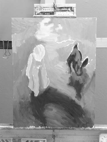
Painting phase 1
B&W value check
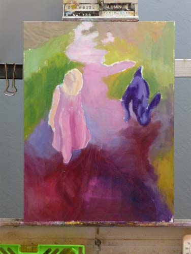
Painting phase 2
Painting Phase 3
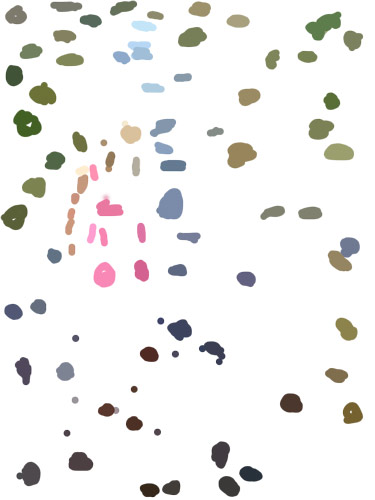
Color spots
Photo, B&W w/2 values
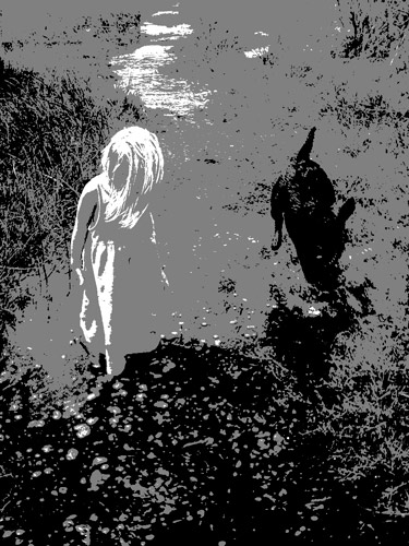
Photo, B&W w/3 values
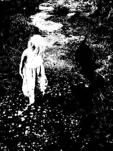
Original Photo
Top row: 1) the finished painting; 2) my painting start; and 3) a black and white version of the start to see if my values were on track.
Middle row: 1) & 2) the next two steps in the painting. 3) a view of a “color spot” layer that I made in Photoshop. I created a new layer, and used Photoshop’s Paintbrush tool to select (Alt-click) and paint spots of those colors because it can be easier to see the colors when they’re isolated. Even more helpful than the color spots is a color-mixing tip I learned from Dianne Mize on Empty Easel: you apply the color to the edge of a small card and compare it to the subject until you get it right.
Bottom row: three views of the original photo. 1) “Posterized” in Photoshop down to two values; 3) posterized with three values; 3) Gina’s original photo.
P.S. This park, which Hannah affectionately calls the “swamp adventure,” is part of the East Bay Regional Parks. It is a river front park next to McAvoy harbor in Bay Point. It’s a little delta oasis in the sprawl of East Contra Costa County.