Categories
Berkeley Drawing Ink and watercolor wash Other Art Blogs I Read Painting People Photos Places Sketchbook Pages

Jana and Casey Do Berkeley

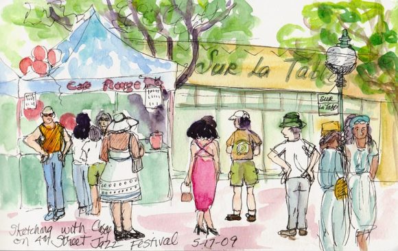
4th Street Jazz Festival- by Jana
4th Street Jazz Festival by Casey
4th Street Jazz Festival-by Casey

Casey Toussaint and her son Paul are visiting from France and I had the pleasure of spending Sunday with them. After a quick visit to my house and studio, we headed down to the Berkeley Marina to cool off on an unseasonably hot day.
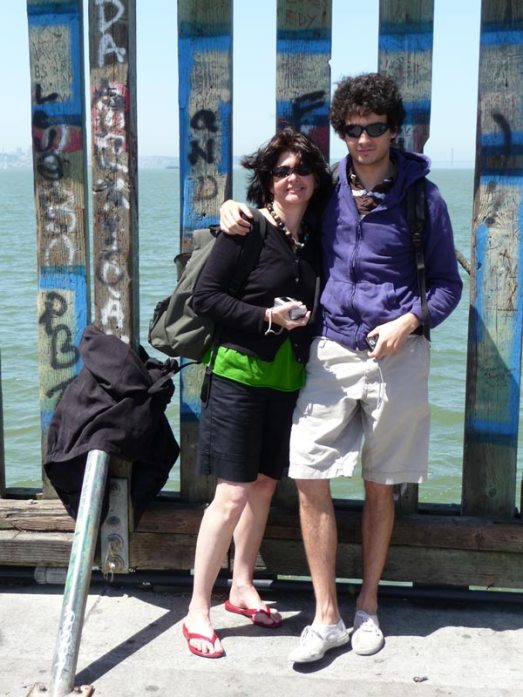
Casey & Paul on Berkeley Pier

We walked to the end of Berkeley’s long pier on San Francisco Bay with views of the Golden Gate Bridge (which Paul wanted to see) and there was a wonderful cool breeze coming in off the ocean. Then we had a delicious lunch at Skates on the Bay, where we had a window seat and watched birds nesting under the eaves and sailboats tacking back and forth on the choppy bay.
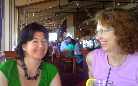
Casey & Jana @ Skates

On the way to our next stop (Dick Blick Art Supplies to pick up a large sketchbook to bring to the afternoon session of the  figure drawing marathon sponsored by the Bay Area Models Guild at Merritt College in Oakland) we passed Berkeley’s Fourth Street boutique/foodie shopping area. We saw that the street was blocked off with a sign, “Fourth Street Jazz Festival” and decided to nix the figure drawing and sketch at the festival instead.

Casey sketching at Peets Fourth Street

We strolled the street and then settled at Peets Coffee for coffee and sketching where we did the two sketches at the top of the post. Casey works quickly, with wonderfully expressive lines, and got in a few more sketches from Peets:
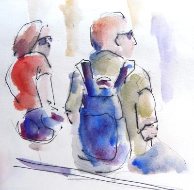
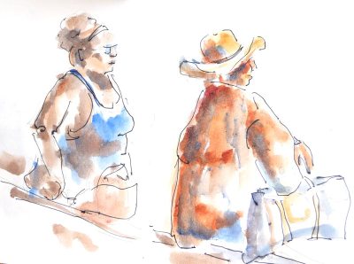
4th Street people by Casey
More 4th St people by Casey

After an hour or two we connected with Paul again, walked over to Blick’s for Casey’s art supply shopping and then headed to Telegraph Avenue and the University of California campus. Casey and I found a spot we wanted to sketch on campus so Paul headed back down Telegraph to Amoeba Records, a huge used CD/record store.

UC Campus building by Jana
Jana's sketch and building
Casey's sketch of the building

When we met Paul back at Amoeba a couple hours later, I was hungry and we decided to head out for dinner. We all felt like Mexican food so I took them to Solano Avenue’s Cactus Taqueria. Paul was quite impressed by the size of the burrito he was served, and took photos of it. I learned that servings are much smaller in French restaurants and that it takes 5 or 6 years of serious study before someone can become a baker. He was surprised that here all one need do to beome a baker is to open a bakery and start baking.
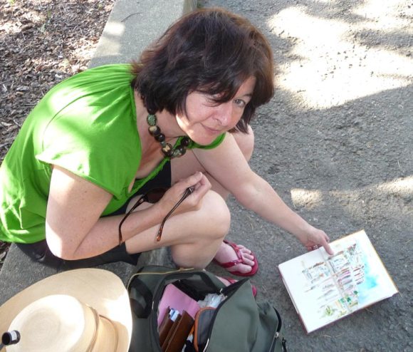
Casey at UC Berkeley

As the sun was setting I drove them back to San Francisco. The fog had rolled in, ending the heat wave, and as we traveled across the Bay Bridge we had amazing views of San Francisco rising up out of the fog bank, sillouhetted by the setting sun. I drove really slowly across the bridge so Paul could take pictures and he got some great ones.

Categories
Faces Flower Art Gouache Ink and watercolor wash International Fake Journal Month Life in general Other Art Blogs I Read People Sketchbook Pages

Who Am I? (Fake Journal Month)

Who Am I, Sepia Micron Pigma Ink & Gouache, 5.5x7.5"

This is the beginning of my contribution to International Fake Journal Month (read on for more about this). To participate, I’m filling a journal this month as a woman who doesn’t know who she is and is trying to find out. (Maybe she’ll learn how she lost her memory too.) I started by Googling “Who Am I” and clicked the first link, a YouTube video by Casting Crowns which inspired the rose and waves besides my pondering self.

Then I checked iTunes and found more than 100 songs named “Who Am I.” I shall play detective, listening to each song, reading the lyrics looking for clues to who “I” am. I’m looking forward to Snoop Dogg’s “Who Am I” day. As I write and draw what I learn, I’ll fill the journal and by the end of the month may have discovered my true identity.

International Fake Journal Month

Roz Stendahl of Roz Wound Up and The International Fake Journal Month blogs is one of my favorite artist bloggers. This month she introduced a quirky and wonderful concept: The Fake Journal. The idea is to create a journal for a month, where you take on a new persona, and fill that journal with the writings and sketches of that person as he or she evolves. To learn more about Fake Journal Month and Roz..

Categories
Art theory Oil Painting Other Art Blogs I Read Painting

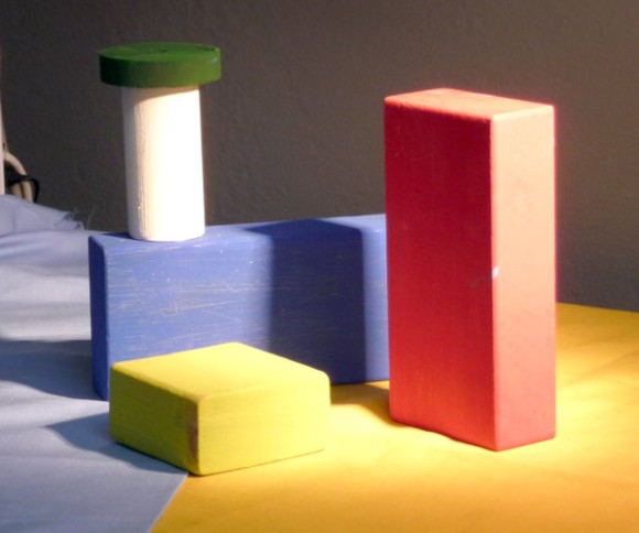
Still Learning to See Color: Block Study (after Hensche)

Color study painted under halogen light, 9x12 in
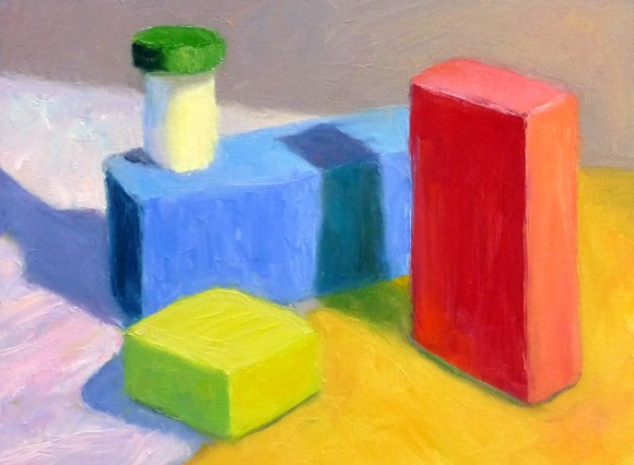
Color study of blocks under halogen light, 9x12 in, oil on panel
Photo of setup (I painted from for blocks, not photo)
I painted from this setup (not from this bad photo)

This study was done to practice seeing, mixing and and painting the relationships of color and light on different planes. Theoretically these colored block studies should be done outdoors with natural light, but it was a cold windy day and I wasn’t feeling well (and still don’t—first it was stomach flu and now a cold) and so worked indoors. When I compare this indoor painting to those I did outdoors and posted here, I can see why it’s better to work outdoors.

This practice is based on the work of Henry Hensche. As Professor Sammy Britt says about Hensche on the Hensche Foundation website:

Charles Hawthorne was the first painter…to put the “Impressionist concept of seeing” into a teaching principle. Hawthorne spent the last fifteen years of his life trying to understand what Monet looked for and how he painted.

Henry Hensche, an assistant to Hawthorne, perfected the concept of seeing and teaching color after Hawthorne’s death in 1930. Mr. Hensche taught and practiced this visual language of color from that first Summer in 1930 until his death in 1992.” [emphasis added]

I’ve studied on and off the past year with Camille Przewodek, a fantastic plein air colorist and former student of Hensche and I think I’m beginning to comprehend the concepts at a basic level (although the study above is a poor representation of that). Another painter who studied with Hensche, John Ebersberger, has created a Hensche Facebook group that is open to the public, for former Hensche students and others who are interested in Hensche’s approach to seeing and painting color relationships.  There are wonderful photos posted there of Hensche paintings and paintings by the artists who have carried on his approach to color, and to my mind, have  advanced it even further. Their discussions and critiques on the groups discussion board are also quite illuminating.

Painting colored blocks under different light is one of the techniques Hensche used to teach students to see that in every plane change there is also a hue or color change (not just a tone or value change), and how these colors change according to the light key (foggy grey light, bright sunlight,  early morning light, afternoon light).

This is not an easy approach and takes years of practice and study, best done with an experienced teacher like Camille Przewodek, John Ebersberger, Carole Gray-Weihman, Dale Axelrod (great links and examples on his website), and others at Atelier aux Couleurs Art Academy who offer workshops locally and internationally. I have found one book, Painting the Impressionist Landscape, that does explains the concepts (although I don’t think that author’s paintings provide stellar examples, especially compared to those listed above).

Even if I never learn to see and paint like they do, I’m sure the concepts I am learning will enrich my painting and it has already changed the way I think about light and color and form.

Categories
Art supplies Art theory Drawing Flower Art Gardening Glass Ink and watercolor wash Oil Painting Other Art Blogs I Read Painting Sketchbook Pages Still Life Watercolor

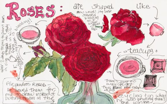
Red Roses Painted with Watercolor, Oil and Blood (!?!)

Red Roses, watercolor

My next door neighbors were pruning their roses for winter so I asked them to save some for me to draw (they were going to throw the still perky roses in the recycling bin). I started by trying to paint them in oils but was having a terrible time mixing the right colors. I scraped off the paint and went to bed, planning to try again the next day.

When the cats knocked the vase over during the night I was actually relieved, thinking the roses would be too funky to paint since all the water was on the floor, not in the vase. But these were some tenacious roses, and were still fine so I decided to try sketching them in watercolor (above and below). I also consulted one of my books on flower painting that said roses were shaped like teacups, so I added a few of those tilted at the same angles to the sketch to help me understand their shape better better.

Blood Red Roses, Ink, Watercolor & Blood!
Blood Red Roses, Ink, Watercolor & Blood

I’d just finished the sketch (above) and was writing about how hard it is to mix the highlight color of  “blood red” roses in oil paint. At that very moment, my nose started bleeding for no reason at all and it dripped onto my sketchbook!  Now I feel like a real Avant-garde artiste, painting in blood!
P.S. A little pinching of the nose and it stopped.

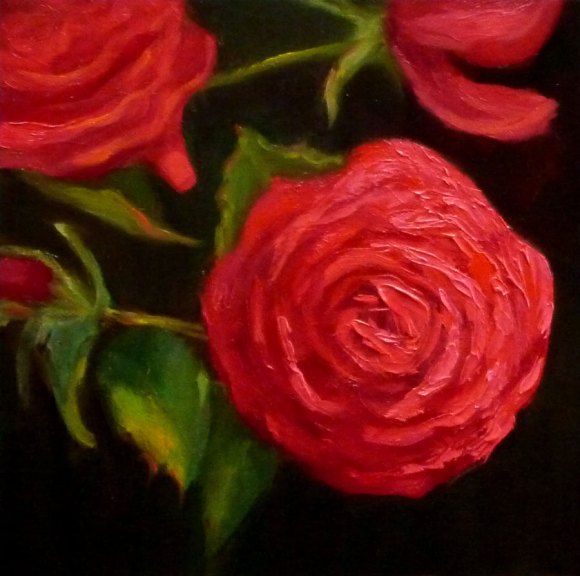
Red Roses, Oil, 6x6"

Mixing a light red color in oil paints

It’s hard to mix a warm, light red in oil paint because when you add white to red oil paint, it makes a cool pink.  This is because all white oil paint is cool (meaning it tends more towards a blue than a warm color like orange or red). But the color of these roses in bright, warm light was a hot pink. It’s easier to get a warm, light red in watercolor because you use the “white” of the watercolor paper to show through and “lighten” the red, not white paint.

To get help with the dilemma I sent an email to Diane Mize at Empty Easel since she and I had recently corresponded about color charts and she’d written an excellent article on Empty Easel about how to mix correct color in oils. She validated that mixing a light red is challenging and offered some good suggestions, including using Naphthol Red, which is a more intense red than the cadmiums (which quickly lose strength in white).

I tried making the lighter areas of the rose thicker, using a palette knife, since those raised areas will catch the light and reflect it making it appear lighter. I also intended to make the dark areas on the roses more neutral and cooler, so that by comparison the warm light area would look even more brilliant. But the roses finally died and that put an end to the painting.  My favorite part of this painting are the leaves at the bottom left.

Categories
Ink and watercolor wash Other Art Blogs I Read Sketchbook Pages Still Life Watercolor

Not Wood Roses

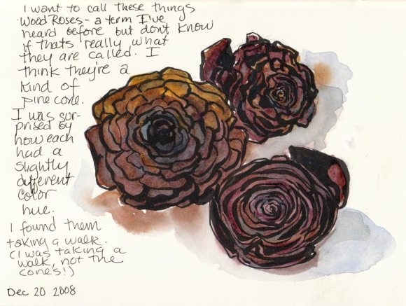
Wood Roses or Pine Cones? (ink & watercolor)

I found these taking a walk (I was walking, not these thingees) which I thought might be called Wood Roses…but I looked it up and learned that Woodrose is “a parasitic plant endemic to New Zealand.”  Since these fell from a pine tree in Berkeley, they’re definitely not woodrose, but they do look like Wood Roses!

Categories
Drawing Ink and watercolor wash Life in general Other Art Blogs I Read Outdoors/Landscape Painting People Photos Plein Air Sketchbook Pages Watercolor

Sketching with Martha & Shirley (St. Patrick’s San Francisco)

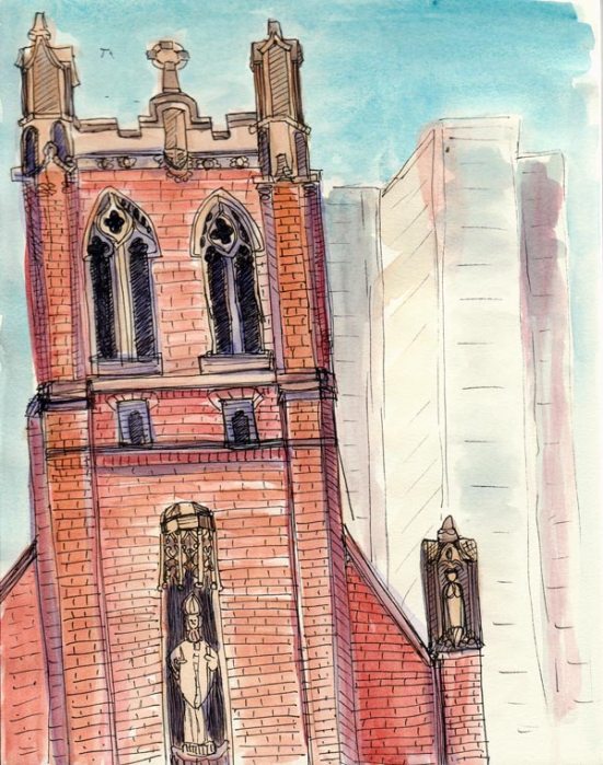
St. Patrick's Church, ink & watercolor 8x6"
St. Patrick's Church, San Francisco, ink & watercolor 8x6"

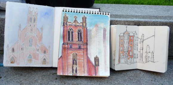
Shirley (Paper and Threads) was visiting San Francisco this week and Martha (Trumpetvine) and I had the pleasure of spending the afternoon sketching with her in the park. Poor St. Patrick’s Catholic Church isn’t really falling over despite the many earthquakes it has weathered over the years. It’s just my usual wonky drawing. Martha and Shirley will post their drawings on their own blogs eventually but here is a snapshot of our work lined up together.

Shirley's, Jana's and Martha's sketches

And here we are lined up, with me a head taller and trying to take a photo and holding my iPhone at arm’s length.

Jana, Martha and Shirley

We were joined virtually on our little art blogger sketchcrawl by phone  from Lisa in Texas and via Facebook (where I posted an update and photo while we were sketching) by Marta (MARTa’s Art) and EJ (Rose-Anglais) .

After sitting on cold concrete steps to sketch we were ready to warm up. We walked back to Shirley’s hotel, and she treated us to a glass of wine on the 39th floor of the Mariott Hotel (also known as the “Jukebox” building because of its unique architecture). Here’s the view from the bar just before sunset.

View from the hotel bar
View from the Marriott Hotel bar

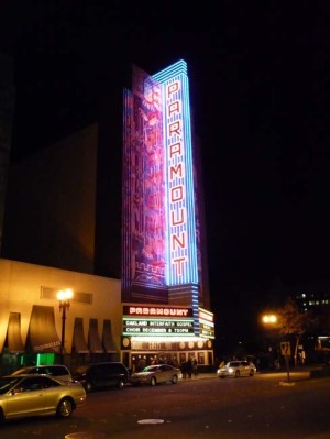
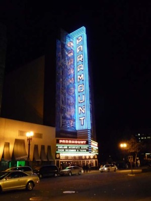
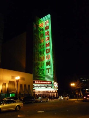
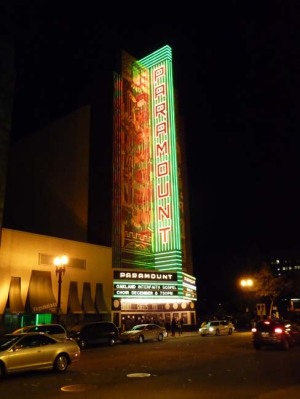
It was such a treat to spend a Friday afternoon with these two very talented and beautiful women.  After the sun set in golds and pinks, and the lights of the city came on, I had to leave while they went off in search of dinner.  I BARTed to Oakland for the monthly Friday night “Art Murmur” gallery walk where my sister and niece had pieces in a show. Walking from BART I passed the grand old Paramount Theatre and set my camera to “burst” mode so I could capture the changing lights of the neon marquis.

Paramount 5
Paramount 1
Paramount 4
Paramount 2
Paramount 3
Paramount 3
Paramount 2
Paramount 4
Categories
Drawing Ink and watercolor wash Other Art Blogs I Read Outdoors/Landscape Painting People Plein Air Sketchbook Pages Watercolor

Sketching at Martinez Waterfront Park

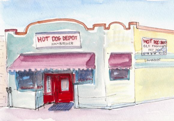
Martinez Hot Dog Depot, Ink & watercolor
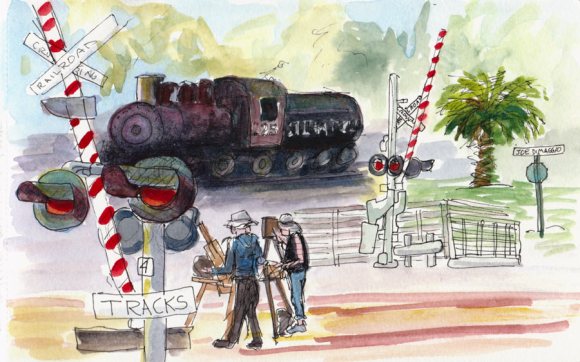
Martinez Waterfront Park, Ink & watercolor in watercolor Moleskine, 5x7"

I arrived late and lazy (due to my efforts to decaffeinate myself) for our paint out at Martinez Waterfront Park today and decided to sketch in ink and watercolor instead of setting up my easel and oil paints. It’s a great park, with a marina full of boats on the bay, fields, trees, ponds, an historic train station and old train (pictured above), a nearby river and marshlands and much more. It’s right on the edge of the older part of town and the Amtrak train station is just outside the entrance to the park.

I sat on a very hard stone bench at the old train station about 20 feet from the tracks.  On the sketch above, I drew without much of a plan, just picking things I saw that interested me and sticking them somewhere on the page, drawing in ink and hoping it would all fit together somehow. I added the watercolor on site.

The two artists in the sketch were standing between the west and east Amtrak tracks. Every 15 minutes a train would roar by about 2 feet of where they were standing, sounding it’s horn so loudly it was painful, but they stood their ground like the dedicated plein air painters that they are.

Martinez Hot Dog Depot, Ink & watercolor
Martinez Hot Dog Depot, Ink & watercolor in Moleskine watercolor sketchbook, 5x7"

I turneda bit to the left at the end of the day and quickly sketched this wonky old Hot Dog Depot (named because it’s adjacent to the train depot. The perspective is all wonky but so was the building. It has a weird corner section where that second smaller window is. So the building isn’t a rectangle, it’s a pentagon (5-sided). I didn’t have time to worry about perspective as the group was convening for a critique and I had to hurry to finish this at all.

Categories
Art theory Drawing Oil Painting Other Art Blogs I Read Painting Photos Sketchbook Pages Still Life

Full Circle: Painting my Pottery Pitcher

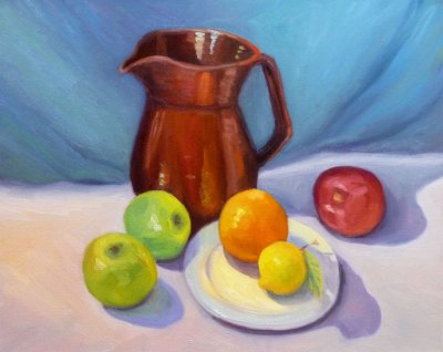
Temoku Pitcher & Fruit, Oil on canvas, 16x20"

The pitcher in this painting is one of the few remaining pieces from my years as a potter, though not a favorite.  I’d assumed I’d always be a potter and could always make more so didn’t worry when I sold nearly everything pre-Christmas one year. Then life changed.

I got married, had a baby (who I intended to just strap in a papoose on my back and continuing working at the wheel, up to my elbows in wet mud–Ha!) and we moved to a row house in San Francisco where I could no longer have a kiln. So that was the end of pottery, but the beginning of drawing and painting.

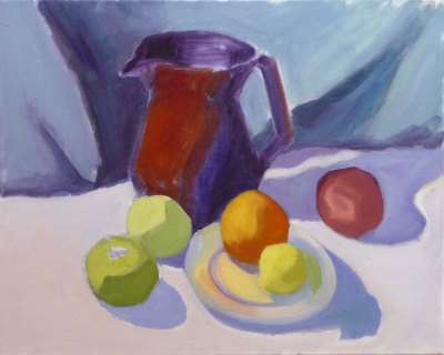
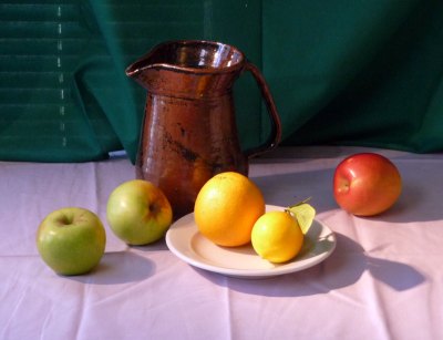
Below you can see the steps I took in making this painting. Although I was working live from my own still life set up, I was also following along with an excellent painting video by Don Sahli. I tried to set up a still life similar to the one he paints in the video but ate  the second orange so substituted a lemon.

[You can see a demo of the Sahli video here.]*

I’d already watched the video and had many “Aha!” moments with it and wanted to practice what I’d learned from it. This weekend I stayed in the studio instead of going out to paint plein air. I played a chapter of the video,  doing that step on my canvas then played the next section. It took Don an hour to do the entire painting but it took me the whole weekend.

Don Sahli is a wonderful teacher and painter who was the last apprentice of Russian painter Sergei Bongart. He breaks painting down to these 4 stages and I photographed those stages (above) as I went along:

  1. Drawing;
  2. Abstract stage (where you do 80% of the work, starting with the darkest dark and then continually ask yourself what color, value, temperature and you paint in one color shape after another);
  3. Modeling (where you finish giving the objects a 3-dimensional appearance, delineating the planes using value, and color temperature.
  4. Final details (adding highlights, caligraphic strokes, dark accents).

After watching the video and doing this exercise, I finally understand so many concepts that I’d read about, been taught, but had still been struggling with, especially the one illustrated below that starts the 3-dimensional appearance of the objects by finding and focusing on the dark/light,  warm/cool color shapes.

*P.S. I have no financial or other interest in Don Sahli’s videos. Just wanted to share a good resource.

Categories
Art theory Landscape Other Art Blogs I Read Sketchbook Pages Subway drawings

Finding my way as an artist

Thumbnails of BART view

Who am I as an artist? What really interests me enough to spend hours painting it? Do I really like painting landscapes? Do I really like painting plein air? Do I even like looking at plein air landscape paintings?

After making 100 plein air landscape studies and only liking 2 of them, it seemed like a good time to reevaluate and those are the questions I’ve been asking myself.

Before I took up oils a year or so ago I was fascinated by details and enjoyed seeing and painting the reflections in glass, faces that told stories (human and non-human animals), the world inside a flower, urban scenes from around my quirky home town.

Then I started painting mostly plein air landscapes in oils and was told I needed to lose the details; simplify;  just paint the big shapes; soften the edges, go for design and composition rather than content. But the more I simplified the less I enjoyed painting. I started to question whether I wanted to continue with oil painting and plein air painting.

Then I serendipitously discovered a book of Charles Sheeler‘s paintings at a used book store. I’d never been much interested in his work before, but when I looked at the images and started reading I was led to the answers I’d been looking for. I saw in his landscapes (mostly urban/industrial), still lifes and interior scenes a specificity, strong point of view, personality, AND great design. I saw a way I could translate what gave me joy in watercolor into my oil painting.

I realized that what interests me is the PARTICULAR, not the general; the close up, personal view that tells a story; a portrait of an object, a person or a place; not the general widescreen view as I’ve been doing.

In trying to better define my thoughts, while waiting for my train at the at the El Cerrito Plaza BART station I sketched the thumbnails at the top and bottom of this post (which can be enlarged by clicking either image).  Below is a photo of the scene, though a slightly different point of view:

Photo of similar view from BART
Photo of similar view from BART minus foreground

And here is what I discovered and wrote in my sketchbook, thumbnail by thumbnail:

1: No focus, BORING. What I’ve been doing: including every single detail from the window frame in the foreground to the cars, parking lot, city, bay, hills across the bay, and the sky.

2. A little more interesting. Focus on the Cerrito Theatre marquis sticking up with foreground and background being less important.

3. A close up view but no focal point, still boring. 3 trees. Who cares?

4. BORING. Sky mountain water. Big Fat So What!

5. Maybe… a portrait of specific trees and lamp post but still not interesting enough to bother painting.

6. Now this interests me! A person waiting, a bench, a sign, a particular tree.

Thumbnails of BART view

Now I just hope I can find a way to implement this new way of viewing and painting with oil paints. I wrote several more pages about these ideas in my sketchbook, but I’ve probably bored you enough for today. Now off to paint!

Categories
Flower Art Glass Other Art Blogs I Read Painting Sketchbook Pages Still Life Watercolor

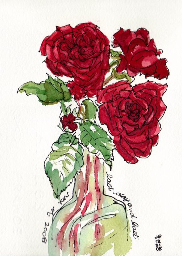
Last Chances: October Roses in Watercolor

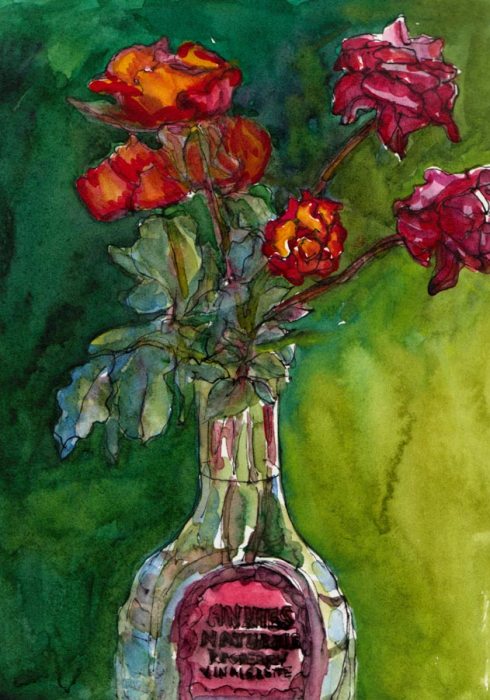
October Roses, Ink & Watercolor 8x6"
October Roses in Annie's Vinaigrette Bottle, Ink & Watercolor 8x6"

It seems like fall is a time of last chances. These might be my last roses of the year and the last chance to paint them so I couldn’t resist, even though they’re a bit stunted and scrawny. The lovely Indian summer we’re having in California has that feel of Last Chance too. Under the warm gusts of Santa Ana winds I can detect the hint of coming chill. Each peach I’ve eaten in the past month has come with the thought, “This is probably the last peach I’ll have this year.”

There’s a feeling of sweet longing and sadness that fall brings. Artist Dee Farnsworth painted the Last of the Summer Corn last month and I saw that same sense of loneliness and loss in her painting. I’m trying not to grasp after summer, resist fall or regret the coming winter. I know acceptance of what IS allows me to live in the present moment and enjoy it. I try to remember that each day is the last chance to experience that day. It will never come again.

Sorry to sound melancholic. I’m actually happy (despite the changing of the season, the terrible news in the world, a tweaked back, and losing every cent I’ve saved this year in the stock market) because my dear neighbor fixed the light over my easel today and now I can paint in good light again. Yippee!

About the painting:

I drew with my long neglected Lami Safari pen, forgetting that the Noodlers Ink isn’t completely waterproof. It seemed even less so on Arches hot press paper, smudging like crazy and then melting and bleeding into the watercolor. I do like the effect here though, the way it creates a softer line than my usual Micron Pigma pens.