Found on the Street #1, Candlestick and Apples, oil painting on panel, 8×8″ (Click image to enlarge)
This is one in a series of paintings of free stuff and things found on the street during my walks in the Berkeley, California area. The little apples had fallen from a neighbor’s tree and the candlestick was in a free box on the curb. Below are photos of some steps in the work in progress of this painting (which is available to purchase from my Daily Paintworks gallery here) and a couple of cool studio tips too.
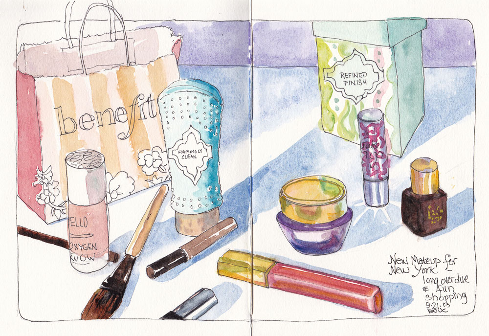
New Makeup for New York, ink and watercolor, 7.5″ x 11″ spread
I’m off to New York City for a fun week of art adventures. I’ll be sketching and visiting art museums with New York art bloggers Shirley, Pat and Carol and the New York City Urban Sketchers. Berkeley artist friend Micaela will be joining me in NY on Friday for a 3-day slumber party and sketching marathon before she takes off to Europe.
As I was preparing for the trip I had fun doing a little shopping when I realized my clothes and makeup were long overdue for a refresh. Above is a sketch of my pretty new cosmetics. If I have time in the morning before I leave (unlikely) I’ll sketch my clothes before I pack them.
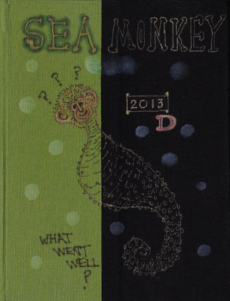
I finally bound my own journal again and am thrilled to have exactly the paper, size and format I like. What a treat to paint on real watercolor paper! As always happens as I’m binding a journal, it named itself: “Sea Monkey.”
Sea Monkey Journal Cover, 8×6″
I Googled what sea monkeys really look like but they were too creepy so I drew a sort of monkey face on a sea-horse body. Then I decorated it with gold and pink pens and drips from a white paint pen (accidental, but liked it so kept going).
As you can see, I don’t take my journals too seriously. It helps to mess them up (journal abuse I call it) right away so they don’t feel precious. An imperfect journal gives me the freedom to sketch playfully (and imperfectly). This one has a major flaw: the text block slipped when I was casing it in and there’s a big wrinkle in the lavender end papers. Oh goodie!
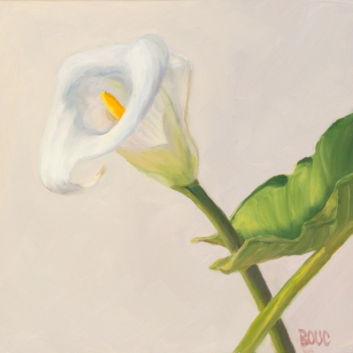
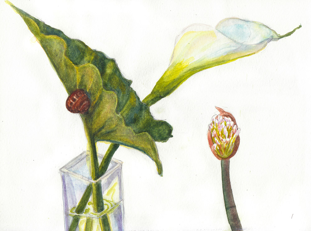
“Lily White on White,” oil on Gessobord panel, 8×8″ (AVAILABLE on DailyPaintworks Auction: CLICK IMAGE to visit auction)
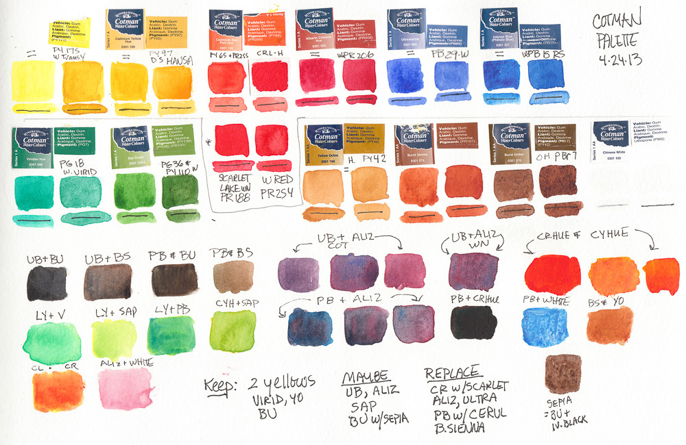
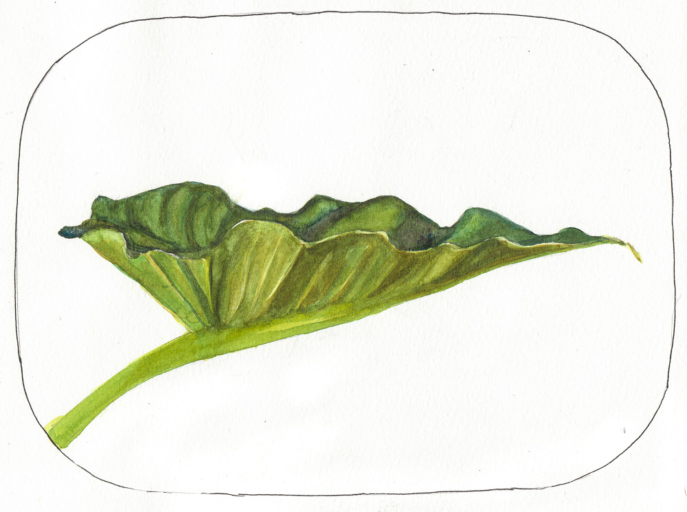
I spent some time sketching and painting a calla lily that sprouted in my garden and while I was at it, tested a palette of Winsor Newton Cotman paints. Several of my friends have this clever, inexpensive Winsor & Newton Cotman Sketchers Palette and I thought it was worth a try so I ordered one.
I started by testing the colors, listing the pigments to match them to artists’ quality pigments I normally use (click to see larger with pigment numbers) and making notes about which ones to swap out (at that point assuming I’d continue using the others).
Test of WInsor Newton Cotman pan paints (FAIL)
I was very frustrated with the results I was getting when painting and in the end, took ALL the Cotman pans out of the palette and replaced them with pans filled with artist quality paints from tubes. I put the Cotman pans in a large jar of water to soak so that I could empty and reuse the empty pans. After dumping and refilling the jar many times I ended up with a jar of tinted water with a lot of white sandy junk at the bottom: the nasty fillers and binders added to the pigments to make it cheap.
I know that for the same $17 that this palette AND crappy paint costs, you can only buy one or two tubes of full strength, high quality paint. But I’d rather have only a few colors than use junk. Most of the following sketches lack vibrancy, richness in color, and paint application was difficult and unattractive. Here they are in reverse order of completion:
Lily sketch #6, watercolor, 8×10″
I liked the drawing above, but not the grayed colors.
Lily sketch #5, ink & watercolor, 8×10″
I liked the shape of the leaf above.
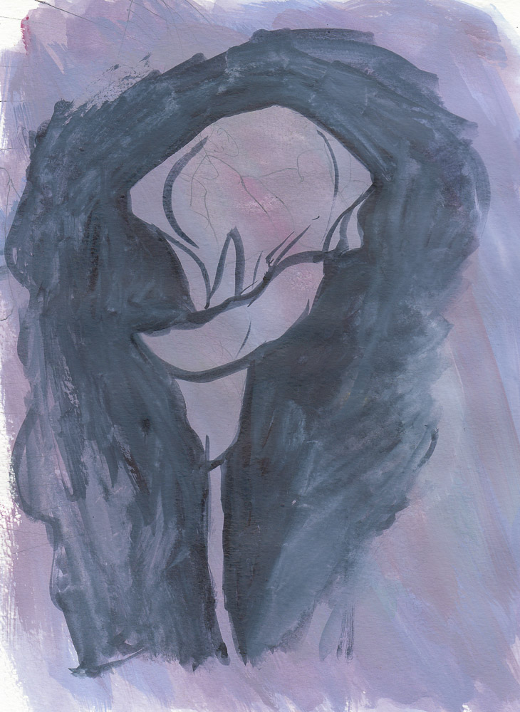
Lily sketch #4?, gouache, 8×10″
I painted over an awful sketch with gouache (above), just loosely trying to get the shape of the flower.
Lily sketch #3-4, watercolor, 8×10″
Two previous attempts at the leaf, on 2 other kinds of paper I taped into the 8×10″ Moleskine.
Lily sketch #1 with Snail, watercolor, 8×10″
The first sketch. I like the composition but the colors and application were yuck.
I’m still using the Cotman Palette. I think it’s a great for sketching because it’s light, compact and holds enough colors (12). And at $17 I don’t mind the price, even after throwing away the colors it cane with. It’s handy to have the now-empty, extra half-pans which usually cost about 50 cents each. So really, I got the palette for $11, and 12 empty pans for $6. Not too bad.
Draw a Pine Tree and a Scented Product (perfume and cat litter), ink & watercolor 8×11″
I had fun with May 6: “Draw a Scented Product.” I sketched two scented “products” — one man-made and one cat-made. The man-made is a lovely (and expensive) room perfume (Vanilla, Bourbon and Mandarin) that I fell in love with at my dentist’s office and unlike most scented products doesn’t give me a headache. It nicely counteracts the scented product my cats produce on a regular basis.
“Draw a pine tree” was the cue for May 5. Easy…found one in my neighborhood bigger than a house and sketched it and painted it sitting in my car on a cold, foggy, windy day.
I’m experimenting with an inexpensive ($13.00) Winsor Newton Cotman watercolor palette. I like the format, size and light weight very much and the way the paint easily re-wets. Although the colors aren’t as intense as their artist’s grade paints they’re all permanent/lightfast. But that might be fine for sketching since it might help me keep the sketches simpler and save fancy washes for real watercolor paper.
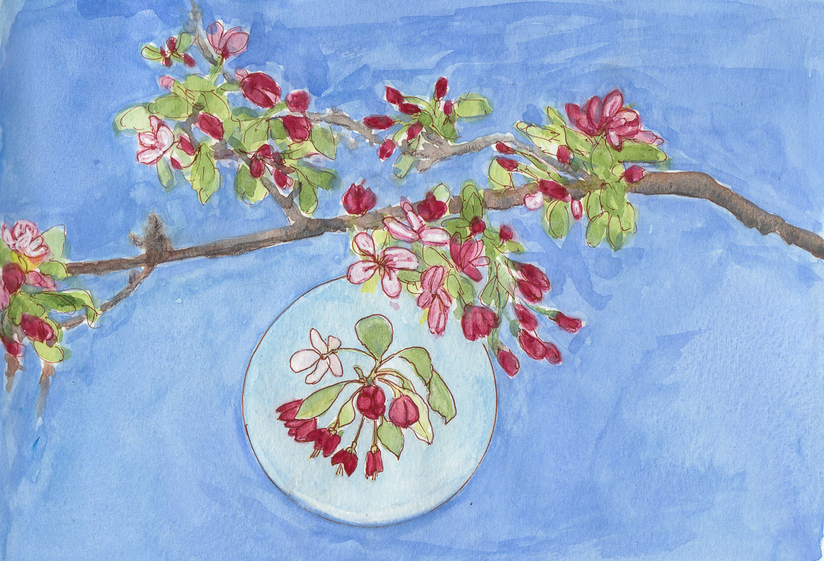
Flowering Crab Apple Branch, left page, ink, watercolor & gouache, 8×11″
Happy spring (or autumn if you’re on the other side of the world)! Despite it being a rainy, grey day here, perfect for spending indoors in jammies (which I did since I was a bit under the weather) spring has definitely arrived in the Bay Area with blossoming trees and green things sprouting everywhere.
Out walking in Berkeley on a Sunday morning in a nice neighborhood, I spotted a beautiful flowering tree between two homes. I was debating with my walking buddy whether to knock on the door and ask if I could take a cutting to sketch and paint from. He thought not, since people might still be sleeping, and suggested I take a photo. But I wanted to draw from the real thing. I was trying to figure out which house actually owned the tree and he was trying to figure out how to get me to keep walking.
Flowering Crab Apple Branch, right page, ink, watercolor & gouache, 8×11″
Just then I heard people chatting, coming towards us on the sidewalk from around the corner. It was the homeowners who’d also been out for a walk. I asked if I could take a branch to paint and they said yes. This is the first of several pieces (two oil paintings and another sketch) I created from their branch.
I wish I’d thought to take their address so I could send a thank you card with the image on it. Maybe my friend will remember what street we were on since he chose our route.
This is the full 2-page spread in the giant Moleskine Watercolor A4 sketchbook I’m using now. It’s 8.5 x 23 inches when opened so rather unwieldy when sketching outside the studio but I’m enjoying it anyway. I drew directly with a sepia Sakura Micron Pigma Pen and then painted with watercolor and a bit of gouache.
I used gouache for the background on this sketch because I wanted a fairly smooth/flat background which I couldn’t get with watercolor because of the way the paper buckles and doesn’t lie flat because of the seam. My favorite part is the enlarged pure watercolor blossoms in the white circle on the left hand side, visible if you click and then click again on the top image. I’m craving some “real” watercolor painting on good paper.
I hated doing performance reviews at work but was always glad when I’d finished mine and could see all I’d accomplished. This year I had to do my last review at work because I am leaving to paint full time next month!!! I think that’s my biggest news of the year and something I’ve been working towards, finishing up projects since September.
Since I know how valuable performance reviews are, I assign myself to do a review of my art/life too. So here are my reflections on the past year and looking forward into 2013.
STUDIO
In early 2012 I moved into my new studio which I’m thoroughly enjoying and have continued to modify to suit my needs, including building Carole Marine’s still life “stage,” and adding a hula hoop for fun warm ups.
My painting Pile of Persimmons was licensed for the cover of Mills College literary journal Persimmon Tree.
I was interviewed for this article about Urban Sketching that was published in the local paper.
ART-LIFE
The biggest life change: I’ve reduced my day job hours to one day a week and in another month will leave to paint full time!!!!
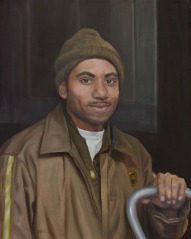
UPS Delivers at Night, Oil on Canvas, 20×16
I continued work on a series of 16×20″ portraits of people at work in my community. One of these, UPS Delivers at Night was the runner-up in best Portrait of the Year on Making a Mark. It is being purchased by the “model” and UPS corporate wants to do a story about it.
Last year I said I wanted to learn to relish and appreciate imperfection and that has helped me to begin to learn to stop before a painting has been perfected (otherwise known as overworked).
I’ve made it a priority in 2013 year to find that magical point of balance between painting, blogging, and everything else like healthy eating, exercise and sleep. I’m already making progress.
Feeling more confident with my oil painting technique, I’m often able to paint with conscious competence now (see this post for explanation of the 4 steps from unconscious incompetence to unconscious competence) which is way better than the conscious incompetence I was coming from.
Last year I decided to do watercolor sketching instead of oil painting at plein air paint-outs. This year I will start oil painting plein air again to see if what I’ve learned in the studio with oils in 2012 will allow me to enjoy and succeed at taking them outdoors.
I experimented with Stillman & Birn Sketchbooks but found I prefer the paper of Moleskine Watercolor Notebooks to S&B when I’m not binding my own.
I began using a limited palette in oils, working with just 4 to 6 colors. It’s a great way to learn more about color and helps create harmonious paintings. In watercolor it seems more difficult since I usually want to control not just color but transparency/opacity /sedimentary and other characteristics of watercolor paint.
I fell in love with oil painting on oil-primed linen panels for smaller sized work (I use regular stretched canvas for anything bigger than 11″x14″). I’ve been using relatively inexpensive Centurion panels and they’re wonderful!
STUDY/WORKSHOPS/TEACHING
I took a week-long Alla Prima Portraiture class with Rose Frantzen at Scottsdale Artists School in February 2012. It was intense. She takes her teaching very seriously and we worked hard from 9 to 5. After class hours she entertained us with wonderful stories from her life and the art world. I learned a lot but would have benefited more if I’d come to the class more skilled at portrait drawing and alla prima painting. I spent too much time just trying to get my darn drawing (with paint) right.
I did a lot of work and study to improve my drawing skills in 2012 and it will continue to be a major focus in 2013.
Although I expected to start up my watercolor classes again in 2012 I didn’t. I plan to start teaching again in the spring, once I’ve completed my last day job assignments.
Continued to sketch every Tuesday night with my Urban Sketchers group as well as on our “field trips” and independently. Our group is having a show this month and has started hosting a monthly sketching event for the public the first Tuesday evening of each month.
Stopped bookbinding to make more time for studio painting but will return to it again in 2013.
ART BUSINESS/SALES and LICENSING
Last year I decided to concentrate on painting and wait until I left my day job to put effort into art biz/marketing. Despite that plan I did sell a number of paintings, sketches, prints and commissioned works including a large watercolor of a corporate building commissioned as a gift to a retiring CEO, as well as portraits of people, cats and dogs, and landscape paintings.
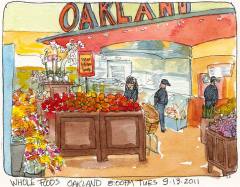
Whole Foods Oakland bought my sketch (below) to use in their employee lunchroom.
Whole Foods Oakland, ink & watercolor, 5×7″
Licensed work, in addition to those listed under Publications above, included a sketch of carrots for Canadian Carrot Community Arts Coffeehouse’s Facebook and a police car sketch used by Fayette County, Georgia’s Public Safety Department for a brochure. It’s amazing the way the web gets our work seen by people in such diverse places such as….
The French advertising agency for Hermes (yes that Hermes!) contacted me to do a series of illustrations for them for a new website
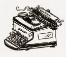
1950 Royal Typewriter
campaign. They wanted the drawings to be in the funky brush-pen style I used for some antique industrial equipment sketches like this old typewriter. They sent me story and concept sketches my drawings were to follow, which they were going to animate. In the end I turned it down for a variety of reasons but it was an amazing opportunity.
A local gallery invited me to have a show in 2013 of my still life paintings. I am honored by the invitation but not sure I want to spend the money on framing everything. Am I being silly? It seems easier to sell online but I know it’s important to “get the work out there” locally too.
BLOGGING & WEB
WordPress sends its members an annual blog report. Mine began: “About 55,000 tourists visit Liechtenstein every year. This blog was viewed about 220,000 times in 2012. If it were Liechtenstein it would take about 4 years for that many people to see it. Your blog had more visits than a small country in Europe.” Cute.
I celebrated my six-year blogging anniversary in 2012 with 220,309 views from 188 countries. I wrote 102 new posts (total 1,118) and uploaded 430 pictures in 2012. My highest views on a day in 2012 was 1,763 on October 29, 2012 and total views on my blog from inception May 2006 through 2012 is 1,213,061.
Posted regularly and administered the Urban Sketchers S.F. Bay Area blog as well as starting a Facebook and Flickr page for Urban Sketchers. Some of our group below.
I neglected my Flickr and my Daily Paintworks site in 2012 as well as posting less often on my blog than in previous years. My intention for 2013 is to revamp and re-energize my website and Flickr pages and post more regularly on my blog. But painting must always come first.
Stillman & Birn sketchbooks are highly rated by other sketchers so I wanted to try one but couldn’t figure out which paper to choose. I emailed the company and they sent me a packet of paper samples. On a sunny afternoon I tested them using potted strawberries and flowers on the deck for my subjects. (Then I ate the strawberry. Yum!)
The two most likely options were the Multi-Media Surface papers: either the Delta 180 pound ivory (at top) or the Beta 180 pound white paper (above). I liked the way the ink went on smoothly. The watercolor worked well if applied directly in one layer without much water. Otherwise it backwashed like crazy (see splotches above).
I liked the Epsilon paper (above) but worried that the 100 pound weight wasn’t going to be thick enough. The very smooth finish was nice for both ink and watercolor, similar to hot-pressed watercolor paper.
The 100 pound Gamma (above) and Alpha (below) vellum surface paper was probably my least favorite, although I ended up judging my impressions by how well I liked the way the sketch turned out instead of technical reasons since they all took ink and watercolor somewhat similarly.
I chose the ivory Delta paper (at top of the post) in an 8×6″ wire-bound journal because I liked that paper the best, even though it only comes wirebound. I’ve used that journal for the past month. It works well if I draw in ink and then apply a stroke of paint and leave it alone. I’ve been less successful if I add another layer of paint or try to get a smooth wash over a larger area. The paper pills, previous layers of paint lift off, or it backwashes.
I also keep getting nasty, dirty, thumbprints on the previously painted page when painting on the next page (which has ruined a couple nice sketches). But maybe that’s just me being clumsy. Or maybe I should only paint on one side of the paper even though it’s thick enough to paint on both.
I’m halfway through the journal and have found workarounds to my problems. It’s been good practice for me to be more direct and get it right on the first stroke or else. But I’d still like the option to add more washes when I need to. It’s a beautifully made journal but I don’t think I’ll buy another. I’m going back to binding my own with the watercolor paper I prefer.
If you’ve used a Stillman & Birn journal, which version did you use and why do you love it (or not)?
San Miguel de Allende, Mexico, 9″x12, oil on panel
I just sold the painting above and wanted to varnish it with a protective layer before shipping. I’ve been afraid to try traditional damar-based varnish which is prone to drips, bubbles and yellowing. I knew that somehow at least one cat hair would embed itself. So in the past I used a spray-on varnish (which has its own disadvantagse) or just shipped sold paintings without varnishing.
The ORIGINAL 2-part Gamvar
I’d read that Gamblin’s Gamvar synthetic varnish was easier to use and very archival, developed based on research at the National Gallery of Art. But it came as a two-part kit that you have to gently mix, every hour over eight hours. For me, that is a recipe for failure. I knew I’d get distracted and miss an hour just like when I make a cup of tea, forget about it, and hours later have to throw it out and start over.
New Gamvar Pre-Mixed Picture Varnish
Now it comes Pre-Mixed!Gamblin just released a pre-mixed version of Gamvar in a 2 oz. bottle containing enough varnish to cover 40 square feet. I called Gamblin with some questions that I didn’t see answered on their website. Their technical support people were on other calls so the operator connected me to their president who cheerfully answered my questions. You can’t beat that for customer service!
Stuff on the table by my recliner in the living room
I had my iPad on the table next to me while I was watching TV, too tired to go in the studio. So I doodled these sketches while relaxing in my black leather recliner, my favorite chair for watching TV, napping or reading.
The Red Studio Basket, drawn on iPad
I love this red basket that I use to carry stuff between the studio and house. Today I spilled a cup of tea in it but it seems to have survived OK. It lives on a little table in my living room by the front door.
There’s something about the limited color choices and simplicity of the iPad app Paper by FiftyThree that makes everything you draw look nice. On screen the layout is designed to resemble a Moleskine notebook. Using a Bamboo Stylus is a lot easier than drawing with my finger but not as easy as drawing with a real pen.
My Glasses, drawn on iPad
Although I studied and practiced digital painting a couple years ago, and even sold a digital illustration to an airline magazine, I prefer painting by hand to making digital artwork. But every now and then I give it another go, just for fun.
Free Scissors
These scissors came packaged with something else I bought (but I forget what) a long time ago. I don’t know why they were sitting nearby, but scissors are always fun to draw.
Paper is a fun app, and while not nearly as powerful as other iPad drawing apps, it’s somehow easier to turn out enjoyable sketches with it.
Hi! Come on in and let me show you around my new studio. The concept for the studio began in 2000 when I bought my cottage, a 1940s duplex. I planned to use the front unit as my home and the rear unit as my studio while still working at my “day job.” When the time came that I could leave to paint full time, I planned to rent out the back apartment for extra income and convert the 400 square foot garage to my studio.
The rear unit studio was wonderful and I spent many happy hours painting and teaching there. But the new studio is even better! Even though it’s near my house, it’s completely separate so the distractions of laundry, dishes and computer; the nagging of cats for dinner; email and phone calls disappear and painting time flows uninterrupted.
Before the tour, here are “before” pictures of its former life as a grease-monkey garage where my son worked on cars.
The garage before it was transformed and the 1970 Firebird Cody was (still is) restoring
The bare garage walls had 40 years of grease and grime and Bondo dust and the concrete floor was badly stained and cracked. The only electricity came in from an extension cord.
Huge engine under constructionBackyard before door and deck
The only entrance was the heavy and awkward sliding barn doors on the driveway side of the garage. Now I’ve transformed the old garage from a place for pursuing a passion for pistons to a passion for paint.
Deck and door to studio
I added the doors and deck (though the contractor’s mistakes led to it not being a two-steps up raised deck as planned–but it islevel unlike how it seems in the photo). The high-maintenance funky grass is gone, replaced by gold fines which makes it feel like a beach. Now it’s a great place to set up a still life and paint outdoors and I love eating lunch and reading out here too.
Here is a 6 minute video tour, and below that, pictures with more detail.
In the video and photos below, you can see that I love good art tools. I have collected this studio equipment and supplies over many years of painting. Much of it I bought secondhand or long ago.


")


