Color Boot Camp SATURATION: Neutral Areas vs. Saturated Areas, 11×14″ oil study
In this last Saturation exercise in the New Masters Academy Color Boot Camp series, the Major Key is low with so much black background. The most contrast of saturation or Minor Key comes in her red dress. I was happy with the way my study proceeded, without too much struggle, and how it turned out. It was easier to paint because there was more contrast in the reference photo.
Below are the reference photo and Mr. Perkins’ 30 minute study.
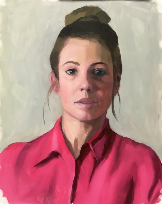
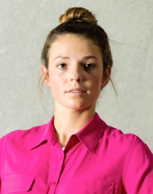
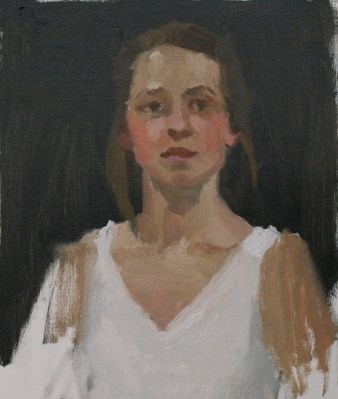
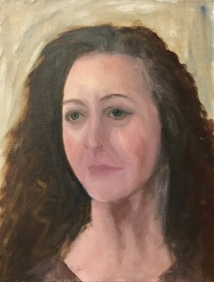
Color Boot Camp SATURATION: Neutral Areas vs. Saturated Areas, 11×14″ oil study
This Color Boot Camp, Saturation exercise, like the previous one, is about painting in a high major and minor key. The High Major Key means that overall the greater proportion of the image (the background) is very saturated. The Minor Key, or range of contrast of saturation, is also high because if the contrast between the highly saturated background and her shirt and her skin tones are moderately saturated.
The underlying drawing and so the painting itself is rather awkward and not a great likeness but I was going for value and saturation. The reference photos with flat lighting and without strong shadows are the hardest to draw and paint since there is no contrast showing the bone structure or planes that give a three-dimensional look to a painting.
Below are the reference photo and Mr. Perkins’ 30 minute study. Again I love the way he simplifies and makes a “painting” without worrying about making a “portrait” on an exact person.
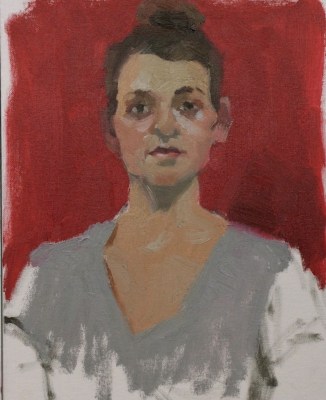
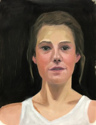
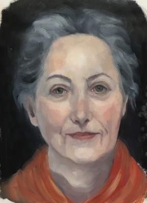
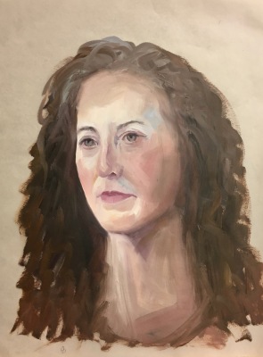
Color Boot Camp SATURATION: Neutral Areas vs. Saturated Areas, 11×14″ oil study
Continuing in the New Masters Academy Color Boot Camp series, this second Saturation exercise is about painting in a high major and minor key. The High Major Key means that overall the greater proportion of the image is very saturated. The Minor Key, or range of contrast of saturation, is also high. As you can see, the background is very neutral relative to her blouse and skin tones.
I was very happy with the way my study turned out. I spent closer to 3 hours than 30 minutes but the session went very well without much struggle.
Below are the reference photo and Mr. Perkins’ 30 minute study. I love the way he simplifies and makes a painting without worrying about painting this exact person.
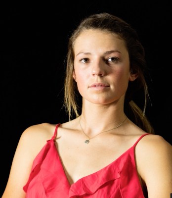
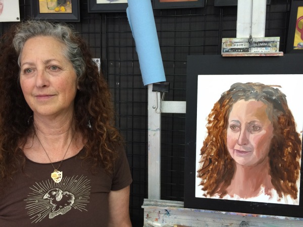
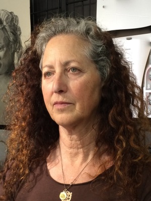
Color Boot Camp SATURATION: Neutral Areas vs. Saturated Areas, Photo Reference
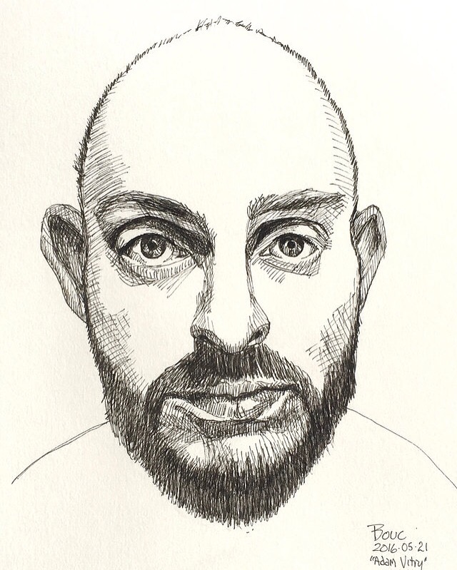
Instead of my usual lengthy posts I thought I’d experiment with the occasional quickie drafted on my phone. A picture, a few words, and done.
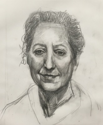
I have several long posts in progress but can’t tear myself away from painting to complete them. So to give me a little more time…here’s my contribution to the SktchyApp weekend challenge to draw using cross-hatching. Done and done!
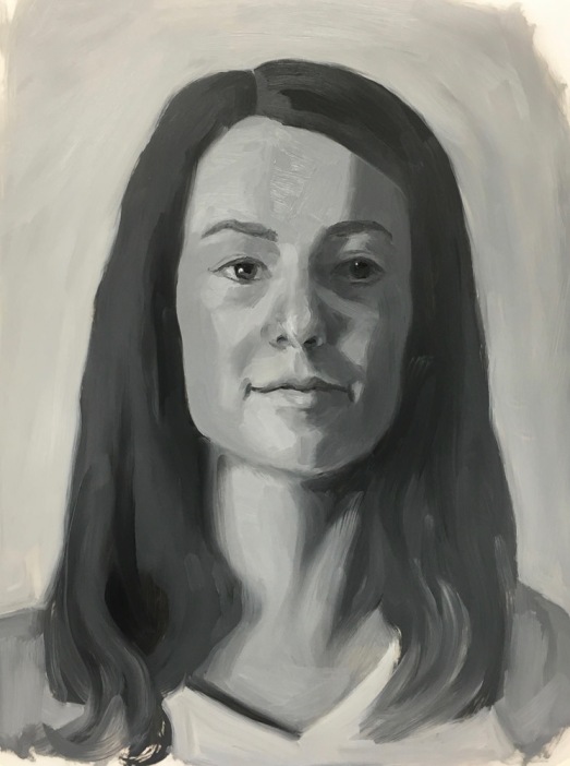
Color Boot Camp: Saturation. Overall LOW Saturation, Study 1 v.2, 11×14″ oil on Dura-Lar
In each of Bill Perkins’ New Masters Academy Color Boot Camp courses, he introduces one aspect of color (e.g. Value, Saturation, Complements, Temperature), demonstrates and explains further with a quick oil study of the same model in different color/lighting situations. I tried this one twice (second version above, first below) because even though he emphasizes these assignments are NOT meant to be portraits, I’m as interested in learning to capture a likeness as I am color. I did a better job on the positioning of her head and getting a likeness in the second one, above. (See bottom of post for reference photo and teacher’s rendition.)
Color Boot Camp: SATURATION. Overall Low Saturation, Study 1 v1
Mr. Perkins uses the concepts of Major Key and Minor Key for each color topic. In Saturation, the Major Key describes the Level of saturation—how intensely saturated the colors are in the greater proportion of the image. The Minor Key represents the Range of contrast between neutral gray and the most saturated color in the image. This first study in saturation is supposed to represent a Low Major and Minor Key.
I was confused at first by how highly saturated the model’s face seemed to be with her very rosy cheeks and golden skin. But after getting some valuable feedback from the teacher, I now understand that the Major Key is Low because the proportion of saturated color (her cheeks) to neutral areas (the rest of the painting) is small; and the Minor Key is Low because the range of saturation from neutral to the moderately-saturated pink in her cheeks is also fairly low.
Below are the photo reference, my paintings, and the teacher’s study. He painted her skin tones much darker than I did. Maybe I need more study with value? I can see how I could have gone a little darker but not as dark as he did. Coming up next, Study 2 with very saturated High Major and Minor Keys; just the opposite of this one.
Color Boot Camp Part I Monochrome. Left to right: Color reference photos, B&W converted ref photo, my two studies
When my art friend Chris Beaven commented on the previous version of this post that it would be interesting to see my studies compared to the black and white versions of the photo references, I did a virtual dope slap (Of course! What a perfect way to see if I got the values right!) and then decided to redo this blog post to show that comparison (above).
While I often convert color photos to black and white to see the values, when I did these studies from Bill Perkins’ Color Boot Camp on New Masters Academy I wanted to try to do the conversion in my artist brain instead of using technology. But putting my studies next to the converted photos gives me just the reality check I needed. I can see that I did pretty well in painting the values from the color photos.
In the lesson he set up one model in four different lighting situations and then demonstrated doing a 30-minute painting of each in black and white. He recommends doing the studies in no more than 30 minutes, emphasizing that it’s more important to do many starts, without worrying about getting a likeness or making finished paintings. I have to admit spending longer than 30 minutes, probably up to 3 hours on some, and in retrospect, the longer I worked the less effective the study was.
If you want to see Bill Perkin’s studies and mine in greater detail, click the “read more” link below.
CBC Part 1-3, Janas #1 High Key, High Contrast Study (My favorite of 8 below)
Being a member of the New Masters Academy is like having a treasure chest of jewels to explore, with new art classes added all the time. The only downside is that I have to assess my own work and be my own teacher since NMA doesn’t offer feedback to the video lessons’ assignments.
I revised this post by publishing a new version of it so I’ve deleted the content here. Please see the next post for the rest of the content from this post.
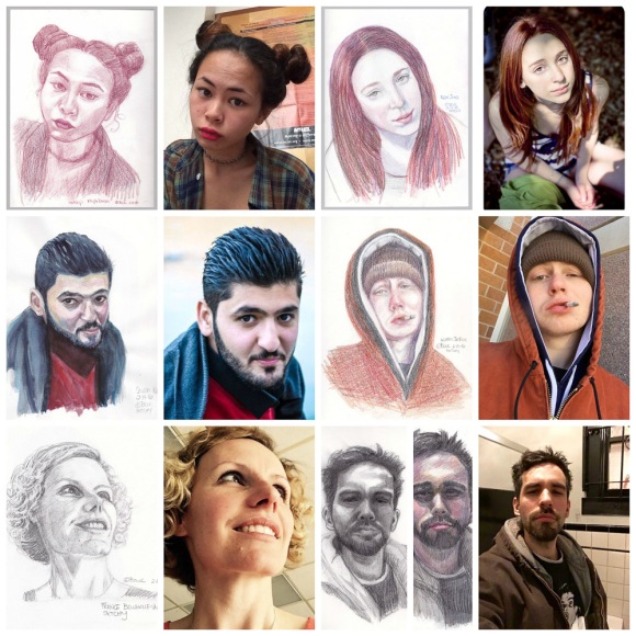
I’ve had so much fun since I discovered the SKTCHY app. It’s so simple: people upload photos and artists use them as inspiration to draw from and then upload snapshots of their artwork. (click on collection below twice to enlarge.)
Collage of recent sketches and their Sktchy.com inspiration photos
Above are my sketches and their Sktchy reference photos from the past week in a collage (made using free PicMonkey online). The Sktchy app is super easy to use, with an incredibly wide variety of people to draw and really interesting artists’ work to be inspired by. Join me there! It’s big fun!!! (FYI, it’s currently only available for iPhone/iPad; Android version is in the works).
Click on any of my sketches below to see larger or in a slide show. They are all in a 12×9″ sketchbook.
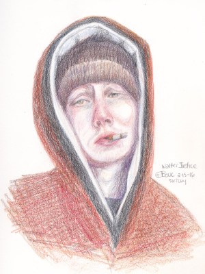
Walter Justice, colored pencil
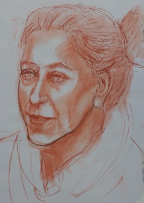
France Belville Van-Stone, graphite
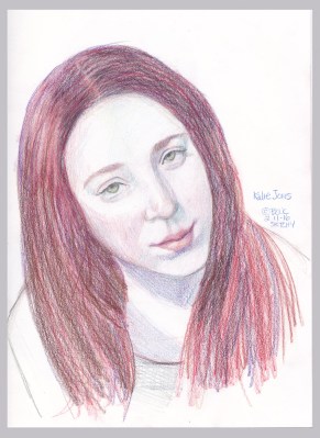
Kalie Jones, colored pencil
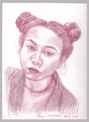
Khyla Duran, colored pencil
Shwan Kamal, photo ref, watercolor
Fernando Quijano, Jr. Graphite, attempt #2
Fernando Quijano, Jr., Colored pencil & Graphite, attempt #1
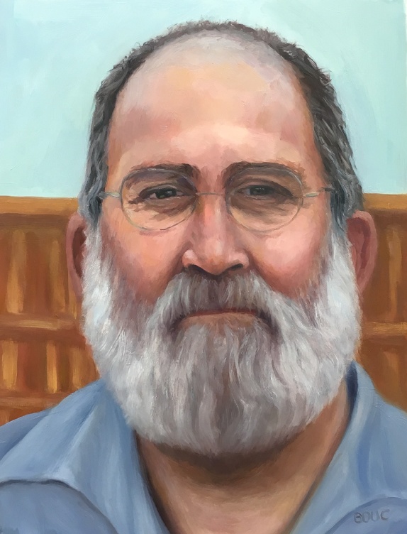
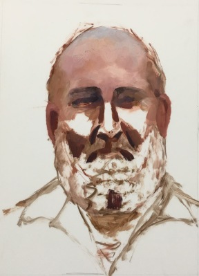
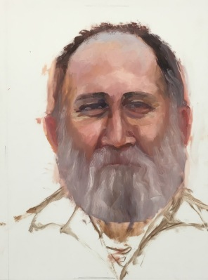
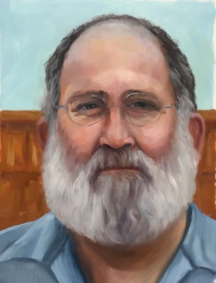
JR Handyman #3 Final, oil on DuraLar, 12×9 inches, 2016
When Jeff the Handyman (who does excellent carpentry and electrical work) came over to look at a job, he was kind enough to let me take his photo for the series I’m painting of people at work in my neighborhood. I tried three times, before and after I started studying head structure and anatomy. With the third study (above) I felt like I’d said what I had to say, with the skills I have at this point, and was ready to move on.
Above is the final study and immediately below are all three attempts in chronological order.
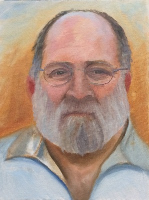
JR #1 Final, oil on panel, 12×9 inches, 2015
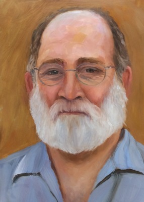
JR #2 Final, Oil on DuraLar, 12×9 inches, 2015
JR Handyman #3 Final, oil on DuraLar, 12×9 inches, 2016
My favorite part of all three above is the sky reflecting on the top of his head. With each attempt my drawing improved a bit. The more I learn, the more I see, and the more I see, the more I know I need to learn!!!. Below are all three studies with work in progress (WIP) steps. I’m not offering the WIP to show how it “should” be done; just the approach I was experimenting with. I am always trying on techniques of other artists I admire but haven’t yet found the approach that “just works” for me.
JR #1-C, oil on panel, 12×9 inches
JR #1-B, oil on panel, 12×9 inches
JR #1 Final, oil on panel, 12×9 inches, 2015
JR #2-A, Oil on DuraLar, 12×9 inches. I always like this sketchy stage the best.
JR #2-B, Reference photo and painting start
JR #2 Final, Oil on DuraLar, 12×9 inches, 2015
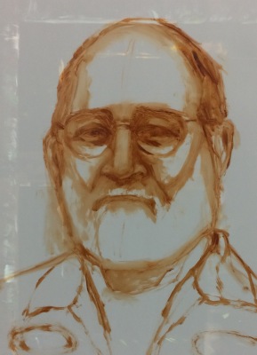
JR #3-A, Portrait start with reference photo
JR #3-A Portrait Start, Oil on DuraLar, 12×9 inches
JR #3-B WIP, Oil on DuraLar, 12×9 inches
JR #4-C WIP. Realized nose was too long.
JR #3-D WIP, Shortened nose, started glasses
JR #3-E WIP. Beard got too wide.
JR #3-F WIP. Narrowed beard & hair, redid shirt
JR #3-F WIP with my Parallel Palette, which I like a lot.
JR Handyman #3 Final, oil on DuraLar, 12×9 inches, 2016
Marcy #24 “Sleepy Sister” Oil on DuraLar, 9×12 inches
When my sister Marcy offered to pose for me for my birthday, I had no idea it would take me 6 months, more than 2 dozen mostly awful drawings and painting attempts (pictures at bottom of post), and lots of study before I could produce a portrait that actually: a) looks human and b) resembles my sister (as I see her).
Although I have a long way to go before I feel competent at this, I am choosing to pause here briefly to honor and share my progress before I raise the bar again on my study of portraiture.
Attempt #1: Painted live in about 2.5 hours. I learned how much I didn’t know about painting portraits
After my first try (above) and many more failed attempts (displayed at bottom of post) I realized I needed a better understanding of head anatomy. I accepted that I can’t fix a bad drawing with pretty paint. I studied my books and videos, tried to memorize proportions and divisions of the head (e.g. eyes are halfway between top of head and chin) and did some head drawing exercises (again…) that I still didn’t quite understand. And I continued failing at drawing and painting Marcy from the photo I took when she sat for me the first time, again from life on another visit and then from other photos.
I’ve done portraits I liked in the past, either by drawing freehand and then correcting again and again, or by enlarging a photo and tracing it onto canvas or paper. But I just couldn’t reliably draw one from life. So I read more books, watched online videos and investigated in-person and online classes. I found a comprehensive online academy last month that is giving me just what I wanted to learn. I think you can see how it is making a difference, starting with #18 below, drawn from life when Marcy posed for me again. In my next post I will review and share links to the learning resources I found.
You can see the progression, from the hilarious to the hideous to the almost-but-no, sorted with most recent first. Some are just bare starts; as soon as I could tell it was unsalvageable, I added the piece to the pile of fails and started over. The paintings are all oil, 12×9″ on Matte Dura-Lar except for the earliest ones on panels. The drawings are mostly on Vidalon Vellum except for the first few 14×11″ on paper.
Marcy #24, oil on Duralar
#23, Drawing for #24, graphite and conte
Photo for #23-#24
#22, “Almost” – completed.
#22, “Almost,” start. I like this earlier stage better than the finished version.
#21, start, discarded (see #20 visible beneath Duralar).
#20, drawing for #21 and #22. I LIKE IT! Conte on Vidalon.
Photo for #21 and #22
#19, drawn from life, completed.
#18, drawn from life, start, conte on Vidalon
*AFTER THIS I STARTED STUDYING HEAD ANATOMY. #17 Oilon Duralar