Categories
Ink and watercolor wash Outdoors/Landscape Painting Sketchbook Pages

Lively Day Sketching at the Cemetery

Mountain View Cemetery, ink & watercolor
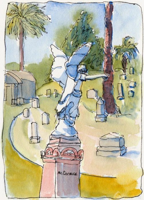
Pointing the Way To...? Mountain View Cemetery, ink & watercolor

I had planned to oil paint with my plein air group at Mountain View Cemetery but there were just too many interesting sights to explore to plant myself in one spot with an easel. I switched to ink and watercolor which is so much more portable.  I wonder what the statue above is supposed to be pointing towards?
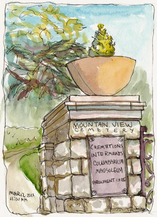
Mountain View Cemetery Entrance, ink & watercolor

The entrance and central plaza is planted with thousands (?) of tulips. I hoped they would be in bloom but I only spotted one early bird. This cemetery is such a beautiful and historic place (as you can see in this photo slide show).
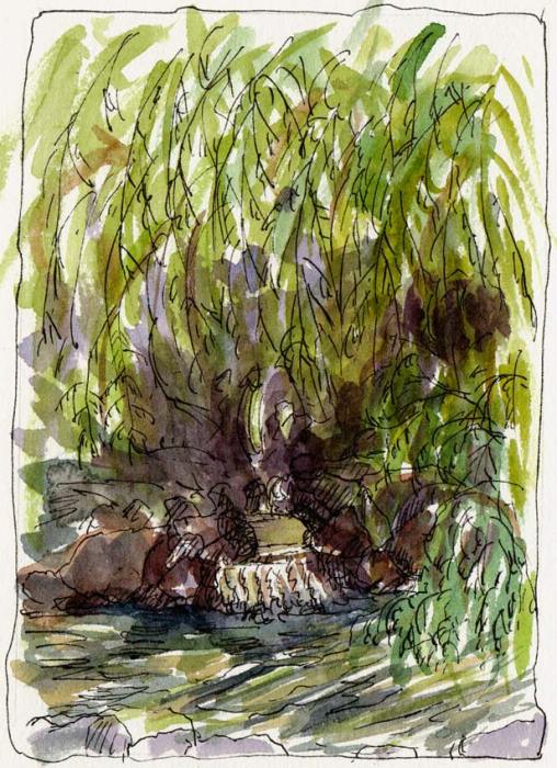
Weeping Willow and Pond, Ink & watercolor

This pond and little waterfall beneath a gigantic weeping willow tree (above) is one of my favorite spots in the cemetery, hidden just behind the entrance gate. I’ve tried to paint it before and have yet to get it right. Maybe next time.
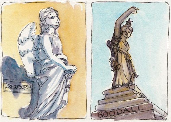
Mountain View Cemetery Statues, ink and watercolor

After the group left I stayed behind to draw a couple more of the statues. The life-sized angel on the left was bunching up her robes, looking off into the distance. The one on the right is yet another female statue pointing at something in the distance.

I’m curious about how people chose or designed their statues in the 1800s. Were they built to order or were there standard designs they could buy? Why are they almost all women? I suppose in death, like birth, a mother watching over us is comforting, even if she’s looking or pointing at something else.

Categories
Drawing Ink and watercolor wash Landscape Outdoors/Landscape Painting Places Sketchbook Pages Urban Sketchers

Roof Garden Lunch at the Cathedral, Oakland


Lunch in the Cathedral Garden, ink & watercolor


Every now and then I manage to get out of the office at lunch time long enough to eat and even sketch for a few minutes. Across the street from our office building is a huge modern cathedral that looks more like a concrete prison with an upside down glass ship on the roof.

Their roof garden follows the concrete theme, with a sort of maze of square concrete planters with benches that force you to sit straight upright on them. But there are trees, shrubbery, and perfectly maintained grass (a delightful treat to pull off sandals and enjoy on bare feet).

I keep wondering why I never see any birds in the roof garden even though it is across the street from Lake Merritt which is a bird refuge, full of pigeons, waterfowl, pelicans, egrets and more. And it is kitty-corner from Snow Park favored by huge flocks of Canadian geese and pigeons (and always covered in big slimy goose turds). Do the guards chase the birds away? Are pigeons Catholic?

Update: I wrote to the Cathedral’s contact person and she explained why there are no birds: “With regard to the birds, I think the main reason for the lack thereof is the cleanliness of the facility. Birds will congregate wherever there is food. Our janitorial staff is always sweeping and keeping the grounds neat and clean.” It’s true, the place is very clean.

Categories
Drawing Ink and watercolor wash Life in general Painting People Places Urban Sketchers

Popcycle SF – Treats on a Traveling Tricycle

Popcycle SF in Downtown Oakland, ink & watercolor

I almost passed up this sketching opportunity as I hurried home from work but realized it was worth postponing dinner for and walked back. Here was this cute guy selling gourmet popsicles out of a pretend ice-cream truck that is really just a large tricyle inside a cloth-covered frame, playing rinky-tinky ice cream truck music.

I asked the proprietor, David Meisenholder, if he would be there for a while so I could sketch him. He’d been about to leave but was nice enough to wait while I sketched him (and he even made a few more sales).

The pretend, miniature “truck” is a brilliantly creative work of art, the kind of thing that makes your mind sort of expand and contract all at once, and is perfectly executed down to the little pretend headlights and grill on the front.

This is a new venture for David and his partner; you can see photos of the Popcycle’s “Maiden Voyage” here and you can find his locations via Twitter.

Categories
Drawing Ink and watercolor wash Landscape Life in general Outdoors/Landscape Painting Places Plein Air Sketchbook Pages Urban Sketchers

Pumping Something in Snow Park, Oakland

Pumping Something in Snow Park, ink & watercolor

I don’t know what they were pumping out of the ground but the name on the truck—”Environliners”—made me think I probably wouldn’t want to know. It was a gorgeous summer day and I was determined to get outside for a few minutes at lunchtime. I spent it eating a take-out salad and sketching in Snow Park across the street from our building in Oakland.

Our office culture is to eat with co-workers in the office kitchen and get right back to work since there’s always more to do than hours in the day. We’ve even been trying to figure out how to add a new month to the calendar to fit it all in.  But some days you have to forget about all that and just enjoy the moment and the all-too-rare sunshine in the Bay Area this summer.

Categories
Art supplies Landscape Oil Painting Outdoors/Landscape Painting Places

Early Morning at Kaiser Garden, Oil Painting

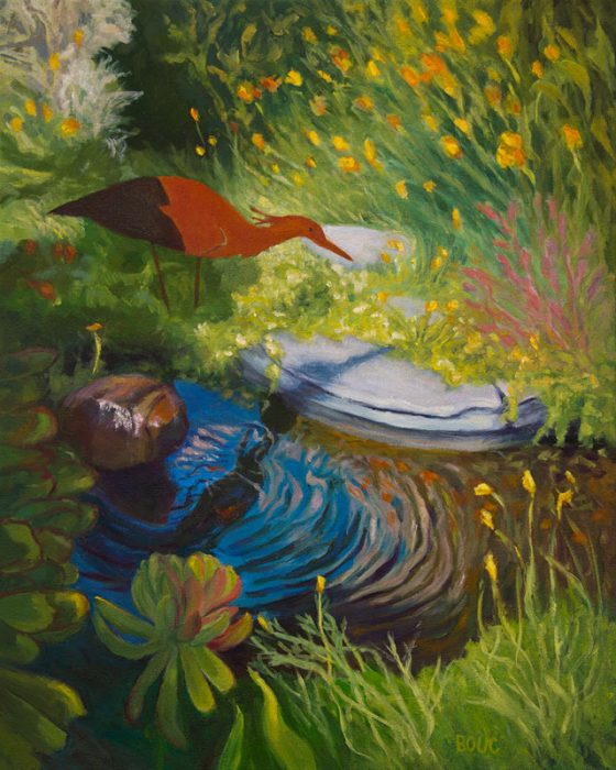
Early Morning Garden, oil on canvas, 20x16"
Early Morning at Kaiser Garden, oil on canvas, 20x16"

I think I’ve finished this painting (but then I thought that several times before). The last time I thought I was finished, I looked back at the notes I’d written opposite my journal sketch about what interested me in the scene and my goals for the painting. I saw I’d missed a point or two and worked on it some more.

Now I’d really appreciate some honest feedback:

Do you think it’s finished or does it still need something, and if so, what do you suggest to improve it?

This was painted with Holbein Aqua Duo water-soluble oil paints. It’s such a joy to oil paint without odor, to thin paint to a wash without solvents, and to mix water instead of turpentine with the Duo linseed oil to make painting medium. The pigment quality, drying time and consistency is identical to regular oils.

Categories
Building Drawing Ink and watercolor wash Landscape Painting Places

Tuesday Night Sketching at CHORI

CHIORI, sketchbook spread, Ink & watercolor

Micaela suggested the Children’s Hospital Oakland Research Institute (CHORI) building in North Oakland for our Tuesday night sketching and it was an interesting challenge. The 1923 building with 80,000 square feet of space was once a high school. Abandoned in the 1980s, it sat disintegrating for many years, with boarded up windows and peeling paint.

When Children’s Hospital took over the building they kept the original design and built within a high-tech facility for the study of biochemistry, hematology, molecular biology, genetics, and more. The laboratory is backed up by emergency power and critical systems such as freezers and incubators are monitored 24 hours a day.

We could hear the hum and buzz of those systems (along with the loud passing BART trains on the overhead rail across the street) while we sketched. It was so cold, foggy and drizzly damp that Sonia sat in her car to sketch and Micaela and I wore multiple layers of down and fleece. Will summer ever come to the Bay Area?

Categories
Drawing Ink and watercolor wash Places Sketchbook Pages

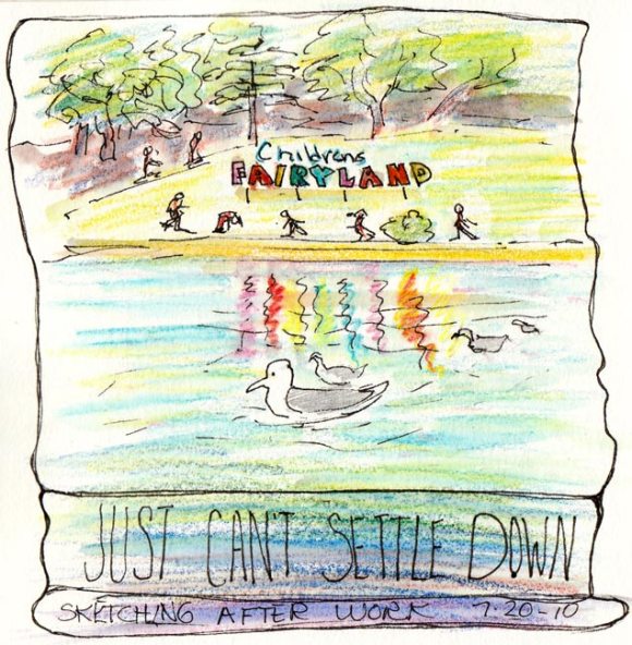
Just Can’t Settle Down: Lake Merritt Sketches

Lake Merritt, ink & watercolor pencil

After work Tuesday night we met to sketch at Lake Merritt which is across the street from my office. I guess I drank too much coffee that day because I couldn’t settle down and focus. There was a fascinating parade of people walking by, all talking to each other or on cellphones, leaving bits of conversation in their wake.

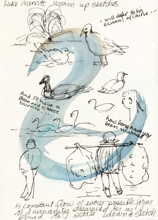
Warmup sketches
Warmup sketches

I warmed up with some sketches of the local seabirds and passing people, noting a few conversation snippets. That’s an old Chinese lady with a pole over her shoulders carrying huge garbage bags on either side that were bigger than she was. I assume she was gathering cans to recycle for a few dollars.

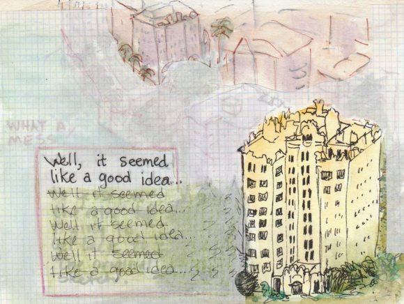
Lake Merritt apartments, mixed media

When it got cold and windy we headed up to my office on the 25th floor and drew the view out the window. I liked my sketch of the building and tall trees at the bottom of the page but instead of stopping there, I kept drawing until the page was full. I didn’t like that so tried various ways to hide the rest and finally pasted ruled tracing paper over it.

Categories
Animals Art theory Landscape Outdoors/Landscape Painting Photos Places Sketchbook Pages Watercolor

Watercolor Study & Watercolor Class Openings

Study for Kaiser Garden II, watercolor, 6.5" x 4.5"

There are still openings in my watercolor class starting Sunday, June 27; click here for all the information. Ok, business done, now on to the painting above, another study from photos I took at the Kaiser garden.

I learned the hard way to do a study first, after time and again putting hours, days or weeks into a painting that was doomed from the start.

No matter how skillful the painting technique is, if the composition is bad (the viewer’s eye goes to a bright corner and then right off the painting), or you’re trying to work from a photo that doesn’t have enough information, or your colors or values are uninteresting, the painting isn’t likely to succeed. Sketching exactly what you see is great fun, but sometimes nature requires editing to make it a painting.

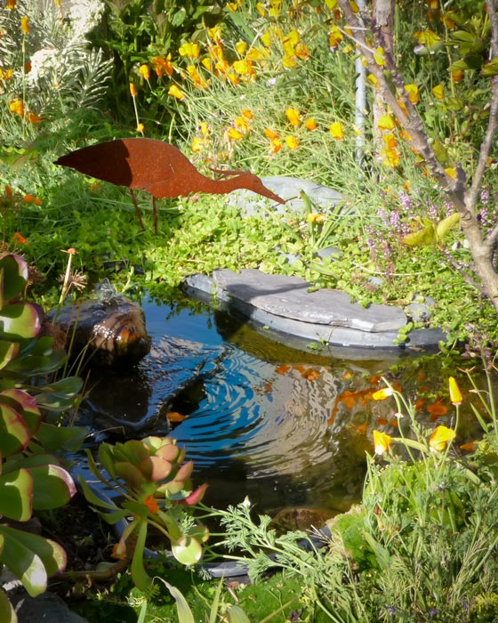
What made me want to paint this scene was the water feature and the bird sculpture but when I looked at my photo I saw big problems with the composition:

Original photo, Kaiser garden

There is way too much going on, the two big succulent plants on the bottom left dominate, a big stem above them leads the eye out of the frame, and the composition seems divided right down the middle, vertically. You barely notice the water.

So I spent some time in Photoshop cropping, rearranging and revising things:

Revised Photo Reference, Kaiser Garden II

Before cropping off the left side, I cut out the bird, moved it to the right, tilted it and gave it legs. Then I darkened the remaining succulents on the left and bottom to use them as a frame for the water feature instead of competing with it. When I started sketching the composition in my journal I decided to get rid of the messy tree branches poking in from the right too.

Although Photoshop is great for preparing a photo reference, so are the scissors, glue, sketches and notes that I used pre-Photoshop. Along with learning Photoshop, I’m also trying to become a better photographer and compose more carefully. I can do that with my digital SLR because it has a viewfinder but my carry-everywhere little Panasonic doesn’t. In the bright sun it was impossible to see anything on the LCD screen, so I guess I’m lucky that I got something I could work from at all.

My notes for the painting are in my journal opposite the study, with reminders about colors and things that worked (or didn’t). I’ve transferred the drawing to the canvas and it’s just waiting for its turn at the easel. I have a feeling it’s really meant to be a watercolor, not an acrylic painting, so may do it both ways.

Categories
Art theory Flower Art Landscape Painting Photos photoshop Places Sketchbook Pages Watercolor

Study for Tulip Painting in Watercolor

Kaiser Hospital Tulip painting study, watercolor, 4.5" x 6.5"

I accidentally arrived an hour early for a doctor’s appointment at one of Kaiser Oakland’s medical offices that has an amazing hidden garden. The building is an architectural treasure, built around a courtyard in 1912 by Julia Morgan as a hospital and home for unwed mothers (or so I’ve been told). Instead of reading old, germy magazines, I spent the hour in the courtyard sketching, wandering and taking photos.

After working out the composition and colors, I’ve got two paintings ready to start: a full-size watercolor sheet of the above image and a slightly smaller canvas of another garden scene.

Before starting a large painting I like to do a study first, getting to know the image more intimately, and experimenting with pigments and techniques so when I start the real painting I have a plan of action or at least a sense of direction.

Tulip study and notes for painting, journal spread

Since I only recently began experimenting with opaque watercolor pigments after years of using only transparents, I made some discoveries with this study and took notes as I worked. Here are a couple that might be of interest:

  • Opaque pigments (Cadmiums, Cerulean, Yellow Ochre) are great when putting down an area of strong color and leaving it (such as when painting in my journal). But they lift too easily when adding layers over them, and become thick and unattractive when trying to mix darks. As I learned in oil painting, darks/shadows are best when thin so they don’t draw attention to themselves with texture.  Seems to be the case in watercolor as well: better to use staining, transparent darks that won’t lift or get thick. For the dark green areas in the painting I’ll use Sap Green with Sepia and vary with a bit of Indigo, Winsor Violet and/or Alizarin.
  • The Legion/Utrecht 100% rag watercolor paper I’m using in my journal lifts incredibly easily. This is great when you actually want to lift paint but not so good when you just want to soften an edge and a bunch of paint lifts off instead!

Here are the original reference photo and the Photoshopped version. As you can see I got rid of some distractions and changed the proportions a bit.

Original reference photo of tulip in garden
Photoshopped tulip reference photo

Photoshop CS5 has some great new composition tools, such as “Content-Aware Fill” which I used to fill in the windows, white at top right corner and a tulip on the right margin. You just select and delete sections you want to replace and PS fills them with information from the surrounding area. I also narrowed the image to fit the proportions of the 22×30 watercolor paper using Content-Aware Scaling which preserves the proportions of the important stuff while squeezing in (or stretching) the other stuff.

Categories
Food sketch Gouache Ink and watercolor wash Painting Places Sketchbook Pages

Sketching at the Louise Stanley Journals Exhibit

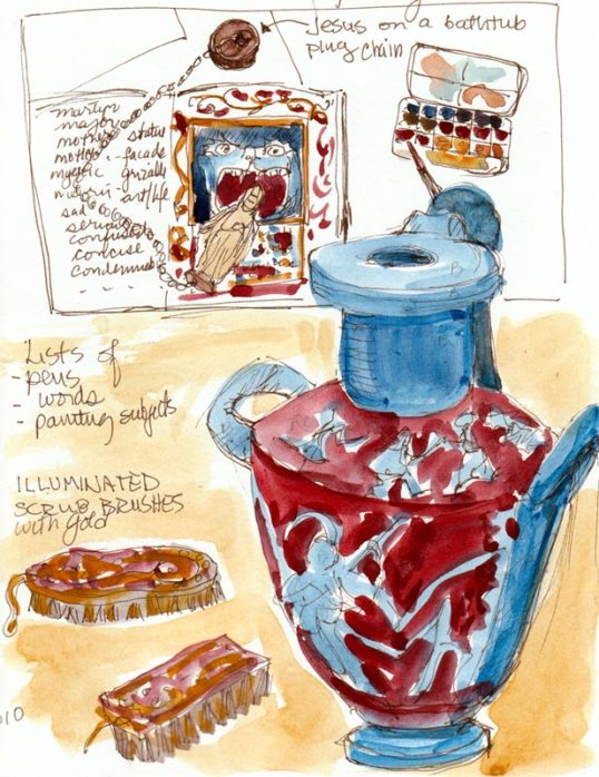
Sketching Lulu's Display, ink & gouache

We began last Tuesday night’s sketchcrawl at Louise Stanley‘s journal exhibit at the California College of Art in Oakland. Lulu’s paintings and sketches are amazing. She combines classical subjects and a great sense of humor with images of modern women on a grand scale in her paintings and in brilliant ink and goauche in her handbound journals. If nothing else, visit her website to read her bio for a peek into her studio and funny writing, and be sure to check out “Lulu’s Rules for Sketchbooks.”

Her journals are full of travel sketches, copies of  museum paintings, and lists of things like pen preference rankings, and titles for paintings. I loved the list “Paintings that Matter” that included titles like ‘When Hell Freezes Over,’ ‘Routine Inspection,’ ‘Unintended Consequences,’ ‘Road to Ruin’ and ‘Dressing the Turkey.” The show at CCA will be up through March 5 and on February. She will also give a talk at the Berkeley Art Center on Saturday, February 20, 2010 at 4:00 p.m.

Next we headed down College Avenue for more sketching.

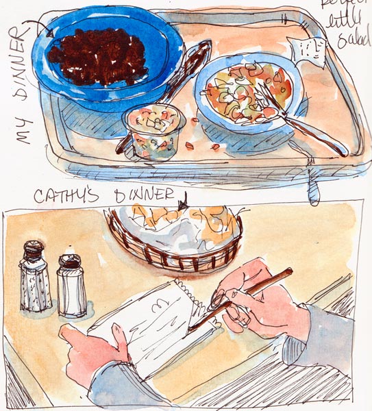
Dinner at Cactus Taqueria, ink & watercolor

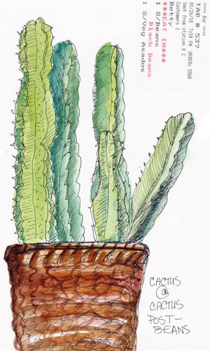
It was nearly 8:00 p.m. and I was hungry,  having skipped dinner, so I voted to sketch indoors at Cactus Taqueria. After eating (and sketching) some black beans, grilled veges and a tiny salad I made at the salsa bar from their coleslaw salsa (?!), I was ready to tackle the cactus (well, on paper anyway) that sat on a shelf above my table.

Cactus Basket, ink & watercolor

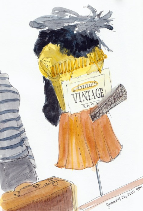
Then it was back out to College Avenue where we were both inspired by the display at Annie’s Vintage Rack.

Annie's Vintage, ink & watercolor

Cathy liked the old suitcases and I liked the old clothes. I probably should have skipped that unfortunately placed sign that seems to be projecting from the skirt. I think it was supposed to look like a megaphone and said “Back to School Sale” on it (though it was just as nearly unreadable as in the sketch).