Brazilian Room, Tilden Park, Watercolor, 22 x 30 in
When I received an email from a woman in Switzerland, asking if I’d be interested in a commission to paint the site of her wedding (the Brazilian Room in Tilden Park) as a 10-year anniversary gift for her husband I said an enthusiastic, “Yes!” We agreed I would have the painting completed when she visited the Bay Area a couple of months later so that she could hand carry it back to Switzerland.
Brazilian Room, Tilden Park, Original Photo Reference
I visited the site, took photos and we agreed I would use the one above as reference for the painting. Since I shot the photo in late spring it wouldn’t really match the colors and light of her August wedding so I also used my imagination and memory of the park in summer to capture the warmth and strong light of August in the Bay Area. Below are some of the steps in the painting process.
My hydrangea bush is doing great this year, probably because it’s on the side of the house that is now a dog run and every day I empty the dog’s water bowl on the bush. Also it’s no longer competing with its two siblings that I removed because one never blossomed and the other had annoying teensy flowers that shed all over the table.
EDiM 22 Remote Control, ink and watercolor, 5×7 in
These remotes live in the studio and operate a little combo TV/VCR, a DVD player and the stereo. There are another half-dozen that live in the house. I’m glad remotes were invented but they are ugly and annoying. I so wish I had this remote (a brilliant sketch and concept!)
EDiM 23 Fan, ink and watercolor, 5×7 in
As I noted in my journal above, drawing a fan seemed like it would be even more boring than drawing the remotes but in fact it was really fun. I was really surprised as I sketch to discover all kinds of interesting design features I’d never noticed before when just turning it on or off (without the using the remote that came with it, which I’ve lost).
So I didn’t make it to every day in May, just 75% of them. I went away for a 3 day retreat and when I came back had lost the momentum. Oh well.
Valentine Carnation, ink and watercolor, 7.5 x 5.5 in
Do you think people born around holidays grow up to reflect the qualities of that holiday? My friend Judith was born the day before Valentine’s Day and she’s extra sweet. I took her out for a birthday breakfast this morning.
Our waitress must have had a bad day (trying to be generous here). The other waitresses all gave long stem red carnations to their customers. We had to beg for a coffee refill and she didn’t give us flowers.
I started to drive away after we’d said goodbye but felt sad not to have a flower to take home and draw. So I parked again, went back into the restaurant and asked for a flower. And here it is.
Valentine Carnation and BuzzBallz, ink and watercolor 7.5 by 11 in spread in sketchbook
The other thing on this page is a round plastic “bottle” with pop-top that I found in the street. The product name and contents are equally disgusting: a cocktail of vodka, apple liquor and apple juice called Buzz Ballz. Really? Who is this being marketed to? (And yes, I washed my hands and the container before painting it.)
It seems like I’ve been struggling with painting sunflowers forever but with each attempt I understand them a little better. I’m very stubborn and will continue trying until the sunflowers and I are really good friends.
I lit the flowers above with very warm light which made the olive-green backdrop cloth look gold and kind of bleached out the color of the flowers. The pictures in this post are in the reverse order I made them, with the last first.
Sunflower #3, ink & watercolor, 5×8″
I did the sketch above after having such difficulty with the two below, trying to better understand the shapes of the flowers and their structure.
Sunflowers in Vase (#2), Oil painting on canvas, 16×12″
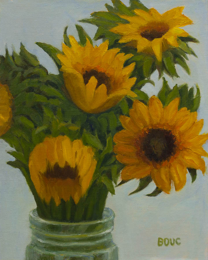
After working for hours on the vase in the painting above I looked at it in the mirror to check the symmetry and couldn’t stop laughing. It was completely off kilter, slanted to one side as if it had melted. It’s just amazing how our eyes and brain work together to correct things and fool us. I had to completely start the vase over to get it close to right. I experimented with using a dark background and tried to paint duller, darker colors for flowers not in the light but vibrant color kept sneaking back in. After days of repainting I called it done so I could move on.
Sunflower #1, Oil painting on panel, 10×8″
The first problem with the one above was my drawing. Instead of taking the time to carefully draw these sunflowers I jumped into painting, combining a few specifics with some generic version of flowers. All the pointy, sharp shapes and droopy flowers are a good visual representation of my struggle, frustration, and ultimately, disappointment with this painting.
I completed these pieces at the end of last year and had to give up when I couldn’t find any more sunflowers. Soon sunflowers will be available and I can start painting them again.
I have a feeling it’s going to go better this time around. I am studying nature drawing with John Muir Laws at his Bay Area Nature Journal Club. This month’s session was all about drawing flowers and I learned all sorts of cool stuff. More about that another time.
Stillman & Birn sketchbooks are highly rated by other sketchers so I wanted to try one but couldn’t figure out which paper to choose. I emailed the company and they sent me a packet of paper samples. On a sunny afternoon I tested them using potted strawberries and flowers on the deck for my subjects. (Then I ate the strawberry. Yum!)
The two most likely options were the Multi-Media Surface papers: either the Delta 180 pound ivory (at top) or the Beta 180 pound white paper (above). I liked the way the ink went on smoothly. The watercolor worked well if applied directly in one layer without much water. Otherwise it backwashed like crazy (see splotches above).
I liked the Epsilon paper (above) but worried that the 100 pound weight wasn’t going to be thick enough. The very smooth finish was nice for both ink and watercolor, similar to hot-pressed watercolor paper.
The 100 pound Gamma (above) and Alpha (below) vellum surface paper was probably my least favorite, although I ended up judging my impressions by how well I liked the way the sketch turned out instead of technical reasons since they all took ink and watercolor somewhat similarly.
I chose the ivory Delta paper (at top of the post) in an 8×6″ wire-bound journal because I liked that paper the best, even though it only comes wirebound. I’ve used that journal for the past month. It works well if I draw in ink and then apply a stroke of paint and leave it alone. I’ve been less successful if I add another layer of paint or try to get a smooth wash over a larger area. The paper pills, previous layers of paint lift off, or it backwashes.
I also keep getting nasty, dirty, thumbprints on the previously painted page when painting on the next page (which has ruined a couple nice sketches). But maybe that’s just me being clumsy. Or maybe I should only paint on one side of the paper even though it’s thick enough to paint on both.
I’m halfway through the journal and have found workarounds to my problems. It’s been good practice for me to be more direct and get it right on the first stroke or else. But I’d still like the option to add more washes when I need to. It’s a beautifully made journal but I don’t think I’ll buy another. I’m going back to binding my own with the watercolor paper I prefer.
If you’ve used a Stillman & Birn journal, which version did you use and why do you love it (or not)?
Bachelors Buttons (I think), ink & watercolor, 8x5"
Bachelors Buttons (I think), ink & watercolor, 8×5″
Just days before the city mowed down all the “dangerous” wildflowers on Carlson Boulevard for the second time, finally killing them, I walked along the narrow median strip with cars zooming by, and snipped specimens of each to paint. (I previously wrote here about why they were dangerous. They grew back after that first trimming.)
Pink Wildflowers, ink and watercolor, 5×8″Pink wildflower sketch with photo
I took them home and went wild, putting them in pretty bottles and vases, then sketching and painting them all day long.
Pink & Yellow Wildflowers, ink and watercolor, 5×8″Pink and yellow wildflowers with photo
My goal was to make free and fresh sketches of each flower that captured its personality while keeping composition in mind.
Little Daisy-Like Wildflowers, ink & watercolor, 8×5″Little Daisy-Like Wildflowers with photo
I postponed posting because of the time it would take to prepare the many sketches, scans and photos from that glorious day. I finally made the time; I didn’t want to be posting spring wildflowers in the Fall!
Lacy Wildflowers in Blue Bottle, ink & watercolor, 8×5″Lacy Wildflowers in Blue Bottle with photo
Do you know the names of any of these flowers? If you do, please leave a comment and tell me and I’ll change the captions with the correct names.
There are many more wildflower sketches to come, which I will post in Part 2.
Volunteer Lilly Amid the Pruned Hydrangeas, ink & watercolor, 7x5"
All my time and creative energy for the past few weeks has been given to sorting, discarding, organizing and moving things as I downsize my living space and move to my new studio. All the studio furniture and most of the painting supplies and gear are in and I’ve emptied and removed almost all the big plastic bins on my steel shelving in the former garage, readying the space for art stuff and still life objects.
One bin was filled with 70+ old paintings on panels that I’d saved over the past few years after my annual January review-and-dump sessions. I’m keeping just 20 of the old ones and another 20 from last year that I like and dumping the rest. One cool thing about this process is that I could easily see where each reject painting went wrong, whether it was drawing, values, composition, and/or color choices. Hopefully that knowledge will help prevent making those mistakes so often in the future.
The Reliable Lilly, ink & watercolor, 7x5"
I also emptied a huge bin filled with family photos that never made it into albums. I filled a trash can with negatives and pics of pretty places and blurry faces. Now all the photos in their envelopes fit in one large file cabinet drawer. Those photos are still in great shape, but the ones in the family albums (with the sticky stuff behind the photos) are fading badly. Later I’ll pull those photos out of the albums and put them in envelopes or boxes too, as they suggest on Small Notebook, a great organizing/simplifying website.
My house is pretty much sorted out now, and in a week or so I should be back to “normal” life, painting and sketching regularly again. The rental unit still needs some finish work, but that can go on behind the scenes, without messes in my living space or cat-terrorizing-power tools and men in boots stomping through the house.