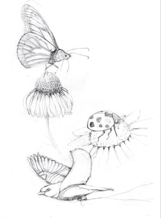
I went through quite a process making little birthday paintings for my granddaughters whose birthdays are two years and one week apart. I think of Madeleine as a little butterfly, always happy and amused. Strong but delicate.
Sketch for painting 11×8.5”
First I looked at reference photos of the different critters and flowers, then sketched them as if I was doing scientific illustration. I transferred my sketch to watercolor paper and painted it. Then I realized it was a terrible composition.
So I started over, deciding that they didn’t need to be scientifically correct. I let my whimsical side come out, recomposed and redrew and painted it again. This time I was happy. I hope she will like it!
Birthday painting for Sadie, Ink & Watercolor, 4×6”
My granddaughter Sadie can swim like a fish, so for her birthday I painted a little undersea scene for her. I’ve always been intrigued by seahorses so it was fun researching, drawing and then painting one.
Growing up in Southern California, I’ve always felt at home in the water, whether just spending the day in the sun and surf or scuba diving.
If I were ever to marry again (unlikely) I want a scuba wedding. I wonder if guests would be willing to come to a “destination” wedding when the destination was underwater.
I recently spent a couple weeks working through a Proportions and Rhythms of the Head portrait drawing class created by Bradwynn Jones. I watched him do the demo drawings (mostly while working out on my rower) and then sketched them myself. When I finished all the drawings I transferred them to watercolor paper and started painting them. This is the first one I painted.
Reference Photo of Mean Model
I took an immediate dislike to this model. She was pretty but mean-girl looking to me. I decided to experiment with a triad of colors on her that turned out to be equally unpleasant.
Final Sketch for the painting
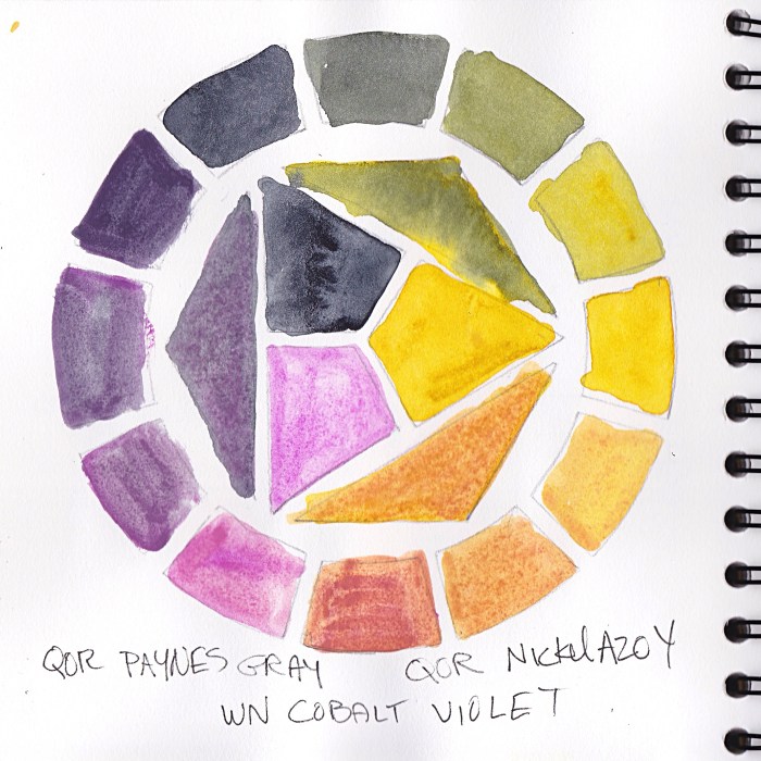
Cobalt Violet has very low tinting strength and just sits on top of the paper, so it came right off if I tried to glaze over it. It is both opaque and granulating, causing an unpleasant texture for skin.
Color wheel test of triad limited palette
The QOR Nickle Azo Yellow also had low tinting strength and when mixed with the violet made a yucky brownish color for shadows. The QOR Paynes Grey combined with the yellow made a gross greenish-gold of her hair.
I didn’t really care because, like I said, take that, mean girl!
Also, Payne’s Grey; I’ve never understood why people use it. Most brands make it from black and ultramarine blue and sometimes a bit of violet. I guess it’s a convenience color, but one that would be so easy to make, though I prefer not to use black paint in watercolor.
Do you use Payne’s Grey? If you do please tell me why and which brand you like.
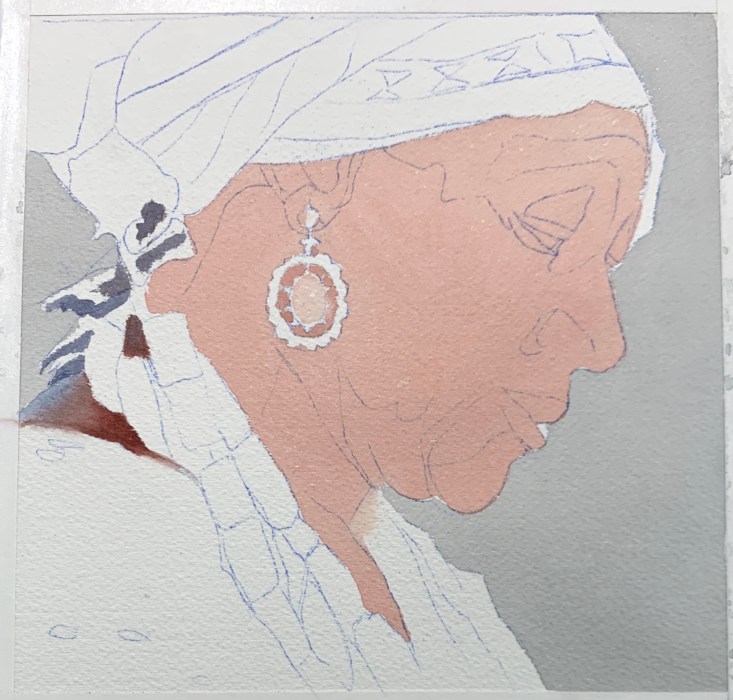
Initial sketch with needed corrections superimposed in Procreate
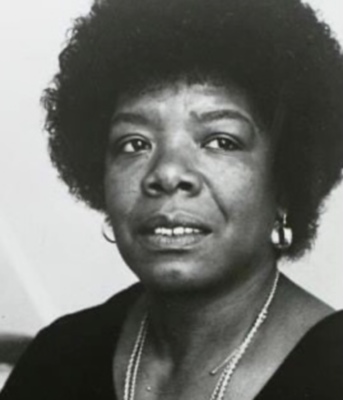
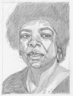
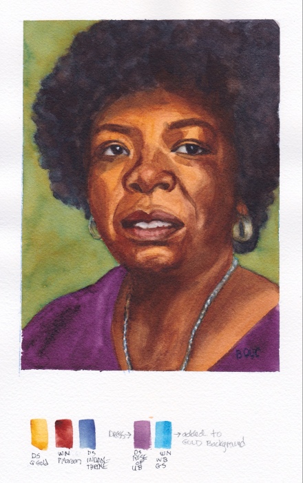
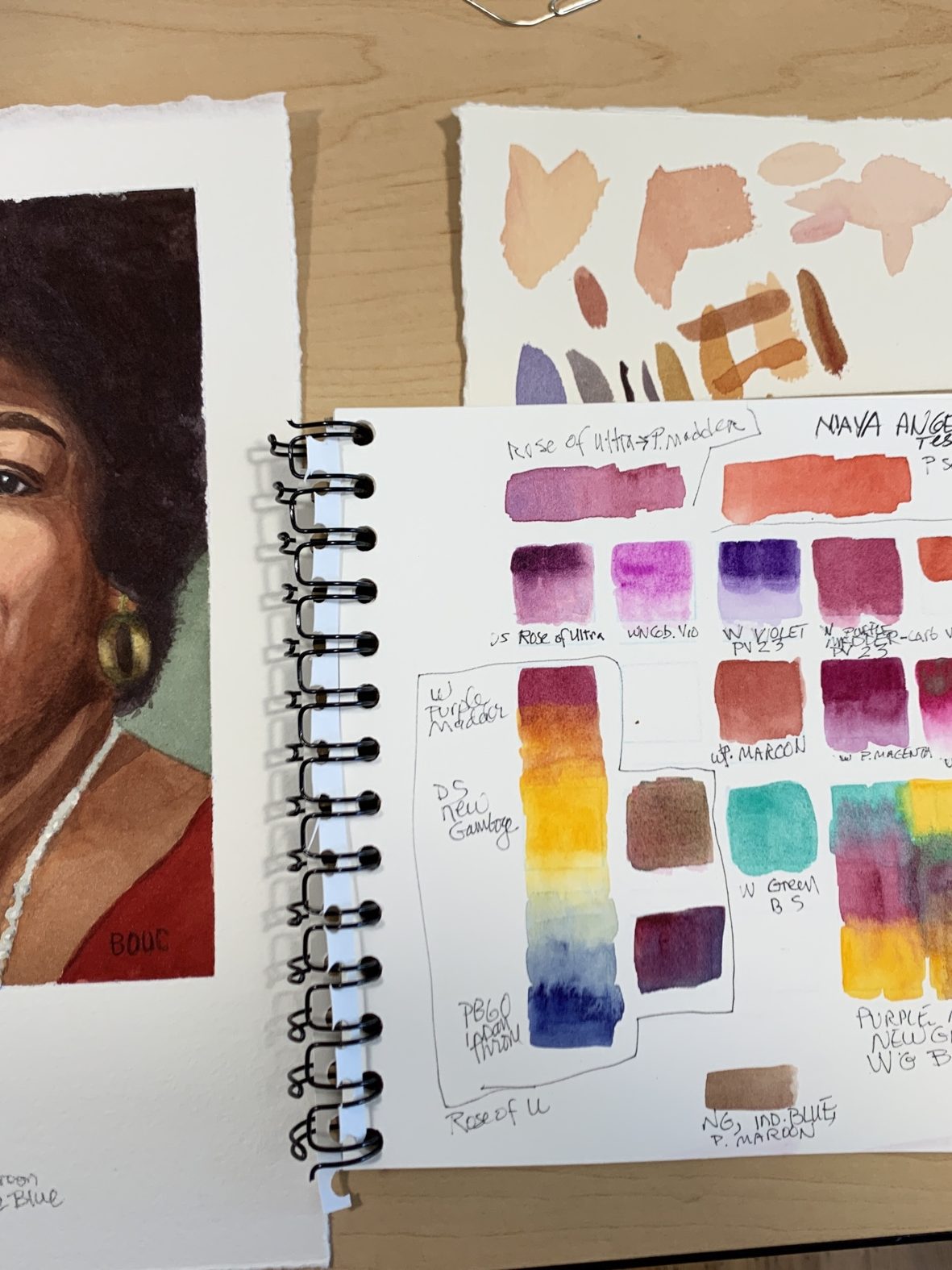
Maya Angelou, from photo reference circa 1972, watercolor, 8×6′
I saw Maya Angelou at the Rainbow Sign, a former Berkeley mortuary on Grove Street, a year after the publication of her book “I Know Why the Caged Bird Sings.” (Link to event announcement).
We sat around her on the funky carpet in the former chapel, and listened raptly as she read and spoke about her life’s journey so far. At that time she was the first ever African-American best-selling author and like me, was living in Berkeley.
Maya Angelou, reference photo circa 1972
I used the photo reference above from around that same time for my preparatory sketch below.
Preliminary sketch on Xerox paper
I painted her twice, using a limited three-color palette of DS Quinacridone Gold, WN Perylene Maroon, and DS Indanthrone Blue. Below is the first (failed) painting attempt.
First failed painting
In the painting (above, Yuck!) I made her skin too dark and too orange, plus when I added Rose of Ultramarine for her dress and Winsor Blue to a gold background, I made a green that clashed with the purple dress.
Color testing before painting and scratch sheet for testing strokes as I painted
For some reason this snippet of her talk 50 years ago has always stayed with me. She said:
My grandmother always told me, “You don’t always get what you pay for, but you always pay for what you get.”
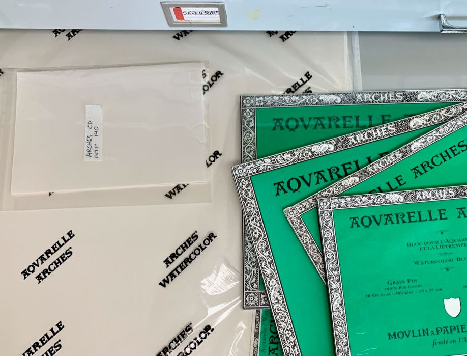
Arches watercolor sheets and blocks in my flat file drawer
Every time I’ve tried to paint a portrait on a block I’ve failed. I became convinced it’s because the cold press blocks are rougher than the sheets, too rough for me. But Arches’ website and Google say no, “they are exactly the same.”
Today I figured it out–I’m right–and I’m mad! And that’s why I’m posting this little PSA post. I hope others will find this when they’re questioning their sanity after being told they’re the same.
The two sides of Arches 140 pound cold press paper are different. When they are pressed in the mold, one side is pressed against a wire screen and the other side is pressed against a felt mat. The latter produces a smoother surface for painting.
Theoretically, Arches watermark/logo is on the side that is meant to be painted on, since if it shows in a painting, it should be readable, right? That side is the smoother side and it’s the side on which I’ve always painted.
But blocks, which are glued on all four sides and to a hard cardboard support on the bottom to prevent buckling, can only be painted on the top exposed surface. And they are bound with the ROUGH side up! Also they have no watermark.
Therefore, they ARE DIFFERENT! It’s not me, it’s the paper!
I guess I will save the blocks for landscape paintings, or peel a sheet off and use the back when I have used up all my sheets.
While I drew and painted her I thought of her as one of the Quilters of Gee’s Bend, Alabama, women who were direct descendants of the enslaved people who worked the cotton plantation there. I saw a traveling show of their quilts at a local museum years ago.
I painted this after watching a video of master Korean watercolor artist J Hunsung paint her. He didn’t credit* the photographer or model for this reference photo.
*The source photo was taken by photographer Jan Sochor.
Quilt Lady sketch 7×7”
It took three attempts to get the sketch right. I’m learning to take my time and get everything sketched in. And if things don’t quite fit together, fix it, don’t pretend it will be ok as is. Looking at my sketch compared to the reference photo below, I can see I still didn’t get it perfectly, but it felt close enough to go for it.
Initial block in
I was so pleased with these perfect flat washes in my initial block in that I had to share them. In watercolor, getting a flawless flat wash is not easy.
Uncropped painting with limited palette colors in the margin
With each watercolor painting, I’m experimenting with a different limited palette and then adding strokes of the colors used at the bottom of the painting. For this one I used Daniel Smith Quinacridone Gold, Winsor Newton Perylene Magenta, Daniel Smith Indanthrone Blue and a guest appearance in the jewelry only of Daniel Smith Perylene Scarlet. (I know it says DS Perylene on the painting but that’s a mistake.)
Watercolor set up with limited palette
I’m enjoying using fresh from the tube paint in a little porcelain palette instead of the ancient dried up old palette I had been using.
Continuing my watercolor relearning journey I’m making progress with each drawing and painting. I watched master watercolor artist Eudes Correia paint this gentleman in a Sktchy class from a photo he provided. You can see his version on Instagram here. I actually like my version better, which is a great feeling.
Limited Palette (from bottom of painting)
I used a limited palette: Raw Sienna, Permanent Alizarin, Cobalt and for the sky, Holbein Peacock.
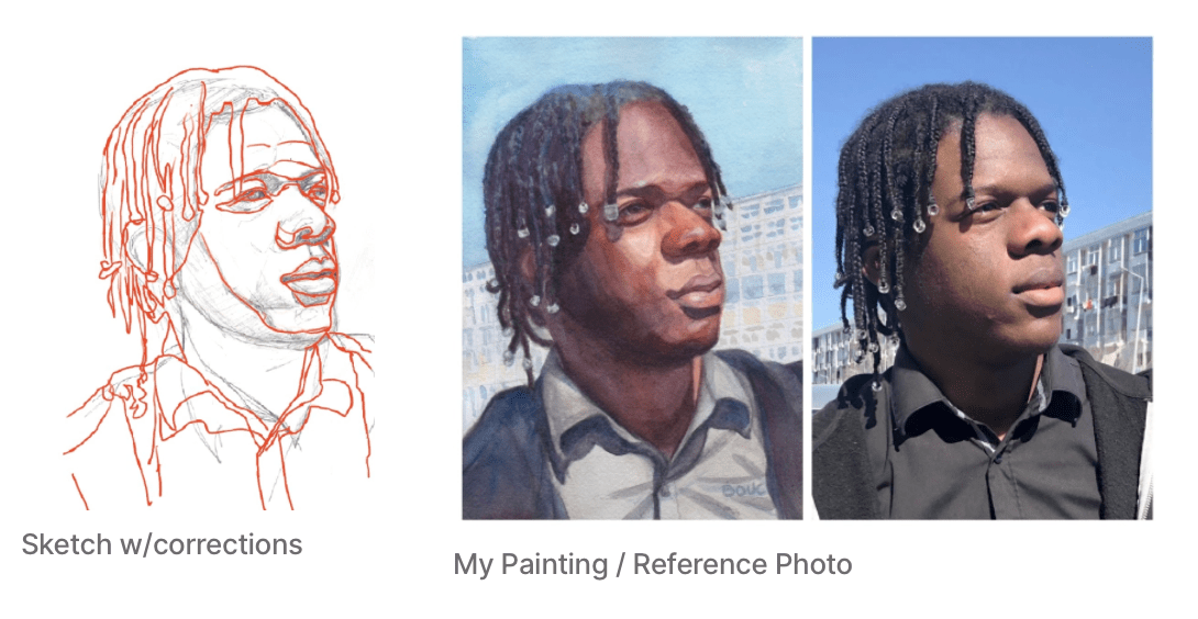
Sketch for Blue Sky and Dreadlocks, 10×8″
I was happy when I checked my drawing to find that I had almost nailed it. Just had to make a few minor adjustments for his shirt and neck width.
L-R: My sketch with corrections, my painting, reference photo (click to enlarge)
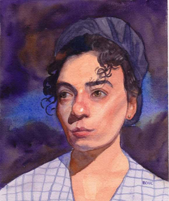
After watching a Sktchy watercolor demo by Alison Pinto, I tried my hand at drawing (see below) and painting this sweet face. I want to assemble a good palette for watercolor portraits, so tried Alison’s interesting palette (see bottom of post for pigments and reference photos). So far I know I do not like Burnt Sienna in portraits.
Sketch for Lady in Light
Lady in the Dark, watercolor, 8×6.5″
I was a little happy with this painting until I realized I’d given her googly eyes and started trying to “fix” the painting, which with watercolor translates to “wreck” the painting. Oh well. This is a scan I made before I started “fixing.”
Lady in Dark, sketch
Pigments: : Winsor Lemon, Indian yellow, Permanent Rose, Holbein Opera, Burnt Sienna, Winsor Violet and Winsor Green Blue Shad
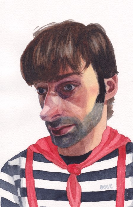
In the reference photo (see bottom of post) he was just a skinny, shirtless guy photographed too close-up, which made his already big nose even bigger. I thought he looked like a French mime so I put him in a mime costume.
Below is my first attempt at painting him. I had so many problems with the drawing being off and the paint handling. His shirt, scarf and suspenders were so pretty and fresh before I muddied them up.
Sad Mime, watercolor, 10×7.5”
I’m still working on portrait drawing skills. It took four drawings before I had one that was close enough to paint.
Below are the various drawings and attempts at correcting them (tracing of photo superimposed on my drawing in Procreate) and the original reference photos.
After nearly a decade away from watercolor, I should have painted a pear or apple to practice. Instead I chose a difficult subject: little Juni, after a swim, with the cool, aqua colors of the pool and the reds of her beach towel reflected in her face (the latter overemphasized and unable to be lightened in my painting unfortunately).
I tried four times to draw and paint her and I may try this one again when I feel more competent.
Boring Guy, Watercolor 10×7″
After I gave up on painting Juni, I tried painting this ginger-haired guy from a photo (below) from an online drawing demo. I found it a little easier to draw and paint him, since I don’t know him. It’s both exciting and frustrating to be relearning watercolor.
Below are the sketches and reference photo. As you can see, my first sketch was missing a huge chunk of the back of his head, a common rookie error. To check my drawing I layered a tracing of the photo over my sketch in Procreate. When I saw how far off I was, I started over with a second drawing that was more accurate.
From left, clockwise: Final Sketch, Corrected First Sketch, First Sketch, Reference Photo