Categories
Drawing Faces People People at Work Portrait Series Sketchbook Pages

Working People Pre-Portrait Portraits in Blue

County Fair Taco Seller, ink, acrylic, watercolor, 7x5"

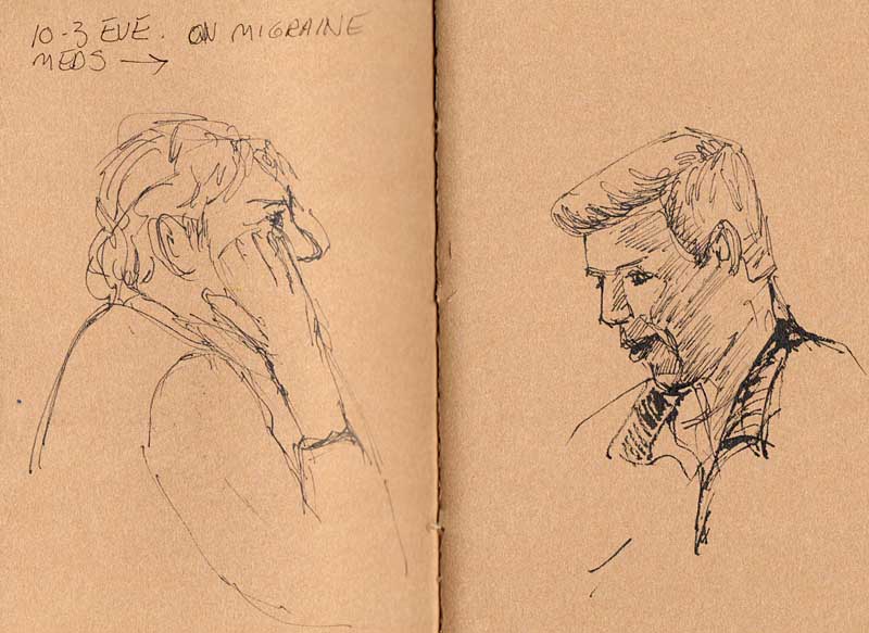
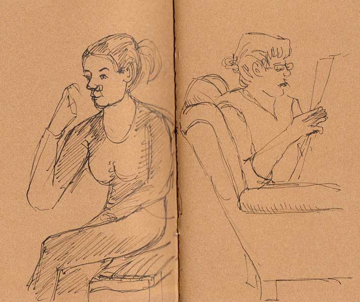
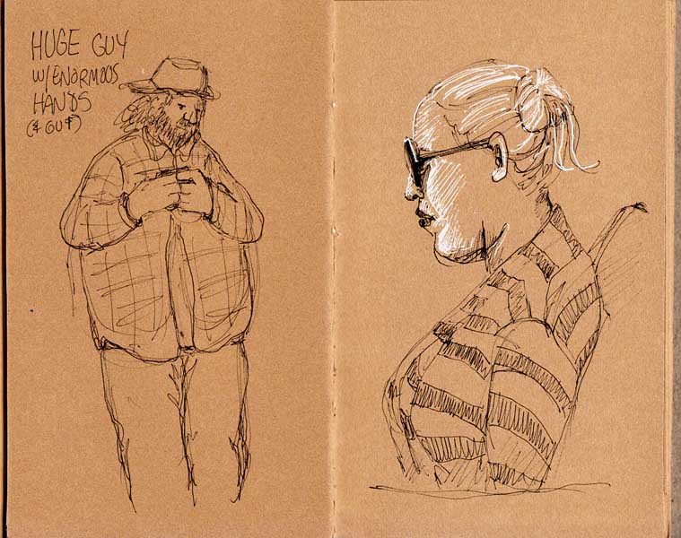
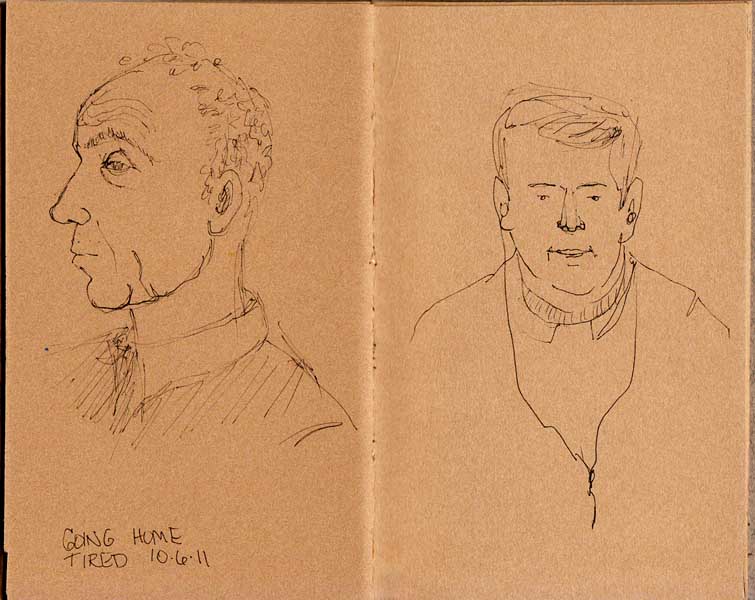
I finally started working on a series of 16×20″ oil portraits, mostly of people who work in my neighborhood shops. It took a long time to figure out how I wanted to approach the paintings and in the meantime I made several preliminary sketches in my journal.

This blue series began as a way to cover a really ugly page in my journal. To cover the mess, I mixed some Golden Absorbent Ground (gesso-like, but designed to prepare surfaces for watercolor painting) and some ultramarine blue watercolor. I didn’t mix it very well, as you can see from the streaks, but I actually like it this way. Drawing with a pen worked well on it too. When taco girl (above) dried, I painted in her very red hair.

Kim the Barista, ink & acrylic & watercolor

I covered two more pages in my journal with the remaining blue Absorbent Ground. Something went a little wrong with my drawing of Kim’s eyes (above) which don’t quite match in size or location. Oops. I sketched Kim before (see pics here) when I was taken by the scene’s resemblance to Manet’s “Bar at Folies Bergère.”

Elliot, Meat Manager, ink and acrylic

I felt a little embarrassed to ask Elliot to let me take a photo of him behind the meat counter but I had to. There is something old-fashioned about him that always makes me picture him in a Norman Rockwell painting. I had a little problem with one of his eyes too, but his oil painting is coming along nicely.

Taco Girl and Kitchen on Fire Spread in Journal

This is the spread in my journal where this series started. The Taco Girl oil portrait is half done. It will be a while before I finish and post the oil paintings but I am enjoying working on several at once, so that while a layer of one dries another is ready to work on.

And I’m so happy to have figured out how I want to paint them: I’m painting how I paint! More about that in another post.

Categories
Bookbinding Drawing People Sketchbook Pages Subway drawings

Quick Sketches in Stonehenge Kraft Brown Potato Chip Journal

Last Page Spread, Chip Journal, 6x7.5"

I breezed through this little pamphlet-bound potato chip box journal in a few weeks. Since Roz Stendahl just posted about her problems binding this paper, I thought I’d share my results with binding and sketching on this paper.

Since my sketchbook was small, pamphlet-bound (stitched down the middle only) with just 3 holes, I didn’t have trouble with the pages cracking like she did in her case-bound journal. I found the paper too rough for drawing with a fine point or fountain pen and settled on a Faber-Castell Pitt Medium pen. I also experimented unsuccessfully on one sketch with a white gel pen.

I do like the paper for quick sketching and I’m going to continue experimenting with it. Roz says it’s good for gouache. I’d like to try it using black line and wash with white gouache for highlights. I used it for oil pastel and wasn’t happy with the results.

Categories
Drawing Ink and watercolor wash Kensington People Sketchbook Pages

Kensington Harvest Parade

Boy Scouts Waiting to Parade, ink & watercolor 5x7"

I was supposed to go to a plein air paint-out but woke up in an ornery mood with a headache and decided to stay closer to home. Kensington, a nearby community of hills, big houses and trees was having their annual Harvest Parade so I drove the mile or so up there and perched on a low wall outside the combination drugstore/post office. These boy scouts above were fooling around on the bench beside me, waiting for the call to line up. They were constantly moving but I somehow managed to draw them as if they were holding still.

Lining up to begin the parade, ink & watercolor, 7x5"
Ready to march, ink & watercolor, 7x5"

Across the street in front of the Sugar Cone Cafe in the hardware store parking lot staging-area, people started lining up. The El Cerrito High School Gaucho’s marching band practiced their flute and drum routines, cub scouts hug-wrestled, and a girl in a fairy costume twirled.

Once the parade started moving I followed along the six blocks to the library/community center destination. It was a charming, small-town event that had everyone smiling.

Categories
Berkeley Drawing Ink and watercolor wash People Places Sketchbook Pages Urban Sketchers

Cheeseboard and Kitchen on Fire

Kitchen on Fire Tools, ink & watercolor, 7x5"
Kitchen on Fire: Tools of the Trade, ink & watercolor, 7x5"

Don’t worry, nothing’s burning! “Kitchen on Fire” is the name of a cooking school in the heart of Berkeley’s Gourmet Ghetto. We ended our sketching evening there when it got too dark to draw on the street. The chefs were cleaning up after an evening class and were nice enough to let us hang out and sketch until they finished. I’ve heard classes there are a lot of fun.

Cheeseboard Musicians, ink & watercolor, 7x5"
Freddy Hughes Band, ink & watercolor, 7x5"

The Cheeseboard Collective (PLEASE see wonderful sketches on their website here) has over 400 kinds of cheese and in the evening sells their pizza of the day to people who line up for it. They host bands who entertain the diners sitting on benches, at cafe tables or picnicking on the grass in the median strip of the street.

Be sure to watch this video long enough to see the two “Keep off the median” street signs and the guy using it as a back rest: pure Berkeley.

My first sketch of the evening was of this group of burly gentlemen below, enjoying their pizza crowded around a table in the dark, lit by streetlights and storefronts.

Eating pizza, ink & watercolor, 5x7"
Eating pizza outside the Cheeseboard, ink & watercolor, 5x7"

I had a hard time with the sketch. There were actually 6 guys but they arrived one at a time, and kept changing places at the table outside the Cheeseboard. I had a whole story going in my mind about how they were Greek or Russian furniture movers.

I thought they didn’t notice me drawing them but when they got up to leave they asked to see. I was mortified since I’d done them no favors with my rendering. They were very nice anyway, recognized each other in the picture and laughed as much at themselves as at my sketch.

Then the guy on the left told me he was an artist who loves to draw and he was very encouraging. That’s the nice thing about sketching in public. Nobody ever criticizes your work, no matter how bad you think it might be.

Categories
Animals Bay Area Parks Drawing Ink and watercolor wash Landscape Outdoors/Landscape Painting Places Plein Air Sketchbook Pages

Earthquake Weather Sketching

Miller-Knox Park Sketches, Journal Spread, 11x7"
Miller-Knox Park Sketches, Journal Spread, 11x7" (see enlarged individuals pics below)

We are having the most glorious Indian summer this October, with nicer weather than we had during the real summer. I always think of this hot, dry weather as Earthquake Weather because of the earthquakes and fires during other hot Octobers. And sure enough there have been several earthquakes the past week.

The little tree, from my car, sketch #1, ink & watercolor
Little tree, from my car, sketch #1, ink & watercolor

When I arrived at Miller-Knox park for a plein air group paint out at 10:00, I decided to sketch the first thing I saw: this little tree. I sketched from where I parked my car. At the end of the paint out, when we returned to the parking lot, everyone was laughing at the dope who parked their car all wonky and it was my car they were pointing at.

Apparently in my enthusiasm to get sketching, I managed to park at such an angle that I went around the cement parking stop blocks, ending up half on the grass and half in the next space, none of which I’d noticed doing.

Lagoon view, geese in the shade

I took a walk and found a nice spot in the shade with a view of the lagoon and lots of white geese and Canadian geese. I lost the white geese when I repainted the shaded area so later added some white watercolor (which never quite works) to try to get them back. Since they’re in the shade, it’s OK that they’re not super white.

Lagoon and bridge view

In the Bay Area you can be in a stunningly beautiful park but have views of freeways or bridges in the background that remind you you’re still in an urban area.

People Picnicking in the Park

My last sketch of the day was of these folks setting up a picnic under the trees. This was one of those days when the weather was perfect, the scenery beautiful, and my pen and paint just worked.

Categories
Sketchbook Pages

Kensington Farmers’ Market

Kensington Farmers's Market, Ink & watercolor, 7x5"

I forgot my water container when I packed my sketching supplies for a trip to shop and paint at the Kensington Farmers market. I dug through my backpack for something to use and found a little plastic earplug case that held about a tablespoon of water and I used that, with water from my water bottle.

Then I stood in the hot sun on the corner, using a newspaper rack for my table, and sipping an iced coffee while a man played guitar and sang nearby. He sounded very much like my favorite singer-songwriter, Richard Shindell, and made my day by singing Leonard Cohen’s Hallelujah, which I like so much I bought a dozen versions of it last year.

Categories
Drawing Food sketch Ink and watercolor wash Painting Sketchbook Pages Still Life

Delicata: Raw, Cut, Cooked

Delicata Squash, ink & watercolor, 7x5"

The Delicata squash were so pretty I wanted to paint them. And then I wanted to cook them (a first time for me). Exploring new produce is an adventure. First draw it, then cut it open and see what’s inside.

Delicata cut, ink & watercolor, 7x5"

The texture of squash doesn’t really appeal to me too much. Especially the slimy parts before it’s cooked. But it makes an interesting sketching subject.

Delicata Cooked on Metal Pan, ink & watercolor, 7x5"

I like this sketch best, with the squash sitting in the reflective, stainless steel roasting pan. I ate a couple of their brethren with my dinner and then brought the leftovers to the studio to sketch.

I’m still not a huge fan . It was OK, roasted with some butter and a little cinnamon. But I think next time (if there is one) I will go for a more savory flavor, with lots of garlic instead.

UPDATE 10/23/11: My art blogger friend Jana Botkin shared these thoughts on squash and art that I had to share here:

  1. A friend once said to me “Squash is the past tense of squish, and squish is not a food”.
  2. We full-time artists could theoretically write off the cost of our groceries if we paint them first!
  3. Garlic, oregano and parmesan cheese are almost the only way I find squash palatable. Without it, it is only palette-able!
Categories
Bay Area Parks Berkeley Drawing Ink and watercolor wash Painting Places Sketchbook Pages

Funky Tilden Carousel Sketches

Tilden Park Carousel, ink & watercolor 5x7"

I almost didn’t post these sketches from the Tilden Park Merry-go-round because I was so frustrated drawing them. But I think it’s interesting to see when others post things that challenged them so here you go.

I try to find something positive in work that doesn’t succeed overall. The one above was the last one I did as I was leaving. I really like the trees in the background and most everything else EXCEPT the messed up shape of the building that houses this wonderful 100-year-old carousel.

Carousel structure, ink & watercolor, 7x5"

I did the one above sitting on a bench inside the building trying to sort out the perspective and the way the whole thing fits together. Meanwhile the smells of burning popcorn and greasy hot dogs were making feel rather ill. I really struggled but in the end I think I got the understanding of what is a merry-go-round and how it works, though you can’t tell from this mess.

Carousel quickie, 7x5"

Another one that I struggled with. The little girl calmly rides while the horse seems to be expressing my struggle. And boy are the perspective and ellipses way, way off!

Get me out of here!
Get me out of here!

Another quickie with the horse expressing my feelings: “Get me out of here! It’s too hard to draw!” My friend Cathy did some nice sketches of the carousel, posted here on our Urban Sketchers blog.

Categories
Art supplies Drawing Landscape Oil Painting Outdoors/Landscape Painting Studio

Painting Pt. Bonita Part 2: Oils and Oil Pastels

Point Bonita #3, Oil on Gessobord Panel, 12x9"

After I did the watercolors I posted yesterday, I set up the sketch, the watercolor and my iPad displaying the photo on the table beside my easel and painted the scene once again, this time with oil paint. After a month or two of being totally frustrated with oil painting, trashing everything I made and about ready to give it up, suddenly painting was easy and I was loving it!

Point Bonita Painting set up in studio

The entire painting worked like a charm except the foreground mount of dirt and ice plant which was the last thing I painted and which I did over and over. It kept trying to call too much attention to itself. I think I finally successfully muted that foreground while still keeping the light on it.

Then I was looking at some delightfully free and vibrant oil pastel work on Aletha Kuschan’s blog which inspired me to try the scene in oil pastels too. I know nothing about oil pastels so I quickly read a few how-to’s on the web and dug in.

BUT before I show you the drawing, I have to say that I made a fatal misstep: I chose a sheet of the totally wrong paper to work on. Instead of starting small on a sheet of white or blue pastel paper, I chose a large sheet of brown Stonehenge drawing paper. What was I thinking? Brown under a turquoise sea?

Point Bonita #4, Oil pastel on Stonehenge paper, 17x13"

It was impossible to cover all the brown paper because even though the oil pastels got really thick in some areas—so thick that no more could be applied—in other spots they just wouldn’t cover.

Although my Holbein Oil Pastels are very old, purchased for a small project I did more than 20 years ago, they were still in good shape. But I didn’t have the right colors, and I had trouble blending. I didn’t have blending stumps, didn’t want to use my fingers and was wearing gloves which didn’t work. I tried a paper towel but it just smeared and left paper towel lint.

Compared to paint, oil pastels seems like a lot of extra work, having to fill in so much area by scribbling over and over. And it was messy; my gloves and the pastels got dirty from colors transferring onto them.

But maybe if I knew what I was doing, or had used the right paper it would have been easier or less messy? (Not to say that oil painting isn’t messy! Everything I own has paint on it!) I like the look of oil pastels done well so I’ll try another experiment with them. But on the right paper this time! Any tips?

Categories
Landscape Marin County Outdoors/Landscape Painting Places Sketchbook Pages Watercolor

Painting Pt. Bonita Part I: Watercolor

Point Bonita, watercolor, 7x5" in journal
Point Bonita #1, watercolor, 7x5" in journal

When I got frustrated with painting from life last month, I took a break and experimented in working from the same photo in different media. First I did the sketch above in my journal from the photo below which I took at Point Bonita in the Marin Headlands last year.

Point Bonita photo cropped to 9x12"

I took the photo during a very cold and windy plein air paint out where I did a plein air sketch (posted here) and planned to eventually paint the scene in the studio. As you can see, I did what I call “imaginating” (a combination of imagining and exaggerating the colors I see in a photo or a scene) instead of rendering the photo as is.

Point Bonita, Watercolor, 12x9"
Point Bonita #2, Watercolor, 12x9"

After I did the little journal painting at the top of this post (which I like very much), I tried it again  4 times bigger on a 12×9″ Arches watercolor block (above). It was fun to get back to painting in watercolor on something other than a small journal page. I didn’t use any masking on either of these, just painted around areas I wanted to stay white.

I enjoyed working larger on a watercolor block–I could work at a slant, mix juicy washes, and not have to worry about trying to keep the pages flat and the journal open. I’m falling in love with watercolor painting all over again.

Stay tuned for the oil and oil pastel versions tomorrow.