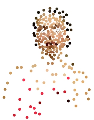
I so enjoy the Sktchy App where people post their photos, artists post their sketches of the photos and everybody is so positive and encouraging. Each weekend Sktchy hosts a Weekend Art Extravaganza or “WAX,” which is a cue or art concept to inspire artists to apply to their sketches. Last weekend it was “Candlelight.” I found the inspiring photo below on Sktchy and used it for this painting.
Photo reference for candlelight
Do join in on Sktchy if you have an iPhone and want practice drawing people (and their pets and home/cities) from all over the world, all ages, all lifestyles. It’s so much fun!
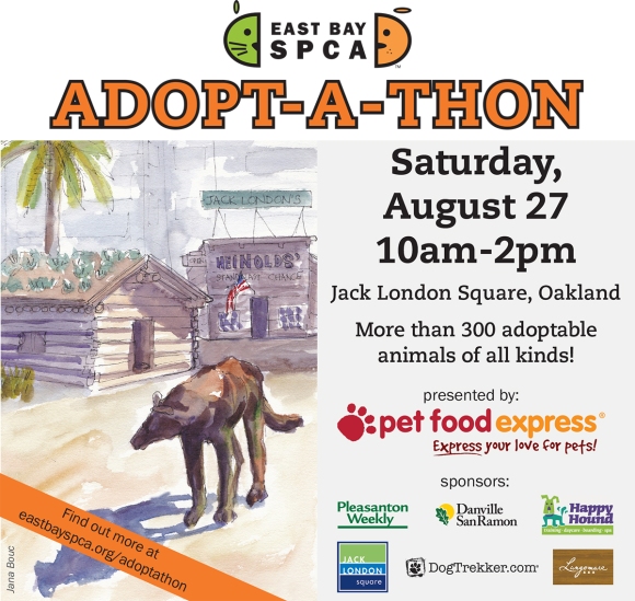
I was honored when the East Bay SPCA asked to license my sketch of Jack London Square (in the poster below) for their annual Adopt-A-Thon fund-raiser publicity materials. They kindly offered to pay for the use of the image but I was very happy to donate it for their use. As an animal lover I am grateful for the wonderful work the SPCA does to care for and find homes for animals.
You can click the image to get more information about the event. It will be a lot of fun and if you’re looking for a new family member of the furry variety, be sure to visit the Adopt-A-Thon! My original sketch is and info about it is at the bottom of this post.
.
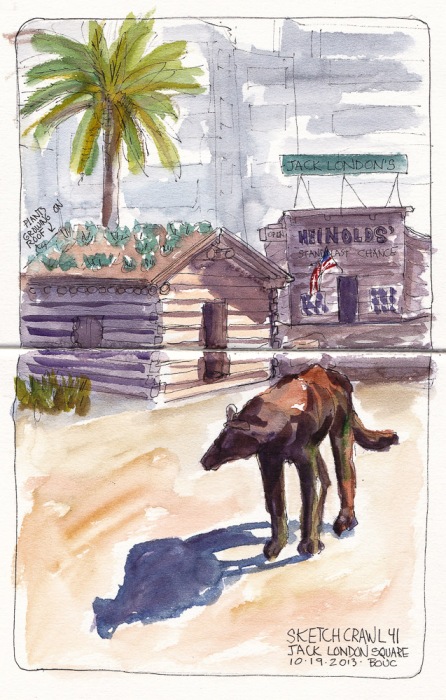
I sketched the scene below at Jack London Square of London’s old cabin and the wolf statue out front on a gorgeous sunny day and the shadows were in just the right place. It was one of those sketches where everything just worked. In the background are the high-rise office buildings of Downtown Oakland.
Jack London Cabin and Wolf Statue, ink and watercolor, 10×7 in
One Hour Pear, oil on Arches Oil Paper, 5×7 inches
After struggling for a few days trying and failing to do a one-hour painting exercise as I posted yesterday, I returned to the studio determined to tackle the challenge again and this time, obey the timer. I “cheated” just a little, redefining the project to better suit my current abilities by doing a quick outline and monochrome block-in with diluted burnt sienna and pre-mixing my paint (below) before starting the timer. At exactly one hour I stopped and then gave myself 5 more minutes to soften the edges on the shadow and back of pear and to add a highlight. It’s not a masterpiece but I met the challenge and, most importantly, enjoyed it!
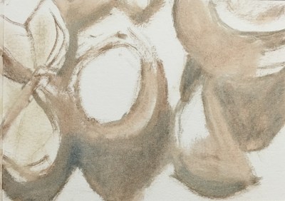
Pre-mixed Paint
Initial block-in
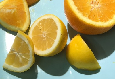
Photo of set-up
One done, two more to go before moving on and returning to some skull drawing and painting practice to enhance my ongoing portrait drawing and painting study.
I’ve given myself the gift of working with artist and painting mentor Sarah Sedwick to spur my growth as an artist, learn new techniques, improve skills and get help from an expert who can spot problems that may be hindering me and that I can’t see myself. We’ve been working on value and color mixing with limited palettes, and after an awful bout of reworking a painting to death she challenged me to do three one-hour paintings. Unfortunately I seem to be constitutionally incapable of doing 1-hour studies, although I haven’t given up trying. My 4 studies above are all 7×5 inches on Arches Oil Paper. Below are the work in progress photos including a photo of the still-life set-ups (though these were all done from life) and in some cases, the color palettes used. You can click on any image to see the set enlarged.
Lemon still life #1
Block-in #1
Palette #1
Set-up #1
Despite my intention each time to do a one-hour study, I painted three-hour (or more) studies. I worked quickly enough to leave them looking unfinished to me, but slowly enough to lose the freshness and conviction of the original brushstrokes. As Sarah explained, the goal wasn’t to learn to paint fast but rather to loosen up and get out of the rut of perfectionism, to get bold and concise with brushstrokes. She said, “The point of timed paintings is to set a constraint so we can be more free in other ways, not create more struggle. We aren’t attempting to create finished masterpieces in one hour, here – it’s a challenge to yourself to see how much you can do, how freely, how efficiently. Setting a time limit frees you to experiment – to slap on some thick paint in an area and go with it – to not stress as much about the drawing and composition – you can fix any issues in the NEXT painting.”
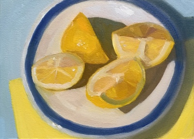
Lemon still life #2
First strokes #2
Block-in #2
Set-up and sketch #2
Palette #2
Part of my problem with these attempts I think, was setting up too complicated of a subject. When I get back to the studio today I’m going to use a simpler subject. And will force myself to stop at one hour no matter what. If I sketch in the composition too quickly it’s inaccurate and I spend my painting time correcting my drawing mistakes. By the time I’ve done a preliminary sketch and/or a careful sketch on the canvas, blocked in the shapes and values with a quick burnt sienna wash/underpainting, the hour is up. I can easily spend another half hour pre-mixing my paint.
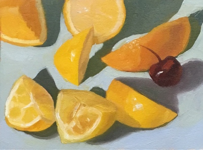
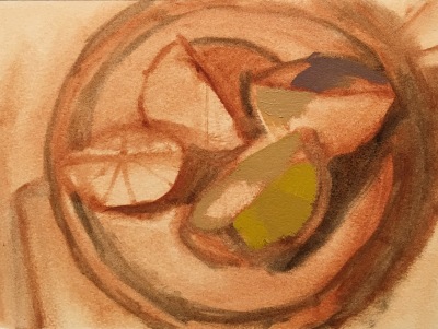
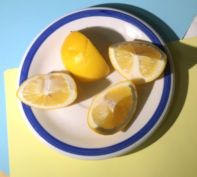
Lemon still life #3
Value plan #3
Block-in #3
Set-up and sketch #3
Then when I start painting I get interested in all the cool light effects and details I see and want to capture. I forget my plan to go with 3 values per subject, simple planes and shapes, big brushstrokes and instead soar off into the groove of seeing and painting, seeing and painting until I look at the clock and suddenly it’s 8:00 pm and I haven’t had dinner or midnight…and I long ago turned off the timer and have lost it again!
I painted the 4th still life below with a limited 4-color palette (White plus Cad yellow pale, Cadmium Red Medium, Ultramarine blue) but in the end I added in a bit of Cad yellow medium and Phthalo blue) because I just couldn’t get the colors I wanted for the lemons and blue background.
Lemon still life #4
Block-in, first strokes #4
Set-up #4
But I am determined, and today I will succeed! I am an optimist, for sure, since that’s what I always say when I go to the studio, but I will obey my timer and see what I can accomplish in one-hour one more time.
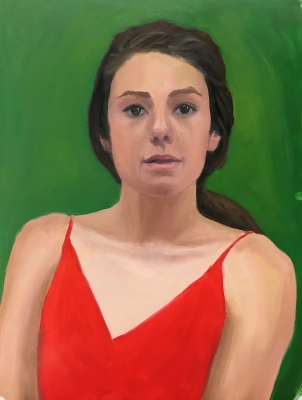
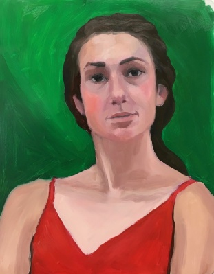
Red Green Complementary Color Portrait #6, Oil on Arches Oil Paper, 14X11 inches
I thought this color and portrait exercise was going to be hard, if not impossible, because of the crazy neon green and red lighting on the model. But because she was lit from the sides her face was modeled with visible planes and shapes it was surprisingly easier than the previous red/green portrait experiments. It was fun to paint and I’m really happy with everything about it. Below is the reference photo and the teacher’s study. I enjoy seeing how he makes each painting look like a different person, using the model as a jumping off place rather than going for a specific likeness.
Red Green Complementary Color Reference Photo #2
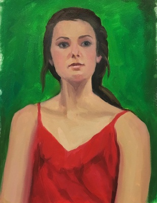
Red Green Complementary Color, Bill Perkin’s study
Usually I pick the one image that I like the best to put at the top of my posts but after doing this exercise six times, I don’t know which, if any, I like at all. My struggles and mood on the day I was working on these studies really came through in the images. Each portrait seems to be saying what I was feeling, from “WTF!” to “I’m confused” to “Erk!” to “Help! Get me out of here!” To “Maybe it’s time to move on.” More about complementary colors and what I learned from this exercise after all the awful paintings below:
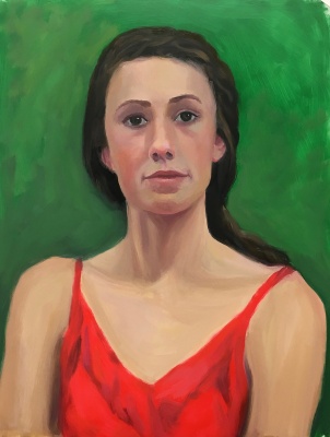
Red Green Complementary Color Portrait #5, Oil on Mylar, 14X11 inches
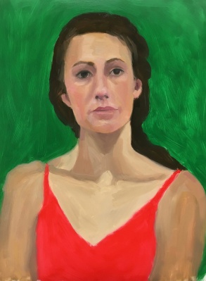
Red Green Complementary Color Portrait #4, Oil on Mylar, 14X11 inches
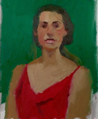
Red Green Complementary Color Portrait #3. Oil on Mylar, 14X11 inches
Red Green Complementary Color Portrait #2. Oil on Mylar, 14X11 inches
Red Green Complementary Color Portrait #1. Oil on Mylar, 14X11 inches
Bill Perkins 30 minute study
Original photo reference.
Original photo reference with color spots in Photoshop
Color spots layer in Photoshop on top of original photo reference.
The goal of the Complementary Color part of the New Masters Academy Color Boot Camp is to work with different pairs of complementary colors under different lighting conditions and observe the way the colors interact, both visually in the image, and when mixing together on the palette. Complementary colors are clearly explained this Wikipedia page.
The easiest way to remember which colors are complements are to think of the triad of the three primary colors: red, blue and yellow. Pick a color; the missing part of the triad is its complement. If you pick green (composed of blue and yellow) then red is missing. Red and green are each other’s complements. Pick yellow and what’s missing? Red and blue. When combined they make purple. Therefore purple and yellow are complementary colors. Ditto for orange (red+yellow) and blue.
Things I noticed: Red and green, like all complements, when beside each other make each other look brighter, more vibrant. When mixed together they dull each other down and make a grayed color. I really struggled to get a likeness, and even though that isn’t the point of the color exercises I got determined (obsessive?) until I finally gave up. Flat, frontal lighting makes it hard to find landmarks and planes in the face.
The last images are of the original photo reference, the teacher’s painting and two Photoshopped pictures where I selected color spots on the reference photo using the eyedropper tool and painted a spot of that color on a layer above the photo layer (displayed here with and without the photo). I do that when I have trouble recognizing what colors I’m actually seeing. I never really nailed any of these, in likeness or color. But the next exercise came out really great and I’ll post that soon.
Daily Sketch, bottle-drawing practice, graphite, 8×10 inch
After struggling with a crooked bottle in a still life painting with lopsided shoulders, this morning I figured out how to draw bottles and keep the curves and angles on both sides symmetrical.
The solution:
Make a mark for top and bottom and widest point of width on each side and draw a rectangle enclosing the shape. Draw a vertical line down the center of the rectangle.
Next I lightly drew a rectangle (or enclosing envelope) around each “section” of the bottle, with the bottom of each rectangle at the spot where the exterior of the bottle changes direction from a curve in or out. I left some of those marks in the sketch above.
Then draw straight diagonal lines from section to section and soften them into matching curves. It’s much easier to draw straight lines accurately than curved ones.
Draw the ellipses for each section using the guidance here from Sadie Valerie.
I did this sketch from a photo on the wonderful Sktchy App but it seemed festive enough and somehow appropriate for this point in time in the USA. Have a happy Independence Day as the nation celebrates by blowing stuff up (and scaring dogs and cats everywhere).
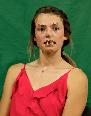
Color Boot Camp SATURATION: Neutral Areas vs. Saturated Areas, 11×14″ oil study
In this last Saturation exercise in the New Masters Academy Color Boot Camp series, the Major Key is low with so much black background. The most contrast of saturation or Minor Key comes in her red dress. I was happy with the way my study proceeded, without too much struggle, and how it turned out. It was easier to paint because there was more contrast in the reference photo.
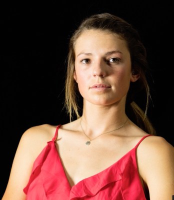
Below are the reference photo and Mr. Perkins’ 30 minute study.
Color Boot Camp SATURATION: Neutral Areas vs. Saturated Areas, 11×14″ oil study
This Color Boot Camp, Saturation exercise, like the previous one, is about painting in a high major and minor key. The High Major Key means that overall the greater proportion of the image (the background) is very saturated. The Minor Key, or range of contrast of saturation, is also high because if the contrast between the highly saturated background and her shirt and her skin tones are moderately saturated.
The underlying drawing and so the painting itself is rather awkward and not a great likeness but I was going for value and saturation. The reference photos with flat lighting and without strong shadows are the hardest to draw and paint since there is no contrast showing the bone structure or planes that give a three-dimensional look to a painting.
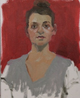
Below are the reference photo and Mr. Perkins’ 30 minute study. Again I love the way he simplifies and makes a “painting” without worrying about making a “portrait” on an exact person.