Categories
Drawing Flower Art Ink and watercolor wash Life in general Painting Rose Sketchbook Pages

Sketching Scruffy Roses Instead of Ice Cream

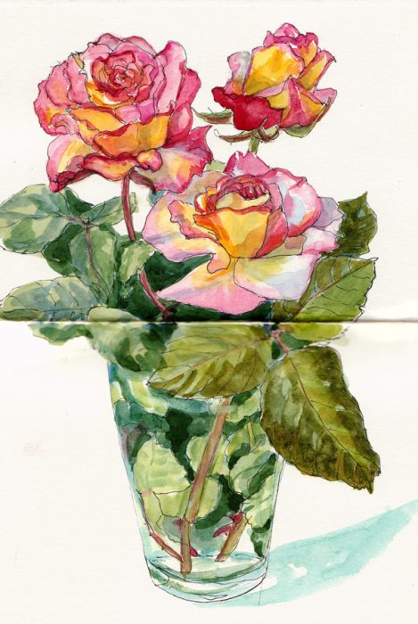
Scruffy Roses Instead of Ice Cream, ink & watercolor

Sometimes when I’m tired and grumpy it feels like the solution to all my problems could be found in a bowl of ice cream. I know I’m not alone in this because I’ve noticed that movies and TV often show female characters heading for the Haagendaz when they’re upset.

I’ve also learned that despite those crossed wires in my brain* that say tired = eat sugar, dessert is rarely the solution, and only creates other problems for me.  So I try to do something else and it usually works. On this occasion I spent the evening sketching some scruffy little roses from my garden. By the time I finished, the nearby ice cream shop had closed and I was ready to go to bed.

*Sleep Deprivation and Carbohydrate Craving

In a Harvard Magazine report on sleep research they explain how and why being sleep deprived creates a physiological craving for sugar. In one study, healthy, male college students who were subjected to sleep interruptions over a couple of weeks became carb-loading sugar fiends and even developed pre-diabetes. In the article the Harvard researchers say:”It could be that a good chunk of our epidemic of obesity is actually an epidemic of sleep deprivation.”

They say that most of us now sleep less than people did a century ago, or even 50 years ago although our biological need for 8 hours of sleep a night hasn’t changed. “We are living in the middle of history’s greatest experiment in sleep deprivation and we are all a part of that experiment,” says Stickgold. “It’s not inconceivable to me that we will discover that there are major social, economic, and health consequences to that experiment. Sleep deprivation doesn’t have any good side effects.”

~From Deep into Sleep | Harvard Magazine Jul-Aug 2005
http://harvardmagazine.com/2005/07/deep-into-sleep.html

Categories
Art theory Flower Art Ink and watercolor wash Painting Sketchbook Pages Watercolor

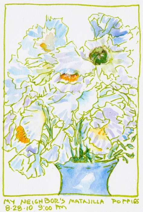
Matalija Poppies (Fried Egg Flower)

Matalija Poppy, Watercolor 9x12"

Today in the my watercolor class I demonstrated painting white flowers and soft-focus bright or dark backgrounds. A neighbor graciously allowed me to pick a huge bouquet of Matalija poppies from her gigantic bush so each artist had their own flower to paint.

To save time I only painted a quarter of the flower before going on to paint the background. This made it a little difficult to finish the painting after the class since by then the flower had completely changed so I just pretended a little.

To paint the background I started by making three different puddles in little bowls: Permanent Alizarin Crimson, Quinacridone Gold and Winsor (phthalo) Blue. I used a separate brush for each color to keep the colors clean. Then I just worked my way around, washing on little gold, a patch of red beside it, a splotch of blue, letting the colors touch and mingle.

Matalija Poppy Sketch, green ink & watercolor
Matalija Poppy Sketch, green brush pen & watercolor

To warm up for today’s demo I did this sketch last night using my fun new green Pitt Artists Brush Pen and then added watercolor. And I spelled the flower name wrong. Which I’ve been doing forever, or at least since I painted the first one several years ago found on my website here.

Categories
Flower Art Landscape Painting Watercolor

Big Tulip Watercolor Painting

Big Tulip, Watercolor on paper, 30x22"

Big Tulip started with this journal sketch and photo which led to a craving to work big for a change. I jumped right in with a full sheet (22×30″) of watercolor paper, reminding myself that it’s not that different:  just use bigger brushes, bigger puddles of paint, and bigger movements.

Of course there’s more to it than that. In planning the painting I decided I’d be free and loose with the background, just go for it and see what happens rather than draw it in. It was fun, but there was a lot of background. I’d like to try the painting again, doing it a little differently.

I’d draw the background plantings with more specificity and I would also use different pigments. I’ve been experimenting with using cadmiums for the yellows, orange and red instead of my usual transparent colors in my palette.

The cadmiums are perfect for journal painting when I want to try to get a rich color down in one layer. They’re stable and easy to work with so they will remain in my travel palette.

But when trying to work with juicy wet-into-wet washes, the cadmiums just sit there and don’t move, like stodgy, Wednesday night meatloaf. For painting close-up flowers I like the excitement and challenge of colors that charge into each other and zip around. It’s fun to paint a petal with lots of water and then drop in rich, bright colors, let them mingle, and try to get them to go where you want by tilting the painting.

Categories
Drawing Flower Art Ink and watercolor wash Painting Plants Sketchbook Pages

DUI: Drawing Under the Influence

Hydrangeas; Attempt #2, ink & watercolor
Hydrangeas Attempt #2; Painted directly without drawing and ink lines added after finishing attempt #3

During days of dismay at my disappointingly dismal drawing dexterity I determined to draw ’til I improved. But I was under the influence of migraine medicine which fixed the headache but left me drowsy. I actually fell asleep at the drawing table, dropped my brush on the page which woke me up, and had to go lie down for a spell between drawings.

Hydrangeas Attempt #1, ink & watercolor
Hydrangeas Attempt #1; drawn in ink, painted with ugly dark background which was then sponged off and a bit more paint added

My hydrangeas are bursting with vibrant blooms so I made them my subject. The first attempt got off to a decent start until I painted a nearly black background, probably due to my really dark mood and being too doped up to know when to stop.

I couldn’t stand the way it looked, so before scanning tonight took a soft, wet sponge and washed off the dark background. Then I dropped a little more color into the wet background.

Hydrangeas Attempt #3, ink & watercolor

I had the most fun with this last attempt, where I drew and painted more loosely, trying to capture the flavor and personality of the flowers.

Categories
Drawing Flower Art Gouache Ink and watercolor wash Life in general Painting Places Rose Sketchbook Pages

When you forget how to draw…

Hillside Gardens Apartments, ink & watercolor

…keep drawing! After feeling so rusty sketching at the county fair I was determined to get my drawing juju back. I knew the only way to find it was to draw more.

I tried sketching at the El Cerrito 4th of July festival (see below) but was all thumbs again. Since I couldn’t make a decent sketch myself, I bought a really nice one at the festival’s art show from my friend Ikuko who had a booth there.

I decided to try again on the walk  home. The Hillside Garden Apartments (at top of post) is an ongoing renovation project and labor of love by the owner to convert an old rundown motel into beautifully landscaped apartments. He and the apartment manager were driving by and saw me standing on the corner sketching. They parked and came  to see what I doing and we had a nice neighborly chat with much mutual admiration.

Can't Draw; Ink, watercolor, colored pencil
Can't Draw; Ink, watercolor, colored pencil (click to enlarge)

Back home I continued drawing. I was happy with this sketch of a rose from my garden (below) but lost focus and overworked the watercolor. So the next day I played around with adding gouache, not worrying about getting the colors “right” since the rose had completely changed anyway.

Love the (Artist) You're With; Ink, gouache & watercolor

Then I wrote myself a little pep talk around the rose, concluding that even if my drawing wasn’t all I wanted it to be, I could at least stop being so self-critical and, to re-phrase the old Crosby, Stills & Nash song: “If you can’t (yet) be the artist you love, then love the one you’re with!”

Categories
Drawing Flower Art Ink and watercolor wash Life in general Painting Sketchbook Pages

Birthday Blog: Glads and Gladioli

Birthday Glads and Gladioli, ink & watercolor
Birthday Glads and Gladioli, ink, rubber stamps, watercolor

My blog and I are celebrating our birthdays! My blog turned 4 last month and my birthday was Saturday but I’m celebrating all month. My neighbors gave me this little bouquet of glads (gladioli) which was perfect because I had so many birthday things I was glad for.

Unlike some who expect bling for their birthday, I’m much more down to earth. Some of the highlights of what made me glad on my birthday:

  1. Starting the day with my annual pilgrimage (a 3-mile round trip walk) to Fat Apples for a baked apple souffle/pancake with my sister and my best friend (who gave me a beautiful ceramic bowl she made).
  2. A short nap (because I woke up at 5:00 a.m. like a little kid on Christmas).
  3. A cleaned out garage courtesy of my son Cody (the only gift I’d asked for).
  4. Getting to borrow my neighbor’s truck and then making it to the dump just before they closed to get rid of a truckload of 10 years of junk.
  5. A homemade card from my mom with photos of my grandmother pregnant with my mom and my mom pregnant with me (and a nice check).
  6. A delicious dinner with Cody.
  7. A video, a cup of tea and a great night’s sleep.
  8. A perfect start to my 2-week birthday vacation!

My vacation is a “stay-cation” with lots of time for sketching and painting in the beautiful Bay Area. And along with spending some quality time in the backyard on the chaise lounge with a book, I have also promised (myself) to finally restock my earthquake emergency supplies since all the food and water in there have expired by now.

Blog Birthday: Thank You!

  • 4 years
  • 782 posts
  • 8,259 comments
  • 679,347 views
  • 88,880 spam caught and deleted!
    (WordPress has excellent spam protection, which is why you never have to do that stupid Captcha-type-in-meaningless-letters to leave a comment here)

THANKS to all of you wonderful blog visitors for your encouragement, support and the great conversations! I’m so grateful for every comment and every visit, and for the many friends I’ve made with artists around the world who share their wisdom so generously!

Categories
Art theory Flower Art Landscape Painting Photos photoshop Places Sketchbook Pages Watercolor

Study for Tulip Painting in Watercolor

Kaiser Hospital Tulip painting study, watercolor, 4.5" x 6.5"

I accidentally arrived an hour early for a doctor’s appointment at one of Kaiser Oakland’s medical offices that has an amazing hidden garden. The building is an architectural treasure, built around a courtyard in 1912 by Julia Morgan as a hospital and home for unwed mothers (or so I’ve been told). Instead of reading old, germy magazines, I spent the hour in the courtyard sketching, wandering and taking photos.

After working out the composition and colors, I’ve got two paintings ready to start: a full-size watercolor sheet of the above image and a slightly smaller canvas of another garden scene.

Before starting a large painting I like to do a study first, getting to know the image more intimately, and experimenting with pigments and techniques so when I start the real painting I have a plan of action or at least a sense of direction.

Tulip study and notes for painting, journal spread

Since I only recently began experimenting with opaque watercolor pigments after years of using only transparents, I made some discoveries with this study and took notes as I worked. Here are a couple that might be of interest:

  • Opaque pigments (Cadmiums, Cerulean, Yellow Ochre) are great when putting down an area of strong color and leaving it (such as when painting in my journal). But they lift too easily when adding layers over them, and become thick and unattractive when trying to mix darks. As I learned in oil painting, darks/shadows are best when thin so they don’t draw attention to themselves with texture.  Seems to be the case in watercolor as well: better to use staining, transparent darks that won’t lift or get thick. For the dark green areas in the painting I’ll use Sap Green with Sepia and vary with a bit of Indigo, Winsor Violet and/or Alizarin.
  • The Legion/Utrecht 100% rag watercolor paper I’m using in my journal lifts incredibly easily. This is great when you actually want to lift paint but not so good when you just want to soften an edge and a bunch of paint lifts off instead!

Here are the original reference photo and the Photoshopped version. As you can see I got rid of some distractions and changed the proportions a bit.

Original reference photo of tulip in garden
Photoshopped tulip reference photo

Photoshop CS5 has some great new composition tools, such as “Content-Aware Fill” which I used to fill in the windows, white at top right corner and a tulip on the right margin. You just select and delete sections you want to replace and PS fills them with information from the surrounding area. I also narrowed the image to fit the proportions of the 22×30 watercolor paper using Content-Aware Scaling which preserves the proportions of the important stuff while squeezing in (or stretching) the other stuff.

Categories
Bay Area Parks Berkeley Drawing Flower Art Ink and watercolor wash Landscape Outdoors/Landscape Painting Places Plein Air Rose Sketchbook Pages

Berkeley Rose Garden

Berkeley Rose Garden & Rose Practice, Ink & Watercolor

When my plein air group met at the Berkeley Rose Garden last Saturday I arrived even later than usual: at noon, only an hour before the session was to end. I found a spot to sit and quickly sketched and painted the complicated, terraced rose garden, finishing just in time for the 1:00 critique.

Berkeley Rose Garden, Ink & Watercolor
Rose Grid, Ink & Watercolor

After the critique I took some photos of the roses that most intrigued me, while guys set up white chairs for a wedding there later in the day. Once home I made a grid in my journal, and displaying the photos on my monitor, tried to understand their design and draw them.

I’ve bound my next journal and named it “Rosie” and want to decorate her with a rose design so this was practice for the rose I’ll draw on the cover. I’ve finished my journal “Froggie” but still have a bunch more pages to post.

I’ve updated my blog template. What do you think of the new design?

Categories
Drawing Flower Art Ink and watercolor wash Painting Sketchbook Pages

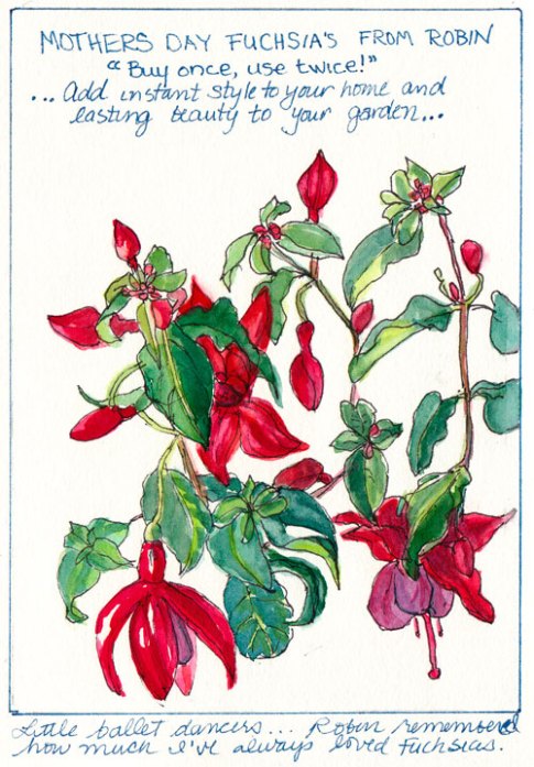
My Mothers’ Day Fuchsias: “Buy Once Use Twice?”

Mothers Day Fuchsias, ink & watercolor

I had a lovely Mothers Day yesterday. After spending a cozy, rainy day in the studio painting, Robin  arrived to chauffer me to Cody’s house for dinner carrying a beautiful fuchsia plant as a gift. Attached to the plant was a tag proclaiming, “Buy once, use twice!” This seemed an odd bit of marketing since I generally expect things I buy to be usable multiple times, not just twice. It also made me wonder how you “use” a plant.

Upon reading further I learned they simply meant it could be enjoyed as a house plant first and then planted in the garden later. Wrapped in festive fuchsia colored cellophane it does cheer up a room. But since my cats try to eat bouquets and houseplants I will probably plant these in the garden soon.

Many of my garden plants were gifts and I always think of the people who gave them to me when I see them in the garden. And they all were “Buy once, Use twice” items too since they got sketched and planted.

The bowl of succulents in my dining room were a gift from my sister.

Succulent Garden in a Bowl, watercolor 9x6"

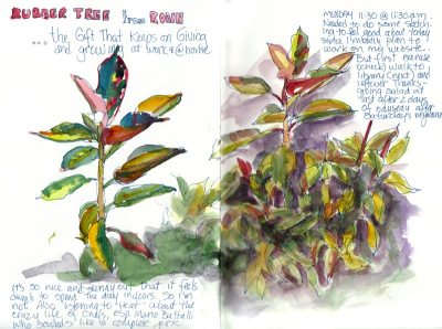
The penstemon in my backyard was a housewarming gift from Barbara and the rubber tree in my side yard came from Robin.

Rubber Tree
Rubber Tree

The azalea in the front yard was a birthday gift from my next door neighbors.

Front yard flowers, ink & watercolor

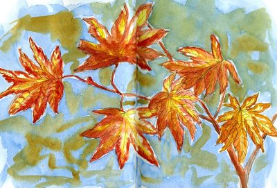
The Japanese maple tree by my front door was a gift from my coworkers in honor of my father’s death nearly 10 years ago.

Japanese Maple leaves, ink & watercolor
Categories
Drawing Flower Art Gardening Ink and watercolor wash Painting Rose

Can’t Resist Those Roses

Irresistable Roses, ink & watercolor

On a day that felt like a marathon of busyness I couldn’t resist pausing this afternoon to sketch roses from my favorite bush which was putting on a glorious show of snazzy blooms.

I like that I can turn my journal sideways and paint across the centerfold to double the size of my “canvas,” but it’s a little sad and distracting having that strong fold line across the middle. I’d thought of painting on a sheet of watercolor paper instead of in my journal but I had the silly idea that there wasn’t time for that and anyway my journal was feeling a little neglected.

I’ve spent the past couple of days catching up on non-art stuff, like cleaning the house from top to bottom, finally dealing with a pile of paper that needed filing or doing, and using the FURminator (best invention ever!) on my two cats, filling an entire empty Kleenex box with fur that would have been shed otherwise. I saved the big ball o’ fur, thinking it might be fun to use in an art project but  haven’t figured out what yet.