
Black Crowned Night Heron I saw at the park today
Continuing from the previous post, here are the rest of December’s Wordles and Pictures and dream sketches.

Continuing from the previous post, here are the rest of December’s Wordles and Pictures and dream sketches.
In October 2022 I returned to journaling my dreams along with normal journaling stuff, and then in December I started illustrating the daily Wordle after I solved the puzzle.
This post is a collection of some of those early sketches. After this, I’ll just post 2-page spreads at a time. Sorry to overload with this one but I wanted to try to get caught up.

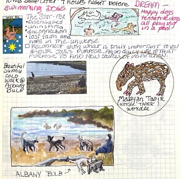
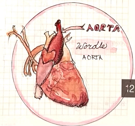
The day I first illustrated a Wordle. It was TAPER but my one rule: I can do whatever I want. So I went with a Malayan TAPIR.

I cropped and blurred out some stuff for privacy but you still get the wild cabbage-baby dream!

When I started my blog, JanasJournal.com in 2006, it was an illustrated daily journal where I shared my world and my creative journeys through many different media. Now I’ve returned to my journaling roots and I’ve found inspiration from a surprising source: the daily Wordle puzzle, which I solve and then illustrate each day.
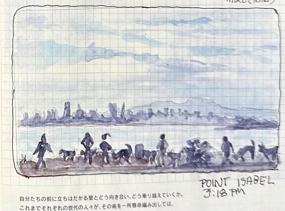
While my journeys may have become more interior thanks to the pandemic, illustrating where my imagination and dreams take me keeps me entertained. But I’m also including sketches from places I go in real life, like Point Isabel above, a huge park along the SF Bay where dogs can run free, roll in the grass, splash in mud puddles and rinse off in the bay.

I’m using a page-a-day Hobonichi “Cousin” journal with weird, very thin, lightly-gridded paper along with fountain pens, drawing pens, watercolors and Tombow markers.
I will share more about the materials as I get the backlog of 3 months of journaling, dreams, Wordles and pictures posted.

When I saw the reference photo of fantastic artist Richard Banks in a Sktchy watercolor class, I wasn’t immediately inspired but decided to give it a try anyway. Maybe because I had nothing invested in the outcome, just in the learning process, I ended up liking the painting for what it is.

My first attempt at drawing him was pretty far off so I didn’t try to correct it, I just started over. I was satisfied with the second attempt above.

Even though his photo was mostly cool colors, I decided to try to use the Zorn Palette and see if I could make it work. The pigments I used were WN Ivory Black, Utrecht Cadmium Red Light, Holbein Yellow Ochre.
I did cheat slightly and did a preliminary very light wash of Winsor Blue/Green Shade over the whole sheet of paper. Typically with the Zorn palette, the black is used as a blue but this Ivory Black seemed way too warm for it to work.


I signed up for a Sktchy Watercolor class to see what I could learn from their teachers. I planned to make myself try the teachers’ different approaches and I did attempt the super loose, wet in wet approach Dritan Duro, the teacher for this class demonstrated, but tossed the crappy results and started over, doing things my way.

Interestingly, the 3-color limited palette I used for this painting was the same as the one I used for my painting of Dorothy, even though the two women look nothing alike. It’s a fun challenge to work with only a 3-color limited palette. (WN Raw Sienna, WN Perm. Alizarin, Winsor Blue Green Shade).
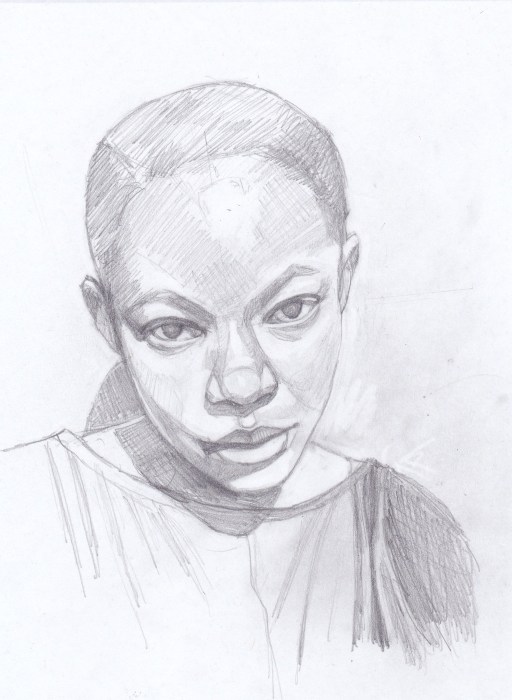
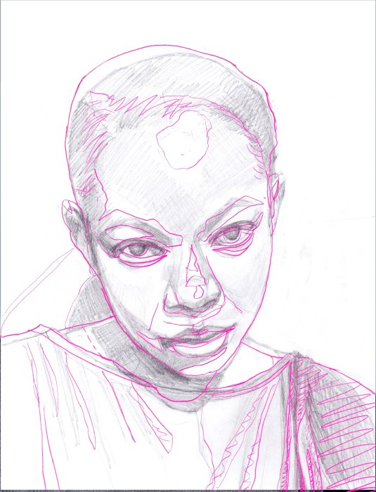
Above is my final sketch and below is my preliminary sketch, scanned into Procreate, with a tracing of the photo over it. I used it to check my drawing and then made the corrections to the final sketch above.
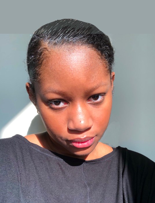

My first thought was, “Dorothy from the Wizard of Oz, all grown up,” and, as the saying goes, “rode hard and put away wet” when I saw the photo (below) on photographer Earthsworld’s Instagram.
My second thought was “I must paint her!” I contacted Earth (his real name) and he gave me permission to paint from and share his photo. Then, while the painting was in progress I came across the cartoon below on Instagram by artist WadeHate.

It was too perfect, another image of Dorothy all grown up. He was kind enough to give me permission to share this artwork.

The original photograph had a background I didn’t want so I experimented in Procreate with different backgrounds. I probably should have just left the background white (below).

The deep orange I chose didn’t please me so I tried washing it off. That left an “interesting” peachy color and a paper surface that was not going to respond well to more paint layers. So, peachy pink is how it shall remain.

When I checked my initial sketch I was delighted to see how close I got on my first try, and how few corrections were needed (above). It’s so nice to see progress, whether it’s in drawing or painting or both. This painting also went really well (except the background).

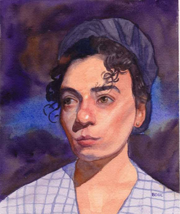
I recently spent a couple weeks working through a Proportions and Rhythms of the Head portrait drawing class created by Bradwynn Jones. I watched him do the demo drawings (mostly while working out on my rower) and then sketched them myself. When I finished all the drawings I transferred them to watercolor paper and started painting them. This is the first one I painted.

I took an immediate dislike to this model. She was pretty but mean-girl looking to me. I decided to experiment with a triad of colors on her that turned out to be equally unpleasant.

Cobalt Violet has very low tinting strength and just sits on top of the paper, so it came right off if I tried to glaze over it. It is both opaque and granulating, causing an unpleasant texture for skin.
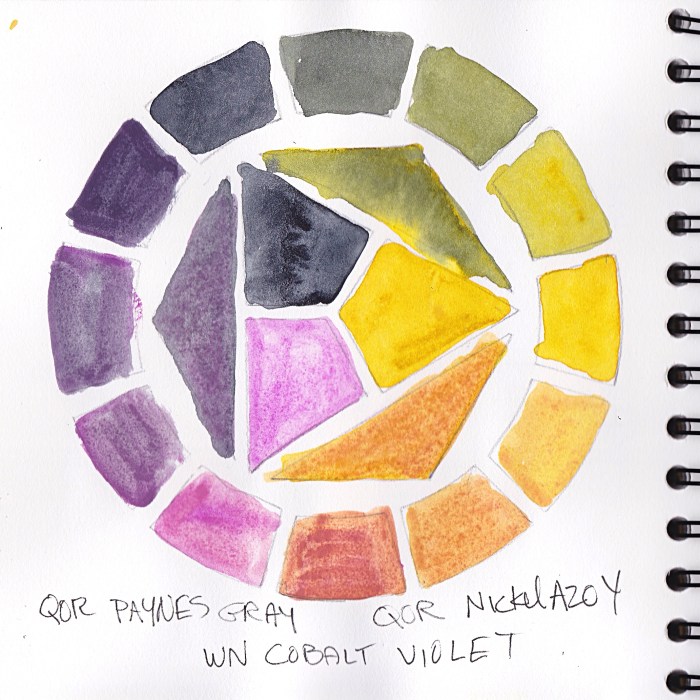
The QOR Nickle Azo Yellow also had low tinting strength and when mixed with the violet made a yucky brownish color for shadows. The QOR Paynes Grey combined with the yellow made a gross greenish-gold of her hair.
I didn’t really care because, like I said, take that, mean girl!
Also, Payne’s Grey; I’ve never understood why people use it. Most brands make it from black and ultramarine blue and sometimes a bit of violet. I guess it’s a convenience color, but one that would be so easy to make, though I prefer not to use black paint in watercolor.
Do you use Payne’s Grey? If you do please tell me why and which brand you like.


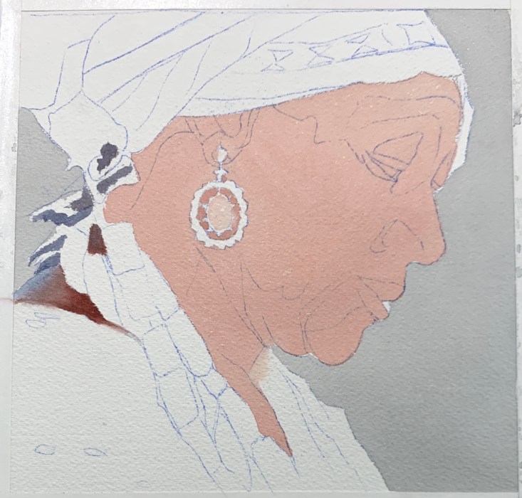
While I drew and painted her I thought of her as one of the Quilters of Gee’s Bend, Alabama, women who were direct descendants of the enslaved people who worked the cotton plantation there. I saw a traveling show of their quilts at a local museum years ago.
I painted this after watching a video of master Korean watercolor artist J Hunsung paint her. He didn’t credit* the photographer or model for this reference photo.
*The source photo was taken by photographer Jan Sochor.
It took three attempts to get the sketch right. I’m learning to take my time and get everything sketched in. And if things don’t quite fit together, fix it, don’t pretend it will be ok as is. Looking at my sketch compared to the reference photo below, I can see I still didn’t get it perfectly, but it felt close enough to go for it.
I was so pleased with these perfect flat washes in my initial block in that I had to share them. In watercolor, getting a flawless flat wash is not easy.

With each watercolor painting, I’m experimenting with a different limited palette and then adding strokes of the colors used at the bottom of the painting. For this one I used Daniel Smith Quinacridone Gold, Winsor Newton Perylene Magenta, Daniel Smith Indanthrone Blue and a guest appearance in the jewelry only of Daniel Smith Perylene Scarlet. (I know it says DS Perylene on the painting but that’s a mistake.)

I’m enjoying using fresh from the tube paint in a little porcelain palette instead of the ancient dried up old palette I had been using.

After watching a Sktchy watercolor demo by Alison Pinto, I tried my hand at drawing (see below) and painting this sweet face. I want to assemble a good palette for watercolor portraits, so tried Alison’s interesting palette (see bottom of post for pigments and reference photos). So far I know I do not like Burnt Sienna in portraits.

I was a little happy with this painting until I realized I’d given her googly eyes and started trying to “fix” the painting, which with watercolor translates to “wreck” the painting. Oh well. This is a scan I made before I started “fixing.”


Pigments: : Winsor Lemon, Indian yellow, Permanent Rose, Holbein Opera, Burnt Sienna, Winsor Violet and Winsor Green Blue Shad
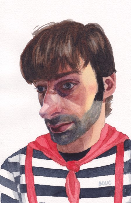
In the reference photo (see bottom of post) he was just a skinny, shirtless guy photographed too close-up, which made his already big nose even bigger. I thought he looked like a French mime so I put him in a mime costume.
Below is my first attempt at painting him. I had so many problems with the drawing being off and the paint handling. His shirt, scarf and suspenders were so pretty and fresh before I muddied them up.

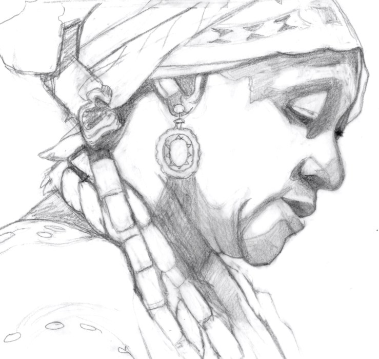
I’m still working on portrait drawing skills. It took four drawings before I had one that was close enough to paint.
Below are the various drawings and attempts at correcting them (tracing of photo superimposed on my drawing in Procreate) and the original reference photos.


