Categories
Berkeley Drawing Ink and watercolor wash Interiors Life in general Painting People Places Sketchbook Pages

Sketching on a Stormy Night at Au Coquelet

Au Coquelet, Ink & watercolor

It was a dark and stormy night when Cathy and I met at Au Coquelet Cafe to sketch while listening to people debate the existence of reality and/or study English in Chinese.

I started by sketching the guy in the middle with black hair and just kept on going, seeing more and more stuff to draw. At one point he walked by our table, saw what we were doing, pulled out his cellphone and took photos of our sketches of him. That was a first! But it seemed a fair trade.

A group of four (perhaps retired professors from the university) seemed to have gathered for the sole purpose of defining reality, or proving it’s existence, or both, punctuated regularly by “huh?” “what did you say?” as one of the gents was hard of hearing (but not hard of “talking” as he blathered on and on).  On our other side were Chinese college students studying English, but mostly in Chinese, with the occasional English phrase thrown in such as “I am a pretty girl” and “I am eating an apple” (which she wasn’t).

Au Coquelet is a perfect place to sketch.  It’s large, open very late, has a couple of rooms,  and counter service only so you don’t have to worry about waiters.  There’s lots of wood, bricks, brick-a-brack and plants, design left over from the hippie days.

I have fond memories of sketching there on another stormy night, New Year’s Eve 1997, when I was supposed to be in Yosemite National Park but had canceled the trip due to rain. And it was good I didn’t go: the next day Yosemite had the worst flooding in 100 years, with roads and bridges so damaged that people were stranded there for weeks without sanitary facilities or food.

So with no plans for the evening, I headed up to the café to draw people who did have plans, partygoers coming in before and after their parties. After a while, a tall, handsome artist sketching at another table came over and joined me. We sketched together and talked, and ended up dating for a few months until I decided that the tales he told were too good to be true.

Categories
Art supplies Bookbinding Drawing Ink and watercolor wash Painting Sketchbook Pages

Testing Paper for Journal Bookbinding + Junk Drawer Still Lifes

Junk Drawer #1, Legion Multi-Media Paper, ink & watercolor
Legion Multi-Media Paper, ink & watercolor

I used random items from my junk drawer as still-life subjects to test paper for binding my next journal.  The paper I’ve chosen is Legion Multimedia Aquarelle 300 gsm (a little thinner than 140 lb). An employee at my local Artists & Craftsman store suggested it when I was unsuccessfully seeking the Fabriano Soft Press 140 lb recommended by Shirley of Paper and Threads.

Legion Test #2
Legion Test #2

Legion Multimedia/Aquarelle

I was delighted to find that the texture of the Multimedia/Aquarelle  paper is perfect for writing on with the finest of pen points (unlike my current journal’s Arches CP paper). It took watercolor washes and multiple layers of glazes beautifully without buckling, pooling, or pilling. Color lifted off easily when rubbed with a damp brush.

The paper is nicely sized to prevent the paper from soaking up the paint, but not so extremely sized as the Arches 90 pound cold press that practically resists the ink.

It has two deckle edges and is relatively inexpensive. The Legion Multimedia/Aquarelle paper cost $2.69 a sheet at my Blick store while the Fabriano Soft Press 140 lb paper was $4.99 a sheet. Unlike the Fabriano, this paper is also available in 90 lb weight which I will try next, but I think that will have to be a special order through Artists & Craftsman since Blick only carries the 300 gsm paper.

Dick Blick’s website says about the Legion Multimedia paper:

“Use any painting and drawing media you choose on this fine quality, crisp white paper! Multimedia/Aquarelle Paper consists of 100% cotton fiber, is acid-free, and has a neutral pH. The paper is 140 lb (300 gsm) weight, and has an uneven textured surface. Available in two different surfaces — Cold Press and Rough. Cold Press is available in sheets and pads, Rough is available in sheets only, and comes in 200 lb (380 gsm) weight.”

I tested the paper for grain direction and it runs the long way, making it possible to tear it down for a journal just the size I like: 5.5″ x 7.5″, with no waste, which is not possible with the Fabriano whose grain runs the short way.

I finally was able to buy a sheet of Fabriano Soft Press (which has a similar surface texture, between hot press and cold press) and tested it too:

Fabriano Soft Press 140 lb: Test #1

Fabriano Soft Press

The Fabriano Soft Press paper had some things in its favor but ultimately the cons outweighed the pros in my mind. It seems like good sturdy paper, and the paint lifted OK without surface damage, but it was slightly less pleasant to write on with a fine-point pen, even though the surfaces of the two papers are very similar.

Since the grain runs the short way (which means the pages will need to fold the short way) you either end up wasting some of the paper or have fewer size options for the book. Also, the paper is thicker and stiffer, which means fewer sheets per book or a thicker, heavier book. And it is more expensive.

But what bothered me the most was the sizing. According to Blick:

“Fabriano papers are synthetically sized both internally and externally so that no animal by-products are used.”

In fact, Fabriano uses an acrylic sizing as opposed to the organic sizing (gelatin) that other companies use. I found that juicy washes on this paper took forever to dry and I assume it has to do with the non-porosity of acrylic sizing.

Fabriano Soft Press Test #2

Despite waiting and waiting and finally using a hair dryer before adding the next layer of glaze, the paint still wasn’t dry and glazes bled into each other.

I also tested the Arches 90 lb Cold Press in my journal (below). Washes, glazing, lifting worked fine, but just isn’t pleasant to use with a fine point pen.

90 lb Arches Cold Press test

I’m looking forward to binding my new book and then giving the Legion Multimedia Aquarelle paper a true test of its journal-goodness and whether it really is the “perfect” watercolor journal bookbinding paper for me.

Categories
Drawing Gardening Ink and watercolor wash Life in general Other Art Blogs I Read Painting Plants Sketchbook Pages

Hydrangeas (and me) in Progress

Hydrangeas in progress, ink & watercolor

We had a sunny day after months of rain, so I took a walk around my garden. I was happy to see the hydrangeas coming back after having been cut down to little woody stalks. The three I’d planted after the comical hydrangea planting fiasco were all sprouting and there was a new one, a volunteer that appeared on its own volition.

And I too feel cut down to my woody stems, stretched thin by all I try to do.

So I’ve been thinking about who I am as an artist, who I want to be, what work brings me the most joy or the most suffering, my artistic strengths and weaknesses, and how I can make the time I spend on art as satisfying as possible.

I’m so grateful for artist friends like Barbara and my sister, who are good listeners and understand the challenge of having so many (too many?) interests and artistic pursuits to follow. Or, as Barbara writes, we’re “Never Bored” (or “Never B-ed” as she spelled it, for reasons she explains in her blog post).

Ultimately my goal is a more balanced life; I know that to stay healthy, along with time for art, I need to make more time for exercise, relaxation and play. (And some of my best art-making has been play; it just doesn’t have to be so darn serious!)

And like my hydrangeas, some good ideas are starting to bud and bloom about how I can nurture my most rewarding art pursuits now, while putting off or letting go of the others until more of my time is my own.

Categories
Art supplies Bookbinding Drawing Ink and watercolor wash Outdoors/Landscape Painting People Pinole Sketchbook Pages Subway drawings

Pinole and Pen, Paper, Ink Tests

Pretty Pinole from Peets, Ink and Watercolor

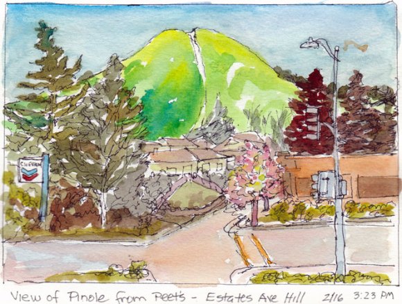
Warm sun, green hills, blossoming trees and a great Peet’s cappuccino to sip at an outdoor table while sketching was made even better by a pen that actually worked in my sketchbook. After struggling to find a pen that would not skip, scratch, smear, show through or bleed on the Arches 90 lb cold press paper I’d bound in my journal, I discovered that my Lamy Safari fountain pen was just right.

Pens

All of the pens I normally use were giving me problems. The Sakura Pigma Micron skipped, scratched over the textured paper when drawing, and was even worse for writing in the journal, whether I used my favorite .01 or a fatter-tipped .05.

Pitt Artist Pen and Sharpie tests

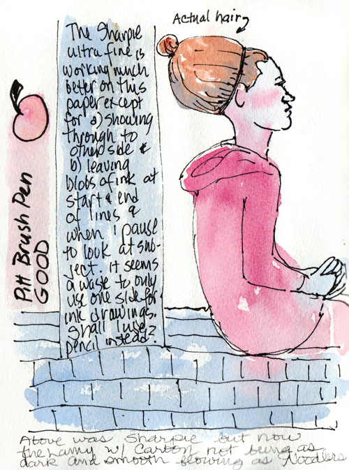
I tried using an Ultra-Fine Point Sharpie since it would at least produce a strong line (above). But I found that the ink flowed too quickly, bleeding and spreading if held in one spot and worse, showed through to the other side.  I also tried the Pitt Artist Brush Pen on this page, which worked OK but was a thicker line than I like for general sketching. The black ink in the finer-point Pitts seemed paler than the Microns, but it might also be that they resist the sizing on the paper more.

Testing Prismacolor .05 Pen

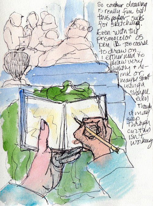
Prismacolor Illustration pens are similar to the Sakura Pigma Micron and Pitt Artist Pens and are very nice and comfortable to hold. But they too performed poorly on the Arches CP. In the sketch above I was trying to do a contour drawing of what I saw on the BART train but my lines were barely visible until I redrew them with a Sharpie.

Testing Noodlers & Carbon Platinum Ink

Then I tested my Lamy Safari F-point fountain pen and was delighted to see that it was a pleasure to write and draw with on the Arches CP paper.

Ink

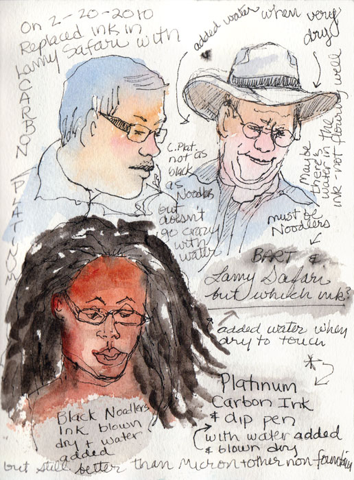
I’d last filled the Safari with Noodlers Black Bulletproof ink, which is supposed to be waterproof but actually bleeds a fair amount when a wash is applied after it’s dry. I used a dip pen to test Platinum Carbon Ink and it held up better, barely bleeding at all.

So I squirted out the remaining Noodlers in my Lamy and refilled it with the Carbon Platinum ink. I’ve been a happy sketcher ever since. The ink is a rich black, doesn’t bleed, is great to write with on this bumpy paper, and is comfy to hold. Yay!

Paper

Now that I’m halfway through my journal it’s time to prepare for binding the next one. I’ve been testing papers and I think I’ve found the one. When I finish my tests I’ll post them. I have a feeling I might have found the perfect paper for ink and watercolor journaling.

Categories
Berkeley Food sketch Ink and watercolor wash Life in general People Sketchbook Pages

Pyramid Alehouse Sketches

Blackened Salmon at Pyrramid Ale House, Ink & Watercolor
Blackened Salmon at Pyramid Ale House, Ink & Watercolor

Pyramid Alehouse in Berkeley is a lively, fun place for good food, good beer and sketching too. My blackened salmon was delicious and a real challenge to wait to draw and paint before eating. After dinner we planned to sketch the brewery area visible from our table. But mid-meal they turned the lights off in the brewery so we went upstairs to check out the view.

Pyrmaid exterior & "Brainstorm" Players, ink washes and watercolor
Combined 2 partial sketches (one exterior, one interior) with a pasted in bit of event calendar

Upstairs there was a crowd of people playing Pyramid’s version of trivial pursuit “Brainstormers Pub Quiz,” with an announcer reading off the challenges that teams try to solve. The teams with the most points win more beer.

I assume there is an honor system that prevents people from getting the answers on their smartphones. I couldn’t play trivial pursuit unless answers like, “You know, it was that guy who was in that movie with that blonde…” would win a prize.

Kitchen from above & Beers on Tap
Kitchen from above & Beers on tap, pasted in stuff

While we were upstairs I (tried to) sketch the chef in his galley kitchen. The perspective was challenging. Then we went downstairs to the bar area. I loved the whimsical handles on the taps, each reflecting some feature of the specific beer. They had 17 beers on tap that night.

I just noticed my color-scheme on these pages: they’re all predominantly beer colored.

Categories
Animals Ink and watercolor wash Life in general Other Art Blogs I Read Painting Sketchbook Pages

Sketching Parakeets at Petco

Parakeets at Petco, ink & watercolor

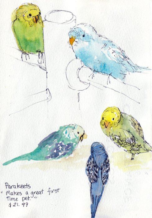
After we finished sketching the laundromat, we moved on to Petco. I can’t wait for longer days so we can do our Tuesday night sketchcrawls outdoors again. But it was fun drawing the parakeets. They were holding pretty still, puffing up and preparing for beds. I worried about them, hoping they have happy lives.

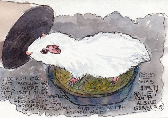
Albino Guinea Pig, ink and watercolor

This little guy was kind of cute in a spooky, red-eyed sort of way, but even on sale I wasn’t tempted. When my sons were young,  I bought an adorable pair of long-haired calico guinea pigs and we had such fun playing with them…for about two weeks. And then there was the years of caring for them….

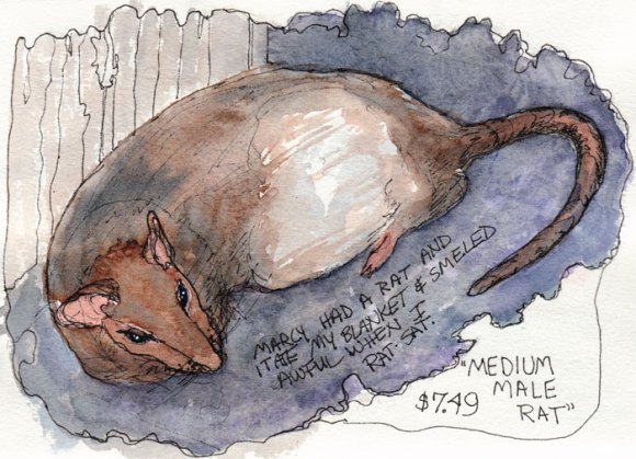
Medium Male Rat, ink & watercolor

He looked way too much like the kind of rodents you do NOT want to see in your house. I’ve seen pet rats that had some charm, but this guy just looked way too big and ratty. My sister had a rat that I babysat when she went on a trip. The rat was in a cage beside my son’s bed and it pulled the wool blanket that was my Grandma’s from the bed into the cage, bit by bit, and chewed off the corners for nesting material.

Then a couple of years ago, when Alison of art blog Scribbles Adagio was creating a multi-media work that included scraps of old blankets, I sent a 12″ square of the blanket to her in Australia. She sent me back one of the finished pieces that now hangs over my bed, a keepsake partly composed of my Grandmother’s blanket.

And I still use that old blanket to keep warm and cozy when I watch TV, even though it’s full of holes, missing corners and a 12″ square.

Categories
Ink and watercolor wash Painting Places Shop windows Sketchbook Pages

Sketching at the Plaza Coin Laundry

Plaza Coin Laundry, Ink & watercolor

Tuesday night sketchcrawl was at  the El Cerrito “Plaza Coin Laundry” (where the machines do not accept coins, just cards and dollar bills!). The sketch above was my last for the evening, done in my car after my sketch buddies had departed. I had struggled mightily with perspective and repeated shapes while we were sketching so it felt good to sit quietly in my car and make one final drawing that worked.

Folding Forever, Ink and watercolor

She was there folding clothes the whole time we sketched while her adult son hung around chatting on his cellphone and not helping.

Making use of a bad sketch
Making use of a badly sketched page

Above is a page where I totally messed up the sketch so instead of just leaving the ugly drawing, I used the page to write notes to myself about how to improve my sketching. Then I painted over it for fun. It’s still messy, but not wasted.

Perspective and pattern

This is what I’d been trying to draw in the previous “bad” sketch. I’d totally messed up the perspective the first time, not believing what I was seeing, but did better on the second try. I also had trouble understanding and drawing the odd shape of the dryer doors on the back wall. Cathy solved that problem by drawing the row of circles first so they were all the same and then adding the trim afterwards instead of starting with the oddly shaped trim like I did.

Categories
Food sketch Ink and watercolor wash Life in general Sketchbook Pages

Parsnip in Purple

Parsnip, ink & watercolor
Ink & watercolor, sketchbook page

I didn’t know what  parsnips tasted like until I was served them at Chez Panisse (though I have a feeling those exquisite thin strips of crispy, sweet, salty delight were the heavenly version of parsnip that would be hard to replicate by a mere mortal like me).

The dish was so good I wanted to try cooking parsnips myself but when I got to the store I had no idea what they looked like. I was searching for something like a turnip or rutabaga). The green grocer showed me the parsnips and told me they were in the carrot family. He also warned me that they stink badly when you first start cooking them but that the smell goes away after about 15 minutes.

My parsnips have been sketched, but they’re still waiting for me to figure out how to cook them, alongside a bunch of beets, the last veges left in the fridge. It’s time to get cooking and then get shopping!

Parsnip recipes welcomed!

And of course I had to look up the etymology of parsnip, rutabaga and turnips.

Parsnip
16c., parsnepe, corruption (by influence of M.E. nepe “turnip”) of M.E. passenep (late 14c.), from O.Fr. pasnaie, from L. pastinaca “parsnip, carrot,” from pastinum “two-pronged fork” (related to pastinare “to dig up the ground”) so called from the shape of the root. The parsnip was considered a kind of turnip.
Rutabaga
1799, from Swed. dial. (W. Götland) rotabagge, from rot “root” + bagge “bag.” Slang meaning “dollar” is from 1940s.
Turnip
1533, turnepe, probably from turn (from its shape, as though turned on a lathe) + M.E. nepe “turnip,” from O.E. næp, from L. napus “turnip.” The modern form of the word emerged late 18c.
Categories
Art theory Berkeley Drawing Ink and watercolor wash Painting Places Sketchbook Pages

Berkeley Firehouse Part II: Cathy’s Sketches

Hazardous Materials Truck Exhaust Hose,
Hazardous Materials Truck Exhaust Hose

When we go on our Tuesday night sketchcrawls I learn so much from seeing how Cathy approaches sketching, with her years of experience and vision as a graphic designer. This sketch is a good example of the way she designs a page, including both the detail and the context, while connecting elements to the edges of the page.

Firefighters' Jacket Rack

Cathy’s sketches often display groups of objects in interesting patterns. She also edits the subject to make a better composition, in this case removing a few jackets to simplify. She first draws a group of objects as one shape as in contour drawing and then adds the interior lines. Again in this sketch above she shows the context as well as the detail, so that it’s not just a rack of jackets and helmets, but with the bit of fire truck you know they’re firemen’s jackets. Notice also her wonderful sketchy and free lines, which she achieves by holding the pen closer to the end than to the point.

Engine No. 2
Engine No. 2

I love the way she got so much detail in the fire truck above but loosely, and with good perspective. Most of her sketches also include informative notes about the subject, placed in a location that adds to the good design. When I asked Cathy how she starts a sketch she said she always tries to start with the thing that interests her most to make sure it fits on the page and that it gets on the page. (It’s so easy to start drawing and run out of page before you ever get to the thing that attracted you first).

Engine No. 2 Side View

More cool details: all the gizmos on the side of the truck.

Gizmo close up
Gizmos close up

When she was sketching this (above), one of the firemen told her that when they are learning their equipment they also sketch all the gear and label it to help them study.

Boots and pants
Boots and pants

Here’s her version of the ready-to-step-into boots and pants.

Cathy sketches with ink in a spiral-bound 4×6″ Strathmore 400 Drawing notebook, focusing on making as many quick sketches as she can. She makes tiny pencil notes over the sketch about color to use when she adds watercolor later in the studio.

All images copyright 2010 by Cathy McAuliffe, used with permission.

She sketches with ink in a 4×6″ Strathmore 400 Drawing Paper pad, focusing on making as many quick sketches as she can. She makes tiny pencil notes over the sketch about color to use when she adds watercolor later in the studio.
Categories
Berkeley Drawing Ink and watercolor wash Painting Sketchbook Pages

Sketching at Berkeley Firehouse, Part I

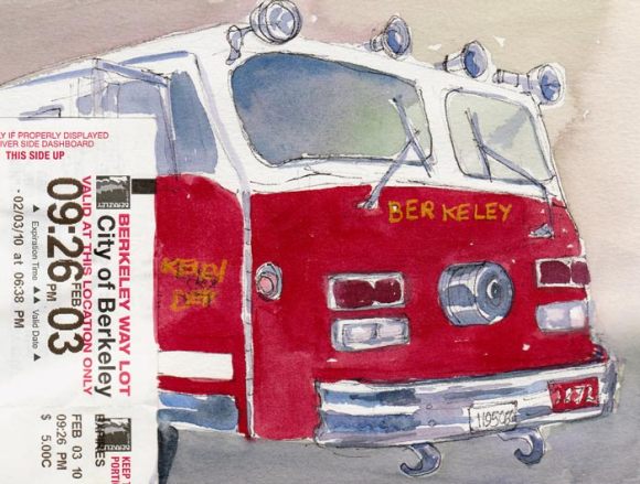
Fire Truck and Parking Receipt, ink & watercolor

The Berkeley Fire Station #2 was the scene of our Tuesday night sketchcrawl two weeks ago. Cathy had requested permission for us to visit and sketch and they generously gave us access to the station, the vehicles and equipment. The firemen live at the firehouse during their long shifts and since it was a quiet night they came around to see what we were doing.  They all told us how much they love their jobs and were extremely helpful, earnestly answering all of our questions.

Fire, Flag, Boots Ready, ink & watercolor
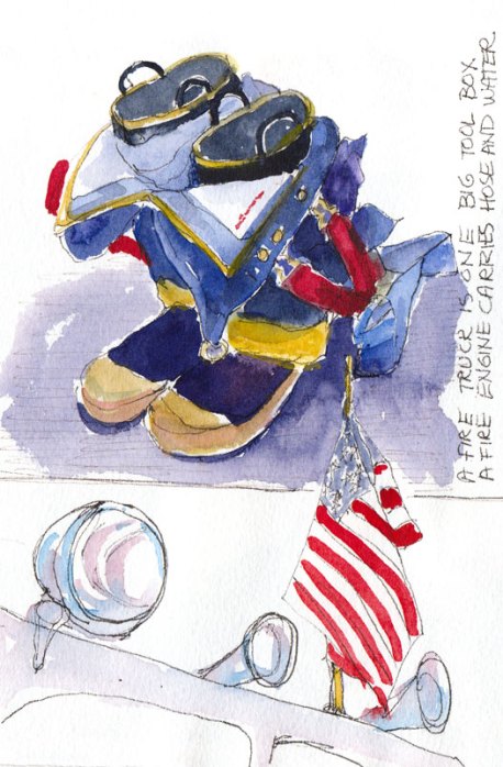
Boots & Overalls Ready; Flag Flying

We loved seeing the boots and overalls, ready to jump into, by the doors of each truck (above). I know the requirements are very stringent for becoming a firefighter, but do they also have to qualify as centerfold models? These guys were simply gorgeous: tall, strong, handsome, and really nice too. (If only they would have posed for us!) Firefighters have one of the highest rates of job satisfaction of all careers.

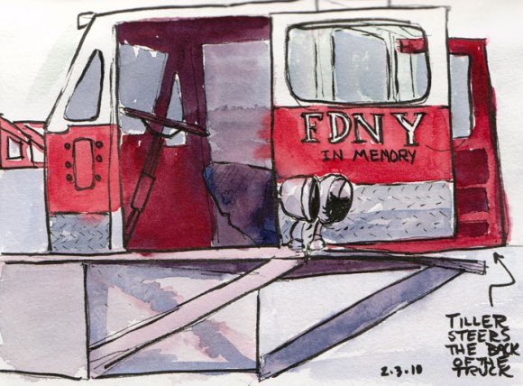
Tiller Truck, ink & watercolor

This little Tiller Truck caboose steers the back of the fire truck while the steering wheel at the front steers the front wheels. We learned that a Fire Truck is “a big tool box” where they keep all their gear such as Jaws of Life and the Fire Engine carries the water and hoses.

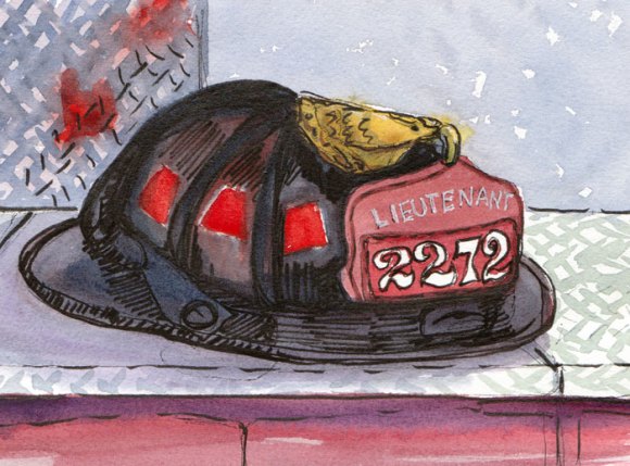
Fire Helmet, ink & watercolor
Lieutenant's Helmet, ink & watercolor

I held off posting these sketches because I’d been really frustrated with the messy, helter-skelter way I laid them out in my sketchbook and the ones not posted that were just ugly (but which I made good use of, writing my notes to self for improvement on top of them). When I looked at Cathy’s sketches I really liked the way she approached the subjects and designed her pages. That set me off on a learning process that I will write about next time when I post her sketches from the evening.