Categories
Art theory Oil Painting Other Art Blogs I Read Painting

Still Learning to See Color: Block Study (after Hensche)

Color study painted under halogen light, 9x12 in
Color study of blocks under halogen light, 9x12 in, oil on panel
Photo of setup (I painted from for blocks, not photo)
I painted from this setup (not from this bad photo)

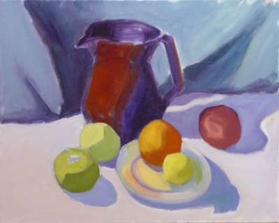
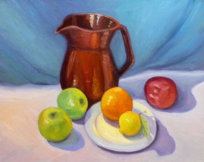
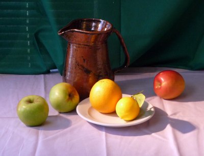
This study was done to practice seeing, mixing and and painting the relationships of color and light on different planes. Theoretically these colored block studies should be done outdoors with natural light, but it was a cold windy day and I wasn’t feeling well (and still don’t—first it was stomach flu and now a cold) and so worked indoors. When I compare this indoor painting to those I did outdoors and posted here, I can see why it’s better to work outdoors.

This practice is based on the work of Henry Hensche. As Professor Sammy Britt says about Hensche on the Hensche Foundation website:

Charles Hawthorne was the first painter…to put the “Impressionist concept of seeing” into a teaching principle. Hawthorne spent the last fifteen years of his life trying to understand what Monet looked for and how he painted.

Henry Hensche, an assistant to Hawthorne, perfected the concept of seeing and teaching color after Hawthorne’s death in 1930. Mr. Hensche taught and practiced this visual language of color from that first Summer in 1930 until his death in 1992.” [emphasis added]

I’ve studied on and off the past year with Camille Przewodek, a fantastic plein air colorist and former student of Hensche and I think I’m beginning to comprehend the concepts at a basic level (although the study above is a poor representation of that). Another painter who studied with Hensche, John Ebersberger, has created a Hensche Facebook group that is open to the public, for former Hensche students and others who are interested in Hensche’s approach to seeing and painting color relationships.  There are wonderful photos posted there of Hensche paintings and paintings by the artists who have carried on his approach to color, and to my mind, have  advanced it even further. Their discussions and critiques on the groups discussion board are also quite illuminating.

Painting colored blocks under different light is one of the techniques Hensche used to teach students to see that in every plane change there is also a hue or color change (not just a tone or value change), and how these colors change according to the light key (foggy grey light, bright sunlight,  early morning light, afternoon light).

This is not an easy approach and takes years of practice and study, best done with an experienced teacher like Camille Przewodek, John Ebersberger, Carole Gray-Weihman, Dale Axelrod (great links and examples on his website), and others at Atelier aux Couleurs Art Academy who offer workshops locally and internationally. I have found one book, Painting the Impressionist Landscape, that does explains the concepts (although I don’t think that author’s paintings provide stellar examples, especially compared to those listed above).

Even if I never learn to see and paint like they do, I’m sure the concepts I am learning will enrich my painting and it has already changed the way I think about light and color and form.

Categories
Gardening Life in general Oil Painting Painting Photos Plants Still Life

Humble Hydrangeas; Antidote to Procrastination

Humble Hydrangeas
Humble Hydrangeas

These humble but persistent hydrangeas were still blooming outside my kitchen window, despite suffering through drought then rain and cold.  Their leaves were few, gray and blotchy and the stems were bent and woody but the flowers just weren’t giving up.

While I worked on the painting I was thinking about humility. I’ve discovered that being humble is a good antidote to procrastination.

When I think that I have to be “good” at something (especially painting), it creates fear that I won’t be. Then I find myself either procrastinating or, if it strikes while I’m painting, reworking a painting again and again because it’s not “perfect” yet.

I’ve found that the best way to step out of that rut of perfectionism is to focus on being honestly humble and not worry about being good, better, best, or perfect. All I have to be is humble little me and like the hydrangeas, just hang in there and shine forth.

About the painting:

I was trying to see and paint light and make good use of color temperature and value contrasts to model the form. I started by doing a monochrome underpainting in acrylic, but didn’t really like the way the acrylic paint kind of ruined the wonderful texture of the ArtBord.  Here are the steps along the way:

1 & 2 are photos of the still life set up, the second in black and white to look at values.

Categories
Oil Painting Painting Sketchbook Pages Still Life

Pile Of Persimmons

Pile of Persimmons, Oil on Gessobord, 8x8"

This was so pleasurable to paint. I experimented with doing an underpainting in acrylic first to put in the darks without having to wait for paint to dry. Then I tried to focus on values and color temperature, but  I think I got sidetracked by all the interesting shapes of light, color, reflections and hazy surfaces  (they were organic persimmons and some of the skin had a kind of filminess like blueberries have).

I’m also working on trying to see and mix just the right color of paint, and apply strokes once (instead of guessing, putting paint down, scraping it off, trying again). Last night when I realized I’d been painting for an hour with dirty brushes and not mixing specific colors but just using random paint left on the palette I dragged myself away from the easel and went to bed, finishing the painting this afternoon.

I’m pretty happy with this one but would like to try again getting closer with color temperature changes and stronger values. Below are the steps I took along the way, including a change in composition. Although I liked the rich dark in the corner, it was drawing too much attention to itself.

If you click on one thumbnail you’ll be taken to a big picture with another thumbnail to click to go to the next.

Categories
Art supplies Art theory Life in general Oil Painting Painting Still Life

Procrastination & Painting Pomegranates

Pomegranate and seeds, oil on Gessobord, 9x12
Pomegranate and seeds, oil painting on Gessobord, 9x12"

I never thought I was a procrastinator but after a week’s vacation meant to be spent painting but rarely getting into the studio until early afternoon at best, I began to look at how I’ve spent my time this week and had trouble figuring out where it had gone.

Then l saw this incredibly creative and well-made four-minute movie on YouTube entitled “Procrastination.” I could see myself in every single scene (except maybe smoking).  If you’ve ever procrastinated getting started on a creative project out of fear of failure, perfectionism, artist’s or writer’s block or any other reason, this video and will make you laugh (or cry).

About the painting:

I discovered Gessobord this week and fell in love with the wonderful surface of these panels. They’re smooth but have a texture that sort of bites into the paint and grabs it, as well as enhancing the colors of the paint. It’s really amazing and is a total pleasure to paint on with oil paints. I wish they were less expensive, but they’re still cheaper than pre-stretched canvas, especially when purchased on sale online.

Instead of trying to do a one or two hour painting and finishing this still life in one chunk, I had to do this one in several short sessions over a period of a few days (because of procrastination and various holiday events and other responsibilities).

I paused and studied the painting, and saw that I needed to improve the composition and values:

Stopping point before analyzing and improving value contrasts
Stopping point to analyze problems

I looked at the painting and the set-up through a piece of red plastic (which elimates the color, emphasizing values) and could see that I needed to darken the background and the inside of the fruit on the left side. I also added the seeds and stains on the cutting board to avoid so much empty space and lead the eye into the painting.

The pomegrantate (already less than fresh when I started) got less attractive and eventually I had to stop and call the painting finished.  I think it will serve as a good stepping stone to the next as I try to put more “miles” on my brushes. And now to stop procrastinating and focus on starting that next painting!

Ooops…when I posted what I thought was the “finished” painting (at bottom) a few minutes ago and then posted this photo of the set-up from day one, I could see that the color of the pom needed to be warmer and the background cooler so I just applied a dark cool glaze to the background and a warm red glaze on some of the pom and posted the finished picture at the top of the post. Now I’m done (I think).

20081130_2566-pomegranate-photo
Photo of set-up on day one
Pomegranate and seeds, oil on Gessobord, 9x12
Thought I was finished but more work needed
Categories
Oil Painting Painting Still Life

Pomegranate on Velvety Scarf

Oil painting on panel, 6x8"

I am not a party girl. I much prefer my time with friends spent one on one. But today I was scheduled to go to two parties. I was supposed to be at a housewarming party in San Francisco anytime from 11-3 and then at my son’s housewarming party in Pinole from 3-6.

One thing after another delayed my departure, including my own procrastination (and ambivalence since I also wanted time to paint). Finally I was showered, dressed, face made up, the gift wrapped and I was ready to leave when my son arrived at the door.

I loaned him the folding table he needed for his housewarming party and gave him some advice about his achey back. Then I packed up all my junk for the party and the hike and sketching I planned to do in Golden Gate Park after I left the first party. (The latter being completely unrealistic time-wise, but I have only the slenderest hold on the reality of time.)

Walking out the door I looked at my watch and realized it was already 2:00. My GPS unit in my car said I would arrive at my destination at 2:30. I figured showing up for half an hour was better than missing it entirely and I took off. The traffic on I-80 slowed to a crawl and my GPS started showing more and more traffic delays. After driving for about 15 minutes and still not reaching the Bay Bridge, the arrival time had changed from 2:30 to 2:56, 4 minutes before the party was to end. I gave up, got off the freeway and went home.

That left me an hour to finish this little painting I started last week. Fortunately the Pomegranate held up for the week and if anything, got a little more character in its lumps and bumps.

But now I’m late getting ready for my son’s party. Fortunately my clothes are ready to put on, and I already gave him a housewarming gift, so I can just get dressed and walk out the door.

Categories
Life in general Oil Painting Painting Still Life

Toilet Paper Roll in Lovely Light

Toilet Roll in oils, 6x8"
Toilet Roll In Lovely Light, oil on board, 6x8"

You know how in movies when someone has a black eye they always say they got it from walking into a door? I could never figure out how that could happen until I did it myself last week during the night and then forgot about it when I woke up.

Yesterday I was trying figure out what a sore red bump on my forehead was—a sort of vertical red line. I thought of all kinds of scary possibilities, going from pimple to blood poisoning to brain tumor. Finally, this morning I remembered that when I was sick last week I was hurrying to the bathroom in the dark and walked right into the open door.

What I hit my forehead on was the narrow side of the door, not the front or back of the door. I’d always pictured people walking into a closed door and it seems like that would make it difficult to bump your face on, since your feet would hit first. But the side of the door was easy; my feet were on either side of it. Fortunately I don’t have a black eye, just a red stripe up my forehead.

About the painting:

With all the nose blowing and drinking vast quantities of fluids while I was sick, this was a sight I saw frequently over the past week.

My bathroom has a large glass block window that shines the most lovely morning light on the less lovely items in the small bathroom. Since it’s such a small room it would be hard to get an easel in there so I took a few photos and worked from them.

Categories
Life in general Oil Painting Painting Still Life

Green Fig (Minus One Bite), Rock Tours, Guardian Angels

Green Fig, Oil on panel, 8x6"
Green Fig, Oil on panel, 8x6

I took one bite out of my last green fig and was treated to an explosion of taste and color so brilliant I had to paint it. I gave myself the length of a Tom Waits live concert podcast to paint it. I finished before the concert did. It’s still playing and is fantastic! It’s one of many of NPR’s “All Songs Considered Live Concerts” that can be listened to directly on their website or downloaded from iTunes.

The back up musicians are incredible (love that sax and drums) and there isn’t a boring or annoying song in the whole 2 hour performance. Of course Tom Waits is not for everyone. He trained his voice when he was young to make it sound like a gravelly-voiced old man and it stuck that way. His songwriting is eerie and strange and some might be offended by his more irreverent themes. “Glitter and Doom” is the name of his 2008 tour and it fits the music perfectly.

2007: The Oil Slick Tour

I’ve always been jealous of how musicians get to name their tours, like Madonna’s “Sticky and Sweet Tour,” (yuck, gross) Elton John’s “Red Piano Tour, ” U-2’s “Vertigo Tour.” I love the idea that for a period of time you name your “tour.” I think I’m going to start having tours instead of years. I could call 2007 the “Oil Slick” tour, as I’ve worked hard this year to learn how to paint in oils, with lots of slipping and sliding along the way.

Now it’s time to plan my tour through 2008, and gather my roadies and back-up singers. Hmmm, what shall I call the tour? I’m thinking maybe the “Anchored Angels Tour” based on some helpful advice from two friends about completely unrelated issues:

Setting Anchor

I’ve been trying to get to bed earlier but my caffeine habit makes it hard to do that. So my friend Ree told me that she never drinks coffee after a certain time in the afternoon. She thinks of that time of day as setting an anchor, putting in to harbor for the day. Then she’s able to get to bed at reasonable time and wake up rested instead of being kept awake by the caffeine into the wee hours and waking up in need of another jolt of java.

Guardian Angels

Another friend said “Don’t fly faster than your Guardian Angel.” I loved that saying since I’m often doing a dozen things at once, trying to get more than is possible done, and can barely keep up with myself.

If I were rich I’d have a full time personal assistant/personal trainer/life coach/personal chef. But since I’m not rich, I have to do all those things for myself, and sometimes I can be quite incorrigible. So maybe if I adoped a Guardian Angel (and not just the wind-up Parking Karma Angel on my dashboard) she could tag along and fill in for that personal trainer/coach/etc. All available Guardian Angels, please apply within.

Categories
Landscape Oil Painting Outdoors/Landscape Painting Photos Plein Air

Lake Anza Autumn Plein Air

Lake Anza Autumn, 9x12, Oil on panel
Lake Anza Autumn, 9x12", Oil on panel

I became the official bathroom monitor today at Lake Anza in Berkeley’s Tilden Park. Swim season is over; there are no lifeguards, entry fees, or snack bar and the lakeside entrance to the restrooms is closed for the season. The overhanging roof by the restroom entrance provided me a nice shady spot to paint but it meant that people kept walking up looking confused (and sometimes a little desperate) when they saw the locked door behind me.

I’d already found an entry to the bathrooms outside the swim area, around the back of the building so about every 15 minutes I told worried people how to find the restroom. I got to help nervous little girls, a group of German tourists, cyclists in shiny shorts, tan teenage girls in tiny bikinis, a hairy man wearing a huge gold necklace and Speedos, a picnicing Mexican family, a group of adults pushing a very ill teenage girl in a wheelchair hooked up to breathing tubes and tanks.

The latter group decided to set themselves up at a picnic table directly in front of me but when they realized they would be blocking my view, they picked up the huge table and moved it. The amazing thing about painting plein air is that people are so nice. Everybody who takes a peek always says something complimentary, even if the painting is total crap. And then they tell you about their [aunt, brother, friend, grandmother, etc.] who paints really good paintings, or how they can’t draw a straight line.

As the day grew warmer more and more people arrived, my original concept for the painting of an empty lifeguard stand on a deserted beach didn’t make much sense. So when this dad and little boy walked by I jumped at the chance to try putting people in a plein air oil painting. I also had an intention to focus on warm/cool color temperature relationships.

I struggled with the water — it kept looking like a meadow. The other painters in my group painted the water in variations of light blue-green and suggested I do the same to solve the problem. But I saw almost no blue in the water. It was gold and green and purple and orange and pink. Then every once in a while a breeze rippled the surface and a bit of sky blue reflection appeared.

After the critique I returned to my easel, painting and repainting the water for two more hours but by then the light had changed so much from when I arrived that I finally called it done and went home.

Here’s the photos of the morning and afternoon views of the same scene.

30 a.m.) photo
Lake Anza (10:30 a.m.) photo
Lake Anza (315 p.m.)
Lake Anza (3:15 p.m.)
Categories
Art theory Drawing Oil Painting Other Art Blogs I Read Painting Photos Sketchbook Pages Still Life

Full Circle: Painting my Pottery Pitcher

Temoku Pitcher & Fruit, Oil on canvas, 16x20"

The pitcher in this painting is one of the few remaining pieces from my years as a potter, though not a favorite.  I’d assumed I’d always be a potter and could always make more so didn’t worry when I sold nearly everything pre-Christmas one year. Then life changed.

I got married, had a baby (who I intended to just strap in a papoose on my back and continuing working at the wheel, up to my elbows in wet mud–Ha!) and we moved to a row house in San Francisco where I could no longer have a kiln. So that was the end of pottery, but the beginning of drawing and painting.

Below you can see the steps I took in making this painting. Although I was working live from my own still life set up, I was also following along with an excellent painting video by Don Sahli. I tried to set up a still life similar to the one he paints in the video but ate  the second orange so substituted a lemon.

[You can see a demo of the Sahli video here.]*

I’d already watched the video and had many “Aha!” moments with it and wanted to practice what I’d learned from it. This weekend I stayed in the studio instead of going out to paint plein air. I played a chapter of the video,  doing that step on my canvas then played the next section. It took Don an hour to do the entire painting but it took me the whole weekend.

Don Sahli is a wonderful teacher and painter who was the last apprentice of Russian painter Sergei Bongart. He breaks painting down to these 4 stages and I photographed those stages (above) as I went along:

  1. Drawing;
  2. Abstract stage (where you do 80% of the work, starting with the darkest dark and then continually ask yourself what color, value, temperature and you paint in one color shape after another);
  3. Modeling (where you finish giving the objects a 3-dimensional appearance, delineating the planes using value, and color temperature.
  4. Final details (adding highlights, caligraphic strokes, dark accents).

After watching the video and doing this exercise, I finally understand so many concepts that I’d read about, been taught, but had still been struggling with, especially the one illustrated below that starts the 3-dimensional appearance of the objects by finding and focusing on the dark/light,  warm/cool color shapes.

*P.S. I have no financial or other interest in Don Sahli’s videos. Just wanted to share a good resource.

Categories
Landscape Oil Painting Outdoors/Landscape Painting

Inspired by El Cerrito Recycling Center

(Not) El Cerrito Recycling Center, oil on panel, 12x9"

Despite the light fixture over my easel getting blinky and unusable and then climbing on a step stool to try to fix it and throwing my back out and then having to clip on a couple of lamps whose bulb color is too pink, I was determined to make an attempt at this painting. I gave myself two hours and got it done.

The painting is inspired by the view of the hills behind the El Cerrito Recyclying Center on a slightly foggy morning last week. I was attracted to the turquoise color I saw in the rocky hills so that was my focus. I deleted parked cars and the Goodwill truck and let the road continue on into the hills instead of ending at a dead end.  I let myself just play around and not try to get it exact.

Now I’m going to take something strong for my back and go to bed. I have lots more painting planned for Sunday and Monday so I’m hoping my back will cooperate after some rest.