Categories
Berkeley Drawing Gardening Ink and watercolor wash Sketchbook Pages

Sketching Berkeley’s Northbrae Neighborhood

Monterey Market Watermelons, ink & watercolor, 6x9"

Cathy and I met at Monterey Market on Hopkins Street in Berkeley’s Northbrae neighborhood for our Monday night sketchcrawl. The scent of ripe fruit was heavenly in their screened fruit patio, but the store was closing so we were soon out on the street.

Cathy sketching
Cathy sketching

I stood behind Cathy while she leaned on a bike rack to sketch the signs on the corner. Then we walked up Hopkins to the Country Cheese and Coffee Market.

Country Cheese, Sepia Micron Pigma, 9x8"

The scents were quite different here: damp cardboard and wafts of the day’s refuse from all the now-closed food sellers on this block including Magnanis Poultry and Monterey Fish Market.  My butt fell asleep from leaning against a large metal box on the sidewalk while I was sketching. I could have sat on the chair but decided to sketch it instead. It felt good to start moving again. We walked around the block looking for inspiration at Berkeley Horticultural Nursery but since they were closed there wasn’t enough to see through the fence.

We headed up Rose Street and through the King Middle School play yard where people were throwing frisbees for their dogs in the sunshine at 8:00 at night. It was really starting to feel like summer.

Alice Waters of Chez Panisse fame, helped start an “edible garden” on the school property and that’s where we did our final sketches, surrounded by beds of vegetables, flowers and fruit.

Edible Garden "campfire", ink & watercolor, 9x12"

We felt like we were at camp, sitting on hale bales arranged in a large circle under an arbor made of rough hewn posts and branches woven together. At the center of the circle, a huge “campfire” of flaming pink and red poppies blazed. I imagined how rewarding it must be for a class of young gardeners to gather there for lessons with their teacher, the beautiful results of their work growing all around them. What a wonderful learning environment!
Categories
Art supplies Drawing Flower Art Ink and watercolor wash Painting Photos photoshop Sketchbook Pages Still Life Watercolor

Hydrangeas: More Testing Fabriano Venezia Sketchbook

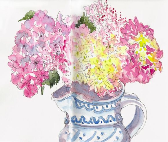
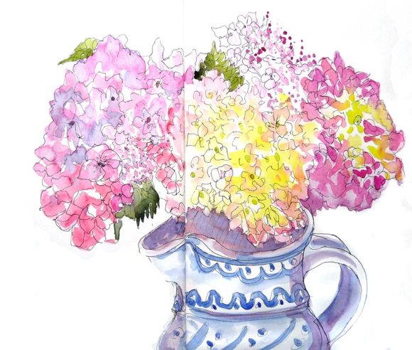
Hydrangeas in Pitcher, 9x11", ink & watercolor

The first hydrangeas of the season provided an opportunity to try out ink and watercolor in the Fabriano Venezzia sketchbook I posted about yesterday. First I drew directly in ink and then tried painting the flower on the right by wetting the paper there, and painting into it.  I didn’t like the results and tried lifting off the paint with a tissue and was pleased and surprised that it came right off, leaving only a slight stain.  Then I painted back into the damp area and got the results I wanted and completed the rest of the painting working very loosely.

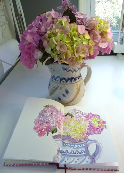
The painting was easy compared to trying to get the image in the sketchbook scanned or photographed for posting. The image above was the result of clamping the edges of the sketchbook to photograph it (see below) and then using Photoshop’s Clone Stamp tool to “erase” the clamps and then using the Levels and Dodge tools to clean up the shadows caused by the paper buckling and some reflections from the light source.

Ready to photograph

I also tried scanning the page in the sketchbook but encountered the same problems I had yesterday with severe blurring plus shadow from the seam. I (want to) like this sketchbook, but preparing the images for posting is really a hassle. Even if I wasn’t working across the spread and just painted on one page I’d still have the problem with the shadow and blurring since it happens on the righthand page.

Scanned version, after touch-up
Scanned version, after major touch-up

Have you had this problem and solved it? I’d be so grateful for suggestions!

Hydrangeas and sketchbook
Categories
Art supplies Drawing People Sketchbook Pages Subway drawings

Dignity, in New Fabriano Sketchbook

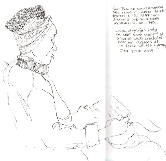
Dignity, ink, 9x10" in Fabriano sketchbook

When I saw this woman reading on BART I had to draw her. She seemed to express the essence of dignity to me. She was carefully dressed and groomed, all in white,  grey and black, with her hair covered in a white crocheted net and that wrapped with a perfectly ironed bandana, tied in a tiny bow in front.

This was my first drawing in my new Fabriano Venezia sketchbook that Roz had tested and praised and that I bought in a couple of sizes from Wet Paint. This is in the 9×6″ size. I left the first page blank to serve as a title page/table of contents later and did this drawing on the next page. I was totally in love with the sketchbook, writing a little rave review on the page of this first sketch about how wonderfully smooth and thick the paper was, and how nicely it worked with the Micron Pigma .01.

I was a little concerned about how much larger and heavier to carry around it is than the Moleskine watercolor notebooks I’ve been using, but thought it would be worth it. BUT when I tried to scan my drawing and the book didn’t quite fit on the scanner, cropping off part of the image, and the middle seam caused half the image to blur and have a dark shadow, no matter what I tried.

Then tonight I tried adding a watered down ink wash to her jacket, which had been black. The paper acted very strangely, not at all like I’d expected. I knew it wasn’t watercolor paper, and thus wasn’t sized, but now I’m now worried how these books will react with watercolor. I guess I’ll find out soon.

Here’s the same image with the ink wash that went all splotchy.

Less Dignity with ink wash

She was so carefully groomed, with everything perfectly ironed and smooth and now she looks much less dignified with her splotchy jacket.  I don’t think the ink wash added anything positive to the drawing, do you? And I don’t think adding more ink to try to make it smoother or darker would be a good thing either.

Categories
Bay Area Parks Drawing Flower Art Ink and watercolor wash Landscape Outdoors/Landscape Painting Places Plants Plein Air Sketchbook Pages

Tilden Botanical Garden Sketches

Pacific May Lilly at Tilden Botanical Garden, ink & watercolor, 4x6"

My plein air group met at Tilden Regional Parks Botanical Garden this cold and foggy morning. Since I wasn’t familiar with the park I explored a bit and then decided to sketch instead of trying to drag my painting gear around the hilly, pebbly paths. Since I only had my large Moleskine and a Micron Pigma .01 pen with me, I added watercolor later at home. The May Lilly above was so sweetly but delicately scented that drawing beside it was like breathing in a dessert.

Bridge & Creek, ink & watercolor, 5x7"

This bridge and creek was the first thing I sketched when I arrived, still arguing with myself about whether to go get my painting cart, whether to go home because it was too cold, whether to go home because I arrived late, how I should have brought my watercolors, how the scene was so complicated and so maybe I should just go home.

But as I drew,  I started noticing interesting details, how dark and light shapes lined up,  where one puzzle piece fit against the next, the design the water was making as it poured over rocks and down the creek, the sound of frogs and birds, and before I knew it that busy, chattering mind had shut off and I was having fun.

Manzanita Tree, Ink & watercolor, 5x16"

As I sketched this spectacular Manzanita, I began noticing how much like strong lean muscles the branches were, with their smooth, polished red surface. Then I found other human attributes: the knotholes looked like eyes while the bends in the branches looked just like elbows. This led me to consider the oneness of all things and I felt very connected to all the nature around me. During our critique at the end of the paint-out, we each take a turn showing our work and talking about our process. When I shared these thoughts someone laughingly asked what I’d eaten for breakfast! I was high on drawing, not Cheerios!

Cat Napping in the Buckwheat, rev2, Ink and watercolor
Cat Napping in the Buckwheat, Ink & watercolor, 4x6"

Walking to our critique, I spotted this garden kittie, having a nice nap in the buckwheat section of the garden and had to stop and sketch it. Nothing bothered this plump pussy who slept amidst the plants, little signs, wood chips and stones near the garden entrance. I added the whiskers with white gel pen.

Categories
Animals Cartoon art Drawing Gouache Illustration Ink and watercolor wash International Fake Journal Month Life in general Other Art Blogs I Read Painting People Sketchbook Pages

Thank You Roz & Boris the Dragonly Critic

Thank You Roz! (Gouache & Ink)

As second place winner in the International Fake Journal Month contest, I won this amazing t-shirt from Roz Stendahl, the inventor of IFJM. I tried to sketch myself sketching myself myself wearing it. I didn’t do the t-shirt (or myself) justice, but I do like the way the bird and I both seem to have the same expression! THANK YOU ROZ! I love it! (My IFJM posts are here and here.)

I’ve been having one of those crises of artistic self-confidence in my drawing the past couple weeks. I’m not sure if the drawing difficulties are real or I’ve just somehow allowed that nasty internal critic out of his cage and back on my shoulder.

Boris the Dragonly Critic, ink & watercolor

I know the cure though: put him back in his cage and do a whole bunch of drawing until he is so bored he falls asleep for a nice long summer nap. And I’ll start by drawing HIM!  Here he is now, safely back in his cage and starting to get very sleepy….

Categories
Art supplies Drawing Ink and watercolor wash Sketchbook Pages

Sketchcrawling at the Pub

Claremont Day Nursery, Dusk; ink & watercolor

Two of my favorite sketchers, Martha and Cathy, joined me for an evening of sketching and dinner at Kensington Circus Pub. The image above was my view out the window just after sunset. Next I sketched a window across the street (below), and then used the page to total my portion of the bill. When I scribbled out a mistake it turned into a creature.

Alchemy, dusk; ink & watercolor

Martha brought her fountain pen collection for us to try out, along with a bottle of Platinum Carbon ink. I was especially interested in her Namiki Falcoln pen, which I’d heard good things about. The two images below were my fooling around with her pens. The Namiki was a little clogged so I switched to using it as a dip pen. It’s a fabulous pen, very flexible and a ton of fun to use, but I found the line to be thicker than I prefer. I was happy to return to my favorite .05 Micron Pigma when I did the first two sketches above.

Ketchup bottle, Namiki Falcoln pen and ink
Ketchup bottle, Namiki Falcoln pen & ink

Cathy gave me a Pilot Varsity pen. It doesn’t have permanent ink so you can use it for ink & wash techniques. I used more ink than was needed to make a good wash so next time I’ll be more restrained when I use it.

Ink bottle, drawn w/Pilot Varsity pen & water wash

We discovered we are all huge fans of the HBO series The Wire which we’re working through on DVD and Cathy shared a few other favorites on DVD that I noted on the page.

I was really tired because I’d been painting all day and then went home afterward and painted until midnight, working on a project I’ll post about soon. But now, back to painting again (with a quick break for watching Adam’s performance on  American Idol).

Categories
Cartoon art Definitions Illustration Ink and watercolor wash Life in general Sketchbook Pages

Word Play: Hubris Meets Hirsute; Labial goes Labile

Hubris, Hirsuit: Excess Pride, Excess Hair, ink & watercolor, 7x6"
Hubris Meets Hirsute, ink & watercolor, 7x6"

Lying on the table, stuck full of needles in a room painted soft peach, with monks softly chanting in the background, my mind wandered to the acupuncturist’s use of the word “labile” in our pre-treatment conversation and the realization that labile and labial were not the same word. While the needles worked (or didn’t) their magic,  I pondered two other odd words I like to ponder: Hirsute and Hubris.

I’d finally looked those two up in the dictionary a few years ago. Hirsute, which  so perfectly sounds like “Hair Suit;” is defined as “excessive hair.” While the definition of Hubris is “excessive pride,” Hubris always makes me picture ancient Egyptian gods and hieroglyphics. Maybe a Horus/Osiris/Hubris connection?

As soon as I got home I grabbed my sketchbook and introduced the two (above). Then I looked up Labile and Labial to see which was the right word when describing fluctuating energy level or emotions.

Labile Labial, ink & watercolor
Labial Goes Labile, ink & watercolor

I was delighted to discover that Labial refers to Lips while Labile refers to Slips! (see the actual definition below).

Definition of Labile

Labile: Unstable, unsteady, not fixed. Labile comes from the Latin labilis, meaning liable to slip.

Definition of Labial

Labial: Pertaining to the lip. A sound requiring the participation of one or both lips is a labial (labium in Latin means lip) sound or, simply, a labial. All labials are consonants.

The word “lip” can be traced back to the Indo-European “leb” which also produced the Latin “labium” from which came the French “levre.” The German “lippe” is just a slip from the English “lip.”

I love words just as much as I love pictures!

Categories
Berkeley Drawing Faces Ink and watercolor wash Life in general Painting People Sketchbook Pages Subway drawings

A Sketchbook Celebration & Definition of Inspiration

First, a quick note that I was interviewed for the fascinating Tools Artists Use website. Although it often ends up sending me shopping, I love to see the tools other people use to make their art. If  you’d like to read the interview about my favorite art supplies and tools, just click here.

OK, so to celebrate the return of the my sketchbook, here are a few sketches from the past couple weeks that are happily no longer lost forever.

Old Sailor Man on BART, ink & watercolor, 6x8"
Old Sailor Man on BART, ink & watercolor, 8x6"

He looked like an old sailor man to me, wishing he was on a boat, not the subway.

While I was waiting for the ear, nose, throat doctor I copied the information from his wall chart and sketched the assortment of stuff on his shelf. I became fascinated with the names of the parts of the mouth and throat (I’m easily amused).

Waiting at the Doctor's Office, 4x6"

Defining Inspiration:

I noted in particular the “Epiglottis” and wondered if the word had anything to do with the word ” Epicurean.” Even more interesting was a depiction of an open throat, described on the chart as “Inspiration” which I supposed means “breathe in.” It made me think about inspiration in art and how, when feeling uninspired we try to force something to come out when perhaps it’s more a matter of simply opening and allowing it to come in, instead.

I had my sketchbooks out to share with my painting group buddies at the end of a nice Friday night dinner together at Jimmy Beans in Berkeley…

Judith at Jimmy Beans, ink & watercolor, 8x6"
Judith at Jimmy Beans, ink & watercolor, 7x6"

so I added one more sketch (above).

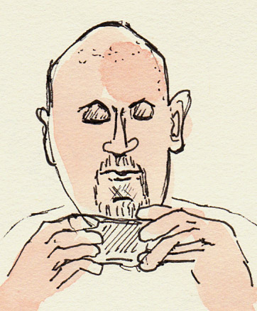
Entranced by his cellphone
Entranced by his cellphone on BART, 3x2"

And one more subway drawing. He was mesmerized by his cellphone but I see now that the sketch looks like he’s playing with his beard or rolling or a joint. (Are they still called joints?) I heard American Idol judge Randy Jackson call a song a joint on the show tonight, so maybe not.

I’m so happy to have my sketchbook back!

Categories
Animals Bay Area Parks Drawing Ink and watercolor wash Life in general Places Sketchbook Pages

Porcupine Found, Sketchbook Lost, Six Flags

Marine World Critters, ink & watercolor in 6x8" sketchbook

Sunday I took Mariah to Six Flags Discovery Kingdom (formerly known as Marine World) for her 10th birthday. After the dolphin show I saw a poster of Quilson the Porcupine and said I hoped we’d get to see him. An exuberant and joyful young lady, Mariah’s enthusiasm paled next to mine when we sat in on animal show and there was Quilson, just as cute as in his picture. It turns out they can’t shoot their quills at enemies (they’re just for display).

Also in the show was an adorable anteater, a cute coatamundi, a jittery chinchilla who shed a pile of fur on her handler, and a desert fox with gigantic ears “used as air conditioners” according to the show’s corny young announcer. He never explained exactly how they work as air conditioners, though. Do they flap them? Do they sweat? Do they just create shade? Who knows?

I was so thrilled to get to see and sketch these critters that I apparently took leave of my senses and unfortunately also my sketchbook. When I next reached for it to sketch the flamingos in another area of the park (“I thought they were extinct” said Mariah), sadly so was my sketchbook. Gone!  We backtracked looking for it, filled out a form at Guest Relations, and then I just tried to focus on having fun with Mariah.

After 7 hours and 6 miles (I was wearing my pedometer) and seeing the crowning event of the day, the Killer Whale Show, we headed for the exit and the Lost and Found office. I told the woman what I’d lost and she asked me to describe the first picture in the sketchbook. I said, “I have no idea what the first picture is but I know what the last one is: a PORCUPINE!” so she handed it over and I literally jumped up and down with glee (looking pretty stupid, and not caring!)

I’ve never lost a sketchbook before and while not disastrous, it was most unpleasant, especially because I use mine not only for drawing, but also to write notes or sketch out ideas for art projects and techniques to try, and information about art events, etc.

I’ll blame it on my sensory overload at Six Flags, with no escape from the speakers placed every 20 feet throughout the park playing  loud rock music interspersed with DJ blather and commercials for Six Flags (?!), the crowds, trying to find our way from one “kingdom” to another, and all the other sights and sounds of a large amusement park. They even have a jumbotron screen at the killer whale show,  which displays the same show you’re watching only gigantic (with more loud music). They actually interrupt the show and play a COMMERCIAL for Six Flags and more commercials play on  large TV screens around the park. Hello Six Flags, we’re already here! Why are you interrupting our fun to tell us about the fun we could be having if we were here?

Categories
Drawing Flower Art Painting Sketchbook Pages Watercolor

Painting Roses in the Hot Dark

White Rose #2, pencil & watercolor 5x5"
White Rose Version #2, pencil & watercolor 5x5"

This morning when I was watering the roses I noticed that the one I sketched yesterday (see below)  had opened and was even prettier today. But it was way too hot to sketch outside so I cut the rose and brought it in. Then it was way too hot in the studio too, even with  all the blinds closed and the lights off.

Trying to ignore the heat, I put the rose in a vase on the drawing table and shined one small light on it, with no light on my sketchbook and tried to really focus on the drawing instead of just approximating the shapes. It’s amazing how focusing on drawing makes the problems and discomforts of the world just drop away. But when the drawing was done, I couldn’t take the heat anymore and dragged the portable air conditioner into the studio. Ahhh relief.

I tried to be more careful with the washes for the shadows than I was yesterday, to keep the white rose white and let the shadows define the form. I’m happy with the way it turned out.

But yesterday, when I drew Rose version #1 below, I really liked my initial pencil drawing. Then I added watercolor on just the rose and liked that too [shoulda stopped]…but then I painted in the background and felt like I lost the definition of the form [shoulda stopped] …

White Rose #1, ink & watercolor 5x5"
White Rose Version #1, ink & watercolor 5x5"

…so then I added some lines with my Micron Pigma which just made it worse. At that point there was nothing I could do but close the sketchbook and look forward to the day when I finally learn the lesson of stopping while I was ahead!