Categories
Life in general Painting Sketchbook Pages Still Life Watercolor

Halloween Candy & Earthquakes

Halloween Candy

Watercolor on Arches Hot Press paper in 5.5 x 7.5″ sketchbook
Larger

Last night was Cody’s birthday party at Hunan Villa in Pinole.  There were 10 of us sitting around the table celebrating, with good food and good company. Halfway through dinner we all noticed the table seemed to be rocking back and forth and so did my chair. Everyone looked at each other trying to make sense of it.  At first we all thought it was someone bumping the table, but the floor seemed to be moving in a strange wavelike manner as well. Suddenly a painting flew off the wall two feet away from us and smashed to the floor, scattering glass everywhere. That’s when we realized it was a fairly good-sized earthquake. Fortunately that was the end of it (for now) and we all went back to celebrating, considerably more alert than before.

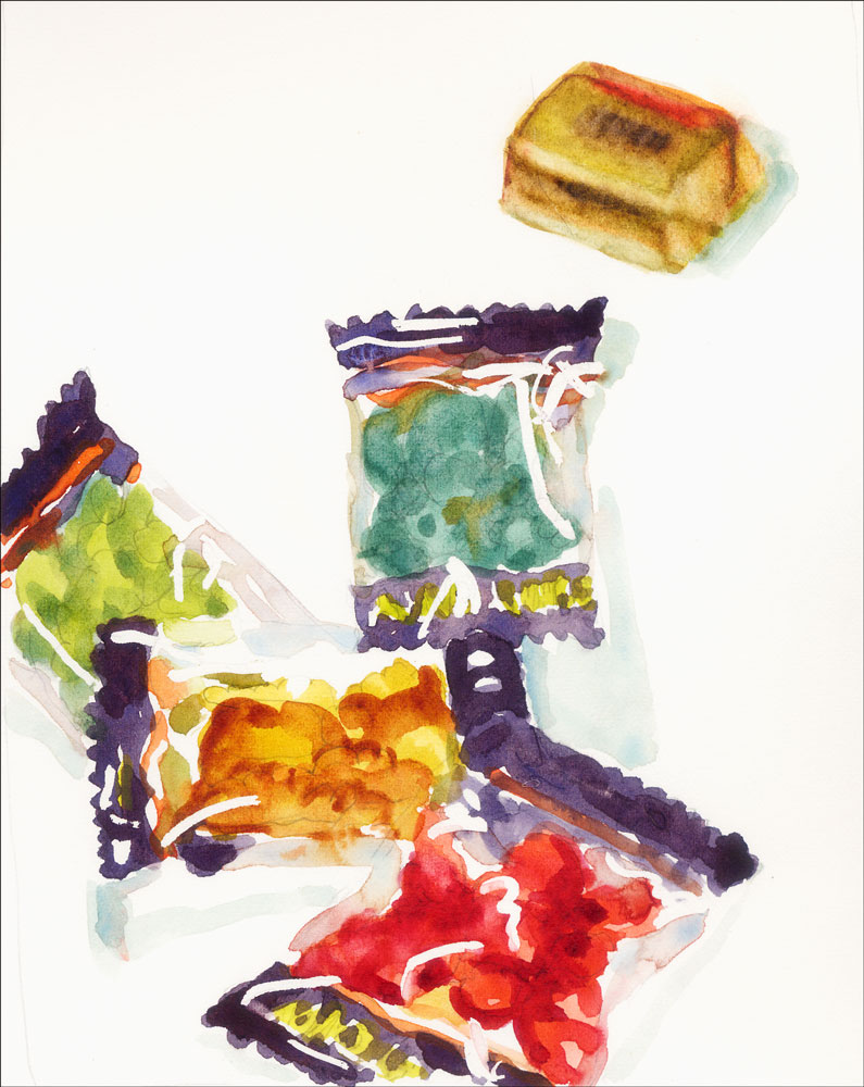
These candies are called “Gruesome Gummy Candy” (and one Hersheys Nugget) — all that was left at 6:00 P.M. at Longs on my way home.  I think they’re supposed to be spiders or tarantulas. I like to wait until the last minute to buy Halloween candy so I don’t eat it all, long before the trick-or-treaters arrive. Sadly only three groups came to my door tonight. In my old neighborhood where I lived on a main street, streams of cute little ones came by all night long, which I relished. Now what to do with all the extra candy? Hmmmm…..

Categories
Gardening Painting Plants Sketchbook Pages Still Life

More Last Tomatoes

The Last Tomatoes in a Bowl

Watercolor on Arches 140 lb hot press paper drawn first in blue Micron Pigma pen, 5.5″ 7.5″
Larger

Yesterday I cleaned up my four tomato plants, removing all the dead leaves and icky, gooshy tomatoes (without screaming once — squooshy, slimey things scare me) and was delighted to discover an abundance of still quite lovely tomatoes, ripe and ready to be picked. I was sure when I painted the last bunch of tomatoes that they were truly the last, but we’ve had some wonderful summer weather all over again and the tomatoes just keep on doing their thing.

I piled them in this old stoneware bowl and stuck them in the fridge. I’ve been working on an oil painting family portrait (more about that tomorrow) and have been neglecting my blog. So I decided to stop working on the oil painting, and loosen up with the tomatoes and some watercolor in my sketchbook.

Now back to the portrait. If I don’t finish it tomorrow I’ll post the work in progress. The painting was inspired by looking through some baby pictures of my son with his father and grandfather that we wanted to bring on a visit to my father-in-law. He’s been very ill and on Thursday night he thoroughly enjoyed seeing the pictures (and us). I was hoping to finish the painting before he died and to share it with him but sadly/blessedly he passed away this morning. If the painting turns out well enough, I’ll bring it to his memorial. In the meantime it’s been a blessing for me to lovingly paint his smiling face, knowing it would not be visible much longer.

Categories
Art theory Oil Painting Painting Still Life

Pear on Blue Plate

Pear in Oil

Oil on canvas panel, 8×6″
Larger

After feeling like I’d taken one big step forward with my painting on Saturday, in Sunday’s painting class I felt like I’d taken two giant steps backwards. I wasn’t inspired by the view of dry, grayish rolling hills and just kept putting paint down, deciding it was all wrong, and scraping it off. I guess I was just tired after painting day and night on Saturday and also there were some new concepts that needed to sink in.

I was determined to do a better job today and wanted to focus on the guidance I received from my teacher on Sunday: avoiding muddy colors by putting strokes down and leaving them, focusing on color temperature and using colorful grays. I painted the pear about three or four times this evening, getting it almost done and then messing it up one way or another, scraping off all the paint, and starting over.

As it got closer to bedtime I got even more determined to put strokes down and leave them. It worked and I’m happy with the results.

Categories
Landscape Oil Painting Other Art Blogs I Read Outdoors/Landscape Painting Plein Air Sketchbook Pages

Lake Merritt Japanese Garden

Lake Merritt Zen Garden

Oil on Masonite Panel, 12×9″
Larger

I’ve been studying oil painting for months, reading piles of books, learning from others, watching endless painting videos (some that are literally “like watching paint dry”), taking a class and practicing every chance I get. Last week it seemed that despite my study and “book learning,” while I had the knowledge of how to paint in oils, I didn’t have the skill to actually do it. Today I think something has clicked and I’m finally starting to get it.

I nearly finished this painting on site with my plein air group this morning at Oakland’s Lake Merritt Botanical Garden. Unfortunately (or fortunately, really), the painting had a little accident on its way home and got smeared. That gave me the perfect excuse to work on it some more.

I’d been having difficulty with painting on the slick surface of the gessoed masonite with the stiff bristle brushes — the paint wouldn’t stick and kept sliding around when I tried to paint another layer on top. Then I got an email message from Nel, raving about a new softer brush she was enjoying: a Raphael Kevrin Mongoose Series 877. I picked one up at Artists and Craftsman in Berkeley and used that to fix and finish the painting. She was right — it’s a fabulous brush!

I had the most trouble painting the water, especially since I omitted the little island/tree in the middle of the pond and moved the big redwood tree all the way to the right. I had to adjust the reflections from what was actually there and I don’t think I quite got it right. Hopefully it looks a little like water and not grass!

Any tips appreciated (I mean advice, not spare change.)

Here’s the photo I used to finish the painting at home, and a couple steps along the way:

Categories
Painting Sketchbook Pages Still Life Watercolor

Last of the Summer Tomatoes

Last of the tomatoes

Watercolor on Arches cold pressed paper in sketchbook, 7×5.5″
Larger

I was so tired tonight after all day meetings at work (and staying up painting very late last night) that all I wanted to do was go to bed as soon as I got home. But my painting group was coming over and I was looking forward to seeing everyone so I tidied up the studio to make room for them to paint after my marathon painting sessions this weekend.

Seeing everyone painting got me energized so I grabbed these tomatoes from my garden, set them up under a light and got to work. I regret the last shadow I put in (between the the two groups of tomatoes). I thought it might help the composition by bridging the two groups, but I think it just added to the confusion of all the competing shapes and colors (which is made worse by the scan–in the original the shadows aren’t so bright).

Categories
Art theory Landscape Oil Painting Outdoors/Landscape Painting

Inspiration Point – Take Two

Oil on Masonite panel, 9″x12″
Larger

This morning on the way to work I started thinking about yesterday’s painting of Inspiration Point and how what I painted didn’t really represent the colors I saw and generally annoyed me.  I started sketching and taking notes about for making another painting of the scene. Also yesterday I talked to technical support at Gamblin Oil Paints about putting together a good limited palette and he gave me some really good suggestions.

So anxious to put my new ideas into action, after work I ran to the art store, picked up a couple colors I didn’t have and set up my palette with the following Gamblin colors: (the ones with asterisks are what Gamblin recommended — the others are my additions)

  • Transparent Earth Red* (used primarily for the drawing and a tonal underpainting using paint thinned with Gamsol which dries in minutes and creates a beautiful glow), Titanium White*, Chromatic Black*;
  • Indian Yellow*, Cad Yellow Light;
  • Quinacridone Red*, Cad Red Light;
  • Ultramarine Blue*, Manganese Blue Hue (a form of Pthalo Blue that looks closer to Cerulean).

I did the sketch/underpainting quickly (a bit too quickly–didn’t quite get the shapes of the hills on the left) and then started in with the rest of the painting. The gessoed masonite is very slick which I kind of like and makes it easy to wipe paint off but also makes it easy to take paint off when you’re trying to paint on top of paint.

I’m happier with this version; pleased that I came closer to what I saw and that I managed to get in a painting after a long day at work.

Categories
Art theory Landscape Oil Painting Other Art Blogs I Read Outdoors/Landscape Painting Photos Plein Air

Inspiration Point, Tilden Park

Inspiration Point, Tilden Park

Larger
Oil on panel, 9×12″

Sunday was my plein air oil painting class in Tilden Park and we met at Inspiration Point in Tilden Park in the Berkeley Hills. On a clear day you can see far into the distance from this site. Unfortunately, when we arrived at 9:00 a.m. the fog was so thick we could barely see halfway across the parking lot. Our teacher, Elio Camacho, had planned to start class by doing a demo — an expansive vista on a large canvas. To try to accomplish something until the fog cleared, he had us set up our easels facing the alleged view and get ready to paint. I enjoyed the idea of randomly picking a spot with no idea what I’d see or paint.

At 10:00, after delicious coffee and treats from Peets Coffee generously brought by a class member, Elio did an amazing small demo of the sun glaring through the fog above some nearby trees. Happily, just as he finished the fog lifted and we got to work.

This time I remembered to take a photo of the scene before I got started so that I could finish the painting at home:
Inspiration Point, Tilden - Photo

Categories
Drawing People Sketchbook Pages

Fishtank Ensemble at Freight & Salvage

Freight & Salvage

Larger
Micron Pigma .005 pen in Moleskine sketchbook

One of my favorite musical groups —The Fishtank Ensemble — was playing at the Freight & Salvage tonight and Michael and I went to hear them. I’ve posted about them before so won’t go into details except to say they’re fabulous! You can hear some of their gypsy jazz/klemer/flamenco tunes on their website. I sketched while we waited for the show to start but was annoyed that I had the wrong pen–the extra extra fine point instead of the .01 I usually use.

Freight and Salvage started out as a Berkeley folk club/coffeehouse 39 years ago, and was originally located in a warehouse with that name. It’s a wonderful place to hear a variety of great music and I’ve had some very memorable nights there. But this night is nearly over and tomorrow is my painting class and I have to leave early in the morning, so…buenas noches, mis amigos.

Categories
Art theory Faces Life in general Painting People Portrait Sketchbook Pages Watercolor

Squinting to See the Light (funny story)

Squinting to see the light

Larger
Watercolor in large Moleskine notebook

Today at work, 10 of us were sitting around the table in the lunchroom eating and chatting. I sat across from our director, facing the picture window and our 27th-story view of Oakland, the San Francisco Bay, Mt. Tamalpais and the huge, cloudy sky. I was thinking about what I learned in my painting class last Sunday about the importance of learning to see color temperatures and value. A good way to do that is to close one eye and squint, which helps to blur the details, so that you can see shapes and values. I decided to practice on a blue house and a large brick building that I could see in the distance. I tried one eye and then the other, curious if it made a difference between my left and right eyes.

Suddenly I realized the conversation had stopped, our director was asking me if I was OK, and everyone was staring at me. I burst out laughing realizing that I was sitting there making weird squinty faces and they were all thinking I had an excruciating headache or had suddenly gone mad. I started trying to explain what I was doing and they looked at me perplexed. They finally realized it was an “art thing” and went back to chatting about work and TV shows and travel.

When I got home tonight, I looked in the mirror to see just how funny I looked and had to do this quickie self-portrait in my sketchbook. Amazingly it actually looks like me!

Categories
Art theory Flower Art Glass Oil Painting Other Art Blogs I Read Painting Still Life

Dahlias after Painting Class

Dahlias in Oil

Larger
Oil paint on gessoed mat board, 12×7.5″

Sunday was my first plein air oil painting workshop with Elio Camacho and it was fabulous! Elio is not only a wonderful painter, but he’s a fantastic teacher — so energetic, enthusiastic and generous in sharing everything he knows (which is a lot!).

Although Elio covered a huge amount of artistic territory in his conversations with us, what really sunk in for me at this session was the importance of temperature (warm vs cool colors) and value (dark vs light) and how to use those relationships to paint the effects of light in the landscape.

To better understand this concept and practice seeing color temperature, he suggested doing a still life of all yellow objects as homework so I painted these dahlias from my garden (after scrubbing all the nasty aphids and ants off them–ick!). Yellow is a good color to practice with because there are many yellow pigments from cool to warm and dark to light and you can successfully lighten it with white, unlike red which turns pastel pink when white is added.

Since I started this journey to learn oil painting, I’ve read many books, watched a dozen oil painting videos, and received wonderful support from my online painting mentor, Nel. There were so many concepts, “rules”, and techniques that I understood intellectually but in class they came to life! Seeing the process demonstrated and being able to ask questions each step of the way was great.

And even better was having Elio checking on me every 15 minutes or so during the three hours I was painting. He demonstrated what he meant when I didn’t understand; he recommended I quit dabbling– put down a stroke and leave it; he showed me how to hold my brush correctly and at what angle, so I was putting paint down without scraping it off at the same time (hold the tip of the brush and keep it at a low angle to the canvas, not perpendicular as I was doing). So many things just clicked.

The painting I did in class isn’t worth posting, though it had some nice moments along the way. Now that I know how to hold my brush properly and understand the importance of the direction of the brush stroke, and am learning to see color temperature and value better, I’m can’t wait to start my next painting!