Categories
Art supplies Drawing Flower Art Gouache Oil Painting Plants Product Review Sketchbook Pages Watercolor

Loads ‘o Lillies and Winsor Newton Cotman watercolor review

"Lily White on White," oil on Gessobord panel, 8x8"
“Lily White on White,” oil on Gessobord panel, 8×8″
(AVAILABLE on DailyPaintworks Auction: CLICK IMAGE to visit auction)

I spent some time sketching and painting a calla lily that sprouted in my garden and while I was at it, tested a palette of Winsor Newton Cotman paints. Several of my friends have this clever, inexpensive Winsor & Newton Cotman Sketchers Palette and I thought it was worth a try so I ordered one.

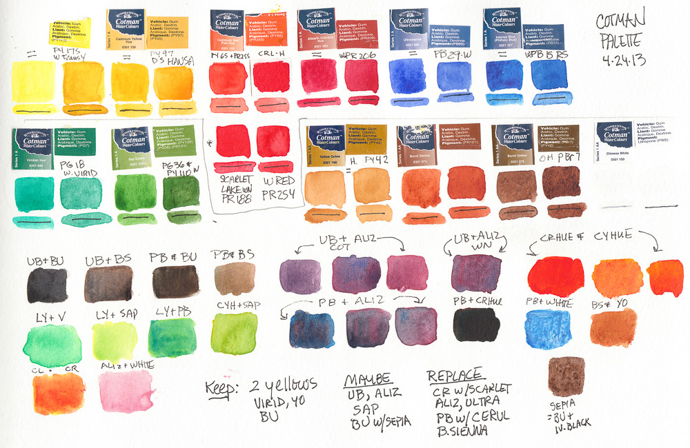
I started by testing the colors, listing the pigments to match them to artists’ quality pigments I normally use (click to see larger with pigment numbers) and making notes about which ones to swap out (at that point assuming I’d continue using the others).

Test of WInsor Newton Cotman pan paints (FAIL)

I was very frustrated with the results I was getting when painting and in the end, took ALL the Cotman pans out of the palette and replaced them with pans filled with artist quality paints from tubes. I put the Cotman pans in a large jar of water to soak so that I could empty and reuse the empty pans. After dumping and refilling the jar many times I ended up with a jar of tinted water with a lot of white sandy junk at the bottom: the nasty fillers and binders added to the pigments to make it cheap.

I know that for the same $17 that this palette AND crappy paint costs, you can only buy one or two tubes of full strength, high quality paint. But I’d rather have only a few colors than use junk. Most of the following sketches lack vibrancy, richness in color, and paint application was difficult and unattractive. Here they are in reverse order of completion:

Lily sketch #6, watercolor, 8x10"
Lily sketch #6, watercolor, 8×10″

I liked the drawing above, but not the grayed colors.

Lily sketch #5, ink & watercolor, 8x10"
Lily sketch #5, ink & watercolor, 8×10″

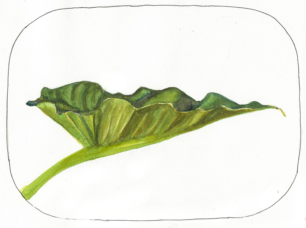
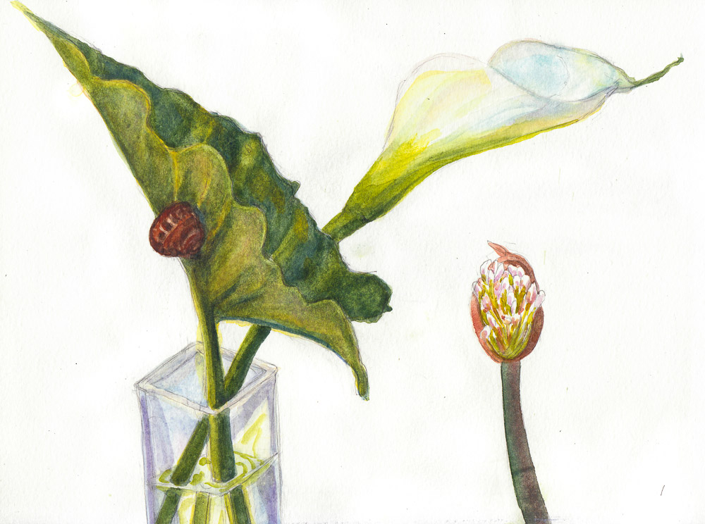
I liked the shape of the leaf above.

Lily sketch #4?, gouache, 8x10"
Lily sketch #4?, gouache, 8×10″

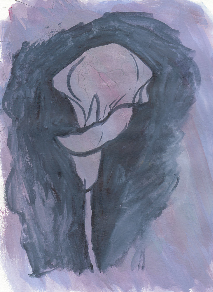
I painted over an awful sketch with gouache (above), just loosely trying to get the shape of the flower.

Lily sketch #3-4, watercolor, 8x10"
Lily sketch #3-4, watercolor, 8×10″

Two previous attempts at the leaf, on 2 other kinds of paper I taped into the 8×10″ Moleskine.

Lily sketch #1 with Snail, watercolor, 8x10"
Lily sketch #1 with Snail, watercolor, 8×10″

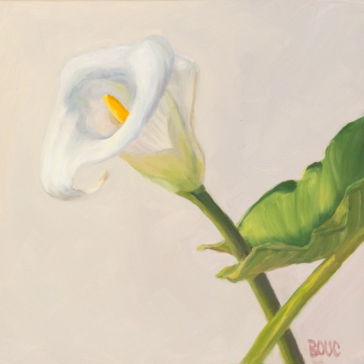
The first sketch. I like the composition but the colors and application were yuck.

I’m still using the Cotman Palette. I think it’s a great for sketching because it’s light,  compact and holds enough colors (12). And at $17 I don’t mind the price, even after throwing away the colors it cane with. It’s handy to have the now-empty, extra half-pans which usually cost about 50 cents each. So really, I got the palette for $11, and 12 empty pans for $6. Not too bad.

Categories
Berkeley Ink and watercolor wash Landscape Outdoors/Landscape Watercolor

Teddy Bear Fountain, Berkeley

Teddy Bear Fountain, Berkeley, ink & watercolor, 8x11"
Teddy Bear Fountain, Berkeley, ink & watercolor, 8×11″

I was excited to sketch Berkeley’s 100-year-old Teddy Bear Fountain again. We found the perfect viewpoint, I sat down on the carved stone bench, pulled out my pen, opened my bag and discovered I’d forgotten my sketchbook! DUH! Fortunately Cristina had a 9×12 watercolor block with her and she let me use it.

When I sketched the fountain before I wasn’t happy with the results so I decided to start with pencil on the complicated scene this time. There was an odd optical illusion; it appeared that the water was only falling behind the fountain so that’s how I painted it. I also intentionally shrunk the width of the base of the fountain.

The sun was setting when I finished drawing so I added paint at home. Please check out Cristina’s comprehensive sketch of the scene and Cathy’s previous sketch that is now featured on Berkeley Library cards. Below is the photo I took before I started drawing.

Teddy Bear Fountain Photo
Categories
Bay Area Parks Ink and watercolor wash Landscape Life in general Plein Air Sketchbook Pages Watercolor

Playing Catch Up!

Egret at Miller-Knox Park, Ink & watercolor 5x8"
Egret at Miller-Knox Park, Ink & watercolor 5×8″

Since my end-of-year wrap-up blog post remains unfinished, here are a couple of autumn sketches that were waiting patiently to be posted. I have a good excuse though: my new iMac arrived last week and since then I’ve been immersed in learning the Mac after over a decade on Windows PCs. I’ve been transferring files, talking to both Moron and Genius-level tech support, and installing and learning Mac versions of my applications.

Miller-Knox Park Autumn, ink & watercolor, 5x8"
Miller-Knox Park Autumn, ink & watercolor, 5×8″

I’m finding the Mac to be quite delightful in many ways and a bit confounding in others. But little by little I’m getting the hang of it… And..Oh Crud! right after I typed that I made some kind of wrong move and instantly I was popped out of the blog and into an endless loop of…

Computer: “Are you sure you want to leave this page?” I click: “Stay on page.” Computer: “Are you sure you want to leave this page?” over and over until I finally give up, say OK and click “Leave this page.” And of course nothing happens. Had to force quit and restart.

But Yay WordPress; it saved the draft! I wish I knew what I did so I don’t do it again. It has happened a bunch of times and I have no clue why.

It’s quite humbling going from being expert on the PC to being such a beginner that I couldn’t even figure out how to turn on the Mac (finally found the power button hidden behind the screen).

Categories
Gardening Landscape Outdoors/Landscape Painting Places Plein Air Pt. Richmond Sketchbook Pages Watercolor

Secret Pt. Richmond “Wave Garden” With Spectacular Views

Pt. Richmond Secret Garden View, Watercolor, 9x12"
Pt. Richmond Secret Garden View, Watercolor, 9×12″

One of our Urban Sketchers, Susan Ford, is a landscape designer who discovered this amazing secret garden in Pt. Richmond that overlooks the bay. The owners of the property,  whose home is just above the garden, recruited concrete artist/sculptor Victor Amador (photos: concrete work) to create winding paths, walls and little nooks with seating areas, all with views of the Bay. They hired Kellee Adams (photos/video about the plantings) to fill it with  colorful, abundant plants. And then the owners opened the property to the public.

I painted the larger watercolor above by working from my on-site sketch (below) as well as from memory and a funky cell phone photo.

Pt. Richmond Park Sketch, watercolor, 5x8"
Pt. Richmond Park Sketch, watercolor, 5×8″

We sketched until sunset, and the evening felt like a truly spiritual experience. It was so peaceful to be surrounded by sky and sea and the sounds of birds, bees, breezes. Although we were only blocks from the freeway I felt like I was far away on a distant island.

Here is a video from a local TV station about the park and its creators when it was first opened in 2008. It doesn’t do justice to the planting which was new then, but is fully grown now.

The Wave Garden is located at the end of Grandview Court in Point Richmond and parking is limited. If you visit, please be quiet and respectful of the neighbors.

Categories
Animals Ink and watercolor wash Painting Sketchbook Pages Watercolor

Lucy: Cat Portrait in Watercolor

Lucy, Watercolor cat portrait on Arches paper, 12x9"
Lucy Painting #2, Watercolor cat portrait on Arches paper, 12×9″

I was asked to make a watercolor portrait of a beloved cat much missed by her family.  This post will be their first chance to see what I’ve come up with so far. I’m not sure I’ve captured her appearance or spirit yet as her family knows her.

(UPDATE 6/12/2012) Yay! They loved the painting and are getting it framed.

They sent two beautiful photos of Lucy in different poses to work from. I had to guess a little since the photos only showed one paw and the bottom half of her ears and I wasn’t sure how accurate the colors were. Below are the studies I made before the painting above.

Categories
Bay Area Parks Landscape Life in general Plein Air Sketchbook Pages Walnut Creek Watercolor

Bad Mood Cloudy Day at Borges Ranch That Ended Well

Borges Ranch Shell Ridge Area, ink & watercolor, 5x8"

My mind was as cloudy as the skies when my plein air group visited Borges Ranch for a Saturday paint out. I was mad because a beautiful bookcase promised to me on Craigslist sold to someone else. I needed it badly. After I donated lots of books along with my rickety old bookcase I still had many I was keeping with no place to put them.

I was too grumpy to hang out with my painting friends so I hiked away from the ranch on the Shell Ridge trail, which is beautiful and quiet except for the sounds of birds. I set up my folding stool and sketched in ink with watercolor washes, facing one direction (above).

Borges Ranch Shell Ridge Open Space, watercolor, 5x8"

Then I turned to face the opposite direction and worked directly in watercolor. I was starting to feel better, enjoying freely painting all the gorgeous colors of spring.

Happy Ending

On the way home from Borges I passed an “Estate Sale” sign and pulled over. Usually estate sales just have a lot of crummy, over-priced furniture, ugly knicknacks, and icky used bathrobes. But this home was huge and completely remodeled, with a master bath better than any spa, a huge dreamy kitchen, and best of all (for me) a home office with TWO bookcases exactly like the ONE I almost bought for $100…and I got them for $20 each! The nice estate sales guy even loaded them in my car for me.

I learned a good lesson: Don’t waste time being grumpy! The second bookcase now holds my cookbooks and gardening books just outside the kitchen which makes them much more accessible than they were before and it looks nice there too.

Categories
Landscape Marin County Outdoors/Landscape Painting Places Sketchbook Pages Watercolor

Painting Pt. Bonita Part I: Watercolor

Point Bonita, watercolor, 7x5" in journal
Point Bonita #1, watercolor, 7x5" in journal

When I got frustrated with painting from life last month, I took a break and experimented in working from the same photo in different media. First I did the sketch above in my journal from the photo below which I took at Point Bonita in the Marin Headlands last year.

Point Bonita photo cropped to 9x12"

I took the photo during a very cold and windy plein air paint out where I did a plein air sketch (posted here) and planned to eventually paint the scene in the studio. As you can see, I did what I call “imaginating” (a combination of imagining and exaggerating the colors I see in a photo or a scene) instead of rendering the photo as is.

Point Bonita, Watercolor, 12x9"
Point Bonita #2, Watercolor, 12x9"

After I did the little journal painting at the top of this post (which I like very much), I tried it again  4 times bigger on a 12×9″ Arches watercolor block (above). It was fun to get back to painting in watercolor on something other than a small journal page. I didn’t use any masking on either of these, just painted around areas I wanted to stay white.

I enjoyed working larger on a watercolor block–I could work at a slant, mix juicy washes, and not have to worry about trying to keep the pages flat and the journal open. I’m falling in love with watercolor painting all over again.

Stay tuned for the oil and oil pastel versions tomorrow.

Categories
Art supplies Drawing Flower Art Ink and watercolor wash Life in general Painting Rose Sketchbook Pages Watercolor

Will You Accept This Rose? (War of the Roses Part II)

Will You Accept This Rose? Yes, Finally. Watercolor, 7x5"

After all the struggles of the previous day, I was determined to succeed in painting a rose and decided to give myself a break. First I rearranged the colors in the palette, putting them in my prefered, mostly color-wheel order instead of helter skelter as they were, and replaced several colors (see below for color chart).

Revised Schmincke Palette chart

(WN=Winsor Newton, S=Schmincke, DS= Daniel Smith, H=Holbein):

Top Row: WN Transparent Yellow, S Cadmium Yellow Light, DS New Gamboge, S Cadmium Red Light, WN Permanent Alizarin, WN Permanent Rose.

Middle Row: WN Violet, S Ultramarine, WN Cobalt Blue, H Cerulean Blue, WN Winsor Blue, DS Indanthrone Blue.

Bottom Row: S Thalo Green, WN Sap Green, S Yellow Ochre, WN Burnt Sienna, DS Indigo, S Titanium White (the latter will probably be removed since I’ve never successfully been able to incorporate white into watercolors).

Second to Last Rose Test, ink & watercolor

The other thing I did to give myself a break was that after I made the second to last rose sketch above from life, I decided to work from a photo of the rose.

Categories
Art supplies Drawing Flower Art Glass Ink and watercolor wash Painting Plein Air Rose Sketchbook Pages Still Life Watercolor

War of the Roses, Part I: Schmincke Watercolor Review

Schmincke Rose Saga #1, ink & watercolor

On the next test run of my new Schmincke palette that Roz introduced here, I painted some roses on a tablecloth in the sun on the deck. While the Schmincke pan paint is lovely to use, and the palette a good size and design, the colors frustrated me. Their version of rose called Permanent Carmine (PV19) is much redder than the Winsor Newton (PV19) Permanent Rose I rely on for pinks and several other colors didn’t appeal to me.

In the color chart below, the top and bottom rows are the original Schmincke colors that came with the set. I added the colors in the center row by filling empty half-pans from tube paint in the space designed for adding extra pans.

Schmincke palette original colors plus added middle row

The colors (abbreviated above) are:

Categories
Art theory Daily Paintworks Challenge Drawing Food sketch Ink and watercolor wash Oil Painting Painting Sketchbook Pages Watercolor

Stacked! (Stacking the Odds in Your Favor)

Stacked, painting of apples and lemon stacked a top each other, oil on Gessobord, 10x8"
"Stacked!" oil on Gessobord, 10x8"

One way to the stack the odds in your favor with most endeavors is to rehearse. So before I attempted the oil painting above, I did a little thumbnail sketch, a full-sized value sketch, and a watercolor sketch (below). I also took photos just in case the paperclips and scotch tape holding it all together failed (but they didn’t–the stack is still standing!)

Stacked, ink & watercolor, 7x5"

I did the watercolor sketch first with the fruit sitting on my drawing table and the grey studio wall as the background. I love ink & watercolor. So immediate and so fun!

Stacked, value study with Prismacolor cool grey markers, 10x8"

Then I set up the fruit stack by my easel and did this value and compositional sketch. I wanted the sketch to be the same size as the painting so I used the Gessobord as a template, tracing around it on the sketching paper. Once I had the drawing the way I wanted it, I used Prismacolor cool grey markers (30%, 50% 80%) to shade the values. It was easy to transfer the full-sized sketch to the Gessobord with a sheet of blue Saral Transfer Paper between the sketch and the board, then drawing over the sketch with a stylus.

I revised the background by hanging a dark gold/green cloth hung behind the still life hiding the gray wall.  Now I’m wondering whether to repaint the leaves. What do you think? Is it better to leave them kind of soft and blurry so they don’t attract too much attention. Did you notice them before I asked the question?

(Painting available here)