Categories
Art supplies Bookbinding Drawing Ink and watercolor wash Painting Sketchbook Pages

Testing Paper for Journal Bookbinding + Junk Drawer Still Lifes

Junk Drawer #1, Legion Multi-Media Paper, ink & watercolor
Legion Multi-Media Paper, ink & watercolor

I used random items from my junk drawer as still-life subjects to test paper for binding my next journal.  The paper I’ve chosen is Legion Multimedia Aquarelle 300 gsm (a little thinner than 140 lb). An employee at my local Artists & Craftsman store suggested it when I was unsuccessfully seeking the Fabriano Soft Press 140 lb recommended by Shirley of Paper and Threads.

Legion Test #2
Legion Test #2

Legion Multimedia/Aquarelle

I was delighted to find that the texture of the Multimedia/Aquarelle  paper is perfect for writing on with the finest of pen points (unlike my current journal’s Arches CP paper). It took watercolor washes and multiple layers of glazes beautifully without buckling, pooling, or pilling. Color lifted off easily when rubbed with a damp brush.

The paper is nicely sized to prevent the paper from soaking up the paint, but not so extremely sized as the Arches 90 pound cold press that practically resists the ink.

It has two deckle edges and is relatively inexpensive. The Legion Multimedia/Aquarelle paper cost $2.69 a sheet at my Blick store while the Fabriano Soft Press 140 lb paper was $4.99 a sheet. Unlike the Fabriano, this paper is also available in 90 lb weight which I will try next, but I think that will have to be a special order through Artists & Craftsman since Blick only carries the 300 gsm paper.

Dick Blick’s website says about the Legion Multimedia paper:

“Use any painting and drawing media you choose on this fine quality, crisp white paper! Multimedia/Aquarelle Paper consists of 100% cotton fiber, is acid-free, and has a neutral pH. The paper is 140 lb (300 gsm) weight, and has an uneven textured surface. Available in two different surfaces — Cold Press and Rough. Cold Press is available in sheets and pads, Rough is available in sheets only, and comes in 200 lb (380 gsm) weight.”

I tested the paper for grain direction and it runs the long way, making it possible to tear it down for a journal just the size I like: 5.5″ x 7.5″, with no waste, which is not possible with the Fabriano whose grain runs the short way.

I finally was able to buy a sheet of Fabriano Soft Press (which has a similar surface texture, between hot press and cold press) and tested it too:

Fabriano Soft Press 140 lb: Test #1

Fabriano Soft Press

The Fabriano Soft Press paper had some things in its favor but ultimately the cons outweighed the pros in my mind. It seems like good sturdy paper, and the paint lifted OK without surface damage, but it was slightly less pleasant to write on with a fine-point pen, even though the surfaces of the two papers are very similar.

Since the grain runs the short way (which means the pages will need to fold the short way) you either end up wasting some of the paper or have fewer size options for the book. Also, the paper is thicker and stiffer, which means fewer sheets per book or a thicker, heavier book. And it is more expensive.

But what bothered me the most was the sizing. According to Blick:

“Fabriano papers are synthetically sized both internally and externally so that no animal by-products are used.”

In fact, Fabriano uses an acrylic sizing as opposed to the organic sizing (gelatin) that other companies use. I found that juicy washes on this paper took forever to dry and I assume it has to do with the non-porosity of acrylic sizing.

Fabriano Soft Press Test #2

Despite waiting and waiting and finally using a hair dryer before adding the next layer of glaze, the paint still wasn’t dry and glazes bled into each other.

I also tested the Arches 90 lb Cold Press in my journal (below). Washes, glazing, lifting worked fine, but just isn’t pleasant to use with a fine point pen.

90 lb Arches Cold Press test

I’m looking forward to binding my new book and then giving the Legion Multimedia Aquarelle paper a true test of its journal-goodness and whether it really is the “perfect” watercolor journal bookbinding paper for me.

Categories
Drawing Gardening Ink and watercolor wash Life in general Other Art Blogs I Read Painting Plants Sketchbook Pages

Hydrangeas (and me) in Progress

Hydrangeas in progress, ink & watercolor

We had a sunny day after months of rain, so I took a walk around my garden. I was happy to see the hydrangeas coming back after having been cut down to little woody stalks. The three I’d planted after the comical hydrangea planting fiasco were all sprouting and there was a new one, a volunteer that appeared on its own volition.

And I too feel cut down to my woody stems, stretched thin by all I try to do.

So I’ve been thinking about who I am as an artist, who I want to be, what work brings me the most joy or the most suffering, my artistic strengths and weaknesses, and how I can make the time I spend on art as satisfying as possible.

I’m so grateful for artist friends like Barbara and my sister, who are good listeners and understand the challenge of having so many (too many?) interests and artistic pursuits to follow. Or, as Barbara writes, we’re “Never Bored” (or “Never B-ed” as she spelled it, for reasons she explains in her blog post).

Ultimately my goal is a more balanced life; I know that to stay healthy, along with time for art, I need to make more time for exercise, relaxation and play. (And some of my best art-making has been play; it just doesn’t have to be so darn serious!)

And like my hydrangeas, some good ideas are starting to bud and bloom about how I can nurture my most rewarding art pursuits now, while putting off or letting go of the others until more of my time is my own.

Categories
Art supplies Bookbinding Drawing Ink and watercolor wash Outdoors/Landscape Painting People Pinole Sketchbook Pages Subway drawings

Pinole and Pen, Paper, Ink Tests

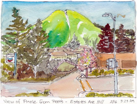
Pretty Pinole from Peets, Ink and Watercolor

Warm sun, green hills, blossoming trees and a great Peet’s cappuccino to sip at an outdoor table while sketching was made even better by a pen that actually worked in my sketchbook. After struggling to find a pen that would not skip, scratch, smear, show through or bleed on the Arches 90 lb cold press paper I’d bound in my journal, I discovered that my Lamy Safari fountain pen was just right.

Pens

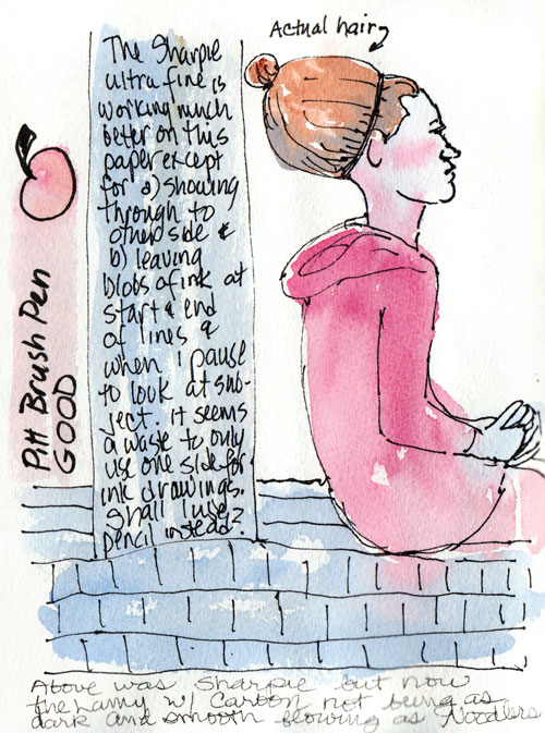
All of the pens I normally use were giving me problems. The Sakura Pigma Micron skipped, scratched over the textured paper when drawing, and was even worse for writing in the journal, whether I used my favorite .01 or a fatter-tipped .05.

Pitt Artist Pen and Sharpie tests

I tried using an Ultra-Fine Point Sharpie since it would at least produce a strong line (above). But I found that the ink flowed too quickly, bleeding and spreading if held in one spot and worse, showed through to the other side.  I also tried the Pitt Artist Brush Pen on this page, which worked OK but was a thicker line than I like for general sketching. The black ink in the finer-point Pitts seemed paler than the Microns, but it might also be that they resist the sizing on the paper more.

Testing Prismacolor .05 Pen

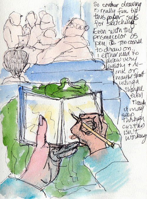
Prismacolor Illustration pens are similar to the Sakura Pigma Micron and Pitt Artist Pens and are very nice and comfortable to hold. But they too performed poorly on the Arches CP. In the sketch above I was trying to do a contour drawing of what I saw on the BART train but my lines were barely visible until I redrew them with a Sharpie.

Testing Noodlers & Carbon Platinum Ink

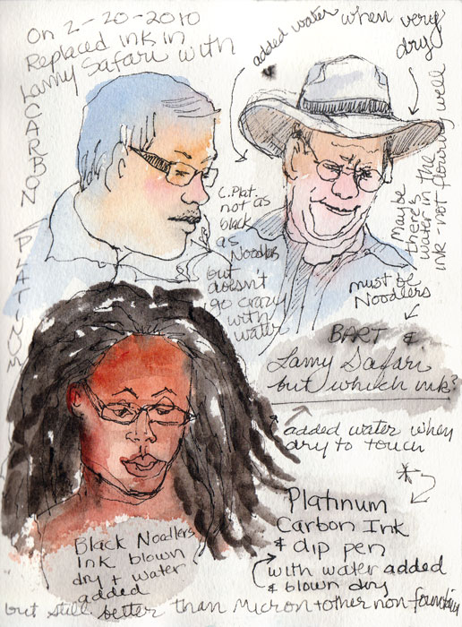
Then I tested my Lamy Safari F-point fountain pen and was delighted to see that it was a pleasure to write and draw with on the Arches CP paper.

Ink

I’d last filled the Safari with Noodlers Black Bulletproof ink, which is supposed to be waterproof but actually bleeds a fair amount when a wash is applied after it’s dry. I used a dip pen to test Platinum Carbon Ink and it held up better, barely bleeding at all.

So I squirted out the remaining Noodlers in my Lamy and refilled it with the Carbon Platinum ink. I’ve been a happy sketcher ever since. The ink is a rich black, doesn’t bleed, is great to write with on this bumpy paper, and is comfy to hold. Yay!

Paper

Now that I’m halfway through my journal it’s time to prepare for binding the next one. I’ve been testing papers and I think I’ve found the one. When I finish my tests I’ll post them. I have a feeling I might have found the perfect paper for ink and watercolor journaling.

Categories
Art theory Berkeley Drawing Ink and watercolor wash Painting Places Sketchbook Pages

Berkeley Firehouse Part II: Cathy’s Sketches

Hazardous Materials Truck Exhaust Hose,
Hazardous Materials Truck Exhaust Hose

When we go on our Tuesday night sketchcrawls I learn so much from seeing how Cathy approaches sketching, with her years of experience and vision as a graphic designer. This sketch is a good example of the way she designs a page, including both the detail and the context, while connecting elements to the edges of the page.

Firefighters' Jacket Rack

Cathy’s sketches often display groups of objects in interesting patterns. She also edits the subject to make a better composition, in this case removing a few jackets to simplify. She first draws a group of objects as one shape as in contour drawing and then adds the interior lines. Again in this sketch above she shows the context as well as the detail, so that it’s not just a rack of jackets and helmets, but with the bit of fire truck you know they’re firemen’s jackets. Notice also her wonderful sketchy and free lines, which she achieves by holding the pen closer to the end than to the point.

Engine No. 2
Engine No. 2

I love the way she got so much detail in the fire truck above but loosely, and with good perspective. Most of her sketches also include informative notes about the subject, placed in a location that adds to the good design. When I asked Cathy how she starts a sketch she said she always tries to start with the thing that interests her most to make sure it fits on the page and that it gets on the page. (It’s so easy to start drawing and run out of page before you ever get to the thing that attracted you first).

Engine No. 2 Side View

More cool details: all the gizmos on the side of the truck.

Gizmo close up
Gizmos close up

When she was sketching this (above), one of the firemen told her that when they are learning their equipment they also sketch all the gear and label it to help them study.

Boots and pants
Boots and pants

Here’s her version of the ready-to-step-into boots and pants.

Cathy sketches with ink in a spiral-bound 4×6″ Strathmore 400 Drawing notebook, focusing on making as many quick sketches as she can. She makes tiny pencil notes over the sketch about color to use when she adds watercolor later in the studio.

All images copyright 2010 by Cathy McAuliffe, used with permission.

She sketches with ink in a 4×6″ Strathmore 400 Drawing Paper pad, focusing on making as many quick sketches as she can. She makes tiny pencil notes over the sketch about color to use when she adds watercolor later in the studio.
Categories
Berkeley Drawing Ink and watercolor wash Painting Sketchbook Pages

Sketching at Berkeley Firehouse, Part I

Fire Truck and Parking Receipt, ink & watercolor

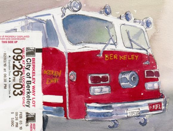
The Berkeley Fire Station #2 was the scene of our Tuesday night sketchcrawl two weeks ago. Cathy had requested permission for us to visit and sketch and they generously gave us access to the station, the vehicles and equipment. The firemen live at the firehouse during their long shifts and since it was a quiet night they came around to see what we were doing.  They all told us how much they love their jobs and were extremely helpful, earnestly answering all of our questions.

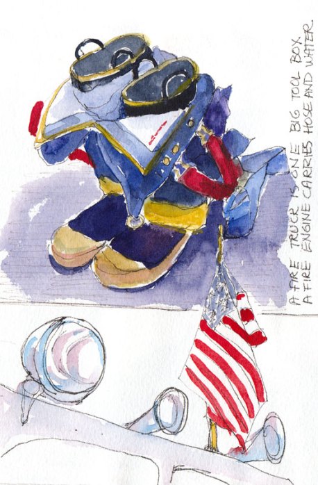
Fire, Flag, Boots Ready, ink & watercolor
Boots & Overalls Ready; Flag Flying

We loved seeing the boots and overalls, ready to jump into, by the doors of each truck (above). I know the requirements are very stringent for becoming a firefighter, but do they also have to qualify as centerfold models? These guys were simply gorgeous: tall, strong, handsome, and really nice too. (If only they would have posed for us!) Firefighters have one of the highest rates of job satisfaction of all careers.

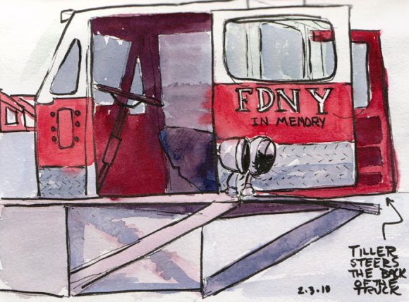
Tiller Truck, ink & watercolor

This little Tiller Truck caboose steers the back of the fire truck while the steering wheel at the front steers the front wheels. We learned that a Fire Truck is “a big tool box” where they keep all their gear such as Jaws of Life and the Fire Engine carries the water and hoses.

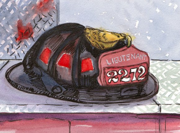
Fire Helmet, ink & watercolor
Lieutenant's Helmet, ink & watercolor

I held off posting these sketches because I’d been really frustrated with the messy, helter-skelter way I laid them out in my sketchbook and the ones not posted that were just ugly (but which I made good use of, writing my notes to self for improvement on top of them). When I looked at Cathy’s sketches I really liked the way she approached the subjects and designed her pages. That set me off on a learning process that I will write about next time when I post her sketches from the evening.

Categories
Animals Drawing Gouache Painting Sketchbook Pages

Crow Planet

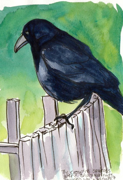
Crow on the fence, ink & gouache

Ever since I saw a crow repeatedly drop a walnut onto the street from its perch on a wire above, fly down to check it, pick it up and drop it again, I wanted to learn more about them. So I’m reading Crow Planet: Essential Wisdom from the Urban Wilderness, a sort of “how to” for amateur naturalists who want to explore nature where it lies (or flies) without having to journey out to Nature with a capital “N.” I learned that crows drop nuts on the road, hoping a car will drive over it and crack it open.

The crow in the sketch above had been hanging out with some crows and a few squirrels on a neighbor’s front porch. This odd group was bickering over who got the peanuts and who got the walnuts that my nutty (pun intended) neighbor lady puts out daily (hourly?). When I showed up he took this  more watchful stance.

I used to dislike crows because  they seemed to overwhelm the landscape when they showed up and their noisy caws drowned out the softer, sweeter sounds of smaller birds. But I’ve learned to appreciate these fascinating birds.

Crows mate for life, have strong communities who help care for the young and sick members, and are quite smart. They play games with each other, can recognize individual human faces, can reason and use tools as this video demonstrates:

Crows are helpful too, since as omnivores, along with plants, they eat insects considered as pests by gardeners, and enjoy fresh roadkill, thus tidying up the neighborhood. They are well-suited to our increasingly urban, concrete jungle, which is why their population has increased. It is estimated that in the U. S. there are as many crows as households—about one crow per family.

If you want more information about crows, there is a good Crow FAQ here by a Cornell University professor who also seems to find them endearing, despite their usually undeserved bad reputations.

Categories
Drawing Ink and watercolor wash People Portrait Self Portrait Sketchbook Pages Subway drawings

Last Pages of the Old Sketchbook

Last page self portrait. Ink & watercolor
Last page self portrait. Ink & watercolor, drawn from life

In Louise Stanley‘s “Rules for Keeping a Sketchbook,” her rule number two  is “Start on the third page to get your courage up.” Number three is “Go back to the first page and do a self-portrait when you’ve got the nerve.” At her exhibit it was great seeing some of her (often comical) self-portraits from journals spanning decades.

For my own journals, I preferred the idea of making the last page a self-portrait instead. That way it still creates  a record of the YOU that put all that stuff in the journal, but it’s not there staring back at you every time you open the book. So this is my self-portrait on the last page of the Fabriano Venezia sketchbook.

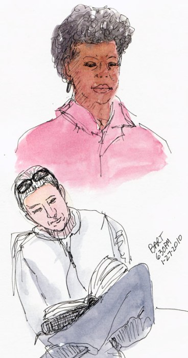
BART Riders, ink and watercolor

And this is the second to last page. Just a couple of subway riders with a bit of watercolor added later. I’m about a quarter of the way into the new journal I bound myself and am really loving it. My next posts will be from that journal.

And now it’s Friday night and what has felt like a very long, exhausting work week is finally over and I get to transition back to my art life. But that will be tomorrow. Tonight I’m just interested in a good night’s sleep.

Categories
Drawing Life in general Sketchbook Pages

Fixed It!

Fixed It! Ink drawing in sketchbook

I was actually on time for once, but couldn’t remember how to get where I was going so I plugged my GPS into one of the outlets in my car. When I pulled it back out to move it to another outlet, the charger thingee seemed to explode, flying to pieces.

Using my key chain flashlight I found something that looked like a fuse, and a spidery silvery thing that seemed to fit atop the cylinder but everything else was missing. I searched the floor and the seats but it was dark, getting late and I had to go.

I quickly checked the GPS to see the route from  Highway 80 to 580 to 24 to the Claremont Exit. Then I turned it off, saving the last bit of battery for it to guide me on the final confusing steps around the one-way streets that would take me to my destination, where I arrived, late as usual.

Buying a new charger unit would be expensive because it has a built-in traffic receiver. So the next day I searched my car again and found two missing pieces in one of the many storage compartments, and another two pieces hiding on the floor (easier to see in the daylight).

Amazingly, for spatially-challenged me, I figured out how to put it all back together. And even more amazing: it still works!

So of course I had to celebrate in my sketchbook.

Categories
Animals Drawing Gouache Painting Photos Sketchbook Pages

I Otter Go to the Zoo

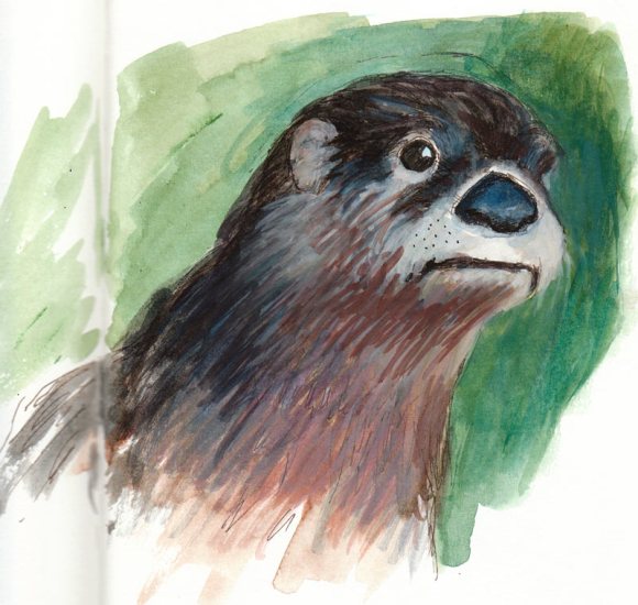
Otter, Gouache and Ink
Optimistic Otter, Gouache and Ink

…but my son Robin did instead. And he took wonderful, soulful photos that he shared with me. So of course I had to sketch them, starting with this otter whose expression really struck me. It came out a little different in each sketch.

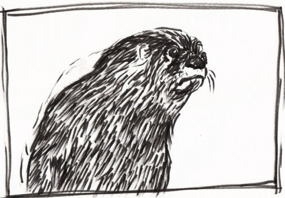
Otter, drawn with icky Pigma Brush Pen
Worried Otter, drawn with icky Pigma Brush Pen

I finally threw away the Pigma Brush Pen I used for this sketch. The point seemed to fray on first use and only got worse. The Pitt Artist Brush Pens seem to hold up better.

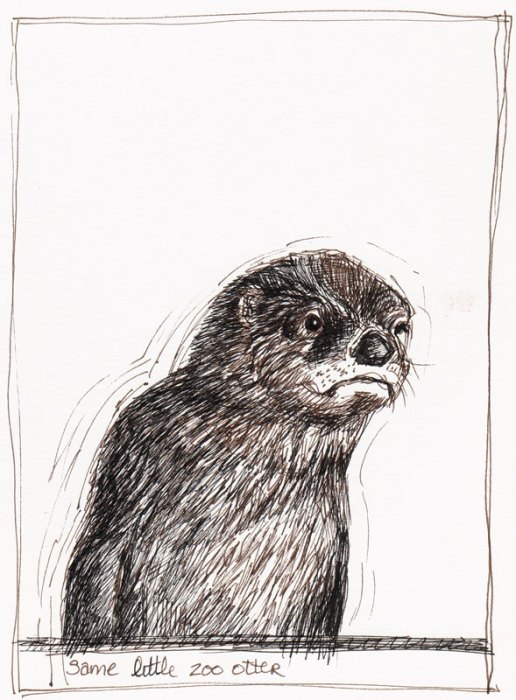
Otter, Sepia & Black Pitt Artist Pens
Perplexed Otter, Sepia & Black Pitt Artist Pens

I think this one is my favorite either because of his expression (why am I assuming it’s a boy?) or because the drawing reminds me of a series of children’s books I used to read to my sons when they were little, about a little badger named Francis.

And here is Robin’s original photo:

Otter, photo by Robin Bouc

I wonder what this cute little guy was thinking. Doesn’t this just call for a caption? What would it be?

Categories
Drawing Food sketch Ink and watercolor wash Painting Sketchbook Pages Watercolor

Catching up with Carrots

Carrot, ink & watercolor

Did you know that organic carrots with the greens still attached are sweeter than the big chunky ones in the grocery store without tops or the little shaved ones known as baby carrots? They’re also more fun to draw. Except for the feathery greens which confused me when I tried to draw them.

Carrots in cellophane, ink & watercolor

And they’re even more challenging to draw when wrapped in a cellophane bag (above).

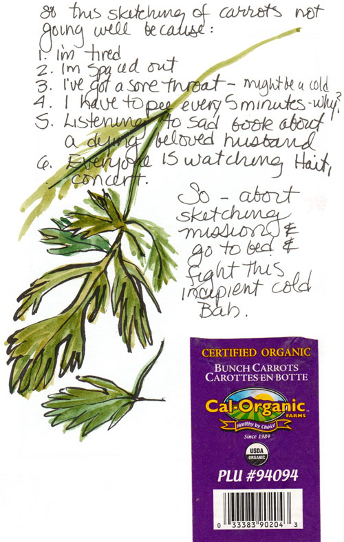
Carrot greens and label

And they felt even harder because I was feeling tired, spaced out, catching a cold, and needing to go to bed. So despite really wanting to figure out how to capture the feathery greens in ink and wash, I gave up, glued the label in the book instead, and went to bed.

I’ve been sketching the several days, but have been too tired and/or too busy with or from my day job to post so now I have a bunch of catching up to do, starting with carrots.