Categories
Bay Area Parks Berkeley Drawing Ink and watercolor wash Painting Places Sketchbook Pages

Funky Tilden Carousel Sketches

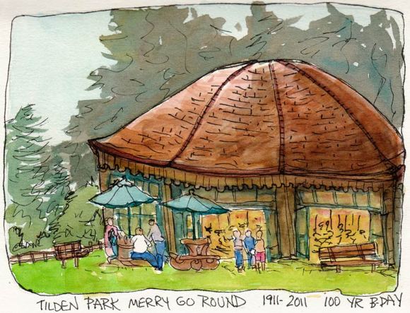
Tilden Park Carousel, ink & watercolor 5x7"

I almost didn’t post these sketches from the Tilden Park Merry-go-round because I was so frustrated drawing them. But I think it’s interesting to see when others post things that challenged them so here you go.

I try to find something positive in work that doesn’t succeed overall. The one above was the last one I did as I was leaving. I really like the trees in the background and most everything else EXCEPT the messed up shape of the building that houses this wonderful 100-year-old carousel.
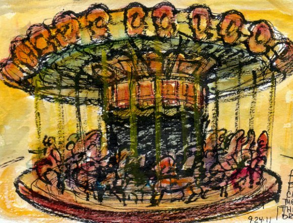
Carousel structure, ink & watercolor, 7x5"

I did the one above sitting on a bench inside the building trying to sort out the perspective and the way the whole thing fits together. Meanwhile the smells of burning popcorn and greasy hot dogs were making feel rather ill. I really struggled but in the end I think I got the understanding of what is a merry-go-round and how it works, though you can’t tell from this mess.
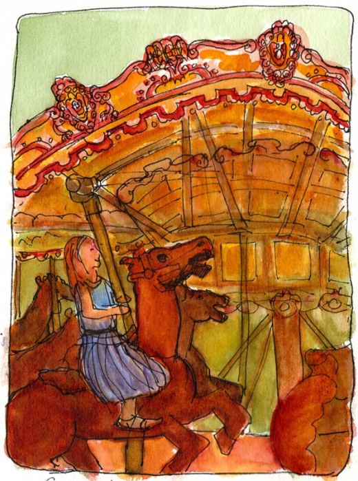
Carousel quickie, 7x5"

Another one that I struggled with. The little girl calmly rides while the horse seems to be expressing my struggle. And boy are the perspective and ellipses way, way off!
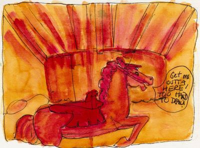
Get me out of here!
Get me out of here!

Another quickie with the horse expressing my feelings: “Get me out of here! It’s too hard to draw!” My friend Cathy did some nice sketches of the carousel, posted here on our Urban Sketchers blog.

Categories
Art supplies Drawing Landscape Oil Painting Outdoors/Landscape Painting Studio

Painting Pt. Bonita Part 2: Oils and Oil Pastels

Point Bonita #3, Oil on Gessobord Panel, 12x9"

After I did the watercolors I posted yesterday, I set up the sketch, the watercolor and my iPad displaying the photo on the table beside my easel and painted the scene once again, this time with oil paint. After a month or two of being totally frustrated with oil painting, trashing everything I made and about ready to give it up, suddenly painting was easy and I was loving it!

Point Bonita Painting set up in studio

The entire painting worked like a charm except the foreground mount of dirt and ice plant which was the last thing I painted and which I did over and over. It kept trying to call too much attention to itself. I think I finally successfully muted that foreground while still keeping the light on it.

Then I was looking at some delightfully free and vibrant oil pastel work on Aletha Kuschan’s blog which inspired me to try the scene in oil pastels too. I know nothing about oil pastels so I quickly read a few how-to’s on the web and dug in.

BUT before I show you the drawing, I have to say that I made a fatal misstep: I chose a sheet of the totally wrong paper to work on. Instead of starting small on a sheet of white or blue pastel paper, I chose a large sheet of brown Stonehenge drawing paper. What was I thinking? Brown under a turquoise sea?

Point Bonita #4, Oil pastel on Stonehenge paper, 17x13"

It was impossible to cover all the brown paper because even though the oil pastels got really thick in some areas—so thick that no more could be applied—in other spots they just wouldn’t cover.

Although my Holbein Oil Pastels are very old, purchased for a small project I did more than 20 years ago, they were still in good shape. But I didn’t have the right colors, and I had trouble blending. I didn’t have blending stumps, didn’t want to use my fingers and was wearing gloves which didn’t work. I tried a paper towel but it just smeared and left paper towel lint.

Compared to paint, oil pastels seems like a lot of extra work, having to fill in so much area by scribbling over and over. And it was messy; my gloves and the pastels got dirty from colors transferring onto them.

But maybe if I knew what I was doing, or had used the right paper it would have been easier or less messy? (Not to say that oil painting isn’t messy! Everything I own has paint on it!) I like the look of oil pastels done well so I’ll try another experiment with them. But on the right paper this time! Any tips?

Categories
Art supplies Bookbinding Drawing People Self Portrait Sketchbook Pages

End of Tablecloth Journal Self Portrait

End of Journal Self Portrait, colored pencils, 7x5"

As I complete each journal I draw a self-portrait for the last page. I really liked the ink drawing I made for this one but then totally messed it up when I was painting it and tried to “fix” something. The more I tried, the worse it became. So I scanned the sketch and used Photoshop to remove all the color, leaving me with just the original line drawing below.

Line drawing for self portrait
Line drawing for self-portrait scanned from bad watercolor sketch

From Photoshop I printed the line drawing onto a piece of the same watercolor paper I use in my journals. Since the ink from my inkjet printer is water-soluble (darn) I couldn’t add watercolor. I used Faber-Castell POLYCHROMOS colored pencils instead and tried to keep a light touch after having overworked the original.

I cut out the sketch to fit into the journal (and cover the yucky sketch), and glued it down with a glue stick. The completed journal is pictured below, covered with a piece of an old tablecloth that lost its “oil cloth” coating when I washed it years ago.

Newly bound journal; cover from old tablecloth
Completed tablecloth-covered journal

It’s so interesting to me how these end of journal sketches turn out. I’d had a rare and unusually good night’s sleep and was in a good mood when I drew this one. What they say about beauty sleep seems to be true, even in sketches — I definitely look more youthful and pretty in this sketch than some of the others I did under less optimal circumstances.

You can see previous end of journal self portraits at this link.

Categories
Albany Building Drawing Ink and watercolor wash People Places Shop windows Sketchbook Pages

Evening Outside the Burger Depot

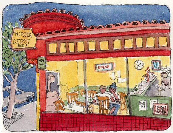
Burger Depot, Ink & watercolor, 5x7"

Trying to get in one last outdoor evening sketch session of the season, we sketched at the bottom of Solano Avenue in Albany. I stood under a street lamp and by the time I finished drawing it was dark out.

The proprietor of the Burger Depot who has owned the shop for over 30 years saw me trying to paint standing, with my palette and water on the ground, and brought over a plastic chair and a little table for me. The street light and light from inside the shop gave me just enough light to see what I was doing.

I was initially drawn to the scene by two seedy looking guys sitting in a window seat but they left before I could draw them. Fortunately the other two guys eating there were wonderful models who kept returning to the same positions, making it easy-ish to draw them.

Categories
Art supplies Drawing Flower Art Ink and watercolor wash Life in general Painting Rose Sketchbook Pages Watercolor

Will You Accept This Rose? (War of the Roses Part II)

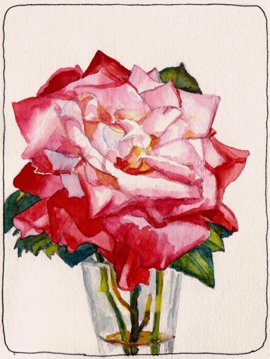
Will You Accept This Rose? Yes, Finally. Watercolor, 7x5"

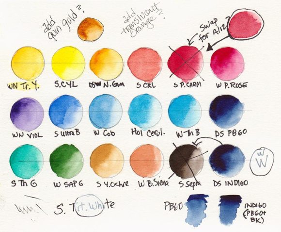
After all the struggles of the previous day, I was determined to succeed in painting a rose and decided to give myself a break. First I rearranged the colors in the palette, putting them in my prefered, mostly color-wheel order instead of helter skelter as they were, and replaced several colors (see below for color chart).

Revised Schmincke Palette chart

(WN=Winsor Newton, S=Schmincke, DS= Daniel Smith, H=Holbein):

Top Row: WN Transparent Yellow, S Cadmium Yellow Light, DS New Gamboge, S Cadmium Red Light, WN Permanent Alizarin, WN Permanent Rose.

Middle Row: WN Violet, S Ultramarine, WN Cobalt Blue, H Cerulean Blue, WN Winsor Blue, DS Indanthrone Blue.

Bottom Row: S Thalo Green, WN Sap Green, S Yellow Ochre, WN Burnt Sienna, DS Indigo, S Titanium White (the latter will probably be removed since I’ve never successfully been able to incorporate white into watercolors).

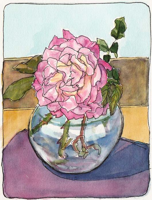
Second to Last Rose Test, ink & watercolor

The other thing I did to give myself a break was that after I made the second to last rose sketch above from life, I decided to work from a photo of the rose.

Categories
Art supplies Drawing Flower Art Glass Ink and watercolor wash Painting Plein Air Rose Sketchbook Pages Still Life Watercolor

War of the Roses, Part I: Schmincke Watercolor Review

Schmincke Rose Saga #1, ink & watercolor

On the next test run of my new Schmincke palette that Roz introduced here, I painted some roses on a tablecloth in the sun on the deck. While the Schmincke pan paint is lovely to use, and the palette a good size and design, the colors frustrated me. Their version of rose called Permanent Carmine (PV19) is much redder than the Winsor Newton (PV19) Permanent Rose I rely on for pinks and several other colors didn’t appeal to me.

In the color chart below, the top and bottom rows are the original Schmincke colors that came with the set. I added the colors in the center row by filling empty half-pans from tube paint in the space designed for adding extra pans.

Schmincke palette original colors plus added middle row

The colors (abbreviated above) are:

Categories
Art supplies Drawing Flower Art Ink and watercolor wash Painting Plants Plein Air Sketchbook Pages

Lavatera Clippings In Amaretti Cookie Can

Lavatera Clippings in Amaretti Cookie Can, ink & watercolor,7x5"

I love this old can that once held Amaretti cookies. After trimming some branches off the giant Lavatera bush by my deck, I decided to paint the cuttings. The cookie can was the first thing I spotted that would hold water and flowers.

I used the new Schmincke watercolors palette I recently bought on sale at Wet Paint. I love the palette but after a few trials, added and replaced some colors which I’ll write about next time. The Schmincke pan paints worked beautifully in the hot sun, releasing juicy flowing paint with just a touch of a wet brush.

I think the sketch captured the feeling of heat and strong light and the funky little table with a dirty glass top looks just like itself.

Categories
Drawing Ink and watercolor wash Interiors Places Sketchbook Pages Urban Sketchers

How to Save Money at Whole Foods

Whole Foods Oakland, ink & watercolor, 5x7"

It’s easy to save money at Whole Foods! Just draw the food, don’t buy it! 🙂

We met at the fancy Oakland Whole Foods for Tuesday night sketching and I had trouble settling down from a challenging day at work. After a couple of false starts outdoors on the patio I moved indoors and found a table with an interesting view.

I decided to start in pencil instead of my usual ink since I was feeling insecure after the first two fails. I was still drawing when everyone wanted to meetup for our show and tell, which I ended up missing so I could finish in ink. I added the paint at home the next day.

Categories
Drawing Ink and watercolor wash Life in general Painting Places Sketchbook Pages Urban Sketchers

K-9 Unit, Paramedics and Fire Truck at El Cerrito Plaza

K-9 Unit, Paramedics and Fire Truck, ink & watercolor, 7x5"

The parking lot at El Cerrito Plaza was filled with police cars, fire trucks, hazmat vans and other emergency responders when I walked up there to do errands Saturday. Contrary to my sketch above, which looks like a police car crashed into an ambulance (thanks to a little drawing flaw), it turned out to be the annual Tri-City Safety Day.

I sat on the curb and sketched while cops, firemen and other public safety people handed out fire hats, pencils and buttons to kids who got to climb on police motorcycles and fire trucks, and explore the DUI checkpoint trailer.

The K9 patrol car was off limits when I was there, as King was standing guard inside, barking if you got too close. I heard that earlier he’d been out and available for petting but I bet the huge German Shepherd scared off more kids than enticed them.

Categories
Drawing Food sketch Ink and watercolor wash Painting Sketchbook Pages

Figs On Deck

Figs in glass bowl in sun, ink & watercolor, 7x5"

After a summer of fighting with a contractor to properly complete my backyard deck and some other construction (beginning stages of garage to studio conversion), the work is done and I can finally enjoy painting on my backyard deck. This was my first happy little backyard sketch of three varieties of organic figs. I painted sitting on my cute new wicker love seat, bought  for just $20 from neighbors who were moving away.

I may at some point share my lengthy rant about the way many contractors condescend, ignore, cheat and/or bully women clients, but it’s too nice a day to dwell on such things. I’ll just say that after talking to other women who’ve managed their own construction projects with male contractors, the problem is all to common.

But now the sun is shining, the wind and fog have disappeared and I have a little bouquet of roses waiting to be painted so I’m heading out to the deck!