Categories
Art theory Landscape Oil Painting Outdoors/Landscape Painting Plein Air

Painting in the Dark for More Colorful Paintings

Sibley Park View from Visitors Center, Oil on panel, 12x9
Sibley Volcanic Park: View from Visitors Center, Oil on panel, 12x9"

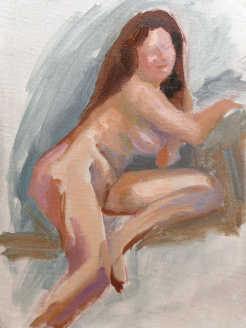
OK, it wasn’t really in the dark, but I was in deep shade and could barely tell what colors I was mixing. Yesterday I went to a non-painting event in 105 degree heat and blinding sun and came home with a migraine. I just couldn’t take another day in the sun today but wanted to join my Sunday plein air group. I set up in the shade of the visitor center at Sibley Volcanic Regional Park in Oakland where we were going meet for our group critique at 2:00.

Bicyclists and hikers stopped by all afternoon to eat lunch in the shade, get water, or use the restrooms. Two hardcore women cyclists spent their entire lunch discussing in great detail their recent fruit purchases. Another woman cyclist in full cycling gear told her cycling buddy that her ex-husband married her ex-best friend. Then she dated that woman’s ex-husband. But when her ex-husband and ex-best friend divorced, she and former best friend fell in love and recently got married thanks to California’s same sex marriage law. They rode off before I could find out if the ex-husbands fell in love with each other too.

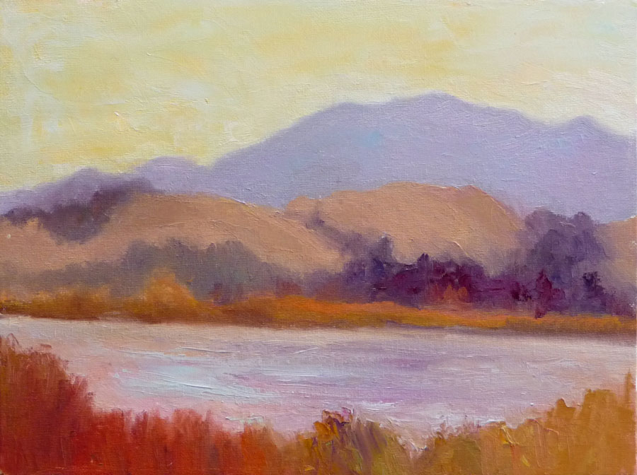
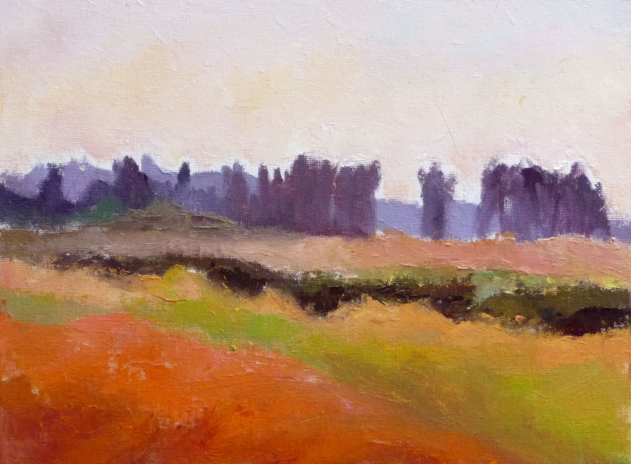
The rest of my plein air group painted the amazing vistas along the roadside on Skyline Drive and Grizzly Peak Boulevards but they had to put up with the heat and direct sun. I was perfectly happy with this lesser vista and the lovely shade.

Painting in the dark

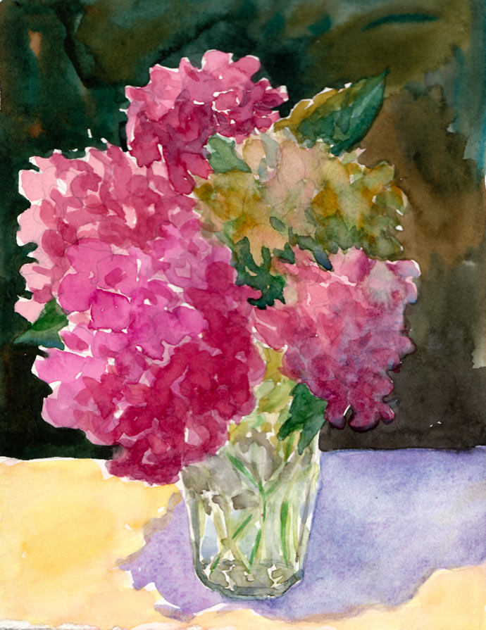
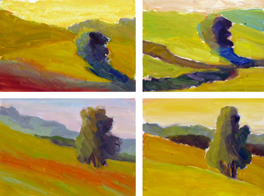
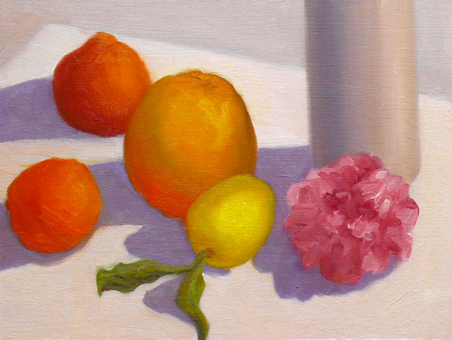
I discovered an interesting phenomenon. When I paint in the bright sun my colors look really nice and bright, but once out of the sun, the painting looks duller and dark. Just the opposite is true when painting in the shade. The colors look much dull and monochromatic in the shade (see above). But in the light they’re bright and colorful. That also seems to happen when I wear gray tinted sunglasses.

In the same way that squinting (reducing the light coming into your eyes) removes the color from the scene, allowing you to see values better, painting in the shade or wearing dark glasses reduces the perceived intensity or saturation of the colors you’re mixing. That in turn tricks you into mixing more brilliant, saturated colors. Or at least that’s what happened to me today. I was pleasantly surprised each time I carried my painting out into the sun to see what it really looked like.

Me enjoying the shade at Sibley
Categories
Art theory Landscape Oil Painting Other Art Blogs I Read Outdoors/Landscape Painting Plein Air

Dry Wetlands: Where’s the water?

Shollenberger Wetlands, 12x9", Oil on panel (click image to enlarge)
Dry wetlands sketch, 12x9", Oil on panel (click image to enlarge)

Shollenberger Park is normally a watery paradise where you see swans, herons, egrets, pelicans, geese, turtles, frogs, lizards and the occasional harmless snake. But when I arrived there this morning with Camille Przewodek’s class, we were surprised to find cracked dry soil where the watery marsh used to be. Camille said she’d been painting there for years and had never seen it dry before. You can see many of her marsh paintings on her website here.

She set up for her demo in the hot sun, on land that used to be under water. Seeing her paint is like watching a magician, the way she creates the illusion of space, depth, atmosphere, weather, even time of day, all done with color relationships.

The smell from the dried up marsh was making me nauseous but nothing phases Camille when she’s painting. She never complains, whether it’s hot or freezing, windy or smelly; she just gets in the zone and paints. Her students know better than to whine about weather or anything else; or as one student pointed out:

“It’s called ‘PLEIN Air’ NOT ‘Complain Air’!”

About the paintings:
Both of these 1 to 2 hour plein air sketches were done at the marsh, trying to work on getting the big shapes and color relationships. I think my easel must not have been level today; the horizon seems to be slanting downhill on today’s sketch above.

Shollenberger Wetlands sketch, 12x9", oil on panel (click image to enlarge)

When I got home I tried to find out what happened to the water at Shollenberger but couldn’t find anything online. I did learn some interesting things about wetlands and what a valuable and important resource they are on the Petaluma Wetlands site.

I know we’re having a drought in California, but I don’t see how such a large body of water could dry up that quickly from being full just a few weeks ago.

I hope all the birds and fish and froggies are OK.  If you know what’s going, please do tell!

Categories
Art theory Flower Art Glass Painting Plants Sketchbook Pages Still Life Studio Watercolor

Painting popcorn ball flowers (hydrangeas) instead…

Hydrangeas (popcorn ball flowers)
Larger

Have you ever been so sleepy you’re just slap-happy silly? That’s how I was yesterday. I’ve been trying to change my schedule to get up early and go to bed early but after a few days of doing the former but not the latter, I was so sleep-deprived yesterday afternoon that I just stopped making sense, even to myself.

When I get over-tired, instead of thinking, “sleep,” I think I’m hungry and crave carbs (and now research is showing that sleep deprivation causes weight gain and other health risks…see here and here).  So instead of eating popcorn (or going to bed at 7:00), I decided to paint these “popcorn ball flowers” (as my sister and I used to call hydrangeas when we were kids…and I thought everybody did until I Googled “popcorn ball flowers because I can never remember their real name, and discovered only recipes for making flowers out of popcorn and no references to hydrangeas!).

First I had to refill my watercolor palette because a couple weeks ago I’d washed out all the funky old paint that had been in there for too long. Some of it was getting moldy and all of it was dirty.  Before refilling my palette, I did color tests of all my paints to decide which pigments I wanted to use now. I love organizing things, so this was a perfectly soothing task for a tired mind.

Finally I was ready to paint, and grabbed my homemade 6×8” sketchbook filled with hot pressed Fabriano Artistico paper, and this bouquet of hydrangeas from my yard that I’d plopped into a drinking glass the day before. Instead of starting with my usual ink drawing, I used pencil and then painted using more of an oil painting technique, starting with the darkest darks instead of the lights.

Maybe it was because I was so tired, but I had so much fun, just being playful as I painted and not worrying about the outcome. As usual I wished I’d stopped about 10 minutes sooner and someday I’ll learn that “when you’re 75% finished you ARE finished!”  Some day….

If you’d like to know which pigments I settled on, click “Continue Reading for the details….

Categories
Art theory Flower Art Oil Painting Painting Still Life Studio

Passable Painting Passages

Roses detail

(Larger)

Garlic detail

(Larger)

I’m learning to appreciate the bits of paintings that work while letting go of the parts that won’t/can’t be fixed. These two sections pleased me, even though the original paintings as a whole were not successful. In both cases I started off boldly, got the big shapes blocked in and immediately painted the two segments above.

Then I got tired, the sun went down and the room in the light changed, the flowers opened in the heat, the floodlight I was using burned out and I didn’t have another, the setup got moved (thanks kitties…see below) and although I tried to fix both paintings over and over I finally decided to cut my losses once again and move on.

I learn so much with each painting, whether it works as a whole or not. I’ve started putting labels on the backs with the year, a serial number and a few words about what worked, what didn’t and what I learned. It will be fun at the end of the year to review my progress.

Fiona taking up modeling:
Fiona wants to be a model

Rose set up day one (and on my bulletin board art by Pete, Alison and John Sonsini‘s wonderful portraits):
Rose setup day 1

Categories
Art theory Drawing Life in general Painting Sketchbook Pages Still Life Watercolor

Mothers’ Day Bouquet Snippet

Mothers' Day Bouquet

Ink & watercolor 5.5″x3.25″ (larger)

I’m back from my week-long workshop with Camille Przewodek in Petaluma. It was a powerful learning experience and an incredible opportunity two learn from two masters, Camille and her husband Dale Axelrod.  They studied for many years with Henry Hensche at the Cape Cod School of Art and are carrying on and expanding upon Hensche‘s and Hawthorne‘s work with color and light.

We painted in beautiful scenic locations from wetland marshes to the quaint village of Nicasio and the last day painted four models by the river that runs alongside Camille’s studio in charming and historic downtown Petaluma. We also did Hensche’s traditional colored block studies. All painting was done outdoors in bright sunlight and the weather couldn’t have been better.

I’ll write more about what I learned at the workshop when my paintings are dry and easier to handle, photograph and post.  In the meantime, here’s just a corner of the huge Mothers Day bouquet my son Cody surprised me with before we went to Brushstrokes Studio, a cute little pottery painting place in Berkeley. Cody and I decorated catfood bowls while his significant other designed a beautiful cup and daughter M painted a plate with a beach scene as a memorial for her grandmother who recently passed away. Then it was off to Pyramid Brewery for a yummy Mothers Day dinner accompanied by refreshing Pyramid Hefeweizen Ale served with a wedge of lemon.

Categories
Art theory Oil Painting Painting Studio

Back to Basics – Color Vocabulary

Painting Blocks to Paint Blocks

Painting blocks to use in light and color-study still-life as explained in this previous post. (Newly gessoed panels drying in little rack behind the blocks).

After jumping head first (or was it feet first?) into oil painting, and then flailing about, trying to find my way, I realized it was time to go back to basics. Just as with writing or speaking, a basic vocabulary is essential to expressing oneself.

But I was trying speak “oils” using the vocabulary of color I’d learned with watercolor, assuming that Red is Red, whether it’s watercolor or oils. Unfortunately, I’m finding that’s like assuming if you can speak English you can speak French since they use the same alphabet.

Testing Colors to Choose a Palette

Oil painting tests of different brands of color to choose my basic palette
(Click Images To Enlarge)

When I first started painting with watercolor, I made dozens of color charts, testing the various pigments to learn about their natures, alone and mixed with other colors. In watercolor this is really essential since there are so many characteristics that affect the flow of the paint: whether it charges into neighboring paint or resists it; whether it’s opaque or transparent; sedimentary (leaving little spots of sediment), staining or lifts easily, how it mixes with other colors and more.

I hadn’t done this with oil painting. But watching Camille Przedowek demonstrate a couple of weeks ago, I was struck by her huge “vocabulary” of color. She was quickly mixing up and painting with colors I couldn’t even name! I realized my oil painting color vocabulary is about that of a 4-year old from a foreign country.

(CLICK “Continue Reading” to read and see the rest…)

Categories
Art theory Landscape Life in general Oil Painting Outdoors/Landscape Painting Plein Air

Am I Having Fun Yet? Uh, no.

Borgas Ranch

Oil on panel, 9×12″ (reworked from original plein air) (larger)

Saturday was the first plein air paint-out of the season for the East Bay Plein Air Painters. We went to Old Borges Ranch, a charming historical old ranch with a blacksmith shop, old barns, farm animals, all surrounded by the brilliant green hills of springtime. It was very cloudy and I decided that what I wanted to focus on was trying to observe and paint the effect of the cloudy, cool, diffused light.

After wandering around trying to pick a spot, by the time I was ready to start painting I only had two hours left before our group critique. This is the same painting as above after two hours:

Borgas Ranch - @ 2 hours

Oil on panel, 9×12″ (original plein air) (larger)

I probably should have left it alone and moved on. But I was frustrated with the way I seem to always be painting hills (I’m sick of painting hills!) and they always look flat. So after the critique, I went back and started working on the painting again, determined to figure out how to make the hills not look flat. I stood there painting for 2 more hours and although I made some discoveries about paint application and brush strokes, I hadn’t improved the painting at all (just the opposite).

What I’d planned to do after the paint-out at 1:00, was to take a walk on the beautiful trails and do some sketching of the interesting sights but it was too late when I finally gave up on the painting at 4:00 because I had a long drive home and had to get ready for a dinner party that evening.

Today, even though I tried to ignore it, the painting and my frustration about it continued to bug me. I finally decided to work on it some more until I either got it or killed it. I guess I did a little of both.

The truth is that today oil painting isn’t feeling like fun. I’m missing the watercolor sketchbooking and drawing for fun I did all the time before I took up oils. I’m jealous of all the people I see while I’m plein air painting who are taking a hike in pretty places instead of torturing themselves trying to paint them. I’m missing filling up my sketchbook with fun, wonky drawings and loose watercolors. I’m longing for working from still life set ups or photos where the light doesn’t change and where it’s not always a rush against time.

I also know that I’m persistent if nothing else, and that I’m not giving up the struggle. But it’s time to have more fun with my art. After all, I’m doing this for my own creative pleasure, and as much as I love learning, sometime a woman just needs to play, too.

Categories
Art theory Landscape Oil Painting Outdoors/Landscape Painting Plein Air

Plein Air “Grunts” with No Green for St. Patricks Day

Quick starts plein air

Oil on panel, 12″x16″,  (larger)

In Camille‘s class today we painted at Helen Putnam Regional Park in Petaluma. Our instructions were to paint four small, very quick (about 20 minutes) starts (sort of like rough drafts in oils) on one 12×16″ panel. If I understood correctly, we were to try to capture the color temperature of a bright sunny day, the relationships between the hues and values, and the relationships between the distant, mid and close up values and colors. And all of this without using green to paint the extremely bright and vibrant lime green hills.

I’m at the point now with this work where I feel like I’ve been living in a foreign country long enough (the land of plein air oil painting) that some of the words the natives (my teachers) speak are starting to be understandable. I still can only respond with grunts (see above “painting,” — definitely no more than a few grunts!) but I kind of get what my teachers are saying.
I’m starting to see the vivid colors in nature beyond the local colors (green tree, red apple). And I’m maybe starting to understand why you might paint a sky a pale yellow before over-painting it with very light blue, or a green hill orange first because it’s in the bright sun, and then modify that orange with something that, when compared to the color next to it, reads as green.

Categories
Art theory Faces Figure Drawing Oil Painting Other Art Blogs I Read Painting People Portrait Sketchbook Pages

Figure Painting Workshop Sketches

20080310_0131-Meri

20 Minute Sketch: Oil on panel 12×9″ Larger

I thought I would scrape off and reuse this panel but when I photographed it I found there was something about the rawness that I liked. It was the second sketch of the first day of my “Weekend Warriors” figure painting workshop with Randall Sexton, a talented and kind teacher. The model, Meri, was the best I’ve worked with…beautiful, voluptious, charming and a real professional. She is originally from Argentina and came to the SF Bay Area after working with artists in New York City for 10 years.

Below is another 20 minute sketch from day one. Again, I thought I’d wipe and reuse but since I kind of like the energy in it (and didn’t like the cheapo Aaron Brothers panel — way too smooth a surface) I think I’ll hang onto it. (Which means it joins the big stack of “learning opportunities” in my closet until I’m ready to dump them).

Oil on panel, 12×9″ (larger)

20080310_0136-Meri

Oil painting from a live model is sort of like plein air painting: time is limited and there are so many elements that need to be right (drawing, color , value, likeness etc.) for the painting to work. There is so much to see, discover, understand and interpret in 20 minute sprints of painting.

The model’s breaks between poses afford an interesting opportunity to walk around the room and see what others are doing. I was struck by how different each artist’s work was. There were some very accomplished local painters in this weekend class. I had the good fortune of setting up beside Iris Sabre, a local painter whose style and technique I greatly admire.

I started the larger painting below at the end of day one, with two 20 minute sessions. When we returned on Day 2 we had 3 more 20 minute sessions to “finish” up. This is nowhere near finished (but I wish I’d at least gotten around to fixing those giant hands!)

Oil on panel, 20×16″ (larger)

20080310_0125-Meri

This was the 20 minute warm up sketch at the beginning of day two:
Oil on canvas panel, 12×9″ (larger)

20080310_0128-Meri

This was the final painting on day two, about 2 hours and again, not close to being finished and suffering from chalkiness and my exhaustion:
Oil on panel, 20×16″ (larger)

20080310_0121-Meri

Categories
Art theory Oil Painting Painting Plein Air Still Life

Citrus and Camelia Plein Air

Citrus & Camelia Plein Air

Oil on panel, 9×12″ (Larger)

You really have to work fast to do a still life outdoors in the afternoon. In less than two hours the sun moved overhead far enough that I had to stop because everything was in shadow. I’d gotten all the objects and their shadows well blocked in and probably should have stopped there, calling it a sketch or a study. But of course I couldn’t.

I had to bring it into the studio to “just touch up the edges.” Then I was going to do another quick painting. But I spaced out and before I knew it, overworked areas that I’d originally painted very freely, made more problematic since I’d forgetten exactly what the pattern of light and shadow was on the objects.

Someday I’ll learn to stop while it’s fresh. Nevertheless, I think I did capture the feeling of a bright sunny afternoon, which was my main goal.