Categories
Art Drawing People Portrait Sktchy Watercolor

Handsome Artist as Grumpy Guy (Zorn Palette)

Watercolor portrait of Richard B.
Richard B, watercolor, 10×7.5” Zorn Limited Palette

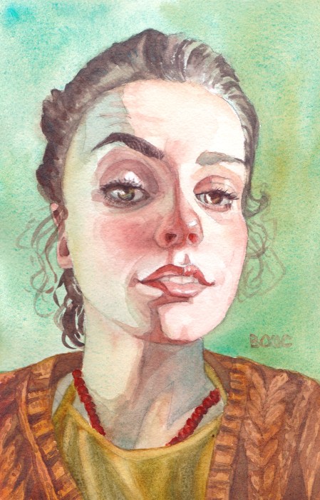
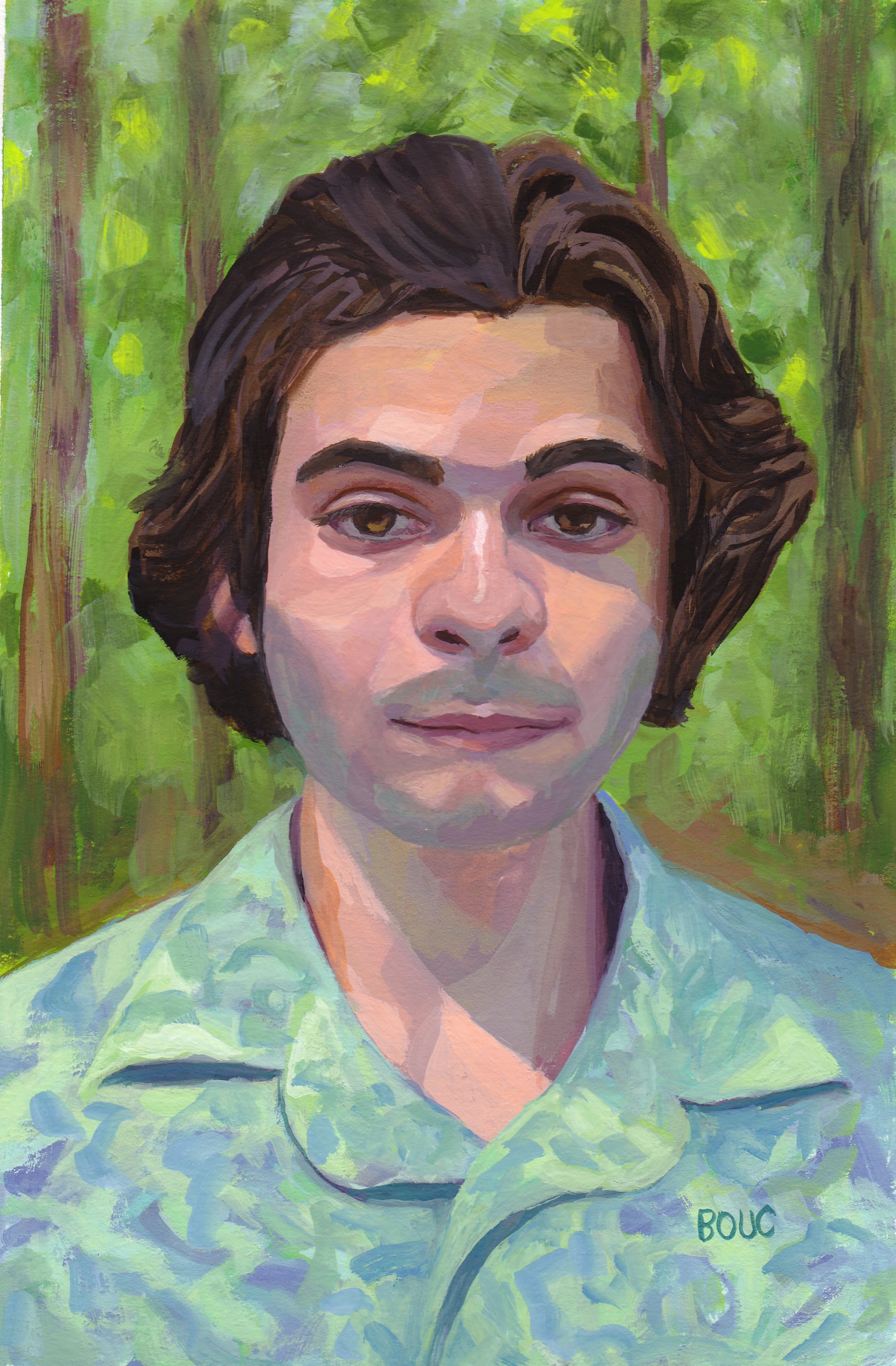
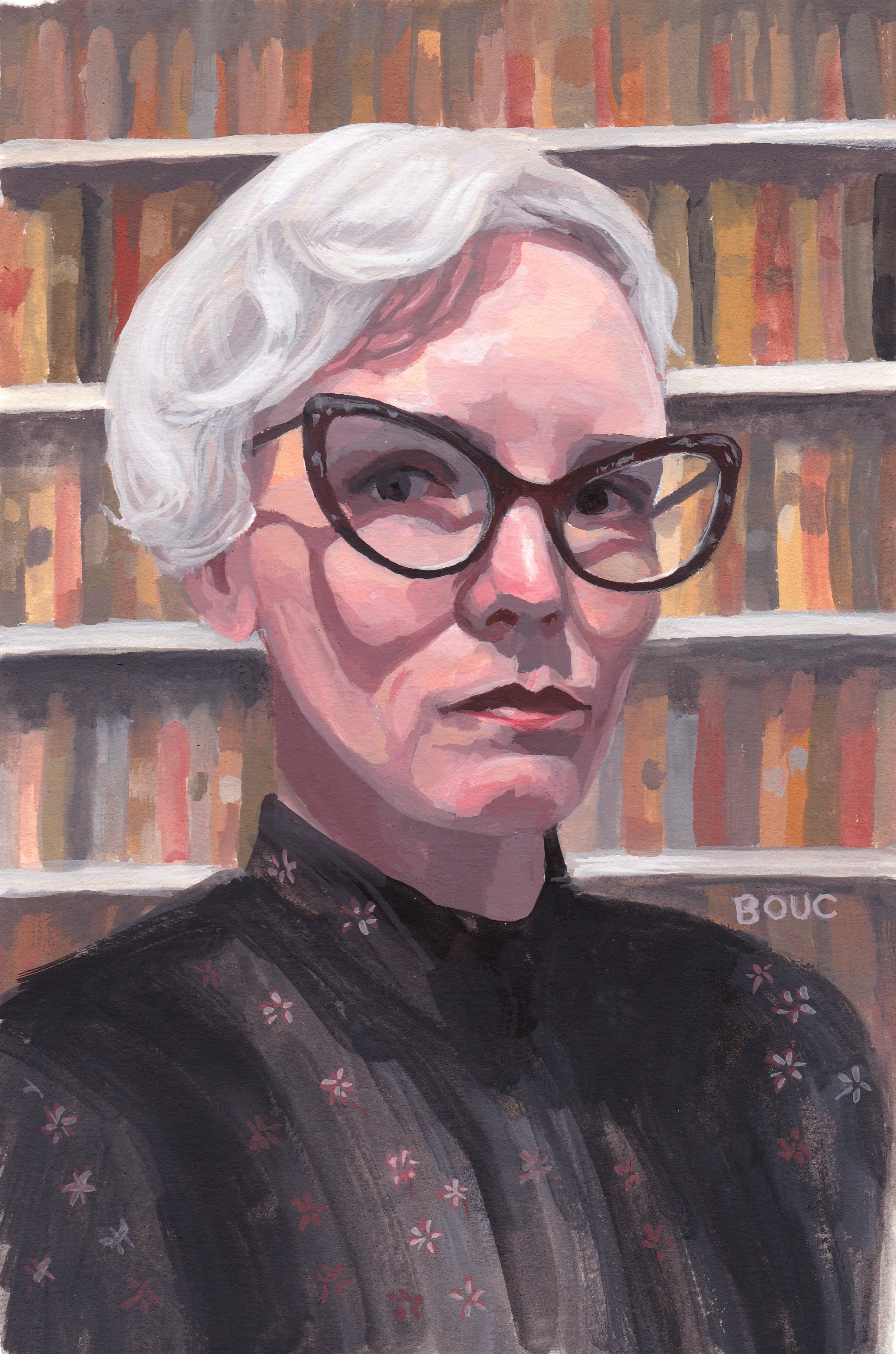
When I saw the reference photo of fantastic artist Richard Banks in a Sktchy watercolor class, I wasn’t immediately inspired but decided to give it a try anyway. Maybe because I had nothing invested in the outcome, just in the learning process, I ended up liking the painting for what it is.

Sketch #2 (Left) and Sketch #1 (Right)

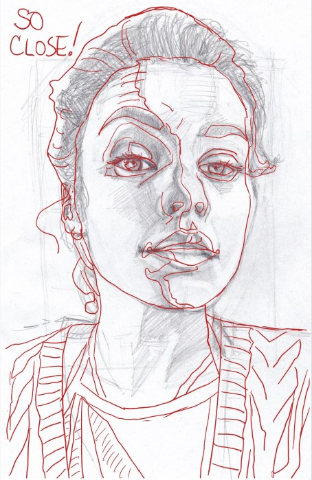
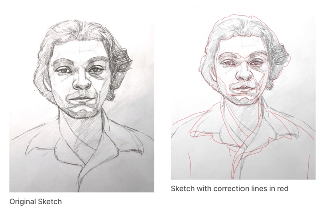
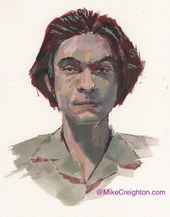
My first attempt at drawing him was pretty far off so I didn’t try to correct it, I just started over. I was satisfied with the second attempt above.

Zorn Palette + Thalo Blue Green Shade for background

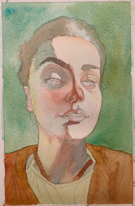
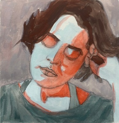
Even though his photo was mostly cool colors, I decided to try to use the Zorn Palette and see if I could make it work. The pigments I used were WN Ivory Black, Utrecht Cadmium Red Light, Holbein Yellow Ochre.

I did cheat slightly and did a preliminary very light wash of Winsor Blue/Green Shade over the whole sheet of paper. Typically with the Zorn palette, the black is used as a blue but this Ivory Black seemed way too warm for it to work.

Reference photo
Categories
Art Faces People Sktchy Watercolor

Emily in Watercolor with Odd 3-Pigment Palette

Emily Christen from Sktchy, Watercolor, 10×6”

I watched the interesting class taught by Kirsten Britt on Sktchy and then, as usual, I painted the subject completely differently than was instructed. Kirsten’s work is beautiful but is all about splotches (here’s her version on IG).

3-Pigment Triad, Limited Palette

I used an odd limited palette for this one which made it a little challenging. The pigments are DS Perylene Scarlet, DS Cobalt Teal and WN Raw Sienna. It wasn’t possible to get any real darks so I stuck with a high key painting.

Original sketch, graphite on paper, 10×6”
My check of the sketch in Procreate

I got very close with my sketch, even with the camera distortion; I only needed a few small adjustments.

Work in Progress – First passes of color
Photo reference
Categories
Art Faces Gouache People Portrait Sktchy Sktchy Watercolor

Is She Sleepy, Bored or Annoyed?

Sleepy Asian Girl, Gouache on paper, 10 x 7 inches

This was one of those rare and wonderful painting experiences where the sketch (below) came together by magic, and I liked it enough to not even check it against the reference photo for accuracy. I didn’t care if it was perfect. The painting just flowed and it was super fun to see and paint all the different colors and textures.

Sleepy Asian Girl Sketch, 10x8 inches, graphite on Xerox paper
Sleepy Asian Girl Sketch, 10×8 inches, graphite on Xerox paper

I kept pondering her story while I worked on the portrait. I had all kinds of ideas but settled on a bone-tired factory or sewing shop worker. Then I did a Google image search of the reference photo (below), which was supplied by a Sktchy artist for her class demo and for us to paint from.

Reference photo

The image search took me down a looooong rabbit hole that led to a match for the photo. It turns out the model is a Japanese artist named Serena Motola. Maybe she was just bored and annoyed to be modeling when she wanted to be painting?

Categories
Art Drawing Faces Gouache Painting People Portrait Sktchy Sktchy

Nate W. in Grey Hoodie

Nate Washington in a grey hoodie, painted in gouache.
Nate Washington in gouache on paper, 10 x 7.5”

Nate Washington (IG link) is a comedian and podcaster who shared his reference photo for this portrait on Sktchy, here. (Except Sktchy app is now called “Museum”)

Karl Staub (IG link), the teacher who used Nate’s photo for his demo did a very graphic, poster-like rendering (see below). I was tempted to do that too, but decided to just continue with my own style instead.

Nate Washington in a grey hoodie, sketched in pencil.
Nate W. in pencil, 10×7.5

Above is my original sketch for the portrait. I had fun finding the planes on his face and clothes. Below is a screenshot for the 30 Faces/30 Days – Watercolor & Gouache class on Sktchy displaying the teacher’s work.

This was supposed to be a 30 portraits in 30 days class, but I think I’m now on month three instead. That’s because since last December I started working out every morning, doing indoor cycling, rowing and running classes plus daily core classes and alternating days of weights, yoga, Pilates, and Barre and two hikes a week with friends. I paint in the afternoon.

I’m getting stronger and fitter and having fun. But it’s always a challenge to find balance between all the things that make up a good life. I’m very fortunate and grateful for the luxury of the choices I get to make.

Categories
Art Drawing Faces Gouache Painting People Portrait Sktchy Sktchy

Forest Bather in Gouache

Bennett P from Sktchy in Gouache, 10×7 inches

I really enjoyed painting this calm, pleasant young man amidst the trees, seemingly bathing in the cool forest light. You can see his original photo reference on Sktchy here.

I started with a pencil sketch on copy paper. Then to check my drawing, I compared my sketch to the photo by scanning my sketch into Procreate with the original photo. On a new layer I traced the photo with a red line and layered that over the sketch (see below). Using the red lines as a reference, I corrected my original sketch on paper, transferred the sketch to watercolor paper and then painted.

Bennett’s reference photo was part of the Sktchy “30 days in Watercolor and Gouache” class taught by Mike Creighton, one of my favorite Sktchy teachers. I thought it would be interesting to share his painting; such a different feel from mine!

Mike Creighton’s gouache painting

He used a limited palette and did a lot of mark making with his brush. I know the idea of the Sktchy classes is to try to mimic the teachers in order to learn a variety of different approaches and techniques, but I almost always end up taking what I like and then going my own way.

Categories
Art Gouache Painting People Portrait Sktchy Sktchy

Mystery Girl Detective in Purple

Kate K. from Sktchy, gouache on paper, 8.5 x 7 inches

While I worked on the sketch for this painting I listened to a mystery audiobook with a female detective so when it came time to do the painting, I decided to make her a detective in a dark subway or tunnel. Using a limited, complimentary palette of mostly purple and yellow (because of her hair, see reference photo below) I put her in a purple trench coat.

Kate K. from Sktchy reference photo

The teacher for this lesson on Sktchy Art School is a big fan of patterned backgrounds, as you can see in this link to her painting. She used “Acryla Gouache” in her demo, which I have tried and don’t like. It’s basically just opaque and matte acrylic, not “real” gouache in my opinion.

Initial sketch for painting of Kate K.

In the sketch above you can see that I indicated the divisions between the shadows and light areas. I’m trying to focus on keeping my value families separated, keeping the darks together separately from the lights family.

Categories
Art Drawing Faces Gouache Painting Portrait Sktchy Sktchy

Librarian (?) in Gouache with Zorn Palette

Stacy D from Sktchy in Gouache using Zorn Palette, 10x7 inches
Stacy D from Sktchy in Gouache using Zorn Palette, 10×7 inches

I dramatically changed the setting of this portrait from a graffiti-covered wall (photo at bottom) to a library. There was something about her expression and clothing that made me think judgmental librarian, not the hip artist she appears to be in her photo feed on Sktchy. (Not that librarians can’t be hip artists! I was thinking of the mean school librarian who was always shushing us and glaring if we giggled.)

This was the last lesson in Mike Creighton’s Sktchy class on gouache portrait painting and color mixing. This lesson was about the Zorn palette: white, yellow ochre, cadmium red light and black. I’m really enjoying playing with limited palettes and discovering all the varieties of color possible with them.

In my initial sketch below, I hadn’t decided on the background yet.

Stacy D. from Sktchy, initial sketch on Xerox paper

When I decided to change the background from the wall in the reference photo below, to a library I did a quick internet search and found the photo below, right, which I used as inspiration.

Reference photo of Stacy D from Sktchy
Internet photo for library photo reference
Categories
Art Drawing Gouache People Portrait Sktchy Sktchy

Triadic Color Scheme in Gouache

Jennifer L. from Sktchy, weird 3-color gouache triadic color scheme, 10x8 inches
Jennifer L. from Sktchy, weird 3-color gouache triadic color scheme, 10×8 inches

A triadic color scheme is one in which three colors are chosen for the palette that are equal distance apart on the color wheel. For example, either the three primaries (red, yellow, blue) or three secondaries (orange, purple, green) or tertiaries like red-orange, blue-green, etc. The colors I chose were a little weird: Linden Green, a greenish yellow because I wanted to capture the brilliant greens in the garden, plus Ultramarine Blue and Cadmium Red Light.

I thought the Linden Green and Cad Red Light made some interesting skin tones.

Mixing experiments with triad of Linden Green, Cad Red Light and Ultramarine Blue

Like all of the reference photos that Mike Creighton chose for his Sktchy gouache and color class, I wasn’t particularly attracted to paint this reference photo (at bottom of post). So I tried to think of it not as a portrait but a puzzle to play with color mixing plus a chance to practice my drawing.

In my initial sketch below, her hand and fingers were the most fun and most challenging.

Initial Sketch on Xerox paper
Reference photo

Overall I’m not thrilled with this one. I don’t really like looking at it. But the puzzle process and mixing experiment was really fun.

Categories
Art Art theory Faces Gouache People Portrait Sktchy

Complimentary: All the Colors in Just Two

América GS from Sktchy in just two colors, 10x8 inches on watercolor paper
América GS from Sktchy in just two colors, 10×8 inches on watercolor paper

In the past when I experimented with limited palettes and color schemes I missed the point. I thought the idea was to compose with just the chosen colors, rather than to discover how many different colors could be made by mixing them together. I hadn’t yet discovered the beauty of neutrals made by mixing two very different colors together. For this portrait, the challenge was to use complimentary colors (colors that are opposite each other on the color wheel).

I chose just two pigments: Winsor Newton Cobalt Turquoise Light and M. Graham Cadmium Red Light; basically a blue-green and a red-orange. I focused on making the lights cool and the shadows warm and was thrilled to discover the wonderful range of colors and neutrals I could make with just these two pigments and white.

First pass with color

Of course the colors are nothing like the actual colors in the reference photo (below), another photo I wouldn’t have chosen to paint myself, which removed the investment to capture it perfectly.

Reference photo of America S from Sktchy
Categories
Art Art theory Drawing Gouache Painting People Portrait Sktchy Sktchy

Alexander’s Analogous Bathroom Selfie in Lavender

Alexander H from his bathroom selfie on Sktchy, 8x8" on watercolor paper
Alexander H from his bathroom selfie on Sktchy, 9×8″ on watercolor paper

Analogous colors sit beside each other on the color wheel. For this gouache experiment with analogous colors, I chose Dioxazine Purple, Quinacridone Magenta, and Pyrole Red; basically a violet, a red-violet and a red. Plus white of course. My favorite gouache paints are M. Graham, especially their white, which is so wonderfully creamy.

Normally when I paint I try to match the colors I see, so painting with arbitrary colors is a very different approach for me, one that requires focusing more on value and warm/cool relationships. There was no way I’d get “normal” skin colors with this combo of colors. Below is my original sketch on Xerox paper which I then transferred to watercolor paper.

Initial sketch
Initial sketch

One funny thing about this Sktchy gouache class is that the teacher seems to pick reference photos of people I never would have chosen. The photo reference for this lesson: a guy seemingly looking in his bathroom mirror when he woke up in the morning. It didn’t inspire me, but maybe the combination of a non-interesting photo and the experiment with color took the pressure off so I could just play. I had so much fun with this one!

Photo reference from Sktchy