
In the past when I experimented with limited palettes and color schemes I missed the point. I thought the idea was to compose with just the chosen colors, rather than to discover how many different colors could be made by mixing them together. I hadn’t yet discovered the beauty of neutrals made by mixing two very different colors together. For this portrait, the challenge was to use complimentary colors (colors that are opposite each other on the color wheel).

I chose just two pigments: Winsor Newton Cobalt Turquoise Light and M. Graham Cadmium Red Light; basically a blue-green and a red-orange. I focused on making the lights cool and the shadows warm and was thrilled to discover the wonderful range of colors and neutrals I could make with just these two pigments and white.
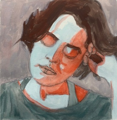
Of course the colors are nothing like the actual colors in the reference photo (below), another photo I wouldn’t have chosen to paint myself, which removed the investment to capture it perfectly.


2 replies on “Complimentary: All the Colors in Just Two”
Very exciting, Jana!!! Must give it a go!! Thank you!
God bless, C-Marie
LikeLike
Thanks sweetie!
LikeLike