Categories
Glass Painting Sketchbook Pages Still Life Watercolor

Better than Plastic: Blue Glass Water Bottle

Blue Bottles
(Larger)

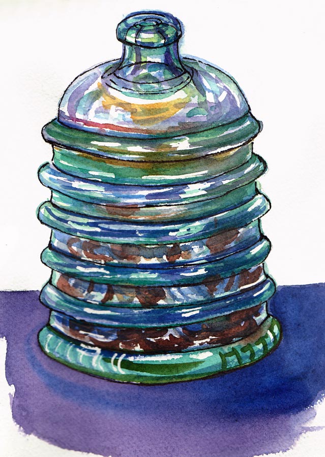
While eating dinner, reading an art book and drinking water from this bottle I became fascinated by the bottle and had to immediately go paint it. The bottle came from from Trader Joes filled with sparkling water. It makes a great reusable water bottle. I washed off the label and just refill it with filtered tap water and a squirt of lemon from my lemon tree and then refrigerate it.

To avoid buying and throwing away tons of plastic water bottles (you’re not supposed to reuse them because they can’t be cleaned properly) I’ve tried a variety of lexan, Nalgene, and stainless steel water bottles. I like to use this glass bottle at home (it’s too heavy and breakable to be portable) and a Kleen Kanteen stainless steel bottle with a sport cap when I go out.

What did we do for water before water bottles and car cup holders? I guess there were thermoses but those weren’t for water. I remember carrying a large purse to middle school in order to carry my big can of hairspray, but I know I never carried water.

When I was a kid, doctors didn’t recommend drinking 8 glasses of water a day like they do now, but they did recommend cigarettes. One cigarette brand ran ads in medical journals with the claim that its cigarettes were “Just as pure as the water you drink.” One of the most infamous cigarette advertising slogans was associated with Camels:”More doctors smoke Camels than any other cigarette.” That ad appeared in medical journals and the popular media for eight years.

About the painting: 6×8″ on Arches cold-press 140 pound watercolor paper in my handmade sketchbook. Mostly Winsor Newton paint plus the bright turquoise on the right side of the big bottle from Kremer Pigments. The funny shadow on the right actually looked like that but it made me happy because it reminded me of the amazing pot and shadow studies, which I adore on Alison’s blog, Scribbles Adagio.

Categories
Flower Art Glass Landscape Oil Painting Outdoors/Landscape Painting People Photos Plein Air Still Life

Farmers Market Diversity, Roses & Revised Painting

Roses Re-do

(Larger) Finished but not satisfied…

Saturday I walked to the Farmers Market at El Cerrito Plaza with the plan to make some watercolor sketches. After half an hour exploring, taking photos and trying to find a spot to sketch I realized I needed to get out of there.

That happens to me sometimes; one minute I’m enjoying the sights and sounds somewhere and the next I just have to leave. Maybe it’s a blood sugar thing—it was time for lunch—or I’d just had enough of crowds and sun and wanted to get back to the studio. Since it’s my Birthday month to do whatever I please I didn’t push myself to stick it out and get a sketch; instead I headed to Peets Coffee for an iced-latte and a nice long walk home.

I took photos of the glorious produce displays at the market, but I couldn’t resist sharing this photo that captures the wonderfully diverse womanhood in the Bay Area. I wish I knew what the rest of her pants say:

Diversity @ Farmers Market

New Camera

I got some great photos at the Farmers Market (that inspired two paintings in progress) with my new camera that is quite compact but has 10x optical zoom. A few years ago I bought a similar camera but for twice as much money and it’s four times bigger and heavier and less competent. I find it amazing how some technology just keeps advancing exponentially while others, like cars, just keep chugging along, not that much more sophisticated all these years later, than Model Ts.

Revised Painting:

Below are a couple or previously posted plein air paintings that I decided to try to finish up (or finish off, as the case may be) in the studio.

Categories
Flower Art Glass Painting Sketchbook Pages Still Life Watercolor

Roses & a freshly cleaned house

Rosy Glow
(Larger)

I gave myself the pre-birthday gift of a professional house cleaning today, by the most fabulous house cleaner in the universe. She cleans things that have never even occurred to me to clean, and when she’s done the house seems to sigh and say “Thanks, I needed that!”

When I walked in the door this evening there was a palpable feeling of clean and everything seemed to glow. These roses from my garden were perched on the dining room table, adding to the feeling of fresh and sweet.

Having my house cleaned is a special treat for me; a gift I give I’ve recently started giving myself twice a year, for my birthday and for New Years. Those are both times of reflection and renewal for me so it seems fitting to create an environment that is also renewed and has a sense of space and possibility.

About the painting:
Drawn with brown ink on 8×6″ hot pressed watercolor paper in handmade sketchbook; painted with watercolor plus a little Chinese White added at the very end to soften the table top color.

Categories
Drawing Flower Art Gardening Glass Painting Plants Sketchbook Pages Still Life Watercolor

Zen & First Spring Roses

First spring roses

Ink & watercolor, 9×6″ (larger)

When I picked these roses yesterday evening, they were heartbreakingly fresh, new and beautiful. I put them in a vase of water in the kitchen, planning to paint them today. This morning I found them laying on the counter where they’d obviously been without water too long and looked limp.

Either they jumped out of their vase or my cats had a hand (er… paw) in their escape. After a few hours back in water they plumped right back up and were a joy to draw. I only had about an hour and that was just enough time to make a happy ink and watercolor.

But why do I feel so sad seeing the beauty of my seven rose bushes and thick patch of irises all loaded with flowers? It’s as if I’m already mourning their demise, knowing how temporary their burst of color and vibrancy is before winter comes again.

Is it my enhanced awareness of the cycle of life and death as I approach one of those milestone birthdays this June? Or is that time seems to be moving so fast these days that I can picture the blooming season flying by like those time-lapse films where the flowers sprout, bloom, shrivel and die within moments.

Instead of feeling sad about their demise (and my own, for that matter), I need to remember the Buddhist teaching of being in the present moment, accepting that everything changes, everything dies; that desire and clinging cause suffering and that letting go relieves it.

So with that, I will allow my flowers to live and die as nature sees fit (as if I had any other choice!), and will enjoy them while they’re here. I’ll try to make the most of my own moments while I’m here too, with as much acceptance as I can. And maybe I’ll finally return to my Zen meditation practice which always brought me such joy and peace, and made all of life more vibrant.

Categories
Animals Art theory Drawing Glass Other Art Blogs I Read Painting People Sketchbook Pages Still Life Watercolor

Debate Doodles & New Sketchbook

January Sketchbook Cover

White ink on black paper, 8×6″ (Larger…but why?)

(above) I was so inspired by seeing Nina Johansson‘s easy-to-make 16-page sketchbook so I made one for myself. Above is the cover drawing, inspired by a dream that I was losing my hair. That was the same dream about dating Jack Nicholson; I realized it wouldn’t work out because he probably wouldn’t be interested in dating a woman with thinning hair (let alone one over 20!).

To make the sketchbook I used one sheet of 140 pound hot-pressed paper cut into 4 strips and then folded (see Nina’s page for how it’s made; it’s very cool!) . I’m going to try 90 pound paper next time since 140 pound is pretty stiff. I punched a hole an inch from the bottom and another an inch from the top and tied the bundle together with twine.

Debate Doodles

Ink and watercolor on Fabriano Artistico hot press paper, 8×6″ (Larger)

(above) This was drawn (doodled) while watching the Republican debate last night (which I found depressing; they all seemed to be competing to show they were less caring about humanity and more militaristic than the next).

Honeydew in bowl

Ink and watercolor, on Fabriano Artistico hot press paper 8×6″(Larger)

(above) Having spent the past two days preparing a spare computer and printer to give to my neighbors, installing it at their house, setting up their internet (using the signal coming from my wireless network), going with them to Best Buy to buy a monitor and on and on, I was desperate to just have some fun in the studio. This was fun. Next I’ll do it in oils.

The art I like the most is quirky, odd, handmade rather than photographically perfect, whimsical, full of personality, nutty, imaginative. Yet I’ve always felt that I should make perfectly drawn and painted work and fought against my natural inclination to make quirky, lopsided, imperfect, nutty, playful pictures. It dawned on me this week that I don’t need to do that anymore and can be as Jana as I want (and am)! Yipppeee!

Categories
Art theory Drawing Glass Painting Sketchbook Pages Still Life Watercolor

Happy 2008! Prosperity and Art Goals

New Year 2008 - Change Jar

Ink & watercolor, 5.5 x 7.5″ (Larger)

I heard Nigela Lawson on the radio talking about New Year’s dining traditions in different cultures that all included eating round things (the shape of coins) to create prosperity in the new year. It inspired me to finally paint this former candy jar where I put the change I find in the dryer and washer after my son does his laundry at my house. The jar never fills, so I assume he also makes withdrawals.

The foods included lentils, grapes and sliced salami. One tradition said to eat 12 grapes, one for each month of the year. If the third grape was sweet it meant March would be prosperous; if it was a sour grape, March wouldn’t be good.

I’m usually more concerned with peace and health than prosperity, but after watching an insipid Suze Orman TV special about women and money last month, I decided that prosperity would be nice too. She emphasized that women often feel they have to apologize for having money, or feel guilty if they are have anything for themselves before everyone else has their needs met.

But of course the key to prosperity is very simple:

Want what you have; Don’t want what you don’t have

Easier said than done, especially in the U.S. where overconsumption is considered to be patriotic.

Art Goals

My art goals for 2008 are also very simple: to enjoy myself by exploring whatever directions I find interesting, challenging, exciting, pleasurable, fun. In other words, learn, practice, grow, but do it in ways that are good for me, that are satisfying and healthy. No lists of shoulds, no rules other than play, practice and enjoy the journey. Be prosperous in the pleasure and enjoyment of the process.

My hope is that by this time next year I will have earned enough competence with oils that I can comfortably and freely work in the medium most fitting to the subject or idea I want to express, whether it be ink, watercolor, oils, goauche, or monoprint.

Categories
Art theory Glass Oil Painting Painting Still Life

Conscious Competence?

Lemons on Green Glass Platter

Oil on canvas panel, 8×6″
Larger

I think I’m finally making a little progress with my oil painting. I’m starting to understand about color temperature and how to make transparent darks (which you absolutely have to protect just like the white of the paper in watercolor). I couldn’t figure out how to get the little highlights on these lemons but maybe I have to wait for the paint to dry and then use a dry brush to sweep across it. Or maybe I could do it with a knife? I tried painting it on with a brush but just kept smearing and muddying the paint. Any suggestions?

In July, I did these lemons on a different green glass plate and …

Lemon on green glass plate (P1010468)
Larger

…I think I see some progress.

My friend Judith told me about a learning theory that divides the stages of learning into four stages:

  1. Unconscious incompetence .(You don’t know how much you don’t know and sometimes have beginner’s luck that makes it seem like it will be easy to learn).
  2. Conscious incompetence. (Now you’ve realized how much you don’t know and how bad you are at the thing you’re trying to learn, and how many people are way ahead of you. You may have the knowledge or information about HOW to do something but not the skill to do it.)  A lot of people give up at this point. This is where I’ve been for past couple months.
  3. Conscious competence. (You understand how to do it, you’ve practiced and built some skill, but it doesn’t come naturally. You have to think through each step but you can do it and a basic level.)
  4. Unconscious competence. (It just comes naturally and you don’t have to constantly think through each step.)

Mom was half-right when she said “practice makes perfect.” I know that when I strive for “perfect” I only end up miserable. I think the saying should be “Practice makes Progress” and right now progress feels great after being mired in Conscious Incompetence for months!

Categories
Art theory Flower Art Glass Oil Painting Other Art Blogs I Read Painting Still Life

Dahlias after Painting Class

Dahlias in Oil

Larger
Oil paint on gessoed mat board, 12×7.5″

Sunday was my first plein air oil painting workshop with Elio Camacho and it was fabulous! Elio is not only a wonderful painter, but he’s a fantastic teacher — so energetic, enthusiastic and generous in sharing everything he knows (which is a lot!).

Although Elio covered a huge amount of artistic territory in his conversations with us, what really sunk in for me at this session was the importance of temperature (warm vs cool colors) and value (dark vs light) and how to use those relationships to paint the effects of light in the landscape.

To better understand this concept and practice seeing color temperature, he suggested doing a still life of all yellow objects as homework so I painted these dahlias from my garden (after scrubbing all the nasty aphids and ants off them–ick!). Yellow is a good color to practice with because there are many yellow pigments from cool to warm and dark to light and you can successfully lighten it with white, unlike red which turns pastel pink when white is added.

Since I started this journey to learn oil painting, I’ve read many books, watched a dozen oil painting videos, and received wonderful support from my online painting mentor, Nel. There were so many concepts, “rules”, and techniques that I understood intellectually but in class they came to life! Seeing the process demonstrated and being able to ask questions each step of the way was great.

And even better was having Elio checking on me every 15 minutes or so during the three hours I was painting. He demonstrated what he meant when I didn’t understand; he recommended I quit dabbling– put down a stroke and leave it; he showed me how to hold my brush correctly and at what angle, so I was putting paint down without scraping it off at the same time (hold the tip of the brush and keep it at a low angle to the canvas, not perpendicular as I was doing). So many things just clicked.

The painting I did in class isn’t worth posting, though it had some nice moments along the way. Now that I know how to hold my brush properly and understand the importance of the direction of the brush stroke, and am learning to see color temperature and value better, I’m can’t wait to start my next painting!

Categories
Art theory Flower Art Glass Oil Painting Painting Sketchbook Pages Still Life

Wax On, Wax Off (Breathe In, Breathe Out)

Rose in a Jar

Oil on panel, 12×9″
Larger

The title of this post refers to words from the 1984 movie Karate Kid and also my process in this painting except for the painting it would be more like “Paint On, Wipe Off (Breathe!) Paint On, Wipe Off… ” (click on “Keep Reading” below to see photos of the steps). I’m not happy with the front flower but I’m ready to move on to the next painting. With each one I learn so much more, including how much more there is to learn!!!!

I had two main goals for this painting/learning experience:

  • Think in terms of “Whole Canvas”
  • Keep trying to understand how to work with oil paint so that I’m taking advantage of its wonderful qualities rather than fighting them. (I’ll keep trying!)

In my many years of watercolor painting, I worked hard to capture what excited me about my subject. I often worked close focus without much background, or just using the lovely white of the paper as my background to set off the glittering glass or glowing flowers I was painting. If the composition didn’t quite work out–no problem, just crop as needed with a mat and frame.

In oil painting the background has to be an integral part of the painting–you can’t just leave the glaring white of the gessoed canvas as your background. And you can’t crop a stretched canvas or panel like you can paper. I was struggling with this concept and finally it clicked. It’s just another way of seeing and, like peeling layers of the onion, the haze peeled from eyes and I could see that a painting is not subject & background — they fit together to complete the picture, just as night completes day. While an object that interests me enough to paint it is the focal point, I need (for now) to think of the PAINTING as the subject.

Categories
Art theory Glass Painting Sketchbook Pages Still Life Watercolor

Kelp Pickles & Creative Blogger Award

Kelp Pickles from Sitka Alaska

Watercolor & ink (black & white in label) on Arches hot press in 6 x 8″ sketchbook
Larger

The Pickles
A co-worker who lives in Alaska part of the year brought back delicious treats, all made from seaweed. These crunchy pickles taste like sweet pickles except better–with a touch of the sea in them. I love anything tasting of the sea, including raw oysters. Eating raw oysters is like eating peaches: the texture is the same, the soft bite through, and then the sudden juiciness. They always remind me of my childhood in Southern California where I practically lived in the ocean, tasting that fresh salty flavor every time I dove or got knocked under a big wave.

The Painting
I painted this from life (well, from jar) with a light shining on it. I added a few highlights with Golden Absorbent Ground, a product that also allows you to cover and repaint problem areas in watercolor paintings. It creates an absorbent texture that doesn’t bleed or dissolve and is similar to the original texture of watercolor paper. It’s best to apply in thin layers if you’re using it to cover an area to repaint it so that it dries smooth.

The Creative Blogger Award
Two art bloggers and wonderful artists, Nel Jansen and Bonny Racca, both honored me by nominating me for this award. I wanted to acknowledge their kindness and admit that I’m a naughty Creative Blogger. When one receives the award one is supposed to pass it forward, nominating 5 others, who nominate 5 others, etc. For a number of reasons I’ve chosen to opt out of that part of the process, but do appreciate the nomination very much! I’ve also learned these kinds of “pass it on” awards and questionnaires are called memes and their definition on Wikipedia is quite interesting.