Last night my step-granddaughter Mariah, a brilliant, almost 10 year-old artist with an enviable sense of design and assurance and confidence in her work came over for a visit while her parents went out to dinner. Even though she she was sick, she was still up for doing some drawing and painting.
We picked a few camellias from my tree and got to work (or was it play?) drawing. She wanted to use acrylics; I fooled around with gouache and watercolor. Here’s her painting:
Mariah's Camellias, Acrylic & graphite on paper, 8x8"
And here are the two I did last night. (The one at the top top of this post I did this morning, with the flowers beside the window. I wasn’t ready to stop painting these pretty flowers, the first of the flowers to bloom in my garden.)
Camellia #2, Watercolor & ink on paper, 6x4"Camellia #1, Gouache and graphite on paper, 4x6"
I really don’t like the way using white with gouache looks so chaulky. I much prefer the clear lights in watercolor that you get by leaving areas white or only lightly glazed with color.
I love Trader Joe’s Balsamic Vinegar. It’s delicious as a salad dressing all by itself; it’s not too tart or bitter and has a pleasant, mild sweetness. I bought a second bottle to take to my office and when I saw them sitting side by side on the counter I thought they looked cute and wanted to paint them.
Then, just as I was nearly finished with the painting, the panel popped off the easel, and seeming to be in slow motion, bounced off the brush holder and landed on the floor, right side UP! I was so surprised, since nothing I drop ever lands right side up, but it did. I was really relieved and went back to doing some final touch ups.
The next thing I knew it was sailing through the air again, flipped, bounced twice, and finally hit the floor painted side DOWN this time. I was ready to get really sad, but amazingly there wasn’t too much damage. The biggest problem was the cat hair. I’d been meaning to vacuum sometime soon….
I touched up the areas that lost paint, picked out all the cat hair using a clean soft brush, wiped the paint off the floor and declared the painting done. I may work on it some more after it dries. But for now, it’s time to clean up, make dinner and then (ugh) do my taxes.
Artichoke Heart, Ink & watercolor on hotpress Arches paper
I think the soft, flowery heart inside a prickly artichoke perfectly illustrates my feelings about Valentines Day. I love artichokes and the heart is always the best part, but you have to work to win the right to savor it. I was surprised how soft, gentle and flexible the leaves were when I peeled them off to get to the heart, compared to how tough they are when they’ve been boiled. I’m sure there’s a good analogy there about love and tenderness, but I’ll leave that to the poets.
I first tried to do this painting using a sketchbook I hadn’t tried before: Maruman Art Spiral, that has what looks like cold press watercolor paper in it. It started dissolving when I tried to lift paint or glaze more than one layer. Yuck. I wasn’t at all happy with the first try below and started over.
First attempt on crummy paper
As I wrote in my last post, the past few weeks have been rough. When I finally got in the studio today. I began by wasting an hour trying to rescue a painting of 3 artichokes I’d started last night and finally decided it was unsalvageable. I felt uninspired, clumsy and like everything I tried to do is crap.
Then my cat jumped on the drawing table to sunbathe under my lamp. I had a brush in my hand, my gouache palette open, a sketchbook I wanted to finish and a willing model. So I did quick kittie sketches with paint, trying to get back in the flow. It helped get the juices flowing again, although my inner critic was still harping at me, telling me these were crap too.
Maybe they are, maybe they aren’t, but they’re bright and colorful and were fun to do, and the stupid sketchbook is filled and on the shelf.
No, the injury and insult referred to in the title of this post does not refer to this painting of a Tangelo. It explains why I haven’t posted lately.
First I had the stomach flu (or was it food poisoning from the dreaded peanut/salmonella scare?) The next week while waiting at the doctor’s for my flu shot, I felt a little tickle in my throat and wondered if I might be getting a cold. I was. It wasn’t terrible, and went to work all week.
When the weekend arrived I expected to feel better and get to paint. But the cold (or was it the flu?) hit full force. For the next 5 days it hurt to think, let alone do anything creative. On day 10 my doctor prescribed antibiotics and I began to recover.
That Friday night after a 10-hour work day, my cat Fiona begged me to come play tag with her. She loves to run through the house chasing me, and me, her. My house is perfect for this game because it’s quite long. It was originally two flats, mirror images, that I connected with a doorway, so it’s a nice long run.
We look completely ridiculous, but it gets us both a bit of exercise. We’ve tried to teach Busby, my other cat, to play, but he doesn’t get it. He comes out of the closet that he’s been sleeping in to watch us, with a confused look on his face.
So there I was running after Fiona when I felt a “snap” in my calf and then a sharp pain that made it nearly impossible to walk, except with a sort of peg-leg gait. When I called the advice nurse he ruled out all the really bad possibilities (broken things, torn apart things, blood clots, etc.) so apparently it’s just going to take some time to heal. It’s been four days and I’m still limping (and coughing).
Despite the limp I was determined to paint this weekend, and chose a delicious Minneola tangelo sitting on the lid of a glass refrigerator container. I liked its funny little poofy crown. I learned that Minneola is both a city in New York and a combination of a Duncan grapefruit and a Dancy tangerine.
I wish I could push rewind and go back one stage on this painting. Knowing when to stop is one of the hardest things in painting.
I saved two rose buds to paint when I pruned my roses last week (in case winter ever comes to the San Francisco Bay Area—it’s been ridiculously hot and sunny). By the time I could get back in the studio, one bud had opened and my order of M. Graham and Schmincke gouache arrived. Although I planned to test the new gouache by making color charts first, I knew the roses wouldn’t hold up much longer. Also included in my art supply order was a new Rotring Art Pen.
I tried out the gouache and pen in the sketch above. I also wrote a quickie review of the Rotring Art Pen and offer some technical information about gouache by experts on the subject. If you’d like to know more about gouache or the pen, please click the “Continue reading” link below.
My next door neighbors were pruning their roses for winter so I asked them to save some for me to draw (they were going to throw the still perky roses in the recycling bin). I started by trying to paint them in oils but was having a terrible time mixing the right colors. I scraped off the paint and went to bed, planning to try again the next day.
When the cats knocked the vase over during the night I was actually relieved, thinking the roses would be too funky to paint since all the water was on the floor, not in the vase. But these were some tenacious roses, and were still fine so I decided to try sketching them in watercolor (above and below). I also consulted one of my books on flower painting that said roses were shaped like teacups, so I added a few of those tilted at the same angles to the sketch to help me understand their shape better better.
Blood Red Roses, Ink, Watercolor & Blood
I’d just finished the sketch (above) and was writing about how hard it is to mix the highlight color of “blood red” roses in oil paint. At that very moment, my nose started bleeding for no reason at all and it dripped onto my sketchbook! Now I feel like a real Avant-garde artiste, painting in blood!
P.S. A little pinching of the nose and it stopped.
Red Roses, Oil, 6x6"
Mixing a light red color in oil paints
It’s hard to mix a warm, light red in oil paint because when you add white to red oil paint, it makes a cool pink. This is because all white oil paint is cool (meaning it tends more towards a blue than a warm color like orange or red). But the color of these roses in bright, warm light was a hot pink. It’s easier to get a warm, light red in watercolor because you use the “white” of the watercolor paper to show through and “lighten” the red, not white paint.
To get help with the dilemma I sent an email to Diane Mize at Empty Easel since she and I had recently corresponded about color charts and she’d written an excellent article on Empty Easel about how to mix correct color in oils. She validated that mixing a light red is challenging and offered some good suggestions, including using Naphthol Red, which is a more intense red than the cadmiums (which quickly lose strength in white).
I tried making the lighter areas of the rose thicker, using a palette knife, since those raised areas will catch the light and reflect it making it appear lighter. I also intended to make the dark areas on the roses more neutral and cooler, so that by comparison the warm light area would look even more brilliant. But the roses finally died and that put an end to the painting. My favorite part of this painting are the leaves at the bottom left.
October Roses in Annie's Vinaigrette Bottle, Ink & Watercolor 8x6"
It seems like fall is a time of last chances. These might be my last roses of the year and the last chance to paint them so I couldn’t resist, even though they’re a bit stunted and scrawny. The lovely Indian summer we’re having in California has that feel of Last Chance too. Under the warm gusts of Santa Ana winds I can detect the hint of coming chill. Each peach I’ve eaten in the past month has come with the thought, “This is probably the last peach I’ll have this year.”
There’s a feeling of sweet longing and sadness that fall brings. Artist Dee Farnsworth painted the Last of the Summer Corn last month and I saw that same sense of loneliness and loss in her painting. I’m trying not to grasp after summer, resist fall or regret the coming winter. I know acceptance of what IS allows me to live in the present moment and enjoy it. I try to remember that each day is the last chance to experience that day. It will never come again.
Sorry to sound melancholic. I’m actually happy (despite the changing of the season, the terrible news in the world, a tweaked back, and losing every cent I’ve saved this year in the stock market) because my dear neighbor fixed the light over my easel today and now I can paint in good light again. Yippee!
About the painting:
I drew with my long neglected Lami Safari pen, forgetting that the Noodlers Ink isn’t completely waterproof. It seemed even less so on Arches hot press paper, smudging like crazy and then melting and bleeding into the watercolor. I do like the effect here though, the way it creates a softer line than my usual Micron Pigma pens.
This was intended to be a study for an oil painting the next day, but during the night the kitties knocked over the bottle, and all the water spilled out, pooling on the studio’s hardwood floors overnight. After their rough night, the lovely roses were no longer such perfect specimens. So this is both their opening curtain and their final curtsy. Mine too, for today. Amazingly (for me) I can’t think of another thing to say!
Have you ever been so sleepy you’re just slap-happy silly? That’s how I was yesterday. I’ve been trying to change my schedule to get up early and go to bed early but after a few days of doing the former but not the latter, I was so sleep-deprived yesterday afternoon that I just stopped making sense, even to myself.
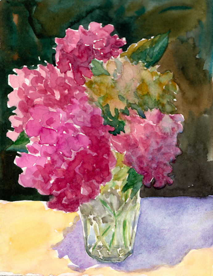
When I get over-tired, instead of thinking, “sleep,” I think I’m hungry and crave carbs (and now research is showing that sleep deprivation causes weight gain and other health risks…see here and here). So instead of eating popcorn (or going to bed at 7:00), I decided to paint these “popcorn ball flowers” (as my sister and I used to call hydrangeas when we were kids…and I thought everybody did until I Googled “popcorn ball flowers because I can never remember their real name, and discovered only recipes for making flowers out of popcorn and no references to hydrangeas!).
First I had to refill my watercolor palette because a couple weeks ago I’d washed out all the funky old paint that had been in there for too long. Some of it was getting moldy and all of it was dirty. Before refilling my palette, I did color tests of all my paints to decide which pigments I wanted to use now. I love organizing things, so this was a perfectly soothing task for a tired mind.
Finally I was ready to paint, and grabbed my homemade 6×8” sketchbook filled with hot pressed Fabriano Artistico paper, and this bouquet of hydrangeas from my yard that I’d plopped into a drinking glass the day before. Instead of starting with my usual ink drawing, I used pencil and then painted using more of an oil painting technique, starting with the darkest darks instead of the lights.
Maybe it was because I was so tired, but I had so much fun, just being playful as I painted and not worrying about the outcome. As usual I wished I’d stopped about 10 minutes sooner and someday I’ll learn that “when you’re 75% finished you ARE finished!” Some day….
If you’d like to know which pigments I settled on, click “Continue Reading for the details….
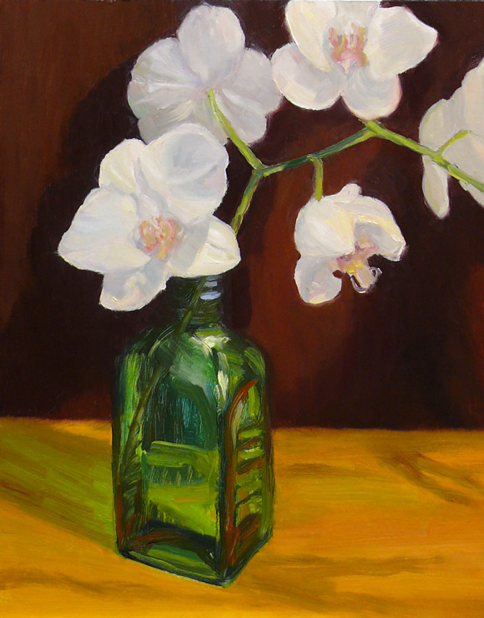
I love painting glass and was happy with the way this bottle turned out. I tried to use the same free and fun approach I take to painting glass in watercolor and it actually worked this time. I wish the flowers were as easy.
It’s easier to show off the beauty and delicate nature of flowers in watercolor than in oil paint, especially white flowers. In watercolor you don’t use white paint, but rather leave the brilliant white of the paper for white areas.
White oil paint can look blueish, cold, chalky and dull so in oil painting you have to create the illusion of warm glowing light by placing either dark or subdued, neutral, or grayed colors beside the white so in comparison it looks bright. It also helps to add a little yellow or orange to white paint to warm it. I tried doing all of the above in this painting, but still struggled with the white flowers, scraping and repainting several times.
I read an inspiring and funny post on singer Christine Kane’s blog called “What Spam Can Teach You About Inner Peace.” It’s really worth reading if you have one of those annoying inner critics who says mean things about you or your artwork. While you’re there, check out another post of hers that is helpful for artists and/or self employed people, “How to Get Off the Hamster Wheel.”


