Categories
Art Drawing Gouache People Portrait Sktchy Sktchy

Triadic Color Scheme in Gouache

Jennifer L. from Sktchy, weird 3-color gouache triadic color scheme, 10x8 inches
Jennifer L. from Sktchy, weird 3-color gouache triadic color scheme, 10×8 inches

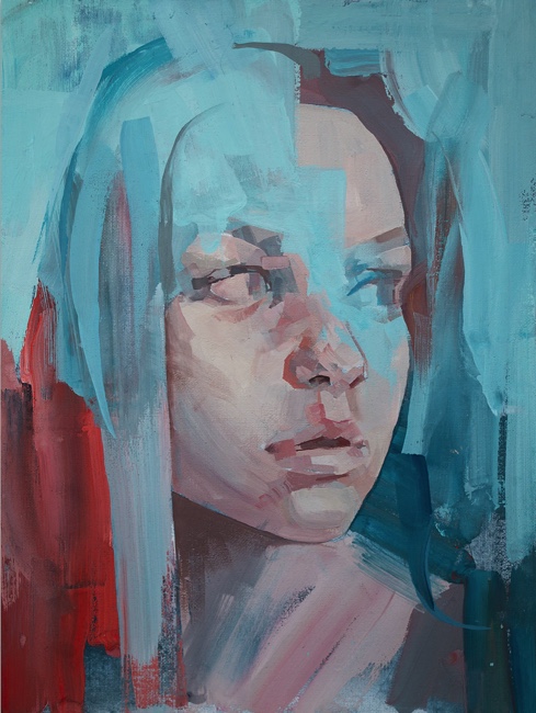
A triadic color scheme is one in which three colors are chosen for the palette that are equal distance apart on the color wheel. For example, either the three primaries (red, yellow, blue) or three secondaries (orange, purple, green) or tertiaries like red-orange, blue-green, etc. The colors I chose were a little weird: Linden Green, a greenish yellow because I wanted to capture the brilliant greens in the garden, plus Ultramarine Blue and Cadmium Red Light.

I thought the Linden Green and Cad Red Light made some interesting skin tones.

Mixing experiments with triad of Linden Green, Cad Red Light and Ultramarine Blue

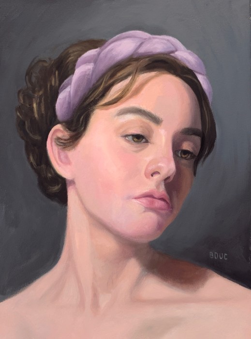
Like all of the reference photos that Mike Creighton chose for his Sktchy gouache and color class, I wasn’t particularly attracted to paint this reference photo (at bottom of post). So I tried to think of it not as a portrait but a puzzle to play with color mixing plus a chance to practice my drawing.

In my initial sketch below, her hand and fingers were the most fun and most challenging.

Initial Sketch on Xerox paper
Reference photo

Overall I’m not thrilled with this one. I don’t really like looking at it. But the puzzle process and mixing experiment was really fun.

Categories
Art Art theory Faces Gouache People Portrait Sktchy

Complimentary: All the Colors in Just Two

América GS from Sktchy in just two colors, 10x8 inches on watercolor paper
América GS from Sktchy in just two colors, 10×8 inches on watercolor paper

In the past when I experimented with limited palettes and color schemes I missed the point. I thought the idea was to compose with just the chosen colors, rather than to discover how many different colors could be made by mixing them together. I hadn’t yet discovered the beauty of neutrals made by mixing two very different colors together. For this portrait, the challenge was to use complimentary colors (colors that are opposite each other on the color wheel).

I chose just two pigments: Winsor Newton Cobalt Turquoise Light and M. Graham Cadmium Red Light; basically a blue-green and a red-orange. I focused on making the lights cool and the shadows warm and was thrilled to discover the wonderful range of colors and neutrals I could make with just these two pigments and white.

First pass with color

Of course the colors are nothing like the actual colors in the reference photo (below), another photo I wouldn’t have chosen to paint myself, which removed the investment to capture it perfectly.

Reference photo of America S from Sktchy
Categories
Art Art theory Drawing Gouache Painting People Portrait Sktchy Sktchy

Alexander’s Analogous Bathroom Selfie in Lavender

Alexander H from his bathroom selfie on Sktchy, 8x8" on watercolor paper
Alexander H from his bathroom selfie on Sktchy, 9×8″ on watercolor paper

Analogous colors sit beside each other on the color wheel. For this gouache experiment with analogous colors, I chose Dioxazine Purple, Quinacridone Magenta, and Pyrole Red; basically a violet, a red-violet and a red. Plus white of course. My favorite gouache paints are M. Graham, especially their white, which is so wonderfully creamy.

Normally when I paint I try to match the colors I see, so painting with arbitrary colors is a very different approach for me, one that requires focusing more on value and warm/cool relationships. There was no way I’d get “normal” skin colors with this combo of colors. Below is my original sketch on Xerox paper which I then transferred to watercolor paper.

Initial sketch
Initial sketch

One funny thing about this Sktchy gouache class is that the teacher seems to pick reference photos of people I never would have chosen. The photo reference for this lesson: a guy seemingly looking in his bathroom mirror when he woke up in the morning. It didn’t inspire me, but maybe the combination of a non-interesting photo and the experiment with color took the pressure off so I could just play. I had so much fun with this one!

Photo reference from Sktchy
Categories
Art Gouache Portrait

A Beauty and a Gloomy Gouache

Olivia McRae in gouache, 10×8 inches

I had so much fun with the painting above and was really happy how it turned out. I’m (slowly) working my way through the Sktchy “30 Faces in 30 Days” gouache and watercolor class, though at the rate I’m going it’s probably going to take me 300 days, not 30 to finish it.

For the painting above, I followed along with Cecile Yadro’s demo. Her style felt very congruent to the way I like to work. You can see the reference photo for this painting on Sktchy here and download Cecile’s free gouache ebook here.

Although it wasn’t mentioned in her lesson, I was especially happy about how I was able to maintain the (high key) value structure while varying the colors and color temperatures within her face, something that clicked for me for the first time.

On the other hand, the next lesson was by Russian artist Nicolai Gánichev and his approach, techniques and final painting didn’t appeal to me at all (see his painting below).

Painting by Nicolai Gánichev 
Photo Reference from lesson

There seems to be a trend in contemporary art of destructing portraits, smearing paint across the subjects face or wiping off their eyes or mouth. Are the artists just bored with their facility in making portraits and have to show their contempt for skill or for the subject? I don’t get it. Also, the reference photo seemed dark and gloomy to me. I tried it anyway.

My sketch
First painting attempt, ugly and gloomy

I sketched her on Xerox paper and then transferred the drawing to watercolor paper. I tried following along with Nicolai but disliked his process so went off on my own. I ended up hating my first painting (above) so I transferred the drawing again, lightened the photo and discovered she actually might have red hair. I wasn’t having fun so I gave up after the second attempt below and moved on.

My final, still unpleasant, attempt at painting her

Categories
Art Gouache Portrait Sktchy Sktchy

Trying Gouache Again

Gouache portrait, 10×8 inches on Arches CP Watercolor paper

I’ve studied gouache before as in this post with color charts and several other times over the years. This month I’ve been participating in the “Sktchy 30 Faces in 30 Days – Gouache and Watercolor” challenge with a different artist demonstrating their way of painting a portrait in either watercolor or gouache each day.

The first gouache demo was presented by Jordan M. Rhodes (@jmr_art on Instagram) who I’ve been following on IG for a long time. I tried to paint along with him but kept on struggling. I ended up taking much longer, painting multiple layers until I was able complete it with some degree of satisfaction. And of course it took me several hours just to get the drawing right-ish first.

My preliminary drawing
Reference photo

I had hoped that doing this 30 day challenge would force me to work faster, but nope. It wasn’t until I got to the next gouache class that I picked up the insights that have given me much more confidence and better skills, which I’ll write about when I share the next portrait.

Categories
Art Faces Oil Painting People Portrait

Emi

Emi, oil on Arches Oil Paper, 10 x 7.5"
Emi, oil on Arches Oil Paper, 10 x 7.5″

This commissioned portrait of a darling little girl was really fun to paint but had some challenges, like trying to invent the pajamas hidden by the highchair straps. It took several drawings (including one of a baby skull I found on Google) before I was ready to move ahead with the painting as you can see in the process steps below.

Emi’s face was actually easier to paint than the pajamas, and I was tempted to keep working on them, probably forever, but the friend who commissioned the painting was happy with it as is, so I am too.

Below is some of the work in progress steps. Please note that the lighting changed the colors in some of the photos.

Categories
Art Digital art Drawing Faces Oil Painting People Portrait Sktchy

Three Portraits of Dayris

Portrait of Dayris, Oil on Arches Oil Paper, 10"x8.5"
Portrait of Dayris, Oil on Arches Oil Paper, 10″x8.5″

I’ve had so much fun painting and sketching the lovely Dayris from Sktchy in oil (above), and before that, in pencil and then doing a digital sketch in Procreate (below). Also below you’ll find a slide show of the work in progress. Doing the two initial drawings really helped me quickly get a pretty accurate drawing for the oil painting. You can see her reference photo on Sktchy here.

Initial pencil drawing of Dayris, 12x9"
Initial pencil drawing of Dayris, 12×9″
Digital Sketch of Dayris in Procreate

Below are the steps in the process of making the portrait.

  • Initial pencil drawing of Dayris, 12x9"
  • Digital Sketch of Dayris in Procreate
  • Umber underpainting
  • Some background and shirt
  • Some paint on face
  • Icky background in with palette knife
  • More work on background, still icky
  • Background better but not happy with shirt or hair
  • Almost done
  • Scraped off shirt and some hair to redo
  • Portrait of Dayris, Oil on Arches Oil Paper, 10"x8.5"
Categories
Art Oil Painting Portrait Procreate on iPad Sktchy

Last Portraits of 2019

Portrait of Kori L from Sktchy, 10x8” oil on gessoed watercolor paper
Portrait of Kori L from Sktchy, 10×8” oil on gessoed watercolor paper

After working on this portrait for two months, trying over and over to capture this lovely woman in paint, I have to admit I never truly succeeded. I learned from all the struggles and attempts but it’s about to be a new year and time to start something new so I’m moving on. You can see her reference photo on Sktchy by clicking on the image of my painting here.

Below are two digital sketches in Procreate from Sktchy, done this month while waiting for the paint to dry on the portrait to try once again on a new layer of oil paint to get it right.

Sketched in #procreate5 from a #sketchyapp photo by Nicolas Schram Illustration
Sketched in Procreate from a Sketchy app photo by Nicolas Schram Illustration

You can see the reference photo for the sketch above here and the one below here on Sktchy. Just click my drawing there to see the reference photo beneath it.

Sketch of H. J. Haggerty from Sktchy in Procreate
H. J. Haggerty from Sktchy in Procreate

Categories
Art Faces Oil Painting Painting People Portrait Sktchy

Portrait of Hannah from Sktchy

Hannah W from Sktchy, 14x11” oil on Arches Oil Paper.
Hannah W from Sktchy, 14×11” oil on Arches Oil Paper. 

Learning to paint (well) for me means a constant but gradual process of 1) learning from my mistakes and 2) having “layers of the onion” lifted from my eyes until I at last can see something that was previously mysteriously hidden from me. (You can see the reference photo for this painting on Sketchy here.)

This painting taught me once again how much harder painting can be when you don’t start with an accurate drawing, going directly to drawing with paint and then correcting, correcting, correcting.

Getting the drawing right and capturing a likeness can be as “simple” as recognizing the big shapes, contours, divisions of space and observing where things line up with each other. Getting the values right can be as “simple” as observing where the light comes from, how it lands on the large and small planes of the face or any object, and asking myself where the darkest and lightest areas are and how this plane compares. Getting good color “just” means accurately observing the overall and predominant range of colors (saturated or grayed, warm or cool) and then asking is this the spot “warmer or cooler, more or less saturated, lighter or darker.”

I can ask myself these questions over and over, but until yet another layer of the onion is lifted, I just can’t see the answer. When that happens my brain tells me it’s too hard and just jumps ahead with a lazy guess, which then sets off another round or layer of correction, correction, correction. But I do learn from my mistakes and each next painting is an opportunity to put what I learned from them into practice and hopefully remove one more layer until at last I will be able to truly see!

Categories
Art Faces Gouache Painting People Portrait Sktchy

Back to Sktchy, a Gouache Portrait

Portrait of Dennis J. from Sktchy, Gouache, 12x9 inches
Portrait of Dennis J. from Sktchy, Gouache, 12×9 inches

I’m returning to using Sktchy for my reference photos of people for portrait practice since there is such a wide range to choose from. I’m not abandoning my series of “people Facebook thinks I should know,” but those are less useful for portrait practice, which I’m wanting to do right now.

Can you tell those splotches on his face are light coming in from a window through maybe lace curtains? I can’t post the original Sktchy reference photo off that site, but you can see it by clicking or swiping on my Sktchy painting on Sktchy here if you’re interested.

One thing I love about gouache is that it limits me to working on a painting for only one or two sessions. Unlike oils that can go on being repainted forever, gouache fairly quickly says, “Sorry, no more paint, no more layers, you’re done.” It teaches me to get the drawing down, go for the values and then lay down brush strokes of color and let them be.