
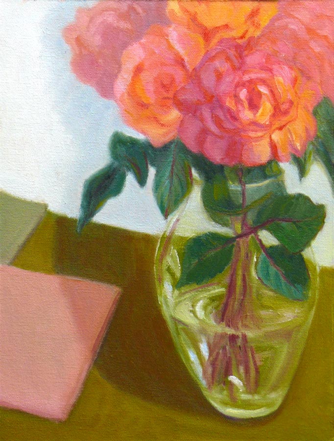
My next door neighbors were pruning their roses for winter so I asked them to save some for me to draw (they were going to throw the still perky roses in the recycling bin). I started by trying to paint them in oils but was having a terrible time mixing the right colors. I scraped off the paint and went to bed, planning to try again the next day.
When the cats knocked the vase over during the night I was actually relieved, thinking the roses would be too funky to paint since all the water was on the floor, not in the vase. But these were some tenacious roses, and were still fine so I decided to try sketching them in watercolor (above and below). I also consulted one of my books on flower painting that said roses were shaped like teacups, so I added a few of those tilted at the same angles to the sketch to help me understand their shape better better.

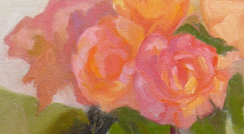
I’d just finished the sketch (above) and was writing about how hard it is to mix the highlight color of “blood red” roses in oil paint. At that very moment, my nose started bleeding for no reason at all and it dripped onto my sketchbook! Now I feel like a real Avant-garde artiste, painting in blood!
P.S. A little pinching of the nose and it stopped.

Mixing a light red color in oil paints
It’s hard to mix a warm, light red in oil paint because when you add white to red oil paint, it makes a cool pink. This is because all white oil paint is cool (meaning it tends more towards a blue than a warm color like orange or red). But the color of these roses in bright, warm light was a hot pink. It’s easier to get a warm, light red in watercolor because you use the “white” of the watercolor paper to show through and “lighten” the red, not white paint.
To get help with the dilemma I sent an email to Diane Mize at Empty Easel since she and I had recently corresponded about color charts and she’d written an excellent article on Empty Easel about how to mix correct color in oils. She validated that mixing a light red is challenging and offered some good suggestions, including using Naphthol Red, which is a more intense red than the cadmiums (which quickly lose strength in white).
I tried making the lighter areas of the rose thicker, using a palette knife, since those raised areas will catch the light and reflect it making it appear lighter. I also intended to make the dark areas on the roses more neutral and cooler, so that by comparison the warm light area would look even more brilliant. But the roses finally died and that put an end to the painting. My favorite part of this painting are the leaves at the bottom left.


