Categories
Art supplies Art theory Life in general Oil Painting Painting Still Life

Procrastination & Painting Pomegranates

Pomegranate and seeds, oil on Gessobord, 9x12
Pomegranate and seeds, oil painting on Gessobord, 9x12"

I never thought I was a procrastinator but after a week’s vacation meant to be spent painting but rarely getting into the studio until early afternoon at best, I began to look at how I’ve spent my time this week and had trouble figuring out where it had gone.

Then l saw this incredibly creative and well-made four-minute movie on YouTube entitled “Procrastination.” I could see myself in every single scene (except maybe smoking).  If you’ve ever procrastinated getting started on a creative project out of fear of failure, perfectionism, artist’s or writer’s block or any other reason, this video and will make you laugh (or cry).
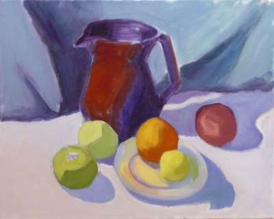
About the painting:

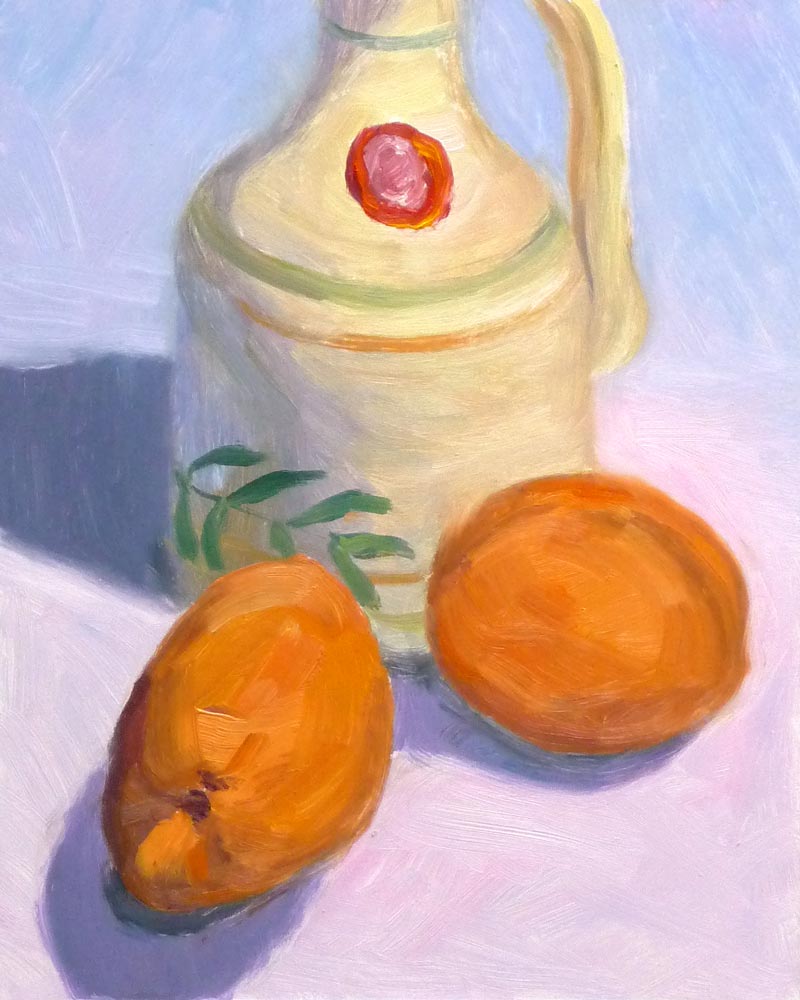
I discovered Gessobord this week and fell in love with the wonderful surface of these panels. They’re smooth but have a texture that sort of bites into the paint and grabs it, as well as enhancing the colors of the paint. It’s really amazing and is a total pleasure to paint on with oil paints. I wish they were less expensive, but they’re still cheaper than pre-stretched canvas, especially when purchased on sale online.

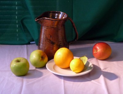
Instead of trying to do a one or two hour painting and finishing this still life in one chunk, I had to do this one in several short sessions over a period of a few days (because of procrastination and various holiday events and other responsibilities).

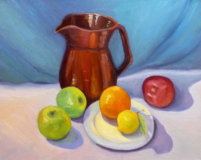
I paused and studied the painting, and saw that I needed to improve the composition and values:

Stopping point before analyzing and improving value contrasts
Stopping point to analyze problems

I looked at the painting and the set-up through a piece of red plastic (which elimates the color, emphasizing values) and could see that I needed to darken the background and the inside of the fruit on the left side. I also added the seeds and stains on the cutting board to avoid so much empty space and lead the eye into the painting.

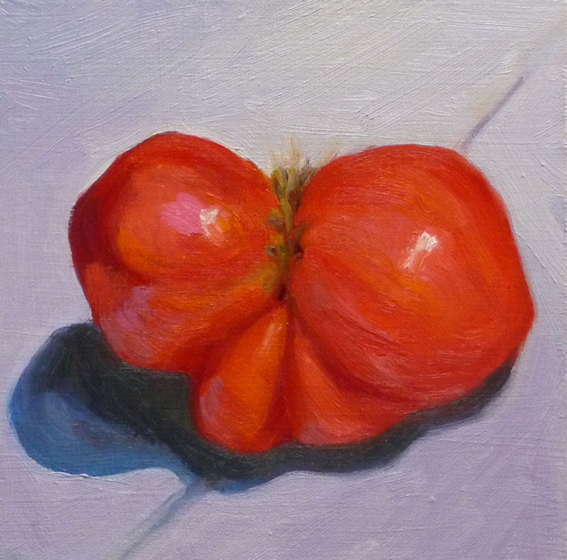
The pomegrantate (already less than fresh when I started) got less attractive and eventually I had to stop and call the painting finished.  I think it will serve as a good stepping stone to the next as I try to put more “miles” on my brushes. And now to stop procrastinating and focus on starting that next painting!

Ooops…when I posted what I thought was the “finished” painting (at bottom) a few minutes ago and then posted this photo of the set-up from day one, I could see that the color of the pom needed to be warmer and the background cooler so I just applied a dark cool glaze to the background and a warm red glaze on some of the pom and posted the finished picture at the top of the post. Now I’m done (I think).

20081130_2566-pomegranate-photo
Photo of set-up on day one
Pomegranate and seeds, oil on Gessobord, 9x12
Thought I was finished but more work needed
Categories
Sketchbook Pages Still Life Watercolor

Summer Leftovers #2: Avocado & Apricot Pits

Avocado & Apricot Pits, Watercolor on coldpress paper, 6x8
Avocado & Apricot Pits, Watercolor on coldpress paper, 6x8"

I thought that these apricot pits and this avocado pit, still in a bit of it’s outer papery sheath would be a good subject for using my set of Kremer Pigments’ pan watercolors.  The Kremer watercolors are unusual in that they’re so highly pigmented, mostly opaque and mostly sedimentary. They are quite stable when applied: the colors don’t charge or bleed much into each other, unlike the more volatile quinacridone and other synthetic pigments.

But I found that those qualities make them less suitable for glazing because their opacity and and saturation mean that one layer hides the one beneath it. Half of the colors in my 14-color palette are muted shades of red, brown, gold, green; a few are more brilliant, but so richly colored that they have to be thinned way down to appear transparent.

I guess what I’m saying is that I’m not as familiar with how these colors work together as I am my regular palette of mostly Winsor Newton tube watercolors. It takes practice to have control over one’s media and I felt pretty out of control with these but enjoyed playing with them. I’ll try them again for the next summer leftovers.

Categories
Life in general Oil Painting Painting Still Life

Green Fig (Minus One Bite), Rock Tours, Guardian Angels

Green Fig, Oil on panel, 8x6"
Green Fig, Oil on panel, 8x6

I took one bite out of my last green fig and was treated to an explosion of taste and color so brilliant I had to paint it. I gave myself the length of a Tom Waits live concert podcast to paint it. I finished before the concert did. It’s still playing and is fantastic! It’s one of many of NPR’s “All Songs Considered Live Concerts” that can be listened to directly on their website or downloaded from iTunes.

The back up musicians are incredible (love that sax and drums) and there isn’t a boring or annoying song in the whole 2 hour performance. Of course Tom Waits is not for everyone. He trained his voice when he was young to make it sound like a gravelly-voiced old man and it stuck that way. His songwriting is eerie and strange and some might be offended by his more irreverent themes. “Glitter and Doom” is the name of his 2008 tour and it fits the music perfectly.

2007: The Oil Slick Tour

I’ve always been jealous of how musicians get to name their tours, like Madonna’s “Sticky and Sweet Tour,” (yuck, gross) Elton John’s “Red Piano Tour, ” U-2’s “Vertigo Tour.” I love the idea that for a period of time you name your “tour.” I think I’m going to start having tours instead of years. I could call 2007 the “Oil Slick” tour, as I’ve worked hard this year to learn how to paint in oils, with lots of slipping and sliding along the way.

Now it’s time to plan my tour through 2008, and gather my roadies and back-up singers. Hmmm, what shall I call the tour? I’m thinking maybe the “Anchored Angels Tour” based on some helpful advice from two friends about completely unrelated issues:

Setting Anchor

I’ve been trying to get to bed earlier but my caffeine habit makes it hard to do that. So my friend Ree told me that she never drinks coffee after a certain time in the afternoon. She thinks of that time of day as setting an anchor, putting in to harbor for the day. Then she’s able to get to bed at reasonable time and wake up rested instead of being kept awake by the caffeine into the wee hours and waking up in need of another jolt of java.

Guardian Angels

Another friend said “Don’t fly faster than your Guardian Angel.” I loved that saying since I’m often doing a dozen things at once, trying to get more than is possible done, and can barely keep up with myself.

If I were rich I’d have a full time personal assistant/personal trainer/life coach/personal chef. But since I’m not rich, I have to do all those things for myself, and sometimes I can be quite incorrigible. So maybe if I adoped a Guardian Angel (and not just the wind-up Parking Karma Angel on my dashboard) she could tag along and fill in for that personal trainer/coach/etc. All available Guardian Angels, please apply within.

Categories
Art theory Drawing Oil Painting Other Art Blogs I Read Painting Photos Sketchbook Pages Still Life

Full Circle: Painting my Pottery Pitcher

Temoku Pitcher & Fruit, Oil on canvas, 16x20"

The pitcher in this painting is one of the few remaining pieces from my years as a potter, though not a favorite.  I’d assumed I’d always be a potter and could always make more so didn’t worry when I sold nearly everything pre-Christmas one year. Then life changed.

I got married, had a baby (who I intended to just strap in a papoose on my back and continuing working at the wheel, up to my elbows in wet mud–Ha!) and we moved to a row house in San Francisco where I could no longer have a kiln. So that was the end of pottery, but the beginning of drawing and painting.

Below you can see the steps I took in making this painting. Although I was working live from my own still life set up, I was also following along with an excellent painting video by Don Sahli. I tried to set up a still life similar to the one he paints in the video but ate  the second orange so substituted a lemon.

[You can see a demo of the Sahli video here.]*

I’d already watched the video and had many “Aha!” moments with it and wanted to practice what I’d learned from it. This weekend I stayed in the studio instead of going out to paint plein air. I played a chapter of the video,  doing that step on my canvas then played the next section. It took Don an hour to do the entire painting but it took me the whole weekend.

Don Sahli is a wonderful teacher and painter who was the last apprentice of Russian painter Sergei Bongart. He breaks painting down to these 4 stages and I photographed those stages (above) as I went along:

  1. Drawing;
  2. Abstract stage (where you do 80% of the work, starting with the darkest dark and then continually ask yourself what color, value, temperature and you paint in one color shape after another);
  3. Modeling (where you finish giving the objects a 3-dimensional appearance, delineating the planes using value, and color temperature.
  4. Final details (adding highlights, caligraphic strokes, dark accents).

After watching the video and doing this exercise, I finally understand so many concepts that I’d read about, been taught, but had still been struggling with, especially the one illustrated below that starts the 3-dimensional appearance of the objects by finding and focusing on the dark/light,  warm/cool color shapes.

*P.S. I have no financial or other interest in Don Sahli’s videos. Just wanted to share a good resource.

Categories
Gardening Life in general Oil Painting Painting Plants Still Life

Early Girl on Blue Velvet

Tomato on Purple Velvet, Oil on panel, 6x6"
Tomato on Blue Velvet, Oil on panel, 6x6"

Last year I planted Early Girl tomatoes and Best Boy tomatoes. They must have gotten together and had some fun over the winter because they’ve returned bearing fruit this summer all on their own.

I was ready to paint something other than that stupid scene at Sibley. Rummaging around in the kitchen a  tomato caught my eye and then when I reached into the stack of colored cloths I keep for still lifes (or is it still lives?) in an overhead cabinet, I came away with a blue-violet piece of velvet (actually it’s a small velvet bag).

It was fun working with such saturated vibrant colors but now I have to clean brushes and let go of painting for a few days while I return to my “day job.” Although I often feel grumpy at having to make that switch, today I’m feeling very grateful for a good job and my comfy home and studio, given all the terrible news of financial ruin and weather-caused devastation I’ve heard today. I haven’t been watching any TV for the past month, which has been great, but today I took a look at the news while I ate dinner and was so sad to see all the suffering.

Categories
Oil Painting Painting Still Life

First Gnarly Tomato of the Year

First Tomato, oil on panel 6x6" (click image to enlarge)
First Tomato, oil on panel 6x6
I didn’t plant tomatoes this year, but oddly, last year’s plants came back on their own. This critter was the first one to ripen and it was so gnarly looking I had to paint it. I wonder why it turned up with this shape? Could it be 3 or 4 tomatoes that grew together like Siamese twins? Or did the tomato frame that supports the vines dent it?
I started by doing a couple watercolor sketches to get an understanding of the shape. Then I made a gallant start on the oil sketch, getting it almost done but then fiddling with it until I had to scrape it all off, repainting and then fiddling some more. I must have scraped and fiddled and scraped 10 times. I called it done at midnight and went to bed.
Tonight after work I gave it another shot, and am happier with this version (painted on top of the first). I can see that I wasn’t using enough paint the first time around. There are so many other colors than red in a tomato and mixing the right color for the right spot is surprisingly challenging.
Categories
Art theory Flower Art Glass Painting Plants Sketchbook Pages Still Life Studio Watercolor

Painting popcorn ball flowers (hydrangeas) instead…

Hydrangeas (popcorn ball flowers)
Larger

Have you ever been so sleepy you’re just slap-happy silly? That’s how I was yesterday. I’ve been trying to change my schedule to get up early and go to bed early but after a few days of doing the former but not the latter, I was so sleep-deprived yesterday afternoon that I just stopped making sense, even to myself.

When I get over-tired, instead of thinking, “sleep,” I think I’m hungry and crave carbs (and now research is showing that sleep deprivation causes weight gain and other health risks…see here and here).  So instead of eating popcorn (or going to bed at 7:00), I decided to paint these “popcorn ball flowers” (as my sister and I used to call hydrangeas when we were kids…and I thought everybody did until I Googled “popcorn ball flowers because I can never remember their real name, and discovered only recipes for making flowers out of popcorn and no references to hydrangeas!).

First I had to refill my watercolor palette because a couple weeks ago I’d washed out all the funky old paint that had been in there for too long. Some of it was getting moldy and all of it was dirty.  Before refilling my palette, I did color tests of all my paints to decide which pigments I wanted to use now. I love organizing things, so this was a perfectly soothing task for a tired mind.

Finally I was ready to paint, and grabbed my homemade 6×8” sketchbook filled with hot pressed Fabriano Artistico paper, and this bouquet of hydrangeas from my yard that I’d plopped into a drinking glass the day before. Instead of starting with my usual ink drawing, I used pencil and then painted using more of an oil painting technique, starting with the darkest darks instead of the lights.

Maybe it was because I was so tired, but I had so much fun, just being playful as I painted and not worrying about the outcome. As usual I wished I’d stopped about 10 minutes sooner and someday I’ll learn that “when you’re 75% finished you ARE finished!”  Some day….

If you’d like to know which pigments I settled on, click “Continue Reading for the details….

Categories
Flower Art Glass Oil Painting Painting Plants Still Life

Orchids in Green Bottle & Mental Spam

Orchids in Green Bottle
Oil on panel, 14×11″ (larger)

I love painting glass and was happy with the way this bottle turned out. I tried to use the same free and fun approach I take to painting glass in watercolor and it actually worked this time. I wish the flowers were as easy.

It’s easier to show off the beauty and delicate nature of flowers in watercolor than in oil paint, especially white flowers. In watercolor you don’t use white paint, but rather leave the brilliant white of the paper for white areas.

White oil paint can look blueish, cold, chalky and dull so in oil painting you have to create the illusion of warm glowing light by placing either dark or subdued, neutral, or grayed colors beside the white so in comparison it looks bright.  It also helps to add a little yellow or orange to white paint to warm it. I tried doing all of the above in this painting, but still struggled with the white flowers, scraping and repainting several times.

I read an inspiring and funny post on singer Christine Kane’s blog called “What Spam Can Teach You About Inner Peace.” It’s really worth reading if you have one of those annoying inner critics who says mean things about you or your artwork. While you’re there, check out another post of hers that is helpful for artists and/or self employed people, “How to Get Off the Hamster Wheel.”

Categories
Life in general Oil Painting Painting Still Life

Jumbo Apricots – Quick Oil Study

Jumbo Apricots - Quick oil sketch

(larger)

I did this painting before bed last night, giving myself just an hour or two to complete an oil sketch. The panel I was using was a bit slick so the paint wasn’t sticking as well as I’d have liked but I was reasonably pleased with the attempt.

While I was painting my wonderful next door neighbors brought me a huge bouquet of flowers for my birthday. For some reason, as each of the three kids and their parents said “Happy Birthday!” and gave me a hug I said “Happy Birthday to you too!” It wasn’t until I’d said it three or four times that I realized it made no sense. Since English is their second language, maybe they thought that’s just another odd American custom (or another odd Jana-ism). They already thought it was weird enough that I was spending my birthday evening by myself in my studio.

But of course painting is what makes me happy and I get to do what makes me happy on my birthday. I told them I’d paint the flowers the next day (and then realized I’d already started painting them as I’d answered the door with several painty brushes in my hand, and the paint was getting all over the bouquet wrapper.

I started the day with my annual tradition of a hike to Fat Apples Restaurant for a French Apple Pancake with my sister, my niece, and my best friend Barbara. We’ve been doing this every year for at least ten years and it was great spending time together and the pancake/souffle was perfect.

About the painting: Oil on panel, 10×8

Categories
Glass Painting Sketchbook Pages Still Life Watercolor

Better than Plastic: Blue Glass Water Bottle

Blue Bottles
(Larger)

While eating dinner, reading an art book and drinking water from this bottle I became fascinated by the bottle and had to immediately go paint it. The bottle came from from Trader Joes filled with sparkling water. It makes a great reusable water bottle. I washed off the label and just refill it with filtered tap water and a squirt of lemon from my lemon tree and then refrigerate it.

To avoid buying and throwing away tons of plastic water bottles (you’re not supposed to reuse them because they can’t be cleaned properly) I’ve tried a variety of lexan, Nalgene, and stainless steel water bottles. I like to use this glass bottle at home (it’s too heavy and breakable to be portable) and a Kleen Kanteen stainless steel bottle with a sport cap when I go out.

What did we do for water before water bottles and car cup holders? I guess there were thermoses but those weren’t for water. I remember carrying a large purse to middle school in order to carry my big can of hairspray, but I know I never carried water.

When I was a kid, doctors didn’t recommend drinking 8 glasses of water a day like they do now, but they did recommend cigarettes. One cigarette brand ran ads in medical journals with the claim that its cigarettes were “Just as pure as the water you drink.” One of the most infamous cigarette advertising slogans was associated with Camels:”More doctors smoke Camels than any other cigarette.” That ad appeared in medical journals and the popular media for eight years.

About the painting: 6×8″ on Arches cold-press 140 pound watercolor paper in my handmade sketchbook. Mostly Winsor Newton paint plus the bright turquoise on the right side of the big bottle from Kremer Pigments. The funny shadow on the right actually looked like that but it made me happy because it reminded me of the amazing pot and shadow studies, which I adore on Alison’s blog, Scribbles Adagio.