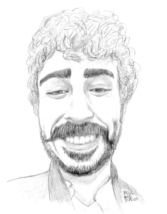
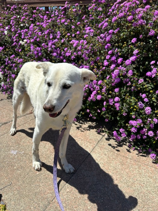
I had a terrible, scary day that included a near poisoning of my dog and other misfortunes, that left me a nervous wreck. Finally, in the evening, I spent some time in my studio sketching this cheery guy from the Museum/Sktchy app that completely changed my pissy mood and I went to bed happy. Here’s what happened:
A big slob of a PGE utility guy came to check my gas meter. When my dog barked, he threw big chunks of a leftover cookie that was in his pocket (who keeps loose cookies in their pockets?) to her over the fence.
He tried to tell me it was dog treats but I quickly saw it was pieces of an oatmeal raisin chocolate chip cookie. I knew chocolate was bad for dogs but I learned that 7-8 raisins or grapes are enough to cause death from kidney failure.
I couldn’t tell how much she ate before I found the mess of chunks and crumbs and cleaned it up. The internet said it was a veterinary emergency and to immediately call the ASPCA Pet Poison Control Center. I paid $95 to spend an hour on the phone with them.
While the toxicologist and vet were consulted and I was on hold, I made an urgent care appointment to have her stomach “pumped.” Finally the Poison control doctors decided that if she ate less than 7 raisins we could watch and wait for 48 hours so I cancelled the urgent care vet appointment.
Then I made the call to PGE to report his awful behavior, AND that he put a bag of his trash including a “Brief Relief urinal bag” and wet wipes and more gross stuff in my garbage can and left trash on the ground. PGE promised to pay the $95 and any other associated costs. And to do something about that guy.
Update: good news, it’s now past 48 hours and she’s OK!
Miss Millie, my 12 year old dog, a formerly feral street puppy from Taiwan
Summer Selfie, Oil on Shellacked Arches Oil Paper, 9”x 6.5”
After the wig experiment I got even braver and cut my hair very short for the first time since I was about 12. I was going for something spiky, between Laurie Anderson and a pixie cut but this is what my curly hair wants to do.
I painted the oil sketch above from a photo as a test for using shellac as an archival primer/sealer/ground on paper. I used the Zorn palette (black, white, cadmium red and yellow ochre).
I got bored after painting my head so everything below my chin is pretty rough.
Getting Started with Shellac
Although it comes in a colorless formula, I bought amber shellac so that it could seal the paper and tone it at the same time (and it’s easier to see what you’ve covered). Since it’s transparent you can do a drawing with pencil or charcoal on the paper and then shellac over it and still see your drawing. (See below)
Shellac Over Pencil Sketch on Paper
Fun fact: Shellac is made from a substance secreted by female (she?) Lac beetles to make their tunnel-like tubes on tree branches. It is harvested by scraping it off those trees in India.
Shellac dries super quickly (in under 15 minutes) by evaporating out the denatured alcohol, which is the liquid the shellac is dissolved. It barely smells at all but it’s still good to have ventilation.
It’s best to make it fresh from flakes, but since I can’t buy denatured alcohol in California to dissolve it in, Zinsser canned shellac is my only option. You buy it at the hardware store, not the art store.
Application: It should be stirred first (not shaken). Then you can apply it with a cheap hardware store bristle brush (or a nicer one if you can get denatured alcohol or don’t mind using ammonia to clean it). Supposedly you can also let the brush dry without cleaning it and when you put it back in the can it will soften and be ready to use.
You can also apply it with a rag, a squeegee or anything except a sponge brush according to the hardware store guy. For this first experiment I just spread it with a flat paint stirrer stick and it worked fine and made a nice variegated background.
I really like the interesting painting surface that shellac provides—not too slippery like acrylic sealant but not so dry/absorbent like gesso or Arches Oil Paper without sealant.
A Few Tips and Mistakes to Avoid
For more shellac tips, watch artist Aimee Erickson’s video demo on using shellac to prime pages in a sketchbook for oil painting.
Shellac is thin and as it turns out, quite splashy. After I applied the shellac to my paper, I put the lid on the can, and, as I usually do with my gesso bucket, I tapped the lid with my rubber mallet to seal it. That sent golden shellac from the rim of the can splattering all over my table, the wall, a framed (in glass fortunately) painting on the wall and everything on the table. Now I carefully wipe the rim before tapping it with the mallet.
I did the drawing for this painting directly on the shellacked paper. Even though I had pretty good luck with the drawing, I still needed to do some erasing and redrawing. That roughed up the surface unpleasantly in some spots. Shellacking over a drawing may be a better solution.
I tried shellacking 140 pound cold pressed watercolor paper instead of Arches Oil Paper for another painting. Even though it does seal the paper, I found the painting surface quite unpleasant, and won’t do that again.
I signed up for a Sktchy Watercolor class to see what I could learn from their teachers. I planned to make myself try the teachers’ different approaches and I did attempt the super loose, wet in wet approach Dritan Duro, the teacher for this class demonstrated, but tossed the crappy results and started over, doing things my way.
Color wheel: WN Raw Sienna, WN Perm. Alizarin, Winsor Blue Green Shade
Interestingly, the 3-color limited palette I used for this painting was the same as the one I used for my painting of Dorothy, even though the two women look nothing alike. It’s a fun challenge to work with only a 3-color limited palette. (WN Raw Sienna, WN Perm. Alizarin, Winsor Blue Green Shade).
Freehand sketch, 9×7”
Above is my final sketch and below is my preliminary sketch, scanned into Procreate, with a tracing of the photo over it. I used it to check my drawing and then made the corrections to the final sketch above.
Corrections marked from tracing photo in Procreate over sketch
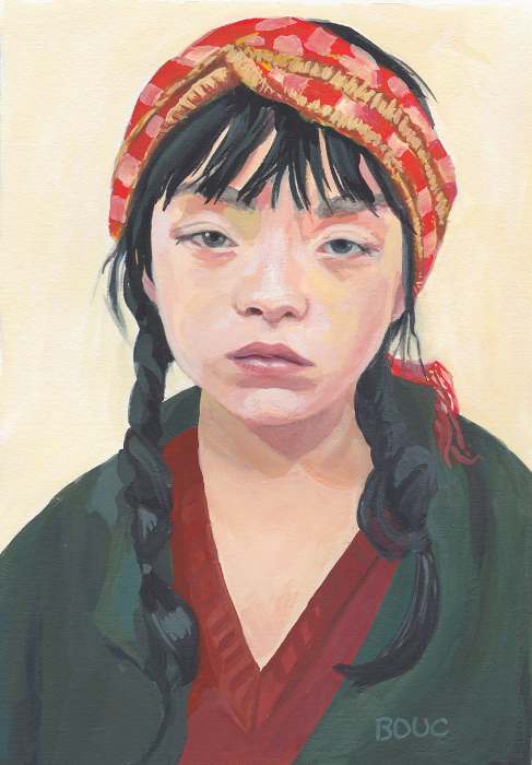
Sleepy Asian Girl, Gouache on paper, 10 x 7 inches
This was one of those rare and wonderful painting experiences where the sketch (below) came together by magic, and I liked it enough to not even check it against the reference photo for accuracy. I didn’t care if it was perfect. The painting just flowed and it was super fun to see and paint all the different colors and textures.
Sleepy Asian Girl Sketch, 10×8 inches, graphite on Xerox paper
I kept pondering her story while I worked on the portrait. I had all kinds of ideas but settled on a bone-tired factory or sewing shop worker. Then I did a Google image search of the reference photo (below), which was supplied by a Sktchy artist for her class demo and for us to paint from.
Reference photo
The image search took me down a looooong rabbit hole that led to a match for the photo. It turns out the model is a Japanese artist named Serena Motola. Maybe she was just bored and annoyed to be modeling when she wanted to be painting?
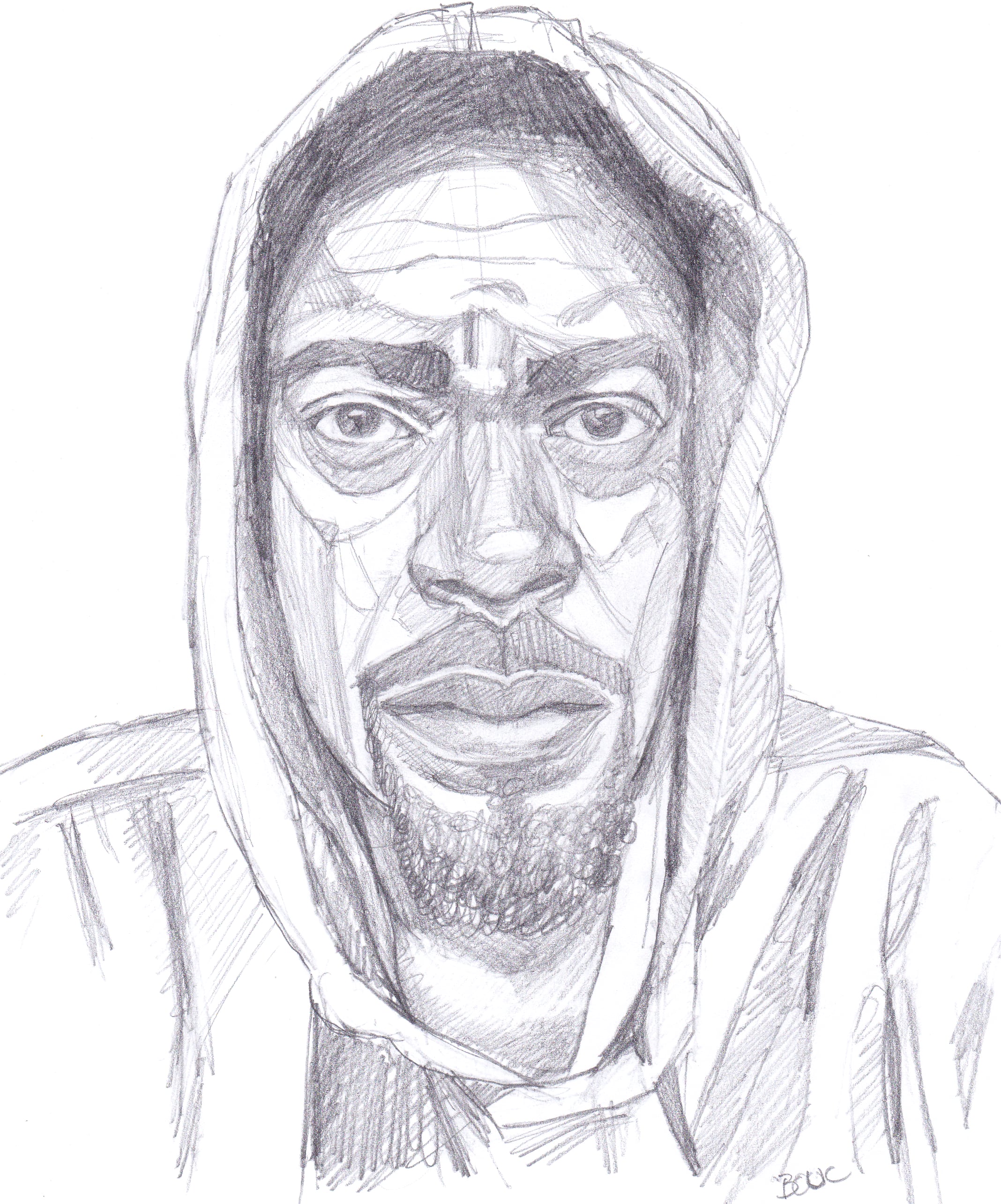
Nate Washington (IG link) is a comedian and podcaster who shared his reference photo for this portrait on Sktchy, here. (Except Sktchy app is now called “Museum”)
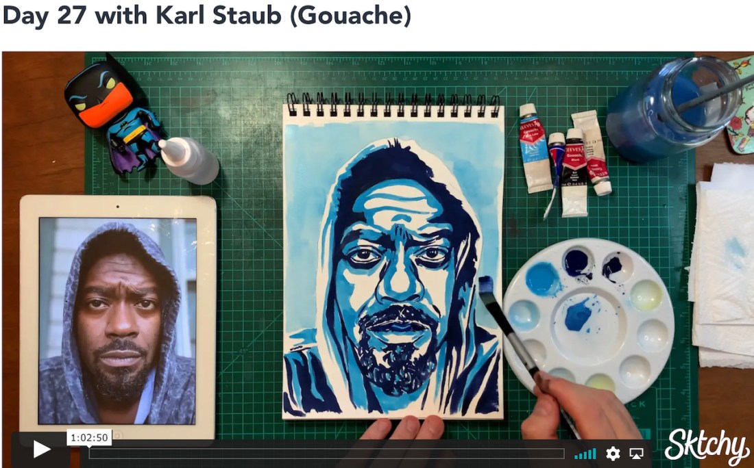
Karl Staub (IG link), the teacher who used Nate’s photo for his demo did a very graphic, poster-like rendering (see below). I was tempted to do that too, but decided to just continue with my own style instead.
Nate W. in pencil, 10×7.5
Above is my original sketch for the portrait. I had fun finding the planes on his face and clothes. Below is a screenshot for the 30 Faces/30 Days – Watercolor & Gouache class on Sktchy displaying the teacher’s work.
This was supposed to be a 30 portraits in 30 days class, but I think I’m now on month three instead. That’s because since last December I started working out every morning, doing indoor cycling, rowing and running classes plus daily core classes and alternating days of weights, yoga, Pilates, and Barre and two hikes a week with friends. I paint in the afternoon.
I’m getting stronger and fitter and having fun. But it’s always a challenge to find balance between all the things that make up a good life. I’m very fortunate and grateful for the luxury of the choices I get to make.
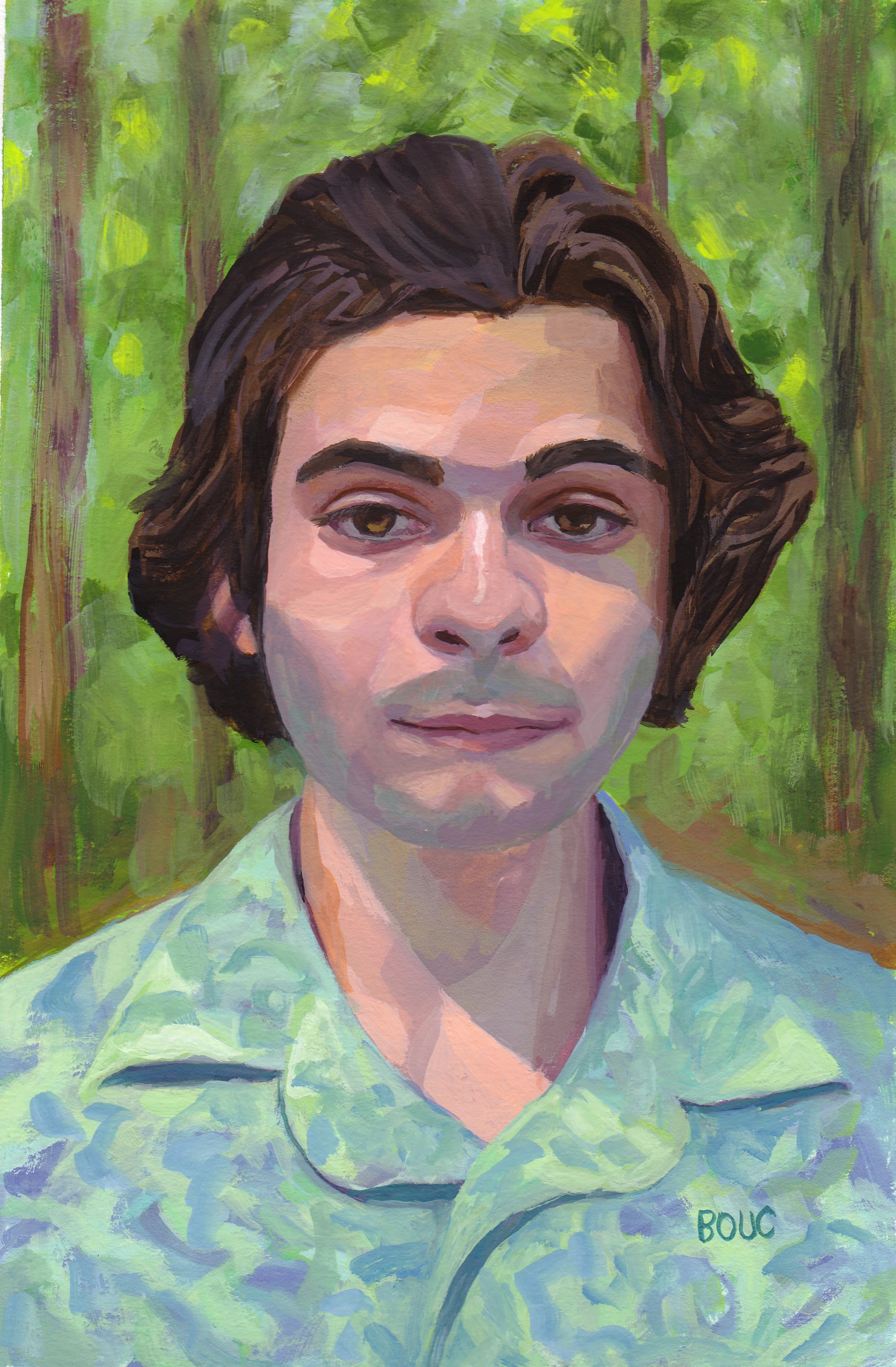
I really enjoyed painting this calm, pleasant young man amidst the trees, seemingly bathing in the cool forest light. You can see his original photo reference on Sktchy here.
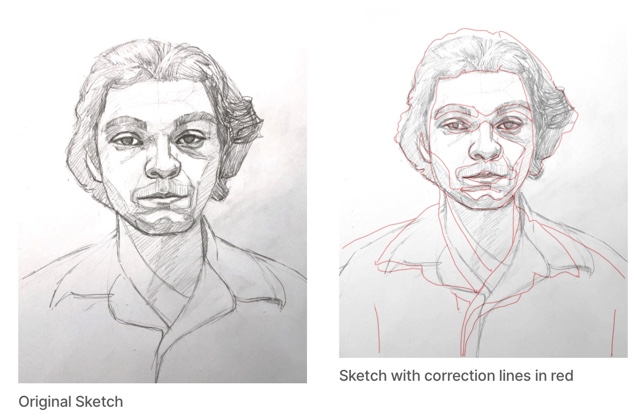
I started with a pencil sketch on copy paper. Then to check my drawing, I compared my sketch to the photo by scanning my sketch into Procreate with the original photo. On a new layer I traced the photo with a red line and layered that over the sketch (see below). Using the red lines as a reference, I corrected my original sketch on paper, transferred the sketch to watercolor paper and then painted.
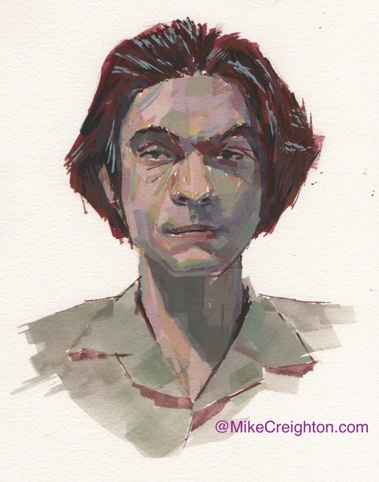
Bennett’s reference photo was part of the Sktchy “30 days in Watercolor and Gouache” class taught by Mike Creighton, one of my favorite Sktchy teachers. I thought it would be interesting to share his painting; such a different feel from mine!
Mike Creighton’s gouache painting
He used a limited palette and did a lot of mark making with his brush. I know the idea of the Sktchy classes is to try to mimic the teachers in order to learn a variety of different approaches and techniques, but I almost always end up taking what I like and then going my own way.
Jennifer L. from Sktchy, weird 3-color gouache triadic color scheme, 10×8 inches
A triadic color scheme is one in which three colors are chosen for the palette that are equal distance apart on the color wheel. For example, either the three primaries (red, yellow, blue) or three secondaries (orange, purple, green) or tertiaries like red-orange, blue-green, etc. The colors I chose were a little weird: Linden Green, a greenish yellow because I wanted to capture the brilliant greens in the garden, plus Ultramarine Blue and Cadmium Red Light.
I thought the Linden Green and Cad Red Light made some interesting skin tones.
Mixing experiments with triad of Linden Green, Cad Red Light and Ultramarine Blue
Like all of the reference photos that Mike Creighton chose for his Sktchy gouache and color class, I wasn’t particularly attracted to paint this reference photo (at bottom of post). So I tried to think of it not as a portrait but a puzzle to play with color mixing plus a chance to practice my drawing.
In my initial sketch below, her hand and fingers were the most fun and most challenging.
Initial Sketch on Xerox paper
Reference photo
Overall I’m not thrilled with this one. I don’t really like looking at it. But the puzzle process and mixing experiment was really fun.
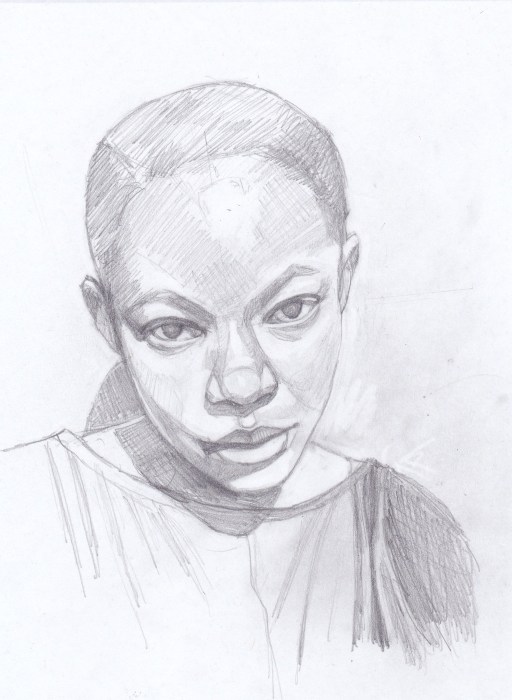
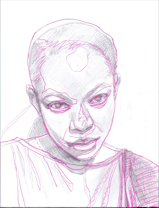
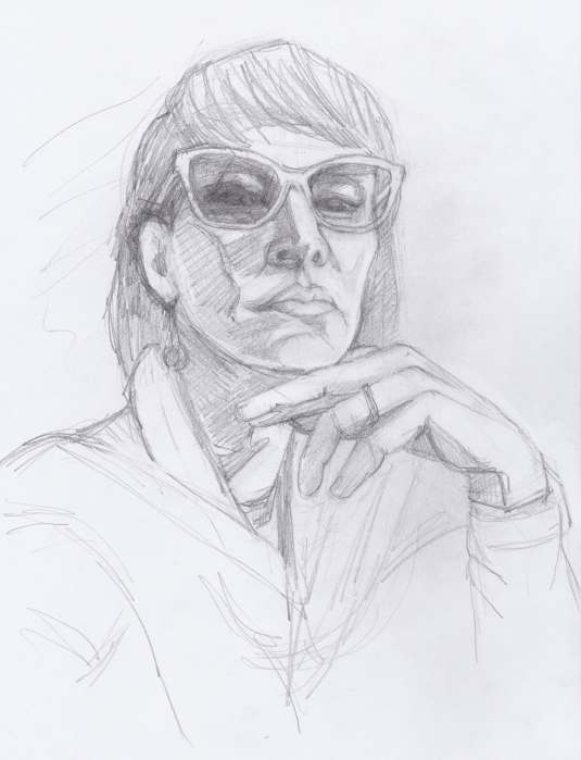
Ioana F from Sktchy, pencil and colored pencil, 10×8 inches
I was inspired to sketch Ioana because of her brilliant hair color (see her photo on Sktchy here) and because a dear friend had to shave her head while undergoing chemo and I was looking for photos of beautiful bald women to share with her. (Ioana also posted photos of herself with a shaved head on Sktchy.) Maybe when my friend finishes her treatment and her hair grows back she’ll dye it shades of pink and orange to celebrate.
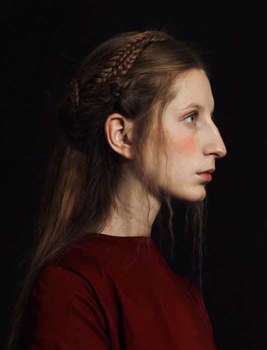
Profile sketch from internet photo, pencil, 10×8 inches
This sketch was done to practice profile drawing which I find difficult. She has such an unusual facial structure as you can see in the photo below, but somehow looks beautiful despite the pointy chin and long nose and big ears. She looks nervous about it all in my sketch.
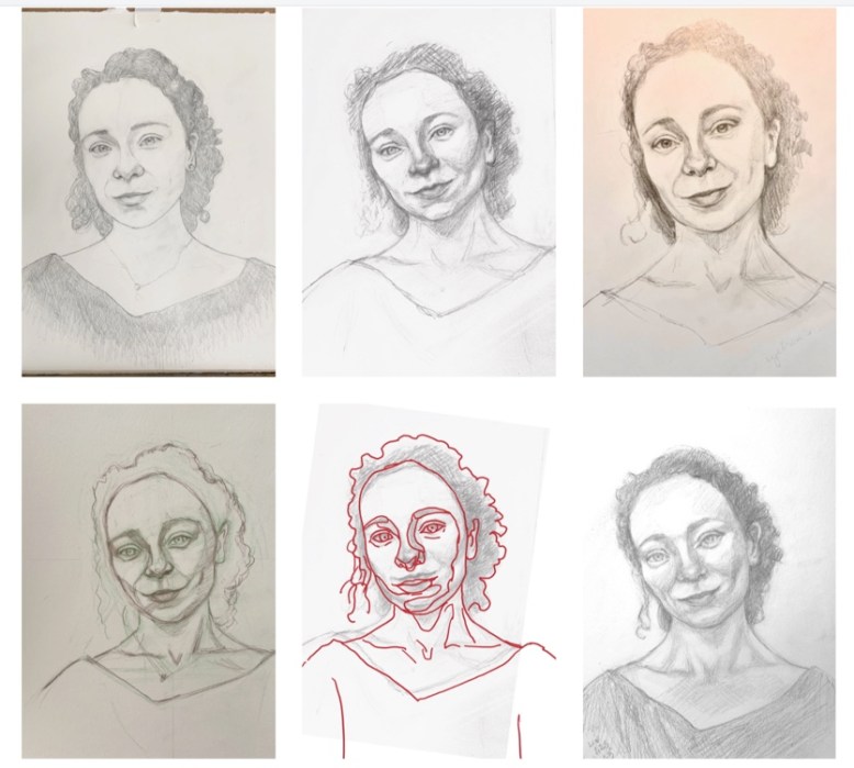
I worked on making a portrait of Aleksandra over and over for a couple of months (see the terrible work below). I finally surrendered and chose a different photo of her. The drawing above went smoothly and I did it in one afternoon. (Sktchy photo reference for above sketch.)
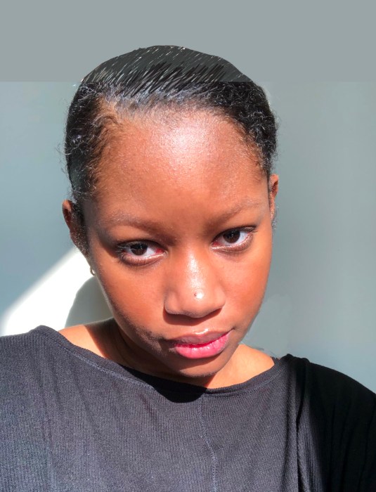
What originally inspired me to paint her was the bright yellow-green background in this Sktchy photo. But I learned the hard way that selfies shot close up distort the features and shape of the face.
Our eyes and brains automatically correct for things like photo distortion and lighting, but trying to draw exactly what is there from a distorted photo doesn’t work unless you’re ok with a distorted drawing. Sometimes that can make for a fun caricature, but in this case I was trying to capture a complimentary likeness of a pretty woman.
Below are some of the failed attempts. The first colored image is an oil painting with about 15 layers of failed attempts beneath the final failed attempt. The second colored image is a gouache painting that I put too much paint on, tried to wash some off, then gave up because the sketchbook paper was ruined.
Last six attempts including a failed oil painting (top row) and gouache (bottom row).
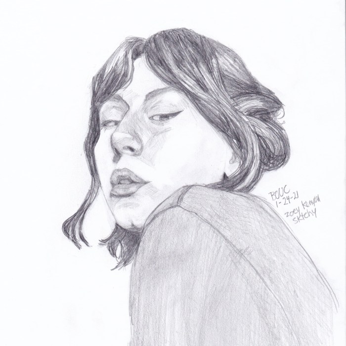
Zoey K from Sktchy. Graphite on copy paper. 8 x 8 inches.
My pencil drawing can’t do justice to her bright red hair (see her photo on Sktchy here) but I’m still limiting myself to pencil to improve my portrait drawing skills.
I’m trying to work out how to address the distortion that is in almost every selfie because of the wide angle lens held close to the face. Perhaps the best solution is to just go with it and not worry about realism. Maybe everyone is used to seeing each other via selfies and that’s what we think people look like now anyway?