Categories
Drawing Ink and watercolor wash Kensington Painting Places Sketchbook Pages Urban Sketchers

Street Light Battle and Dinner at the Gas Station?!

Kensington Street Lights, ink & watercolor, 8x6"
Kensington Street Lights, ink & watercolor, 8×6″

The little village of Kensington is battling over their streetlights. According to El Cerrito Patch, “A number of residents in the upscale community complained in late July when PG&E began removing the distinctive old streetlights on wood poles and replacing them with generic “cobra head” lights on shiny steel poles.” The replacement project was put on hold and community meetings planned to sort it.

I wanted to sketch the controversial street lights so we met on The Arlington, Kensington’s main street for our Tuesday night sketch-out. I found a spot to sketch where I could see all three of the street light types (though of course not so close together as in the picture above).

Kensington Chevron with Whip-Out Food Truck, ink & watercolor 8x4"
Kensington Chevron with Whip-Out Food Truck, ink & watercolor 8×4″

It got dark quickly so we sat outside the Sugar Cone Cafe at their sidewalk tables and sketched by the light from their windows. Across the street at the Chevron Station, people were lining up to get dinner from the Whip-Out Food Truck. It’s funny how food trucks have gone from being “the roach coach” that served awful food to factory workers to the new gourmet thing.

You can see some of the delightful sketches my sketch buddies Cristina and Ceiny did that evening of the festive cafe and the food truck on our Urban Sketchers blog. I give Cathy credit for the pool of light in front of the gas station that I added to my sketch after I saw it in hers (which I’ll link to when she posts it).

Categories
Art supplies Drawing Ink and watercolor wash Painting Product Review Sketchbook Pages

Testing Stillman & Birn Sketchbook Paper with Strawberries: A Review

Stillman & Birn Delta 180 lb Ivory paper, ink & watercolor, 6x4"
Stillman & Birn Delta 180 lb Ivory Multi-Media, ink & watercolor, 6×4″

Stillman & Birn sketchbooks are highly rated by other sketchers so I wanted to try one but couldn’t figure out which paper to choose. I emailed the company and they sent me a packet of paper samples. On a sunny afternoon I tested them using potted strawberries and flowers on the deck for my subjects. (Then I ate the strawberry. Yum!)

Stillman & Birn Beta 180 lb white multimedia paper, ink & watercolor, 4x6"
Stillman & Birn Beta 180 lb white Multi-Media Surface, ink & watercolor, 4×6″

The two most likely options were the Multi-Media Surface papers: either the Delta 180 pound ivory (at top) or the Beta 180 pound white paper (above). I liked the way the ink went on smoothly. The watercolor worked well if applied directly in one layer without much water. Otherwise it backwashed like crazy (see splotches above).

Stillman & Birn Epsilon 100 lb white Plate Surface, ink & watercolor, 4x6"
Stillman & Birn Epsilon 100 lb white Plate Surface, ink & wc, 6×4″

I liked the Epsilon paper (above) but worried that the 100 pound weight wasn’t going to be thick enough. The very smooth finish was nice for both ink and watercolor, similar to hot-pressed watercolor paper.

Stillman & Birn Gamma 100 lb white Vellum Surface, ink & watercolor, 4x6"
Stillman & Birn Gamma 100 lb ivory Vellum Surface, ink & watercolor, 4×6″

The 100 pound Gamma (above) and Alpha (below) vellum surface paper was probably my least favorite, although I ended up judging my impressions by how well I liked the way the sketch turned out instead of technical reasons since they all took ink and watercolor somewhat similarly.

Stillman & Birn Alpha 100 pound white Vellum Surface, ink & watercolor, 4x6"
Stillman & Birn Alpha 100 pound white Vellum Surface, ink & watercolor, 4×6″

I chose the ivory Delta paper (at top of the post) in an 8×6″ wire-bound journal  because I liked that paper the best, even though it only comes wirebound. I’ve used that journal for the past month. It works well if I draw in ink and then apply a stroke of paint and leave it alone. I’ve been less successful if I add another layer of paint or try to get a smooth wash over a larger area. The paper pills, previous layers of paint lift off, or it backwashes.

I also keep getting nasty, dirty, thumbprints on the previously painted page when painting on the next page (which has ruined a couple nice sketches). But maybe that’s just me being clumsy. Or maybe I should only paint on one side of the paper even though it’s thick enough to paint on both.

I’m halfway through the journal and have found workarounds to my problems. It’s been good practice for me to be more direct and get it right on the first stroke or else. But I’d still like the option to add more washes when I need to. It’s a beautifully made journal but I don’t think I’ll buy another. I’m going back to binding my own with the watercolor paper I prefer.

If you’ve used a Stillman & Birn journal, which version did you use and why do you love it (or not)?

Categories
Berkeley Drawing Sketchbook Pages Urban Sketchers

Happy Toesday: Random Bits

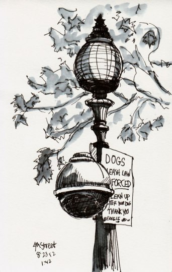
Streetlight on 4th Street Patio, Berkeley, ink and water, 8x5
Streetlight on 4th Street Patio, Berkeley, ink and water, 8×5″

When uninspired and all else fails, draw a street light. Even better when there are two lights on the same pole. And a sign.

4th Street Yuppie Dad
My Big Foot
My Big Foot

Finished the street light and spotted yuppie dad waiting for tot and mom to do more shopping at the stores on 4th Street selling mostly expensive stuff nobody needs.

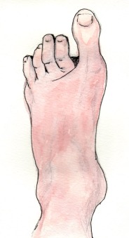
No street light? No problem. There’s always a foot. I put this foot sketch on a birthday card for my son with an apology for passing on the big, narrow feet that make shoe shopping so hard.

Thomas Livingston Antiques, Adeline & Ashby, Berkeley

A quick little leftover sketch from sketching on Ashby and Adeline. The building is bright red and full of interesting details that will be fun to draw when I have more time.

Categories
Lighting Oil Painting Still Life Studio

From Grisaille to Color: Painting a Colored Block Landscape in Oils

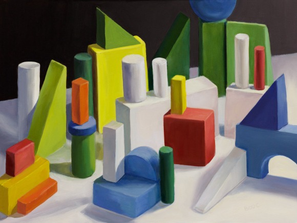
Block Landscape, final painting, 12x16, oil on panel
Block Landscape, final painting, 12×16, oil on panel

I wanted to learn how to get from a grisaille underpainting to a full color painting after I did the Frankie Flathead monochrome study. So I decided to set up some colored blocks as if they were a landscape, and paint them in layers, starting with a grisaille, trying to find a method that worked for me.

Above is the final painting and below is the step-by-step process that I followed.

Categories
Drawing Ink and watercolor wash Life in general Painting Places Sketchbook Pages Urban Sketchers

San Francisco Opera at the Ballpark

Rigoletto: SF Opera at the Ballpark, ink & watercolor
Rigoletto: SF Opera at the Ballpark, 5×8″, drawn in ink then watercolor (and a bit of digital paint) added later. NOTE: Flags at half mast for slain diplomats.  Also, appalled by all the corporate advertising, I replaced their signs with generic ones.

My first trip to the S.F. Giant’s ballpark was for a simulcast of the San Francisco Opera’s production of Rigoletto. Our plan was to sketch this annual tradition where 30,000 people attend the opera for free and picnic on the field or feast on hot dogs, beer and garlic fries in the stands.

Public transit was jammed. I stood all the way to SF on the BART (the subway), then we transferred to a SF Muni streetcar so tightly packed my bag got closed in the door and my big feet barely had space to stand.

Categories
Animals Drawing Ink and watercolor wash Painting Sketchbook Pages Urban Sketchers

Wasps Nest!

Wasps Nest Under the Eaves, ink & watercolor, 8x5"
Wasps Nest Under the Eaves, ink & watercolor, 8×5″

Each year a family (a nation?) of yellow-jacket wasps builds a nest here. One year they built a nest in an abandoned bird feeder which led to an interesting garden ecology life-cycle story. This time the nest is under the eaves of my studio. Fortunately it’s in an area where they’re not bothering me and vice-versa.

I would have liked to draw them and their nest with more detail, but decided it was best to work from a distance, have a more vague drawing, and not get stung.

When I eat lunch on the nearby deck, a wasp scout or two will come by for their share, which I put on a plate on the table for them. That way they don’t bother me on the chaise lounge where I usually eat and read.

I investigated having the nest professionally removed but read that they are beneficial to the garden, as they eat insect pests and move pollen around. I was surprised to learn that you shouldn’t swat at them as that makes them instinctively want to bite, which they can do repeatedly since unlike bees they don’t lose their stinger.

When the season changes I’m hoping they go away so I can remove the nest to observe and draw it more closely. And I’m watching for dead wasps that I can draw, but no luck so far.

Categories
Albany Building Drawing Ink and watercolor wash Painting Sketchbook Pages Urban Sketchers

Hotsy Totsy Club’s Hot Stewsdays

Hotsy Totsy Club at Sunset, ink & watercolor 5x8"
Hotsy Totsy Club at Sunset, ink & watercolor 5×8″

We started our Tuesday evening sketching outside the Hotsy Totsy Club in Albany. I had trouble with my watercolor Moleskine paper kind of pilling up when I tried to put another layer of paint on the shadow side of the funky building. Not sure why but that has happened to several pages so I’m glad to be finishing up the Moleskine and going back to binding my own sketchbooks.

Around sunset it got cold  so we moved inside.

Hotsy Totsy interior, ink & watercolor, 5x5"
Hotsy Totsy interior, ink & watercolor, 5×5″

We heard they had free hot stew on Tuesday nights (S’tewsday) and thought that would be a good way to warm up. It turned out they don’t serve it until 9:00 so Judith and I shared a hot toddy (as opposed to a Hot Totsy which the bartender explained was served on fire). It was pretty dark inside and hard to judge the colors we were painting.

I previously posted some snide comments about the Hotsy Totsy Club here, but it got new owners around that time who transformed it from a 72-year-old sleazy joint mostly populated by old drunks to a fun neighborhood retro saloon. Here’s an article about the club’s transformation.

We hung out and sketched until 9:00 when we were rewarded with the most delicious gumbo ever! Full of fat shrimp and all the other spicy goodness that is gumbo. Yum!

Categories
Berkeley Building Drawing Ink and watercolor wash Landscape Painting Places Sketchbook Pages Urban Sketchers

Berkeley’s Gourmet Ghetto Sketches

Earthly Goods, Shattuck & Vine, Berkeley, ink & watercolor, 8x5"
Earthly Goods, Shattuck & Vine, Berkeley, ink & watercolor, 8×5″

Back in the 1970s when Chez Panisse first opened, the neighboring area became known as Gourmet Ghetto, and it has continued in that tradition since then. The area is packed with wonderful foodie joints, fine restaurants and specialty food shops as well as boutiques like Earthly Goods (above).

French Hotel, ink & watercolor, 8x5"
The French Hotel has lost part of its neon sign. Ink & watercolor, 8×5″

The French Hotel (above) is in the same neighborhood and has a great espresso bar on the ground floor. A couple of doors down is the Cheese Board Collective, famous for their special pizzas that people line up for while being entertained by a jazz band and then eat, picnic style, on the center median strip of Shattuck, despite signs saying not to. (This previous post has funny video of people breaking that particular rule.)

Categories
Berkeley Building Drawing Ink and watercolor wash Landscape Painting Places Sketchbook Pages Urban Sketchers

Normandy Village (and losing sketches, sketchbooks, keys, my mind?)

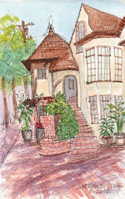
Normandy Village Berkeley, ink & watercolor sketch, 8x5"
Normandy Village Berkeley, ink & watercolor sketch, 8×5″

This sketch of Normandy Village in North Berkeley got lost, passed by in my journal and never got posted. When I uploaded the image I was surprised to see a May date on my screen and went to grab my sketchbook to make sure that was right. Sometimes if I’m in the sketching “zone” I lose track of things like dates, and write the wrong month or year.

I couldn’t find my sketchbook. I knew I’d had it with me on at least one of my errands today because I sketched in it. I looked all over the house; no sketchbook. Then I went to grab my car keys to see if I left it in the car.  I couldn’t find my keys. I’m usually very organized and always put my keys in the same place but they weren’t there.

Finally I opened the front door to see if I’d dropped them (which doesn’t make sense because I obviously needed them to get in the house!) and there were my keys, hanging on the outside of the door in the lock. Duh! I’d left them there when rushing in the door to take care of an urgent need, shall we say.

I grabbed the keys, beeped the car door open but the sketchbook wasn’t there either.

Panicking, I made a second search of the house and found my sketchbook on my bed, hidden in plain sight.  I was going to sketch it sitting on the bed and post that picture right here, but realized I couldn’t sketch it while sketching in it. And the sketch was from May.

You can read about Normandy Village on my previous blog post here.

Categories
Art theory Oil Painting Painting Portrait

Frankie Flathead Finally Painted (Planes of the Head Grisaille Study)

Frankie Flathead Planes of the Head Study, oil on canvas panel, 11x14"
Planes of the Head, Grisaille study, oil on canvas panel, 11×14″

When I bought a “Planes of the Head” life-sized plaster cast two years ago I wanted to learn more about portrait painting. I put it on display in the studio and studied it. I knew I should be drawing and painting from the cast, but hoped learning would happen by osmosis since it didn’t really inspire me as a painting subject.

Planes of the Head Plaster Cast

Then I got curious about grisaille techniques after seeing beautiful paintings that began with that approach. I watched the excellent video “How to Paint: The Grisaille Method” by Jon deMartin (in which he paints from a cast of Julius Caeser) and decided to try grisaille using homely Frankie Flathead, my Planes of the Head cast, as my model. See bottom of post for a clip of the deMartin video.

Planes of the Head Open Grisaille
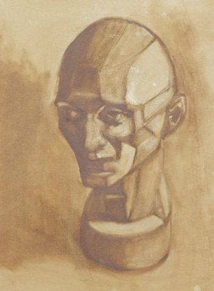
Open Grisaille in which Frankie resembles a demented old perv

I was going to display all my steps along the way, but my photos weren’t good enough. Above is the first stage, the “open” grisaille, which means it’s painted thinly, using only transparent washes of grey (or in this case, burnt umber) and wiping paint off to achieve the lighter values. At the top of the post is the “closed” grisaille, made by mixing and applying a range of values opaquely, using white and the same burnt umber on top of the original “open” grisaille.

One of the most powerful things I discovered in the video is the way light changes across planes.

Gray scale and strip painted 50% gray
9-step Value Scale (white to black) on left and strip painted Value 4 Gray on right (screenshot from video)
Same Value 5 gray strip curved to show the range of values as it turns from light
Same Value as image to the left but the Value 4 Gray strip is curved to show the range of values as it turns away from light (screenshot from video)

When bent so planes are at different angles to the light, the gray strip on the right seems to have all the values in the 9-step value strip on the left. Isn’t this a powerful demonstration of the effects of light and shadow?

My first attempt at grisaille was  interesting. I made many mistakes and got lots of good practice.

My finished painting isn’t great, but doing the study helped prepare me for the next lesson I gave myself (and that I enjoyed more and will post soon): starting with a grisaille to set the value structure in a still life and then adding the color in the same values.

Below is a clip from the video. I was very curious about how grisaille works so it was worth the $35 to download the three-hour program, also available here to watch online and DVD.

(Disclaimer: I have no connection to or receive no benefit from writing about these products)