I took one bite out of my last green fig and was treated to an explosion of taste and color so brilliant I had to paint it. I gave myself the length of a Tom Waits live concert podcast to paint it. I finished before the concert did. It’s still playing and is fantastic! It’s one of many of NPR’s “All Songs Considered Live Concerts” that can be listened to directly on their website or downloaded from iTunes.
The back up musicians are incredible (love that sax and drums) and there isn’t a boring or annoying song in the whole 2 hour performance. Of course Tom Waits is not for everyone. He trained his voice when he was young to make it sound like a gravelly-voiced old man and it stuck that way. His songwriting is eerie and strange and some might be offended by his more irreverent themes. “Glitter and Doom” is the name of his 2008 tour and it fits the music perfectly.
2007: The Oil Slick Tour
I’ve always been jealous of how musicians get to name their tours, like Madonna’s “Sticky and Sweet Tour,” (yuck, gross) Elton John’s “Red Piano Tour, ” U-2’s “Vertigo Tour.” I love the idea that for a period of time you name your “tour.” I think I’m going to start having tours instead of years. I could call 2007 the “Oil Slick” tour, as I’ve worked hard this year to learn how to paint in oils, with lots of slipping and sliding along the way.
Now it’s time to plan my tour through 2008, and gather my roadies and back-up singers. Hmmm, what shall I call the tour? I’m thinking maybe the “Anchored Angels Tour” based on some helpful advice from two friends about completely unrelated issues:
Setting Anchor
I’ve been trying to get to bed earlier but my caffeine habit makes it hard to do that. So my friend Ree told me that she never drinks coffee after a certain time in the afternoon. She thinks of that time of day as setting an anchor, putting in to harbor for the day. Then she’s able to get to bed at reasonable time and wake up rested instead of being kept awake by the caffeine into the wee hours and waking up in need of another jolt of java.
Guardian Angels
Another friend said “Don’t fly faster than your Guardian Angel.” I loved that saying since I’m often doing a dozen things at once, trying to get more than is possible done, and can barely keep up with myself.
If I were rich I’d have a full time personal assistant/personal trainer/life coach/personal chef. But since I’m not rich, I have to do all those things for myself, and sometimes I can be quite incorrigible. So maybe if I adoped a Guardian Angel (and not just the wind-up Parking Karma Angel on my dashboard) she could tag along and fill in for that personal trainer/coach/etc. All available Guardian Angels, please apply within.
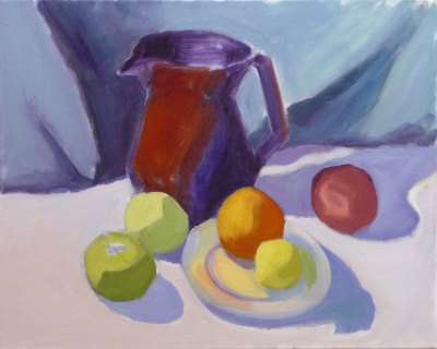
The pitcher in this painting is one of the few remaining pieces from my years as a potter, though not a favorite. I’d assumed I’d always be a potter and could always make more so didn’t worry when I sold nearly everything pre-Christmas one year. Then life changed.
I got married, had a baby (who I intended to just strap in a papoose on my back and continuing working at the wheel, up to my elbows in wet mud–Ha!) and we moved to a row house in San Francisco where I could no longer have a kiln. So that was the end of pottery, but the beginning of drawing and painting.
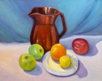
Below you can see the steps I took in making this painting. Although I was working live from my own still life set up, I was also following along with an excellent painting video by Don Sahli. I tried to set up a still life similar to the one he paints in the video but ate the second orange so substituted a lemon.
I’d already watched the video and had many “Aha!” moments with it and wanted to practice what I’d learned from it. This weekend I stayed in the studio instead of going out to paint plein air. I played a chapter of the video, doing that step on my canvas then played the next section. It took Don an hour to do the entire painting but it took me the whole weekend.
Temoku Pitcher & Fruit, Oil on canvas, 16×20″
Don Sahli is a wonderful teacher and painter who was the last apprentice of Russian painter Sergei Bongart. He breaks painting down to these 4 stages and I photographed those stages (above) as I went along:
Drawing;
Abstract stage (where you do 80% of the work, starting with the darkest dark and then continually ask yourself what color, value, temperature and you paint in one color shape after another);
Modeling (where you finish giving the objects a 3-dimensional appearance, delineating the planes using value, and color temperature.
Final details (adding highlights, caligraphic strokes, dark accents).
After watching the video and doing this exercise, I finally understand so many concepts that I’d read about, been taught, but had still been struggling with, especially the one illustrated below that starts the 3-dimensional appearance of the objects by finding and focusing on the dark/light, warm/cool color shapes.
*P.S. I have no financial or other interest in Don Sahli’s videos. Just wanted to share a good resource.
October Roses in Annie's Vinaigrette Bottle, Ink & Watercolor 8x6"
It seems like fall is a time of last chances. These might be my last roses of the year and the last chance to paint them so I couldn’t resist, even though they’re a bit stunted and scrawny. The lovely Indian summer we’re having in California has that feel of Last Chance too. Under the warm gusts of Santa Ana winds I can detect the hint of coming chill. Each peach I’ve eaten in the past month has come with the thought, “This is probably the last peach I’ll have this year.”
There’s a feeling of sweet longing and sadness that fall brings. Artist Dee Farnsworth painted the Last of the Summer Corn last month and I saw that same sense of loneliness and loss in her painting. I’m trying not to grasp after summer, resist fall or regret the coming winter. I know acceptance of what IS allows me to live in the present moment and enjoy it. I try to remember that each day is the last chance to experience that day. It will never come again.
Sorry to sound melancholic. I’m actually happy (despite the changing of the season, the terrible news in the world, a tweaked back, and losing every cent I’ve saved this year in the stock market) because my dear neighbor fixed the light over my easel today and now I can paint in good light again. Yippee!
About the painting:
I drew with my long neglected Lami Safari pen, forgetting that the Noodlers Ink isn’t completely waterproof. It seemed even less so on Arches hot press paper, smudging like crazy and then melting and bleeding into the watercolor. I do like the effect here though, the way it creates a softer line than my usual Micron Pigma pens.
When I was a young mother with a newborn babe, the house where we lived had a huge, old fig tree in the backyard. I didn’t know I liked figs then, butI loved the fig tree and so did all the birds and squirrels in the neighborhood.
My infant son and I spent many days that first summer after his birth resting, playing or crying (yes both of us) on the grass beside the tree. The tree’s sheltering, quiet grace and the broad reach of it’s branches lent me strength and helped me feel grounded during those very difficult sleepless weeks and months.
A few weeks ago I ate my first figs and fell in love with them. I was always a little scared to try them; something about their soft squishiness bothered me. But once I took that first delicious bite I realized what I’d been missing.
Now I think of figs as the oysters of the fruit family, just as I think of oysters as the peaches of the fish family. When I slide a succulent raw oyster into my mouth and bite into it, I’m immediately brought back to the happy days spent in the warm salty sea growing up in Southern California.
And now that I’ve painted these little beauties, I’m gonna go eat ’em!
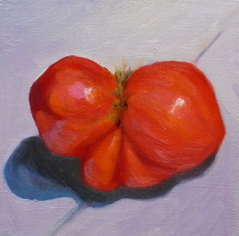
Last year I planted Early Girl tomatoes and Best Boy tomatoes. They must have gotten together and had some fun over the winter because they’ve returned bearing fruit this summer all on their own.
I was ready to paint something other than that stupid scene at Sibley. Rummaging around in the kitchen a tomato caught my eye and then when I reached into the stack of colored cloths I keep for still lifes (or is it still lives?) in an overhead cabinet, I came away with a blue-violet piece of velvet (actually it’s a small velvet bag).
It was fun working with such saturated vibrant colors but now I have to clean brushes and let go of painting for a few days while I return to my “day job.” Although I often feel grumpy at having to make that switch, today I’m feeling very grateful for a good job and my comfy home and studio, given all the terrible news of financial ruin and weather-caused devastation I’ve heard today. I haven’t been watching any TV for the past month, which has been great, but today I took a look at the news while I ate dinner and was so sad to see all the suffering.
I didn’t plant tomatoes this year, but oddly, last year’s plants came back on their own. This critter was the first one to ripen and it was so gnarly looking I had to paint it. I wonder why it turned up with this shape? Could it be 3 or 4 tomatoes that grew together like Siamese twins? Or did the tomato frame that supports the vines dent it?
I started by doing a couple watercolor sketches to get an understanding of the shape. Then I made a gallant start on the oil sketch, getting it almost done but then fiddling with it until I had to scrape it all off, repainting and then fiddling some more. I must have scraped and fiddled and scraped 10 times. I called it done at midnight and went to bed.
Tonight after work I gave it another shot, and am happier with this version (painted on top of the first). I can see that I wasn’t using enough paint the first time around. There are so many other colors than red in a tomato and mixing the right color for the right spot is surprisingly challenging.
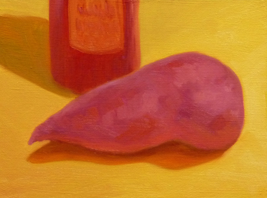
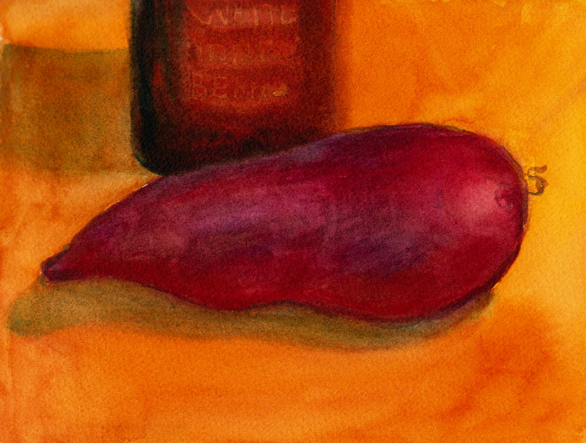
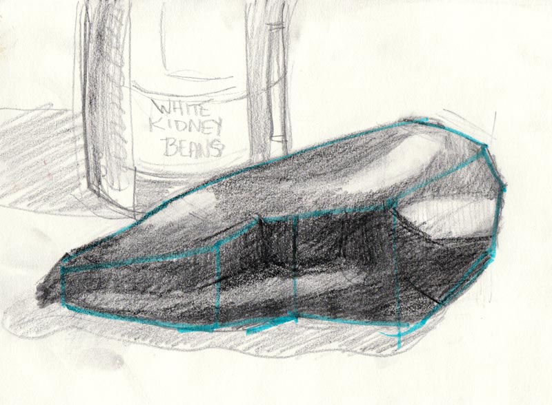
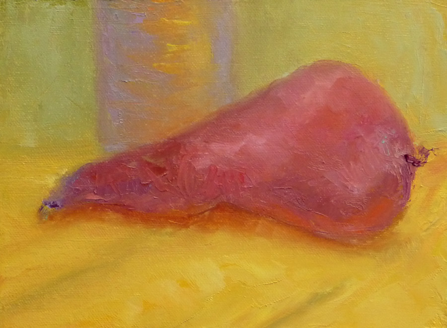
Feeling frustrated from failing to form a faithful facsimile of a silly spud I sought some solutions. (I’ve always loved alliteration.) Displayed below in reverse order (last version first) are my efforts in trying to understand the shape of one homely sweet potato (and a can of beans).
Sweet Spud #4 , Oil on panel, 6x8" (after watercolor study and sketch below)Sweet Spud #3, watercolor on Arches cold pressed paper, 6x8"Sweet potato #2 (Pencil sketch to try to understand planes and volume), 6x8"Sweet Spud #1, (First oil painting before doing the studies) 6x8"
I think I like the watercolor best, what about you?
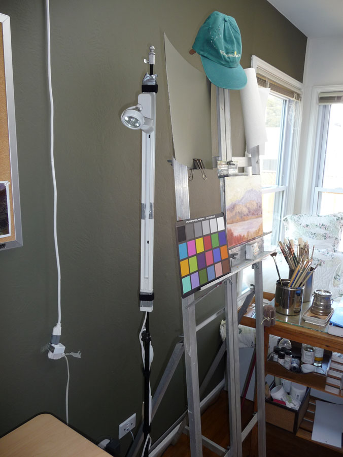
I’ve made some improvements to lighting and comfort in my studio and wanted to share what I’ve learned in the process. In the picture below you can see some of the changes from my previous post about reorganizing the studio. These include the floor mat, the wall paint, and a still-life lighting setup.
This post could also be called, “What I Bought Myself for My Birthday” as these goodies were all birthday presents to myself. (Click the images to enlarge.)
Studio with new cushy floor mat, lighting and dark painted wall
FLOOR MAT
The floor mat pictured above makes a huge difference in comfort. I got the idea at my hairdressers when I wondered how she stands all day. She pointed out her floor mat and when I felt how cushy it was, I had to get one. I work standing at a computer or at the easel much of the time. Without a cushion my feet tend to hurt by the end of the day. I tend to sit until my back hurts and then stand until my feet hurt and then switch agin. The mat makes it comfortable to stand comfortably for much longer.
WALL PAINT
I painted the wall behind my easel and desk Benjamin Moore “1490 Country Life” using their new Aura line of which is nearly odor free and covers in one coat. I’d noticed studio walls painted this color in many of the painting videos I’ve watched. Finally one of the artists actually specified that this 1490 color was especially popular with portrait artists for their studios because of how the color sets off skin.
But it also reduces the glare off of the previously white wall I was getting from my overhead light and helps to cut unwanted bounced light and the resulting double shadows on a still life that I’m lighting with a strong directional light (more about that in a minute).
I still have to wear the hat you see hanging on the ease—the overhead fixture does a beautiful job of lighting a canvas without reflection, but with a relatively low ceiling it’s pretty bright on the eyes.
STORAGE
Below is the wonderful canvas and supply rack that my next door neighbor built for me.
Canvas storage rack in closet
It can be free standing but was built to fit inside this closet. The four sections on the far left hold already painted panels and for now, the rest hold panels and canvases ready to paint. The structure is seriously overbuilt due to a slight miscommunication. We speak in a combination of English (my native language) and Spanish (his) and sometimes we think we understand each other but don’t. It’s so sturdy it may even hold up the house in the case of an earthquake.
To the right of the structure is still a bit of closet hanging space where I hang my painting smock and my plein air painting outfit, a very lightweight, ventilated, long sleeved, sunproof shirt so I don’t need sunscreen and lightweight pants that are also sunproof that turn into shorts when you unzip and remove the legs.
The top shelf of the structure (below) provides a place to put my other plein air gear: my Soltek easel, my brushes in a canvas brush carrier, and two canvas carriers from RayMar Art, the company from which I also buy my painting panels (they are archival, don’t warp and are less expensive than most of this quality).
Shelf for easel and other plein air equipment
LIGHTING
Below is the setup for lighting still life that I’m finally satisfied with, after trying numerous other lightbulbs, fixtures, and other accessories. I wanted a way to get a strong directional light on the still life so there was good contrast in values, modeling of the shape and structure of the object(s), a strong shadow shape without double or triple shadows caused by interference from other lights, and a light color/temperature that gives the illusion of sunlight. A tall order indeed!
Still life lighting set up
As you can see above this system creates a nice swath of directional light, with a strong single shadow (though the photo doesn’t do it justice–it’s hard to photograph lighting!). Below is another picture of how I have it set up.
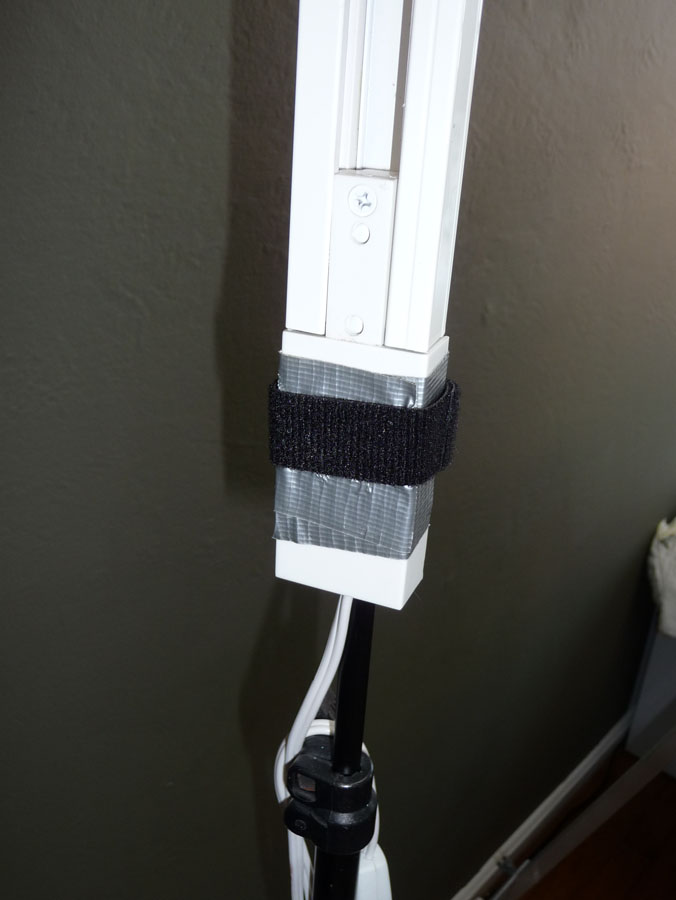
I went to a local lighting store and we tried out all sorts of things. It took them awhile to understand that I wasn’t buying lighting to light a painting, but to light a still life I was going to paint. They recommended a short section of halogen tracklighting with a narrow-beam floodlight halogen bulb. They added a cord and switch for me since I was going to keep it nearby rather than permanently install it on the ceiling. Then I attached the track light to a cheap old lighting stand I had from photography days.
Track light attached to light stand
The ugly cord and switch on the left above is an inelegant solution that allowed me to avoid having to have an electrician wire the overhead light. It just plugs in and switches on and off. Too bad the cord isn’t the right length.
On the two pics below you can see how I used duct tape and a strip of velcro 2-sided strapping to attach the track light to the stand.
Track light with halogen spot attached to old light standDuct tape/velcro attachment
Below is the lighbulb we found that works perfectly for this application: Sylvania Tru-Aim Brilliant Halogen (50MR16/B/NFL25) which I think means it’s a 50 watt narrow-beam flood light.
Lightbulb box for track light
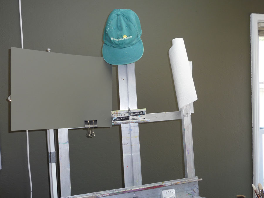
SInce the light was so bright I made this cardboard shield and painted it the same color as the wall and clipped it on to the easel so I could study the still life without also looking at the light. I’m sure there’s a more elegant solution, but this works. The paper towels sit on a funky paintbrush which is stuck into a slot at the top of the easel.
Cardboard painted with wall paint to shade light, paper towel "holder"
My WorkRite electric desk, which holds my computer and monitor not only allows me to work sitting or standing but I discovered that I can use the end of the table by the easel to place a still life at whatever height I like. I can also display a photo on the monitor and scoot the monitor closer to the easel to work from.
Set up for still life with electric desk
I can hang different colored cloths as still life backdrops from the bulletin board with pushpins and I like having artwork on it that inspire me.
The painting to the left isn’t usually there. I hung it when a gallery owner came over for a studio visit because she was interested in including it in an upcoming show (it will be there next month — more about that later).
Another view
I should also say that I have no financial or other interest in any of the companies or products I mentioned in this post. I just like them.
Flowers Buggin' • 12x9" • oil on panel • (Click image to enlarge)
During a temporary burst of gardening interest a few years ago I planted chrysanthemum bulbs around my garden. I’d bought the package of bulbs at Costco and there were two colors in the pack: a lovely peachy color and a sour lemon color. I hoped they’d be mostly the peachy ones and the first year that’s what came up. The next year and ever since, all that appears are the icky lemon yellow ones.
Even worse than their color is the fact that they are bug magnets. Whole colonies of tiny black ball-like bugs appear on the stems and inside the flower, between all the petals, which took forever to wash off before putting them in the bottle. Yuck!
I’m pretty sure the bugs are aphids, which are farmed by the ants that also hang out on these plants. I gained new respect for ants when I learned that they actually raise and protect herds of aphids and then milk them for the “nectar” they produce.
QUESTION: Is my site taking a long time to load for you? Do the pictures load slowly, especially when they’re large like this one?
Carbo-Kittie
Speaking of ants, that reminds me of the very bad morning I had last Friday. I woke up with a nasty migraine and when the first cup of coffee didn’t get rid of the headache, I went out to get a latte at Peets (which usually works).
When I returned home an hour later, I walked into the house and discovered that my crazy calico cat had barfed at least once in every room of the house, managing to hit every throw rug. After I cleaned up the floors and threw the rugs in the washer, I discovered a swath of ants marching across the studio and had to clean them up too. All this before 9:00 a.m. and still with a migraine.
I couldn’t figure out what had so badly upset Fiona’s stomach until, when putting the newly laundered throw rugs back on the floor, I found sesame seeds under my bed. Then I remembered the box of Ak-Mak high-fiber, whole wheat crackers I’d found on the kitchen floor when I came home from work the night before. I thought I caught her before she ate any, but the sesame seeds under the bed meant she must have been snacking on them under the bed before I got home.
She’s been fine since that morning but I bet it’s just a matter of time before she goes grazing in the cracker/cereal/pasta cabinet again. She’s ripped open and sampled boxes of Cheerios and dry pasta, carried a bag of split peas to tear up under my bed (lots of fun to clean up) and her favorite, corn cobs, which I’ve also found under my bed.
I’ve got to figure out how to install baby latches. I tried once but couldn’t get the two parts lined up right and then stripped the screw when trying to remove it. So now it’s just limply hanging there, getting in the way.
P.S. The title of this post is borrowed from an interesting band’s name, Critters Buggin’. Some members of that band are also in Garage a Trois, whose music I prefer to the more frenetic Critters.
This was intended to be a study for an oil painting the next day, but during the night the kitties knocked over the bottle, and all the water spilled out, pooling on the studio’s hardwood floors overnight. After their rough night, the lovely roses were no longer such perfect specimens. So this is both their opening curtain and their final curtsy. Mine too, for today. Amazingly (for me) I can’t think of another thing to say!


