Bedside Table with Coffee & "An Illustrated Life" - Morning
DeLuxe Parked - morning walkPoodle Waiting at Trader Joes, El Cerrito - Midday Busby Annoyed, Trying to Nap - After DinnerFiona "As Seen on TV" (literally) - Evening
Messy Desk - Late Evening
I challenged myself to do a sketchcrawl of my day, making a 10 minute drawing (almost) every hour, wherever I was at the moment. I was surprised by how many times during the day I saw things I’d like to draw. But I waited for my timer to tell me, “Now!” and then started drawing. If I was out and about, I added the watercolor at home in the evening.
Reading Danny Gregory’s book, An Illustrated Life, inspired me to get back to my sketchbooks which I’d been neglecting while I focused on oil painting this past year. As a result of that neglect, I had half a dozen unfinished sketchbooks that I’ve challenged myself to complete by the end of the year. Hence the sketchcrawl above (and more to come as the year draws to a close, or should I say, “as I draw the year (and my sketchbooks) to a close!
Salad Remains with Danny's Book (ink & watercolor)
I was feasting my eyes on Danny Gregory‘s new book, “An Illustrated Life” while I was eating a delicious salad in my big yellow salad bowl for lunch today. When I finished eating I had to sketch the colorful remains. The first drawing didn’t work (partially seen on the previous sketchbook page above), though I took it as far as I could and then drew it again and painted it (happily using up two pages in this sketchbook I don’t like).
I love reading about all the other sketchbook artists in Danny’s book and the way they think about sketching and their sketchbooks. It inspired me to finally finish off all of the random sketchbooks I have going. I have at least half a dozen unfinished sketchbooks, some that I’ve made (like the one used above) and some that I’ve bought. I keep them in a special open box and grab the one that calls to me.
There are several that I don’t like for a variety of reasons (e.g. don’t like the paper, don’t like the dimensions, don’t lay flat, don’t scan well, too fancy…) and they’ve been partially used and abandoned. I’m making it my goal to fill them all by January 1 so that I can put them on a shelf and start working in one book at a time in a chronological order. I like order.
I found these taking a walk (I was walking, not these thingees) which I thought might be called Wood Roses…but I looked it up and learned that Woodrose is “a parasitic plant endemic to New Zealand.” Since these fell from a pine tree in Berkeley, they’re definitely not woodrose, but they do look like Wood Roses!
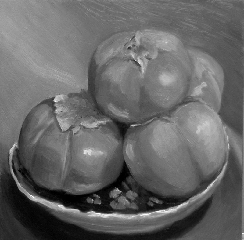
This was so pleasurable to paint. I experimented with doing an underpainting in acrylic first to put in the darks without having to wait for paint to dry. Then I tried to focus on values and color temperature, but I think I got sidetracked by all the interesting shapes of light, color, reflections and hazy surfaces (they were organic persimmons and some of the skin had a kind of filminess like blueberries have).
I’m also working on trying to see and mix just the right color of paint, and apply strokes once (instead of guessing, putting paint down, scraping it off, trying again). Last night when I realized I’d been painting for an hour with dirty brushes and not mixing specific colors but just using random paint left on the palette I dragged myself away from the easel and went to bed, finishing the painting this afternoon.
I’m pretty happy with this one but would like to try again getting closer with color temperature changes and stronger values. Below are the steps I took along the way, including a change in composition. Although I liked the rich dark in the corner, it was drawing too much attention to itself.
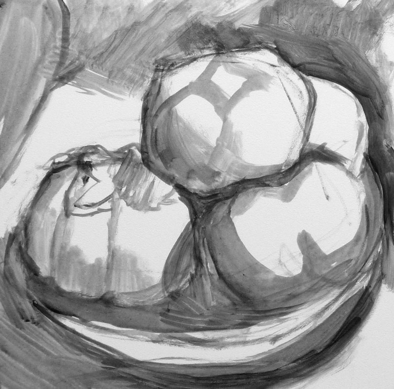
#1 – Drawing in acrylic paint
#2- Continuing monochrome acrylic underpainting
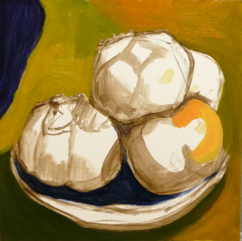
#3 – Blocking in the oil painting
#4 – oil painting cont.
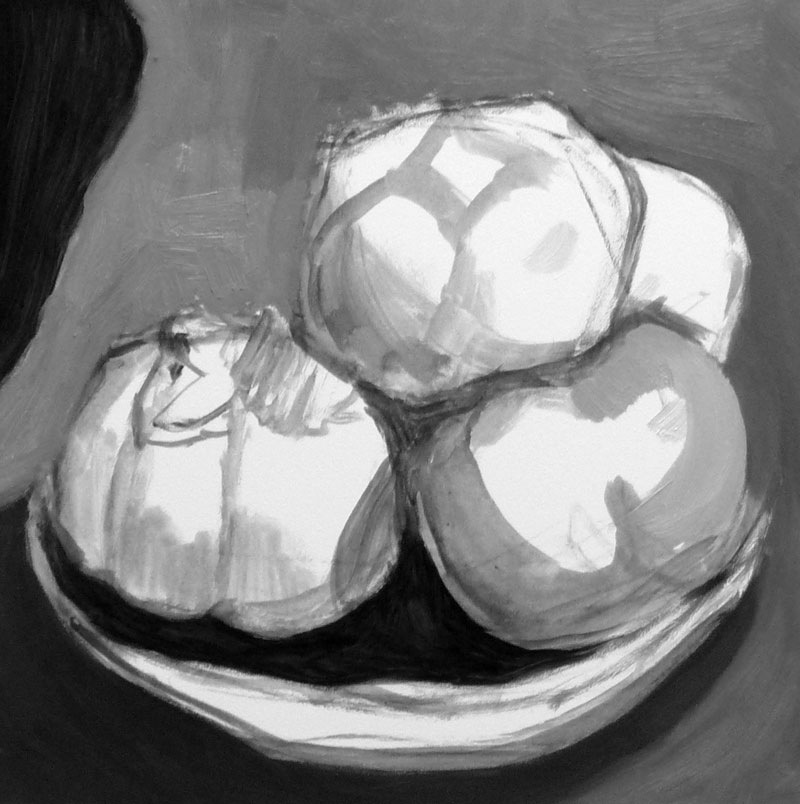
B&W photo to check values of finished painting
Pile of Persimmons, Oil on Gessobord, 8×8 inches. $150 BUY NOW
If you click on one thumbnail you’ll be taken to a big picture with another thumbnail to click to go to the next.
Bananas in a Bag, Watercolor & acrylic on hot press paper, 6x8"
I’m usually skeptical of anything that says “As Seen on TV” on the label, but I heard someone raving about how “Debbie Meyer Green Bags” keep fruit fresh longer and decided to give them a try. They actually do work. I used them during the summer with tomatoes from my garden and very few of them went rotten. They seemed to last for weeks without putting them in the refrigerator. I used the bags successfully with bananas and peaches too.
They supposedly can be reused 8 to 10 times but I’ve found that each time you reuse the bags they seem to have less potency. The package says they are “made with a “a natural mineral ‘Oya’ that absorbs and removes the ethylene gases that cause normal deterioration.” Oya is made from zeolite, a kind of clay found in Japanese caves.
You do have to keep the contents of the bags dry and I found putting them in the refrigerator means they get moisture inside and you have to keep wiping the inside of the bag. I hope I don’t find out later
About the watercolor:
I wanted to use masking fluid to preserve the white highlights and shiny spots on the bag but when I opened my bottle of masking fluid I found it had turned into a solid lump of white rubber. So I tried using a white colored pencil as a resist on the white areas, but when I painted over it it didn’t repel the paint. I could have drawn the whole thing out really, really carefully and saved the white areas by painting around them, but I didn’t have the time tonight.
So I just painted, planning to use my white gel pen for the highlights but discovered it too had dried up. In the end I made the highlights with liquid Golden acrylic, drawing straight from the little squirt bottle of paint, blobs and all.
Debbie Meyer Green Bags
P.S. WordPress rolled out it’s new version today with a beautiful, pwerful and simple new user interface that makes blogging a joy! Yay WordPress!
Pomegranate and seeds, oil painting on Gessobord, 9x12"
I never thought I was a procrastinator but after a week’s vacation meant to be spent painting but rarely getting into the studio until early afternoon at best, I began to look at how I’ve spent my time this week and had trouble figuring out where it had gone.
Then l saw this incredibly creative and well-made four-minute movie on YouTube entitled “Procrastination.” I could see myself in every single scene (except maybe smoking). If you’ve ever procrastinated getting started on a creative project out of fear of failure, perfectionism, artist’s or writer’s block or any other reason, this video and will make you laugh (or cry).
About the painting:
I discovered Gessobord this week and fell in love with the wonderful surface of these panels. They’re smooth but have a texture that sort of bites into the paint and grabs it, as well as enhancing the colors of the paint. It’s really amazing and is a total pleasure to paint on with oil paints. I wish they were less expensive, but they’re still cheaper than pre-stretched canvas, especially when purchased on sale online.
Instead of trying to do a one or two hour painting and finishing this still life in one chunk, I had to do this one in several short sessions over a period of a few days (because of procrastination and various holiday events and other responsibilities).
I paused and studied the painting, and saw that I needed to improve the composition and values:
Stopping point to analyze problems
I looked at the painting and the set-up through a piece of red plastic (which elimates the color, emphasizing values) and could see that I needed to darken the background and the inside of the fruit on the left side. I also added the seeds and stains on the cutting board to avoid so much empty space and lead the eye into the painting.
The pomegrantate (already less than fresh when I started) got less attractive and eventually I had to stop and call the painting finished. I think it will serve as a good stepping stone to the next as I try to put more “miles” on my brushes. And now to stop procrastinating and focus on starting that next painting!
Ooops…when I posted what I thought was the “finished” painting (at bottom) a few minutes ago and then posted this photo of the set-up from day one, I could see that the color of the pom needed to be warmer and the background cooler so I just applied a dark cool glaze to the background and a warm red glaze on some of the pom and posted the finished picture at the top of the post. Now I’m done (I think).
Photo of set-up on day oneThought I was finished but more work needed
I am not a party girl. I much prefer my time with friends spent one on one. But today I was scheduled to go to two parties. I was supposed to be at a housewarming party in San Francisco anytime from 11-3 and then at my son’s housewarming party in Pinole from 3-6.
One thing after another delayed my departure, including my own procrastination (and ambivalence since I also wanted time to paint). Finally I was showered, dressed, face made up, the gift wrapped and I was ready to leave when my son arrived at the door.
I loaned him the folding table he needed for his housewarming party and gave him some advice about his achey back. Then I packed up all my junk for the party and the hike and sketching I planned to do in Golden Gate Park after I left the first party. (The latter being completely unrealistic time-wise, but I have only the slenderest hold on the reality of time.)
Walking out the door I looked at my watch and realized it was already 2:00. My GPS unit in my car said I would arrive at my destination at 2:30. I figured showing up for half an hour was better than missing it entirely and I took off. The traffic on I-80 slowed to a crawl and my GPS started showing more and more traffic delays. After driving for about 15 minutes and still not reaching the Bay Bridge, the arrival time had changed from 2:30 to 2:56, 4 minutes before the party was to end. I gave up, got off the freeway and went home.
That left me an hour to finish this little painting I started last week. Fortunately the Pomegranate held up for the week and if anything, got a little more character in its lumps and bumps.
But now I’m late getting ready for my son’s party. Fortunately my clothes are ready to put on, and I already gave him a housewarming gift, so I can just get dressed and walk out the door.
You know how in movies when someone has a black eye they always say they got it from walking into a door? I could never figure out how that could happen until I did it myself last week during the night and then forgot about it when I woke up.
Yesterday I was trying figure out what a sore red bump on my forehead was—a sort of vertical red line. I thought of all kinds of scary possibilities, going from pimple to blood poisoning to brain tumor. Finally, this morning I remembered that when I was sick last week I was hurrying to the bathroom in the dark and walked right into the open door.
What I hit my forehead on was the narrow side of the door, not the front or back of the door. I’d always pictured people walking into a closed door and it seems like that would make it difficult to bump your face on, since your feet would hit first. But the side of the door was easy; my feet were on either side of it. Fortunately I don’t have a black eye, just a red stripe up my forehead.
About the painting:
With all the nose blowing and drinking vast quantities of fluids while I was sick, this was a sight I saw frequently over the past week.
My bathroom has a large glass block window that shines the most lovely morning light on the less lovely items in the small bathroom. Since it’s such a small room it would be hard to get an easel in there so I took a few photos and worked from them.
Avocado & Apricot Pits, Watercolor on coldpress paper, 6x8"
I thought that these apricot pits and this avocado pit, still in a bit of it’s outer papery sheath would be a good subject for using my set of Kremer Pigments’ pan watercolors. The Kremer watercolors are unusual in that they’re so highly pigmented, mostly opaque and mostly sedimentary. They are quite stable when applied: the colors don’t charge or bleed much into each other, unlike the more volatile quinacridone and other synthetic pigments.
But I found that those qualities make them less suitable for glazing because their opacity and and saturation mean that one layer hides the one beneath it. Half of the colors in my 14-color palette are muted shades of red, brown, gold, green; a few are more brilliant, but so richly colored that they have to be thinned way down to appear transparent.
I guess what I’m saying is that I’m not as familiar with how these colors work together as I am my regular palette of mostly Winsor Newton tube watercolors. It takes practice to have control over one’s media and I felt pretty out of control with these but enjoyed playing with them. I’ll try them again for the next summer leftovers.
After yesterday’s major migraine adding insult to a weeklong cold/flu bug, I’m grateful to be back among the living today, even if still less than 100%. It seemed like a good day to start doing some watercolor sketches of the collection of thingees I’ve saved from the summer, including pits from all my favorite stone fruits, shriveled and dried things from plants now gone, and stuff I’ve picked up on walks. These rosehips were the most recent and most colorful; all of the other stuff is in shades of brown and more about texture than color.
Since I’ve gotten used to oil painting alla prima*, it’s interesting to switch to watercolor and slow down to let sections/layers of watercolor dry before each next step. It makes for a nice rhythm and prevents that mindless paint paint paint I run into with oils. Waiting for the paint to dry gives time to step away and and then return to see what’s needed with fresh eyes and a chance to think a bit before putting down the paint.
*Alla Prima: A style of painting where the painting is done in one session while the paint is still wet. From the Italian word which literally means at all at once).