This commissioned portrait of a darling little girl was really fun to paint but had some challenges, like trying to invent the pajamas hidden by the highchair straps. It took several drawings (including one of a baby skull I found on Google) before I was ready to move ahead with the painting as you can see in the process steps below.
Emi’s face was actually easier to paint than the pajamas, and I was tempted to keep working on them, probably forever, but the friend who commissioned the painting was happy with it as is, so I am too.
Below is some of the work in progress steps. Please note that the lighting changed the colors in some of the photos.
Mimi at Marcy’s, oil on Arches Oil Paper, 9.5″ x 7″
Although I’m happy with this pre-quarantine composition and painting, I regret not checking the drawing before beginning to paint. I sensed something wasn’t right and sure enough, when I did the digital tracing (below) I found my mistake, but it was too late. I’d either need to start over or let it go.
When drawing/painting people I ask myself, “Does it at least look human, if not that specific human?” Hmmmm. Well, I guess I can celebrate the parts that worked and let go of mistakes and remember to check my drawing next time! Also I might be coming to believe that sometimes the anatomy isn’t as important as the feeling I’m trying to convey, and that caricature or distortion might be ok (though it’s probably better when it’s intended).
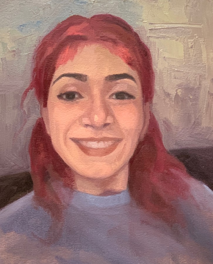
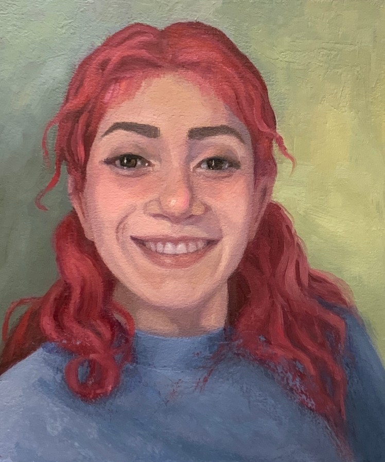
Portrait of Dayris, Oil on Arches Oil Paper, 10″x8.5″
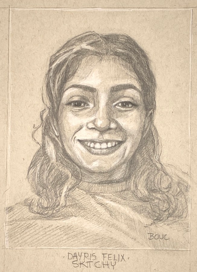
I’ve had so much fun painting and sketching the lovely Dayris from Sktchy in oil (above), and before that, in pencil and then doing a digital sketch in Procreate (below). Also below you’ll find a slide show of the work in progress. Doing the two initial drawings really helped me quickly get a pretty accurate drawing for the oil painting. You can see her reference photo on Sktchy here.
Initial pencil drawing of Dayris, 12×9″
Digital Sketch of Dayris in Procreate
Below are the steps in the process of making the portrait.
Initial pencil drawing of Dayris, 12×9″
Digital Sketch of Dayris in Procreate
Umber underpainting
Some background and shirt
Some paint on face
Icky background in with palette knife
More work on background, still icky
Background better but not happy with shirt or hair
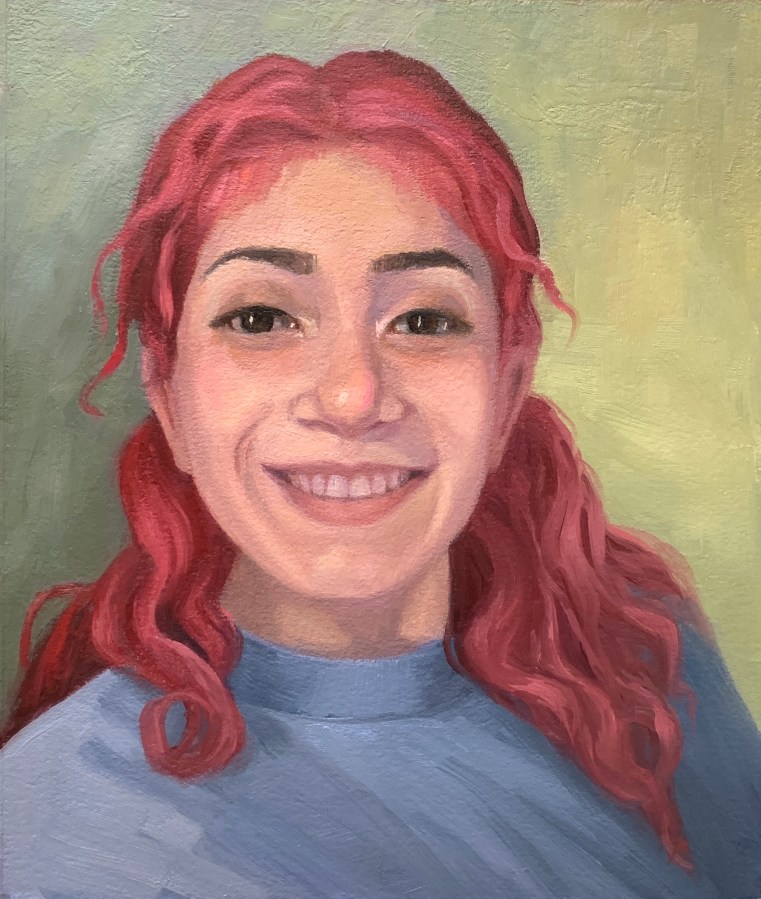
Almost done
Scraped off shirt and some hair to redo
Portrait of Dayris, Oil on Arches Oil Paper, 10″x8.5″
Portrait of Kori L from Sktchy, 10×8” oil on gessoed watercolor paper
After working on this portrait for two months, trying over and over to capture this lovely woman in paint, I have to admit I never truly succeeded. I learned from all the struggles and attempts but it’s about to be a new year and time to start something new so I’m moving on. You can see her reference photo on Sktchy by clicking on the image of my painting here.
Below are two digital sketches in Procreate from Sktchy, done this month while waiting for the paint to dry on the portrait to try once again on a new layer of oil paint to get it right.
Sketched in Procreate from a Sketchy app photo by Nicolas Schram Illustration
You can see the reference photo for the sketch above here and the one below here on Sktchy. Just click my drawing there to see the reference photo beneath it.
Hannah W from Sktchy, 14×11” oil on Arches Oil Paper.
Learning to paint (well) for me means a constant but gradual process of 1) learning from my mistakes and 2) having “layers of the onion” lifted from my eyes until I at last can see something that was previously mysteriously hidden from me. (You can see the reference photo for this painting on Sketchy here.)
This painting taught me once again how much harder painting can be when you don’t start with an accurate drawing, going directly to drawing with paint and then correcting, correcting, correcting.
Getting the drawing right and capturing a likeness can be as “simple” as recognizing the big shapes, contours, divisions of space and observing where things line up with each other. Getting the values right can be as “simple” as observing where the light comes from, how it lands on the large and small planes of the face or any object, and asking myself where the darkest and lightest areas are and how this plane compares. Getting good color “just” means accurately observing the overall and predominant range of colors (saturated or grayed, warm or cool) and then asking is this the spot “warmer or cooler, more or less saturated, lighter or darker.”
I can ask myself these questions over and over, but until yet another layer of the onion is lifted, I just can’t see the answer. When that happens my brain tells me it’s too hard and just jumps ahead with a lazy guess, which then sets off another round or layer of correction, correction, correction. But I do learn from my mistakes and each next painting is an opportunity to put what I learned from them into practice and hopefully remove one more layer until at last I will be able to truly see!
Portrait of Dennis J. from Sktchy, Gouache, 12×9 inches
I’m returning to using Sktchy for my reference photos of people for portrait practice since there is such a wide range to choose from. I’m not abandoning my series of “people Facebook thinks I should know,” but those are less useful for portrait practice, which I’m wanting to do right now.
Can you tell those splotches on his face are light coming in from a window through maybe lace curtains? I can’t post the original Sktchy reference photo off that site, but you can see it by clicking or swiping on my Sktchy painting on Sktchy here if you’re interested.
One thing I love about gouache is that it limits me to working on a painting for only one or two sessions. Unlike oils that can go on being repainted forever, gouache fairly quickly says, “Sorry, no more paint, no more layers, you’re done.” It teaches me to get the drawing down, go for the values and then lay down brush strokes of color and let them be.
Facebook Thinks I Should Know Him #8, Oil on Arches Oil Paper, 11×14″
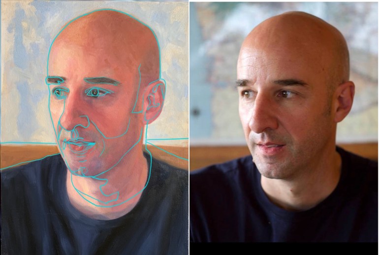
Facebook was right, this handsome guy is the wonderful European artist and art teacher, Martinho Correia, who I follow on FB now. This painting taught me (again!) how important the initial drawing is to the outcome of a portrait. I tend to start with much gusto and hubris* and just go for it. Then I reach a point where the portrait is nicely painted but something isn’t quite right.
Left: Traced photo on top of painting, Right: Original Facebook photo
In this case, as you can see above, when I used Procreate on the iPad to layer a tracing of the photo over my painting, the right eye, mouth and ear were slightly out of place and I’d made the t-shirt neckline too low. However, I was also delighted that given the sloppy drawing start, I’d gotten as close as I did (see below).
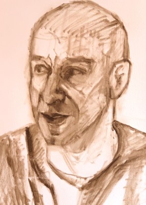
Initial drawing in thinned burnt umber paint
Of course I should have checked my drawing way back in the beginning, not after I’d so carefully rendered that misplaced right eye. If I’d been painting digitally it would have been so easy! But there’s no “select” and “move” commands in oil painting so I repainted and adjusted over and over until I reached the point of “good enough” (aka “I’m so done and over this it!”).
Embarrassing video of the process created from photos taken at the end of each afternoon’s painting session.
*Hubris is from Greek, where it meant “excessive pride, violating the bounds set for humans” and was always punished by the gods. We no longer have the Greek gods, so in English it just refers to over-the-top self-confidence.
“What, Me Worry?” (People Who Facebook Says I Should Know #7). Oil on Arches Oil Paper first covered with acrylic matte medium to reduce absorbency, 10.5 x 10.5 inches
It was fun to get back to this series of portraits of people who Facebook thinks I should know. I have no idea why Facebook suggested this nice, young British chap since we don’t seem to have any “friends” or interests in common.
What Me Worry? Image of Mad Magazine’s Alfred E. Neuman
The whole time I was painting I kept thinking of Alfred E. Neuman (“What, Me Worry?)” from Mad Magazine, which made me laugh. And now, comparing the photos (you can see reference photo on easel below), I can see this young man’s face should actually be rounder, more like Alfred’s.
Sketch and value structure underpainting in burnt umber and beginning of adding paint
Above are some steps in the process from the initial sketch through the beginning of adding color. Below is the set up with the reference photo on my iPad on the easel and my paint mixed up and ready on the palette.
Photo reference, palette and work in progress including taming his ears
Cute Grandma and Baby: People Facebook Says I Should Know #5.” Gouache, 6.5 x 6.5 inches
Unlike with oil paints, there’s a point with gouache where it just gets nasty if you try to add one more layer or brush stroke. The positive side to that is that it encourages me to try to get the color and value right as quickly as possible; to put a stroke down and leave it, not thinking “close enough, I’ll fix it later” like I tend to do in oils (a lazy, bad habit).
On this painting I passed the point of no return on the woman’s face and have to admit I did a wee bit of softening/smudging in Procreate before I posted this to fix the lumps too many layers of paint made on her nose. Even so I didn’t do justice to how cute both she and the baby actually are in their photo.
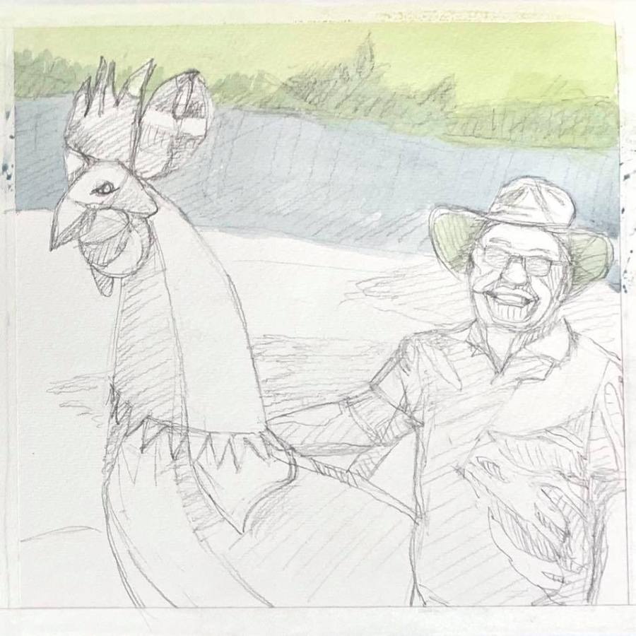
Guy with Giant Chicken: People Who Facebook Says I Should Know #4.” Gouache, 8×8 inches.
Another mystery photo! Is he an artist who builds giant chicken statues or perhaps a chicken rancher with his trademark chicken?
I noticed that when I paint with gouache on cold press watercolor paper I end up with little white spots in dark areas so this time I tried a different gouache technique. I covered the whole sketch first with thin washes. It wasn’t that helpful. I learned that for that to work it’s necessary to get the values right in the underpainting, making darks really dark.
Below is the sketch and in progress photos.
Sketch with first thinned gouache underpaintingFinished thinned gouache underpainting