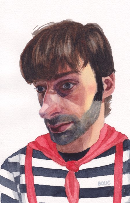
In the reference photo (see bottom of post) he was just a skinny, shirtless guy photographed too close-up, which made his already big nose even bigger. I thought he looked like a French mime so I put him in a mime costume.
Below is my first attempt at painting him. I had so many problems with the drawing being off and the paint handling. His shirt, scarf and suspenders were so pretty and fresh before I muddied them up.
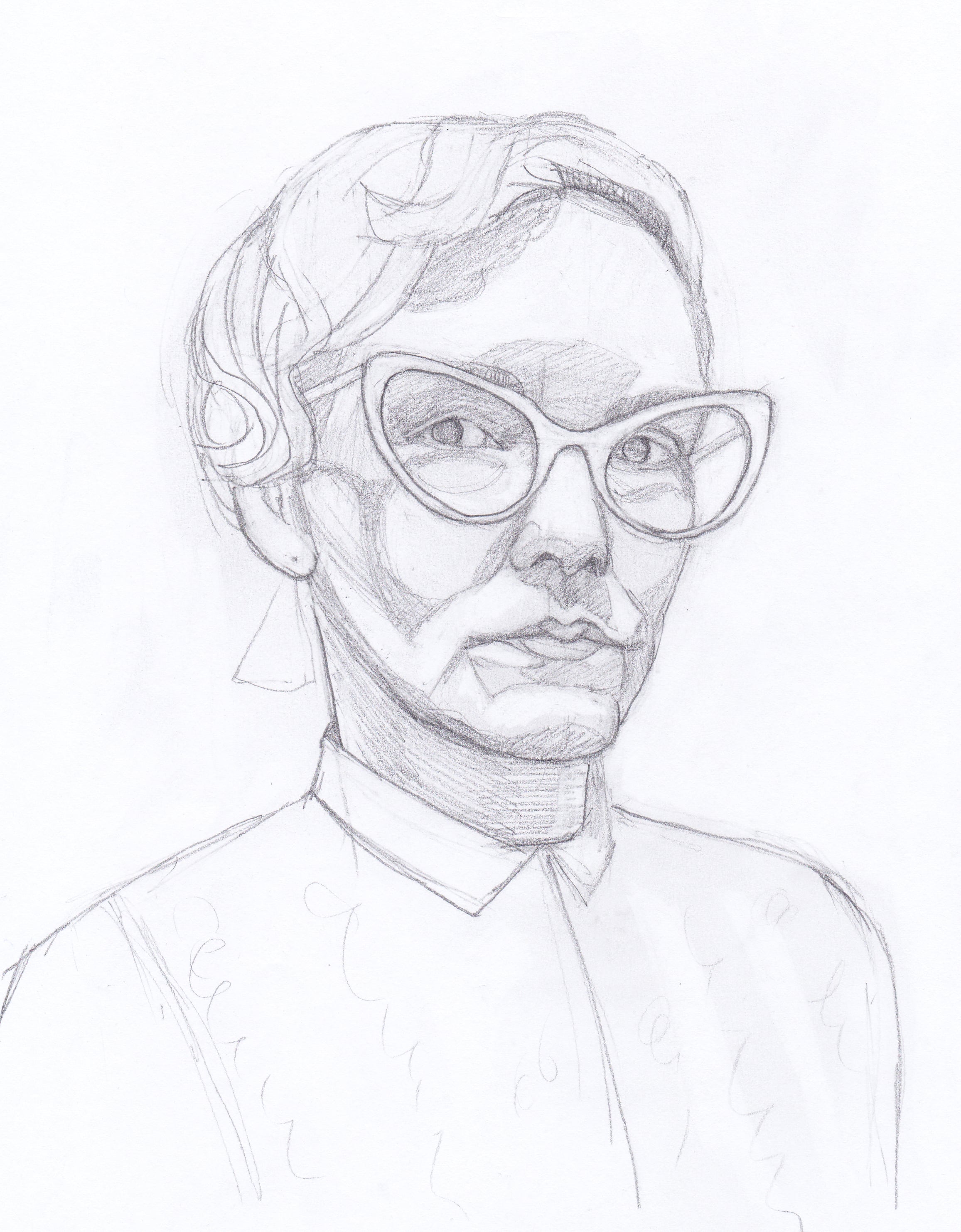
Sad Mime, watercolor, 10×7.5”
I’m still working on portrait drawing skills. It took four drawings before I had one that was close enough to paint.
Below are the various drawings and attempts at correcting them (tracing of photo superimposed on my drawing in Procreate) and the original reference photos.
After nearly a decade away from watercolor, I should have painted a pear or apple to practice. Instead I chose a difficult subject: little Juni, after a swim, with the cool, aqua colors of the pool and the reds of her beach towel reflected in her face (the latter overemphasized and unable to be lightened in my painting unfortunately).
I tried four times to draw and paint her and I may try this one again when I feel more competent.
Boring Guy, Watercolor 10×7″
After I gave up on painting Juni, I tried painting this ginger-haired guy from a photo (below) from an online drawing demo. I found it a little easier to draw and paint him, since I don’t know him. It’s both exciting and frustrating to be relearning watercolor.
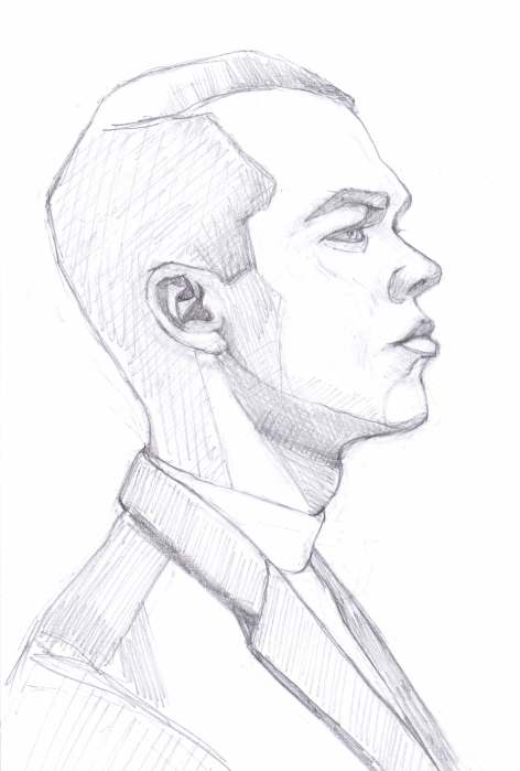
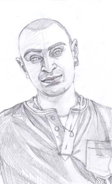
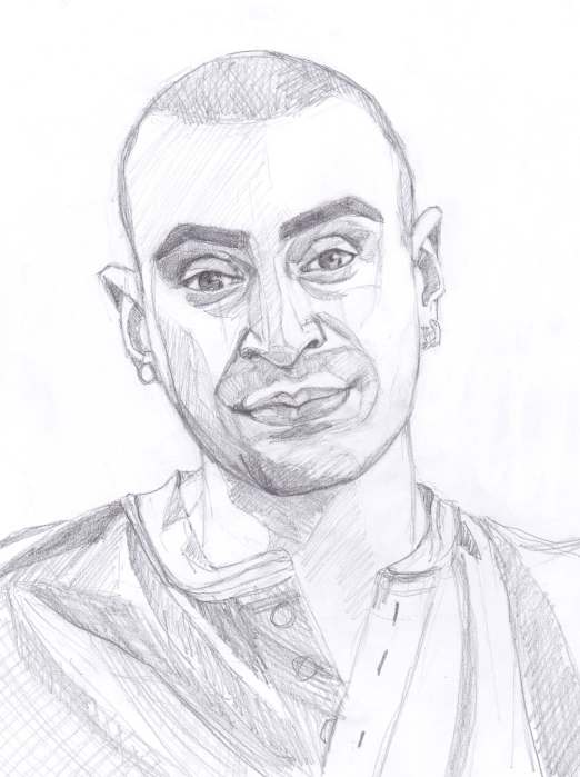
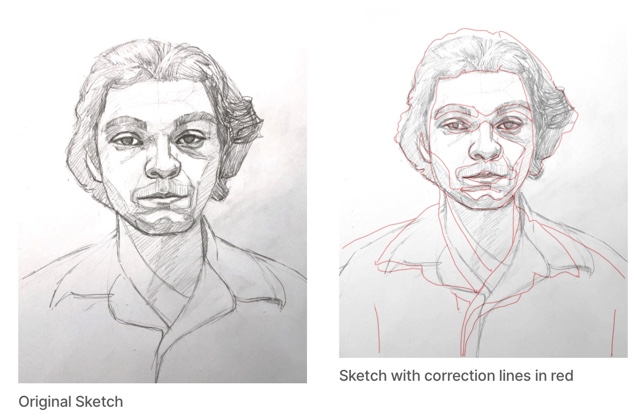
Below are the sketches and reference photo. As you can see, my first sketch was missing a huge chunk of the back of his head, a common rookie error. To check my drawing I layered a tracing of the photo over my sketch in Procreate. When I saw how far off I was, I started over with a second drawing that was more accurate.
From left, clockwise: Final Sketch, Corrected First Sketch, First Sketch, Reference Photo
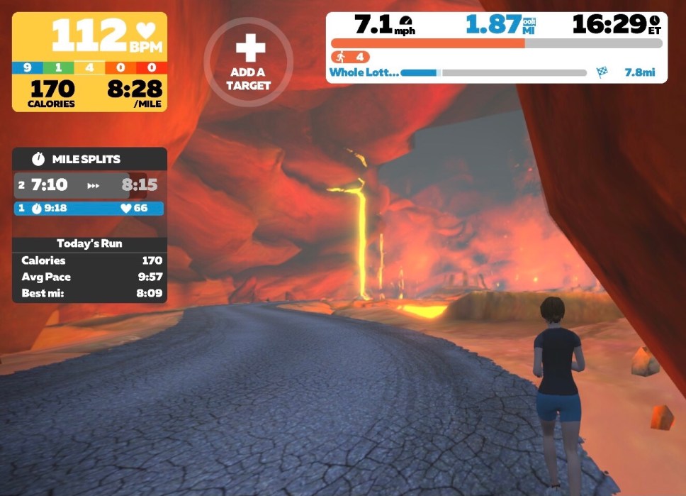
I used a limited palette to paint this guy twice. I based the one above on the colors I’d seen in a run around erupting volcanoes on Zwift. I also painted him using the original blue colors of the reference photo below.
Zwift is a virtual world/video game that you move through based on your speed and effort on a spinning bike or treadmill (see screenshot below). My limited palette was Indigo, Napthol Red and Cadmium Yellow Pale.
A scene from my run in Zwift’s Whole Lotta Lava route
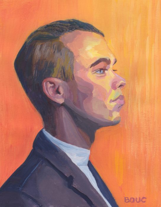
I thought he’d be fun to draw, with that prominent forehead and strong jawline and he was. I also painted him using a limited primary palette of yellow, red and blue, trying to get colors close to the reference photo (below).
Big Forehead Guy, #1, Gouache, 10×7.5”
About volcanoes…when I was a kid I had a reoccurring nightmare about being on an erupting volcano with Little Lulu and Tubby, characters from my favorite childhood comic books.
Below is the photo reference, my sketches, correction checks (photo tracing over sketch in Procreate) and the painting starts.
Photo referenceFirst SketchComparing 1st sketch to photo Second SketchBlue painting startRed painting WIP
I saw a photo of this restaurant critic in Berkeleyside, an online local newspaper, and immediately wanted to paint him. I made several drawings, trying to get a likeness. And then I painted him twice. Above is the second painting; below is the first.
Restaurant Critic #1, Gouache, 10×7.5”
I think his expression shows my frustration rather than the serene smile you can see in the reference photo here. Below are the drawings, which maybe captured his expression better than the paintings.
My drawing practice had been left behind over the months I worked on an oil painting that I ultimately abandoned. I was rusty at both painting in gouache and drawing but you have to start where you are, so that’s what I did.
Strawberries, Cheerios and Milk, 20×21″, watercolor 2013
The watercolor paintings in this post are from 10-20 years ago. I haven’t been posting new work for several months because I got stuck working on one oil painting portrait. I struggled with it, overworking, reworking, starting over, rinse and repeat. There’s something about being able to endlessly work on an oil painting that triggers my perfectionism, and not in a good way.
Pink Rose, 2003, Watercolor, 16×12″
Watercolor and gouache have natural stopping points. You have to pause to let the paint and paper dry. You can’t keep painting layer on layer endlessly or you have a muddy mess. You either call it done or you start over.
Sister City Parade, Watercolor, 22×30″, 2001 (An actual parade going down the street in my neighborhood when I was moving in 22 years ago)
I also became sensitive to solvents. I stopped using Gamsol while painting but even the smell of drying oil paint without solvents made me feel icky. Just using a little Gamsol for brush and palette cleaning left me with the taste of metal in my mouth and a headache, both signs of chemical sensitivity. I already have funky lungs so that was it. Bye-bye oils.
Ruth Bancroft Gardens Old Barn, ink & watercolor, 5×8″ 2013, SOLD
I’ve always preferred the look of watercolors to oil paintings anyway. In fact the only paintings I have hanging in my home are watercolors. I thought I would go through a grieving period but it’s been a couple months and I’ve felt only relief and excitement.
Sleeping Neighbor, Watercolor 30×22″, 2009, SOLD
I have thousands of dollars worth of oil paint, oil brushes, canvases, panels and oil paper that I will sell at some point. In the meantime, I’m finding it thrilling to watch water and color flow on paper again.
Sold. Michelle’s Rose, Watercolor, 2015 (SOLD) (Painted as a demo in a watercolor class I was teaching)
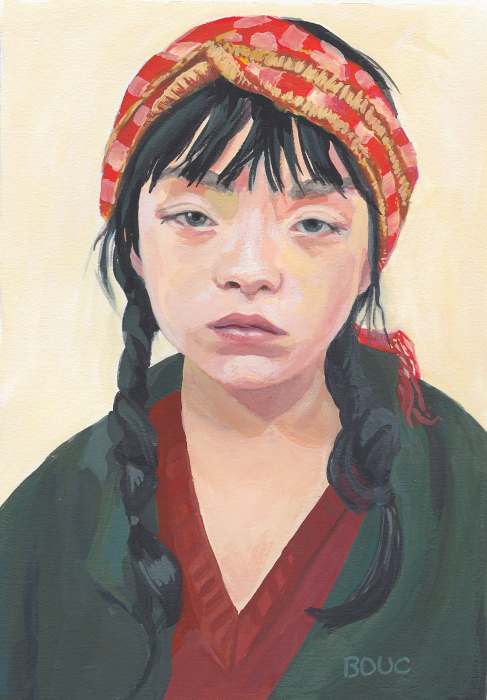
Sleepy Asian Girl, Gouache on paper, 10 x 7 inches
This was one of those rare and wonderful painting experiences where the sketch (below) came together by magic, and I liked it enough to not even check it against the reference photo for accuracy. I didn’t care if it was perfect. The painting just flowed and it was super fun to see and paint all the different colors and textures.
Sleepy Asian Girl Sketch, 10×8 inches, graphite on Xerox paper
I kept pondering her story while I worked on the portrait. I had all kinds of ideas but settled on a bone-tired factory or sewing shop worker. Then I did a Google image search of the reference photo (below), which was supplied by a Sktchy artist for her class demo and for us to paint from.
Reference photo
The image search took me down a looooong rabbit hole that led to a match for the photo. It turns out the model is a Japanese artist named Serena Motola. Maybe she was just bored and annoyed to be modeling when she wanted to be painting?
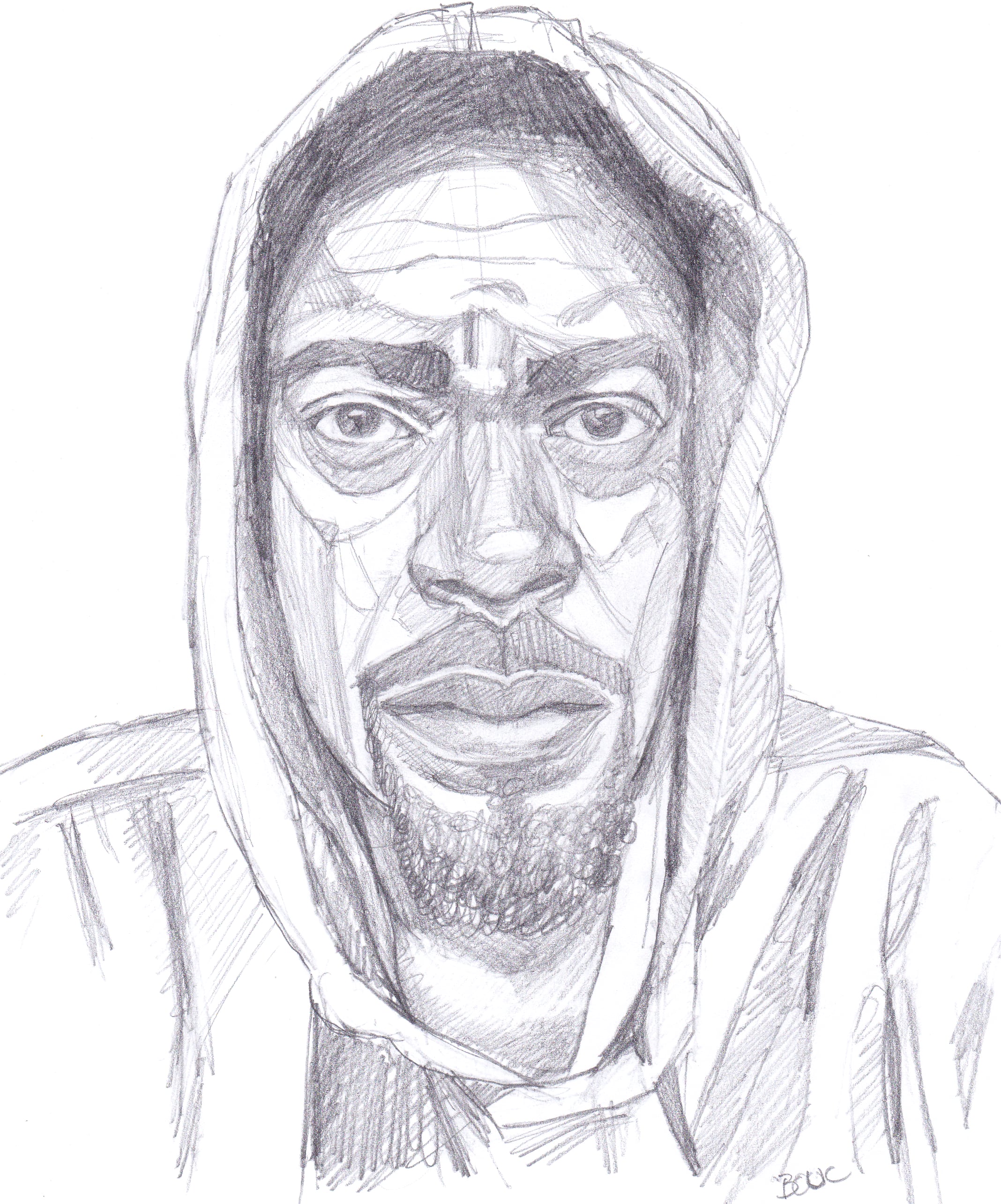
Nate Washington (IG link) is a comedian and podcaster who shared his reference photo for this portrait on Sktchy, here. (Except Sktchy app is now called “Museum”)
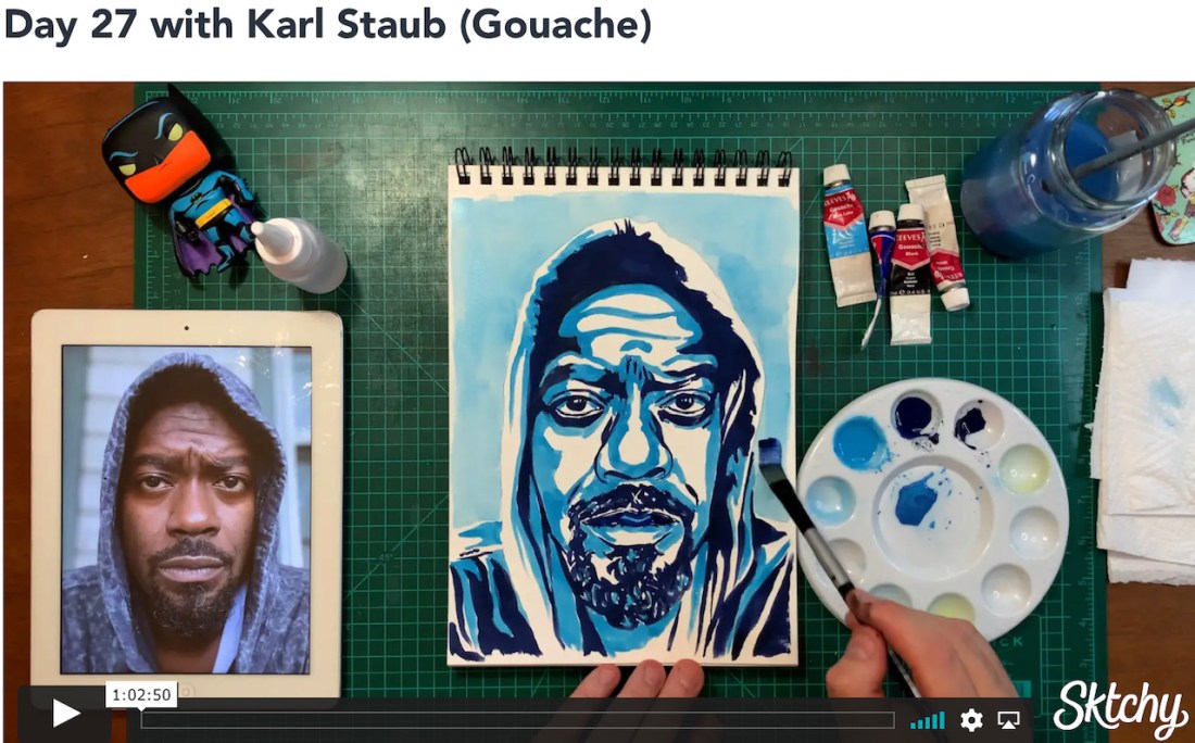
Karl Staub (IG link), the teacher who used Nate’s photo for his demo did a very graphic, poster-like rendering (see below). I was tempted to do that too, but decided to just continue with my own style instead.
Nate W. in pencil, 10×7.5
Above is my original sketch for the portrait. I had fun finding the planes on his face and clothes. Below is a screenshot for the 30 Faces/30 Days – Watercolor & Gouache class on Sktchy displaying the teacher’s work.
This was supposed to be a 30 portraits in 30 days class, but I think I’m now on month three instead. That’s because since last December I started working out every morning, doing indoor cycling, rowing and running classes plus daily core classes and alternating days of weights, yoga, Pilates, and Barre and two hikes a week with friends. I paint in the afternoon.
I’m getting stronger and fitter and having fun. But it’s always a challenge to find balance between all the things that make up a good life. I’m very fortunate and grateful for the luxury of the choices I get to make.
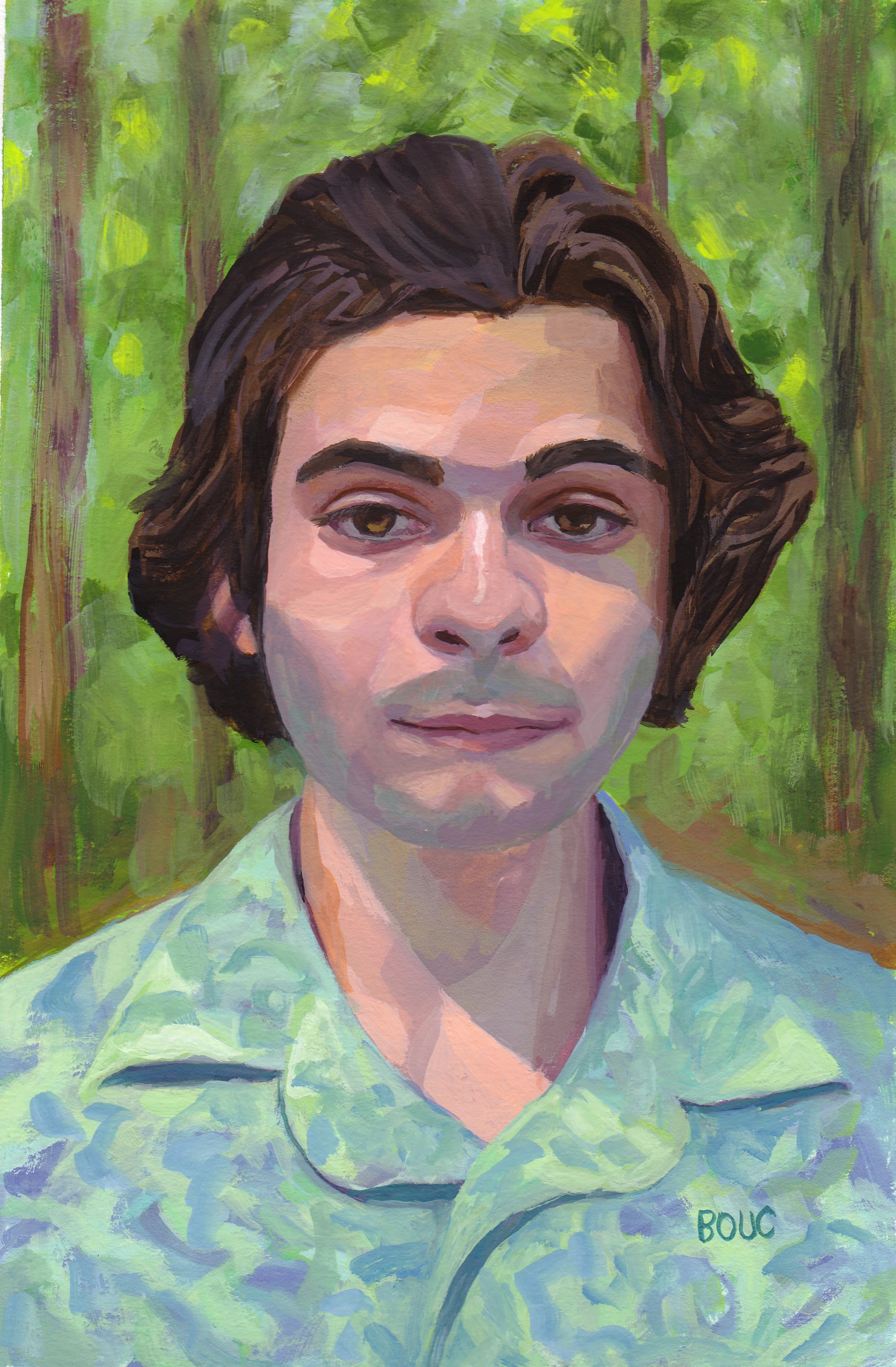
I really enjoyed painting this calm, pleasant young man amidst the trees, seemingly bathing in the cool forest light. You can see his original photo reference on Sktchy here.
I started with a pencil sketch on copy paper. Then to check my drawing, I compared my sketch to the photo by scanning my sketch into Procreate with the original photo. On a new layer I traced the photo with a red line and layered that over the sketch (see below). Using the red lines as a reference, I corrected my original sketch on paper, transferred the sketch to watercolor paper and then painted.
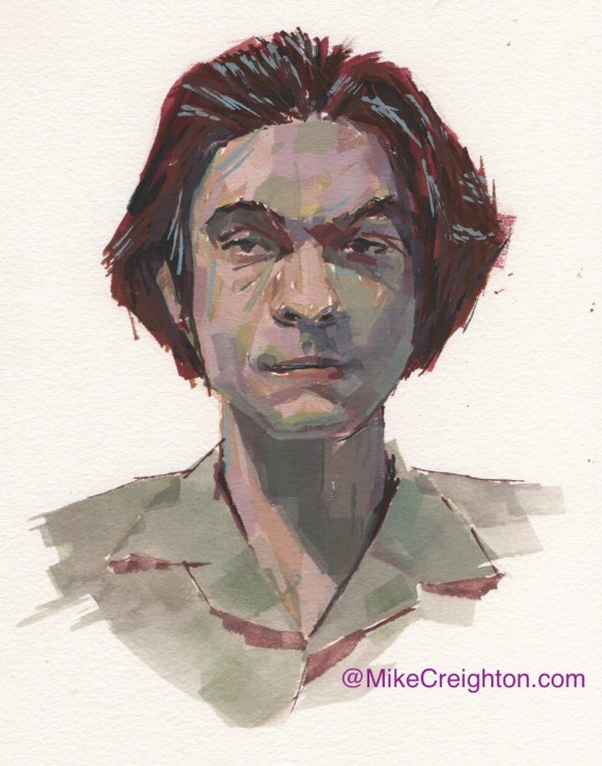
Bennett’s reference photo was part of the Sktchy “30 days in Watercolor and Gouache” class taught by Mike Creighton, one of my favorite Sktchy teachers. I thought it would be interesting to share his painting; such a different feel from mine!
Mike Creighton’s gouache painting
He used a limited palette and did a lot of mark making with his brush. I know the idea of the Sktchy classes is to try to mimic the teachers in order to learn a variety of different approaches and techniques, but I almost always end up taking what I like and then going my own way.
Kate K. from Sktchy, gouache on paper, 8.5 x 7 inches
While I worked on the sketch for this painting I listened to a mystery audiobook with a female detective so when it came time to do the painting, I decided to make her a detective in a dark subway or tunnel. Using a limited, complimentary palette of mostly purple and yellow (because of her hair, see reference photo below) I put her in a purple trench coat.
Kate K. from Sktchy reference photo
The teacher for this lesson on Sktchy Art School is a big fan of patterned backgrounds, as you can see in this link to her painting. She used “Acryla Gouache” in her demo, which I have tried and don’t like. It’s basically just opaque and matte acrylic, not “real” gouache in my opinion.
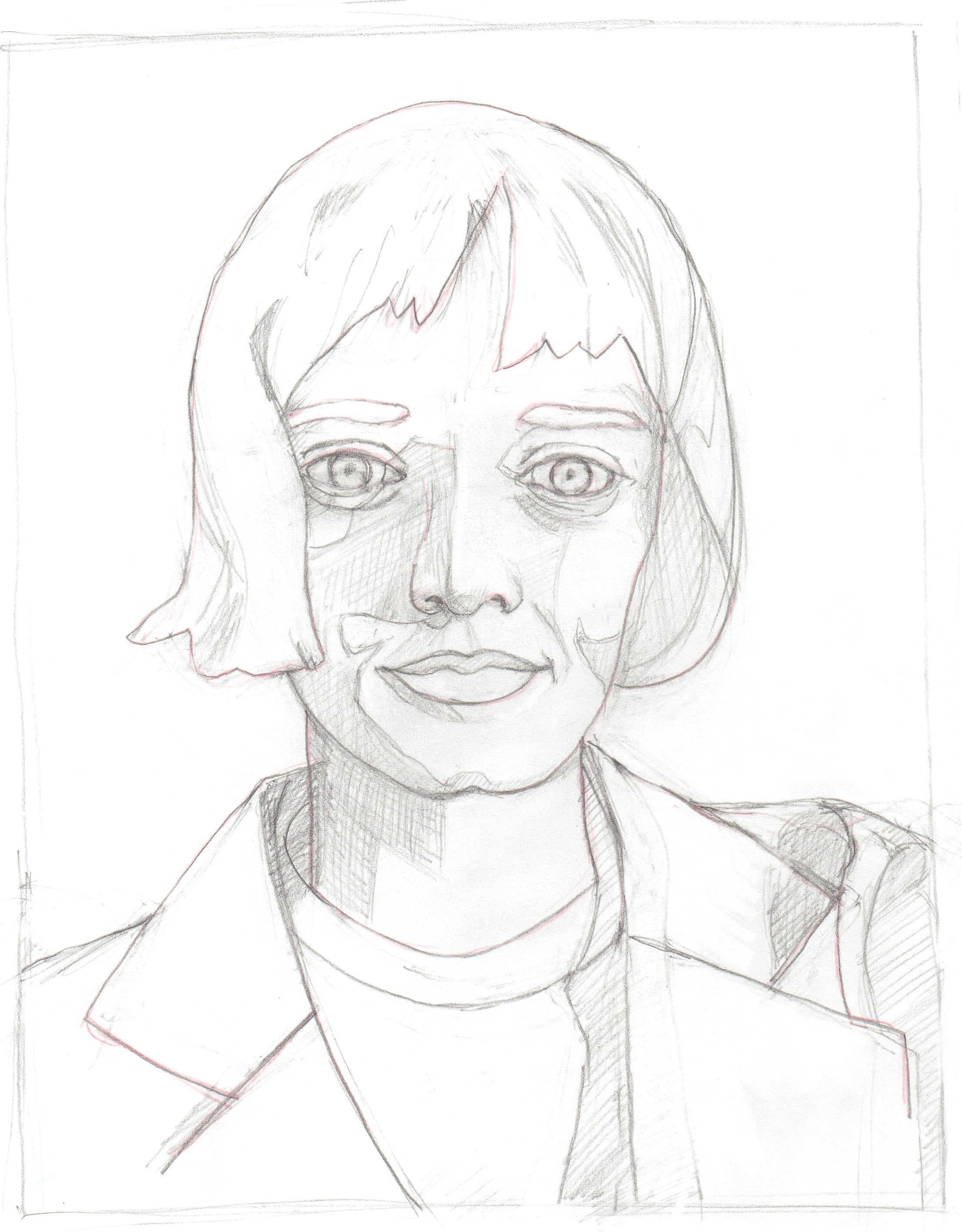
Initial sketch for painting of Kate K.
In the sketch above you can see that I indicated the divisions between the shadows and light areas. I’m trying to focus on keeping my value families separated, keeping the darks together separately from the lights family.
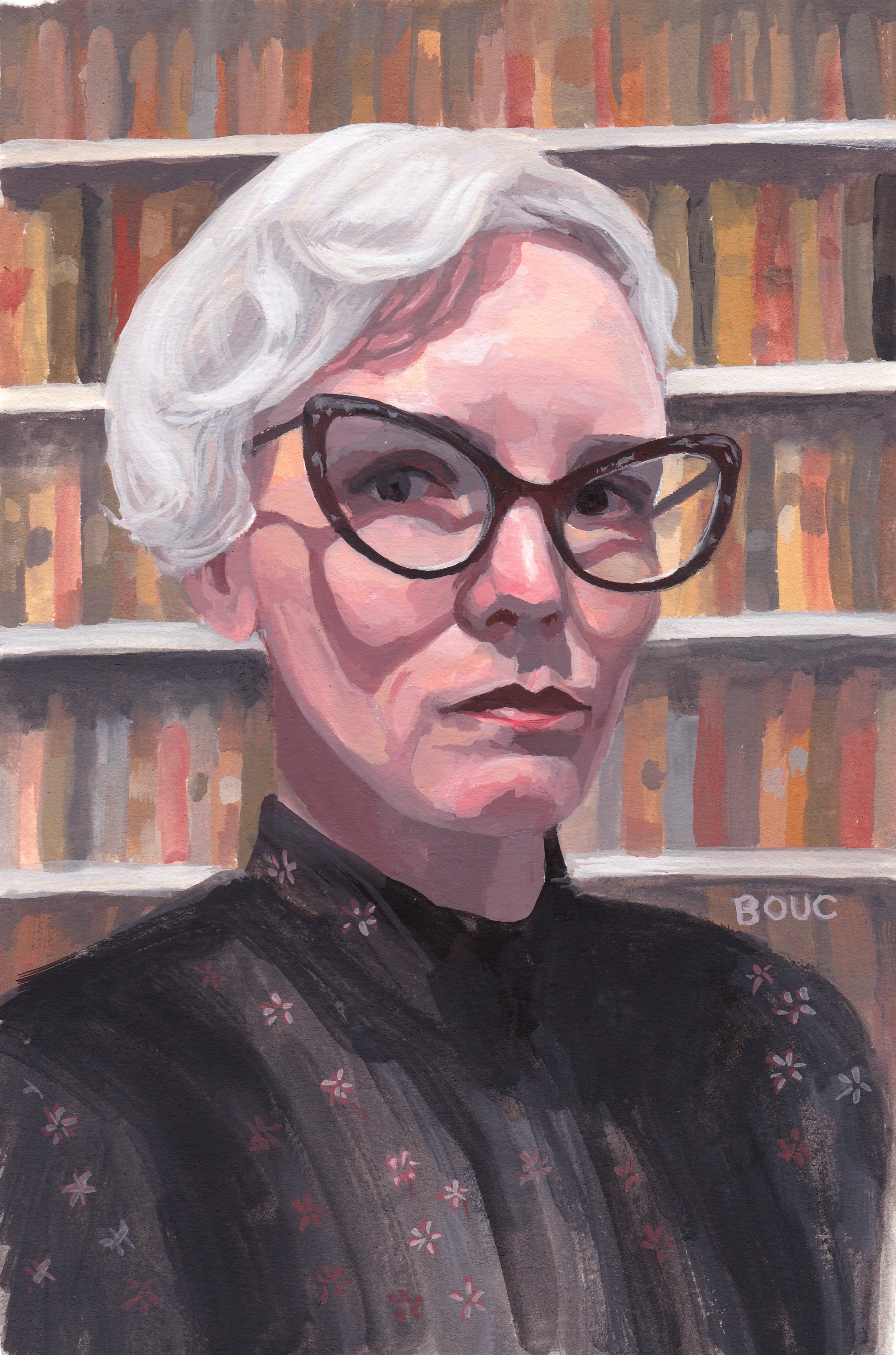
Stacy D from Sktchy in Gouache using Zorn Palette, 10×7 inches
I dramatically changed the setting of this portrait from a graffiti-covered wall (photo at bottom) to a library. There was something about her expression and clothing that made me think judgmental librarian, not the hip artist she appears to be in her photo feed on Sktchy. (Not that librarians can’t be hip artists! I was thinking of the mean school librarian who was always shushing us and glaring if we giggled.)
This was the last lesson in Mike Creighton’s Sktchy class on gouache portrait painting and color mixing. This lesson was about the Zorn palette: white, yellow ochre, cadmium red light and black. I’m really enjoying playing with limited palettes and discovering all the varieties of color possible with them.
In my initial sketch below, I hadn’t decided on the background yet.
Stacy D. from Sktchy, initial sketch on Xerox paper
When I decided to change the background from the wall in the reference photo below, to a library I did a quick internet search and found the photo below, right, which I used as inspiration.