Categories
Art theory Landscape Oil Painting Other Art Blogs I Read Outdoors/Landscape Painting Photos Plein Air

View from Viansa Winery

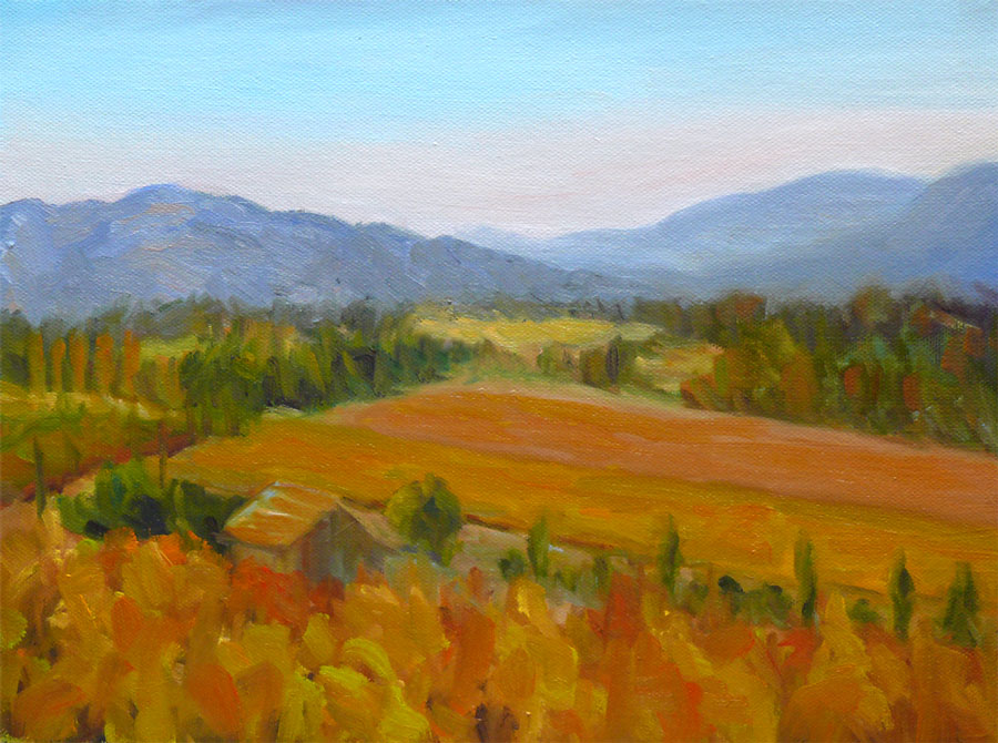
Oil on Canvas Panel, 12″x9″ (Larger)

On November 3 I went to Viansa Winery in Sonoma County with my plein air painting group. It’s a beautiful estate in the wine country with wonderful views in every direction. I painted the first layer of this painting on site and then today at home I painted another layer, correcting the original plein air sketch. I set my timer for one hour and completely redid the whole painting in about 45 minutes. Then I had dinner and when I came back I forgot my plan to do a one-hour painting and spent another two hours fiddling around with stuff I could have left alone.

As Karen suggested in her comment here a couple days ago, it’s good to focus on one goal per painting. I did that with this painting. My goal was to create a sense of distance, and I think I accomplished that. (Yay!) What’s interesting is that even though it’s only been three weeks since I started this painting, I see how much I’ve learned just in that short time…or maybe how much of what I’ve learned in the past year is starting to sink in and take hold. The on-site painting was out of proportion and very flat–no sense of depth or distance. But it was colorful which was my focus on that day — getting some color into my painting.

As I worked on this tonight I was thinking about two things my teacher recently pointed out to me that applied to the problems I’d had with this painting:

  1. Paint the dog before the fleas (in other words, get the big shapes in before starting on the little details)
  2. When you have man-made objects in a painting, such as buildings or fences, they have to be the right size or the whole painting will look wrong because we know what the object is and what it’s size is.

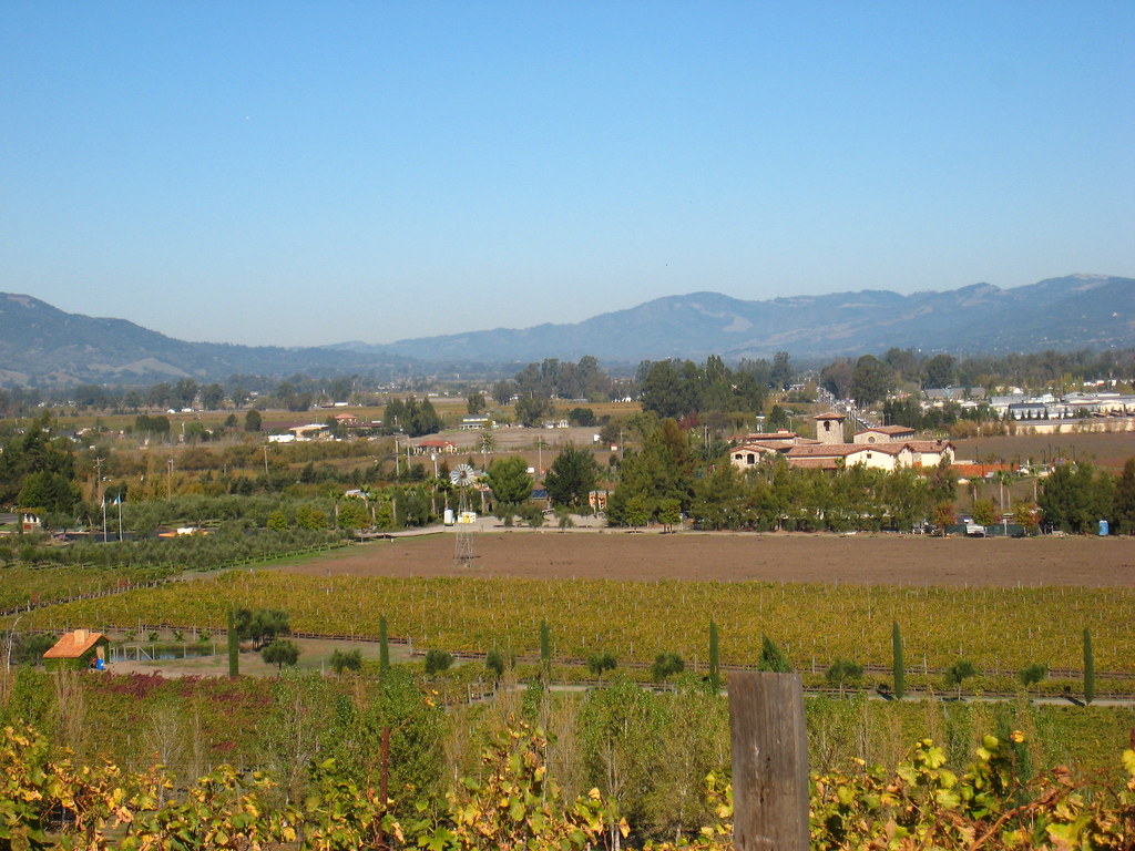
Here’s the photo I took of the scene:
View from Viansa Winery Photo
Larger

In the original version I got really involved in painting the little building in the front left and the bigger one halfway back on the right. But I’d made them bigger than they should have been so I could paint the details. And they were definitely the fleas, not the dog!

Categories
Art theory Landscape Oil Painting Other Art Blogs I Read Outdoors/Landscape Painting Portrait

Watching Painting Videos

Watching Painting Videos

I’ve been renting videos from SmartFlix.com on oil painting landscapes, portraits, and plein air painting and have enjoyed watching most of them, and so has Fiona, pictured above. SmartFlix.com is a website where you can rent videos on any kind of artistic endeavor or just about any other “how-to” — from welding to piloting a helicopter.

The service works well. They charge $10 for each video (theoretically for a week but I’ve kept some two weeks with no problem) They mail them to you with return packaging and postage included. My only complaint is that occasionally, after ordering a video, I find that there will be a wait for it while it comes back from the last member. Usually they’re shipped within a few days. There are no membership or monthly fees. You pay only when you rent a video. Like Amazon, there are user reviews which I found very helpful in making my selections.

Here are the videos I’ve watched so far, with my comments about them. (Please click “Continue Reading” below.)

Categories
Landscape Oil Painting Other Art Blogs I Read Outdoors/Landscape Painting Plein Air Sketchbook Pages

Lake Merritt Japanese Garden

Lake Merritt Zen Garden

Oil on Masonite Panel, 12×9″
Larger

I’ve been studying oil painting for months, reading piles of books, learning from others, watching endless painting videos (some that are literally “like watching paint dry”), taking a class and practicing every chance I get. Last week it seemed that despite my study and “book learning,” while I had the knowledge of how to paint in oils, I didn’t have the skill to actually do it. Today I think something has clicked and I’m finally starting to get it.

I nearly finished this painting on site with my plein air group this morning at Oakland’s Lake Merritt Botanical Garden. Unfortunately (or fortunately, really), the painting had a little accident on its way home and got smeared. That gave me the perfect excuse to work on it some more.

I’d been having difficulty with painting on the slick surface of the gessoed masonite with the stiff bristle brushes — the paint wouldn’t stick and kept sliding around when I tried to paint another layer on top. Then I got an email message from Nel, raving about a new softer brush she was enjoying: a Raphael Kevrin Mongoose Series 877. I picked one up at Artists and Craftsman in Berkeley and used that to fix and finish the painting. She was right — it’s a fabulous brush!

I had the most trouble painting the water, especially since I omitted the little island/tree in the middle of the pond and moved the big redwood tree all the way to the right. I had to adjust the reflections from what was actually there and I don’t think I quite got it right. Hopefully it looks a little like water and not grass!

Any tips appreciated (I mean advice, not spare change.)

Here’s the photo I used to finish the painting at home, and a couple steps along the way:

Categories
Art theory Landscape Oil Painting Other Art Blogs I Read Outdoors/Landscape Painting Photos Plein Air

Inspiration Point, Tilden Park

Inspiration Point, Tilden Park

Larger
Oil on panel, 9×12″

Sunday was my plein air oil painting class in Tilden Park and we met at Inspiration Point in Tilden Park in the Berkeley Hills. On a clear day you can see far into the distance from this site. Unfortunately, when we arrived at 9:00 a.m. the fog was so thick we could barely see halfway across the parking lot. Our teacher, Elio Camacho, had planned to start class by doing a demo — an expansive vista on a large canvas. To try to accomplish something until the fog cleared, he had us set up our easels facing the alleged view and get ready to paint. I enjoyed the idea of randomly picking a spot with no idea what I’d see or paint.

At 10:00, after delicious coffee and treats from Peets Coffee generously brought by a class member, Elio did an amazing small demo of the sun glaring through the fog above some nearby trees. Happily, just as he finished the fog lifted and we got to work.

This time I remembered to take a photo of the scene before I got started so that I could finish the painting at home:
Inspiration Point, Tilden - Photo

Categories
Art theory Flower Art Glass Oil Painting Other Art Blogs I Read Painting Still Life

Dahlias after Painting Class

Dahlias in Oil

Larger
Oil paint on gessoed mat board, 12×7.5″

Sunday was my first plein air oil painting workshop with Elio Camacho and it was fabulous! Elio is not only a wonderful painter, but he’s a fantastic teacher — so energetic, enthusiastic and generous in sharing everything he knows (which is a lot!).

Although Elio covered a huge amount of artistic territory in his conversations with us, what really sunk in for me at this session was the importance of temperature (warm vs cool colors) and value (dark vs light) and how to use those relationships to paint the effects of light in the landscape.

To better understand this concept and practice seeing color temperature, he suggested doing a still life of all yellow objects as homework so I painted these dahlias from my garden (after scrubbing all the nasty aphids and ants off them–ick!). Yellow is a good color to practice with because there are many yellow pigments from cool to warm and dark to light and you can successfully lighten it with white, unlike red which turns pastel pink when white is added.

Since I started this journey to learn oil painting, I’ve read many books, watched a dozen oil painting videos, and received wonderful support from my online painting mentor, Nel. There were so many concepts, “rules”, and techniques that I understood intellectually but in class they came to life! Seeing the process demonstrated and being able to ask questions each step of the way was great.

And even better was having Elio checking on me every 15 minutes or so during the three hours I was painting. He demonstrated what he meant when I didn’t understand; he recommended I quit dabbling– put down a stroke and leave it; he showed me how to hold my brush correctly and at what angle, so I was putting paint down without scraping it off at the same time (hold the tip of the brush and keep it at a low angle to the canvas, not perpendicular as I was doing). So many things just clicked.

The painting I did in class isn’t worth posting, though it had some nice moments along the way. Now that I know how to hold my brush properly and understand the importance of the direction of the brush stroke, and am learning to see color temperature and value better, I’m can’t wait to start my next painting!

Categories
Drawing Faces Other Art Blogs I Read People Sketchbook Pages Subway drawings

Subway Drawings & Mom Visit

Subway Drawing -bart41

Chubby cyclist. He was so stuffed into his clothes it must have been uncomfortable — but I give him lots of credit for riding his bike to and from the BART station instead of driving there like I do.
All drawings Micron Pigma pen in small Moleskine notebook

Subway Drawing -bart39

Sound asleep and resting comfortably after a long day.

Subway Drawing - bart40

She figured out I was drawing her and gave me a big smile as she got off. I didn’t have time to finish her bearded partner though I wished I did. He had a lovely gentle face.

It’s been a crazy week at work leaving me no energy to draw or paint in the evening. My mother ( see her artwork from the 50s here) arrives tonight for a nearly weeklong visit. I’m hoping to do some drawing while she’s here and I start a plein air painting workshop on Sunday with Elio Camacho.

Categories
Faces Other Art Blogs I Read Painting People Portrait Sketchbook Pages Watercolor

Portrait Swap – Ujwala in Watercolor

Ujwala, Watercolor

Watercolor in large Moleskine watercolor sketchbook from color photo
Larger

Ujwala, Monochrome

Watercolor (Ultramarine Blue & Indigo) in large Moleskine watercolor sketchbook from black & white photo
Larger

Forgive me Ujwala; I fear I haven’t done you justice but I thoroughly enjoyed painting your beautiful and expressive face. Thank you for allowing me to draw and paint you.

Update: Casey just posted her drawing of Ujwala too. Check it out here.

Quite awhile ago my friend and fellow art blogger Ujwala in Bangladesh invited me to do a portrait swap with her to be posted on Illustrator Rama Hughes‘ Portrait Party blog but I got sidetracked. She reminded me again recently when I was commenting on the wonderful series of portraits she’s been working on. The Portrait Party blog is really fun. It’s all drawings, paintings, and cartoons done by pairs of artists of each other. Rama recently posted pictures my friend Judith and I did of each other and when Ujwala finishes mine we’ll send them to him. If you want join the portrait party, just follow the instructions on his blog.

When I agreed (again) to do the portrait swap (which just means I paint you and you paint me), she promptly emailed me two great photos. It took me another few weeks to get around to sending her photos. I took pictures of myself at midnight in my old plaid flannel pajamas, holding the camera at arms length under bright light in the studio. The resulting photos showed every wrinkle and magnified my nose since I was holding the camera so close. I decided to forget about vanity and just send her the photos so we could get started.

Categories
Art theory Other Art Blogs I Read Painting Sketchbook Pages Still Life Watercolor

Egg Cup with Mushrooms

Egg cup with mushrooms

Watercolor on Arches cold pressed paper, 6″x5″ in sketchbook
Larger

I was at Berkeley Giclee on 4th Street in Berkeley on Monday to approve a test print of a painting I sold before the final giclee was made. The photographer/printer, Tony Molatore is a genius and so great to work with. The print is the same size as the original painting and it’s really hard to tell them apart.

While I was on 4th Street I stopped at the Crate and Barrel Outlet and bought some inexpensive goodies to use in still life setups including this little egg cup and periwinkle colored square plate. I’m going to paint this in oils too, but tonight my painting group was here and I wanted to join them with watercolor.

In my many years of painting in watercolor I focused on accurately capturing what I was seeing and on watercolor technique. Now that I’m also painting in oils I can’t just leave the white of the paper as background, or easily crop paintings when they’re done. Overall design and composition become very important so I’ve been trying to relearn all those elements from classes I took so many years ago. I tried to apply a couple of “rules” of good composition here:

1. Never “float” a still life. Make it go off the page on two sides or more (Told to me by Nel Jansen who learned it from another artist.)

2. “Never make any two intervals the same.” In other words, no equal divisions of space or equal quantities of dark/light, warm/cool, color, hard edge/soft edge etc. in a painting (The Simple Secret to Better Painting by Greg Albert — a good basic book on composition).

On the other hand, I’m noticing I have a foreground with nothing in the middle ground or background which seems a little odd and a few hard edges that should have been softened (which I will do later).

And on the other, other hand I had a wonderful time painting and being with my dear painting buddies tonight and seeing the lovely colors and shapes in the things I was painting.

Categories
Art theory Oil Painting Other Art Blogs I Read Painting Photos Plein Air Sketchbook Pages

Treasure Island Marina, SF Bay, Plein Air

Treasure Island Marina, SF Bay
Oil on 9 x 12″ canvas board
Larger

My plein air group painted on Treasure Island this morning, a former military base and site of the 1939 World’s Fair in the San Francisco Bay. There were some amazing views of the SF skyline, the Bay Bridge, and Port of Oakland but it was very foggy and windy (as usual for the bay) when we arrived so I chose to paint in a more sheltered location in the marina.

Here’s the scene when I arrived:
IMG_1328

And here’s a quick snapshot I caught of the sailboat in the foreground as it glided past me:
IMG_1335

These are the sketches I did when I arrived, trying to decide on the view and focal point.
At first I was going to do the SF skyline but after sketching it realized it didn’t interest me; the shape of the dip along the skyline of trees on the hill did.
Treasure Island thumbnails

I did some things right on this painting, after taking to heart the good advice from my wonderful oil painting mentor Nel (whose wonderful Everyday Paintings deservedly sell Every Day — I own two), from Katherine Tyrell‘s post about plein air painting, and from the comments here on my last plein air attempt.

This time I didn’t chase the light (changing the painting every time the light changed). Instead, I noted when I started that the light wasn’t interesting–too foggy–but guessed it would probably clear up at some point. So I decided to block in the masses–the big shapes of the hills, sky and water and as soon as the sun came out I would then add the light effects, which worked fine. I also remembered that boats are flat on the bottom because the water line is flat and level. I also liked the the way I did the tree tops against the sky.

A couple things I didn’t quite get right: I forgot that everything looks darker and duller when you bring it indoors–it looked so pretty in the bright sun but is actually a little too dark. Also last time I swore I wouldn’t “fix” things in the studio, but I hadn’t had time to finish the boats so I worked on them, which was fine,. But then I “touched up” the hills and lost some of the glowing edges I had originally.

It might not be great art, but at least I didn’t feel like I had no idea what I was doing, as I had a month or two ago.

Advice, critique, comments are welcomed!

Categories
Art theory Landscape Oil Painting Other Art Blogs I Read Outdoors/Landscape Painting Plein Air

Sharing my learning process

Tilden Park Plein Air & Studio 3

Oils on 9×12″ canvas panel
Larger view

In the interest of sharing my learning process in oils, I’ve posted this painting and some of my teacher’s critique. There are so many problems with this plein air plus studio painting that it seems to prove Dee Farnsworth’s saying, “Plein air is French for ‘bad landscape painting.'” I like to think of plein air painting as being the outdoor version of figure/life drawing — you’re trying to capture a 3-D live subject in real time, but with changing light.

The biggest problem is that it’s a painting of nothing…that is, there’s no focal point. In fact, the thing that interested me the most about the scene (some interesting branches) didn’t even make it into the painting. The composition basically sucks: there should be a path of dark values for the eye to follow but instead there’s a bright path leading nowhere: your eyes go up the path where you can turn left or right but there’s nothing there to see.

The shadows on the road don’t work because they’re too lumpy — shadows should be flat with softer edges. The daubing paint application is basically the same everywhere (I was trying to make myself use more paint–I tend to be too stingy with oil paint and was trying to work thicker). The foliage should be painted as masses–clumps of different sizes and shapes that go from dark underneath to light on top–just as you’d paint an apple–to give them dimension and form.

My teacher thought the painting was better before I messed around with it in the studio. Here’s the original done at the park (below):

Tilden Park Plein Air 1st

I’d gone out painting with my friend Susie who is much more experienced at plein air than I. When we packed up she pointed out that when we set up to paint, the Eucalyptus trees were light against a dark background, but as the sun had moved, the scene had reversed and the foreground trees were now dark against light background trees. I hadn’t even realized that but had unconsciously kept “correcting” my painting as the afternoon progressed which was not a good thing for the painting. It was best at about one hour. After that it just got more and more mucked up. When I brought it home I decided to work on it some more in the studio and lost a lot of what I’d originally liked about the painting which I didn’t realize until I posted both of them.

About knowing when to stop…I’ve always loved this story by Danny Gregory:

“When Jack was in preschool, there was one teacher whose class always did the most amazing paintings. Each one was clear and sharp and intelligent, Picassos in a sea of muddy fingerpaints. I asked her what she taught her kids, what she said to keep their visions so pure. She replied, “I don’t tell them anything, really. I just know when to take their paper away.”