Categories
Art theory Landscape Oil Painting Painting People Photos Places

Hannah’s Reflection

Hannah's Reflection, Oil on Gessobord, 16x12

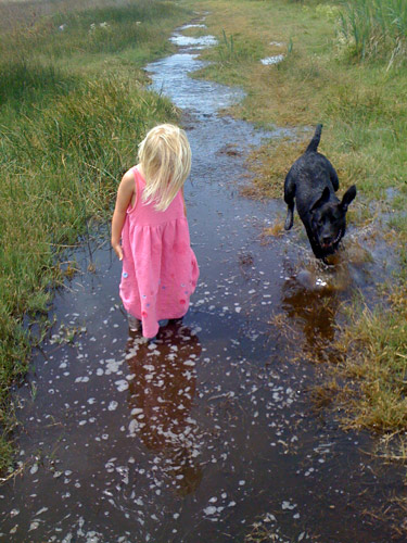
My friend Gina emailed me a photo with a note saying, “I like the light in this photo– for some reason I always think of you when I look at it.” Although I rarely paint from photos, especially those taken by other people, I just had to paint this one. My computer monitor is set up so that I can paint directly from the image on the screen which is a lot better than working from the limited colors in a printed image.

I’m not sure if I’m done yet, but I couldn’t see what else was needed so I stopped. If you have any suggestions for improving the picture, I’d love to hear.

Below are some stages of the painting.  I used a bit of artistic license: I gave Hannah a bit of a haircut and deleted Gina’s wonderful dog Bella because:

  1. The dog was competing with Hannah as the focal point and was about the same size.
  2. I couldn’t get Bella to “read” as a dog; no matter how hard I tried to draw her correctly, she just kept turning into a jackrabbit.

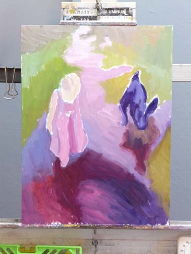
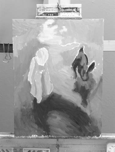
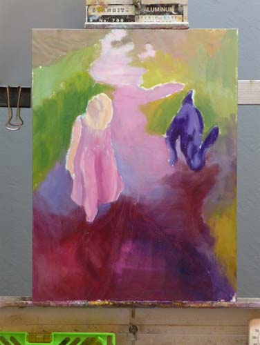
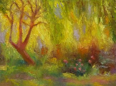
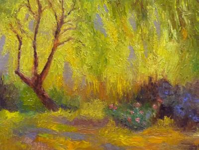
Top row: 1) the finished painting; 2) my painting start; and 3) a black and white version of the start to see if my values were on track.

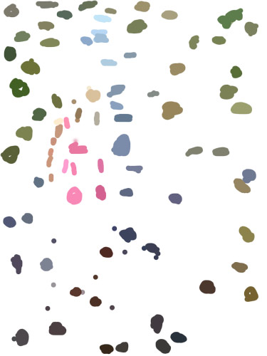
Middle row: 1) & 2) the next two steps in the painting. 3) a view of a “color spot” layer that I made in Photoshop. I created a new layer, and used Photoshop’s Paintbrush tool to select (Alt-click) and paint spots of those colors because it can be easier to see the colors when they’re isolated. Even more helpful than the color spots is a color-mixing tip I learned from Dianne Mize on Empty Easel: you apply the color to the edge of  a small card and compare it to the subject until you get it right.

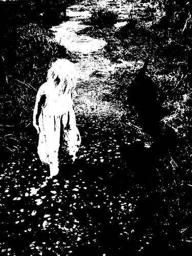
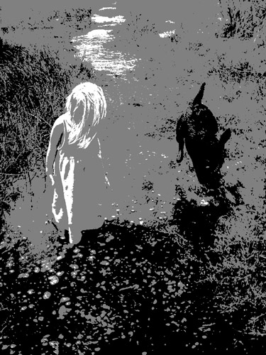
Bottom row: three views of the original photo. 1)  “Posterized” in Photoshop down to two values; 3) posterized with three values; 3) Gina’s original photo.

P.S. This park, which Hannah affectionately calls the “swamp adventure,”  is part of the East Bay Regional Parks. It is a river front park next to McAvoy harbor in Bay Point. It’s a little delta oasis in the sprawl of East Contra Costa County.

Categories
Art theory Oil Painting Other Art Blogs I Read Painting

Still Learning to See Color: Block Study (after Hensche)

Color study painted under halogen light, 9x12 in
Color study of blocks under halogen light, 9x12 in, oil on panel
Photo of setup (I painted from for blocks, not photo)
I painted from this setup (not from this bad photo)

This study was done to practice seeing, mixing and and painting the relationships of color and light on different planes. Theoretically these colored block studies should be done outdoors with natural light, but it was a cold windy day and I wasn’t feeling well (and still don’t—first it was stomach flu and now a cold) and so worked indoors. When I compare this indoor painting to those I did outdoors and posted here, I can see why it’s better to work outdoors.

This practice is based on the work of Henry Hensche. As Professor Sammy Britt says about Hensche on the Hensche Foundation website:

Charles Hawthorne was the first painter…to put the “Impressionist concept of seeing” into a teaching principle. Hawthorne spent the last fifteen years of his life trying to understand what Monet looked for and how he painted.

Henry Hensche, an assistant to Hawthorne, perfected the concept of seeing and teaching color after Hawthorne’s death in 1930. Mr. Hensche taught and practiced this visual language of color from that first Summer in 1930 until his death in 1992.” [emphasis added]

I’ve studied on and off the past year with Camille Przewodek, a fantastic plein air colorist and former student of Hensche and I think I’m beginning to comprehend the concepts at a basic level (although the study above is a poor representation of that). Another painter who studied with Hensche, John Ebersberger, has created a Hensche Facebook group that is open to the public, for former Hensche students and others who are interested in Hensche’s approach to seeing and painting color relationships.  There are wonderful photos posted there of Hensche paintings and paintings by the artists who have carried on his approach to color, and to my mind, have  advanced it even further. Their discussions and critiques on the groups discussion board are also quite illuminating.

Painting colored blocks under different light is one of the techniques Hensche used to teach students to see that in every plane change there is also a hue or color change (not just a tone or value change), and how these colors change according to the light key (foggy grey light, bright sunlight,  early morning light, afternoon light).

This is not an easy approach and takes years of practice and study, best done with an experienced teacher like Camille Przewodek, John Ebersberger, Carole Gray-Weihman, Dale Axelrod (great links and examples on his website), and others at Atelier aux Couleurs Art Academy who offer workshops locally and internationally. I have found one book, Painting the Impressionist Landscape, that does explains the concepts (although I don’t think that author’s paintings provide stellar examples, especially compared to those listed above).

Even if I never learn to see and paint like they do, I’m sure the concepts I am learning will enrich my painting and it has already changed the way I think about light and color and form.

Categories
Art supplies Art theory Drawing Flower Art Gardening Glass Ink and watercolor wash Oil Painting Other Art Blogs I Read Painting Sketchbook Pages Still Life Watercolor

Red Roses Painted with Watercolor, Oil and Blood (!?!)

Red Roses, watercolor

My next door neighbors were pruning their roses for winter so I asked them to save some for me to draw (they were going to throw the still perky roses in the recycling bin). I started by trying to paint them in oils but was having a terrible time mixing the right colors. I scraped off the paint and went to bed, planning to try again the next day.

When the cats knocked the vase over during the night I was actually relieved, thinking the roses would be too funky to paint since all the water was on the floor, not in the vase. But these were some tenacious roses, and were still fine so I decided to try sketching them in watercolor (above and below). I also consulted one of my books on flower painting that said roses were shaped like teacups, so I added a few of those tilted at the same angles to the sketch to help me understand their shape better better.

Blood Red Roses, Ink, Watercolor & Blood!
Blood Red Roses, Ink, Watercolor & Blood

I’d just finished the sketch (above) and was writing about how hard it is to mix the highlight color of  “blood red” roses in oil paint. At that very moment, my nose started bleeding for no reason at all and it dripped onto my sketchbook!  Now I feel like a real Avant-garde artiste, painting in blood!
P.S. A little pinching of the nose and it stopped.

Red Roses, Oil, 6x6"

Mixing a light red color in oil paints

It’s hard to mix a warm, light red in oil paint because when you add white to red oil paint, it makes a cool pink.  This is because all white oil paint is cool (meaning it tends more towards a blue than a warm color like orange or red). But the color of these roses in bright, warm light was a hot pink. It’s easier to get a warm, light red in watercolor because you use the “white” of the watercolor paper to show through and “lighten” the red, not white paint.

To get help with the dilemma I sent an email to Diane Mize at Empty Easel since she and I had recently corresponded about color charts and she’d written an excellent article on Empty Easel about how to mix correct color in oils. She validated that mixing a light red is challenging and offered some good suggestions, including using Naphthol Red, which is a more intense red than the cadmiums (which quickly lose strength in white).

I tried making the lighter areas of the rose thicker, using a palette knife, since those raised areas will catch the light and reflect it making it appear lighter. I also intended to make the dark areas on the roses more neutral and cooler, so that by comparison the warm light area would look even more brilliant. But the roses finally died and that put an end to the painting.  My favorite part of this painting are the leaves at the bottom left.

Categories
Art theory Life in general Painting Sketchbook Pages

From 2008 to Blank Slate: A Year’s Work

A Year's Oil Painting Study

I spent New Year’s Day sorting through the piles of sketchbooks and paintings I completed in 2008 and preparing the studio for 2009. My bulletin board is now a blank slate, ready for new work to go up. I gathered all the oil paintings that hadn’t gone directly to the garbage (121 survived) and sorted them into the piles you see above.

On the left are the 68 paintings heading off to the garage as a sort of purgatory zone. Next year they’ll probably go in the trash.

The middle stack of 42 are now shelved in the studio. These are the paintings that show progress and bits of success, but that I don’t want to hang on the walls.

The last pile on the right (plus the standing canvas of me) are the 11 paintings from 2009 that I like, imperfections and all. Also shown above is the presentation folder into which I inserted my oil paint color studies. I refer to these charts quite often and will be making more for new colors I’m experimenting with. It’s handy having them in this binder.

Sketchbooks completed in 2008

Above are the sketchbooks I completed in 2008 (and cheating just a bit, the first week of 2009). Half of them were actually started in 2008, but the other half were left over from previous years, when I was working in multiple sketchbooks at one time, without finishing any of them.

2008 and 2009 Art Goals

I just reread my January 1, 2008 art goals:

“My art goals for 2008 are also very simple: to enjoy myself by exploring whatever directions I find interesting, challenging, exciting, pleasurable, fun. No lists of shoulds, no rules other than play, practice and enjoy the journey.

My hope is that by this time next year I will have earned enough competence with oils that I can comfortably and freely work in the medium most fitting to the subject or idea I want to express, whether it be ink, watercolor, oils, goauche, or monoprint.”

I think I did pretty well in following that plan, pursuing many art adventures, including a considerable amount of plein air painting, sketching and and lots of study and practice in oil painting. I studied independently, with books, videos and with teachers and just tried to put those “miles on my brushes” as they say.

I still don’t feel completely competent with oils; I know what I don’t know, but I know what I do know too.

Goals for 2009:

1. Begin my 10,000 Days of Art project and make each of those days count. And again, the same hope as last year… “that by this time next year I will have earned enough competence with oils that I can comfortably and freely work in the medium most fitting to the subject or idea I want to express, whether it be ink, watercolor, oils, goauche, or monoprint.” Also I’d like to do morewith goauche and monoprint this year.

2. Do something I learned from my best friend Barbara, an amazing ceramic artist and art blogger:

Ask each day: “What can I do to enjoy myself today?
(I know this sounds a bit self-indulgent, but it’s often hard-earned and provides the “filling of the well” necessary to be able to do good for others too.)

Since enjoying myself always involves drawing, painting or other art-making, I intend to have a very enjoyable and artful year.

Categories
Art supplies Art theory Life in general Oil Painting Painting Still Life

Procrastination & Painting Pomegranates

Pomegranate and seeds, oil on Gessobord, 9x12
Pomegranate and seeds, oil painting on Gessobord, 9x12"

I never thought I was a procrastinator but after a week’s vacation meant to be spent painting but rarely getting into the studio until early afternoon at best, I began to look at how I’ve spent my time this week and had trouble figuring out where it had gone.

Then l saw this incredibly creative and well-made four-minute movie on YouTube entitled “Procrastination.” I could see myself in every single scene (except maybe smoking).  If you’ve ever procrastinated getting started on a creative project out of fear of failure, perfectionism, artist’s or writer’s block or any other reason, this video and will make you laugh (or cry).

About the painting:

I discovered Gessobord this week and fell in love with the wonderful surface of these panels. They’re smooth but have a texture that sort of bites into the paint and grabs it, as well as enhancing the colors of the paint. It’s really amazing and is a total pleasure to paint on with oil paints. I wish they were less expensive, but they’re still cheaper than pre-stretched canvas, especially when purchased on sale online.

Instead of trying to do a one or two hour painting and finishing this still life in one chunk, I had to do this one in several short sessions over a period of a few days (because of procrastination and various holiday events and other responsibilities).

I paused and studied the painting, and saw that I needed to improve the composition and values:

Stopping point before analyzing and improving value contrasts
Stopping point to analyze problems

I looked at the painting and the set-up through a piece of red plastic (which elimates the color, emphasizing values) and could see that I needed to darken the background and the inside of the fruit on the left side. I also added the seeds and stains on the cutting board to avoid so much empty space and lead the eye into the painting.

The pomegrantate (already less than fresh when I started) got less attractive and eventually I had to stop and call the painting finished.  I think it will serve as a good stepping stone to the next as I try to put more “miles” on my brushes. And now to stop procrastinating and focus on starting that next painting!

Ooops…when I posted what I thought was the “finished” painting (at bottom) a few minutes ago and then posted this photo of the set-up from day one, I could see that the color of the pom needed to be warmer and the background cooler so I just applied a dark cool glaze to the background and a warm red glaze on some of the pom and posted the finished picture at the top of the post. Now I’m done (I think).

20081130_2566-pomegranate-photo
Photo of set-up on day one
Pomegranate and seeds, oil on Gessobord, 9x12
Thought I was finished but more work needed
Categories
Art theory Landscape Oil Painting Outdoors/Landscape Painting Plein Air

Plein air painting: What’s it good for?

Lake Temescal Backlit, Oil on panel 9x12"
Lake Temescal Backlit, Oil on panel 9x12

An artist friend once said that in her opinion, the definition of ” plein air” is “bad landscape painting.” While I have seen some really great plein air landscapes, I’m finding that its challenges often lead to results that look clunky and kindergartenish. It takes a lot of practice to be able to successfully capture a scene in the two hour window you have before the light changes and everything looks completely different.

When starting a plein air painting (or any painting for that matter) it is recommended to first simplify the scene down to its most basic elements, the largest shapes of value and color. However, because I love detail so much, something inside me often rebels at simplifying and then I find myself with an incoherent mess.

I like to think of plein air painting as akin to figure drawing, rather than a way to achieve finished works of art: It’s good for you, but not an end in itself. But if I spend my painting time mostly working plein air, I end up with lots of crappy paintings and frustration from working small. And that leads to messing around with  the painting at home instead of leaving it alone.

Painting process

Below is the sketch that I painted at Lake Temescal on Sunday. It was a gorgeous day and although the lake was smooth and reflective and beautiful, the backlit trees along the lake were calling out to be painted. Below is the original version of the scene painted plein air.

Original painted plein air

When I brought it home I broke my rule (that I have yet to follow): Leave plein air paintings alone, call them sketches and move on.  Instead, after dinner I started messing with it, using a photo reference.

Today I studied the painting, still dissatisfied, trying to figure out what was wrong. I converted photos of the scene and my painting to “grayscale” in Photoshop and compared them. Immediately I could see that the photo had strong value contrast and that my painting did not. I worked on it some more, adding some dark accents. Here are the photos:

When a painting isn’t working I turn it into a little laboratory for learning, pushing it until it’s total crap or I’ve learned what I was trying to learn, or both. I think I should have just left this one as a happy color study.

Categories
Art theory Drawing Oil Painting Other Art Blogs I Read Painting Photos Sketchbook Pages Still Life

Full Circle: Painting my Pottery Pitcher

Temoku Pitcher & Fruit, Oil on canvas, 16x20"

The pitcher in this painting is one of the few remaining pieces from my years as a potter, though not a favorite.  I’d assumed I’d always be a potter and could always make more so didn’t worry when I sold nearly everything pre-Christmas one year. Then life changed.

I got married, had a baby (who I intended to just strap in a papoose on my back and continuing working at the wheel, up to my elbows in wet mud–Ha!) and we moved to a row house in San Francisco where I could no longer have a kiln. So that was the end of pottery, but the beginning of drawing and painting.

Below you can see the steps I took in making this painting. Although I was working live from my own still life set up, I was also following along with an excellent painting video by Don Sahli. I tried to set up a still life similar to the one he paints in the video but ate  the second orange so substituted a lemon.

[You can see a demo of the Sahli video here.]*

I’d already watched the video and had many “Aha!” moments with it and wanted to practice what I’d learned from it. This weekend I stayed in the studio instead of going out to paint plein air. I played a chapter of the video,  doing that step on my canvas then played the next section. It took Don an hour to do the entire painting but it took me the whole weekend.

Don Sahli is a wonderful teacher and painter who was the last apprentice of Russian painter Sergei Bongart. He breaks painting down to these 4 stages and I photographed those stages (above) as I went along:

  1. Drawing;
  2. Abstract stage (where you do 80% of the work, starting with the darkest dark and then continually ask yourself what color, value, temperature and you paint in one color shape after another);
  3. Modeling (where you finish giving the objects a 3-dimensional appearance, delineating the planes using value, and color temperature.
  4. Final details (adding highlights, caligraphic strokes, dark accents).

After watching the video and doing this exercise, I finally understand so many concepts that I’d read about, been taught, but had still been struggling with, especially the one illustrated below that starts the 3-dimensional appearance of the objects by finding and focusing on the dark/light,  warm/cool color shapes.

*P.S. I have no financial or other interest in Don Sahli’s videos. Just wanted to share a good resource.

Categories
Art theory Landscape Other Art Blogs I Read Sketchbook Pages Subway drawings

Finding my way as an artist

Thumbnails of BART view

Who am I as an artist? What really interests me enough to spend hours painting it? Do I really like painting landscapes? Do I really like painting plein air? Do I even like looking at plein air landscape paintings?

After making 100 plein air landscape studies and only liking 2 of them, it seemed like a good time to reevaluate and those are the questions I’ve been asking myself.

Before I took up oils a year or so ago I was fascinated by details and enjoyed seeing and painting the reflections in glass, faces that told stories (human and non-human animals), the world inside a flower, urban scenes from around my quirky home town.

Then I started painting mostly plein air landscapes in oils and was told I needed to lose the details; simplify;  just paint the big shapes; soften the edges, go for design and composition rather than content. But the more I simplified the less I enjoyed painting. I started to question whether I wanted to continue with oil painting and plein air painting.

Then I serendipitously discovered a book of Charles Sheeler‘s paintings at a used book store. I’d never been much interested in his work before, but when I looked at the images and started reading I was led to the answers I’d been looking for. I saw in his landscapes (mostly urban/industrial), still lifes and interior scenes a specificity, strong point of view, personality, AND great design. I saw a way I could translate what gave me joy in watercolor into my oil painting.

I realized that what interests me is the PARTICULAR, not the general; the close up, personal view that tells a story; a portrait of an object, a person or a place; not the general widescreen view as I’ve been doing.

In trying to better define my thoughts, while waiting for my train at the at the El Cerrito Plaza BART station I sketched the thumbnails at the top and bottom of this post (which can be enlarged by clicking either image).  Below is a photo of the scene, though a slightly different point of view:

Photo of similar view from BART
Photo of similar view from BART minus foreground

And here is what I discovered and wrote in my sketchbook, thumbnail by thumbnail:

1: No focus, BORING. What I’ve been doing: including every single detail from the window frame in the foreground to the cars, parking lot, city, bay, hills across the bay, and the sky.

2. A little more interesting. Focus on the Cerrito Theatre marquis sticking up with foreground and background being less important.

3. A close up view but no focal point, still boring. 3 trees. Who cares?

4. BORING. Sky mountain water. Big Fat So What!

5. Maybe… a portrait of specific trees and lamp post but still not interesting enough to bother painting.

6. Now this interests me! A person waiting, a bench, a sign, a particular tree.

Thumbnails of BART view

Now I just hope I can find a way to implement this new way of viewing and painting with oil paints. I wrote several more pages about these ideas in my sketchbook, but I’ve probably bored you enough for today. Now off to paint!

Categories
Art theory Landscape Life in general Oil Painting Painting Plein Air

Confessions of a Dangerous Driver

Morning light, Petaluma, oil on panel, 12x9"
Morning light study, Petaluma, oil on panel, 12x9
Afternoon light color study, Petaluma, oil on panel, 12x9"
Afternoon light study, Petaluma, oil on panel, 12x9

I ran a red light right in front of a police car on my way to painting class on Monday. If that wasn’t bad enough, I didn’t even realize I’d done it.

I even thought to myself as I drove past the police car that was waiting for the light to change, how nice it is that police don’t look at women like me suspiciously the way they might at young men in loud cars.

Seconds later I heard the siren, saw the flashing red lights, and pulled over. The cute, young officer was shaking his head,  it was so ridiculous. He couldn’t believe what I’d done and, trying to make sense of it, asked if I was distracted, was looking at a light further ahead, etc.

I never even saw the other car he told me had had to slam on the brakes to avoid me, and who then looked at the cop as both of them shrugged and shook their heads in amazement for a moment.

I eventually figured out what happened. Because I was distracted,  the traffic signal had registered in my mind as a stop sign. So I stopped politely, feeling immune to police scrutiny, and then drove on, leaving the officer sitting behind me at the light.

Thank goodness there was no damage or injuries (other than to my pride and pocketbook—it’s going to be an expensive ticket). It was a good lesson about driving distracted.  I’d been thinking about how late I was AND (hate to admit it) I was on the phone leaving a message for someone (although using the required headset).

About the paintings

Camille offered an extra afternoon session Monday so that we could do both a morning study as usual, and a late afternoon study of approximately the same scene to capture the difference in light. I simplified the buildings, trees and landscape to abstract shapes or puzzle pieces, so that I could focus on the colors and light effects.

In the morning the foreground and midground was mostly in shadow while the distance was in open sun and the sky appeared a weak yellowish to slightly pink color.  In the afternoon everything was front lit with a very warm light.

It was a long day and after Camille made some adjustments to my afternoon study and gave suggestions for doing more,  I realized I was too tired to paint any longer. I lay down on the grass in the park and spent the last half hour of class sketching a palm tree on my back (I mean I was on my back in the grass; it’s hard enough drawing palm trees, let alone sketching one on my own back!).

It had been too long since I laid in the grass on a summer day in the shade of a tree looking up at the sky. I need to do more of that and less rushing around distracted!

Categories
Art theory Landscape Oil Painting Painting Plein Air

Sibley Take Two: Better?

Sibley Take 2, Oil on Panel, 12x9"

When I took a peek at yesterday’s painting this morning I was disturbed by the color of the foreground wall (“YUCK!” I said out loud when I walked in the studio). I worked on it some more and now it’s closer to how I actually saw it.  I also touched up a few things here and there.

I noticed that I’ve broken a rule of composition: avoid placing two of something, better to have three. For some reason human minds prefer three items to two: two is boring three creates interest. Also avoid two shapes of the same size because contrast is what makes the painting interesting I’ve got two trees the same size, though one is a little further back; two bushes; the wall is split in two, etc.

So what do you think? Is this better than yesterday’s version? Am I done? I’m still bothered that the road and the top of the wall are nearly the same color, but they actually were just about identical and pretty close together.

Advice always greatly appreciated!