Categories
Art Flower Art Glass Oil Painting Rose Still Life

Spring Rose Series #6

“Spring Rose Series #6”, oil on Yupo, 12x9”.
“Spring Rose Series #6”, oil on Yupo, 12×9”.

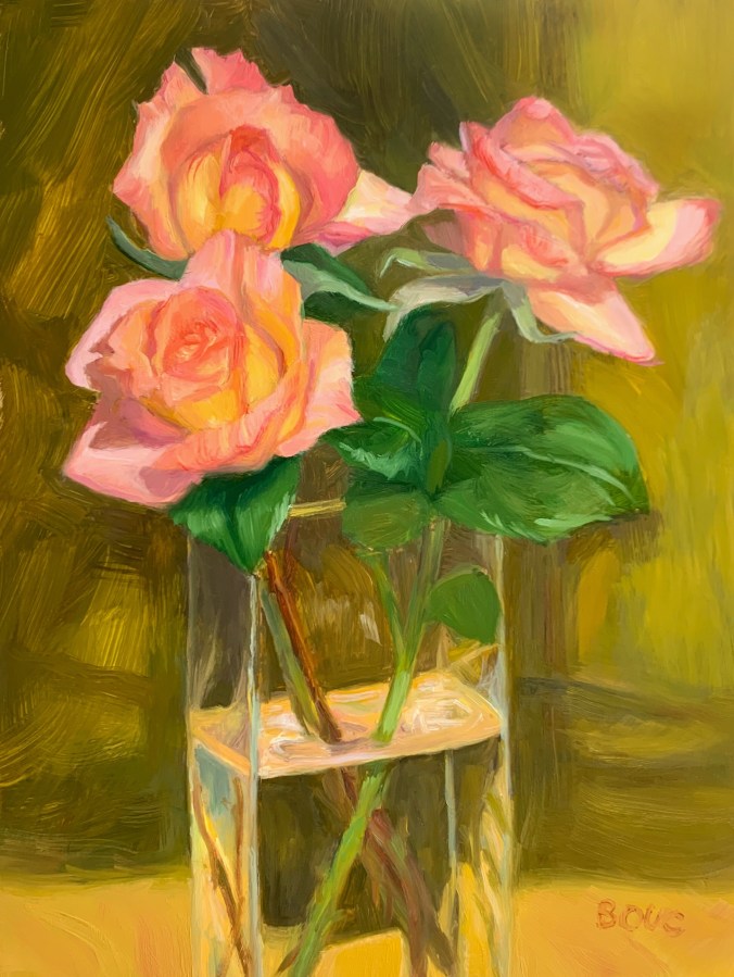
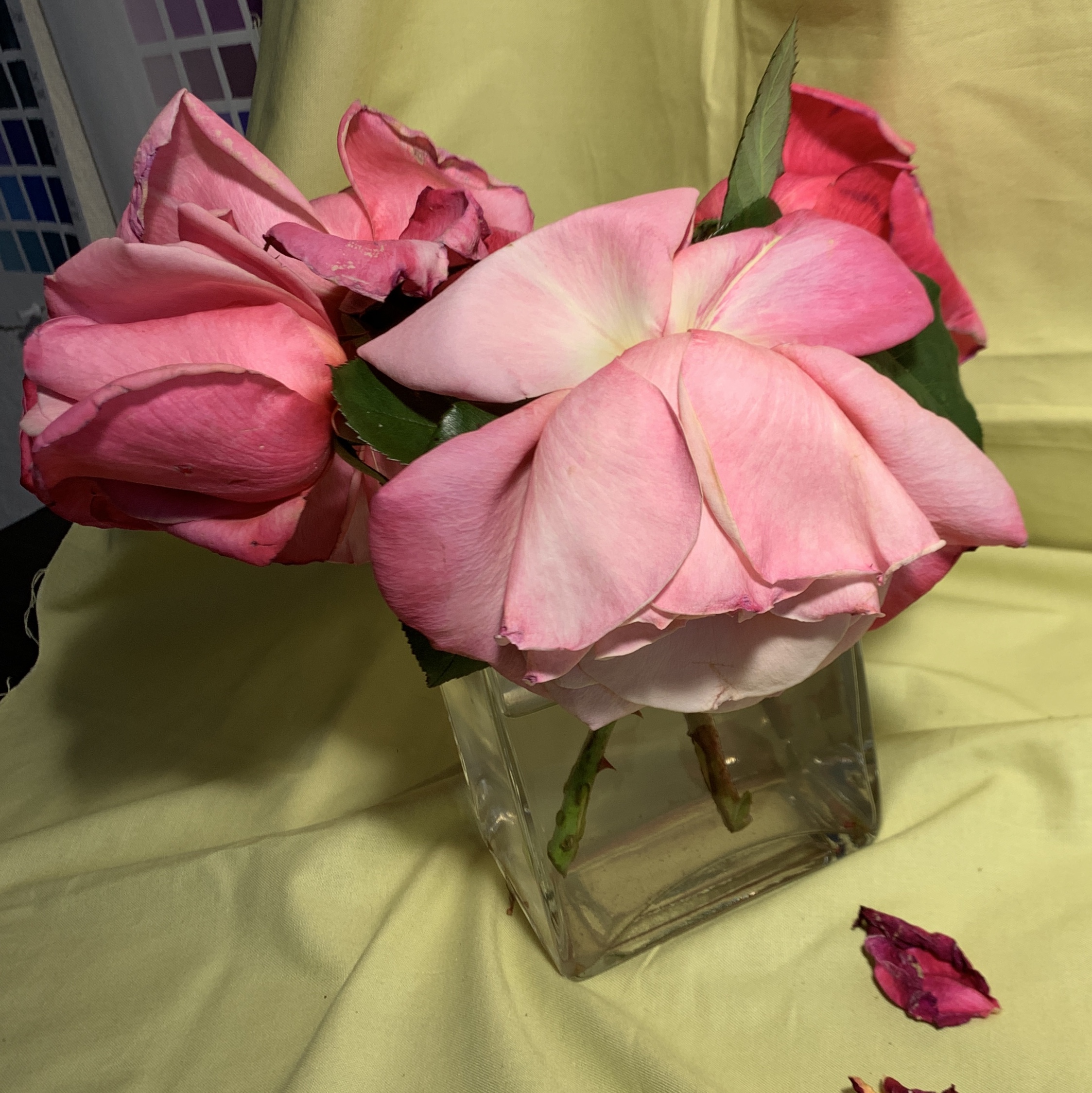
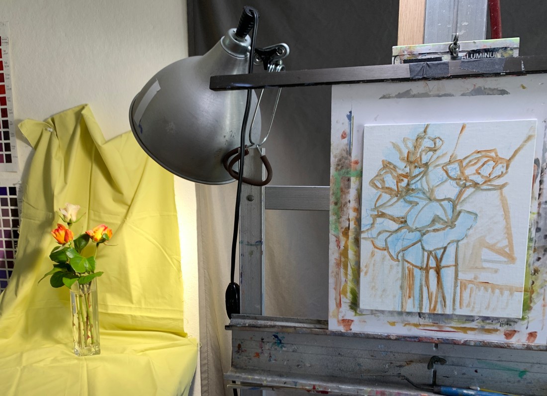
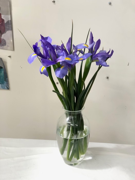
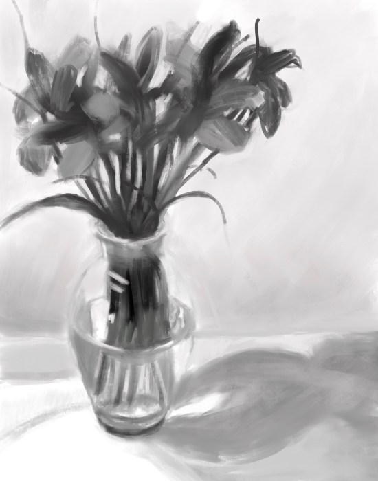
I was careful to get these roses painted in one afternoon, after spending a couple hours arranging the still life and getting the drawing down because I knew the flowers would keep changing. On the second afternoon I worked on the leaves and background. I saved the vase for last, thinking it wouldn’t change. But of course it did, as the flowers slumped and the water level dropped. I wanted to paint it from life, but had trouble making sense of what I was seeing and ended up wiping it off. 

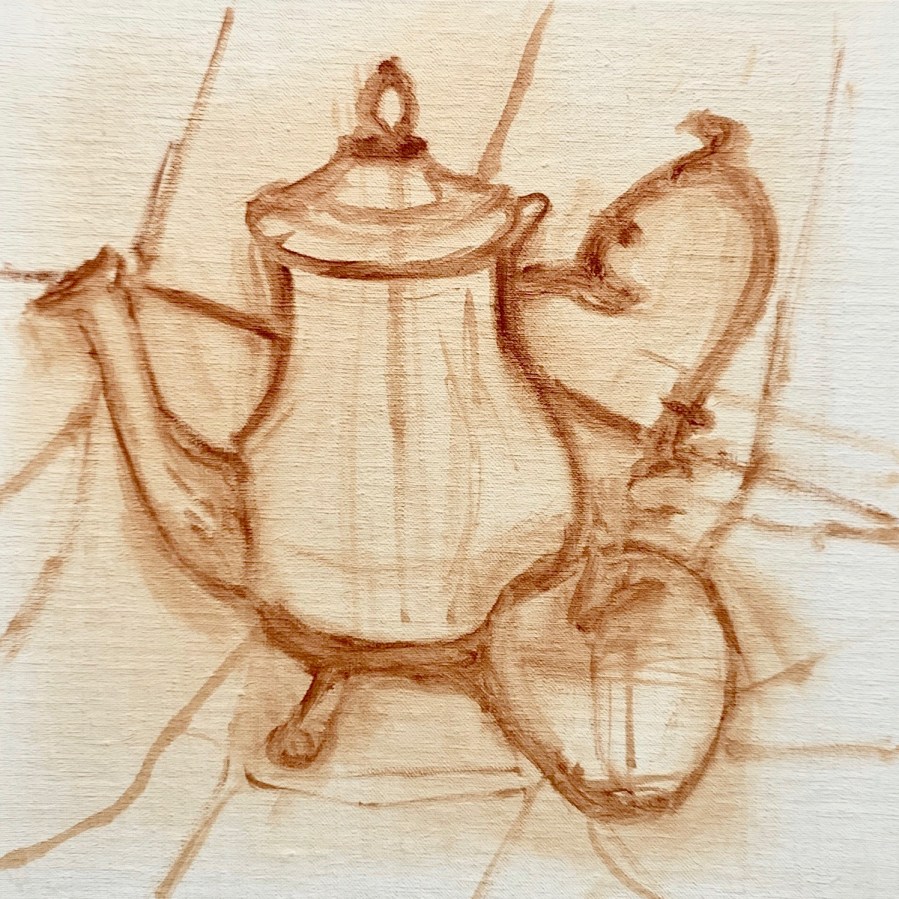
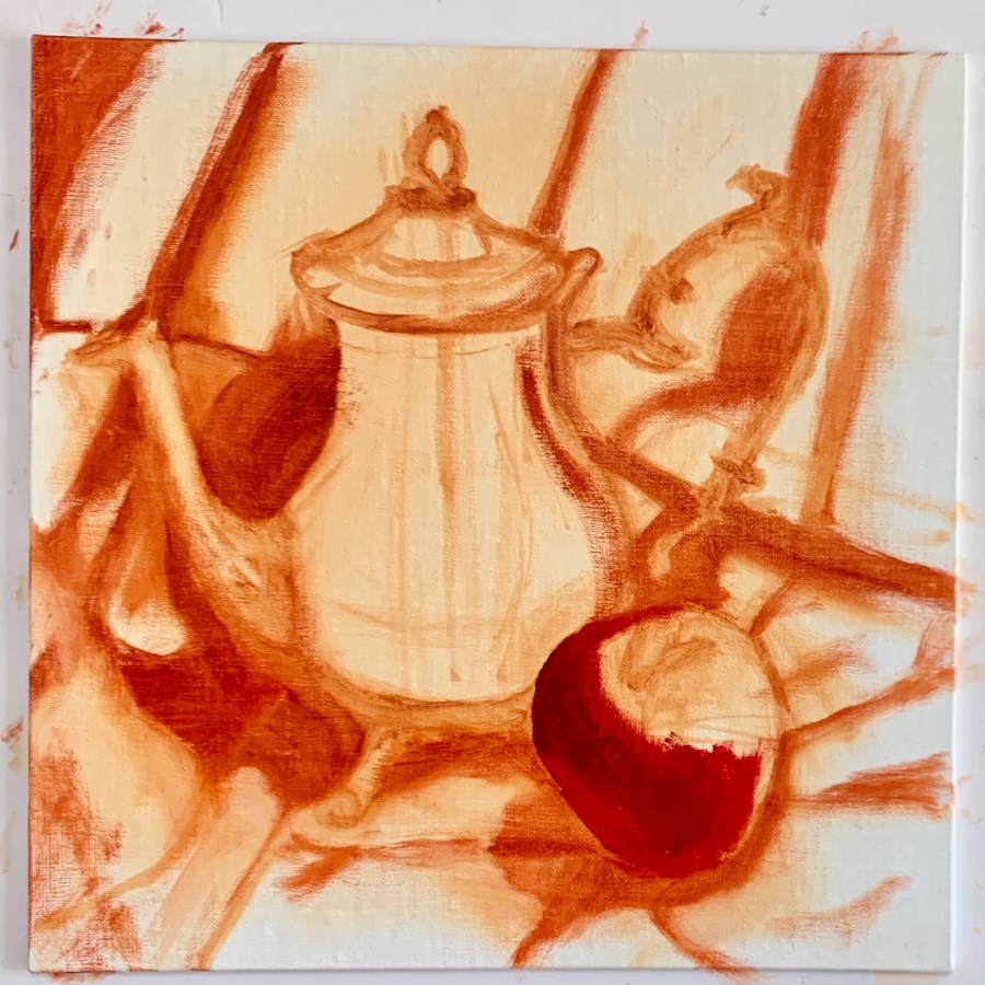
By the next day I had to toss the flowers so I used a photo reference on my iPad of the vase. Two more days of fails and wipe-offs followed. Finally I got to a point where I was willing to declare it done. You can see some of the steps in the process below.

Photo reference and initial block in stages
Photo reference and initial block in stages. Worked on flowers first.
Worked on leaves and background. Tried and failed repeatedly with vase.
Categories
Art Flower Art Glass Oil Painting Painting Rose Still Life

Spring Rose Series #5 (and #2-#4)

“Spring Rose Series #5” Oil on Yupo, 12x9”
“Spring Rose Series #5” Oil on Yupo, 12×9”

I was happy with this painting of my roses, done from life in 2 1/2 afternoons, especially after having tried and failed several times to paint my neighbor’s pink roses. (See below for photos of the process).

I’d read that oil painting on Yupo paper worked well and was archival so decided to give it a try with a pad of Yupo I’d bought long ago for watercolor. It hadn’t fit my watercolor style then, but I found it very fun to paint on with oils and also easy to wipe off. It’s similar to painting on DuraLar except it’s not transparent.

Photo of setup and steps in the process
Photo of setup and steps in the process of painting above

Every time I tried to paint my neighbor’s roses, I’d get the drawing and block in started, run out of time and the next morning the flowers had slumped or collapsed to the point I’d have to give up, wipe off and start over.

 Roses painting attempt 3 and 4
Roses painting attempt 3 and 4

I finally decided the square oil primed linen panel was jinxed and abandoned it. (Or maybe it was karma? The first bunch I’d taken without permission but even after I’d gotten permission his roses just wouldn’t hold up.)

Rose painting attempt #2
Dead Flowers Again!
Dead Flowers Again!
Categories
Art Flower Art Oil Painting Painting Rose Still Life

Spring Rose Series #1

“Spring Rose Series #1”, Oil on Linen Panel, 10x8”
“Spring Rose Series #1”, Oil on Linen Panel, 10×8”

My roses have started their spring parade of long stem blooms and I can’t resist painting them even though I’m allergic to their scent. This painting started a whole series that went from OK (this one) to 5 total fails (each painted on top of the previously scraped one), to one I declared successful, which I’ll post next time.

See photos of the setup and work in progress below. 

Categories
Art Oil Painting Painting Still Life

Silver Teapot and Happy Apple

"Silver Teapot and Happy Apple" Oil on oil-primed linen panel, 10x10”
“Silver Teapot and Happy Apple” Oil on oil-primed linen panel, 10×10”

This was my favorite oil painting experience ever. It was one of those paintings where everything just came together. Yay!

I painted it from life in two afternoons. I think what led to my success was that first I got the drawing right and then I just put the paint down and left it, doing very little touching up and/or correcting (aka overworking).

Below are a few photos of the setup and the beginnings of the work in progress.


Categories
Art Oil Painting Procreate on iPad

Another Semi-Fail Flower

Matilija Poppy, oil on canvas, 8.5” x 11.5 inches

The only thing I like in this painting is the Matilija poppy and maybe the shadows. I’ve painted Matilija Poppies (much better) before like this one that also appears in the book “The Watercolor Artists Bible” along with several other of my watercolors. For some reason I find it much harder to paint flowers successfully in oils.

I started this mostly yucky painting by first using Procreate to design a color plan to work from (below) that I unfortunately didn’t exactly stick to. I like the digital version much better. Then I did a black and white underpainting in acrylic before painting in oils.

Color plan done in Procreate and black and white photo for values
Photo of set up
Photo of set up
Categories
Art Flower Art Oil Painting Painting

Hydrangeas with Post-It Note

Hydrangeas with Post-it Note, oil on Gessobord panel, 10x8" Available
Hydrangeas with Post-it Note, oil on Gessobord panel, 10×8″

My hydrangea plant lives just outside my kitchen window and each year I enjoy painting it. This time I was going for a more abstracted feel with soft, soothing beautiful colors and just the tease of a bent post-it note.

I hope all the rain we’ve had this winter will help it continue to produce fabulous blooms! This painting is available in my DPW gallery.

I love the way the petals range from pink to blue to lavender from the soft yellow when they first sprout. Below is a photo of the setup.

Photo of set up
Categories
Art Flower Art Oil Painting Still Life

Iris in an Aqua Cup and Bonus Pear Painting

Iris in an Aqua Cup, oil on unstretched canvas, 12x9"
Iris in an Aqua Cup, oil on unstretched canvas, 12×9″

I was thrilled when my irises bloomed again this year after failing to do so last spring. I love the warm light I was able to capture in this painting. It went through a lot of changes before I finally settled on this version. (Available on my DPW gallery here.)

Bonus Pear, oil on Gessobord, 6x6"
Bonus Pear, oil on Gessobord, 6×6″

This was just a little love letter to a pretty pear. (Available on my DPW Gallery here.)

Categories
Art Glass Oil Painting Procreate on iPad Still Life

Hanging Lemons: Two paintings and a Candy Jar

Lemon, Candy Dish and a Cosmetic Swab, oil painting on unstretched canvas, 16x12”
Lemon, Candy Dish and a Cosmetic Swab, oil painting on unstretched canvas, 16×12”

I had so much fun painting this hanging lemon and grandma’s candy dish and the previous hanging lemon oil study below. Also scroll down for the fun Procreate color studies and sketches and WIP photos.  I know the candy dish is wonky but I decided I like the wavy distortions.  I’m not sure which I prefer more, the iPad color study or this painting (which is available at my DPW gallery here.)

I’d love to know which you prefer: iPad painting or oil painting? And here is the little hanging lemon painting I did earlier:

Hanging Lemons, oil on Gessobord panel, 7x5"
Hanging Lemons, oil on Gessobord panel, 7×5″

This little painting came first; a fun experiment in composition and hanging things from the wall to paint. The painting is available at my DPW gallery here.

Original color study sketch in Procreate on the iPad. Print is available upon request.

In some ways I prefer this chunky quick study more than the oil painting. I am working towards finding a way to apply what I’ve been doing on the iPad to my oil paintings. Next up on the blog are a series of more of these iPad sketches.

Categories
Art Flower Art Oil Painting Still Life

Spring Yellow Daffodils

Spring Yellow Daffodils with Lemon Wedge
Spring Yellow Daffodils with Lemon Wedge, oil on Gessobord panel, 12×9″

I tried painting these several ways, with just the vase and flowers, with a whole lemon, and then a lemon wedge. It’s all about yellow. And springtime. And daffodils. (Available on my DPW gallery here.)

Photo of set up
Photo of set up

Categories
Art Flower Art Oil Painting

Irises on White Cloth

Irises on a White Cloth, oil on panel, 14x11" Available here.
Irises on a White Cloth, oil on panel, 14×11″ Available here.

I painted these from life, but first did a value sketch in Procreate to help me stay within the range of values I chose for the painting. That’s a concept I’ve been pondering: that you can design whatever value range you want for a painting, from mostly light to mostly dark, and then mix the paint colors accordingly. I printed out the Procreate value sketch and put it on my easel for reference as you can see in the work in progress photos below.