

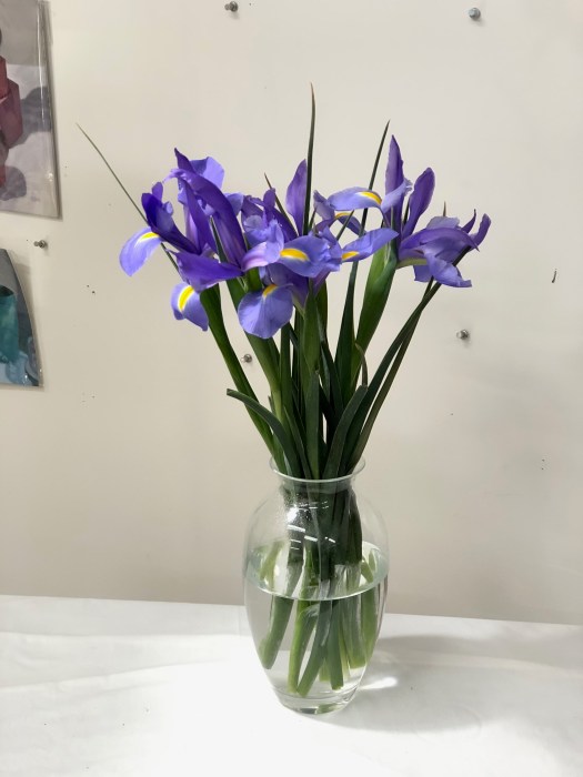
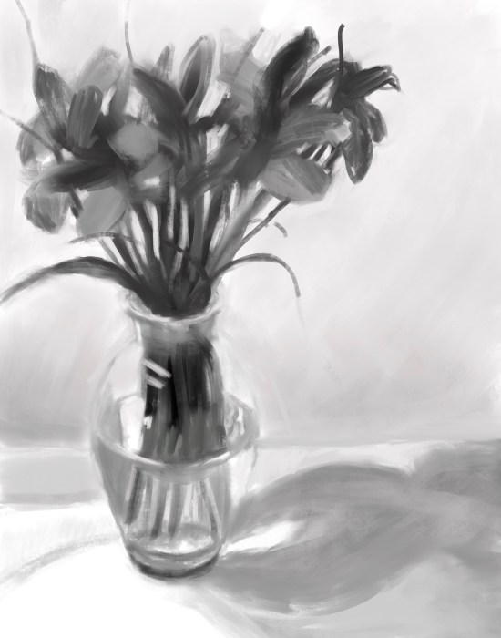
I painted these from life, but first did a value sketch in Procreate to help me stay within the range of values I chose for the painting. That’s a concept I’ve been pondering: that you can design whatever value range you want for a painting, from mostly light to mostly dark, and then mix the paint colors accordingly. I printed out the Procreate value sketch and put it on my easel for reference as you can see in the work in progress photos below.


5 replies on “Irises on White Cloth”
I really enjoyed the images of your process, and the thoughtfulness of approaching this painting. Very inspiring, and efficient!
LikeLiked by 1 person
Thanks! (and sorry for the late late reply. I just found your reply…it had been hiding from me!)
LikeLiked by 1 person
🙂 Very pretty! And my favorite color purple.
Have a very HAPPY weekend 🙂
LikeLiked by 1 person
I’m wondering why you wouldn’t do you value study in watercolor or oil rather than a digital?
LikeLike
Great question Ruth. (and sorry for late late late reply!!!) It’s quick and easy to sketch and correct and adjust digitally, to try different things and see what works without going through piles of paper.
LikeLike