Categories
Art theory Dreams Illustration Friday Life in general People Sketchbook Pages Watercolor

Leap (year) * Illustration Friday

Leap

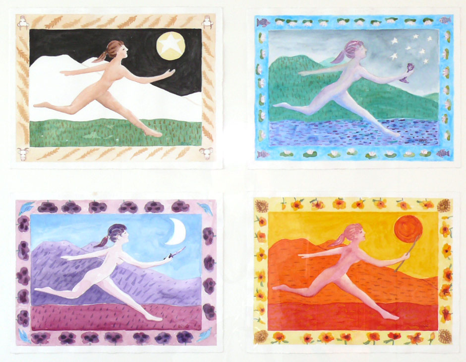
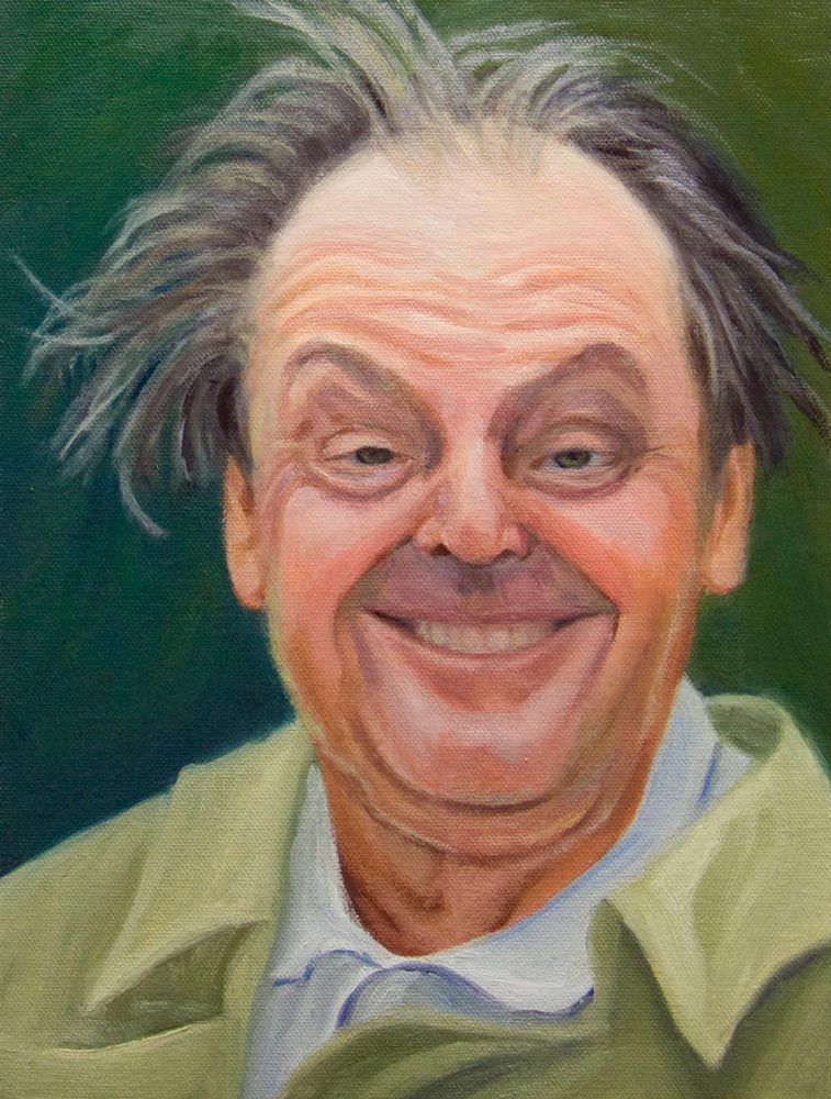
Four watercolors, framed together 24×32″ (Larger)

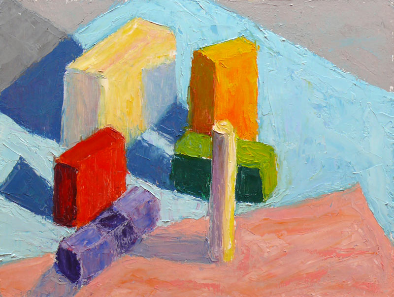
This week’s Illustration Friday challenge is “Leap” in honor of leap year, this February 29, 2008. But the paintings and sketches in this post were actually made twenty years ago. They were inspired by two dreams recorded in a 1988 dream sketchbook (below) and a class in color theory I was taking at the time, based on Joseph Albers work. The images include references to the seasons; times of day/night; the elements of water, fire, earth, and air; and tarot symbols.

The dreams that night were showing me a choice I needed to make in my life. Then as now I was fascinated by computers/technology and art (a perfect combination for an art blogger, no?). But my dreams pointed out how the time and energy I was spending on the computer tied me in knots and stole from my creativity.

Here is the image from the first dream that night: A computer tech “boiler room” full of electronics, miles of wires, computers, monitors, and icky nerds frantically, obsessively, working non-stop at their computers with no time to even look up. It was a nightmare really…full of tension.

Leap-1988

In the next dream I left that scene and I was running free in a field and it felt really good.

Leap-1988-2

And then, from a quote I’d heard somewhere, this image and words.

Leap-1985

When I awoke I knew I had to make the choice for life, freedom, and art, and quit spending so much time at my computer.

I guess like anything else in life, it comes down to a matter of finding balance and making choices about what’s really important. If I remember to ask myself whether I’ll feel happier at the end of the day if I’ve spent my time drawing/painting or working on the computer, I usually know which to choose (Art!).

Categories
Art theory Berkeley Drawing Outdoors/Landscape Sketchbook Pages Watercolor

North Berkeley Library & Freedom from Junk

North Berkeley Library

Ink and watercolor in 6×8″ Strathmore Drawing sketchbook (Larger)

This sketch is all about pausing in a busy day to sit and draw, taking advantage of a little sun between rainstorms, and enjoying feeling free. Until I began the sketch, I hadn’t realized how beautiful (and extraordinarily complicated) the landmark building (photo) of the North Berkeley Public Library is.

Freedom from stuff

My feeling of freedom came from filling three shopping bags with books I no longer needed and taking them to my favorite used book store, Black Oak Books. They gave me store credit for two-thirds of the books (which I promptly traded for three books I had on hold).

I could have sold the remaining bag of books on Amazon or at another used bookstore, but decided to just let them go. I dropped them off at the library as a donation and walked out empty handed, feeling quite pleased. Instead of rushing on to the next task, I plopped down on a bench and started sketching.

Now I have space on my bookshelves and room in my car (the three bags had been hogging my backseat for two weeks). And I love that wonderful spacious feeling that comes from removing clutter, whether physical or mental, from my life.

About the sketch: As you can see, my study of perspective hasn’t quite paid off yet. (The doors and windows slant the opposite direction from the roofline of the front wall). I drew with a purple Micron Pigma pen and then added watercolor at home. I tried to remember the colors of the walls but realized I didn’t pay enough attention to what was in light and in shadow. To practice using visual memory, I purposely didn’t take a photo or look at one on line.

So now I can see that my visual memory needs work, along with my perspective drawing. How great to know that there is no end to learning as an artist. I never have to worry about getting bored. Painting and learning are my two favorite things in life!

Categories
Art theory Illustration Friday Sketchbook Pages Watercolor

Early Theory of Perspective

Illustration Friday

Early Theory of Perspective

  1. The world is flat and ends at the horizon.
  2. As you get closer to the horizon you get smaller and smaller until….
  3. You fall off the edge and disappear…
  4. And that’s why it’s called the “vanishing point.”

This week’s Illustration Friday challenge is the word “Theory.” Since I’ve been re-learning perspective and reading about the progression of artists’ attempts to create the illusion of depth and space, I thought I’d propose my own history of what the earliest thoughts about perspective might have been.

My continuing exploration of perspective has led to me making a fool of myself as I walk around, closing one eye and putting my hands up to match the angles on buildings and trees as I look for vanishing points and check how angles and lines relate to one another.

I tried to demonstrate to some co-workers as we went out foraging for lunch how the horizon is relative to the individual viewing it, not a fixed location. Nobody was going for it though, either trying to prove me wrong or having more important things to think about, like whether they were in the mood for soup or salad.

Here’s what my favorite book (so far) on perspective says about the horizon:

Eye level rises and falls with the level of your eye, wheher you are down near the floor, sitting, standing, in a tall building, or in an airplane. The eye-level plane extends an infinite distance in all directions and at a remote distance coincides with the horizon, which the eye level is often called.

I can’t really explain why this concept so intrigues me, but I just can’t get over it. I loved the way Brittney Gilbert, writer of CBS5.com’s blog “Eye on Blogs,” titled her link to my recent post: “The Horizon is You-Dependent.”

It just makes me wonder what other facts of life that I’ve taken for granted are only perceptual, not actual. Is reality completely subjective?

Categories
Art theory Drawing Landscape Plein Air Sketchbook Pages

Back to Basics: Perspective

20080212-perspective1

Pencil sketch, 9×12 (larger)

I studied perspective in college drawing class but didn’t completely understand it, didn’t like it, and thought I had little use for it. Years later my friend Barbara gave me a copy of Drawing on the Right Side of the Brain. In that wonderful book, the author offers a more “right-brained” way to work with perspective, using a variety of strategies that allow one to see angles and shapes without having to use more “left-brained” techniques like 2-point perspective.

It gave me what I needed to draw well enough to get by, and I came to appreciate my slightly wonky style of drawing. It worked just fine for free-spirited sketches or paintings. When I needed something to be drawn accurately (as the basis for a realistic watercolor, for example), I would either grid it up, trace the enlarged photo onto watercolor paper, or draw/erase/draw/erase first on tracing paper until I got it right and then trace that onto watercolor paper.
20080212-perspective6

I got confused in this one…it has several problems

But plein air painting, which I’ve become passionate about, requires a quick accurate drawing in order to start and finish a painting within 2-3 hours max. After that time the light changes so much that colors, shadows, and anything moving (clouds, creatures, water) are completely different. Starting with a bad drawing dooms the painting right from the start. I needed to go back to basics and get a grip on perspective.

I grabbed Keys to Drawing by Bert Dodson, read the section on perspective and started sketching stacked up childrens blocks, stuff in my house, and from my imagination, trying to understand perspective.

20080212-perspective3

Here’s something I didn’t know before: The horizon is always at your eye level. The horizon line (e.g. where the sky meets the land or the sea) is actually what you see when looking straight ahead at your eye level, whether you’re sitting, standing, or lying on the ground. I find that really amazing — it just seems so self-centered, somehow.

20080212-perspective5

(I drew eyeballs on this one to remind me of my point of view/horizon)

A few things still confused me so I did some more research on the web and found two helpful sites with good information. How to Draw and Paint, offers a couple of basic, easy to understand articles about perspective. Ralph Larmann’s Art Studio Chalkboard from the University of Evansville goes into more technical detail and provided answers to the things that were confusing me (like what happens when the object straddles the horizon, or the object is at an angle, like peaked roofs, or the ground is hilly).
20080212-perspective2 20080212-perspective4

I’m going to do some more practicing using what I’ve printed out from those two sites. I also picked up an excellent book from the library: Perspective Drawing by Kenneth Auvil, which is actually fun and interesting reading. Any other suggestions for improving linear perspective drawing would be gratefully accepted.

Categories
Art theory Oil Painting Other Art Blogs I Read Painting Photos Plein Air

Learning to See Color

Color study with blocks and food

Oil on panel, 9×12″ (Larger)

On Monday mornings I’m taking a painting class from Camille Przewodek in Petaluma. I first read about her on Ed Terpening’s blog and when I saw her absolutely stunning work I was thrilled to be able to study with her.

As I understand it, the focus of her class is learning to develop one’s ability to see light, atmosphere, and their effects on the subject one is painting and to develop the ability to interpret that in paint. Camille bases her teaching on Henry Hensche‘s, with whom she studied and then spent many years further expanding upon his work. Hensche was a student of Charles Hawthorne who was a student of William Merrit Chase, an American Impressionist who developed his color theories via his study of Monet‘s groundbreaking work.

Camille’s paintings are simply stunning. A slide show of her paintings brought tears to my eyes with their beauty…something that has only happened to me once before when I saw Renoir’s Luncheon of the Boating Party in person.

Newcomers to the class begin by doing plein air still life color studies of colored blocks. Using blocks simplifies the subject matter in order to focus on using changes in color hue and temperature to create the illusion of form and depth. There’s an explanation of this process in the book, Painting the Impressionist Landscape: Lessons in Interpreting Light and Color by Lois Griffel, who took over Hensche’s art school after he died.

Color Study plein air with blocks

Oil on panel, 9×12″ (larger)

Above is the first block study I did in class while everyone else was painting beautiful marshland. The process for doing the studies is to block in the masses with a palette knife, leaving white space between color areas, breaking each shape into two values: shade and light. You start with one color and move to the next, focusing on the relationship between each color and the next.

Elio Camacho, my other wonderful painting teacher, also strongly emphasizes the importance of the relationship between contiguous colors. They both explain that there’s no such thing as a “muddy” color—that the appearance of muddiness results from the relationship not being right between a color and it’s neighbor.

Color Study, cloth lightened

Oil on panel, 9×12″ (Larger)

The one above was done at home under a bright light, trying to simulate sunlight on a dark and rainy day. When I brought the original version of this painting to class for critique, Camille pointed out that blue cloth was too dark because in the bright light it shouldn’t be darker than the shadow on the white block so I worked on it some more, lightening the cloth. If you want to see how it looked before, and the steps in getting there, including the photo of the blocks, just click “continue reading” below.

Categories
Art theory Drawing Flower Art Oil Painting Painting Plants Still Life

Miniature Daffodils in oil

Finished oil painting

Oil on canvas panel, 8×6″ (larger)

I’m happy to report that my computer is back up and running but I lost a couple months of email messages in the crash.
If I haven’t responded to an important message you sent me, please send it again and I’ll reply quickly.

Early last week my boss gave me this charming little pot of “Spring Brite Mini Bulb” daffodils for me. I couldn’t wait for the weekend so I could it home and paint it. I experimented with using a palette/painting knife. It’s so much fun — a lot like sketching in that you can work quickly, easily replace colors, add to them, or scrape off and re-do sections or the whole composition. It also forces you to be less concerned with details (at least at my level of skill in handling the palette knife). I used a small diamond-shaped knife for this.

Below is a progression of my steps, working backwards: (click Continue Reading to see the rest)

Categories
Animals Art theory Drawing Glass Other Art Blogs I Read Painting People Sketchbook Pages Still Life Watercolor

Debate Doodles & New Sketchbook

January Sketchbook Cover

White ink on black paper, 8×6″ (Larger…but why?)

(above) I was so inspired by seeing Nina Johansson‘s easy-to-make 16-page sketchbook so I made one for myself. Above is the cover drawing, inspired by a dream that I was losing my hair. That was the same dream about dating Jack Nicholson; I realized it wouldn’t work out because he probably wouldn’t be interested in dating a woman with thinning hair (let alone one over 20!).

To make the sketchbook I used one sheet of 140 pound hot-pressed paper cut into 4 strips and then folded (see Nina’s page for how it’s made; it’s very cool!) . I’m going to try 90 pound paper next time since 140 pound is pretty stiff. I punched a hole an inch from the bottom and another an inch from the top and tied the bundle together with twine.

Debate Doodles

Ink and watercolor on Fabriano Artistico hot press paper, 8×6″ (Larger)

(above) This was drawn (doodled) while watching the Republican debate last night (which I found depressing; they all seemed to be competing to show they were less caring about humanity and more militaristic than the next).

Honeydew in bowl

Ink and watercolor, on Fabriano Artistico hot press paper 8×6″(Larger)

(above) Having spent the past two days preparing a spare computer and printer to give to my neighbors, installing it at their house, setting up their internet (using the signal coming from my wireless network), going with them to Best Buy to buy a monitor and on and on, I was desperate to just have some fun in the studio. This was fun. Next I’ll do it in oils.

The art I like the most is quirky, odd, handmade rather than photographically perfect, whimsical, full of personality, nutty, imaginative. Yet I’ve always felt that I should make perfectly drawn and painted work and fought against my natural inclination to make quirky, lopsided, imperfect, nutty, playful pictures. It dawned on me this week that I don’t need to do that anymore and can be as Jana as I want (and am)! Yipppeee!

Categories
Art theory Dreams Faces Oil Painting Other Art Blogs I Read Painting People Photos Portrait Studio

Dreamt about Jack Nicholson so I painted him

Oil on canvas panel, 12×9″ (Larger)

I had a fun dream that I was on a date with Jack Nicholson so the next day I decided to paint his portrait. (I wouldn’t really want to date him–I think he’s scary but fascinating.) I downloaded some photos from the web, picked this one and set it up on my computer monitor.

In Photoshop I cropped the photo to 12″x9″ to make it the same proportions as my canvas and then set Photoshop’s grid to divided the image into thirds. Then with charcoal I drew the same grid on my canvas panel (dividing it into 9 rectangles). That made it easier to correctly sketch in the shapes that make up the face.

Here’s the set up with the painting nearly done. It so great to be able to work from the monitor instead of a printed photo though it still can’t compare to working from life:
Jack Nicholson portrait in progress
(Larger) (Alison and Pete your artwork is visible on my bulletin board, along with some other inspiring artists’ work)

When I thought I was done, I looked at both images in a mirror and saw a bunch of problems that needed fixing. I flipped the photo 180 degrees in Photoshop and turned the painting upside down too. That made it easier to spot and corrent problems as shapes instead of facial features which is harder. I wasn’t going for a perfect finished portrait, but rather was trying to have fun and continue practicing with oils.

While I was working was listening to a historical novel about Pierre-Auguste Renoir and the making of his famous painting, Luncheon of the Boating Party (my favorite impressionist painting of all time–it made me cry when I saw it in person). I’m enjoying Susan Vreeland’s book of the same name, but I can’t imagine a non-artist enjoying it as much, since it goes into great detail about colors, composition, art theory, and the struggles and joys of painting from life.

Here are a couple of great quotes by Renoir that I really loved:

“I always paint from life and never paint anything I don’t enjoy.”

“I make it a rule never to paint except out of pleasure.”

Categories
Animals Art theory Landscape Oil Painting Outdoors/Landscape Painting Plein Air

Point Isabel Dog Park & a painting breakthrough

Point Isabel Dog Park Plein Air

Oil on canvas panel, 6″x8″ (Larger)

We’re expecting a series of big storms for the next week but the weather today was comfortable, no wind and in the 50s. Although I’ve been working on another painting and wanted to keep going on it, I couldn’t resist the opportunity to get outside and paint before the storm hits.

I headed down to nearby Pt. Isabel, an enormous park along the bay that is designated as an off-leash dog park. It has spectacular views of the Golden Gate Bridge but smog, fog and clouds made the visibility so bad that I picked a closer view.

I’m really excited about the breakthrough I had yesterday with oil painting, and how I was able to apply it to this little painting. Up until yesterday I’d been using various oil painting mediums to thin the paint and what I kept ending up with was thin, washed out, chalky, greyed, paint; stickiness and smell from alkyd mediums and smell (and toxins) from turpentine. I’d heard people say they used little to no medium and I couldn’t understand how that was possible. It seemed like the paint would be too thick and hard to manipulate without first thinning it down.

I finally tried it and was shocked to discover it works! Of course it means using a lot more paint, especially on this coarser canvas, but I was able to put down one layer of paint, and leave it. If I made a mistake I could scrape the paint off of that section and repaint it, no problem. Before when I tried to do that, there wasn’t really anything to scrape off because my paint was sooooo thin.

I did this painting in about an hour. I know the dogs look a little dorky, but it’s just a little oil sketch, so who cares. Then I was able to go home and continue working on the painting in progress in my studio. That painting is almost finished and I’m just so excited that after all the work and study I’ve put into oil painting it at last feels as if I’m getting somewhere. And I still have 5 more days of vacation!

Categories
Art theory Drawing Glass Painting Sketchbook Pages Still Life Watercolor

Happy 2008! Prosperity and Art Goals

New Year 2008 - Change Jar

Ink & watercolor, 5.5 x 7.5″ (Larger)

I heard Nigela Lawson on the radio talking about New Year’s dining traditions in different cultures that all included eating round things (the shape of coins) to create prosperity in the new year. It inspired me to finally paint this former candy jar where I put the change I find in the dryer and washer after my son does his laundry at my house. The jar never fills, so I assume he also makes withdrawals.

The foods included lentils, grapes and sliced salami. One tradition said to eat 12 grapes, one for each month of the year. If the third grape was sweet it meant March would be prosperous; if it was a sour grape, March wouldn’t be good.

I’m usually more concerned with peace and health than prosperity, but after watching an insipid Suze Orman TV special about women and money last month, I decided that prosperity would be nice too. She emphasized that women often feel they have to apologize for having money, or feel guilty if they are have anything for themselves before everyone else has their needs met.

But of course the key to prosperity is very simple:

Want what you have; Don’t want what you don’t have

Easier said than done, especially in the U.S. where overconsumption is considered to be patriotic.

Art Goals

My art goals for 2008 are also very simple: to enjoy myself by exploring whatever directions I find interesting, challenging, exciting, pleasurable, fun. In other words, learn, practice, grow, but do it in ways that are good for me, that are satisfying and healthy. No lists of shoulds, no rules other than play, practice and enjoy the journey. Be prosperous in the pleasure and enjoyment of the process.

My hope is that by this time next year I will have earned enough competence with oils that I can comfortably and freely work in the medium most fitting to the subject or idea I want to express, whether it be ink, watercolor, oils, goauche, or monoprint.