Categories
Landscape Oil Painting Other Art Blogs I Read Outdoors/Landscape Painting Plein Air Sketchbook Pages

Lake Merritt Japanese Garden

Lake Merritt Zen Garden

Oil on Masonite Panel, 12×9″
Larger

I’ve been studying oil painting for months, reading piles of books, learning from others, watching endless painting videos (some that are literally “like watching paint dry”), taking a class and practicing every chance I get. Last week it seemed that despite my study and “book learning,” while I had the knowledge of how to paint in oils, I didn’t have the skill to actually do it. Today I think something has clicked and I’m finally starting to get it.

I nearly finished this painting on site with my plein air group this morning at Oakland’s Lake Merritt Botanical Garden. Unfortunately (or fortunately, really), the painting had a little accident on its way home and got smeared. That gave me the perfect excuse to work on it some more.

I’d been having difficulty with painting on the slick surface of the gessoed masonite with the stiff bristle brushes — the paint wouldn’t stick and kept sliding around when I tried to paint another layer on top. Then I got an email message from Nel, raving about a new softer brush she was enjoying: a Raphael Kevrin Mongoose Series 877. I picked one up at Artists and Craftsman in Berkeley and used that to fix and finish the painting. She was right — it’s a fabulous brush!

I had the most trouble painting the water, especially since I omitted the little island/tree in the middle of the pond and moved the big redwood tree all the way to the right. I had to adjust the reflections from what was actually there and I don’t think I quite got it right. Hopefully it looks a little like water and not grass!

Any tips appreciated (I mean advice, not spare change.)

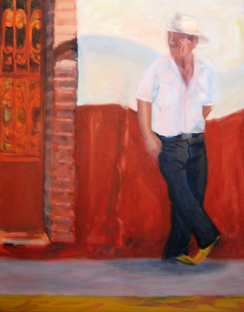
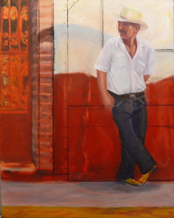
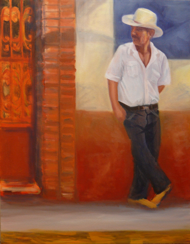
Here’s the photo I used to finish the painting at home, and a couple steps along the way:

Categories
Painting Sketchbook Pages Still Life Watercolor

Last of the Summer Tomatoes

Last of the tomatoes

Watercolor on Arches cold pressed paper in sketchbook, 7×5.5″
Larger

I was so tired tonight after all day meetings at work (and staying up painting very late last night) that all I wanted to do was go to bed as soon as I got home. But my painting group was coming over and I was looking forward to seeing everyone so I tidied up the studio to make room for them to paint after my marathon painting sessions this weekend.

Seeing everyone painting got me energized so I grabbed these tomatoes from my garden, set them up under a light and got to work. I regret the last shadow I put in (between the the two groups of tomatoes). I thought it might help the composition by bridging the two groups, but I think it just added to the confusion of all the competing shapes and colors (which is made worse by the scan–in the original the shadows aren’t so bright).

Categories
Art theory Landscape Oil Painting Outdoors/Landscape Painting

Inspiration Point – Take Two

Oil on Masonite panel, 9″x12″
Larger

This morning on the way to work I started thinking about yesterday’s painting of Inspiration Point and how what I painted didn’t really represent the colors I saw and generally annoyed me.  I started sketching and taking notes about for making another painting of the scene. Also yesterday I talked to technical support at Gamblin Oil Paints about putting together a good limited palette and he gave me some really good suggestions.

So anxious to put my new ideas into action, after work I ran to the art store, picked up a couple colors I didn’t have and set up my palette with the following Gamblin colors: (the ones with asterisks are what Gamblin recommended — the others are my additions)

  • Transparent Earth Red* (used primarily for the drawing and a tonal underpainting using paint thinned with Gamsol which dries in minutes and creates a beautiful glow), Titanium White*, Chromatic Black*;
  • Indian Yellow*, Cad Yellow Light;
  • Quinacridone Red*, Cad Red Light;
  • Ultramarine Blue*, Manganese Blue Hue (a form of Pthalo Blue that looks closer to Cerulean).

I did the sketch/underpainting quickly (a bit too quickly–didn’t quite get the shapes of the hills on the left) and then started in with the rest of the painting. The gessoed masonite is very slick which I kind of like and makes it easy to wipe paint off but also makes it easy to take paint off when you’re trying to paint on top of paint.

I’m happier with this version; pleased that I came closer to what I saw and that I managed to get in a painting after a long day at work.

Categories
Art theory Landscape Oil Painting Other Art Blogs I Read Outdoors/Landscape Painting Photos Plein Air

Inspiration Point, Tilden Park

Inspiration Point, Tilden Park

Larger
Oil on panel, 9×12″

Sunday was my plein air oil painting class in Tilden Park and we met at Inspiration Point in Tilden Park in the Berkeley Hills. On a clear day you can see far into the distance from this site. Unfortunately, when we arrived at 9:00 a.m. the fog was so thick we could barely see halfway across the parking lot. Our teacher, Elio Camacho, had planned to start class by doing a demo — an expansive vista on a large canvas. To try to accomplish something until the fog cleared, he had us set up our easels facing the alleged view and get ready to paint. I enjoyed the idea of randomly picking a spot with no idea what I’d see or paint.

At 10:00, after delicious coffee and treats from Peets Coffee generously brought by a class member, Elio did an amazing small demo of the sun glaring through the fog above some nearby trees. Happily, just as he finished the fog lifted and we got to work.

This time I remembered to take a photo of the scene before I got started so that I could finish the painting at home:
Inspiration Point, Tilden - Photo

Categories
Art theory Faces Life in general Painting People Portrait Sketchbook Pages Watercolor

Squinting to See the Light (funny story)

Squinting to see the light

Larger
Watercolor in large Moleskine notebook

Today at work, 10 of us were sitting around the table in the lunchroom eating and chatting. I sat across from our director, facing the picture window and our 27th-story view of Oakland, the San Francisco Bay, Mt. Tamalpais and the huge, cloudy sky. I was thinking about what I learned in my painting class last Sunday about the importance of learning to see color temperatures and value. A good way to do that is to close one eye and squint, which helps to blur the details, so that you can see shapes and values. I decided to practice on a blue house and a large brick building that I could see in the distance. I tried one eye and then the other, curious if it made a difference between my left and right eyes.

Suddenly I realized the conversation had stopped, our director was asking me if I was OK, and everyone was staring at me. I burst out laughing realizing that I was sitting there making weird squinty faces and they were all thinking I had an excruciating headache or had suddenly gone mad. I started trying to explain what I was doing and they looked at me perplexed. They finally realized it was an “art thing” and went back to chatting about work and TV shows and travel.

When I got home tonight, I looked in the mirror to see just how funny I looked and had to do this quickie self-portrait in my sketchbook. Amazingly it actually looks like me!

Categories
Art theory Flower Art Glass Oil Painting Other Art Blogs I Read Painting Still Life

Dahlias after Painting Class

Dahlias in Oil

Larger
Oil paint on gessoed mat board, 12×7.5″

Sunday was my first plein air oil painting workshop with Elio Camacho and it was fabulous! Elio is not only a wonderful painter, but he’s a fantastic teacher — so energetic, enthusiastic and generous in sharing everything he knows (which is a lot!).

Although Elio covered a huge amount of artistic territory in his conversations with us, what really sunk in for me at this session was the importance of temperature (warm vs cool colors) and value (dark vs light) and how to use those relationships to paint the effects of light in the landscape.

To better understand this concept and practice seeing color temperature, he suggested doing a still life of all yellow objects as homework so I painted these dahlias from my garden (after scrubbing all the nasty aphids and ants off them–ick!). Yellow is a good color to practice with because there are many yellow pigments from cool to warm and dark to light and you can successfully lighten it with white, unlike red which turns pastel pink when white is added.

Since I started this journey to learn oil painting, I’ve read many books, watched a dozen oil painting videos, and received wonderful support from my online painting mentor, Nel. There were so many concepts, “rules”, and techniques that I understood intellectually but in class they came to life! Seeing the process demonstrated and being able to ask questions each step of the way was great.

And even better was having Elio checking on me every 15 minutes or so during the three hours I was painting. He demonstrated what he meant when I didn’t understand; he recommended I quit dabbling– put down a stroke and leave it; he showed me how to hold my brush correctly and at what angle, so I was putting paint down without scraping it off at the same time (hold the tip of the brush and keep it at a low angle to the canvas, not perpendicular as I was doing). So many things just clicked.

The painting I did in class isn’t worth posting, though it had some nice moments along the way. Now that I know how to hold my brush properly and understand the importance of the direction of the brush stroke, and am learning to see color temperature and value better, I’m can’t wait to start my next painting!

Categories
Animals Life in general People Sketchbook Pages Watercolor

Cat Attack, Bomb Threat & Happy Birthday

90th Birthday Party

Larger
Ink and watercolor in small Moleskine watercolor sketchbook

My mom’s visit started with a cat attack and ended with a bomb threat at the airport (which extended her stay an extra day). My sister picked her up at the airport and as they walked in her door, Marcy started to tell my mom not to touch her grouchy, unpredictable cat. She was a moment too late: mom reached out to pet him and Bob the Cat sunk his claws into her hand. Next stop was a visit to the hospital where the nurse there washed her finger and put a band-aid on it and gave my mom a tetanus shot. After that she proudly showed off her band-aid and told the story to anyone who would listen.

Today, my poor sister again did airport duty, since she lives near the airport. When they arrived at the airport it was shut down due to a bomb scare. Marcy brought Mom back home, where she decided to stay another night. Now she’ll have lots of exciting stories to tell when she gets home.

In between, we attended the 90th birthday party(pictured above) of my great aunt in a country club. There were about 75 people people who came to show their love and respect to this feisty, vivacious 90 year old. It was nice seeing my cousins for the first time in years and their grown kids and their 2 year old twin boys and all the lovely old ladies dressed to the teeth for this special day. I drew this surreptitiously at the table while people were making speeches about my aunt. The perspective is a little confusing as the man on the left was at my table and the ladies behind him were at the next table.

Reading this was probably about as interesting as watching someone else’s vacation slides. I’ve got lots of exciting art stuff to share too, but most of my energy the past week has been devoted to family. Now it’s back to regularly scheduled programming: painting!

Categories
Sketchbook Pages Watercolor

Cat Toys and Endings

Cat toys

Ink and watercolor in Aquabee sketchbook
Larger

To preserve my sanity I squeezed in a quick sketch in the half hour before I had to leave for my great aunt’s 90th birthday party at her club. I should be primping and trying to make myself look like I belong at a fancy country club in an expensive suburb but this was more important.

I’m a pretty solitary person, needing at least as much alone time (if not more) than social time. Days of family events and spending time with extended family during my mom’s visit can get me pretty overwhelmed so I have to carve out moments like this one. I grabbed the first thing I could find to draw, put on a CD, and got to work.

Now I have to decide whether to wear my white pants since it looks like a summer day today (which no doubt will horrify all the ladies as it’s after the official deadline for white) or be nice and wear something more seasonally appropriate. And now I only have ten minutes to shower, makeup and dress before the hour-long drive so wish me luck.

Meanwhile, here’s a link to Ronell’s blog post, “Endings” where she writes exactly what I’m feeling about the end of summer, the end of peaches, and time marching on, made even more poignant by mother’s approaching 84th birthday and my great aunt’s 90th. I wish I could have written her beautiful post but instead I’ll just say, “What she said….”

Categories
Oil Painting Painting People Puerto Vallarta

Work in Progress – Puerto Vallarta Cowboy

Puerto Vallarta Cowboy 10 (WIP) – – – Puerto Vallarta Cowboy 11 (WIP)
Larger — — — — — – — — – –(Revised version)- Larger
(Earlier version w/charcoal lines)

I knew there was something wrong with the composition of this painting in progress that I started in July but I wasn’t sure what the problem was. I studied it yesterday and realized that my eyes kept going to the blank area on the ground between the brick column and the guy’s feet. I was thinking about adding a box or something to the painting in that spot but then Elinor stopped in with Robin and pointed out that the problem was the weak contrast around his head where it’s all white against white and doesn’t draw your attention and is competing with the strong red area and contrast at the bottom of the wall where a white crack serves as an arrow to the ground.

To fix the painting, I decided to add more contrast around the guys head and break up the space/negative shapes in the composition. I experimented by drawing lines in charcoal seen in the picture on the left. Then I painted the blue square behind his head (that will have white lettering added to it instead of the blue lettering on a white wall in the original photo) to add contrast and make his face the focal point it should be. I also added a second column of bricks, lowered the red paint area on the wall and added an ochre band on top of it, and lightened the sidewalk.

I have a hard time finding the problems in my own paintings though I can usually spot them a mile away in someone else’s. I need to make a checklist of questions to ask myself about a painting when I have that uneasy feeling and don’t know why. Any suggestions welcomed as there’s still a way to go on this one.

Categories
Art theory Painting Sketchbook Pages Watercolor

Working on Cars in My Driveway

Car Repair 2
Larger
Sharpie pen and watercolor in Aquabee sketchbook

Cody Car Repair 2
Larger

Just as I finally was ready to start painting today, both my sons came over to work on their cars in my driveway (right outside the studio). It was a beautiful Indian summer day and I wanted the door open. But Cody was running a compressor and a power tool that made horrible noise as he removed the bolts holding all the wheels on the car. I made lemonade out of the lemon by drawing them (very quickly — they kept moving) and then turning up the stereo really loud.

I spent a lot of the weekend preparing for a new series of paintings  — sketching, making notes and digging up reference material and also thinking about next steps for a painting in progress. I’m trying to wait until I have a plan of action before I put brush to canvas so that I don’t spend half of my painting time dabbling and the other half wiping off the dabbles.

When I’m in that “between paintings” stage I can get very grumpy and frustrated. But for once I took advantage of the lull and cleaned up the studio; organized my cabinet full of glassware, fabrics and still life objects; and cleared off the studio kitchen counter which had been piled with random stuff waiting for a home. When I finished I was ready to start the sketch of the first of the new series and finally knew what I needed to do to the paint in progress (more about that tomorrow).