Categories
Landscape Oil Painting Outdoors/Landscape Painting Plein Air

Benicia Plein Air Sketch and the Goose Lady

Benicia Plein Air

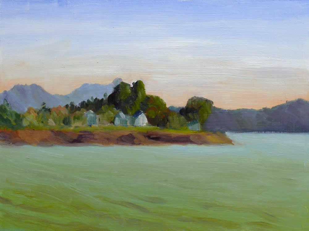
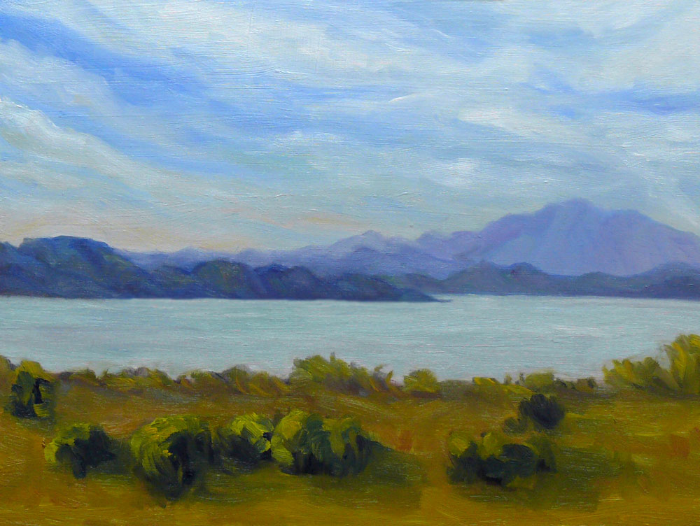
Oil on canvas panel, 9×12″ (Larger)
Painted plein air

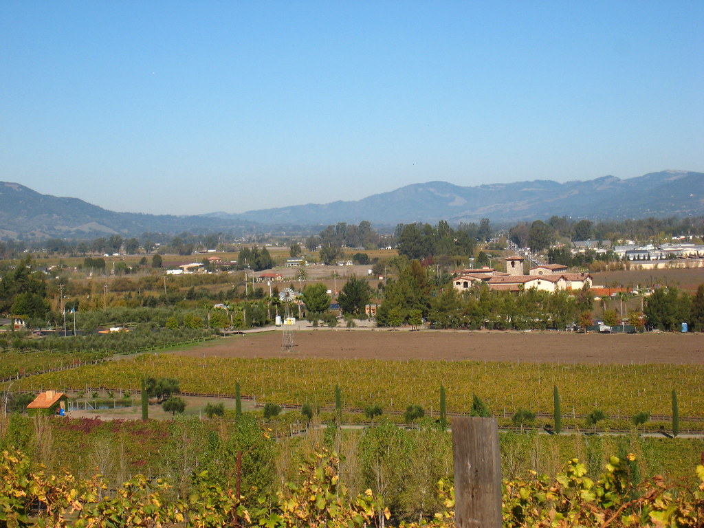
Last weekend the two plein air groups I belong to combined and met at Matthew Turner Park in Benicia on San Pablo Bay. It was a gorgeous, sunny crisp day and a nice switch to be meeting in the afternoon instead of first thing in the morning.

There were a number of odd characters around entertaining us. A middle-aged woman sat in her car nearby us calling her dog (“Dog…dog…come here dog!”). Except there were no dogs anywhere in sight. There were lots of geese though, including one that seemed to be wearing a white, ruffled feather tu-tu.

She kept up her patter and eventually the geese wandered over to her car. For the next couple hours she barked commands at the geese, still calling them “Dog.” She lectured them about being too greedy, warned them they better start sharing nicely, and threatened to leave if they didn’t behave. It reminded me of when my parents used to threaten my sister and I when they were driving and we were misbehaving in the back seat, “If you don’t stop it I’ll pull over and give you both a spanking!”)

Then a man with a grey ponytail arrived and started talking to the geese and feeding them too. He claimed to know each of their names and their histories. The geese were apparently used to this treatment and were quite demanding, pecking at the feet of some of the artists when we first arrived before their benefactors got there.

I’d planned to finish and touch up this painting in the studio, but I’ve learned my lesson. After wasting the past few days trying to “finish” another plein air painting, I’ve decided to leave plein air sketches alone. I’ll make another post about that tomorrow with before and after pics.

Categories
Drawing Other Art Blogs I Read Outdoors/Landscape Sketchbook Pages Studio

Payless Shoes from Peets Coffee


Ink in Moleskine sketchbook (Larger)

After taking a huge load of stuff to Goodwill and the recycling center (that came from three days of reorganizing the studio, which led to cleaning out my closets, cabinets and the garage) my reward was a latte at Peets (and what feels like a fabulous new, spacious studio!).

Now that I’m nearly done with this organizing/rearranging project it was great to relax and just draw what I could see out the window while I sipped my coffee.

This is another sketch inspired by Pete Sculley’s drawings with incorporated overheard snippets of conversation. (overheard: “I know you can’t make any decisions.” “My parents are here and I can’t just send them home.”)

Next time I’ll post photos of my newly organized studio.

Categories
Flower Art Life in general Outdoors/Landscape Painting Sketchbook Pages Watercolor

Flower Stand at Night

Ink & Watercolor in Canson 7″x10″ Sketchbook (Larger)

This little flower stand looked inviting and yet so forlorn all by itself on a dark, lonely corner in downtown Oakland the night before Thanksgiving. On my way home from work I stopped to take a few photos using a postbox as a tripod and was lucky enough to get some good shots.

I did this quick ink sketch with watercolor from a photo as a study for an oil painting. I especially like the way this appears on the monitor since it enhances the feeling of light glowing out of the dark.

I’ve been feeling a bit of Seasonal Affective Disorder (SAD) lately — grumpy and craving light. I know that it’s a common affliction and just a physical reaction — that things are just as fine in my life as they were a couple weeks ago before SAD hit. A friend of mine recommends sitting in front of special lights designed for this purpose and says they really help her. I know exercise helps mood so I’ve been trying to do more of that, especially outdoors when it’s sunny, but I think it’s time to explore SAD lights.

As much as I love to occasionally spend a good rainy afternoon listening to Mozart’s Requiem and wallowing in melancholia, generally I prefer feeling cheery.

Categories
Landscape Oil Painting Outdoors/Landscape Painting Plein Air

View of Mt. Tamalpais from Pt. Pinole


Oil on canvas panel, 9″x12″
(Larger)

I started this painting at Point Pinole last month but it had so many problems that I put it aside and never posted it. Today I decided to give it a do-over. It was either that or reclaim the panel by covering it in gray paint and using it for another painting.

When I compared my photo of the scene to my painting I could see how far off I really was — I’d both enlarged and shrunk the scene and painted distant details I couldn’t really see. So I did some redrawing, repainting, and I’m happy with the progress I’ve made and the understanding I’ve gained since the first version.

Of course there’s a huge difference in the level of difficulty between painting in the studio vs. painting plein air where the day’s changing light makes the scene change constantly. Even so, I’m missing painting outdoors and have vowed to get out there again next weekend, no matter what the weather. I wimped out this weekend while we were having a cold snap (for the SF Bay Area — frost in the morning and then temps in the low 50s during the day).

Categories
Art theory Landscape Oil Painting Other Art Blogs I Read Outdoors/Landscape Painting Photos Plein Air

View from Viansa Winery

Oil on Canvas Panel, 12″x9″ (Larger)

On November 3 I went to Viansa Winery in Sonoma County with my plein air painting group. It’s a beautiful estate in the wine country with wonderful views in every direction. I painted the first layer of this painting on site and then today at home I painted another layer, correcting the original plein air sketch. I set my timer for one hour and completely redid the whole painting in about 45 minutes. Then I had dinner and when I came back I forgot my plan to do a one-hour painting and spent another two hours fiddling around with stuff I could have left alone.

As Karen suggested in her comment here a couple days ago, it’s good to focus on one goal per painting. I did that with this painting. My goal was to create a sense of distance, and I think I accomplished that. (Yay!) What’s interesting is that even though it’s only been three weeks since I started this painting, I see how much I’ve learned just in that short time…or maybe how much of what I’ve learned in the past year is starting to sink in and take hold. The on-site painting was out of proportion and very flat–no sense of depth or distance. But it was colorful which was my focus on that day — getting some color into my painting.

As I worked on this tonight I was thinking about two things my teacher recently pointed out to me that applied to the problems I’d had with this painting:

  1. Paint the dog before the fleas (in other words, get the big shapes in before starting on the little details)
  2. When you have man-made objects in a painting, such as buildings or fences, they have to be the right size or the whole painting will look wrong because we know what the object is and what it’s size is.

Here’s the photo I took of the scene:
View from Viansa Winery Photo
Larger

In the original version I got really involved in painting the little building in the front left and the bigger one halfway back on the right. But I’d made them bigger than they should have been so I could paint the details. And they were definitely the fleas, not the dog!

Categories
Art theory Oil Painting Outdoors/Landscape Painting People

The Surveyor in the Lavender


Oil on canvas panel, 12×9″ (Larger)

A couple weeks ago there was a team of surveyors on my street, measuring the block. I’d always wondered what they saw when they looked through their surveyor thingees on tripods. I asked them what they were doing, and whether I could look through their device to see what it looks like. It was really amazing. This guy stood at one end of the block and held up his device, which I think was a target and the other guy looked through his scope and aimed it at the target. It had a powerful computerized magnifier in it, so that from nearly block away, the target looked like it was one inch away. Then I asked if I could take pictures of them and they agreed. The other guy was too far away and this one was cuter anyway so I took a bunch of pictures of him and then selected one of the photos to paint.

I spent a lot of time drawing on the canvas freehand before I started painting, trying to get the drawing correct. I used a white pastel pencil to draw on the medium-gray toned canvas, which worked really well — it was easy to wipe off for correcting and didn’t smear into the paint.

There’s more I could do to finish this painting but my goal right now is to make lots of paintings for the practice instead of taking a few paintings as far as I can. On the other hand, if you see any areas for improvement or problems with this painting, I’d greatly appreciate the critique.

Categories
Art theory Landscape Oil Painting Other Art Blogs I Read Outdoors/Landscape Painting Portrait

Watching Painting Videos

Watching Painting Videos

I’ve been renting videos from SmartFlix.com on oil painting landscapes, portraits, and plein air painting and have enjoyed watching most of them, and so has Fiona, pictured above. SmartFlix.com is a website where you can rent videos on any kind of artistic endeavor or just about any other “how-to” — from welding to piloting a helicopter.

The service works well. They charge $10 for each video (theoretically for a week but I’ve kept some two weeks with no problem) They mail them to you with return packaging and postage included. My only complaint is that occasionally, after ordering a video, I find that there will be a wait for it while it comes back from the last member. Usually they’re shipped within a few days. There are no membership or monthly fees. You pay only when you rent a video. Like Amazon, there are user reviews which I found very helpful in making my selections.

Here are the videos I’ve watched so far, with my comments about them. (Please click “Continue Reading” below.)

Categories
Art theory Landscape Oil Painting Outdoors/Landscape Painting Plein Air

Tilden Park Re-do

Tilden Park

Oil painting on panel, 9″x12″
Larger

Last Sunday in my plein air oil painting class I painted this scene on this panel but it pretty much looked like dark mud so I worked on it some more today. I like to keep going with a painting until I either succeed, push it as far as it can go, get sick of it, or it just gets too late and I have to go to bed. I think tonight I hit all of the above.

I have the hardest time painting outdoors in the bright sun. Everything ends up much darker than it should be. I’m also not very good at mixing light colors in oils—possibly due to never using white in watercolor. Adding white to oil paint creates quite different color mixtures than adding more water to watercolor to let the white of the paper shine through and lighten the color.

I’m going to be plein air painting both Saturday and Sunday this weekend, and given the weather report of sunny days, I’ll continue trying to find my way painting in bright light. Tomorrow I’m going to try wearing my polarized sun glasses and see what I come up with. I’m also going to try forcing myself to make high key paintings, with most of the painting lighter than middle gray to force myself to get away from the dark mud.

Categories
Landscape Oil Painting Other Art Blogs I Read Outdoors/Landscape Painting Plein Air Sketchbook Pages

Lake Merritt Japanese Garden

Lake Merritt Zen Garden

Oil on Masonite Panel, 12×9″
Larger

I’ve been studying oil painting for months, reading piles of books, learning from others, watching endless painting videos (some that are literally “like watching paint dry”), taking a class and practicing every chance I get. Last week it seemed that despite my study and “book learning,” while I had the knowledge of how to paint in oils, I didn’t have the skill to actually do it. Today I think something has clicked and I’m finally starting to get it.

I nearly finished this painting on site with my plein air group this morning at Oakland’s Lake Merritt Botanical Garden. Unfortunately (or fortunately, really), the painting had a little accident on its way home and got smeared. That gave me the perfect excuse to work on it some more.

I’d been having difficulty with painting on the slick surface of the gessoed masonite with the stiff bristle brushes — the paint wouldn’t stick and kept sliding around when I tried to paint another layer on top. Then I got an email message from Nel, raving about a new softer brush she was enjoying: a Raphael Kevrin Mongoose Series 877. I picked one up at Artists and Craftsman in Berkeley and used that to fix and finish the painting. She was right — it’s a fabulous brush!

I had the most trouble painting the water, especially since I omitted the little island/tree in the middle of the pond and moved the big redwood tree all the way to the right. I had to adjust the reflections from what was actually there and I don’t think I quite got it right. Hopefully it looks a little like water and not grass!

Any tips appreciated (I mean advice, not spare change.)

Here’s the photo I used to finish the painting at home, and a couple steps along the way:

Categories
Art theory Landscape Oil Painting Outdoors/Landscape Painting

Inspiration Point – Take Two

Oil on Masonite panel, 9″x12″
Larger

This morning on the way to work I started thinking about yesterday’s painting of Inspiration Point and how what I painted didn’t really represent the colors I saw and generally annoyed me.  I started sketching and taking notes about for making another painting of the scene. Also yesterday I talked to technical support at Gamblin Oil Paints about putting together a good limited palette and he gave me some really good suggestions.

So anxious to put my new ideas into action, after work I ran to the art store, picked up a couple colors I didn’t have and set up my palette with the following Gamblin colors: (the ones with asterisks are what Gamblin recommended — the others are my additions)

  • Transparent Earth Red* (used primarily for the drawing and a tonal underpainting using paint thinned with Gamsol which dries in minutes and creates a beautiful glow), Titanium White*, Chromatic Black*;
  • Indian Yellow*, Cad Yellow Light;
  • Quinacridone Red*, Cad Red Light;
  • Ultramarine Blue*, Manganese Blue Hue (a form of Pthalo Blue that looks closer to Cerulean).

I did the sketch/underpainting quickly (a bit too quickly–didn’t quite get the shapes of the hills on the left) and then started in with the rest of the painting. The gessoed masonite is very slick which I kind of like and makes it easy to wipe paint off but also makes it easy to take paint off when you’re trying to paint on top of paint.

I’m happier with this version; pleased that I came closer to what I saw and that I managed to get in a painting after a long day at work.