Categories
Art Drawing Faces Gouache Painting Portrait Sktchy Sktchy

Librarian (?) in Gouache with Zorn Palette

Stacy D from Sktchy in Gouache using Zorn Palette, 10x7 inches
Stacy D from Sktchy in Gouache using Zorn Palette, 10×7 inches

I dramatically changed the setting of this portrait from a graffiti-covered wall (photo at bottom) to a library. There was something about her expression and clothing that made me think judgmental librarian, not the hip artist she appears to be in her photo feed on Sktchy. (Not that librarians can’t be hip artists! I was thinking of the mean school librarian who was always shushing us and glaring if we giggled.)

This was the last lesson in Mike Creighton’s Sktchy class on gouache portrait painting and color mixing. This lesson was about the Zorn palette: white, yellow ochre, cadmium red light and black. I’m really enjoying playing with limited palettes and discovering all the varieties of color possible with them.

In my initial sketch below, I hadn’t decided on the background yet.

Stacy D. from Sktchy, initial sketch on Xerox paper

When I decided to change the background from the wall in the reference photo below, to a library I did a quick internet search and found the photo below, right, which I used as inspiration.

Reference photo of Stacy D from Sktchy
Internet photo for library photo reference
Categories
Art Drawing Gouache People Portrait Sktchy Sktchy

Triadic Color Scheme in Gouache

Jennifer L. from Sktchy, weird 3-color gouache triadic color scheme, 10x8 inches
Jennifer L. from Sktchy, weird 3-color gouache triadic color scheme, 10×8 inches

A triadic color scheme is one in which three colors are chosen for the palette that are equal distance apart on the color wheel. For example, either the three primaries (red, yellow, blue) or three secondaries (orange, purple, green) or tertiaries like red-orange, blue-green, etc. The colors I chose were a little weird: Linden Green, a greenish yellow because I wanted to capture the brilliant greens in the garden, plus Ultramarine Blue and Cadmium Red Light.

I thought the Linden Green and Cad Red Light made some interesting skin tones.

Mixing experiments with triad of Linden Green, Cad Red Light and Ultramarine Blue

Like all of the reference photos that Mike Creighton chose for his Sktchy gouache and color class, I wasn’t particularly attracted to paint this reference photo (at bottom of post). So I tried to think of it not as a portrait but a puzzle to play with color mixing plus a chance to practice my drawing.

In my initial sketch below, her hand and fingers were the most fun and most challenging.

Initial Sketch on Xerox paper
Reference photo

Overall I’m not thrilled with this one. I don’t really like looking at it. But the puzzle process and mixing experiment was really fun.

Categories
Art Art theory Faces Gouache People Portrait Sktchy

Complimentary: All the Colors in Just Two

América GS from Sktchy in just two colors, 10x8 inches on watercolor paper
América GS from Sktchy in just two colors, 10×8 inches on watercolor paper

In the past when I experimented with limited palettes and color schemes I missed the point. I thought the idea was to compose with just the chosen colors, rather than to discover how many different colors could be made by mixing them together. I hadn’t yet discovered the beauty of neutrals made by mixing two very different colors together. For this portrait, the challenge was to use complimentary colors (colors that are opposite each other on the color wheel).

I chose just two pigments: Winsor Newton Cobalt Turquoise Light and M. Graham Cadmium Red Light; basically a blue-green and a red-orange. I focused on making the lights cool and the shadows warm and was thrilled to discover the wonderful range of colors and neutrals I could make with just these two pigments and white.

First pass with color

Of course the colors are nothing like the actual colors in the reference photo (below), another photo I wouldn’t have chosen to paint myself, which removed the investment to capture it perfectly.

Reference photo of America S from Sktchy
Categories
Art Art theory Drawing Gouache Painting People Portrait Sktchy Sktchy

Alexander’s Analogous Bathroom Selfie in Lavender

Alexander H from his bathroom selfie on Sktchy, 8x8" on watercolor paper
Alexander H from his bathroom selfie on Sktchy, 9×8″ on watercolor paper

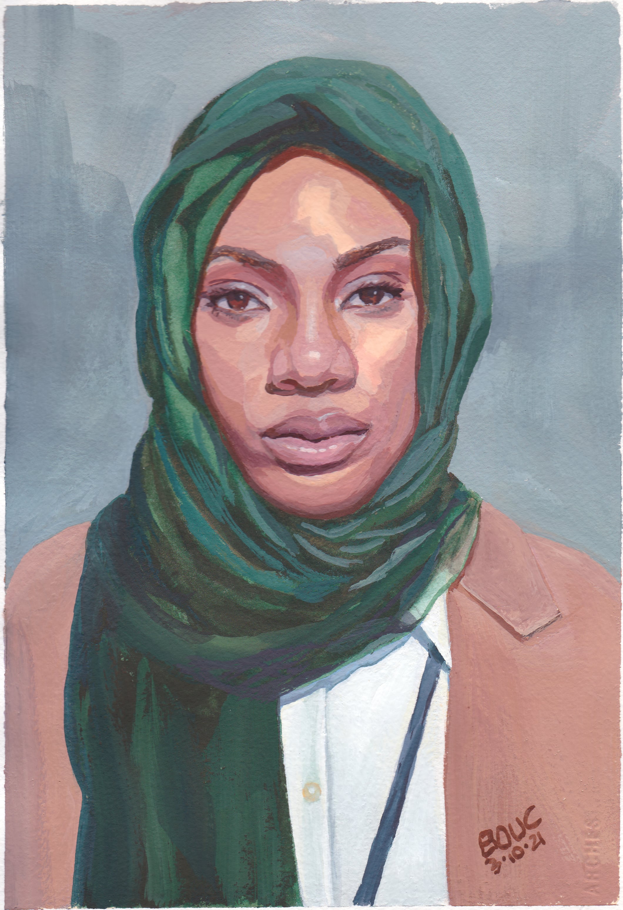
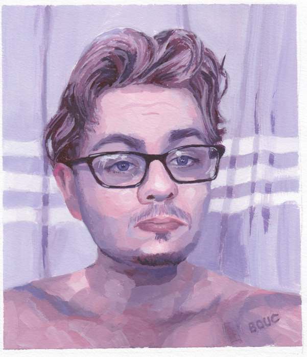
Analogous colors sit beside each other on the color wheel. For this gouache experiment with analogous colors, I chose Dioxazine Purple, Quinacridone Magenta, and Pyrole Red; basically a violet, a red-violet and a red. Plus white of course. My favorite gouache paints are M. Graham, especially their white, which is so wonderfully creamy.

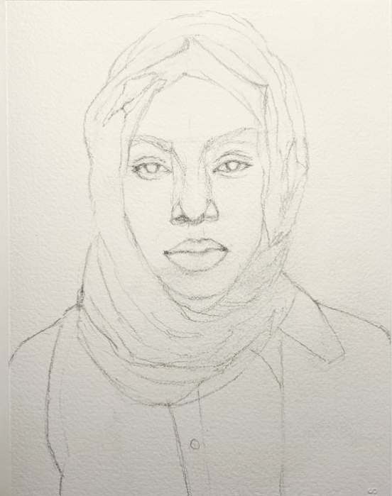
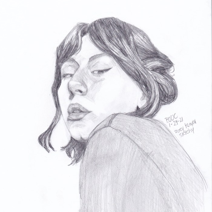
Normally when I paint I try to match the colors I see, so painting with arbitrary colors is a very different approach for me, one that requires focusing more on value and warm/cool relationships. There was no way I’d get “normal” skin colors with this combo of colors. Below is my original sketch on Xerox paper which I then transferred to watercolor paper.

Initial sketch
Initial sketch

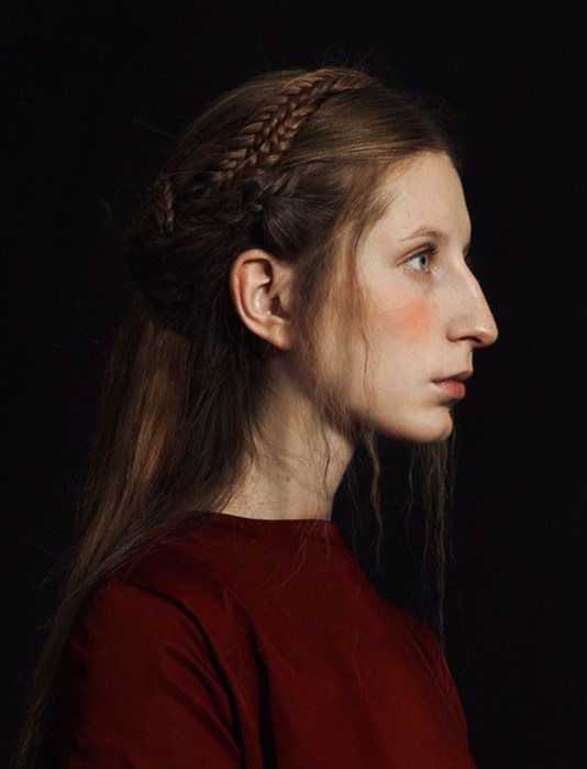
One funny thing about this Sktchy gouache class is that the teacher seems to pick reference photos of people I never would have chosen. The photo reference for this lesson: a guy seemingly looking in his bathroom mirror when he woke up in the morning. It didn’t inspire me, but maybe the combination of a non-interesting photo and the experiment with color took the pressure off so I could just play. I had so much fun with this one!

Photo reference from Sktchy
Categories
Art Gouache Portrait Sktchy Sktchy

Trying Gouache Again

Gouache portrait, 10×8 inches on Arches CP Watercolor paper

I’ve studied gouache before as in this post with color charts and several other times over the years. This month I’ve been participating in the “Sktchy 30 Faces in 30 Days – Gouache and Watercolor” challenge with a different artist demonstrating their way of painting a portrait in either watercolor or gouache each day.

The first gouache demo was presented by Jordan M. Rhodes (@jmr_art on Instagram) who I’ve been following on IG for a long time. I tried to paint along with him but kept on struggling. I ended up taking much longer, painting multiple layers until I was able complete it with some degree of satisfaction. And of course it took me several hours just to get the drawing right-ish first.

My preliminary drawing
Reference photo

I had hoped that doing this 30 day challenge would force me to work faster, but nope. It wasn’t until I got to the next gouache class that I picked up the insights that have given me much more confidence and better skills, which I’ll write about when I share the next portrait.

Categories
Drawing Faces People Portrait Sktchy Sktchy

Rainbow Hair and a Pretty Pointy Profile Pic

Ioana F from Sktchy, pencil and colored pencil, 10x8 inches
Ioana F from Sktchy, pencil and colored pencil, 10×8 inches

I was inspired to sketch Ioana because of her brilliant hair color (see her photo on Sktchy here) and because a dear friend had to shave her head while undergoing chemo and I was looking for photos of beautiful bald women to share with her. (Ioana also posted photos of herself with a shaved head on Sktchy.) Maybe when my friend finishes her treatment and her hair grows back she’ll dye it shades of pink and orange to celebrate.

Profile sketch from internet photo, pencil, 10x8 inches
Profile sketch from internet photo, pencil, 10×8 inches

This sketch was done to practice profile drawing which I find difficult. She has such an unusual facial structure as you can see in the photo below, but somehow looks beautiful despite the pointy chin and long nose and big ears. She looks nervous about it all in my sketch.

Reference photo from somewhere on the internet
Categories
Art Drawing Faces People Portrait Sktchy

Aleksandra Again and Again

Aleksandra Final Pencil Sketch
Aleksandra Final Sketch, pencil, 10×8″

I worked on making a portrait of Aleksandra over and over for a couple of months (see the terrible work below). I finally surrendered and chose a different photo of her. The drawing above went smoothly and I did it in one afternoon. (Sktchy photo reference for above sketch.)

What originally inspired me to paint her was the bright yellow-green background in this Sktchy photo. But I learned the hard way that selfies shot close up distort the features and shape of the face.

Our eyes and brains automatically correct for things like photo distortion and lighting, but trying to draw exactly what is there from a distorted photo doesn’t work unless you’re ok with a distorted drawing. Sometimes that can make for a fun caricature, but in this case I was trying to capture a complimentary likeness of a pretty woman.

Below are some of the failed attempts. The first colored image is an oil painting with about 15 layers of failed attempts beneath the final failed attempt. The second colored image is a gouache painting that I put too much paint on, tried to wash some off, then gave up because the sketchbook paper was ruined.

Last six attempts including a failed oil painting (top row) and gouache (bottom row).

Below are the really terrible initial drawings.

Early attempts, some with imposed corrections