Categories
Illustration Friday Painting People Portrait Watercolor

Wedding: Illustration Friday

Matt & Margot

Watercolor, 22″ x 15″
Larger
Illustration Friday’s topic this week is Wedding. Usually when I participate in IF I create something new. I love the creative process of coming up with a concept for an illustration that is fresh, unique, and not the first thing anyone would think of (e.g. Paris = Eiffel Tower = trite). The second fun part is imagining and visualizing the image and then bringing it to life with pen and paint.

But this week I couldn’t resist posting this wedding portrait I did a couple years ago for my friends Matt and Margot, especially since this month is their anniversary and they’re expecting their first child in less than a month. Congratulations M&M!

Categories
Drawing Other Art Blogs I Read People Sketchbook Pages Watercolor

Sketchcrawl 15 – Berkeley’s Fourth Street

Sketchcrawl15-peets

Peet’s Coffee. Larger

All are drawn in ink and painted with watercolor in small Moleskine watercolor notebook
Yesterday was Sketchcrawl 15 and I joined a friendly, talented group of artists (including Oakland artist Carrie, Sonoma county artist Natalie, Cathy from East Bay Plein Air Painters, and fellow art-bloggers Martha, Vern and Pete) on Berkeley’s Fourth Street to sketch. We had a good time sketching in nice weather, and met up again at the end of the day at Brennan’s Pub for drinks.

Brennan’s used to be a favorite hangout in my late 20s — a place to meet friends for drinks and partying back in the day. I hadn’t been there in at least 20 years so it was fun to see it was still virtually the same and to have a yummy Irish Coffee for old times sake. I learned today that Brennan’s will be demolished in the near future to make room for a new development but they will be moving to a historic, former train depot nearby.

Sketchcrawl15-lilly

Lilly. Larger
“Good Afternoon. Could you help me please?” “Good afternoon, could you help me please?” “Good afternoon, could you help me please?” “Thank you Jesus.” “Good afternoon, could you help me please?”

Martha and I sat on a bench across the street from Hear Music so she could draw their storefront. Just to my left was this cheerful and charming (and repetitive) blind woman soliciting money from the shoppers in this upscale area. For the half hour we sat there she continued her chant, while her sweet but old, grizzled male friend gave her quiet little cues about who was walking by, what they looked like and what they were doing. She was excited we were sketching her. I gave him my card and promised to send a copy of the finished sketch, which he liked. She also allowed me to take photos and I plan to do a painting of her as she was quite beautiful (which you can’t tell from my sketch, sadly.) We put a few dollars in her begging bowl (a quart-sized yogurt container).

Sketchcrawl15-gate

Larger
The last sketch of the day in the little courtyard behind Sur la Table. Martha went inside and drew kitchen goods.

Sketchcrawl15-spengers

Spenger’s Fish Grotto
Larger

This is the first sketch of the day I did while we waited for everyone to arrive. I painted it later at home from little color notes I penciled in to the sketch. Pete did a fabulous drawing of Spenger’s using a blue Copic fine liner and watercolor, so please be sure to visit the Berkeley Sketchcrawl website to see his drawings and Martha’s, and the cool photos Martha took of everyone sketching.

Categories
Drawing Life in general People Sketchbook Pages

Another Harassment & Discrimination Training

Paul at Meeting

Ink in moleskine sketchbook
Click to see larger

Men at meeting

Click to see larger

It seems like only yesterday that we had the annual sexual harassment and discrimination training for managers but it was actually last October which I was able to check by doing a search on my blog for the drawings from that meeting. At first I was annoyed since I had so many other things to do, but then I realized I could sit there listening and sketch–not a bad deal getting paid to spend the morning sketching.

I think the progression of the drawings above is interesting. The first one I did was the guy on the left in the picture directly above. It was a weak first attempt at the same guy next on the right. As I progressed to the right, each person’s likeness got a little sharper until I think I really nailed the last guy on the right. Then I turned to the next page and did the drawing at the top of this post. I was really pleased with it as I think it came pretty close to capturing the gentleman. The last thing I drew was the cup. There was a bad attempt at another face under it which I turned it into my coffee cup with some extra scribbling.

What was even more interesting was that at this sexual harassment training, all the men sat together on one side of the U-shaped table and the women sat on the other two sides. (There’s more women than men at this educational non-profit since most staff come from the female-dominated teaching field.) Maybe the men were just enjoying the rare opportunity to share a little male bonding at work.

Categories
Life in general Other Art Blogs I Read People Sketchbook Pages

Yay! No School for Scoundrels Here!

School Board Meeting

Micron Pigma Ink in small Moleskine notebook
Click to see larger

I attended my first school board meeting tonight to join with about 70 people from my neighborhood association to speak out against the planned school for expelled students in a former elementary school in my neighborhood. Many residents, including several who are teachers and/or work with disturbed kids spoke passionately and persuasively. One of the five board members who’d attended our previous meeting spoke eloquently about why it was a bad location for these students (including the fact they’d be coming from the opposite end of the district and there’s no public transit within a quarter mile of the school).

When I first sat down a woman in the next seat who was there for another cause and was very experienced with the school board meetings told me it was a done deal–the school would be put there, period, the end. Fortunately she was very surprised and wrong — the board voted against putting it at this site. YAY!

Since my painting group was supposed to meet tonight, I invited them to attend the meeting and bring sketchbooks. Only my dear friend Judith (who I can always count on to be enthusiastic about joining me to do whatever kind of odd things I cook up) said yes. While I did the sketch above, Judith did the drawing below (I love her lines!):

Judith's Drawing at the meeting

Ink and watercolor pencils in large Aquabee sketchbook
Copyright Judith H.

Click to see larger

Except for my butt hurting from sitting in the metal folding chair for nearly two hours, it was a great night. It really felt like a miracle to have swayed the board and kept this scary, poorly planned school away from our humble but proud little neighborhood.

Categories
Drawing Life in general People Sketchbook Pages

No School for Delinquents in our Neighborhood!

Neighborhood-meeting

Ink in Moleskine notebook
Click here for larger view

When I finished drawing these people at the neighborhood meeting, I realized I’d compressed the space so that people are crammed together much more than they actually were. I wish I would have thought to capture some of the angry expressions as people spoke instead of everyone just looking sort of bored.

Tonight there was a neighborhood meeting to protest the placement in my neighborhood of a school for “high risk” middle and high school students who’ve been expelled from public school. Many are on probation for committing crimes. They plan to stick the kids in a former elementary school just two blocks from my house that is currently used as an adult school for classes like Yoga, Spanish, Ballroom Dance and English as a Second Language. Nearly 100 neighbors showed up at the meeting and spoke out vociferously against the plan. It looks like it could go either way at this point. Somehow the district slipped this plan through without Board approval or community notification but now it will be on the next board meeting agenda.

I sure hope we’re successful in fighting it since just last month the board approved (against the neighborhood association’s vote) to allow a public alternative high school to move into what has been until now a small private elementary school with a focus on Japanese language (and well-behaved children) that is just two blocks the other direction. Even though that high school’s brochure claims to be all about group hugs, yoga and community service, the idea of 150 teenagers just a block away is not at all appealing.

When I was house hunting I was always a little wary of neighborhoods that the realtor claimed had strong neighborhood groups because I figured there was a reason they needed one. But in the Bay Area, with some of the most expensive housing in the country, I feel fortunate to have been able to buy my own home at all. And this is a wonderful neighborhood with the best neighbors I’ve ever had and now I’m glad for the strong the neighborhood association.

Categories
People Sketchbook Pages Subway drawings

BART Subway drawings

bart30

All are ink in small Moleskine sketchbook. This guy (above) had huge fleshy ears and his headphones barely covered them. He got off really quickly or I would have done more studies of his ears which enthralled me (I’m easily amused).

bart28

She slept the whole way home. I always wonder whether soundly sleeping people miss their stop. We were all tired on that car since it was 7:00 p.m. and I guess we’d all worked late. Almost everyone was sleeping .

bart29

I wish it wasn’t so late and I wasn’t so tired tonight because I’m excited about going out plein air painting tomorrow morning with one of the three groups in my area that I found and joined and I’d love to say more about that. But today was really busy and then I just spent a couple hours packing all my art supplies to make sure I had everything I needed for both oil painting and watercolor sketching in my cart. Then I tried to touch up a couple of pretty bad plein air practice paintings I did this week (in my backyard), thinking I’d post those but they’re not ready. So all I have to post tonight are a couple very quick sketchy sketches from my ride home from work on BART this week.

Categories
Faces Oil Painting Other Art Blogs I Read Painting People Portrait

Francis: Work in progress, oils

Francis-Grisaille underpainting done

Grisaille underpainting, oil on canvas, 9×12 (larger)

Francis is a little boy I photographed (with his mom’s permission) in the cafe at the Museum of Modern Art in San Francisco. Something about his red hair and sweet, wise nature made me want to paint him. This is a second attempt–the first got tossed. I’m trying a technique I recently saw demonstrated at the California Watercolor Association meeting. The goal is to end up with strong darks, high contrast and glowing skin. The artist who demonstrated the technique started her demo by showing slides of Caravaggio‘s paintings. He is known for strong contrast of glowing light in an otherwise dark scene, known as Chiaroscuro.

Once this layer dries I will be painting over the underpainting with a thin layer of color, trying to allow the darks and lights to remain and show through.

Francis-sketch on toned canvas
(above) First I started by toning the canvas with a thin wash of acrylic burnt umber paint. Burnt sienna would have been better though–this color is too dark and not warm enough. Then I used Saral transfer paper to trace the enlarged photo onto the canvas. Portraits are the one subject that I still do that kind of transfer instead of drawing freehand when I want to be sure to get a resemblance with all the features the right size in the right place.

Francis-Getting started

(Above) Next I started blocking in the dark shapes and lines I saw using burnt sienna oil paint thinned with Gamsol Odorless Mineral Spirits.

Francis-blocking in

(Above) Once I had the shapes blocked in I was ready to start adding the black paint, trying to keep it thin so some of the burnt sienna would show through.

Francis-Grisaille underpainting started

(Above) Then I started adding white paint, trying to make smooth transitions between dark and light. And this brought me to the finished grisaille underpainting at the top. Now I just need to let it dry and then start adding the thin layer of color and see what happens.

Categories
Art theory Life in general People Sketchbook Pages Subway drawings

Art Shows on TV & Subway Drawings

BART26

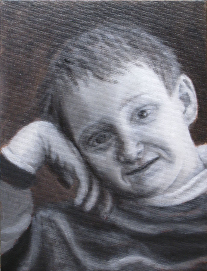
Above, on the train to work in the morning, 5 minute drawing.
Click here for larger image

All are ink in Moleskine sketchbook

BART27-El Cerrito Plaza Station

Above, waiting for the train on the platform, 3 minute drawing

Bart25

Click here for larger image
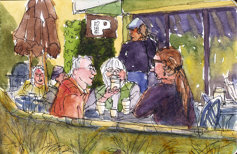
Above, people on the train to work, probably 3 minutes each (my trip is only 13 minutes)

I’m sooooo tired tonight. I think I used up all my brain juice at work today which seemed more intense than usual, multi-tasking, solving problems, meeting needs, responding to questions, ticking one thing after another off the bottom of my to-do list as more things piled on top of it. At the end of the day I had 48 work email messages I still hadn’t dealt with yet, some left over from Monday. I get about a hundred a day, most needing me to do something. Thank goodness tomorrow is Thursday and Friday starts my weekend. How did I ever manage a 5-day work week? It’s only 8:15 and it feels like 10 p.m. so I’m going to go watch some mindless TV and then go to bed.

Art History Shows
I’ve TiVo’d and have been gradually watching the Simon Schama series, The Power of Art, on PBS. It’s really weird. Each week a different seedy-looking British actor portrays another famous artist (most of whom weren’t British) while Schama narrates bits of history, trying to make everything sound as lurid as possible. The actors dramatize the artists’ darkest, most desparate moments of depravity, criminality, mental illness, illicit affairs, and bizarre behavior, focusing not on their most famous work, but the work they were most infamous for. It’s kind of like the Jerry Springer/National Enquirer/tabloid TV show version of the world of art. Some of the scenes are really disturbing such as Van Gogh squeezing tube after tube of brilliant oil paint into his mouth and swallowing it. Yechh!

I’ve also TiVo’d a CPB show, “Art of the Western World” with another British guy narrating the history of art, period by period, with just the opposite approach–a bit on the “good for you” but boring side. It was originally made as a college course, I think. I love my TiVo, by the way. It’s easy to use and I can set it to record every episode of a show with one click of the remote, and search for shows about art and painting and click to record them (which is how I found these programs). One more excellent program is American Masters on PBS. Recent episodes have featured David Hockney: “The Color of Music” and John James Audubon: “Drawn from Nature.”

Painting How-To Shows
Another show I’ve been enjoying is Your Brush with Nature. Each week the host, Heiner Hertling, paints a plein air oil painting on site in different locations. It’s not corny like some painting shows and he’s a good teacher, thinking out loud as he tackles the challenges of painting outdoors. There are two watercolor painting shows I record: Terry Madden’s Watercolor Workshop and Gary Spetz’s Painting Wild Places. I’ve gotten a little tired of Spetz because he does SO MUCH detailed masking with masking fluid, but both Madden and Spetz make attractive paintings and demonstrate techniques worth knowing about. For acrylics, Jerry Yarnell demonstrates how to paint what look like traditional oil paintings but using acrylics. I was having a really hard time figuring out acrylics and watching his show really helped to understand. I tried watching the ubiquitous Bob Ross oil painting shows on PBS but just couldn’t stomach them because they were way too gimicky and not at all about painting what you see (“here’s how to paint happy little trees”). I do love his voice though.

I’ve recently discovered an art video rental company like Netflix only for art videos called Smartflix. I haven’t rented from them yet (it’s a little expensive–$10 a video rental) but it seems like it might be worth it–cheaper than taking classes (though without the teacher feedback on your own work) –to see masters at work whose books I’ve read but seeing them work adds another whole dimension.

Categories
Art theory Oil Painting Painting People Photos Portrait Puerto Vallarta

Work in Progress: Puerto Vallarta Cowboy in oil

PV Cowboy - Oil painting layer 2

Oil painting IN PROGRESS – 22 x 28 inches
Click here to see larger

I started this oil painting today from a photo I took in Puerto Vallarta a few months ago (see bottom of this post for the original photo). I thought I’d track my process and progress and post the results as I go.

(Clicking on any of the pictures below will take you to Flickr where you can click All Sizes to see larger)

Original thumbnail sketches

Above are the thumbnail sketches (each about 2″ x 3″) that I did first, trying to work out the composition and colors. I needed to make the sketch match the dimensions of the canvas. Unlike watercolor paper that you can cut to any size, with canvas you either have to stretch it yourself (been there, done that) or use standard sizes.

Above top right: I used grey markers to work out the values but I didn’t change the composition from the photo. Above bottom left: In this grey marker sketch I moved the cowboy to the right, adding more wall between him and the door and added some white gel pen to put back light I lost. Above bottom right: I used gouache to work out the colors.

Enlarged photo with cowboy moved Drawing on colored acrylic ground

(Above left) I placed the original photo in InDesign so I could print it out in grey scale in”tiled” pieces and then I taped the printed sections together so that it would be the same size as my 22×228 canvas. Then I printed just the cowboy in color and stuck him where I wanted him on the large printout. I could have done this in Photoshop but decided it was quicker to do manually. It’s placed over the canvas in this photo.

(Above right) I toned the canvas with acrylic paint mixed to a sort of orangey-brown. I used a sponge brush and kind of messed it up, going over an area that was partially dry, which took off paint instead of putting it on. Fortunately it was in an area where there’s a textured wall so it didn’t matter. Then I put a sheet of Saral graphite “carbon paper” between my enlarged printout and the canvas and using a stylus originally designed for using on a Palm Pilot PDA, drew (invisibly) along the outline of the shapes on the enlarged photo. The Saral paper transfered those lines to the canvas. Unfortunately I didn’t notice the enlargement slipped so I had to retrace the guy again, half an inch to the left which left a lot of confusing double lines. The main reason I wanted to trace was to get the shapes on his face right and they were totally messed up. So I redrew him over the graphite lines with a fine point Sharpie instead of tracing, which worked OK.

Working from enlarged thumbnail sketch & photo

Above: I scanned my thumbnail value sketch, enlarged it to 8×10 and printed it out and stuck it on my easel along with the reference photo and then….

5-Monochrome acrylic underpainting

Above: Using black acrylic gesso I referred to my value sketch to make a grisaille or monochrome underpainting over the orange. Now that I’m looking at this I realized I forgot to put the grey rectangle behind his head that will have the text on it and the orange is looking paler than it really was.

6-Painting the face upside down

Above: I was having trouble with the face so I enlarged his face and printed it, then turned the canvas and the printout upside down and tried to get the shadows and value patterns right on his face.

Then I blocked in the first layer of color with oil paints over the underpainting (picture at top of post). Once it dries I’ll paint another layer. I plan to work loosely, avoiding overworking, especially the door on the left which I like just the way it is.

Below, the original photo. Isn’t he wonderfully macho?

Original photo

Categories
Drawing People Sketchbook Pages

Sketching musicians in the dark

Fishtank Ensemble 2

All sketches are ink in small Moleskine notebook
Click here to see larger

The Fishtank Ensemble performs a fascinating mix of Eastern European/Klezmer/Gypsy/Flamenco/Japanese music and their beautiful lead singer has the most astonishing, operatic voice. They were performing at Ashkenaz on a Wednesday night while I was on vacation and I went by myself to hear them since for everyone else it was a “school night.”

It was a fabulous, thrilling performance, and much of the music was very fast so I was drawing really fast too, even though I could just barely see what I was doing. Here are some more of my sketchy drawings from that night. If only they could convey the excitement of the music!

Fishtank Ensemble 1

To see larger click here.
The square instrument above is a Japanese shamisen. The lead singer plays violin and saw and can make her voice sound just an ethereal saw.

Fishtank Ensemble 3 Dancer at the Fishtank Ensemble Performance

Left above: The lead singer is tall, slim and dazzling, (my drawing doesn’t do her justice), wearing a flippy little black skirt and a very small jeweled black velvet top with bare midriff and delicate high heeled sandals.

Right above: On the other hand, this woman who was dancing in front of me looked like she was trying to make herself look dumpy. She was wearing striped kneesocks with oxford shoes, a short baggy sweater on top of a long baggy shirt and a bulky pleated knit skirt. She had her hair in pigtails and was wearing big glasses. But she was having a ton of fun dancing up a storm.