Categories
Glass Sketchbook Pages Still Life Watercolor

Clover Honey Bubblebath and Bath Brush

Clover Honey Bubble Bath

Watercolor in large Moleskine watercolor sketchbook
Click here to see larger

These lovely items were my birthday gift from my office and I’ve been dying to paint them. I’m probably going to do it again as a “real” watercolor too, not just a sketch like this one. I might give it a shot in oil too.

The bubble bath in the bottle is thick as honey and looks and smells like it too. It’s full of other wonderful things from the garden: lettuce, celery, sage, clover, bilberry, cucumber, rosemary and avocado oil. It’s called Gardener’s Greenhouse Bubbling Bath Clover Honey. It’s the nicest bubble bath I’ve ever had and the bath brush is lovely and soft. I used them last night for the first time and it was heavenly.

My cats had never seen bubble bath before, and being fascinated with anything watery, were transfixed. While I lay in the tub and read, they fished for pawfuls of bubbles, tried to eat them, which I discouraged (I tasted it to see if it really tasted like honey and sadly it didn’t–soap!) and chased them around when I fluffed some onto the floor for them.

I woke up at 4:00 a.m. with a headache today and had a really busy day, including practicing setting up for plein air oil painting by assembling everything and then painting in my own garden. I picked a perfect spot — my Japanese Maple glowing in the light–but by the time I had everything together, it was in the shade. I painted anyway, and the painting turned out fairly icky. But it was all about rehearsing and hopefully I found all of the problems and things I still need to make this set up work. More about that later…for now it’s time to catch up on the sleep I missed last night.

Categories
Landscape Life in general Other Art Blogs I Read Outdoors/Landscape Painting Plein Air Sketchbook Pages Watercolor

Towata Park, Alameda

Towata Park, Alameda

Ink and watercolor in large Moleskine watercolor sketchbook
Click here to see larger

Thursday night was a 2-hour plein air paint-out on Alameda Island that was part of the Frank Bette Art Center’s annual invitational weeklong event that culminates in a show and a fund-raising auction in the park Saturday. Susie and I went there straight from work and had a very enjoyable time looking at all the accomplished plein air painters at work spread out over about a half-mile square area. It was warm, very windy and the sun was setting on the water, creating glare amidst views of a marsh, the bay, a small boat harbor, San Francisco across the bay, and a huge old concrete bridge with rush hour traffic flying across it a very short distance away. Despite all these challenges, the artists were doing some amazing work. After we’d admired all the interesting styles and techniques we found a spot where we could sit and draw too.

We’d both been attracted to the funny little boat to the left of the picture so we both drew and painted the same scene (but quite differently) in about 20 minutes. Then we took another walk around to see the finished pieces and left as the artists were setting up their paintings in a circle so that they could vote on the winning painting. While we were there, I got to see Ed Terpening, a fellow blogger, in action (the painting he was working on last night can be seen by clicking his name), and met Tom Zephyrs, a fantastic artist who is the brother-in-law of a childhood friend. Susie and my favorite was a large pastel in brilliant colors of the imposing bridge by artist and blogger Ann McMillan. She won first prize at last year’s event and that pastel is featured on the Frank Bette’s website page about the event.

Two nights in a row of painting inspiration and two nights in a row of dreaming about painting…until the earthquake hit at 4:42 this morning, putting an end to lovely dreams for the night. Fortunately it didn’t create any problems and was short enough that I didn’t even have time to do my usual earthquake reaction: panic and try to remember what it is I’m supposed to do during an earthquake. It felt like someone had taken my one-story, rectangular house that is much longer one way than the other, and picked it up at one end and snapped it, like you do with a sheet when you’re opening it and laying it on the bed.

Categories
Outdoors/Landscape Sketchbook Pages Watercolor

Colusa Circle’s Kensington Bistro

Kensington Bistro

Ink and watercolor in small Moleskine notebook
Click here to see larger

I supposedly work half a day from home on Mondays so that I can get out and paint in the afternoons. Unfortunately I often have trouble turning off the work email and end up working most of the day. Today I forced myself out the door around 3:00 for a walk and a visit to my favorite produce market, Colusa Market in Kensington. I parked at the Colusa Circle, took an enjoyable walk, and then came back and sat on a bench in front of the pub called the “Kensington Circus” and drew the Kensington Bistro across the traffic circle. The little peaks on the building are all wonky but I just couldn’t make myself get out a ruler and use 2 point perspective. I just wanted to draw so I did. The bistro is situated on a slight hill so the building does slant downhill from left to right…but still…

Categories
Art theory Oil Painting Painting People Photos Portrait Puerto Vallarta

Work in Progress: Puerto Vallarta Cowboy in oil

PV Cowboy - Oil painting layer 2

Oil painting IN PROGRESS – 22 x 28 inches
Click here to see larger

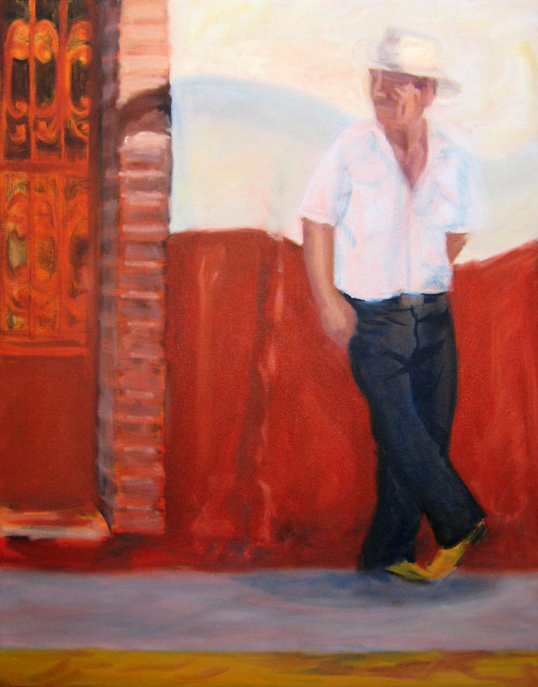
I started this oil painting today from a photo I took in Puerto Vallarta a few months ago (see bottom of this post for the original photo). I thought I’d track my process and progress and post the results as I go.

(Clicking on any of the pictures below will take you to Flickr where you can click All Sizes to see larger)

Original thumbnail sketches

Above are the thumbnail sketches (each about 2″ x 3″) that I did first, trying to work out the composition and colors. I needed to make the sketch match the dimensions of the canvas. Unlike watercolor paper that you can cut to any size, with canvas you either have to stretch it yourself (been there, done that) or use standard sizes.

Above top right: I used grey markers to work out the values but I didn’t change the composition from the photo. Above bottom left: In this grey marker sketch I moved the cowboy to the right, adding more wall between him and the door and added some white gel pen to put back light I lost. Above bottom right: I used gouache to work out the colors.

Enlarged photo with cowboy moved Drawing on colored acrylic ground

(Above left) I placed the original photo in InDesign so I could print it out in grey scale in”tiled” pieces and then I taped the printed sections together so that it would be the same size as my 22×228 canvas. Then I printed just the cowboy in color and stuck him where I wanted him on the large printout. I could have done this in Photoshop but decided it was quicker to do manually. It’s placed over the canvas in this photo.

(Above right) I toned the canvas with acrylic paint mixed to a sort of orangey-brown. I used a sponge brush and kind of messed it up, going over an area that was partially dry, which took off paint instead of putting it on. Fortunately it was in an area where there’s a textured wall so it didn’t matter. Then I put a sheet of Saral graphite “carbon paper” between my enlarged printout and the canvas and using a stylus originally designed for using on a Palm Pilot PDA, drew (invisibly) along the outline of the shapes on the enlarged photo. The Saral paper transfered those lines to the canvas. Unfortunately I didn’t notice the enlargement slipped so I had to retrace the guy again, half an inch to the left which left a lot of confusing double lines. The main reason I wanted to trace was to get the shapes on his face right and they were totally messed up. So I redrew him over the graphite lines with a fine point Sharpie instead of tracing, which worked OK.

Working from enlarged thumbnail sketch & photo

Above: I scanned my thumbnail value sketch, enlarged it to 8×10 and printed it out and stuck it on my easel along with the reference photo and then….

5-Monochrome acrylic underpainting

Above: Using black acrylic gesso I referred to my value sketch to make a grisaille or monochrome underpainting over the orange. Now that I’m looking at this I realized I forgot to put the grey rectangle behind his head that will have the text on it and the orange is looking paler than it really was.

6-Painting the face upside down

Above: I was having trouble with the face so I enlarged his face and printed it, then turned the canvas and the printout upside down and tried to get the shadows and value patterns right on his face.

Then I blocked in the first layer of color with oil paints over the underpainting (picture at top of post). Once it dries I’ll paint another layer. I plan to work loosely, avoiding overworking, especially the door on the left which I like just the way it is.

Below, the original photo. Isn’t he wonderfully macho?

Original photo

Categories
Painting Sketchbook Pages Still Life Watercolor

Quick Cantaloupe

Cantaloupe

Ink & watercolor in large Moleskine watercolor notebook
Click here to see bigger

When I was traveling across country many years ago, taking an old highway instead of a huge interstate, I stopped for breakfast in an old-fashioned roadside diner with wood panelled walls and big, dark padded booths. I was handed a typed menu covered in a thick plastic sleeve with red leatherette edging. There was a typo on the menu that said, “Fresh cantalpupe.” I’ve never been able to look at cantaloupe since then without remembering that wonderfully odd typo and saying silently to myself, “cantalpupe.” Try it…it’s so fun to say…but then so is cantaloupe with it’s extra, silent “u”. Shouldn’t it be pronounced cantaloope with that u in there?

And it tastes good too. Now I’m going to go eat my still life and go to bed!

Categories
Life in general Oil Painting Still Life

Rainier Cherries (Oil painting)

Cherries Oil Painting - Finished

Oil painting on RayMar panel, 8×6″
Click here to see larger

I’ve been dieting the past couple weeks, trying to take off the 10 pounds I put on over the past year and a half of blogging instead of jogging. It’s been made considerably easier by the wonderful fresh summer fruit I’ve been eating. I think the cherry season might be waning now, which makes me sad since these Rainier Cherries are more delicious than any of the junk food they replaced. I’ve lost the first five pounds and hope to be done with the diet before the succulent peaches, plums and nectarines are gone.

Oil painting is so much fun. I’m really enjoying working alla prima (with fresh paint, finishing a painting while all the paint is still wet, rather than letting it dry and painting in layers). I’m practicing this technique so that I can eventually try painting plein air with oils (but it will be a while before I’m ready for that.

Here are the steps in making this painting (if you want to see them bigger you can click on the images and and then click All Sizes:

The sketch with vine charcoal:
Cherries Oil Painting-Step 1

Blocking in the shapes and colors:
Cherries Oil Painting-Step 2

Almost done…should I have stopped here?

Cherries Oil Painting-Step 3

I had a hard time with the background, which is a white plate. It had some reflection from the cherries, highlights from the lamp pointing at it and a bit of shadow around the rim. I’m not sure if I should have stopped sooner or worked on this painting longer but since it’s about learning and practicing and moving on to try something else, I think I’m done. Any suggestions or advice very much welcomed!

Categories
Oil Painting Painting Still Life

What color is a lemon?

Lemon on green glass plate (P1010468)

Oil on panel, 6×8″
Click here to see larger

Despite today being my last day of vacation, my cat barfing in response to fireworks, and my 3-year-old refrigerator dying yesterday, my muse has finally returned and I got started on some new painting projects. The first one is this small oil painting to try to understand what color the inside of a lemon is. It’s easy to say yellow, but as my friend Susie said, it’s transparent and reflective, like glass–and therefore not really any one particular color. I set it up on green glass so on the thin slice, the green shows through. The inside of the lemon is paler and less yellow in the original painting but I couldn’t get it quite right on the screen. Anyway, it’s not a masterpiece, but I’m pleased with getting the hang of the alla prima process (doing a whole painting at one time) with oils, and just love the feel of working with them.

Dry Ice: Interesting Stuff
Tuesday after lunch I realized my refrigerator wasn’t working and learned that the repairman couldn’t come until Thursday so I went off to buy dry ice. The guys in the shop were sympathetic and gave me 80 pounds of the stuff for free. I carefully carried in the steaming, icy bags, using potholders, 1 block at a time, loading it into the freezer and fridge. Later when I talked to my mom, she reminded me that I had another refrigerator in my studio kitchen (my house is a duplex, and the back unit is my studio). Duh!!! I rarely turn that fridge on since it’s a power hog, just using it to store extra beverages.

I turned it on and waited for it to get cold enough. Then I loaded all groceries I’d bought the day before into my laundry basket and carted them to the other kitchen. I was stunned to see that in that short time, all my wonderful lettuces and herbs and vegetables had frozen solid and were ruined. Then I left a few bottles of beer and some cans of soda in the broken fridge with the dry ice, thinking they’d be fine. I bet you can guess what happened next: The soda cans froze, expanded and exploded, covering the inside of the fridge with a layer of ice and icicles. In the freezer, frozen berries had turned to soup and they made their own lovely purple puddles of ice. But I just ignored the whole mess and spent the day in the studio.

Categories
Animals Flower Art Outdoors/Landscape Watercolor

Butterfly at Blake Gardens

Butterfly watercolor

Watercolor on Arches paper, 11 x 7.5″ (with a touch of white gouache on antennae)
Click here for larger version

Buttefly photo

(Above) Reference photo I took on Thursday at Blake Gardens.

I have two more days of vacation left and finally I’m really ready to paint. I’ve sorted out the images I want to work from and have some ideas how I want to approach them. This first image seemed to call for watercolor and it felt good to get back to paint again tonight.

But unfortunately today mostly got lost to errands, paperwork and monitor calibration again when I called the company who makes the Eye One calibration tool I bought because of some continuing problems I was having. Their tech support was superb and the patient and intelligent gentleman I spoke to uncovered a number of problems I’d created by messing around with stuff I shouldn’t have been messing with. He helped me undo my mistakes, got everything working properly, and helped me to understand more about the concept of color management.

Now it’s back to managing REAL color on the end of a paintbrush. I’m not panicking too badly about the end of vacation because I only go back to work for one day (Thursday) and then I’m off again for my usual 3 1/2 day weekend.

Categories
Every Day Matters Illustration Friday Sketchbook Pages Studio Watercolor

IF: Twist; EDM #124: Something Yellow

Twist; EDM Something Yellow

Watercolor in Moleskine large watercolor sketchbook

This week’s Illustration Friday challenge is “Twist” — there’s nothing like a nice twist of lemon in a glass of ice water (or in something more exciting, like a lemon drop martini, which I’m sure sounds better than it tastes, since I’m not a fan of martinis). And last week’s Everyday Matters challenge was to draw something yellow…so there you go.

I did this watercolor sketch yesterday but when I scanned it, my monitor display was driving me crazy. No matter what I did in Photoshop I couldn’t get an image that looked anything like the original. I tried again and again to calibrate my monitor using Adobe Gamma but just couldn’t get it right. I finally gave up around midnight, vowing to resolve the problem today one way or another.

Today I went to a great photography store in Berkeley, Looking Glass Photo. They rent and sell everything you need for digital or film photography and they’re staffed by experts who are generous with their knowledge. Initially I was going to rent a fancy set of calibration tools but a handsome, Buddha-like man named Paul (a customer who used to work there) steered me towards buying a simpler unit for not much more money than it would have cost to rent the unnecessarily fancy tools for just one day. I bought the Gretagmacbeth Eye-One Display 2 which looks like a small regular computer mouse.

I waited until it got dark out, turned on my full spectrum overhead lights only and then hung the little device over my monitor. I tried the automatic calibration which was OK, and then I tried the more detailed program, which I think did a better job. When it finished, I scanned my little lemon twist and amazingly it appeared on my screen just like the original. I have no idea how it will look on your screen, but at last, after all the changes in my studio, my monitor, scanner and printer are all working together again. Whoopee! Now I can get back to painting instead of messing with computer stuff!

P.S. If this looks washed out or too bright on your monitor, please let me know.

Categories
Flower Art Gardening Landscape Outdoors/Landscape Plants Plein Air Sketchbook Pages Watercolor

Tilden Botanical Garden

Serpentine Cone Flower

Serpentine Cone Flower
Ink and watercolor in large Moleskine watercolor notebook
Click here to see enlarged

Today I went to Berkeley’s Tilden Park Botanical Gardens with Richard. It’s a lovely, serene place filled with California native plants and trees from giant redwoods to wildflowers. He hiked around the hills, fields, bridges, creeks and wooded areas, enjoying the quiet breeze and birdsong. Most of the flowering plants had already done their big blooming in the spring but these coneflowers grabbed my interest so I sat down on the grass and did this quick sketch while Richard, a photographer, took close up shots of flowers.

Then we decided to move on to Blake Gardens. Richard had never been there and there were many parts of the estate I’d never explored, so we hiked all around there too, finding amazing jewels of nature and design at every turn. We took lots of photos but since time was limited and we wanted to see everything, I didn’t do another drawing. Now that I’ve seen the full scope of what’s there I think it holds promise for unlimited painting opportunities.