Categories
Painting Sketchbook Pages Still Life Watercolor

Salad rubbish

Salad-rubbish

Watercolor on Fabriano Artistico hot press paper (in sketchbook)
Larger

After I chopped vegetables for a salad today I looked down at the little triangular rubbish container/drainer in the sink. It was full of cucumber peels, red bell pepper core, radish ends, and mushroom trimmings. I thought it was pretty enough to paint. So I did. Happy Labor Day to everyone who has the day off today. Now back to my fun struggles with oil painting…

Categories
Art theory Landscape Oil Painting Other Art Blogs I Read Outdoors/Landscape Painting Plein Air

Sharing my learning process

Tilden Park Plein Air & Studio 3

Oils on 9×12″ canvas panel
Larger view

In the interest of sharing my learning process in oils, I’ve posted this painting and some of my teacher’s critique. There are so many problems with this plein air plus studio painting that it seems to prove Dee Farnsworth’s saying, “Plein air is French for ‘bad landscape painting.'” I like to think of plein air painting as being the outdoor version of figure/life drawing — you’re trying to capture a 3-D live subject in real time, but with changing light.

The biggest problem is that it’s a painting of nothing…that is, there’s no focal point. In fact, the thing that interested me the most about the scene (some interesting branches) didn’t even make it into the painting. The composition basically sucks: there should be a path of dark values for the eye to follow but instead there’s a bright path leading nowhere: your eyes go up the path where you can turn left or right but there’s nothing there to see.

The shadows on the road don’t work because they’re too lumpy — shadows should be flat with softer edges. The daubing paint application is basically the same everywhere (I was trying to make myself use more paint–I tend to be too stingy with oil paint and was trying to work thicker). The foliage should be painted as masses–clumps of different sizes and shapes that go from dark underneath to light on top–just as you’d paint an apple–to give them dimension and form.

My teacher thought the painting was better before I messed around with it in the studio. Here’s the original done at the park (below):

Tilden Park Plein Air 1st

I’d gone out painting with my friend Susie who is much more experienced at plein air than I. When we packed up she pointed out that when we set up to paint, the Eucalyptus trees were light against a dark background, but as the sun had moved, the scene had reversed and the foreground trees were now dark against light background trees. I hadn’t even realized that but had unconsciously kept “correcting” my painting as the afternoon progressed which was not a good thing for the painting. It was best at about one hour. After that it just got more and more mucked up. When I brought it home I decided to work on it some more in the studio and lost a lot of what I’d originally liked about the painting which I didn’t realize until I posted both of them.

About knowing when to stop…I’ve always loved this story by Danny Gregory:

“When Jack was in preschool, there was one teacher whose class always did the most amazing paintings. Each one was clear and sharp and intelligent, Picassos in a sea of muddy fingerpaints. I asked her what she taught her kids, what she said to keep their visions so pure. She replied, “I don’t tell them anything, really. I just know when to take their paper away.”

Categories
Drawing Other Art Blogs I Read People Sketchbook Pages Watercolor

Sketchcrawl 15 – Berkeley’s Fourth Street

Sketchcrawl15-peets

Peet’s Coffee. Larger

All are drawn in ink and painted with watercolor in small Moleskine watercolor notebook
Yesterday was Sketchcrawl 15 and I joined a friendly, talented group of artists (including Oakland artist Carrie, Sonoma county artist Natalie, Cathy from East Bay Plein Air Painters, and fellow art-bloggers Martha, Vern and Pete) on Berkeley’s Fourth Street to sketch. We had a good time sketching in nice weather, and met up again at the end of the day at Brennan’s Pub for drinks.

Brennan’s used to be a favorite hangout in my late 20s — a place to meet friends for drinks and partying back in the day. I hadn’t been there in at least 20 years so it was fun to see it was still virtually the same and to have a yummy Irish Coffee for old times sake. I learned today that Brennan’s will be demolished in the near future to make room for a new development but they will be moving to a historic, former train depot nearby.

Sketchcrawl15-lilly

Lilly. Larger
“Good Afternoon. Could you help me please?” “Good afternoon, could you help me please?” “Good afternoon, could you help me please?” “Thank you Jesus.” “Good afternoon, could you help me please?”

Martha and I sat on a bench across the street from Hear Music so she could draw their storefront. Just to my left was this cheerful and charming (and repetitive) blind woman soliciting money from the shoppers in this upscale area. For the half hour we sat there she continued her chant, while her sweet but old, grizzled male friend gave her quiet little cues about who was walking by, what they looked like and what they were doing. She was excited we were sketching her. I gave him my card and promised to send a copy of the finished sketch, which he liked. She also allowed me to take photos and I plan to do a painting of her as she was quite beautiful (which you can’t tell from my sketch, sadly.) We put a few dollars in her begging bowl (a quart-sized yogurt container).

Sketchcrawl15-gate

Larger
The last sketch of the day in the little courtyard behind Sur la Table. Martha went inside and drew kitchen goods.

Sketchcrawl15-spengers

Spenger’s Fish Grotto
Larger

This is the first sketch of the day I did while we waited for everyone to arrive. I painted it later at home from little color notes I penciled in to the sketch. Pete did a fabulous drawing of Spenger’s using a blue Copic fine liner and watercolor, so please be sure to visit the Berkeley Sketchcrawl website to see his drawings and Martha’s, and the cool photos Martha took of everyone sketching.

Categories
Every Day Matters Painting Sketchbook Pages Still Life Studio Watercolor

Peach: EDM 133 & A peachy new homemade sketchbook

EDM #133

Watercolor on 140 lb. Fabriano Artistico hot press paper
Click for larger view

This week’s Everyday Matters’ challenge is Draw a Peach. I’ve been eating at least one juicy sweet peach a day all summer. I start the day with a peach cut up in a bowl of cereal for breakfast and have one cut up in plain yogurt for an afternoon snack. This variety is so huge that breakfast looks more like a bowl of peach than a bowl of cereal.

New sketchbook

I made myself a new sketchbook and this painting is the first page. Here’s a photo of the sketchbook:

Homemade Sketchbook

Larger view

I didn’t have the inclination or patience to learn actual bookbinding for sketchbooks like Martha and Kate nor the budget to have them beautifully custom made for me like Laura’s. So I came up with a quick, inexpensive way to do it (mostly) myself. I tore two sheets of watercolor paper–one hot press and one cold press–in half and then in half, etc. until each piece was about 7 3/4″ by 5 3/4″. Then I sorted so that every other page is hot press/cold press, and brought the stack to Kinkos (a U.S. photocopy shop). I had them punch and bind it with a spiral wire thingee and a frosted cover and black back for which they charged about $6.00. The paper is way better than the Moleskines and Aquabees I’ve been using, the dimensions are more to my liking, it’s bound on the short side so can be used more easily in landscape format and the spiral binding lets me fold pages under (which means not easily drawing across two pages, but I rarely do that anyway).

The day after I made it I read about the way Miguel makes his own sketchbooks, using a Filofax (day planner) cover and punching three holes in the paper with a special Filofax punch. I’ll try that next, since I have a similar kind of day planner with a nice leather cover that I’m not using and could convert to a sketchbook. The only problem with that method is that when you finish the pages you remove them and box them and refill with new paper. The finished pages don’t remain an intact sketchbook.

Categories
Landscape Oil Painting Outdoors/Landscape Painting Plein Air Sketchbook Pages

Painting & Problem Begin with P

Alameda-Boat

Oil on panel, 12×9″
Click to see Larger

Yesterday I went out painting in Alameda with my plein air group. The view was delightful, the people were warm and friendly (both the group and the natives), the weather was nearly perfect and the city had actually blocked off a lane on the bridge (for construction–not for us) which gave us a perfect area to paint.

And I had nothing but problems. I’ve been reading several different books on oil painting and they all contradict each other. So I went out to paint with my head full of different approaches and with a goal to stop hoarding paint and put a lot on the canvas. Needless to say, the painting was a mess. After two hours I packed it up and watched a more experienced oil painter at work. I immediately saw where I’d gone wrong and decided that after the critique I’d go back out to the bridge and start over. But my feet hurt and I was hungry and the wind had really picked up so I decided to take a photo and paint at home using my first painting and a photo as a reference. One more problem…I’d forgotten my camera so had to use my cell phone’s crummy camera.

Here’s the photo which tinted the sky purple (which it wasn’t):

Categories
Art theory Landscape Oil Painting Outdoors/Landscape Painting Plein Air

Sunset View Cemetery- Oil sketch

Sunset View Cemetery Sketch

Click here to see larger
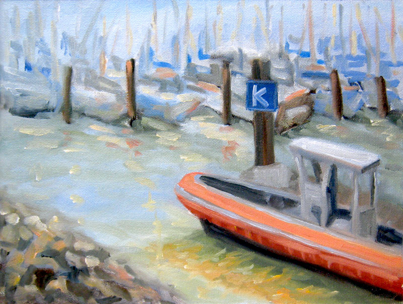
Oil on Raymar Panel 9×12″

Sadly I wasn’t feeling well enough to join the Benicia Plain Air Painters at Mare Island Friday and Saturday. I was fighting a cold (I won…after 12 hours sleep last night!). On Saturday it took me until 2:00 in the afternoon to get out of my jammies and into the shower, about the time the event was ending. Even though I still felt crummy the weather was beautiful (though windy) so I decided to try painting someplace closer.

The Sunset View Cemetery is quite nearby and has some lovely views so I headed up there. I drove around and around trying to find a spot to paint. Then I walked around, dragging all my gear, finally settling on this view. Unfortunately it was on top of the hill in the bright sun and very windy so I couldn’t use my umbrella to shade the palette and canvas, making color mixing tricky.

Even though I felt funky and tired, once I started painting all I felt was joy and pleasure. Then I ran out of steam after about 90 minutes, just managing to block in the lights and darks. I fiddled with it a bit today but wiped off all my fiddles. I decided I liked it just the way it is so I’m calling it a finished “sketch.” I may try making a larger painting from the sketch.
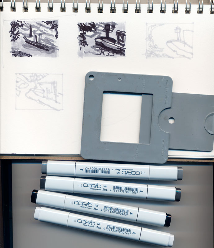
Value studies

Here are the compositional value studies I did first with Copic Markers (more about the markers). I meant for the tree to be further to the right like the bottom sketch but it ended up being closer to the middle in the painting.

Cemetery-value-comp

Alla prima in oils vs. watercolor

Two things that are important in working alla prima (all at once instead of in many layers) in oils and very different from my approach to watercolors are:

1) The importance of planning the composition (of course it’s important with watercolor too, but with watercolor you can crop off the bottom or side of a painting if you need to do improve the composition) . With stretched canvas or canvas panels it’s not nearly as easy as just snipping off the offending section or hiding it under a mat.

2) Getting the values (darks and lights) and the color right the first time. In watercolor I’m used to going for an approximation of the right color and then adding washes to make it darker, cooler, warmer, etc. In alla prima painting in oils I’ve learned I need to figure out the values first, then put down the darkest darks, and then the light areas for each main shape. Unlike watercolor, there’s no corrective glazing or washes when you’re working with wet gooshy paint.

Categories
Landscape Oil Painting Outdoors/Landscape Painting

Mare Island, Vallejo CA

Mare Island, Vallejo CA

Oil on panel, 8×6″
Click to see larger

Tomorrow I’m planning to go to a paint-out on Mare Island in Vallejo with a group of plein air painters based in Benicia. The organizer of the event posted some photos and a map of where we’ll be painting and I thought I’d get a head start by doing a practice painting from one of the photos of possible painting spots. It’s a two day event that started today but after I did a bunch of errands was too tired. Now tonight I’ve developed an icky cough and I’m hoping that my tiredness this week wasn’t because I’m catching a cold. There were a couple of coughing snifflers at work this week (grrrr)….

While I was working on this little painting the three kids (age 5-10) from next door came over to bring me a plate with a slice of orange jellow and a piece of birthday cake (it was the little girl’s birthday) so I invited them in to paint with me. I set them up with paint, a 64 box of Crayolas, some Caran d’Ache watercolor crayons, and a pile of paper. They each did several paintings (most contained the same little peaked roof house, with front door, doorknob, tree, smoke from chimney and the words “Happy Birthday” on them) but one painting was all black.  (Once they left the cake and jello went in the trash…I’m still on my diet and not a big fan of supermarket cake and jello anyway).

Now for some vitamin C and some sleep!

Categories
Landscape Oil Painting Outdoors/Landscape Painting Plein Air Sketchbook Pages

Berkeley Marina & Guerilla Painter Pochade Box

K Dock Berkeley Marina in Oils

Oil on RayMar panel, 12 x 9″ (Click to see larger)

This is my first “official” plein air oil painting that I did at the Berkeley Marina this morning where I joined a group of local plein air painters. I’m so thrilled to have found them. We met at 10:00 and then  went off to to paint in different spots, getting together again at 1:00 for a lively critique. I got some very useful suggestions  (e.g. adjust the bottom line of the boats is straight across the canvas so adjust to more of a diagonal slantig down to the left). I noticed that very problem when I was working out my preliminary thumbnail/value sketches but I momentarily forgot about artistic license and left it as I saw it instead of changing it for a better composition.

Although I felt shy about being so unskilled at oils and plein air painting I felt very welcomed by the group. It was a beautiful sunny (but cool and windy) day in Berkeley with the usual assortment of nuts, hikers, bikers, families and local characters passing by who all stopped to offer supportive comments or tell me about an artist they know or have seen before. I was so pleasantly suprised — not one person said, “Ewwww! What a bad painting!” or laughed at me. I didn’t worry about that with watercolor but somehow with an easel and all the trappings I felt like I stood out more.

Plein air set up at Berkeley Marina
(Click to see larger)

This is my new Guerilla Painter 9×12″ Pochade Box Plein Air Easel set up and I love it! It holds almost everything needed for painting plein air and is sturdy and super fast and easy to set up. I’ve never been so impressed with a company’s customer service as I had at Judson’s Plein Air either. I had a million dumb questions in trying to decide whether to buy this “cigar box” style easel or a french easel or a Soltek (which I couldn’t afford anyway) and when I called (twice) I spoke to Monica, who patiently answered every question, gave great advice, way above and beyond the usual which was so appreciated by this novice plein air painter.

The box is incredibly well made, really beautiful and makes setting up to paint, painting and carrying wet canvases a cinch. They also offer watercolor and pastel and acrylic versions of this box in various sizes. The tripod has a quick release so you just set the box on it and it clicks into place, and is very sturdy. It has separate adjustments for height and leg spread (far apart for windy, rough, or uneven conditions). It comes with an attached “stone bag” (the black thing at the bottom) for putting something heavy on it to weigh it down (only necessary for gale force winds, I’d think because it was windy today and nothing budged or wiggled). Their Mighty-Mite Brush washer  jar is also wonderful. It fits in the box and doesn’t leak like every other container for mineral spirits I’ve found. The palette is in just the right spot as is the canvas with this box. I bought the plastic covered palette accessory which is a good addition. As someone who really appreciates good tools, I couldn’t be happier.

In the picture above on the right is my shopping cart I use for carting my plein air supplies around. It’s pretty practical although stuff can fall out the open spaces and picking it up is tricky since it tries to fold in on itself. I’ve ordered two different closed wheely carriers and when I get them will compare them all and pick the best for my purposes.

Thumbnail value sketch tools
(Click for larger image)

Above are the tools I used to make my preliminary thumbnail composition and value sketches. I recently discovered wonderful Copic markers–they’re fabulous — no smell and they blend and go on like silk. This handy composition/value finder can be opened to a marked setting for the size of paper or canvas. Then you close one eye and look through it to decide what to put in your composition. It’s middle gray so that you can also compare colors to it to determine if they’re darker or lighter. I used its opening to trace the rectangles in my Aquabee sketchbook so that the thumbnails would be the same dimensions as my canvas.

Categories
Life in general Painting Plants Sketchbook Pages Still Life Watercolor

Remains of the Day

feather

Watercolor in Moleskine large watercolor notebook (Larger)

I picked up this feather and some sort of dingleberry/pod that fell from a tree on a walk by Lake Merritt (which has a bird sanctuary). I actually collected several feathers of different sizes, textures and colors that I wanted to draw. But trying to keep the cats away from the feathers got to be too much trouble so I put the others away. After repeatedly removing the cats from the drawing table I gave up and put this one away too, switching to drawing this little pod thingee.

Tonight my painting group got together at my studio after several weeks of not meeting and it was so nice to see everyone again and catch up on each other’s art, work, life, and families while we all painted. We’ve been together for at least 10 years (nobody can remember when we actually started), and though we’re all very different we’ve become a wonderfully close, supportive, loving little family. Together we’ve survived divorces, deaths of loved ones, romances (failed and successful), surgeries, cancer, teenagers, empty nesting (and kids who won’t leave home) and more. And all the while we’ve kept painting, learning, and growing as artists and friends. I’m so lucky to have their support and friendship.

Categories
Faces Oil Painting Other Art Blogs I Read Painting People Portrait

Francis: Work in progress, oils

Francis-Grisaille underpainting done

Grisaille underpainting, oil on canvas, 9×12 (larger)

Francis is a little boy I photographed (with his mom’s permission) in the cafe at the Museum of Modern Art in San Francisco. Something about his red hair and sweet, wise nature made me want to paint him. This is a second attempt–the first got tossed. I’m trying a technique I recently saw demonstrated at the California Watercolor Association meeting. The goal is to end up with strong darks, high contrast and glowing skin. The artist who demonstrated the technique started her demo by showing slides of Caravaggio‘s paintings. He is known for strong contrast of glowing light in an otherwise dark scene, known as Chiaroscuro.

Once this layer dries I will be painting over the underpainting with a thin layer of color, trying to allow the darks and lights to remain and show through.

Francis-sketch on toned canvas
(above) First I started by toning the canvas with a thin wash of acrylic burnt umber paint. Burnt sienna would have been better though–this color is too dark and not warm enough. Then I used Saral transfer paper to trace the enlarged photo onto the canvas. Portraits are the one subject that I still do that kind of transfer instead of drawing freehand when I want to be sure to get a resemblance with all the features the right size in the right place.

Francis-Getting started

(Above) Next I started blocking in the dark shapes and lines I saw using burnt sienna oil paint thinned with Gamsol Odorless Mineral Spirits.

Francis-blocking in

(Above) Once I had the shapes blocked in I was ready to start adding the black paint, trying to keep it thin so some of the burnt sienna would show through.

Francis-Grisaille underpainting started

(Above) Then I started adding white paint, trying to make smooth transitions between dark and light. And this brought me to the finished grisaille underpainting at the top. Now I just need to let it dry and then start adding the thin layer of color and see what happens.