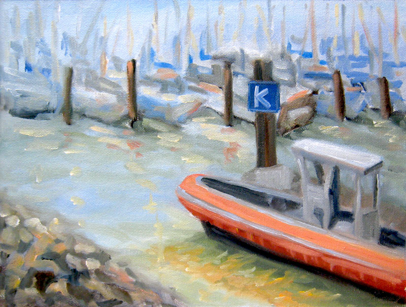
Categories
Art theory Flower Art Glass Oil Painting Other Art Blogs I Read Painting Still Life

Dahlias after Painting Class

Dahlias in Oil

Larger
Oil paint on gessoed mat board, 12×7.5″

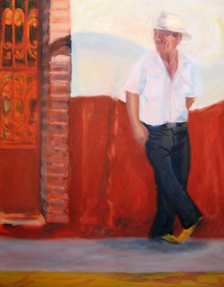
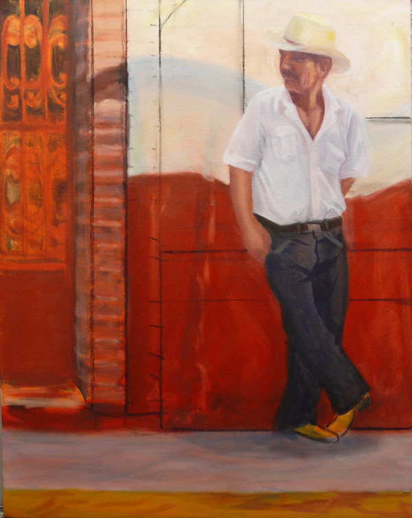
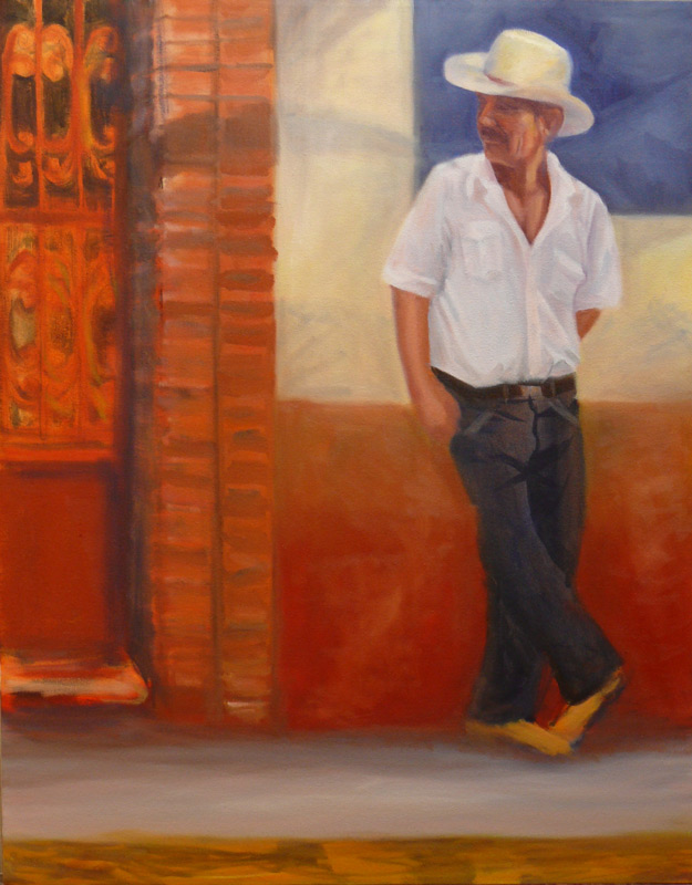
Sunday was my first plein air oil painting workshop with Elio Camacho and it was fabulous! Elio is not only a wonderful painter, but he’s a fantastic teacher — so energetic, enthusiastic and generous in sharing everything he knows (which is a lot!).

Although Elio covered a huge amount of artistic territory in his conversations with us, what really sunk in for me at this session was the importance of temperature (warm vs cool colors) and value (dark vs light) and how to use those relationships to paint the effects of light in the landscape.

To better understand this concept and practice seeing color temperature, he suggested doing a still life of all yellow objects as homework so I painted these dahlias from my garden (after scrubbing all the nasty aphids and ants off them–ick!). Yellow is a good color to practice with because there are many yellow pigments from cool to warm and dark to light and you can successfully lighten it with white, unlike red which turns pastel pink when white is added.

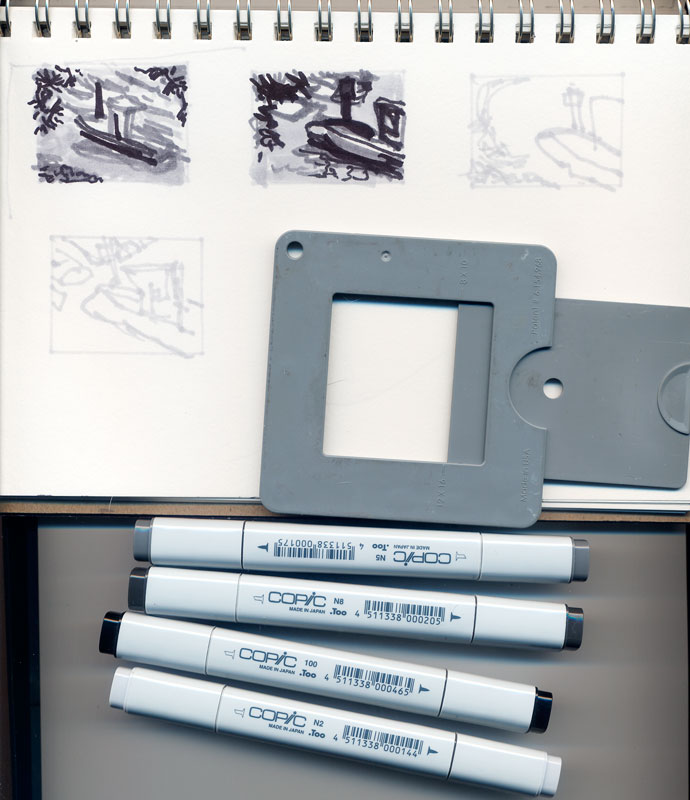
Since I started this journey to learn oil painting, I’ve read many books, watched a dozen oil painting videos, and received wonderful support from my online painting mentor, Nel. There were so many concepts, “rules”, and techniques that I understood intellectually but in class they came to life! Seeing the process demonstrated and being able to ask questions each step of the way was great.

And even better was having Elio checking on me every 15 minutes or so during the three hours I was painting. He demonstrated what he meant when I didn’t understand; he recommended I quit dabbling– put down a stroke and leave it; he showed me how to hold my brush correctly and at what angle, so I was putting paint down without scraping it off at the same time (hold the tip of the brush and keep it at a low angle to the canvas, not perpendicular as I was doing). So many things just clicked.

The painting I did in class isn’t worth posting, though it had some nice moments along the way. Now that I know how to hold my brush properly and understand the importance of the direction of the brush stroke, and am learning to see color temperature and value better, I’m can’t wait to start my next painting!

Categories
Oil Painting Painting People Puerto Vallarta

Work in Progress – Puerto Vallarta Cowboy

Puerto Vallarta Cowboy 10 (WIP) – – – Puerto Vallarta Cowboy 11 (WIP)
Larger — — — — — – — — – –(Revised version)- Larger
(Earlier version w/charcoal lines)

I knew there was something wrong with the composition of this painting in progress that I started in July but I wasn’t sure what the problem was. I studied it yesterday and realized that my eyes kept going to the blank area on the ground between the brick column and the guy’s feet. I was thinking about adding a box or something to the painting in that spot but then Elinor stopped in with Robin and pointed out that the problem was the weak contrast around his head where it’s all white against white and doesn’t draw your attention and is competing with the strong red area and contrast at the bottom of the wall where a white crack serves as an arrow to the ground.

To fix the painting, I decided to add more contrast around the guys head and break up the space/negative shapes in the composition. I experimented by drawing lines in charcoal seen in the picture on the left. Then I painted the blue square behind his head (that will have white lettering added to it instead of the blue lettering on a white wall in the original photo) to add contrast and make his face the focal point it should be. I also added a second column of bricks, lowered the red paint area on the wall and added an ochre band on top of it, and lightened the sidewalk.

I have a hard time finding the problems in my own paintings though I can usually spot them a mile away in someone else’s. I need to make a checklist of questions to ask myself about a painting when I have that uneasy feeling and don’t know why. Any suggestions welcomed as there’s still a way to go on this one.

Categories
Art theory Flower Art Glass Oil Painting Painting Sketchbook Pages Still Life

Wax On, Wax Off (Breathe In, Breathe Out)

Rose in a Jar

Oil on panel, 12×9″
Larger

The title of this post refers to words from the 1984 movie Karate Kid and also my process in this painting except for the painting it would be more like “Paint On, Wipe Off (Breathe!) Paint On, Wipe Off… ” (click on “Keep Reading” below to see photos of the steps). I’m not happy with the front flower but I’m ready to move on to the next painting. With each one I learn so much more, including how much more there is to learn!!!!

I had two main goals for this painting/learning experience:

  • Think in terms of “Whole Canvas”
  • Keep trying to understand how to work with oil paint so that I’m taking advantage of its wonderful qualities rather than fighting them. (I’ll keep trying!)

In my many years of watercolor painting, I worked hard to capture what excited me about my subject. I often worked close focus without much background, or just using the lovely white of the paper as my background to set off the glittering glass or glowing flowers I was painting. If the composition didn’t quite work out–no problem, just crop as needed with a mat and frame.

In oil painting the background has to be an integral part of the painting–you can’t just leave the glaring white of the gessoed canvas as your background. And you can’t crop a stretched canvas or panel like you can paper. I was struggling with this concept and finally it clicked. It’s just another way of seeing and, like peeling layers of the onion, the haze peeled from eyes and I could see that a painting is not subject & background — they fit together to complete the picture, just as night completes day. While an object that interests me enough to paint it is the focal point, I need (for now) to think of the PAINTING as the subject.

Categories
Art theory Oil Painting Other Art Blogs I Read Painting Photos Plein Air Sketchbook Pages

Treasure Island Marina, SF Bay, Plein Air

Treasure Island Marina, SF Bay
Oil on 9 x 12″ canvas board
Larger

My plein air group painted on Treasure Island this morning, a former military base and site of the 1939 World’s Fair in the San Francisco Bay. There were some amazing views of the SF skyline, the Bay Bridge, and Port of Oakland but it was very foggy and windy (as usual for the bay) when we arrived so I chose to paint in a more sheltered location in the marina.

Here’s the scene when I arrived:
IMG_1328

And here’s a quick snapshot I caught of the sailboat in the foreground as it glided past me:
IMG_1335

These are the sketches I did when I arrived, trying to decide on the view and focal point.
At first I was going to do the SF skyline but after sketching it realized it didn’t interest me; the shape of the dip along the skyline of trees on the hill did.
Treasure Island thumbnails

I did some things right on this painting, after taking to heart the good advice from my wonderful oil painting mentor Nel (whose wonderful Everyday Paintings deservedly sell Every Day — I own two), from Katherine Tyrell‘s post about plein air painting, and from the comments here on my last plein air attempt.

This time I didn’t chase the light (changing the painting every time the light changed). Instead, I noted when I started that the light wasn’t interesting–too foggy–but guessed it would probably clear up at some point. So I decided to block in the masses–the big shapes of the hills, sky and water and as soon as the sun came out I would then add the light effects, which worked fine. I also remembered that boats are flat on the bottom because the water line is flat and level. I also liked the the way I did the tree tops against the sky.

A couple things I didn’t quite get right: I forgot that everything looks darker and duller when you bring it indoors–it looked so pretty in the bright sun but is actually a little too dark. Also last time I swore I wouldn’t “fix” things in the studio, but I hadn’t had time to finish the boats so I worked on them, which was fine,. But then I “touched up” the hills and lost some of the glowing edges I had originally.

It might not be great art, but at least I didn’t feel like I had no idea what I was doing, as I had a month or two ago.

Advice, critique, comments are welcomed!

Categories
Art theory Oil Painting Painting Still Life Studio

Tomato Under Glass

Tomato Under Glass

Oil on gessoed Museum Board, 7.5″ x 9.25″
Larger

I did this oil sketch from life in the studio yesterday evening. One of the “rules” of oil painting is to keep your darks thin, with no texture and you can see why on the background here. Those brushstrokes catch the light and draw attention to it. Here’s the preliminary sketch with the darks blocked in first:

Categories
Art theory Landscape Oil Painting Other Art Blogs I Read Outdoors/Landscape Painting Plein Air

Sharing my learning process

Tilden Park Plein Air & Studio 3

Oils on 9×12″ canvas panel
Larger view

In the interest of sharing my learning process in oils, I’ve posted this painting and some of my teacher’s critique. There are so many problems with this plein air plus studio painting that it seems to prove Dee Farnsworth’s saying, “Plein air is French for ‘bad landscape painting.'” I like to think of plein air painting as being the outdoor version of figure/life drawing — you’re trying to capture a 3-D live subject in real time, but with changing light.

The biggest problem is that it’s a painting of nothing…that is, there’s no focal point. In fact, the thing that interested me the most about the scene (some interesting branches) didn’t even make it into the painting. The composition basically sucks: there should be a path of dark values for the eye to follow but instead there’s a bright path leading nowhere: your eyes go up the path where you can turn left or right but there’s nothing there to see.

The shadows on the road don’t work because they’re too lumpy — shadows should be flat with softer edges. The daubing paint application is basically the same everywhere (I was trying to make myself use more paint–I tend to be too stingy with oil paint and was trying to work thicker). The foliage should be painted as masses–clumps of different sizes and shapes that go from dark underneath to light on top–just as you’d paint an apple–to give them dimension and form.

My teacher thought the painting was better before I messed around with it in the studio. Here’s the original done at the park (below):

Tilden Park Plein Air 1st

I’d gone out painting with my friend Susie who is much more experienced at plein air than I. When we packed up she pointed out that when we set up to paint, the Eucalyptus trees were light against a dark background, but as the sun had moved, the scene had reversed and the foreground trees were now dark against light background trees. I hadn’t even realized that but had unconsciously kept “correcting” my painting as the afternoon progressed which was not a good thing for the painting. It was best at about one hour. After that it just got more and more mucked up. When I brought it home I decided to work on it some more in the studio and lost a lot of what I’d originally liked about the painting which I didn’t realize until I posted both of them.

About knowing when to stop…I’ve always loved this story by Danny Gregory:

“When Jack was in preschool, there was one teacher whose class always did the most amazing paintings. Each one was clear and sharp and intelligent, Picassos in a sea of muddy fingerpaints. I asked her what she taught her kids, what she said to keep their visions so pure. She replied, “I don’t tell them anything, really. I just know when to take their paper away.”

Categories
Landscape Oil Painting Outdoors/Landscape Painting Plein Air Sketchbook Pages

Painting & Problem Begin with P

Alameda-Boat

Oil on panel, 12×9″
Click to see Larger

Yesterday I went out painting in Alameda with my plein air group. The view was delightful, the people were warm and friendly (both the group and the natives), the weather was nearly perfect and the city had actually blocked off a lane on the bridge (for construction–not for us) which gave us a perfect area to paint.

And I had nothing but problems. I’ve been reading several different books on oil painting and they all contradict each other. So I went out to paint with my head full of different approaches and with a goal to stop hoarding paint and put a lot on the canvas. Needless to say, the painting was a mess. After two hours I packed it up and watched a more experienced oil painter at work. I immediately saw where I’d gone wrong and decided that after the critique I’d go back out to the bridge and start over. But my feet hurt and I was hungry and the wind had really picked up so I decided to take a photo and paint at home using my first painting and a photo as a reference. One more problem…I’d forgotten my camera so had to use my cell phone’s crummy camera.

Here’s the photo which tinted the sky purple (which it wasn’t):

Categories
Art theory Landscape Oil Painting Outdoors/Landscape Painting Plein Air

Sunset View Cemetery- Oil sketch

Sunset View Cemetery Sketch

Click here to see larger
Oil on Raymar Panel 9×12″

Sadly I wasn’t feeling well enough to join the Benicia Plain Air Painters at Mare Island Friday and Saturday. I was fighting a cold (I won…after 12 hours sleep last night!). On Saturday it took me until 2:00 in the afternoon to get out of my jammies and into the shower, about the time the event was ending. Even though I still felt crummy the weather was beautiful (though windy) so I decided to try painting someplace closer.

The Sunset View Cemetery is quite nearby and has some lovely views so I headed up there. I drove around and around trying to find a spot to paint. Then I walked around, dragging all my gear, finally settling on this view. Unfortunately it was on top of the hill in the bright sun and very windy so I couldn’t use my umbrella to shade the palette and canvas, making color mixing tricky.

Even though I felt funky and tired, once I started painting all I felt was joy and pleasure. Then I ran out of steam after about 90 minutes, just managing to block in the lights and darks. I fiddled with it a bit today but wiped off all my fiddles. I decided I liked it just the way it is so I’m calling it a finished “sketch.” I may try making a larger painting from the sketch.

Value studies

Here are the compositional value studies I did first with Copic Markers (more about the markers). I meant for the tree to be further to the right like the bottom sketch but it ended up being closer to the middle in the painting.

Cemetery-value-comp

Alla prima in oils vs. watercolor

Two things that are important in working alla prima (all at once instead of in many layers) in oils and very different from my approach to watercolors are:

1) The importance of planning the composition (of course it’s important with watercolor too, but with watercolor you can crop off the bottom or side of a painting if you need to do improve the composition) . With stretched canvas or canvas panels it’s not nearly as easy as just snipping off the offending section or hiding it under a mat.

2) Getting the values (darks and lights) and the color right the first time. In watercolor I’m used to going for an approximation of the right color and then adding washes to make it darker, cooler, warmer, etc. In alla prima painting in oils I’ve learned I need to figure out the values first, then put down the darkest darks, and then the light areas for each main shape. Unlike watercolor, there’s no corrective glazing or washes when you’re working with wet gooshy paint.

Categories
Landscape Oil Painting Outdoors/Landscape Painting

Mare Island, Vallejo CA

Mare Island, Vallejo CA

Oil on panel, 8×6″
Click to see larger

Tomorrow I’m planning to go to a paint-out on Mare Island in Vallejo with a group of plein air painters based in Benicia. The organizer of the event posted some photos and a map of where we’ll be painting and I thought I’d get a head start by doing a practice painting from one of the photos of possible painting spots. It’s a two day event that started today but after I did a bunch of errands was too tired. Now tonight I’ve developed an icky cough and I’m hoping that my tiredness this week wasn’t because I’m catching a cold. There were a couple of coughing snifflers at work this week (grrrr)….

While I was working on this little painting the three kids (age 5-10) from next door came over to bring me a plate with a slice of orange jellow and a piece of birthday cake (it was the little girl’s birthday) so I invited them in to paint with me. I set them up with paint, a 64 box of Crayolas, some Caran d’Ache watercolor crayons, and a pile of paper. They each did several paintings (most contained the same little peaked roof house, with front door, doorknob, tree, smoke from chimney and the words “Happy Birthday” on them) but one painting was all black.  (Once they left the cake and jello went in the trash…I’m still on my diet and not a big fan of supermarket cake and jello anyway).

Now for some vitamin C and some sleep!

Categories
Landscape Oil Painting Outdoors/Landscape Painting Plein Air Sketchbook Pages

Berkeley Marina & Guerilla Painter Pochade Box

K Dock Berkeley Marina in Oils

Oil on RayMar panel, 12 x 9″ (Click to see larger)

This is my first “official” plein air oil painting that I did at the Berkeley Marina this morning where I joined a group of local plein air painters. I’m so thrilled to have found them. We met at 10:00 and then  went off to to paint in different spots, getting together again at 1:00 for a lively critique. I got some very useful suggestions  (e.g. adjust the bottom line of the boats is straight across the canvas so adjust to more of a diagonal slantig down to the left). I noticed that very problem when I was working out my preliminary thumbnail/value sketches but I momentarily forgot about artistic license and left it as I saw it instead of changing it for a better composition.

Although I felt shy about being so unskilled at oils and plein air painting I felt very welcomed by the group. It was a beautiful sunny (but cool and windy) day in Berkeley with the usual assortment of nuts, hikers, bikers, families and local characters passing by who all stopped to offer supportive comments or tell me about an artist they know or have seen before. I was so pleasantly suprised — not one person said, “Ewwww! What a bad painting!” or laughed at me. I didn’t worry about that with watercolor but somehow with an easel and all the trappings I felt like I stood out more.

Plein air set up at Berkeley Marina
(Click to see larger)

This is my new Guerilla Painter 9×12″ Pochade Box Plein Air Easel set up and I love it! It holds almost everything needed for painting plein air and is sturdy and super fast and easy to set up. I’ve never been so impressed with a company’s customer service as I had at Judson’s Plein Air either. I had a million dumb questions in trying to decide whether to buy this “cigar box” style easel or a french easel or a Soltek (which I couldn’t afford anyway) and when I called (twice) I spoke to Monica, who patiently answered every question, gave great advice, way above and beyond the usual which was so appreciated by this novice plein air painter.

The box is incredibly well made, really beautiful and makes setting up to paint, painting and carrying wet canvases a cinch. They also offer watercolor and pastel and acrylic versions of this box in various sizes. The tripod has a quick release so you just set the box on it and it clicks into place, and is very sturdy. It has separate adjustments for height and leg spread (far apart for windy, rough, or uneven conditions). It comes with an attached “stone bag” (the black thing at the bottom) for putting something heavy on it to weigh it down (only necessary for gale force winds, I’d think because it was windy today and nothing budged or wiggled). Their Mighty-Mite Brush washer  jar is also wonderful. It fits in the box and doesn’t leak like every other container for mineral spirits I’ve found. The palette is in just the right spot as is the canvas with this box. I bought the plastic covered palette accessory which is a good addition. As someone who really appreciates good tools, I couldn’t be happier.

In the picture above on the right is my shopping cart I use for carting my plein air supplies around. It’s pretty practical although stuff can fall out the open spaces and picking it up is tricky since it tries to fold in on itself. I’ve ordered two different closed wheely carriers and when I get them will compare them all and pick the best for my purposes.

Thumbnail value sketch tools
(Click for larger image)

Above are the tools I used to make my preliminary thumbnail composition and value sketches. I recently discovered wonderful Copic markers–they’re fabulous — no smell and they blend and go on like silk. This handy composition/value finder can be opened to a marked setting for the size of paper or canvas. Then you close one eye and look through it to decide what to put in your composition. It’s middle gray so that you can also compare colors to it to determine if they’re darker or lighter. I used its opening to trace the rectangles in my Aquabee sketchbook so that the thumbnails would be the same dimensions as my canvas.