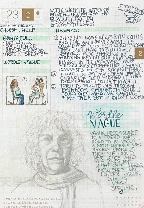
The pencil portrait on this page has a VAGUE resemblance to a dear friend who used to be vague—always a good listener and caring person but one who rarely spoke up about herself.
Then she found her voice and now she asks for what she needs. She is no longer vague; she is very specific and now our friendship is so much stronger.
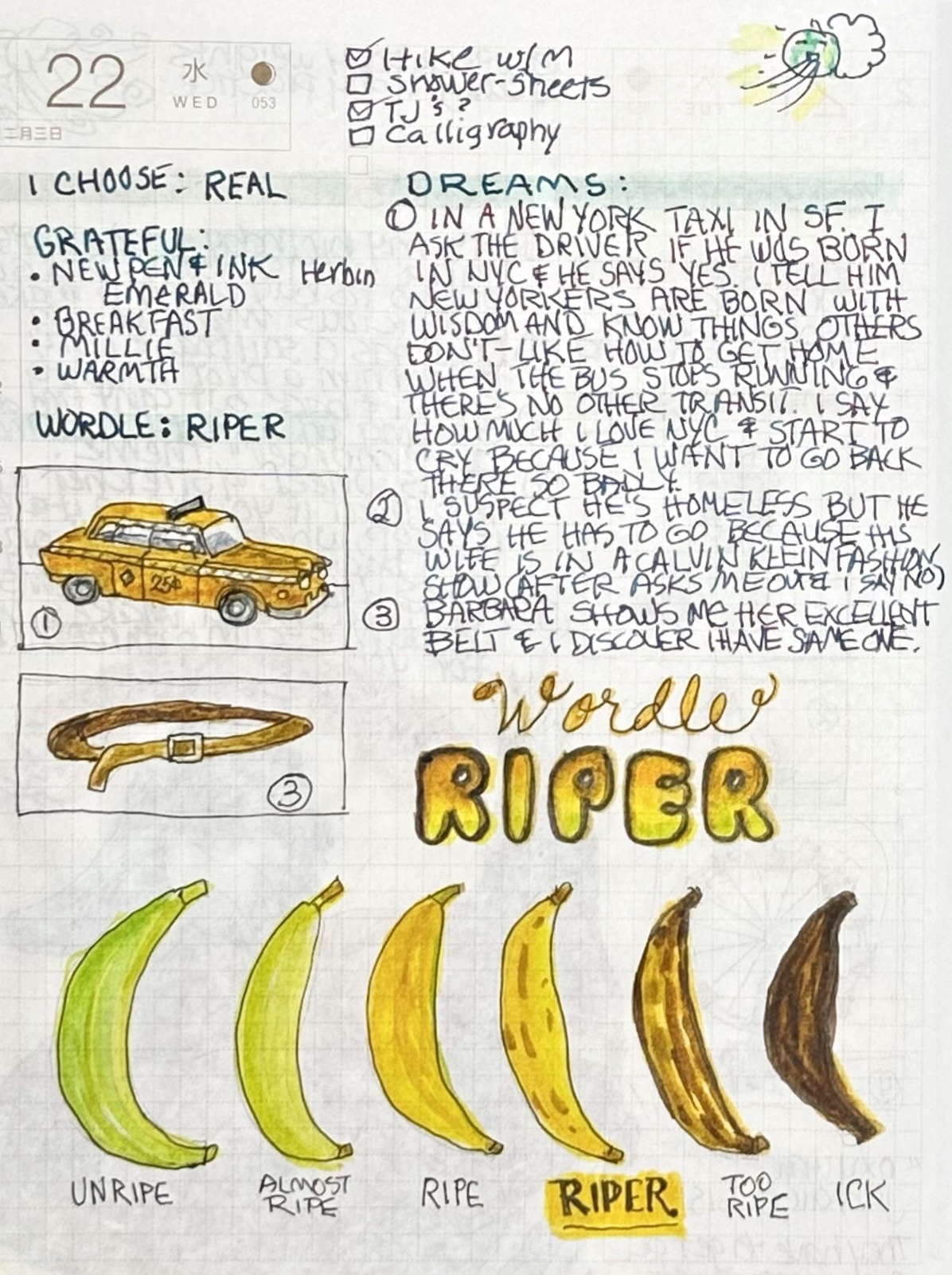
For Wordle: RIPER I drew the stages of bananas from Green to Ick. Why do they go from green to black so fast? I learned recently that if you seal the end where it connected to the bunch with plastic wrap or foil the ripening process goes more slowly.
The dreams above were:
(1) Riding in a NYC taxi and explaining to the driver how New Yorkers are born with wisdom and know things others don’t, like how to get home when the bus stops running, and then crying because I love NY so much and want to be back there.
(2) I thought the cab driver might be homeless but he said he had to hurry and go because his wife is in a Calvin Klein Fashion show.
(3) Admiring my friend Barbara’s belt and then realizing I have one just like it. (Except in real life I don’t own a single belt but wish I did.)
For Wordle: RUDDY I drew the North American Ruddy Duck. These funny, cute critters need to get a running start across the water in order to take flight. Also above are some vibrant dreams illustrated that you can read if you want to click to enlarge the image.
Wordle: SWEAT(s) and dream that Adam Scott was my boyfriend
My usual at-home wardrobe consists of sweats (above) because as Mark Twain said, ”The coldest winter I ever spent was summer in San Francisco.” The constant fog and wind in my neighborhood call for sweats and a hoodie most of the time, even or especially in the summer.
I’d been watching the very funny Party Down on Hulu (from 2010) that Adam Scott stars in. So in my dream (above) he was my boyfriend and we were planning our ill-fated wedding.
When I googled “KIOSK,” I landed on http://www.PrisonKiosk.net, a seller of Prison Music Kiosks with the tagline, “The “i-Tunes of U.S. prisoners.” The site displays a photo of a hapless prisoner paying to play music. The Prison-Industrial complex provides opportunities for entrepreneurs to invent businesses to capitalize on the system.
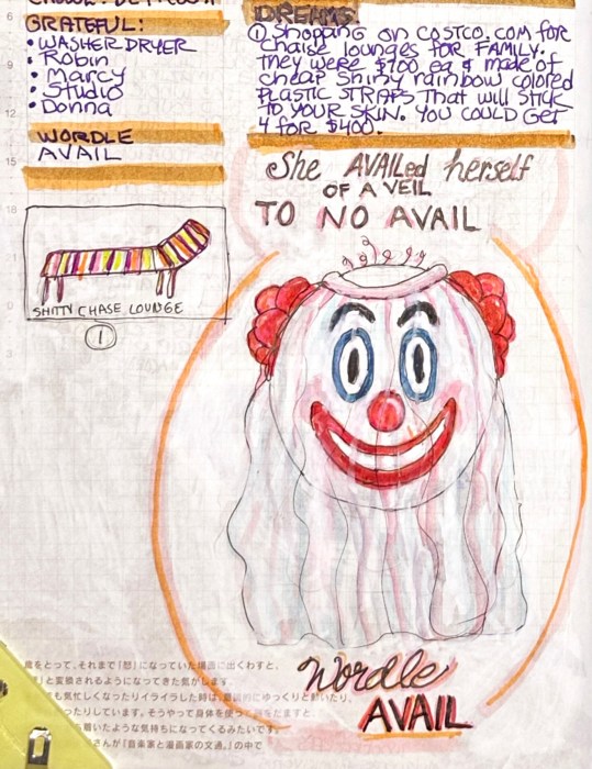
Wordle: AVAIL
She AVAILed herself of a VEIL to No AVAIL. It wasn’t going to hide the fact that she was a creepy clown. Also a dream of shopping for chaise lounges at Costco. All they had were the nasty ones with plastic straps of colored plastic that stick to your skin and leave stripey dents.
Wordle: CACHE (Woodpeckers Cache: 700 pounds of acorns)
In Santa Rosa, California a cache of 700 pounds of acorns were discovered in the walls and chimney of home that had been stored there by a pair of Acorn Woodpeckers (Melanerpes formicivorus). I love their little red caps that look like Catholic cardinal’s hats.
In the dream (above) I was the star of a hearing aid study where the hearing aids have AI and the whole world comes alive in 3-D sound like you’re in a video game.
Wordle: MAGIC and dreams of elephant-nosed dog and housecleaning
Dreams are MAGIC because in dreams I can fly and it’s so much fun! In dream #1 above I was at the SPCA and saw a cute, fluffy puppy with a nose like an elephant’s trunk. I wanted to adopt him (but he was already spoken for).
Usually my dreams are much more mundane, like dream #2 and #3, mostly about housecleaning.
The Wordle was SOUND and it was a day of synchronicity because I finally have good sound in the studio again thanks to a cheap Bluetooth Dongle. (Click image to enlarge to read more about it).
I am months and probably 100 pages behind in posting so will keep this short. I almost posted these two journal pages a month ago but got frustrated when I couldn’t get a clean image. I decided to just get them posted anyway, even if they’re not close to perfect.
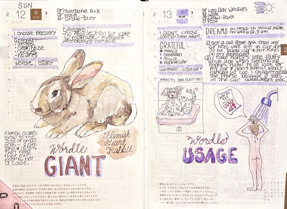
Flemish Giant rabbits grow to the size of small dogs—2.5 feet long and 15 pounds. They need their own rooms, not a cage, according to a website about them. I thought they qualified for Wordle GIANT.
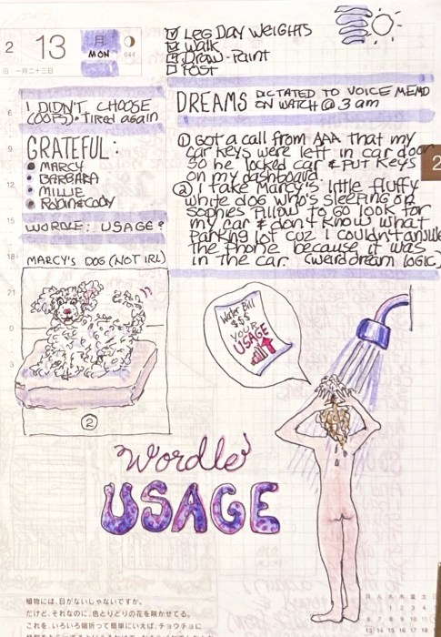
Wordle: USAGE (Water Usage) and DREAMS
I love taking long showers but in the SF Bay Area and most of California, water is a precious and scare commodity so we have to monitor our usage. My water bill displays graphs displaying if I’ve been a good citizen and minimized my water usage. I try my best.
My dreams: I got a call from AAA that I’d left my car keys were in my car so he locked the car and put my keys on the dash. I took my sister’s little fluffy white dog (that she doesn’t have in real life) to go look for my car. I couldn’t remember where I’d parked it and couldn’t answer the phone because the phone was in the car (weird dream logic).
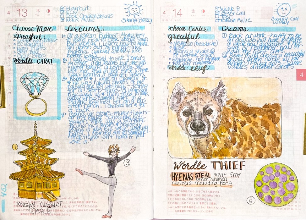
Wordle: THIEF (Hyenas) and pretty polka dot dream image
For Wordle THIEF I drew a hyena, famous for stealing meat from other animal hunters, including lions. My dreams were 1) a dream about being back at work and forgetting how to do stuff and 2) an image of a beautiful yellow-green circle with lavender dots.
Wordle: CARAT and dreams of Korean Buddhist Temple and Ballet
I didn’t get too creative with Wordle: CARAT, just drew a diamond.
My dreams were very colorful. I will just explain the two that are illustrated. The others included this quote “Practicing isn’t hard if you love it.” Hmmm. Is it weird that I make up quotes in my dreams.
1) I was at a Korean Buddhist temple learning how to cook noodle soup (influenced I’m sure by watching the wonderful Korean series The Extraordinary Attorney Woo on Netflix).
2) Roberto was taking photos of me raising one leg very high for some kind of sports thing. A lady ridiculed us and then stole his camera but I chased her and got it back.
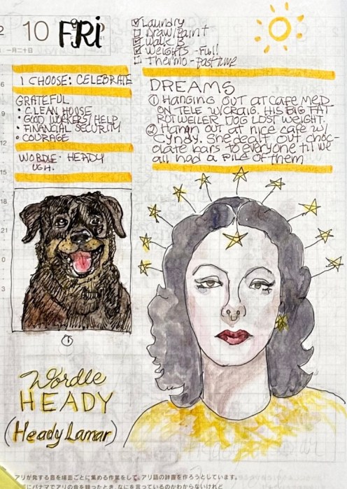
Hedy (Hedwig) Lamarr was a beautiful Austrian-American film actress during Hollywood’s Golden Age. In the dreams above, I was hanging out in cafes with friends. One had his Rottweiler with him and the other was handing out chocolate.
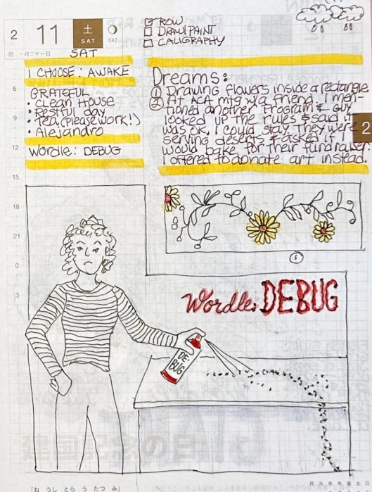
Wordle: DEBUG and dreams
Although the word DEBUG is meant to apply to computer programs, I thought of my battles with ants over the years. I seem to always have lived atop a giant ant hill.
PSA: ant spray is not the solution. Terra Ant Baits actually work to wipe out the whole ant crime family. It gets worse for about a week before it gets better, but then it’s very effective.
The dreams were fun: drawing flowers inside a rectangle and donating art instead of cookies for a fund raiser.
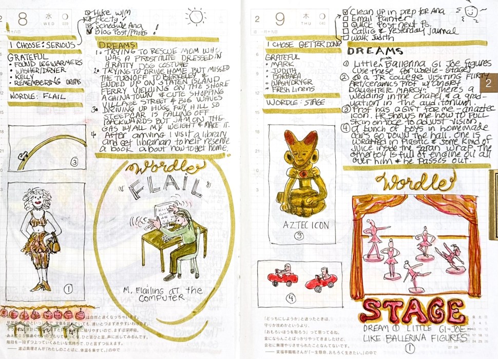
(Above) There is so much on these two pages that I’ll post them separately below with their stories. The righthand page was especially meaningful, with the pink ballet dancers from my dream: